


Signage Style: The 23 Best Fonts for Signs

Have you ever stood in front of a sign, completely captivated? Maybe it’s the sharp, sleek letters that caught your eye, or the way the font just seemed to speak to you.
That’s the power of the right font in signage. It’s not just about making words visible; it’s about creating a visual language that connects and communicates.
As a designer, I’ve seen firsthand how the choice of font can elevate a simple sign to an impactful piece of communication.
In this article, we’re diving into the world of best fonts for signs. It’s a journey through typography, understanding how the right font can make your message not just seen, but felt. We’ll explore various font categories like Serif, Sans Serif, and those eye-catching Script Fonts. Plus, we’ll touch on essential design principles like readability and contrast that are key to effective sign making.
Top Fonts for Signs
| Font Name | Style Category | Legibility | Usage | Availability |
|---|---|---|---|---|
| Helvetica | Minimal Sans Serif | High | Modern, Clean Designs | Paid |
| Garamond | Vintage and Cultural | Moderate | Classic, Elegant Prints | Paid/free versions |
| Adobe Garamond Pro | Vintage and Cultural | Moderate | Academic, Professional Prints | Paid |
| Futura | Minimal Sans Serif | High | Geometric Designs | Paid |
| Gotham | Urban Font Family | High | Modern, Urban Designs | Paid |
| Proxima Nova | Modern Sans Serif | High | Web, Print, Multifunctional | Paid |
| Open Sans | Minimal Sans Serif | High | Web, Mobile, UI Design | Free |
| Bodoni | Vintage and Cultural | Moderate | Fashion, Editorial Printing | Paid |
| Franklin Gothic | Sans Serif Typeface | High | Advertisements, Newspapers | Paid |
| Montserrat | Minimal Sans Serif | High | Digital, Print, Posters | Free |
| Univers | Minimal Sans Serif | High | Corporate, Technical Prints | Paid |
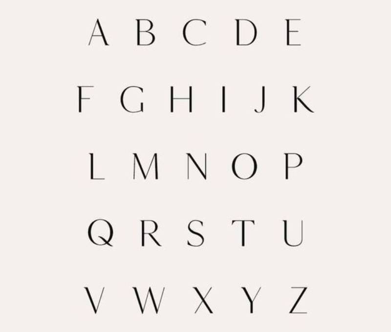
Classic and Timeless Fonts
Classic and Timeless Fonts, they’re like the old-school vinyl records of the font world. They never go out of style.
Think of fonts like Helvetica and Garamond. They have this cool, unshakeable vibe that works almost anywhere.
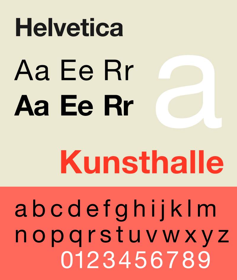
This one is the Swiss Army knife of fonts. It’s so versatile that you can slap it on any sign, and it’ll look like it was born to be there. Helvetica is easy to read, which makes it a winner for both indoor and outdoor signs.
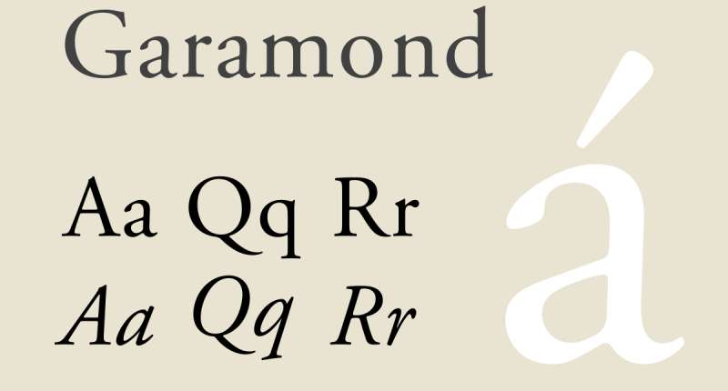
This font is like that classic, vintage car that turns heads. It’s elegant and perfect for smaller text where you want a touch of class without sacrificing readability.
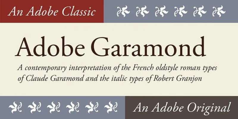
It’s the slightly snazzier cousin of Garamond. This one’s got all the elegance of Garamond, but it’s a bit more modern and super useful for all kinds of signage.
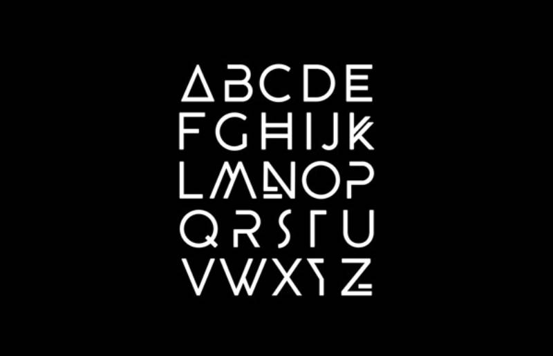
Modern and Geometric Fonts
Next up, Modern and Geometric Fonts. These are your high-tech, futuristic fonts. They’re all about clean lines and sharp angles – perfect for a more contemporary, cutting-edge look.
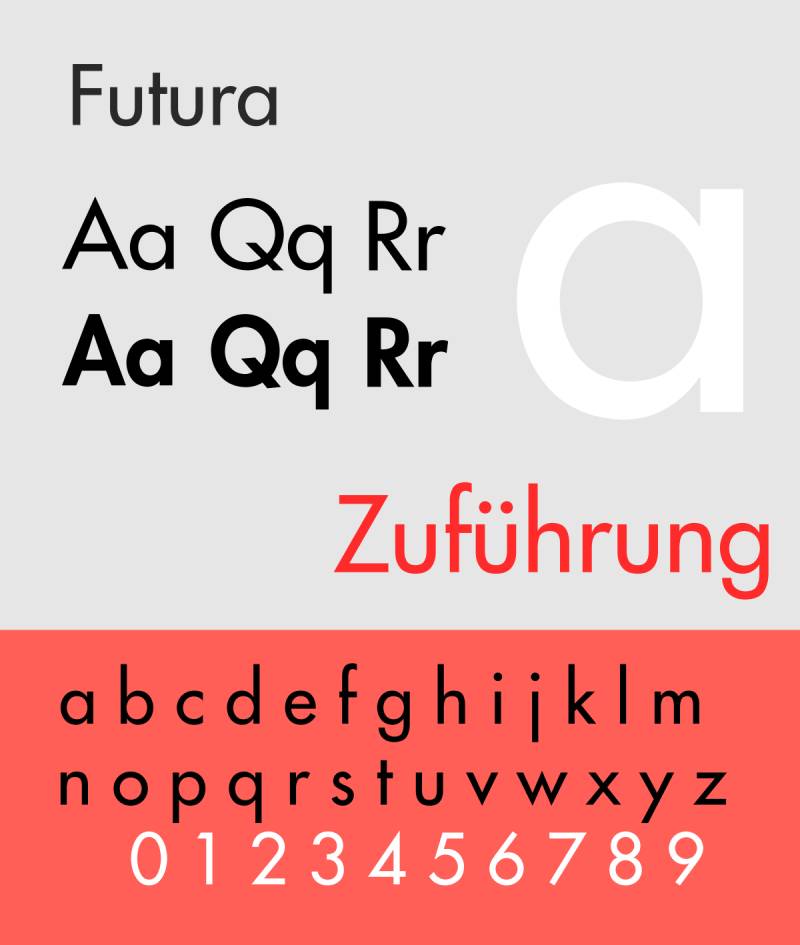
This font is like the concept car of fonts. It’s all geometric clarity and forward-thinking design. Futura is great for making a bold, modern statement.
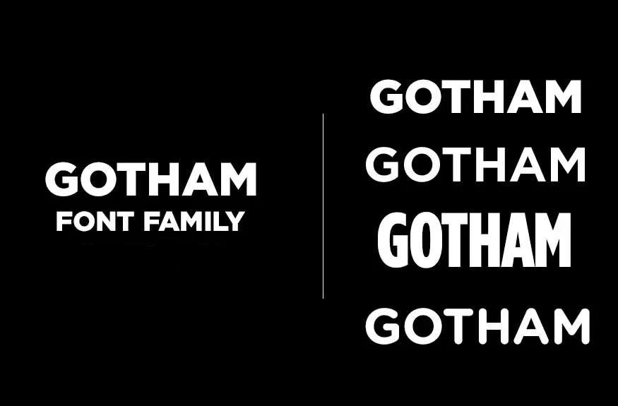
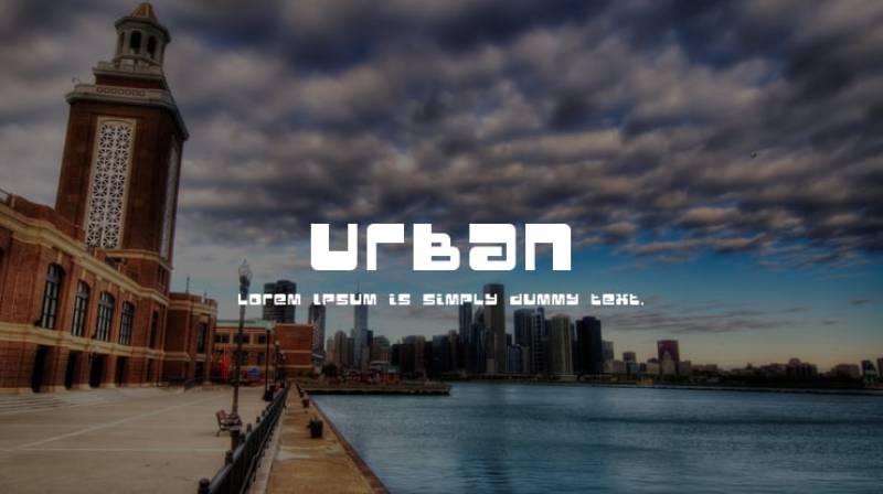
If fonts had a coolness scale, Gotham would be off the charts. It’s modern, it’s geometric, and it’s got this neat, urban vibe that’s hard to beat.
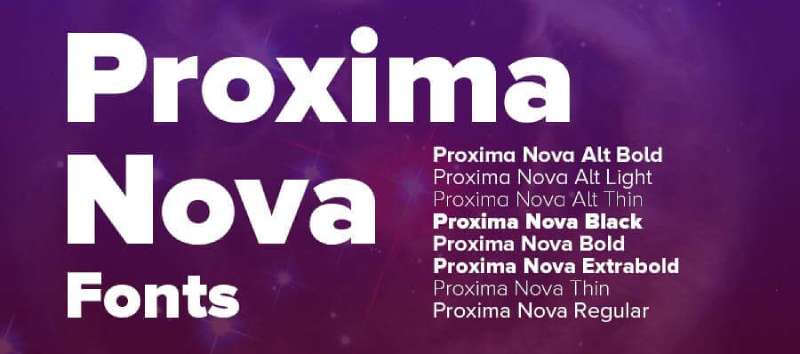
This one’s a newer player in the game but has quickly become a favorite for both indoor and outdoor signs. It’s a modern sans-serif that just nails the balance between friendly and professional.
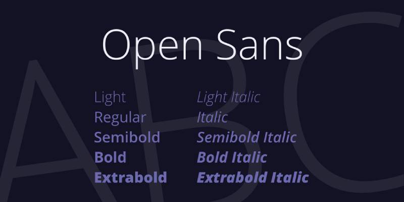
Born for digital displays, Open Sans is like the friendly face in the crowd. It’s clear, legible, and works just as well on a screen as it does on a sign.
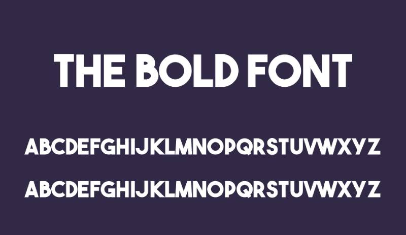
Bold and Impactful Fonts
And then, we’ve got the Bold and Impactful Fonts. These fonts don’t just speak; they shout. They’re all about making an impact and grabbing attention.
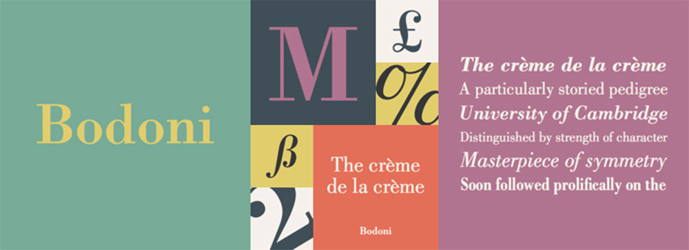
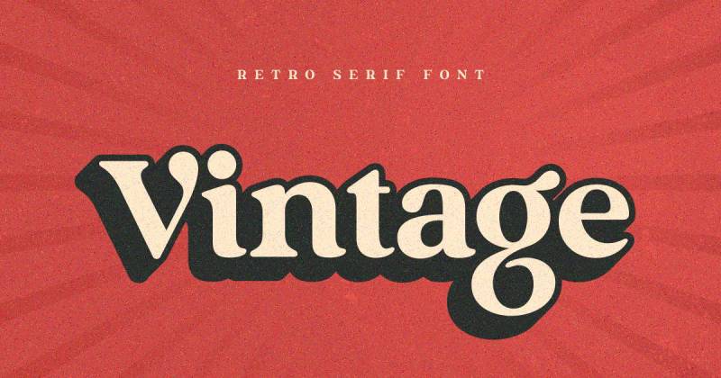
Bodoni is like the fashion model of fonts – stylish, eye-catching, and full of contrast with its thick and thin strokes. It’s perfect when you want to make a stylish statement.
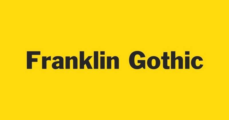
Imagine a font that’s both bold and can fit into narrow spaces. That’s Franklin Gothic for you. It’s got this no-nonsense, straightforward vibe that’s just so compelling.
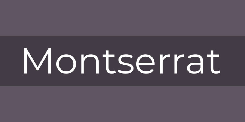
Talk about versatility! Montserrat can be your go-to for pretty much any project. It’s got a modern touch but still holds its own in a variety of settings.
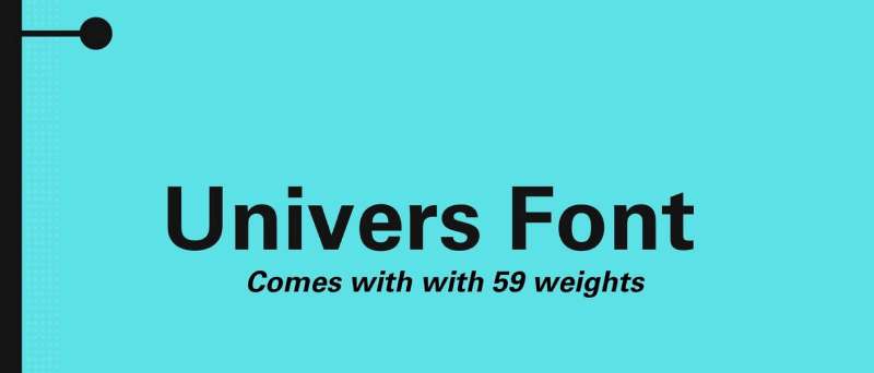
This one’s a crowd-pleaser. Univers is super popular because it’s just so easy to read from a distance, making it a top pick for signs that need to catch the eye from afar.
Unique and Thematic Fonts
Unique and thematic fonts are like the spice in your favorite dish. They add that extra zing, making everything more interesting. These are the fonts that give your sign personality and make it memorable.
Think of fonts like Ambattur, Beagle Sign, Orlando. These aren’t just fonts; they’re like elegant, flowing handwriting frozen in time. They’re perfect when you want that elegant touch, something that whispers class and sophistication.
Fonts like Bant Achillers and Makuton are not just letters. They’re a time machine. They take you back to different eras or immerse you in different cultures. Imagine a sign for a retro diner or a shop that sells traditional Japanese goods. These fonts can transport your audience before they even step in.
San Marino – this isn’t just a font, it’s a statement. It’s clean, it’s trendy, and it screams urban chic. Perfect for urban shops or modern cafes where the vibe is as important as the menu.
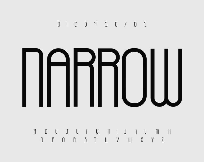
Sabang Island, for example, is tall and stands out. It’s perfect for signs where space is limited but impact is needed.
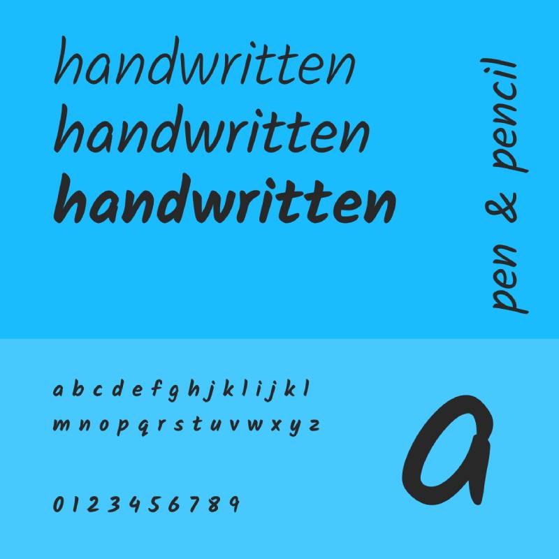
Beagle Sign, for instance, brings that personal, handwritten feel. It’s stylish, unique, and adds a human touch to any sign.
Ranormal is versatile and stunning. It’s free, and it brings that custom-made, signature style to your signage.
Bant Achillers, with its modern-vintage design and a monoline layout, bridges the gap between the old and the new seamlessly.
Manufaktur stands out. It’s bold, inspired by Swedish industrial design, and it makes a sign pop.
NORMAL – it’s minimalist, modern, and perfect for businesses that believe in ‘less is more’.
Lineat – stylish, modern, perfect for businesses that want to stand out.
Frank – this one’s bold, versatile, and comes in multiple weights and styles. It’s like having a whole font family at your fingertips.
Gallagher – it’s vintage, it’s free, and it’s perfect for retro-style signage.
Factors Influencing Font Selection
When it comes to picking the best fonts for signs, it’s not just about what looks cool. It’s like choosing the right ingredients for a recipe – you need to consider a few key things to make sure everything comes together perfectly.
Brand Consistency
First up, Brand Consistency. Your font needs to vibe with your brand. If your brand is all about being modern and techy, you wouldn’t pick a vintage script font, right? It’s like wearing sneakers with a tuxedo – just doesn’t fit. The font should reflect your brand’s personality, whether it’s fun and quirky or serious and professional.
- Aligning font choice with brand identity: This is crucial. Your sign’s font is your brand’s voice. You want it to tell your story the way you intend it to be told.
Sign Usage and Location
Next, think about Sign Usage and Location. Where’s this sign going? Is it for a cozy café on a busy street or a sleek billboard on the highway? Context is king.
- Indoor vs. outdoor signage: Outdoor signs need fonts that are clear and easy to read from a distance. Indoor signs can be more playful and intricate.
- Viewing distance and conditions: This is a biggie. You need to think about how far your audience will be when they’re reading the sign. Bigger, bolder fonts work best from a distance, while you can get away with more detailed fonts up close.
Design Considerations for Effective Signage
Now, let’s talk design. Choosing the best fonts for signs is an art. You want your sign to not only look good but also be effective.
Readability and Visibility
Readability and Visibility are the heart and soul of a good sign. If people can’t read your sign, what’s the point, right?
- Font size and legibility: Size matters, folks. Too small, and no one can read it. Too big, and it looks shouty. Find that sweet spot where your font is just the right size to be read comfortably.
- Contrast with background and colors: Contrast is your friend. You want your font to pop against the background. Think dark font on a light background or vice versa. It’s like making sure your text stands out in a sea of colors.
Font Pairing and Diversity
And finally, Font Pairing and Diversity. Sometimes, one font isn’t enough, and you need to mix and match.
- Combining different font types: It’s like a duet – two fonts that complement each other can make your sign sing. But be careful not to overdo it. Too many fonts can be like too many cooks in the kitchen.
- Limiting the number of fonts used: Stick to a couple of fonts at most. It keeps things clean and coherent. Like a well-organized playlist, it just flows better.
Do’s and Don’ts in Signage Font Selection
Choosing the best fonts for signs? It’s like crafting the perfect playlist for a road trip. You need the right mix to keep it interesting, but not too wild that it loses coherence. Let’s break down the dos and don’ts to nail this thing.
Best Practices
Here’s what you should definitely be doing:
- Using contrasting fonts for visual appeal: Think of contrast like salt in cooking. It brings out the flavors, or in this case, the appeal. Mix a bold font with a more subdued one to make your sign pop.
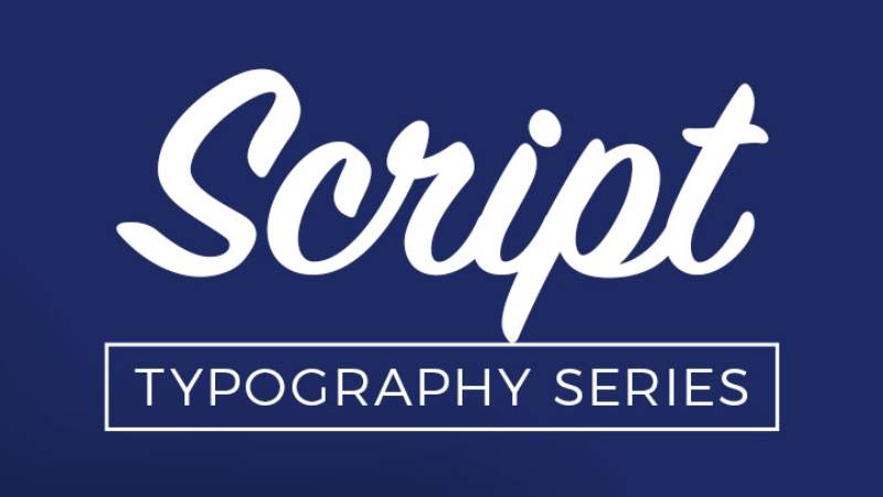
- Appropriate use of script fonts: Script fonts are like that secret ingredient – great in small doses but overwhelming if overused. Use them for emphasis, not for the main message.
Common Mistakes
And now, the pitfalls to avoid:
- Overusing certain fonts: Just because a font is popular doesn’t mean it’s right for every sign. It’s like playing the same song on repeat – gets old fast.
- Inappropriate font sizes and styles for specific contexts: Using a super fancy font for a street sign? Nope. Keep the context in mind. Your font should fit the environment it’s in, like choosing the right outfit for an occasion.
FAQ On The Best Fonts For Signs
What Makes a Font Good for Signage?
It’s all about readability and impact. A good sign font needs to be clear from a distance, easy on the eyes, and should fit the vibe of the place it’s representing. Think Helvetica for its no-nonsense clarity or Garamond for a touch of elegance.
How Do I Choose Between Serif and Sans Serif Fonts for My Sign?
Consider the atmosphere you’re aiming for. Serif fonts, like Times New Roman, give off a classic, trustworthy vibe, ideal for professional settings. Sans serif fonts, such as Arial, lean towards a modern, clean look, great for a contemporary feel.
Can Script Fonts Work Well on Signs?
Sure, but use them sparingly. Script fonts, like Lobster, are perfect for adding flair or highlighting something special. But for the main text, stick to something more straightforward. You want your sign to be readable, not just pretty.
Are There Any Fonts I Should Avoid for Signage?
Yeah, steer clear of overly decorative or complex fonts. Fonts like Papyrus or Comic Sans can make your sign look unprofessional. Keep it simple and classy. Remember, the sign is there to convey a message, not to show off funky fonts.
What’s the Best Font Size for Outdoor Signs?
Bigger is usually better for outdoor signs. You want something that people can read from a distance. Think about the location and viewing distance. A general rule? Go as big as your space and design allow, without cramming.
How Important is Color Contrast in Signage Font Selection?
Super important. Your font and background colors should contrast well to ensure readability. Dark font on a light background or vice versa works best. Avoid color combinations that blend together or are hard on the eyes.
Is It Okay to Use Multiple Fonts on a Single Sign?
Yes, but don’t go overboard. Two fonts are usually enough – one for the main message and another for details. Make sure they complement each other. Too many fonts can make your sign look cluttered and confusing.
How Do Digital Screen Displays Affect Font Choice?
Digital screens have their quirks. You’ll want a font that’s clear and legible even on a lit screen. Sans serif fonts, like Open Sans, are generally a good choice. Avoid fonts with fine details that might get lost on a screen.
What Fonts Are Best for Temporary Signs?
For temporary signs, go with something bold and straightforward. You want to grab attention quickly. Fonts like Impact or Bold Arial work well. They’re clear, noticeable, and get the message across without fuss.
How Does the Font Choice Reflect the Brand Identity?
Your font choice is a direct reflection of your brand’s personality. A funky, casual font can convey a fun, approachable brand. A more traditional, serif font can suggest sophistication and professionalism. Your font sets the tone for how people perceive your brand.
Conclusion
Wrapping up this journey through the world of best fonts for signs, it’s clear that font choice is no small decision. It’s about finding that sweet spot where style meets clarity, where the personality of your brand shines through without sacrificing readability. Whether it’s the timeless elegance of a Serif font or the clean simplicity of a Sans Serif, the right choice can transform a simple message into a powerful statement.
Remember, the font you pick is more than just letters on a board. It’s the voice of your brand, the first handshake with your audience. Choose a font that aligns with your identity, whether it’s the professional air of Garamond or the modern vibe of Proxima Nova. Consider the setting, the audience, and the message you want to convey.
In the end, the best fonts for signs are those that not only catch the eye but also speak to the heart. They’re the fonts that tell your story in a glance, leaving a lasting impression long after the sign is out of sight. Keep it legible, keep it relevant, and let your sign do the talking.
If you liked this article about the best fonts for signs, you should check out this article about the best fonts for brochures.
There are also similar articles discussing the best fonts for Photoshop, the best fonts for engraving, the best fonts for ADHD, and the best fonts for monograms.
And let’s not forget about articles on the best fonts for Android, the best fonts for letterhead, the best fonts for quotes, and the best fonts for email signatures.
Bogdan Sandu, a seasoned designer with 15 years of diverse experience, has been designing websites since 2008.
Renowned for his expertise in logo design and visual branding, Bogdan has developed a multitude of logos for various clients.
His skills extend to creating posters, vector illustrations, business cards, and brochures. Additionally, Bogdan's UI kits were featured on marketplaces like Visual Hierarchy and UI8.
Latest posts by Bogdan Sandu (see all)
- The Benefits Of Print on Demand - 13 May 2024
- Earthly Delight: Rich Brown Color Palettes - 13 May 2024
- Designer Fonts: What Font Does Balenciaga Use? - 13 May 2024