The wrong font can ruin an engraving job before the laser even fires.
Choosing the best fonts for engraving is not a purely aesthetic decision. Stroke weight, letter-spacing, and font classification all determine whether text survives the cutting process on metal, wood, leather, or acrylic.
Not every typeface holds up under rotary or laser engraving conditions. Hairline serifs collapse. Tight kerning causes letters to merge. Scripts that look elegant on screen become unreadable blobs at 8pt on stainless steel.
This guide covers the ten best engraving fonts, ranked by real performance across materials, with specific size thresholds, weight recommendations, and licensing details for each one.
The Best Fonts For Engraving
Font choice makes or breaks an engraving job. A typeface that looks great on screen can fall apart completely when cut into metal, wood, or acrylic. Stroke weight collapses. Hairline details vanish. Letter spacing that felt balanced suddenly looks cramped.
The fonts below are selected based on structural attributes that directly affect engraving performance: stroke consistency, letter-spacing defaults, weight availability, and how well each typeface holds up on physical materials. Not every font works for every material, so this guide breaks each one down by use case.
—
Trajan
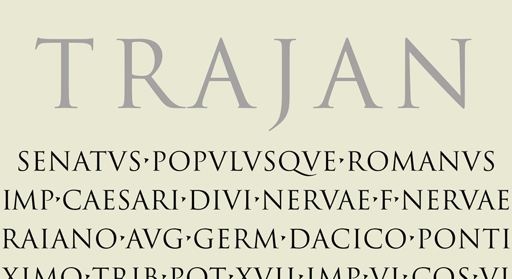
Trajan is an inscriptional serif typeface designed by Carol Twombly in 1989, released by Adobe as part of the Adobe Originals program. It reproduces the Roman square capitals (capitalis monumentalis) carved into Trajan’s Column in Rome, dating to 113 AD.
Trajan suits formal and monumental engraving because its letterforms were literally designed for stone carving, giving it exceptional structural clarity at large sizes.
Used on the Titanic film poster and the West Wing title sequence, Trajan is one of the most recognized display typefaces in print and engraving contexts.
What makes Trajan suitable for engraving?
Trajan uses tapered serifs and moderate stroke contrast derived from chisel-cut Roman inscriptions. Its all-capitals structure eliminates descender conflicts, which simplifies layout for plaques, trophies, and commemorative pieces. The proportional variation between wide letters (O, M) and narrow ones (I, E) produces natural optical spacing that reads clearly at display sizes.
Key attributes:
| Attribute | Value |
| Classification | Inscriptional serif |
| Designer | Carol Twombly, 1989 |
| Weight range | Regular, Bold (Trajan Pro 3 expands this) |
| Variable font | No |
| Optical sizes | No |
| Recommended sizes | 18pt+ for engraving; not suitable below 12pt |
| Letter-spacing default | Wide |
| License | Commercial (Adobe Fonts subscription) |
| Available on | Adobe Fonts |
| Price | Adobe Creative Cloud subscription ($69.99/mo); free alternative: Cinzel (OFL) |
How does Trajan perform for engraving?
Trajan renders with high stroke contrast that holds up well on metal and stone surfaces. Its wide capital proportions give each letter enough visual mass to survive rotary and laser engraving without losing definition. It performs best at sizes above 18pt; below that, the thin stroke segments begin to lose detail on harder materials like stainless steel.
What are the best pairings for Trajan in engraving?
Trajan pairs with Copperplate Gothic for a monumental, all-caps composition where consistent weight is needed across different text sizes. It also pairs with Garamond for mixed-case layouts on certificates or diplomas, where Garamond handles body text and Trajan handles the headline. The Trajan/Copperplate pairing is the more standard practice in trophy and plaque engraving.
What are the limitations of Trajan for engraving?
Trajan is all-capitals only. The lowercase in Trajan Pro 3 is rendered as small caps, which limits its flexibility for mixed-case personal messages. It also requires an Adobe subscription for commercial use, with no legitimate free version of the original available.
Trajan – Recommended Use Cases Within Engraving
- Best for: Plaques, trophies, memorial stones, formal awards, military insignia
- Avoid for: Small jewelry engraving below 12pt, personal messages requiring true lowercase
- Optimal weight: Regular for standard plaques; Bold for deep rotary engraving on metal
- Optimal size range: 18pt and above
—
Garamond

Garamond is an old-style serif font with roots tracing back to the 16th-century type designs of Claude Garamond. The version most commonly used today is either Adobe Garamond (designed by Robert Slimbach, 1989) or EB Garamond (Georg Duffner and Octavio Pardo), an open-source revival available on Google Fonts.
Garamond works best for engraving on wood, leather, and paper-based materials because its moderate stroke contrast and refined serifs hold detail well at mid-range sizes.
What makes Garamond suitable for engraving?
Garamond has a medium x-height and moderate contrast between thick and thin strokes, which reduces the risk of detail loss during laser engraving. Its balanced cap height and clean apertures in letters like “e” and “c” keep characters legible even when engraved at sizes as small as 10pt on smooth wood surfaces. The Italic variant adds flexibility for personal messages and wedding gift engraving.
Key attributes:
| Attribute | Value |
| Classification | Old-style serif |
| Designer | Claude Garamond (16th c.); modern revival by Robert Slimbach, 1989 |
| Weight range | Light to Bold (5 weights in Garamond Premier Pro; EB Garamond: Regular to ExtraBold) |
| Variable font | Yes (EB Garamond on Google Fonts) |
| Recommended sizes | 10pt–24pt for wood and leather engraving |
| Letter-spacing default | Normal |
| License | EB Garamond: OFL (free); Adobe Garamond: Adobe Fonts subscription |
| Available on | Google Fonts (EB Garamond); Adobe Fonts (Adobe Garamond) |
| Price | Free (EB Garamond); subscription (Adobe Garamond) |
How does Garamond perform for engraving?
On smooth wood and leather, Garamond’s moderate stroke contrast produces clean, readable lines without requiring excessive laser power. The thin stroke segments are narrower than those in sans-serif options, which can cause detail loss on rough or porous surfaces like oak or unfinished leather. On finer materials like cherry wood or veg-tan leather, it performs reliably at 10pt and above.
What are the best pairings for Garamond in engraving?
Garamond pairs with Futura for a contrast between classical and geometric styles, common in branded product engraving. It also pairs with Trajan when a consistent serif hierarchy is needed across a plaque or certificate, with Trajan handling the main heading and Garamond handling secondary text.
What are the limitations of Garamond for engraving?
Garamond’s thin strokes make it unsuitable for rotary engraving on metal, where hairline details tend to smear or disappear. It should not be used below 10pt on textured or rough surfaces.
Garamond – Recommended Use Cases Within Engraving
- Best for: Wood engraving, leather personalization, wedding gift inscriptions, certificates
- Avoid for: Metal rotary engraving, rough or porous surfaces, sizes below 10pt
- Optimal weight: Regular 400 for body text; SemiBold for primary inscriptions
- Optimal size range: 10pt–24pt
—
Copperplate Gothic
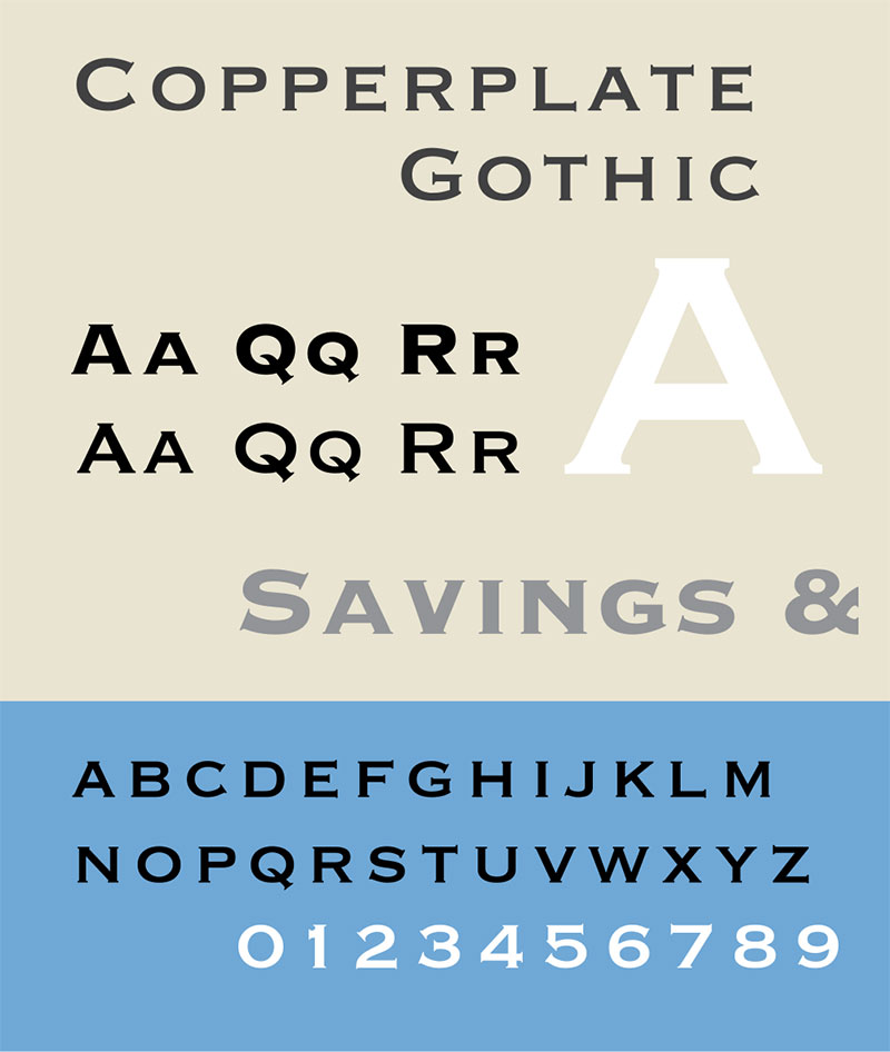
Copperplate Gothic is a wedge-serif display typeface designed by Frederic W. Goudy and first produced by American Type Founders (ATF) in 1901. It takes its name directly from the copperplate engraving tradition that dominated print reproduction from roughly 1530 to the 19th century. Additional weights were developed by Clarence C. Marder and Morris F. Benton at ATF through 1912.
Copperplate Gothic is the most historically connected engraving font on this list. Its entire visual identity comes from the aesthetic of engraved metal plates.
What makes Copperplate Gothic suitable for engraving?
Copperplate Gothic uses a uniform stroke weight with tiny wedge serifs that terminate each stroke crisply. This near-monolinear construction means very little stroke contrast, which significantly reduces the risk of fine detail loss during engraving. The all-capitals design (small caps serve as lowercase) simplifies spacing decisions on small items like business cards, nameplates, and dog tags.
Key attributes:
| Attribute | Value |
| Classification | Wedge-serif display (all-caps) |
| Designer | Frederic W. Goudy, 1901; expanded by Clarence C. Marder and Morris F. Benton |
| Weight range | Light, Medium, Bold, Heavy (9 styles via Linotype) |
| Variable font | No |
| Recommended sizes | 8pt–14pt for stationery; 14pt+ for plaques |
| Letter-spacing default | Wide |
| License | Commercial (Linotype/MyFonts); bundled in macOS and Windows |
| Available on | MyFonts, Adobe Fonts, pre-installed on macOS/Windows |
| Price | Commercial via Linotype; free for personal use (system font version) |
How does Copperplate Gothic perform for engraving?
The near-uniform stroke weight makes Copperplate Gothic one of the most reliable fonts for rotary metal engraving. Engraving machine operators at companies like Trotec and Epilog frequently include it in their default font catalogs. It holds its structure at 8pt on brass and aluminum. The wedge serifs add just enough visual definition to separate letters cleanly without requiring heavy engraving depth.
What are the best pairings for Copperplate Gothic in engraving?
Copperplate Gothic pairs with Trajan for formal monumental pieces, where Trajan sets the main inscription and Copperplate handles supporting text at smaller sizes. It pairs with Helvetica for modern professional stationery or nameplates that need a clean secondary typeface for contact information or dates.
What are the limitations of Copperplate Gothic for engraving?
Copperplate Gothic has no true lowercase, only small caps. This limits its use for personal, conversational messages where mixed-case text feels more natural. The all-caps construction also reduces readability for long inscriptions at very small sizes (below 7pt).
Copperplate Gothic – Recommended Use Cases Within Engraving
- Best for: Business stationery, metal nameplates, brass plaques, military dog tags, calling cards
- Avoid for: Long personal messages, engravings requiring true lowercase below 10pt
- Optimal weight: Light for fine detail; Bold for deep rotary cuts
- Optimal size range: 8pt–18pt
—
Futura

Futura is a geometric sans-serif font designed by Paul Renner in 1927, commissioned by the Bauer Type Foundry for the New Frankfurt modernist housing project. It was commercially released in 1936 and has since been expanded by Monotype into Futura Now, a family of 102 styles including a variable font.
Futura’s near-even stroke weight and geometric construction make it a practical choice for laser engraving on modern materials.
What makes Futura suitable for engraving?
Futura uses strokes of near-uniform weight derived from basic geometric forms: circles, triangles, and squares. Low stroke contrast means minimal variation between thick and thin segments, which keeps letter clarity consistent across different engraving depths. The tall ascenders and open letter spacing in the standard weights give each character enough breathing room to remain distinct at mid-range sizes on acrylic and aluminum.
Key attributes:
| Attribute | Value |
| Classification | Geometric sans-serif |
| Designer | Paul Renner, 1927 (Bauer Type Foundry) |
| Weight range | Light to Black (Futura Now: 102 styles) |
| Variable font | Yes (Futura Now) |
| Recommended sizes | 10pt–30pt for engraving; Bold/Heavy at smaller sizes |
| Letter-spacing default | Normal to wide |
| License | Commercial (Monotype/Linotype); Futura Now via Adobe Fonts subscription |
| Available on | Adobe Fonts, MyFonts, bundled in macOS (limited weights) |
| Price | Subscription or one-time commercial license |
How does Futura perform for engraving?
Futura’s even stroke weight means laser and rotary engraving tools cut each part of each letter at roughly the same depth. This reduces inconsistency between strokes and produces a cleaner result on reflective surfaces like anodized aluminum. Gravograph includes a full range of Futura fonts in its Pack 1 professional engraving software bundle, indicating industry-level adoption. At very small sizes (below 8pt), the geometric open forms like the letter “o” and “a” can lose their interior space on deep rotary cuts.
What are the best pairings for Futura in engraving?
Futura pairs with Garamond for product packaging or gift engraving where a sans-serif headline needs a warmer serif for body text. It pairs with Copperplate Gothic when an all-caps, uniform-weight combination is needed for modern stationery or tech-product engraving.
What are the limitations of Futura for engraving?
The full commercial license for Futura Now requires a Monotype subscription or significant one-time cost. Free alternatives like Century Gothic approximate the geometric construction but are not identical. Futura’s geometric letter “a” (single-story) can be mistaken for the letter “o” at very small sizes, which is a known readability risk for short inscriptions.
Futura – Recommended Use Cases Within Engraving
- Best for: Acrylic signage, anodized aluminum products, modern branded items, tech accessories
- Avoid for: Traditional or formal contexts requiring serif engraving; very small sizes on rough surfaces
- Optimal weight: Medium or Bold for clean laser cuts; avoid Light below 12pt
- Optimal size range: 10pt–30pt
—
Helvetica

Helvetica is a neo-grotesque sans-serif typeface designed by Max Miedinger and Eduard Hoffmann in 1957 at the Haas Type Foundry in Switzerland. It is currently owned and distributed by Monotype. Helvetica Neue (1983) expanded the family significantly, and Helvetica Now (2019) is the most current version, available in 48 styles.
Gravograph lists Helvetica alongside Arial in its best-seller professional engraving font catalog, used by industrial and commercial engravers worldwide.
What makes Helvetica suitable for engraving?
Helvetica has a high x-height relative to cap height, which keeps lowercase letters readable at smaller sizes. Its neutral, closed letterforms produce consistent stroke widths with minimal variation, making it predictable across different engraving depths and materials. The uniform letter spacing defaults reduce the need for manual kerning adjustments in engraving software.
Key attributes:
| Attribute | Value |
| Classification | Neo-grotesque sans-serif |
| Designer | Max Miedinger and Eduard Hoffmann, 1957 |
| Weight range | Thin to Black (Helvetica Now: 48 styles) |
| Variable font | Yes (Helvetica Now Variable) |
| Recommended sizes | 8pt+ for engraving; Regular or Medium weight at 10pt minimum |
| Letter-spacing default | Tight to normal |
| License | Commercial (Monotype); not available free |
| Available on | Adobe Fonts, MyFonts, Monotype direct |
| Price | Subscription or commercial one-time license |
How does Helvetica perform for engraving?
On metal surfaces (stainless steel, brass, aluminum), Helvetica’s high x-height and uniform stroke weight produce clean, legible results down to 8pt. Its closed apertures (particularly on “c”, “e”, and “s”) can become an issue on porous wood surfaces where ink or material bleed is a factor, but on smooth metal and acrylic it outperforms most sans-serif alternatives at small sizes.
What are the best pairings for Helvetica in engraving?
Helvetica pairs with Copperplate Gothic for professional stationery engraving, where Copperplate handles the formal display line and Helvetica handles contact information at smaller sizes. It pairs with Garamond for mixed-material products where one surface is engraved metal and another is printed paper or leather.
What are the limitations of Helvetica for engraving?
Helvetica requires a commercial license. Arial is a common free substitute, but the two are not identical. Helvetica’s tight default spacing can cause letters to merge during deep rotary cuts on soft metals; increasing tracking by 5–10% is often necessary.
Helvetica – Recommended Use Cases Within Engraving
- Best for: Industrial metal engraving, nameplates, modern jewelry, corporate branded items
- Avoid for: Traditional or ornate contexts; deep rotary cuts without adjusted tracking
- Optimal weight: Regular or Medium; avoid Thin and Light below 14pt
- Optimal size range: 8pt–20pt
—
Arial

Arial is a neo-grotesque sans-serif typeface designed by Robin Nicholas and Patricia Saunders at Monotype in 1982, originally developed to match the metric widths of Helvetica for IBM laser printer compatibility. It is included as a standard system font in Windows and macOS.
Arial is the single most widely used font in commercial engraving software, included in virtually every machine manufacturer’s default font library.
What makes Arial suitable for engraving?
Arial’s monolinear stroke construction and high x-height produce consistent letter widths that translate reliably across different engraving machines and materials. Its pre-installed availability means no additional software setup is needed, which matters in production environments where consistency across machines is a priority. The Unicode variant (Arial Unicode) supports the largest number of character sets of any standard engraving font.
Key attributes:
| Attribute | Value |
| Classification | Neo-grotesque sans-serif |
| Designer | Robin Nicholas and Patricia Saunders, 1982 |
| Weight range | Narrow, Regular, Bold, Black (multiple widths) |
| Variable font | No |
| Recommended sizes | 6pt+ for laser engraving; 8pt minimum for rotary |
| Letter-spacing default | Normal |
| License | Bundled with Windows/macOS; free for personal use; commercial redistribution restricted |
| Available on | Pre-installed on Windows and macOS; Google Fonts (not available); Microsoft Office |
| Price | Free (system font) |
How does Arial perform for engraving?
Arial renders cleanly at very small sizes, making it the go-to font for jewelry engraving where space is limited. On disc jewelry and ring shanks requiring text at 6pt–10pt, Arial outperforms most serif options because its open, simplified letterforms retain their shape during the engraving process. Monport Laser specifically recommends Arial as an ideal single-line font for small-format laser engraving work.
What are the best pairings for Arial in engraving?
Arial pairs with Copperplate Gothic in professional stationery and nameplate contexts, where Copperplate handles the display heading and Arial manages smaller supporting text. It also pairs with Garamond on wood or leather items where the engraved face uses Arial for legibility and a printed element uses Garamond for warmth.
What are the limitations of Arial for engraving?
Arial is visually generic. For luxury goods or premium gift engraving, it reads as a default choice, which may undermine the product’s perceived value. The Bold weight at large sizes (above 24pt) can appear blocky on deep rotary cuts, losing the clean finish that finer weights provide.
Arial – Recommended Use Cases Within Engraving
- Best for: Jewelry engraving, small text on metal, industrial nameplates, multi-language engravings
- Avoid for: Premium or luxury products where visual distinctiveness matters
- Optimal weight: Regular for text below 12pt; Bold for text 12pt and above
- Optimal size range: 6pt–20pt
—
Engravers MT
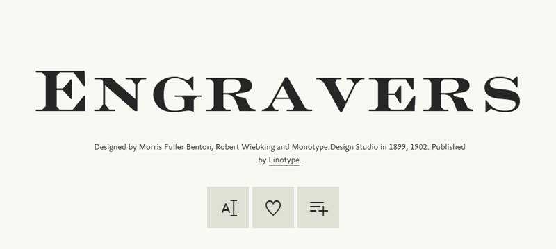
Engravers MT is an all-capitals display typeface published by Monotype, tracing its design lineage to the Engravers Roman cut by Robert Wiebking in 1899 and Engravers Bold by Morris Fuller Benton at ATF in 1902. The Monotype version (MT) evolved from these original designs to closely mimic the hand-lettered scripts used by 19th-century copperplate and steel plate engravers.
Engravers MT is one of the few typefaces specifically built to replicate the look of hand-engraved lettering.
What makes Engravers MT suitable for engraving?
Engravers MT features strong contrast between thick and thin strokes, modeled directly on the burin-cut letterforms of copperplate engraving plates. The sharply cut serifs and wide letter proportions produce an “engraved” appearance that reads as authentic on physical materials. At display sizes (18pt and above), each letter carries enough stroke mass to survive the engraving process without losing its defining features.
Key attributes:
| Attribute | Value |
| Classification | Display serif (all-caps), engraving style |
| Designer | Monotype Design Studio (based on Wiebking, 1899; Benton, 1902) |
| Weight range | Regular only (single weight) |
| Variable font | No |
| Recommended sizes | 14pt+ for engraving; best at 18pt–36pt |
| Letter-spacing default | Wide |
| License | Commercial (Monotype); personal use versions available |
| Available on | MyFonts, Adobe Fonts, Microsoft Office (limited) |
| Price | Commercial license required for professional use |
How does Engravers MT perform for engraving?
Engravers MT’s high stroke contrast is its biggest asset and its biggest risk. On smooth brass, copper, and silver, the thick strokes engrave beautifully and the thin hairlines hold their shape. On rougher surfaces or when using high-speed rotary tools, the thin stroke segments can disappear, leaving only the heavy strokes and distorting the letter shapes significantly. It performs best with slower, more precise laser or hand-tool engraving.
What are the best pairings for Engravers MT in engraving?
Engravers MT pairs with Trajan for formal plaque compositions where both typefaces carry a historical engraving reference. It pairs with Copperplate Gothic when a contrast between high-contrast display lettering (Engravers MT) and near-monolinear text (Copperplate) is needed. See how pairing fonts with contrasting stroke contrast can create visual hierarchy without relying on size alone.
What are the limitations of Engravers MT for engraving?
Engravers MT comes in a single weight, which severely limits its flexibility for hierarchy. It should not be used below 14pt under any rotary engraving conditions; the hairline strokes will not survive the process at smaller sizes.
Engravers MT – Recommended Use Cases Within Engraving
- Best for: Formal certificates, brass plaques, copper keepsakes, high-end gift engraving
- Avoid for: Small text below 14pt, rough surfaces, high-speed rotary engraving
- Optimal weight: Regular (only option available)
- Optimal size range: 18pt–36pt
—
Palatino
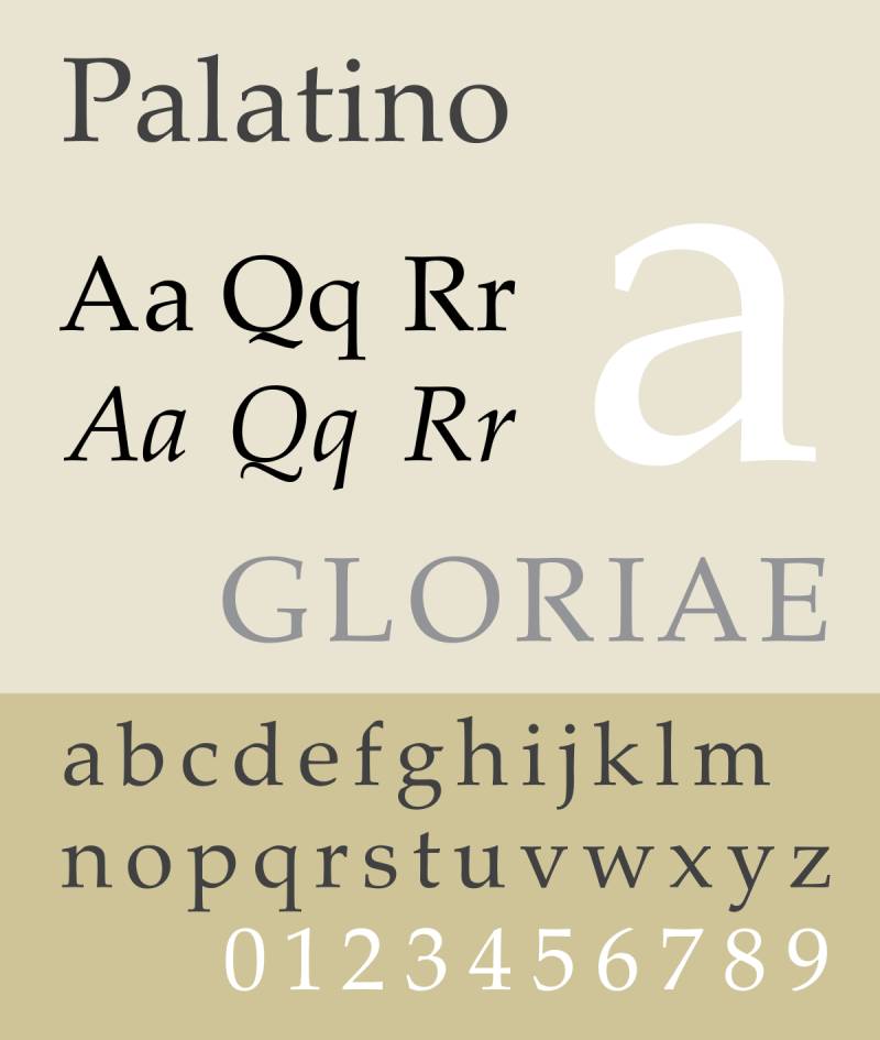
Palatino is an old-style serif typeface designed by Hermann Zapf in 1949, originally produced by the Stempel foundry and later licensed to Linotype. It is named after the 16th-century Italian calligrapher Giambattista Palatino. A version (Book Antiqua) is bundled with Microsoft Office, and Palatino Linotype ships with Windows.
Palatino is one of the most legible serif fonts at mid-range sizes, which makes it a reliable option for wood and leather engraving where the material can soften fine detail.
What makes Palatino suitable for engraving?
Palatino has broader letterforms than most old-style serifs, with a relatively large x-height that improves lowercase readability. The stroke contrast is moderate, not as extreme as Engravers MT, which reduces the risk of thin-stroke collapse during engraving. Zapf designed it with calligraphic proportions, so the letterforms have natural weight distribution that translates well when cut into organic materials like wood and leather.
Key attributes:
| Attribute | Value |
| Classification | Old-style serif (humanist) |
| Designer | Hermann Zapf, 1949 (Stempel foundry) |
| Weight range | Regular, Italic, Bold, Bold Italic (Palatino Linotype) |
| Variable font | No |
| Recommended sizes | 10pt–24pt for wood/leather engraving |
| Letter-spacing default | Normal |
| License | Palatino Linotype: bundled with Windows; commercial versions via Linotype/Adobe |
| Available on | Pre-installed on Windows (Palatino Linotype); Adobe Fonts; Google Fonts (via TeX Gyre Pagella, an open-source version) |
| Price | Free (Windows system font); commercial for extended families |
How does Palatino perform for engraving?
On wood, Palatino’s calligraphic stroke distribution produces a warm, legible result at 10pt and above, where the natural variation in stroke weight adds visual character without introducing fragile hairlines. On leather, the broader letterforms stay readable even when the surface has slight texture. It does not perform as well on metal as fonts designed specifically for hard-surface engraving, because the subtle stroke transitions require precise control over engraving depth.
What are the best pairings for Palatino in engraving?
Palatino pairs with Futura for a classic contrast between humanist serif and geometric sans-serif, useful for engraved product lines that need hierarchy between a brand name and a product description. It pairs with Garamond for all-serif compositions on certificates or diplomas, where Palatino handles body copy and Garamond handles titles.
What are the limitations of Palatino for engraving?
Palatino’s calligraphic stroke variation makes it less predictable on metal surfaces than monolinear options like Arial or Copperplate Gothic. It is not recommended for rotary metal engraving below 12pt.
Palatino – Recommended Use Cases Within Engraving
- Best for: Wood keepsakes, leather journals, certificates, diploma engraving
- Avoid for: Metal surfaces below 12pt; industrial rotary engraving
- Optimal weight: Regular for body; Bold for display lines
- Optimal size range: 10pt–24pt
—
Times New Roman

Times New Roman is a transitional serif typeface designed by Stanley Morison and Victor Lardent in 1931 for The Times newspaper, produced by Monotype. It is among the most widely distributed fonts in history, pre-installed on virtually every operating system and included in Microsoft Office.
Times New Roman is not the most original engraving font choice, but its stroke structure and availability make it a dependable fallback for standard laser engraving work.
What makes Times New Roman suitable for engraving?
Times New Roman was engineered for high legibility in narrow column widths under newspaper printing conditions. Its slightly condensed letterforms and pronounced stroke contrast (designed to survive reproduction at small sizes) translate well to laser engraving on smooth surfaces. The moderate serifs hold up better than more delicate serif fonts under standard engraving conditions.
Key attributes:
| Attribute | Value |
| Classification | Transitional serif |
| Designer | Stanley Morison and Victor Lardent, 1931 (Monotype) |
| Weight range | Regular, Italic, Bold, Bold Italic |
| Variable font | No |
| Recommended sizes | 10pt–18pt for engraving |
| Letter-spacing default | Normal |
| License | Bundled with Windows/macOS/Microsoft Office; free for personal use |
| Available on | Pre-installed on all major operating systems |
| Price | Free (system font) |
How does Times New Roman perform for engraving?
Times New Roman renders clearly on smooth wood and acrylic at 10pt and above. Its slightly condensed design means more characters fit per line, which is useful for plaque inscriptions with longer text. On metal, the thinner hairline strokes can disappear on rough surfaces, but on polished brass or aluminum it holds up to 10pt with standard laser settings.
What are the best pairings for Times New Roman in engraving?
Times New Roman pairs with Arial for mixed-format engravings where a conventional serif/sans-serif split is needed. It pairs with Copperplate Gothic for formal certificates where Times handles the body text and Copperplate handles the heading. This is a common pairing in diploma and award engraving.
What are the limitations of Times New Roman for engraving?
Times New Roman reads as a default, generic choice. For products where engraving quality is a differentiator (luxury gifts, premium trophies), it may undermine the product’s perceived quality. It is also not well-suited for very small jewelry engraving below 10pt, where its hairline strokes collapse under most rotary conditions.
Times New Roman – Recommended Use Cases Within Engraving
- Best for: Standard plaques, wood signs, certificates, budget award engraving
- Avoid for: Luxury or premium products; metal engraving below 10pt
- Optimal weight: Regular for body text; Bold for headline lines
- Optimal size range: 10pt–18pt
—
Old English Text MT

Old English Text MT is a blackletter typeface published by Monotype, based on the textura quadrata lettering style used in medieval manuscripts and early movable type printing. The “MT” version is a Monotype revival widely available through Microsoft Office and Adobe Fonts. It belongs to the broader category of blackletter fonts that defined European typography between the 12th and 16th centuries.
Old English Text MT is the go-to choice for monogram engraving, diploma headings, and any context where a formal, heraldic aesthetic is needed.
What makes Old English Text MT suitable for engraving?
Old English Text MT uses thick, consistently weighted vertical strokes with angular hairline connections characteristic of the textura blackletter style. The high stroke weight of the primary strokes gives each letter enough mass to survive laser and rotary engraving at display sizes. Its decorative quality is concentrated in the letterform structure itself rather than thin ornamental details, which makes it more durable in the engraving process than more delicate script fonts.
Key attributes:
| Attribute | Value |
| Classification | Blackletter (textura quadrata) |
| Designer | Monotype Design Studio (revival) |
| Weight range | Regular only |
| Variable font | No |
| Recommended sizes | 14pt+ for engraving; 18pt–36pt for best results |
| Letter-spacing default | Normal to tight |
| License | Bundled with Microsoft Office; commercial use requires Monotype license |
| Available on | Microsoft Office, Adobe Fonts, MyFonts |
| Price | Free with Office; commercial license for professional use |
How does Old English Text MT perform for engraving?
At 18pt and above, Old English Text MT produces strong, legible letterforms on wood, acrylic, and polished metal. The bold vertical strokes cut cleanly in laser engraving. Below 14pt, the tight letter spacing and complex crossbar structures in letters like “g”, “k”, and “y” begin to merge, making the text difficult to read. It performs best on lighter-colored materials where contrast between the engraved area and the surface is high.
What are the best pairings for Old English Text MT in engraving?
Old English Text MT pairs with Times New Roman for diploma or certificate engraving, where Old English handles the institution name and Times handles the body text. It pairs with Arial for modern-traditional contrast on personalized gift products, such as wooden keepsake boxes where the monogram uses Old English and the message uses Arial.
What are the limitations of Old English Text MT for engraving?
Old English Text MT is available in a single weight, which limits flexibility. Its complex letterforms make it unsuitable for small sizes or for materials with rough or porous textures, where interior negative spaces in letters collapse and characters lose their identity.
Old English Text MT – Recommended Use Cases Within Engraving
- Best for: Monogram engraving, diploma headings, heraldic plaques, wedding keepsakes, trophy bases
- Avoid for: Small text below 14pt; rough wood or leather; long body text inscriptions
- Optimal weight: Regular (only option)
- Optimal size range: 18pt–36pt
—
Engraving Font Comparison at a Glance
| Font | Best Material | Minimum Size | Stroke Type | License |
| Trajan | Stone, metal | 18pt | High contrast serif | Commercial |
| Garamond | Wood, leather | 10pt | Moderate contrast serif | Free (EB Garamond) |
| Copperplate Gothic | Brass, aluminum | 8pt | Near-monolinear wedge serif | System font / Commercial |
| Futura | Acrylic, aluminum | 10pt | Monolinear sans-serif | Commercial |
| Helvetica | Metal, acrylic | 8pt | Monolinear sans-serif | Commercial |
| Arial | Metal, jewelry | 6pt | Monolinear sans-serif | Free (system font) |
| Engravers MT | Brass, copper, silver | 14pt | High contrast serif | Commercial |
| Palatino | Wood, leather | 10pt | Calligraphic serif | Free (Windows) |
| Times New Roman | Wood, acrylic | 10pt | Transitional serif | Free (system font) |
| Old English Text MT | Wood, polished metal | 14pt | Blackletter | Free with Office |
The choice between these fonts comes down to three factors: the material being engraved, the minimum text size required, and whether the job calls for a formal, modern, or decorative result.
For metal engraving at small sizes, Arial and Copperplate Gothic are the most reliable. For wood and leather at mid-range sizes, Garamond and Palatino hold up well. For formal display engraving where size is not a constraint, Trajan, Engravers MT, and Old English Text MT each bring a distinct historical weight to the work.
If you are working with laser cutting alongside engraving, many of the same font rules apply, particularly around stroke weight and minimum size thresholds. For engraving on fabric surfaces, the considerations overlap with those for fonts used in embroidery, where stroke weight and letter spacing similarly determine the final quality of the output.
What Makes a Font Suitable for Engraving?
Not every typeface survives the transition from screen to material. A font that looks clean at 72px can collapse completely when cut into brass at 8pt. The difference comes down to three structural factors: stroke weight, letter-spacing defaults, and how much detail survives the specific engraving process being used.
The global engraving machines market was valued at $3.5 billion in 2024, growing at a CAGR of 4.8% through 2033, according to Verified Market Reports. Laser engraving alone accounts for 60% of that market share, making font-to-laser compatibility a practical production decision, not an aesthetic one.
| Font Property | Why It Matters for Engraving | Risk When Ignored |
| Stroke weight | Thin strokes collapse under heat or tool pressure | Letters lose definition or disappear |
| Letter-spacing | Tight kerning causes adjacent letters to merge | Text becomes unreadable at small sizes |
| Stroke contrast | High contrast (thick/thin mix) fails on rough surfaces | Hairlines vanish; only heavy strokes survive |
| Aperture size | Closed letterforms fill in during deep cuts | Letters like “e”, “o”, “a” lose interior space |
How does engraving method affect font choice?
Laser engraving vaporizes material using focused heat, which means stroke edges are sharp but very thin strokes can overheat and blur on porous surfaces like wood.
Rotary engraving uses a spinning cutter that physically removes material. The tool has a physical width, so the minimum stroke a rotary machine can cut cleanly is determined by the cutter tip diameter, typically 0.010 to 0.030 inches.
Gravotech recommends a minimum character height of 0.8mm for laser engraving and notes that serif fonts require higher resolution settings at small sizes. The general rule for rotary engraving: the smallest legible letter is 5 to 7 times the line width of the cutting tool.
- Laser: best with monolinear sans-serifs at small sizes; serifs work at 14pt+
- Rotary: requires stroke widths wider than the cutter tip; avoid hairlines entirely
- Hand tool: most forgiving; allows higher-contrast serifs and blackletter styles
What role does material type play in font selection?
Wood held 32.5% of laser engraving machine revenue in 2023, making it the single largest material segment, according to Market Research Future. Metal followed at 25.6%.
Each material behaves differently under the engraving process. Wood grain can cause thin strokes to spread or feather. Metal reflects heat and requires higher power, which demands thicker strokes to survive. Acrylic melts cleanly but shows every detail, including unwanted stroke artifacts.
Material-to-font matching:
- Metal (brass, steel, aluminum): monolinear sans-serifs or wedge-serif fonts; minimum 8pt
- Wood: moderate-contrast serifs work well at 10pt+; avoid hairlines on rough grain
- Acrylic: geometric sans-serifs perform best; very small sizes are achievable
- Leather: calligraphic serifs and bold scripts at 12pt+; avoid ultra-thin strokes
- Glass: bold display fonts only; fine detail shatters under inconsistent laser depth
—
Which Font Classification Works Best for Metal Engraving?
Metal is the most demanding engraving surface. It reflects heat, resists the cutting tool, and shows every flaw in a font’s stroke structure. The wrong font on metal produces blurry edges, collapsed hairlines, and letters that look degraded within months of wear.
In 2023, over 1.3 million fiber laser units were installed globally for metal engraving applications, with the U.S. Census Bureau reporting a 12% growth in the customization market that same year. Companies like Trotec and Epilog, which supply industrial engraving machines to jewelry manufacturers and trophy makers, both include Helvetica and Arial in their default font libraries, signaling clear industry preference for monolinear sans-serif typefaces on metal.
| Font | Stroke Type | Min. Size on Metal | Best Metal Surface |
| Arial | Monolinear | 6pt | Steel, aluminum, jewelry |
| Helvetica | Monolinear | 8pt | Brass, stainless steel |
| Copperplate Gothic | Near-monolinear wedge serif | 8pt | Brass, copper, nameplates |
| Trajan | High-contrast inscriptional serif | 18pt | Polished brass, stone |
| Engravers MT | High-contrast serif | 14pt | Silver, copper (smooth only) |
Sans-serif fonts outperform high-contrast serifs on stainless steel and aluminum at sizes below 12pt because uniform stroke weight prevents collapse under consistent laser power. The math is straightforward: a hairline serif at 0.003 inches cannot survive the same engraving pass as a 0.010-inch uniform stroke.
Copperplate Gothic occupies a useful middle ground. Its wedge serifs are small enough to survive rotary engraving on brass while adding formal character that pure sans-serifs lack. This is why it appears in virtually every professional engraving shop’s font catalog for stationery, business cards, and metal nameplates.
Trajan and Engravers MT are different cases entirely. Both rely on stroke contrast for their visual identity. On smooth, polished metals like silver or copper at 18pt and above, they perform beautifully. Below that threshold or on textured surfaces, the thin strokes vanish and the letters lose their defining shape.
What minimum size rules apply specifically to metal engraving?
Laser Co, a commercial engraving service, recommends 10pt and above as a general minimum for laser engraving, with 12pt for scored lines. For jewelry engraving specifically, which operates on curved surfaces with compressed space, the effective minimum for readable text drops to 6pt when using monolinear sans-serifs.
The rule from the rotary engraving community: minimum letter height equals 5 to 7 times the line width of the cutting tool. A 0.010-inch cutter requires letters at least 0.050 to 0.070 inches tall. Translate that to points: approximately 4pt to 5pt minimum. In practice, 8pt is the recommended floor because tool wear and material inconsistency add margin to every cut.
- Jewelry (ring shanks, disc pendants): 6pt minimum, Arial or Helvetica only
- Dog tags and small metal plates: 8pt minimum, Copperplate Gothic or Arial
- Trophy plates and nameplates: 10pt to 14pt, any of the above plus Copperplate
- Plaques and signage: 14pt+, full range including Trajan and Engravers MT
—
Which Fonts Work Best for Wood and Leather Engraving?
Wood engraving is a different problem than metal. The material is organic, porous, and directional. Grain runs across the surface, and laser heat interacts differently depending on whether the cut runs with or against it. A serif font that collapses on stainless steel can perform well on smooth cherry wood at the same size.
Wood dominates the laser engraving material market at 32.5% revenue share in 2023, according to Market Research Future. Leather and apparel represent a growing segment, driven by fashion and accessories applications. Combined, organic materials account for the majority of consumer-facing personalized engraving work.
What fonts perform best on wood surfaces?
Garamond and Palatino both work well on wood at 10pt and above because their moderate stroke contrast introduces visual character without creating fragile hairline segments. The natural variation in stroke weight matches the organic texture of the material.
Surface texture changes everything:
- Smooth wood (cherry, maple, birch): Garamond, Palatino, Times New Roman at 10pt+
- Medium grain (oak, walnut): Bold-weight sans-serifs or bold serifs at 12pt+
- Rough or porous wood: Bold sans-serifs only (Arial Bold, Futura Bold) at 14pt+
Old English Text MT works on smooth wood at 18pt and above, where its thick vertical strokes cut cleanly and its decorative character fits the aesthetic of wooden keepsakes, monogrammed boxes, and rustic signage. Below 14pt on any wood surface, the tight letter spacing and complex crossbars in characters like “g” and “y” begin to merge.
What fonts work best on leather?
Leather engraving grew significantly in fashion and accessories applications through 2023, with fiber and CO2 laser systems both used depending on leather type and thickness. The key constraint on leather is that the material compresses slightly under heat, which widens thin strokes and can fill in small interior spaces of letters.
Palomino, Garamond, and Palatino all perform reliably on vegetable-tanned leather at 12pt and above. Script fonts present a specific risk: their connected strokes and variable weights can merge at engraving depth, turning legible cursive into a solid burned line.
Leather engraving font rules:
- Use bold or regular weights, never Light or Thin
- Minimum 12pt on smooth veg-tan; 14pt on textured or suede surfaces
- Script fonts require 16pt minimum and should be tested before production runs
- Increase letter-spacing by 10% from default to prevent stroke merging
Etsy, which processed over 25 million personalized product searches in 2024, lists engraved leather goods among its top-selling customized categories. Most Etsy sellers producing leather goods in volume use Arial or Garamond Regular as their default engraving font, chosen specifically for legibility at the small sizes common in wallet and keychain engraving.
—
What Font Size and Spacing Rules Apply to Engraving?
Size and spacing mistakes are the most common cause of failed engraving production runs. The font choice can be perfect, but if the point size is too small or the tracking too tight, the result is unreadable regardless of which typeface was selected.
The global personalized gifts market was valued at $31.48 billion in 2024, growing at 8.5% CAGR through 2032, according to Stellar Market Research. Engraved items specifically increased by 39% within that market. Most of those failures in quality happen not from wrong font selection, but from incorrect size and spacing decisions.
What are the minimum point sizes by material?
Minimum sizes that consistently produce readable engraving:
- Jewelry (rings, disc pendants): 6pt (sans-serif only)
- Small metal tags, dog tags: 8pt (monolinear fonts only)
- Wood and acrylic (smooth surfaces): 10pt
- Leather and rough wood: 12pt to 14pt
- Plaques, trophies, signage: 14pt minimum; serif and display fonts at 18pt+
Gravotech confirms that with laser engraving at 1,000 DPI and a 1.5-inch focal lens, text can go below 1mm in height. Standard production setups using 2-inch lenses should not attempt text below 2mm (approximately 6pt). Testing on the actual material before a production run is non-negotiable.
How does letter-spacing affect engraving readability?
Default letter-spacing on Helvetica is tight by design, optimized for screen and print where ink spread is predictable. On metal under a laser, the same spacing causes adjacent letters to merge as engraved areas widen slightly from heat dispersion.
Increasing tracking by 5 to 10% above default resolves this for most monolinear sans-serif fonts on metal. Wide-spacing fonts like Copperplate Gothic and Trajan require no adjustment because their defaults already account for formal inscription spacing.
Key difference: fonts designed for engraving (Copperplate Gothic, Engravers MT) have wide tracking built in. Fonts designed for print (Helvetica, Times New Roman) need manual tracking adjustments before they are production-ready for engraving.
Font weight at small sizes follows a consistent rule: Light and Thin weights fail below 12pt on any surface. Regular weight is the minimum for text at 8pt to 12pt. Bold becomes necessary below 8pt, where only maximum stroke mass survives the engraving process intact.
—
How Do Licensing and Software Compatibility Affect Engraving Font Choice?
A font that is technically perfect for engraving but requires a commercial license adds cost to every project it appears in. For high-volume production, this matters. For one-off personal engraving work, it often does not. The practical reality of most small engraving businesses is that they run entirely on free system fonts.
In 2023, over 720,000 laser engraving units were sold to small-scale businesses producing custom items, according to Market Growth Reports. Most of those operators rely on fonts pre-installed in their engraving software, which typically includes Arial, Times New Roman, Copperplate Gothic, and a handful of single-line engraving fonts.
Which engraving fonts are free vs. commercial?
Free (system fonts or OFL):
- Arial, Times New Roman, Palatino Linotype: pre-installed on Windows
- Copperplate Gothic: bundled with macOS and Windows; personal use free
- EB Garamond: OFL license, fully free for commercial use via Google Fonts
- Old English Text MT: bundled with Microsoft Office
Commercial license required:
- Helvetica and Helvetica Now: Monotype subscription or one-time license
- Futura and Futura Now: Monotype/Linotype commercial license
- Trajan Pro 3: Adobe Fonts subscription ($69.99/month Creative Cloud)
- Engravers MT (full family): Monotype commercial license
EB Garamond is the strongest free alternative in the serif category. It is an OFL-licensed open-source revival available through Google Fonts, compatible with CorelDRAW, Lightburn, and xTool Creative Space. For operators who need a Garamond-quality serif without an Adobe subscription, it is the correct choice. Cinzel serves the same role as a Trajan alternative, though its letterform proportions differ slightly from the original.
What file format and software compatibility issues affect font choice?
Engraving software handles font files differently from design software. Lightburn and xTool Creative Space both support TTF and OTF formats natively. CorelDRAW, the standard in professional rotary engraving shops, also supports both but renders certain OTF features differently depending on version.
The more significant distinction is between outline fonts (standard TTF/OTF) and single-line fonts (also called open-path or wire fonts). Standard outline fonts create filled letter shapes that a laser engraver fills with raster passes. Single-line fonts trace only the centerline of each stroke, making them faster to engrave and better suited for pen plotters and certain CNC applications.
Single-line fonts are not standard TTF files. They require specific software support and are rarely found in consumer font libraries. For most engraving work, standard outline fonts in TTF format are the correct and compatible choice. Single-line fonts are needed only when speed matters more than fill density, or when the machine requires vector-only input.
—
Which Fonts Should Be Avoided for Engraving and Why?
Knowing what fails saves more production time than knowing what works. Font choice errors in engraving are discovered after the cut is made and cannot be undone. The fonts below have specific structural problems that make them unreliable in production engraving contexts.
Engraved items increased by 39% within the personalized gifts category from 2022 to 2024, according to Market Reports World. As more operators and small businesses enter the market, font selection errors become more common, particularly among Cricut and Glowforge users who are new to the technical constraints of physical engraving.
Which font characteristics fail in engraving production?
Thin and Light weight variants are the single most common font failure in laser engraving. Futura Light, Helvetica Thin, Garamond Light, and any font labeled “Hairline” or “Ultra Light” cannot produce a reliably legible stroke below 14pt on any standard engraving surface.
Problematic font categories:
- Script and cursive fonts: connected strokes with variable weight merge into solid burned lines at small sizes; Brush Script, most handwriting fonts
- High-contrast display serifs below threshold: Bodoni, Didot, and Engravers MT below 14pt lose hairline strokes entirely on rough or textured surfaces
- Fonts with tight default kerning: Helvetica requires tracking adjustment of +5 to +10% before production; unadjusted, adjacent letters merge under heat dispersion
- Decorative display fonts: swash capitals, inline effects, and ornamental details that work on screen become indistinct blobs when engraved
What specific font features cause legibility failure?
Futura’s geometric single-story “a” creates a specific identification problem at small sizes. At 8pt and below, the single-story “a” in Futura reads as “o” in short inscriptions, particularly on reflective metal surfaces where the engraving depth varies slightly across the piece.
This is a documented issue among laser engravers. The solution is either to switch to a double-story “a” font (Garamond, Palatino, Times New Roman) for short inscriptions, or to use Futura only at 10pt and above where the geometric forms are large enough to be unambiguous.
Avoid these specific combinations:
- Any Light or Thin weight below 12pt on any surface
- Futura below 10pt for short text (names, initials, short phrases)
- Script fonts below 16pt on metal or rough wood
- Bodoni or Didot below 16pt on any surface other than smooth polished metal
- Old English Text MT below 14pt on any surface
The font selection rules for physical signage overlap significantly with engraving, and many of the same failure modes apply. Similarly, operators moving from screen-based design to physical cutting should also review how fonts perform in vinyl lettering, where thin strokes present identical production risks.
Font licensing adds one more practical constraint. A font that fails in production due to a licensing violation (using a personal-use-only font in commercial engraving work) carries legal risk in addition to the production cost. Verify the license category before any font enters a commercial workflow.
FAQ on The Best Fonts For Engraving
What is the best font for engraving on metal?
Arial and Helvetica are the top choices for metal engraving. Both use monolinear stroke construction that survives laser and rotary cutting without collapsing. Copperplate Gothic works well for formal nameplates and brass plaques at 8pt and above.
What font size is too small for engraving?
Below 6pt, most fonts become unreadable on any engraved surface. For laser engraving, Gravotech recommends a minimum character height of 0.8mm. Rotary engraving requires larger minimums, typically 8pt, due to the physical width of the cutting tool.
Can script fonts be used for engraving?
Yes, but only at 16pt and above on smooth surfaces. Script fonts have variable stroke weights and connected letterforms that merge at small sizes. Always test on the actual material before committing to a production run.
What fonts work best for wood engraving?
Garamond and Palatino both perform reliably on smooth wood at 10pt and above. Their moderate stroke contrast adds character without creating fragile hairlines. On rough or porous wood grain, switch to bold sans-serif options like Arial Bold or Futura Bold.
Is Trajan a good engraving font?
Trajan works well for plaques, trophies, and stone at 18pt and above. Its inscriptional serif design originates from Roman stone carving, which gives it natural structural compatibility with engraving. Avoid it below 14pt or on textured metal surfaces.
What is the difference between laser engraving and rotary engraving font requirements?
Laser engraving allows smaller font sizes and finer detail. Rotary engraving needs stroke widths wider than the cutter tip, typically 0.010 to 0.030 inches. Hairline fonts fail in rotary engraving entirely. Sans-serif fonts with uniform strokes work best for both methods.
What fonts should be avoided for engraving?
Avoid Thin and Light weight variants below 12pt, high-contrast display serifs like Bodoni below 16pt, and decorative fonts with ornamental swashes. Tight kerning without manual tracking adjustment also causes legibility failure, particularly on metal surfaces.
Is Copperplate Gothic good for jewelry engraving?
Copperplate Gothic works well for jewelry at 8pt and above on smooth metal. Its near-monolinear wedge serifs hold definition during laser cutting. For very small ring or pendant inscriptions below 8pt, switch to Arial, which performs more reliably at minimal sizes.
Do free fonts work for professional engraving?
Yes. Arial, Palatino Linotype, Copperplate Gothic, and Old English Text MT are all pre-installed system fonts usable in professional engraving workflows. EB Garamond is a fully free OFL-licensed alternative to Adobe Garamond, available through Google Fonts for commercial use.
What font works best for engraving on leather?
Garamond Regular and Palatino at 12pt and above are the most reliable choices for leather engraving. Leather compresses slightly under laser heat, which widens thin strokes. Increase default letter-spacing by 10% to prevent adjacent letters from merging during the engraving process.
Conclusion
This conclusion is for an article presenting the best fonts for engraving across metal, wood, leather, and acrylic surfaces.
Font legibility in engraving comes down to stroke weight and material compatibility, not personal preference. Copperplate Gothic holds up on brass nameplates. Garamond delivers on smooth wood. Arial handles jewelry engraving where nothing else fits.
Rotary engraving, laser cutting, and CNC work each have different minimum size thresholds. Matching the right typeface to the right process eliminates most production failures before they happen.
Whether you’re personalizing trophy plates, monogramming leather goods, or engraving wedding gift inscriptions, font weight and letter-spacing defaults matter as much as the typeface name itself.
Test on your material. Adjust tracking. Start at the recommended point size. The rest follows.

Renowned for his expertise in logo design and visual branding, Bogdan has developed a multitude of logos for various clients.
His skills extend to creating posters, vector illustrations, business cards, and brochures. Additionally, Bogdan's UI kits were featured on marketplaces like Visual Hierarchy and UI8.
He also wrote in the past years on sites like Design Your Way, WebDesignerDepot, WPDean, Designmodo, Speckyboy, Slider Revolution, and more.
- Canva vs PowerPoint: Which Is Better for Presentations? - 22 September 2026
- How to Install Fonts on Mac (Step-by-Step Guide) - 20 September 2026
- From Mockup to Code: How AI-Augmented Development Speeds Up the Design Handoff - 19 September 2026

Bogdan Sandu is a seasoned designer who has been designing websites since 2008. Renowned for his expertise in logo design and visual branding, Bogdan has developed a multitude of logos for various clients. His skills extend to creating posters, vector illustrations, business cards, and brochures. Additionally, Bogdan's UI kits were featured on marketplaces like Visual Hierarchy and UI8. He also wrote in the past years on sites like Design Your Way, WebDesignerDepot, WPDean, Designmodo, Speckyboy, Slider Revolution, and more.
You Might Also Like