You’ve seen blackletter fonts everywhere, from The New York Times masthead to tattoo parlors to heavy metal album covers. But what is a blackletter font, exactly, and why has this medieval script survived for over 800 years?
Blackletter is a typeface classification rooted in 12th-century European calligraphy. Its angular strokes, dense letterforms, and dramatic thick-to-thin contrast set it apart from every other style of typography still in active use.
This guide breaks down blackletter’s origins, its four major subcategories (Textura, Rotunda, Schwabacher, and Fraktur), the visual characteristics that make it instantly recognizable, and how designers pair it with modern typefaces today. You’ll also learn why it declined across most of Europe, and where it thrives in current design work.
What Is a Blackletter Font

A blackletter font is a style of typeface rooted in medieval European calligraphy. It’s defined by dense, angular letterforms with dramatic thick-to-thin stroke transitions and broken curves where you’d normally expect smooth, rounded shapes.
You’ve probably seen it without knowing the name. The masthead of The New York Times. Tattoo lettering. Heavy metal album covers. That old-world look on craft beer labels. All blackletter.
The script goes by several names, which gets confusing fast. Gothic script, Fraktur, Old English, textura. These terms overlap but aren’t identical. Fraktur is technically one subcategory. Old English, as it appears in font menus like Old English Text MT, has nothing to do with the actual Old English language spoken in Anglo-Saxon England centuries earlier.
What makes blackletter instantly recognizable is its texture on the page. Letters sit tall and narrow, packed tightly together. The overall effect creates a woven, almost fabric-like density. That’s actually where “textura” gets its name.
The global font and typeface market hit $1.14 billion in 2024, according to Global Growth Insights, and is projected to reach $1.66 billion by 2034. Blackletter holds a specific slice of that market, mostly in display and decorative use rather than body text.
Unlike a clean sans-serif font or a traditional serif font, blackletter demands attention. It carries historical weight and cultural meaning that most other typography classifications simply don’t.
Origins of Blackletter Script
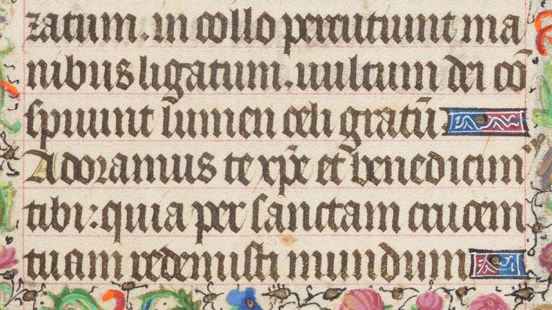
Blackletter developed in Western Europe around the 12th century. It evolved from Carolingian minuscule, the standard writing system used across the continent at the time.
The reason it caught on was practical, not aesthetic. Europe was getting more literate. New universities were popping up in Paris, Bologna, Oxford. Books were in high demand across subjects like law, grammar, history, and theology. Monks and scribes needed a faster, more space-efficient script.
Blackletter solved both problems. Its compressed letterforms fit more text per line, and the angular strokes were quicker to produce with a broad-nib pen than the rounder Carolingian shapes. Parchment was expensive, so saving even a few lines per page made a real difference over hundreds of pages.
The Gutenberg connection is hard to overstate. When Johannes Gutenberg printed his 42-line Bible in Mainz around 1454-1455, he carved a textura blackletter typeface for it. That Bible became the first major book printed in Europe using movable metal type. Historians estimate Gutenberg produced around 180 copies, of which roughly 49 survive today in at least partial form, according to the Library of Congress.
By choosing blackletter for the most significant printed book in Western history, Gutenberg cemented it as the default look of serious, authoritative text for centuries.
The script spread unevenly across Europe after that. Italy and France moved toward Roman type during the Renaissance. But Germany, Scandinavia, and the Baltic states held onto blackletter well into the modern era. Communication Arts notes that even in the early 20th century, more than half of all books printed in German-speaking countries still used blackletter.
Main Blackletter Subcategories
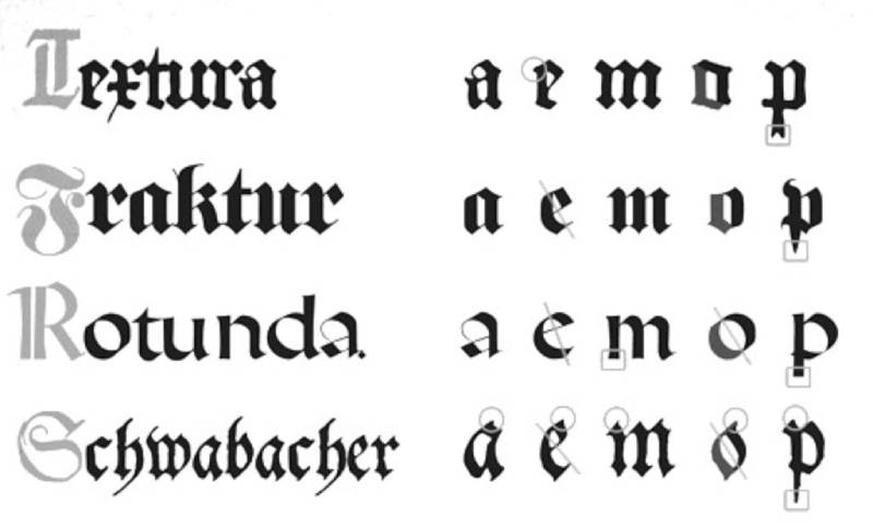
Not all blackletter looks the same. Four major families developed over several centuries, each with distinct characteristics shaped by region, era, and function.
Calling every blackletter font “Fraktur” is a common mistake. It’s like calling every car a sedan. Took me a while to break that habit myself.
Textura and Rotunda
Textura is the oldest and most rigid blackletter style. Tall, angular letters packed so tightly they resemble the weave of a textile. This is what Gutenberg used for his Bible, and it’s the form most people picture when they hear “Gothic script.”
It worked beautifully for formal manuscripts and liturgical texts. But readability? Not great, especially at smaller sizes. The letters blur together.
Rotunda went a different direction entirely. Developed in Italy and Spain, it kept the general blackletter framework but introduced rounder letterforms, particularly the lowercase “o.” You can actually distinguish it from textura at a glance because it looks less aggressive, less compressed. It made sense for Southern Europe, where the calligraphic tradition leaned toward softer curves.
Schwabacher and Fraktur
Schwabacher replaced textura as Germany’s everyday printing typeface in the late 1400s. It softened the hard edges of earlier blackletter while keeping the overall structure intact.
Then came Fraktur in the early 16th century, and it took over everything.
Fraktur is the subcategory you’re most likely to encounter today. Its capital letters feature those distinctive S-shaped or C-shaped decorative strokes, sometimes called “elephant trunks” in German typographic circles. Emperor Maximilian I commissioned the first Fraktur typeface around 1513, and it quickly became the dominant printed script across German-speaking Europe for the next 400+ years.
The Antiqua-Fraktur dispute, a long-running argument over whether Roman or blackletter type was the “correct” German script, dragged on from the 19th century well into the 20th. It only ended when outside forces intervened (more on that below).
Visual Characteristics of Blackletter Typefaces
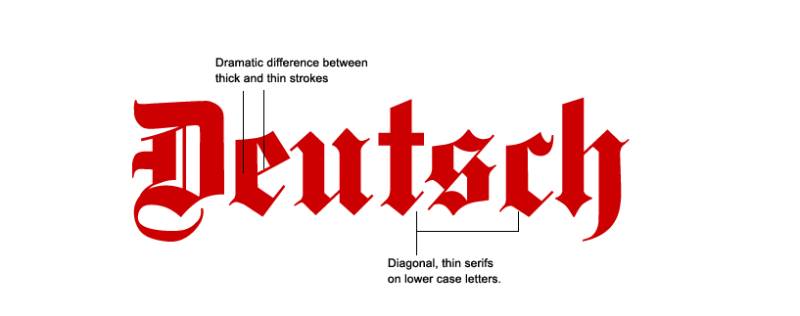
You can spot a blackletter font across a room. No other typeface classification has this kind of instant visual signature.
Broken curves: Where a Roman or sans-serif “o” forms a smooth oval, a blackletter “o” is built from straight or angled segments. The strokes “break” rather than flow. That’s where the name Fraktur comes from, actually. Latin fractus, meaning “broken.”
High stroke contrast: The difference between thick and thin strokes is dramatic. A broad-nib pen held at a consistent angle naturally produces this effect. The result gives every letter a strong sense of rhythm and contrast.
Narrow, vertical letterforms: Most blackletter characters are taller than they are wide. This compression is what allows more text per line, the whole reason the script was developed in the first place.
Ornate capitals: Uppercase letters in blackletter fonts are heavily decorated. Swashes, diamond-shaped serifs, and elaborate flourishes make them visually stunning but sometimes hard to tell apart. The uppercase “I” and “J” in some Fraktur fonts are nearly identical, which can trip you up.
The overall page texture is dense. Stand back and squint at a block of blackletter text, and it reads almost like a patterned fabric. Compare that to the open, airy feel of a modern sans-serif layout with generous white space, and the difference is staggering.
Understanding these traits matters if you’re working with typography elements in any design project. Blackletter’s visual weight affects balance, visual hierarchy, and the overall emphasis of your layout in ways that lighter typefaces never will.
Why Blackletter Declined in Most of Europe
The story of blackletter’s decline is really two stories. One is about taste. The other is about politics.
The Renaissance Shift
Italian humanists in the 15th century revived Carolingian letterforms and created what we now call Roman type, the ancestor of most body-text fonts used today. They saw blackletter as heavy, medieval, outdated.
Roman type spread through France, England, Spain, and Portugal over the next century. By the 1600s, blackletter had been pushed to the margins in most of Western Europe outside the German-speaking world.
But Germany held on. Fraktur became more than a typeface there. It was a cultural identity marker. Otto von Bismarck famously refused to read books set in Roman type, calling it “un-German.”
The 1941 Ban and Its Aftermath
This is where things get strange.
The Nazi regime initially promoted Fraktur as a symbol of German national identity. Official documents, propaganda posters, the cover of Mein Kampf, all used blackletter typefaces. The party even scolded newspapers for printing in Roman characters, calling it evidence of “Jewish influence.”
Then, on January 3, 1941, Martin Bormann issued the Normalschrifterlass, the “normal type decree.” It declared Fraktur to be Schwabacher Judenlettern, “Jewish letters,” and banned its use across all government, military, and educational publishing.
The claimed reasoning was absurd. There was no historical connection between Jewish communities and the Schwabacher typeface. At the time of its creation, only Christians were permitted to own printing houses.
The real motivation was practical. Germany had conquered much of Western Europe by 1941. Occupied populations couldn’t read Fraktur. There weren’t enough blackletter printing presses outside German-speaking areas to produce decrees and propaganda. Antiqua (Roman type) was the pragmatic choice for an occupying power.
After World War II, nobody wanted anything to do with the “Nazi font.” By the 1950s, blackletter had essentially died out as a text typeface in German-speaking countries. The 99% Invisible podcast notes that it was relegated to decorative purposes like beer labels and newspaper nameplates, where it remains today.
Blackletter in Modern Typography and Design
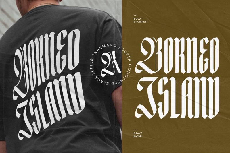
Blackletter didn’t disappear. It shifted context.
Strip away the historical and political baggage, and what remains is one of the most visually distinctive typeface styles ever created. Designers keep reaching for it because nothing else looks quite like it.
Newspaper Mastheads and Editorial Use
The New York Times, The Washington Post, The Daily Telegraph. Some of the most recognized logos in media use blackletter or blackletter-inspired lettering for their nameplates. The effect communicates tradition, authority, and seriousness, all without saying a word.
This is a textbook example of font psychology at work. The typeface does half the branding before anyone reads a single headline.
Music, Streetwear, and Tattoo Culture
Heavy metal bands adopted blackletter early. Motorhead, countless death metal acts, the connection between gothic letterforms and dark, aggressive aesthetics was a natural fit.
Hip-hop picked it up too. West Coast rap in particular made blackletter tattoos and album art a cultural staple through the 1990s and 2000s.
Streetwear brands followed. The crossover between tattoo culture, music, and fashion created a demand for blackletter that shows no signs of slowing down. Blackletter fonts became increasingly popular in the early 2000s among artistic sub-cultures, and designers are still using them to create striking work in 2025.
Packaging, Branding, and Certificates
Craft breweries love blackletter. So do whiskey brands, artisan food producers, and luxury packaging designers.
The typeface signals heritage and craftsmanship. A brand’s typography choice alone can position a product as premium or traditional without any other visual cue.
Certificates, diplomas, and formal documents still lean on blackletter too. If you’ve graduated from a university in the last decade, your degree probably has at least some blackletter text on it. SitePoint notes there’s a strong chance your diploma was set partly in a blackletter face.
Digital type foundries have responded to this ongoing demand. Google Fonts offers options like UnifrakturMaguntia. Adobe Fonts and independent foundries like Storm Type Foundry in Prague have released modern blackletter families. Communication Arts reports that since the 2000s, nearly all new blackletter typefaces have come from small foundries and independent type designers rather than large companies.
Popular Blackletter Fonts Used Today
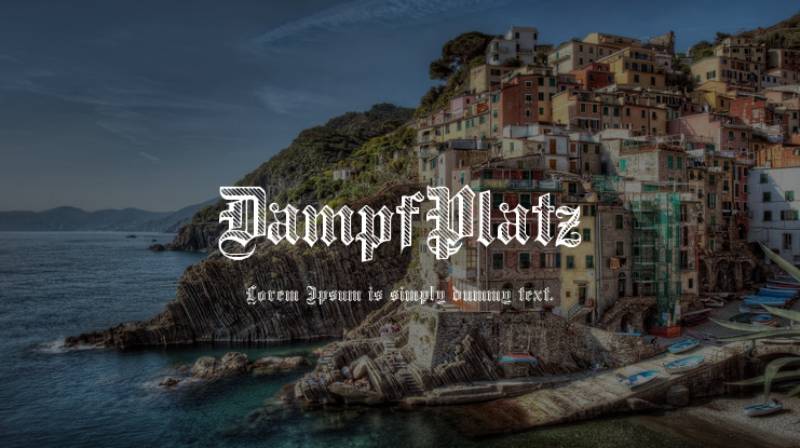
Finding the right blackletter font depends on what you’re building. A tattoo shop logo needs something different from a diploma header or a craft beer label.
Most designers start with what’s already on their system. Old English Text MT ships with Windows and is probably the most widely recognized digital blackletter. It’s not historically accurate, but it gets the job done for quick projects.
For web projects, free options exist. Typewolf lists UnifrakturMaguntia, Pirata One, Germania One, and Fruktur as solid blackletter choices available through Google Fonts.
Storm Type Foundry in Prague has released six blackletter families, including Coroner and Moyenage. Czech designer Frantisek Storm created Coroner as a Fraktur hybrid with Roman serif forms blended into the lowercase letters.
Font licensing matters here. Some blackletter fonts are open-source under the SIL Open Font License. Others require commercial licenses, especially for logo use or packaging. Always check before you ship anything.
Readability Challenges with Blackletter Fonts
Blackletter is hard to read. That’s the biggest practical problem with it, and honestly, it’s not even close.
Most people alive today have never been trained to read these letterforms. The angular strokes, the dense spacing, the ornate capitals that blur together. Your audience has spent their entire life reading Roman and sans-serif type. Throwing blackletter body text at them is like handing someone a book in a script they half-recognize.
Why Modern Readers Struggle
The University of Central Florida’s Readability Consortium found that switching to a more appropriate typeface for a given reader can boost reading speed by 35%. Blackletter works in the opposite direction. It slows people down.
Uppercase letters are the worst offenders. A blackletter capital “I” can look almost identical to a “J.” The letter “B” and “V” share similar decorative strokes in many Fraktur fonts. At small sizes, these distinctions collapse entirely.
WebAIM notes that when reading text, most people parse patterns of 6 to 9 characters at a time rather than individual letters. Blackletter’s dense, uniform texture disrupts that pattern recognition process.
When Blackletter Works (and When It Doesn’t)
Good for:
- Headlines and display text
- Logos and brand marks
- Certificates and diplomas
- Short decorative phrases
Bad for:
- Body text longer than a sentence or two
- Mobile screens at small sizes
- Any context where speed of reading matters
WCAG requires a minimum 4.5:1 contrast ratio for normal text. Blackletter’s thick-to-thin stroke variation can create spots where thin strokes fall below that threshold, especially on colored backgrounds. If you’re using blackletter on the web, test it at multiple sizes.
How to Pair Blackletter with Other Typefaces
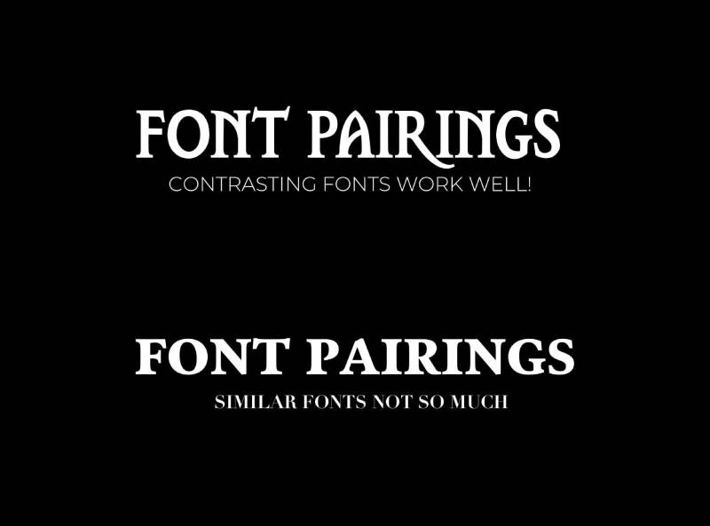
Blackletter demands a quiet partner. It takes up so much visual space that the pairing font needs to step back and let it lead.
The Interaction Design Foundation recommends limiting typeface combinations to two or three per project. With blackletter, two is usually the right call.
High-Contrast Pairings That Work
The strongest combinations put blackletter headlines against clean, neutral body text. Think maximum visual distance between the two.
Blackletter + sans-serif: This is the default pairing. A Fraktur headline over Helvetica, Inter, or Roboto body text creates sharp typographic hierarchy without any visual competition.
Blackletter + old-style serif: Garamond, Caslon, or Libre Baskerville share historical DNA with blackletter. They emerged from the same broad calligraphic tradition, so they pair with less friction than you’d expect.
The Los Angeles Times uses this exact approach. Blackletter masthead, clean serif and sans-serif for everything else.
Pairings to Avoid
Never pair blackletter with another decorative or script font. Two attention-grabbing typefaces fighting for dominance creates noise, not hierarchy.
Also skip slab serif fonts as body text under blackletter headlines. Both carry heavy visual weight. The combination feels top-heavy, like stacking two loud voices in the same room.
Leading (line spacing) and tracking (letter spacing) need extra attention when blackletter is involved. Increase both beyond your normal settings. Blackletter’s dense letterforms need breathing room, especially in the body text that sits below them.
Blackletter vs. Old English vs. Gothic Script

These three terms get used interchangeably, and it causes endless confusion. Even experienced designers mix them up.
Here’s the short version: they’re related but not the same thing.
The “Old English” Problem
“Old English” in your font menu has nothing to do with the Old English language. The language spoken by Anglo-Saxons predates blackletter by several centuries and was written in insular script or Futhorc runes, not angular Gothic letterforms.
Old English Text MT is a textura-style blackletter typeface. Microsoft bundled it with Windows, and the name stuck. Now everyone calls blackletter “Old English” because that’s what shows up when they scroll through their font list.
If you’re looking for fonts similar to Old English, you’re really looking for textura-style blackletter options.
The “Gothic” Confusion
This one is geographic. In Europe, “Gothic” has meant blackletter for centuries. The connection goes back to Renaissance humanists who considered the medieval script barbaric (Gothic, as in the Goths).
In America, “Gothic” somehow ended up meaning grotesque sans-serif. Fonts like Franklin Gothic and Century Gothic are clean, modern sans-serifs with zero connection to medieval calligraphy. The naming convention is just an American quirk that refuses to go away.
So when someone says “Gothic font,” you genuinely have to ask which continent they’re talking about. At least in my experience, about half the time they mean something completely different from what you’d assume.
The simple rule: if you need precision, say “blackletter.” It’s the only term that means one thing everywhere.
FAQ on Blackletter Fonts
What is a blackletter font?
A blackletter font is a typeface style based on medieval European calligraphy. It features angular letterforms, dense spacing, and dramatic stroke contrast. Also called Gothic script, it originated in the 12th century and remains popular for display use today.
What is the difference between blackletter and Fraktur?
Blackletter is the broad typeface family. Fraktur is one subcategory within it, alongside Textura, Rotunda, and Schwabacher. Fraktur is the most widely recognized version, but calling all blackletter “Fraktur” is technically incorrect.
Is blackletter the same as Old English font?
Not exactly. “Old English” in font menus (like Old English Text MT) refers to a blackletter typeface. It has no connection to the Old English language, which was written in insular script centuries before blackletter existed.
Why is blackletter hard to read?
Blackletter’s dense, angular letterforms and ornate capitals are unfamiliar to modern readers trained on Roman type. The narrow spacing and similar-looking uppercase letters reduce pattern recognition, making it impractical for body text.
Where is blackletter used today?
Newspaper mastheads like The New York Times, tattoo lettering, heavy metal album art, craft beer labels, luxury packaging, diplomas, and streetwear branding. It functions best as display typography for headlines and logos.
What fonts pair well with blackletter?
Clean sans-serif fonts like Helvetica, Inter, or Roboto work best. Old-style serifs like Garamond or Caslon also pair well. Avoid combining blackletter with other decorative or script typefaces, as both compete for attention.
Is blackletter considered a Gothic font?
In Europe, yes. “Gothic” has referred to blackletter for centuries. In America, “Gothic” often means sans-serif (like Franklin Gothic). The meaning depends entirely on geographic context, which causes frequent confusion among designers.
Can I use blackletter fonts for web design?
Yes, but only for headlines or short display text. Blackletter fails as body copy on screens due to readability issues at small sizes. Google Fonts offers free options like UnifrakturMaguntia for web projects.
Why did Germany stop using blackletter?
In January 1941, the Nazi regime issued the Normalschrifterlass decree banning Fraktur from official use. After World War II, blackletter carried political stigma in Germany and was replaced by Roman type for all everyday printing.
Are blackletter fonts free to use?
Some are. Google Fonts offers open-source blackletter typefaces under the SIL Open Font License. Others on Adobe Fonts or MyFonts require commercial licenses. Always verify licensing terms before using any blackletter font in client work.
Conclusion
Understanding what is a blackletter font gives you access to one of the oldest and most visually powerful typeface classifications still in active use. From Gutenberg’s 42-line Bible to modern logo design and streetwear branding, this script has outlived centuries of cultural shifts.
The four subcategories, Textura, Rotunda, Schwabacher, and Fraktur, each carry distinct visual traits worth knowing. Picking the wrong one for your project is an easy mistake to make.
Readability limits blackletter to headlines, mastheads, and short display text. Pair it with a clean sans-serif or old-style serif for body copy, and give the letterforms generous spacing to breathe.
Whether you’re designing a certificate, building a brand identity, or choosing a tattoo lettering style, blackletter carries weight that no other typeface family can match. Use it with intention.

Renowned for his expertise in logo design and visual branding, Bogdan has developed a multitude of logos for various clients.
His skills extend to creating posters, vector illustrations, business cards, and brochures. Additionally, Bogdan's UI kits were featured on marketplaces like Visual Hierarchy and UI8.
He also wrote in the past years on sites like Design Your Way, WebDesignerDepot, WPDean, Designmodo, Speckyboy, Slider Revolution, and more.
- The Beehiiv Logo History, Colors, Font, And Meaning - 18 September 2026
- Versatile Work Sans Font Pairing for Every Project - 16 September 2026
- Organize Digital Files Like a Pro Before Your Next Client Handoff - 16 September 2026

Bogdan Sandu is a seasoned designer who has been designing websites since 2008. Renowned for his expertise in logo design and visual branding, Bogdan has developed a multitude of logos for various clients. His skills extend to creating posters, vector illustrations, business cards, and brochures. Additionally, Bogdan's UI kits were featured on marketplaces like Visual Hierarchy and UI8. He also wrote in the past years on sites like Design Your Way, WebDesignerDepot, WPDean, Designmodo, Speckyboy, Slider Revolution, and more.
You Might Also Like