


ADHD-Friendly Fonts: The Best Fonts for ADHD

Ever wonder why some fonts make you feel at home, while others are like a maze? Think about it. For those with ADHD, this isn’t just about style; it’s a key to unlocking focus and clarity. That’s where the best fonts for ADHD come into play.
In this dive into the world of typography, we’re exploring how the right fonts can be game-changers for attention and readability.
We’re talking Arial to Open Dyslexic, and why Serif vs. Sans Serif isn’t just a designer’s debate but crucial for cognitive ease.
Fonts aren’t just letters on a screen; they’re gateways to understanding, especially for diverse minds.
By the end of this journey, you’ll not only grasp the importance of typography for attention disorders but also walk away with a list of ADHD-friendly fonts.
From screen readability perks to user-friendly font design, we’re unpacking it all. Whether you’re a web wizard or just curious, get ready to see fonts in a whole new light!
The Best Fonts for ADHD
| Font Name | Readability | Design Style | Availability | Notable Features |
|---|---|---|---|---|
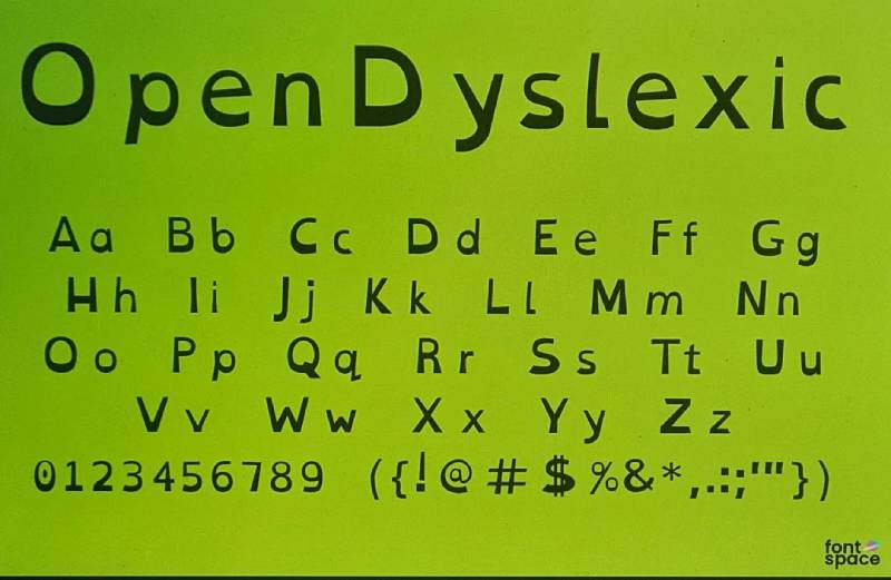
| OpenDyslexic | High | Unique, weighted | Free | Letters have heavy bottoms to add a gravity to each. |
| Comic Sans | Moderate | Casual Script | Common | Approachable and informal, good for casual reading. |
| Arial | High | Sans-serif | Common | Simple and clear, widely available. |
| Verdana | High | Sans-serif | Common | Wide spacing, clear distinction between characters. |
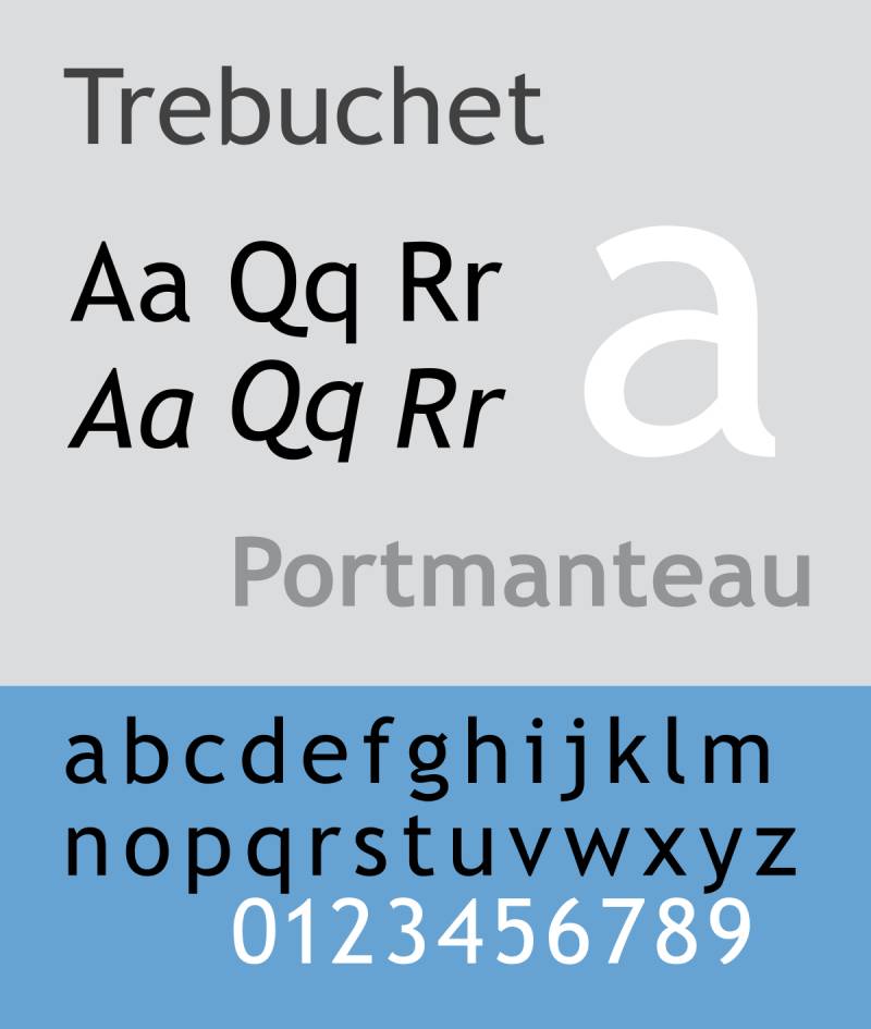
| Trebuchet MS | Moderate | Humanist sans-serif | Common | Good readability, slightly condensed lettering. |
The Role of Fonts in Enhancing Focus for ADHD
Impact of Font Choice on ADHD
Hey, let’s chat about fonts and ADHD. It’s not just about looking pretty; it’s deeper. Best fonts for ADHD?
Yeah, they’re a real thing.
They can seriously influence focus and readability. Imagine reading a book where every letter is clear and kind to your eyes. That’s what the right fonts do for people with ADHD. They make the text more approachable and less of a chore.
Fonts have this subtle power, you know? They can shape how we process information. And when you’re dealing with ADHD, every little bit of help counts. Fonts that are clear, simple, and have a friendly vibe can make a world of difference. They reduce that feeling of being overwhelmed by a sea of text.
Serif vs. Sans Serif Fonts
Now, onto the big debate: Serif vs. Sans Serif. Classic Serifs, they have these little feet at the end of each letter. They’re like the traditional attire of the font world. But Sans Serifs? They’re the modern, clean-cut folks. No extra fluff.
For ADHD, many lean towards Sans Serifs. Why? They’re straightforward, no-nonsense, and easy on the eyes. Fonts like Arial and Helvetica are stars in this category. But it’s also about personal preference. What works for one might not work for another. It’s like finding the right pair of glasses that fit just right.
Criteria for Selecting ADHD-Friendly Fonts
Key Features of Suitable Fonts
When picking out the best fonts for ADHD, there are a couple of things to keep in mind. Clarity is king.
You want fonts that don’t make you squint or guess. They should be as clear as a sunny day.
Uniform shapes? Yes, please. It’s like having a predictable rhythm that’s comforting and easy to follow.
And spacing, let’s not forget about that. Adequate spacing is like having enough room to breathe. It prevents letters from getting all cozy and jumbled up.
Recommended Font Types
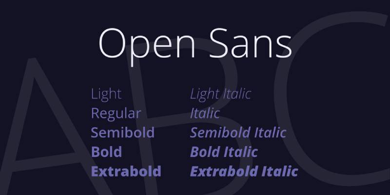
So, what are some top picks? Sans Serifs often take the crown here. Fonts like Arial, Open Sans, and even Helvetica are solid choices. They’re like those reliable friends who are always easy to hang out with.
But wait, there’s more. Ever heard of fonts designed for dyslexia? Open Dyslexic is one of them. And guess what? They’re super helpful for ADHD too. These fonts have this unique way of weighing letters and spacing them out. It’s like they’re holding your hand through each sentence.
Top Fonts for Better Focus in ADHD
Hey there! Let’s talk about something super important yet often overlooked – fonts.
Not just any fonts, but the best fonts for ADHD. Why? Because the right font can turn a sea of words into a smooth sail for someone with ADHD.
List of Recommended Fonts
So, what are these magic fonts? Let’s break it down.
Arial
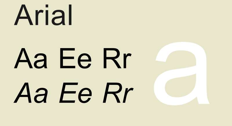
This one’s a classic. Known for its clarity and simplicity, Arial is like that easy-going friend who’s always easy to understand.
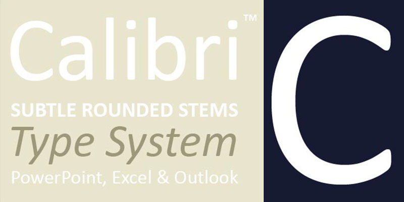
Ah, Calibri. Modern, yet so smooth. It’s like skating on ice; no bumps, no hiccups.
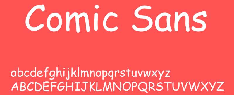
Don’t judge a font by its vibe! Comic Sans, with its playful look, might seem casual, but it’s a champ for readability, especially with its round shapes.

Now, this is a special one. Crafted for dyslexia, it’s a superhero for ADHD too, thanks to its weighted letters and roomy spacing.
Think even spacing and clean lines. It’s like a zen garden for your eyes, helping you keep focused.
Simple yet effective. Its narrow characters are like a straight path through a forest – easy to navigate.
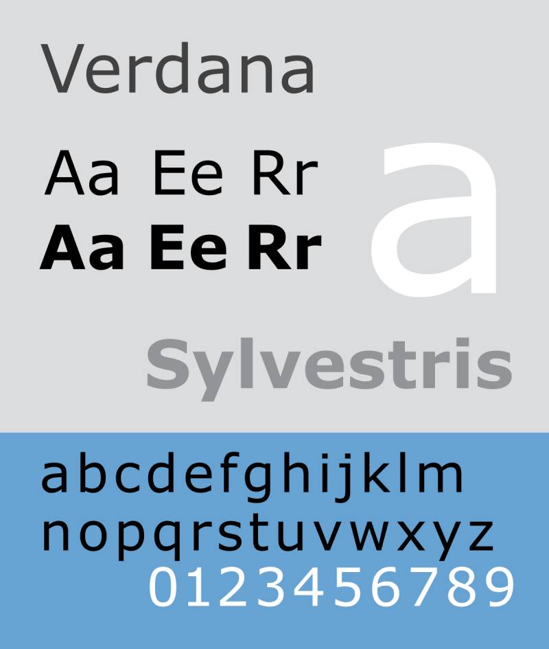
With its wide proportions and clear letters, Verdana is like a breath of fresh air for readability.
A classic that never gets old. It’s like that timeless song that’s always good to hear.
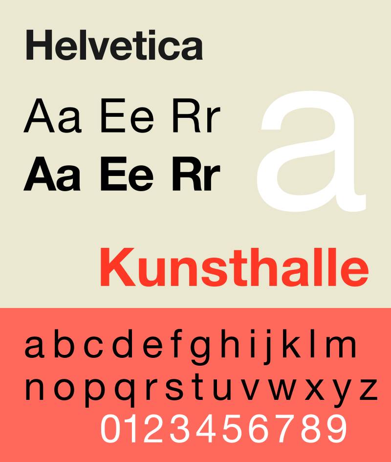
Clean, simple, no-nonsense. Helvetica is the jeans-and-tee of fonts – always the right choice.
It’s all about balance and readability with this one.

Sleek, modern, and oh-so-clean. Dosis brings that focused vibe to the table.
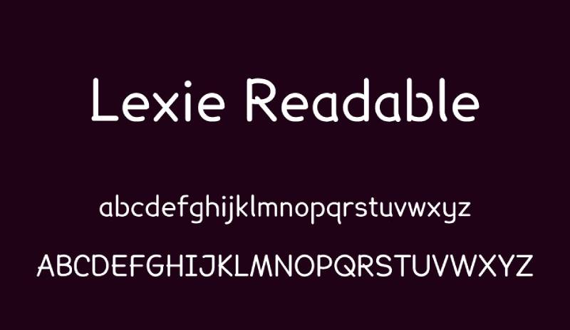
As the name suggests, it’s all about being easy to read, with clear and simple characters.
Clear letterforms and spacious layout. It’s like having a clear path laid out in front of you.
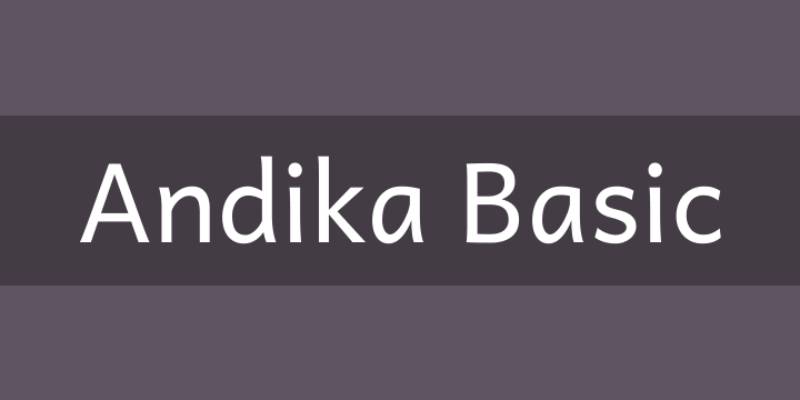
Open letterforms and generous spacing. Reading with Andika feels like a breeze.
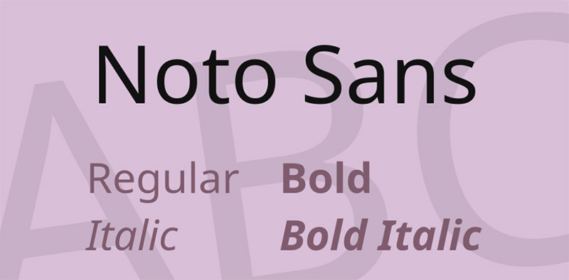
Designed for a distraction-free reading experience, Noto Sans keeps it clean and straightforward.
Well-defined shapes and optimized spacing. It’s like having a guide for your eyes.
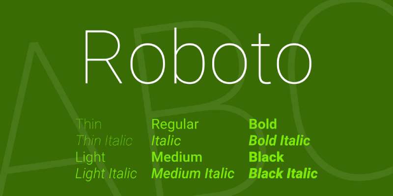
Slightly thinner than Open Sans, Roboto brings a modern, geometric flair.
Designed with readability and accessibility in mind.
Aimed at dyslexic readers, but its unique features are great for avoiding confusion in ADHD.
FAQ On Best Fonts For ADHD
What Makes a Font ADHD-Friendly?
It’s all about readability and comfort. ADHD-friendly fonts, like Arial or Open Sans, have clear, simple designs. They avoid unnecessary complexity, making it easier for the brain to process each character. Think of fonts that don’t strain your eyes or make you lose focus.
How Do Fonts Impact ADHD Focus?
Fonts can be a game-changer. They either draw you in or push you away. For ADHD, the right font minimizes distractions. It’s like having a smooth path for your eyes to follow, reducing the effort needed to read and comprehend.
Why Are Sans Serif Fonts Recommended for ADHD?
Sans Serif fonts, like Helvetica, are straightforward – no extra frills. This simplicity helps reduce visual stress and makes it easier for ADHD brains to process information. It’s about having a clean and distraction-free reading experience.
Are Serif Fonts Bad for ADHD?
Not necessarily bad, but Serif fonts can be trickier for ADHD. Their extra details can create visual complexity, which might be distracting. However, it’s personal. What works for one might not for another. Always worth trying out different styles!
What’s the Role of Font Size and Spacing for ADHD?
Huge! Font size and spacing are like the room you give words to breathe. Too cramped, and it feels overwhelming. Proper spacing and a comfortable size can make text more approachable and easier to digest for someone with ADHD.
Can Color Contrast in Fonts Affect ADHD?
Absolutely. High contrast between text and background eases the strain on the eyes. Low contrast can be a hurdle, making it hard to focus. It’s like having the right lighting – too dim or too bright, and you can’t see well.
Are There Specific Fonts Designed for ADHD?
While there’s no font designed exclusively for ADHD, those created for dyslexia, like Open Dyslexic, can be beneficial. They often have features that improve readability, which is also great for ADHD.
How Does Digital Screen Display Affect Font Choice for ADHD?
Digital screens bring their own challenges – glare, brightness, etc. Fonts that are clear and simple, like Verdana or Noto Sans, work well on screens. They’re like having sunglasses on a sunny day, reducing the glare and making it comfortable to read.
What’s the Difference Between ADHD and Dyslexia Fonts?
ADHD fonts focus on minimizing distraction and enhancing focus. Dyslexia fonts, like Dyslexie, often have unique letter designs to prevent mixing them up. Both aim for readability, but their approaches cater to different needs.
How Can I Test if a Font Works for My ADHD?
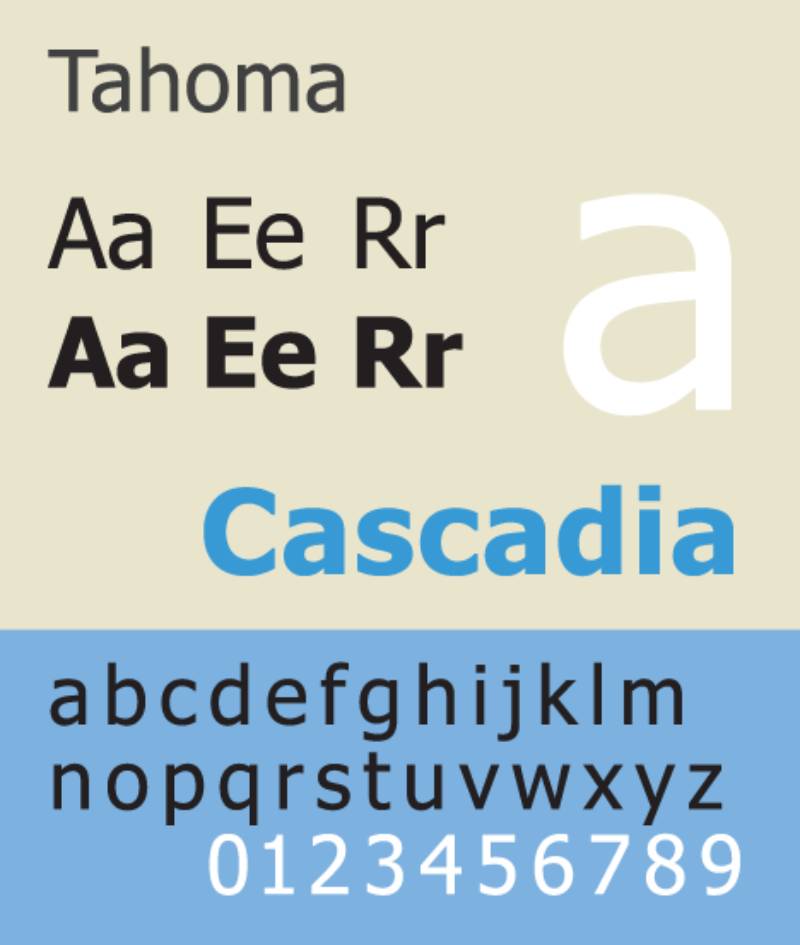
Trial and error. Try reading a piece of text in different fonts and notice how you feel. Does it feel easier with Arial or maybe Tahoma? It’s like sampling flavors – you pick the one that tastes right for you.
Conclusion
So, we’ve been on a bit of a journey, haven’t we? Diving into the world of best fonts for ADHD, it’s like we’ve opened a door to a whole new understanding of typography and its impact on focus and readability.
Remember, the right font can be a small but mighty hero in the world of ADHD. It’s not just about making things look good. It’s about making them feel right. Fonts like Arial, Open Sans, and Helvetica have shown they’re not just pretty faces on your screen or page. They’re like friendly guides, leading your eyes gently along the text.
Adapting these fonts into your daily life, be it digital or print, isn’t just a design choice. It’s a step towards inclusivity, understanding, and respect for neurodiversity. As we keep exploring, let’s remember the role of typography for attention disorders and keep sharing insights and experiences.
The conversation doesn’t end here. It’s an ongoing journey, and each shared experience, each new bit of research, gets us closer to understanding the power of the best fonts for ADHD.
If you liked this article about the best fonts for ADHD, you should check out this article about the best fonts for brochures.
There are also similar articles discussing the best fonts for Photoshop, the best fonts for engraving, the best fonts for monograms, and the best fonts for android.
And let’s not forget about articles on the best fonts for letterhead, the best fonts for signs, the best fonts for quotes, and the best fonts for email signatures.
Bogdan Sandu, a seasoned designer with 15 years of diverse experience, has been designing websites since 2008.
Renowned for his expertise in logo design and visual branding, Bogdan has developed a multitude of logos for various clients.
His skills extend to creating posters, vector illustrations, business cards, and brochures. Additionally, Bogdan's UI kits were featured on marketplaces like Visual Hierarchy and UI8.
Latest posts by Bogdan Sandu (see all)
- The Budweiser Logo History, Colors, Font, And Meaning - 6 May 2024
- Feast Your Eyes: Delicious Food Color Palettes - 6 May 2024
- The Tecate Logo History, Colors, Font, And Meaning - 5 May 2024