By the end of 2026, Gartner expects 40% of enterprise applications to run on task-specific AI agents, up from under 5% just a year earlier.
That shift raises the stakes for business app design, the discipline behind every dense, permission-gated tool employees are required to use whether they like it or not.
Most of it fails quietly. Employees route around confusing modules, or they just open a spreadsheet and never look back. Support tickets pile up too, but that’s usually a symptom rather than the actual problem.
That covers a lot of ground, from ERP and CRM platforms to HR and finance software to the internal admin panels most employees only open when something’s already broken.
None of it succeeds by accident. Every screen reflects a decision about roles, workflows, and what a trained employee actually needs to see first.
What Is Business App Design
Salesforce built its whole platform around one idea: a sales rep should see a pipeline built for closing deals, not an open canvas for browsing. That’s roughly the shape business app design takes everywhere else too.
Split the category two ways. There’s software built for a company’s own staff, think ERP systems, CRM platforms, HR software, the stuff nobody outside the building ever sees. Then there’s B2B software sold to other businesses, which usually looks customer-facing on the buyer’s end even though it started life as somebody’s internal tool.
That puts it inside the broader field of UX design, just narrowed toward measurable task outcomes instead of discovery or delight.
Success isn’t measured by session length or scroll depth here. It’s measured by how fast a trained employee finishes a task, and how many errors happen along the way.
Gartner’s global CIO survey found that only 48% of digital initiatives fully meet or exceed their business outcome targets. That means the majority fall short in some way, and poor user adoption keeps turning up as a recurring factor across similar industry research.
The category keeps expanding too. McKinsey’s 2025 State of AI survey found 71% of organizations now use generative AI in at least one business function, stretching what these interfaces now need to support.
How Business App Design Differs From Consumer App Design
| Dimension | Consumer Apps | Business Apps |
|---|---|---|
| User motivation | Competes for attention | Required for the job |
| Session pattern | First-time discovery | Repeated daily use |
| Success metric | Engagement, retention | Task completion, error rate |
Attention-Driven Design vs Task-Driven Design
Consumer apps compete in an open market where people choose freely, and leave the moment friction shows up.
Conversion rate is the metric that governs consumer interface work, and it only exists because visitors can leave. Procurement software has no real equivalent, mostly because employees have no alternative to opt out to in the first place.
Business apps run on a different logic entirely. Employees don’t choose the CRM. It gets assigned to them, and they use it because the job requires it.
A consumer app has to earn attention before anyone bothers using it twice. Business software skips that problem and goes straight to a harder one: stripping friction out of a task nobody had the option to skip in the first place.
Consumer Onboarding vs Enterprise Training

Slack ships an admin console and enterprise key management built specifically for IT-controlled deployment, a layer consumer messaging apps never needed.
First-time discovery drives consumer onboarding app design, where the goal is a stranger’s first “aha moment” inside a minute or two.
Enterprise onboarding works backward from that. New hires often sit through structured training before they ever open the software, since the interface assumes context it won’t explain on its own.
Enterprise UX research ties recurring enterprise software failures back to exactly this gap. The interface assumes people already know what they’re looking at, and plenty of new hires don’t.
What Core Principles Guide Business App Design
Functional business software and the cluttered internal tools people quietly route around mostly split on habit. Does every screen behave the same way? Does complexity show up gradually instead of all at once? Can someone predict what a button does before clicking it? Does the thing hold up on whatever device someone’s stuck using that day?
Research on design system adoption has found organizations with established design systems report meaningfully greater brand consistency. A separate comparative study by Sparkbox found that developers using IBM’s Carbon design system built a simple form page 47% faster than developers coding the same page from scratch.
IBM built its Carbon Design System to enforce exactly this kind of consistency across IBM Cloud, Watson, and its other enterprise products.
Consistency and Predictability

Identical actions must produce identical results across every screen in a business app, from the billing module to the reporting dashboard.
A save button that behaves differently in two modules breaks trust fast, especially for employees running the same task hundreds of times a week.
- Shared component libraries across every module
- Consistent iconography and labeling
- Predictable placement of primary actions
Research on design system adoption ties this directly to speed. Faster delivery follows naturally once teams stop re-deciding basic patterns for every new screen.
Progressive Disclosure for Data-Heavy Screens
Enterprise screens often carry more fields and metrics than a single view can hold without turning into noise.
The fix is showing a summary first, then letting people drill into full detail only when they actually need it. That’s progressive disclosure in practice.
A collapsed row that expands into complete record detail keeps the main list scannable while still giving power users the depth they need.
Ant Design and Salesforce Lightning both bake this pattern into their component libraries by default, rather than leaving it to individual teams to reinvent every time.
Responsive Behavior Across Devices
A warehouse worker checking inventory from a handheld scanner needs the same core functions as someone at a desktop, just rearranged for a smaller screen. Field-use mobile access has become standard for business apps now, not an edge case reserved for a handful of people.
Menu structures collapse into simplified mobile menus and buttons without losing access to critical actions.
Multi-tenant SaaS products complicate this further. The same codebase has to render different layouts per organization without duplicating logic behind the scenes.
How Role-Based Access and Permissions Shape Interface Design
Business apps rarely show every user the same screen. What a person sees, edits, or even knows exists depends on their assigned role.
Salesforce’s permission set architecture lets a sales rep and a system administrator log into the identical platform and see two completely different navigation menus. Permission tiers usually narrow as you move down the org chart, roughly like this:
- Admins see configuration panels and user management tools
- Managers see team-level reporting and approval controls
- Contributors see only the records tied to their own work
- Viewers see read-only summaries with no edit access
IBM’s 2024 Cost of a Data Breach Report puts the average global breach cost at $4.88 million, up 10% from the year before and the largest single-year jump since the pandemic. Separately, Verizon’s Data Breach Investigations Report has repeatedly found that human error, privilege misuse, stolen credentials, or social engineering factor into roughly two-thirds of confirmed breaches.
That figure is why permission design isn’t a cosmetic layer. It’s a direct line to security exposure.
Insider-threat research, including Cybersecurity Insiders’ annual survey, consistently finds that a large majority of organizations consider themselves at least moderately vulnerable to insider threats, a risk that broad, unscoped access only makes worse.
The login screen design functions as the first permission checkpoint, since role assignment starts there before any menu or dashboard even loads.
RBAC adoption reflects this pressure. Regulated industries such as healthcare have been among the fastest adopters of role-based access control, driven largely by HIPAA-related access requirements.
What Data Visualization and Dashboard Standards Apply
| Dashboard Type | Primary Audience | Update Frequency |
|---|---|---|
| Operational | Frontline teams | Real-time or near real-time |
| Analytical | Analysts, researchers | On-demand, exploratory |
| Executive | Leadership | Weekly or monthly |
Oracle’s 2023 “Decision Dilemma” study, which surveyed roughly 14,000 employees and business leaders across multiple countries, found that a substantial share of respondents had abandoned a business decision entirely because the surrounding data felt overwhelming.
Summary-First Dashboard Layout

Summary metrics come first, detail comes second. That ordering keeps a dashboard usable under real time pressure, not just tidy.
Reviews of dashboard usability research consistently identify information overload as a widespread problem, driven mainly by excessive data density and weak visual hierarchy.
Cognitive load research points to five to nine metrics as the practical limit for a single screen, in line with working memory capacity.
Some enterprises have acted on this directly by auditing and retiring internal dashboards that weren’t tied to real decisions, keeping only the views that actively drove action.
Sortable dashboard UI design patterns place these summary tiles above the fold, with detail panels a click away.
Table Design for Large Data Sets

Large record tables need more than static rows and columns to stay usable at scale.
- Sortable column headers
- Sticky headers during scroll
- Inline filters per column
- Pagination or infinite scroll, matched to data volume
Bar charts suit comparisons, line charts suit trends, scatter plots suit relationships. That’s really the whole rule: chart selection should follow the data’s shape, not somebody’s visual preference.
On smaller screens, chart design for mobile dashboards has to simplify further, dropping secondary labels that would otherwise clutter a five-inch screen.
Tableau and Microsoft Power BI remain the reference points most enterprise teams design table and chart behavior against.
How Business Apps Structure Complex Workflows and Multi-Step Processes
Approval chains, onboarding sequences, and order processing all share one challenge: guiding a user through dependent steps without losing them halfway through.
Multi-step forms consistently outperform equivalent single-step forms in conversion testing, and the gap is wide enough to have reshaped how enterprise workflows get built.
| Pattern | Structure | Best For |
|---|---|---|
| Wizard | Linear, sequential steps | Onboarding, setup flows |
| Task queue | Non-linear, status-based | Approvals, ticket handling |
Wizard Patterns for Sequential Tasks

Linear wizards work best when step two genuinely depends on step one, like a purchase order that needs a budget code before it can request approval.
Nielsen Norman Group research on progress indicators shows that users who see clear feedback on how much work remains stay engaged noticeably longer than those given no indication at all.
Autosave at each step, plus validation before advancing, heads off the biggest source of frustration: losing entered data to a session timeout.
Form-analytics research has found that progress indicators alone can meaningfully reduce abandonment when implemented well, though the exact lift varies by form length and audience.
Status Tracking for Non-Linear Processes
Not every process moves in a straight line. Support tickets, approval requests, and order fulfillment often sit in a queue, waiting on something outside the user’s control.
Status indicators (pending, in review, approved, rejected) replace the step-by-step structure of a wizard with a state-based view instead.
SAP Fiori’s task-based navigation model organizes these queues around what a specific role needs to act on next, rather than a generic inbox.
A tab bar layout separating pending, in-progress, and completed items keeps each state scannable without extra filtering.
Sortable list-based task views handle the same job on smaller screens, where a tab bar alone can’t hold enough context.
What Accessibility Standards Business App Design Must Meet
Enterprise software often serves audiences protected by law, which makes accessibility a compliance requirement rather than a finishing touch.
WCAG 2.2, published as a W3C Recommendation in October 2023, is the baseline most enterprise procurement contracts now reference.
The WebAIM Million 2026 report analyzed the top one million home pages and found 95.9% had detectable WCAG failures, up slightly from 94.8% the year before, breaking a multi-year trend of small improvements.
- Keyboard navigation for every interactive element on data-dense screens
- Minimum color contrast ratios for dashboards and status indicators
- Section 508 alignment for software sold into U.S. federal contracts
- Focus visibility for users navigating without a mouse
Section 508 remains the primary benchmark for federal software, and currently aligns with WCAG 2.0 Level AA rather than the newer 2.1 or 2.2 versions.
State and local governments in the U.S. were originally required to meet Title II web accessibility rules by April 24, 2026 for larger entities. In April 2026, the Department of Justice issued an interim final rule extending that deadline by roughly a year: large entities (populations of 50,000 or more) now have until April 26, 2027, and smaller entities and special districts until April 26, 2028. The underlying standard remains WCAG 2.1 Level AA.
WCAG 2.2 has moved into procurement language faster than earlier versions of the standard did. Actual compliance is another matter, as the WebAIM numbers above make clear.
That gap shows up most in procurement. Vendors selling into government contracts increasingly need to prove WCAG alignment before a deal closes.
Which Design Systems and Component Libraries Support Business App Design
Enterprise interface work runs mostly on a handful of component libraries, each backed by a different company and shipped under a different license.
| System | Maintained By | Primary Use Case | License |
|---|---|---|---|
| Carbon Design System | IBM | Data-heavy enterprise products | Apache 2.0 |
| Fluent UI | Microsoft | Microsoft 365 and Windows apps | MIT |
| Salesforce Lightning Design System | Salesforce | Salesforce platform apps | BSD-3-Clause |
| Ant Design | Ant Group | Admin panels and dashboards | MIT |
IBM’s own documentation lists w3, its internal employee intranet, plus its CIO and HR systems, as environments Carbon supports directly. So Carbon stretches well past IBM’s own product UI.
Ant Design has become a default choice for internal admin panel design built in React. The core project has drawn nearly 100,000 stars on GitHub, a scale few enterprise component libraries reach.
Fluent UI stretches furthest across platforms, covering Windows, MacOS, and Android UI design alongside iOS and web.
License choice matters more than it looks. A permissive MIT or Apache license lets internal teams fork and modify components freely, while asset licensing for icons and fonts often stays more restrictive even inside an open source design system.
How Business App Design Impacts Employee Adoption and Productivity
A large and consistent body of analyst research puts enterprise software project failure rates well above half, a gap adoption research traces back to training burden and workaround culture rather than missing features.
Poor interface design shows up first in support queues. Internal support desks commonly field hundreds of tickets a month, with most typically resolved in a single touch. That volume tracks closely with how confusing the underlying tools actually are.
Employees also lose real time hunting for information inside badly organized systems. Research from workflow-adoption platform Userlane puts that loss at roughly 20–25 minutes a day per employee.
- Task completion time, tracked per workflow
- Support ticket volume, tracked per module
- Time spent in training before independent use
General Electric ran a company-wide UX initiative (its Industrial Internet Design System) that delivered a 100% productivity gain in its development teams and an estimated $30 million in savings in the first year, according to a Toptal case study.
When the sanctioned tool creates enough friction, employees route around it entirely. The Cloud Security Alliance’s 2023 SaaS Security Survey found that 67% of employees at Fortune 1000 companies use unapproved SaaS applications, with slow internal tooling cited as a leading driver.
That pattern has a name, shadow IT, and it’s often less a security failure than a design failure wearing a security costume.
What Security and Compliance Requirements Shape Business App Design
Enterprise buyers now treat security certification as a purchasing filter, not a technical footnote.
Gartner Digital Markets’ 2024 buyer research found that 46% of software buyers who made a recent purchase selected their vendor because of security certifications, reputation, or data privacy practices.
SOC 2 shapes session timeout design and audit log visibility across the interface. GDPR governs consent screens and data-access request flows for apps facing EU users. Field-level encryption needs some kind of visible indicator wherever sensitive data shows up on screen, and single sign-on shifts authentication out of the app entirely, handing it to a central identity flow instead.
A growing share of enterprise buyers now expect a SOC 2 report before signing with a technology vendor, particularly in regulated or data-sensitive industries.
Session timeout design varies by framework. PCI DSS names a specific limit, 15 minutes, while SOC 2 and ISO 27001 leave the exact value to the organization’s own risk assessment.
GDPR carries its own weight here. The CMS GDPR Enforcement Tracker, which logs published fines across every EU member state, puts the average fine per case at roughly €2.3 million over the life of the regulation. That figure alone makes consent-flow design a budget line, not an afterthought.
A Mercedes-Benz employee pushed an internal access token to a public repository in late September 2023. Security researchers discovered the exposure in January 2024 and found it had given unrestricted access to the company’s internal GitHub Enterprise Server, including source code and SSO credentials, for nearly four months before Mercedes-Benz revoked the token.
That gap sat entirely in the audit and monitoring layer, the exact layer SOC 2’s access-visibility requirements exist to catch.
What Common Mistakes Undermine Business App Design
Copying consumer interface patterns onto data-dense enterprise screens is the most common failure, and one of the most expensive to reverse.
| Mistake | Why It Fails |
|---|---|
| Consumer-style minimalism on data screens | Hides fields power users need visible |
| Skipping permission testing pre-release | Wrong roles see or edit the wrong data |
| Treating accessibility as a post-launch fix | Retrofits cost far more than early builds |
The cost curve behind that last row is well documented, if debated in its exact multiplier. A frequently cited rule of thumb, often traced back to Tom Gilb’s writing in the late 1980s, holds that fixing a usability issue after release can cost roughly 100 times more than fixing the same issue during the design phase, and substantially more once it reaches development.
American Airlines tested a version of this directly. Bias and Mayhew’s widely cited usability-ROI research found that correcting usability problems during the design phase of a system redesign cut the cost of those fixes by 60 to 90% compared with fixing them after launch.
Permission testing gets skipped for a simple reason. It’s tedious, and it rarely shows up in a demo. It shows up months later, in an audit or a breach report.
Dashboards inherited from consumer product thinking tend to prioritize visual polish over the field density enterprise users actually rely on.
How to Measure Business App Design Success
- Task completion rate per workflow
- Time-on-task, benchmarked against the previous version
- Error rate per step in multi-step processes
- Support ticket volume tied to specific screens
The System Usability Scale (SUS) ties these together into one comparable number. Jeff Sauro’s analysis of over 500 studies and roughly 5,000 SUS scores puts the industry average SUS score at 68, with anything above considered above average.
A score in the 80s is where products stop being merely usable and start being ones people recommend to a colleague.
Figma’s mobile app is a commonly cited example. It reportedly launched with a SUS score of 73, and six months of changes driven by user research pushed that to 81, a jump from a B grade to an A grade on the standard SUS curved grading scale.
Most measurement programs pair SUS with the same broader usability benchmarks tracked in UX design statistics, rather than relying on a single number in isolation.
None of these metrics mean much alone. Task completion rate without error rate hides rework. SUS without support ticket data hides real-world friction the survey never asked about.
Business App Design Examples
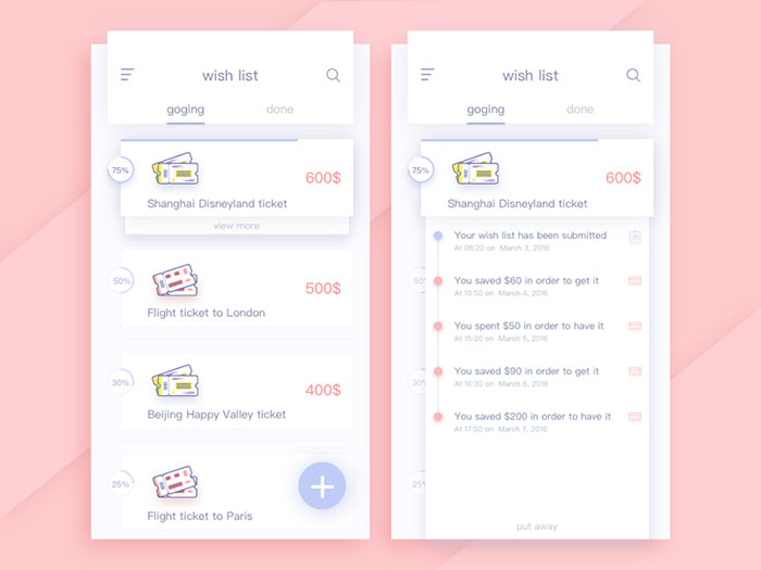
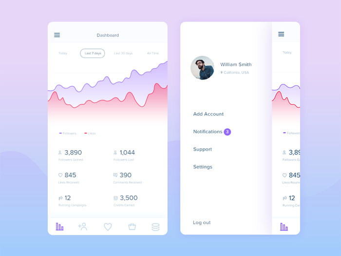
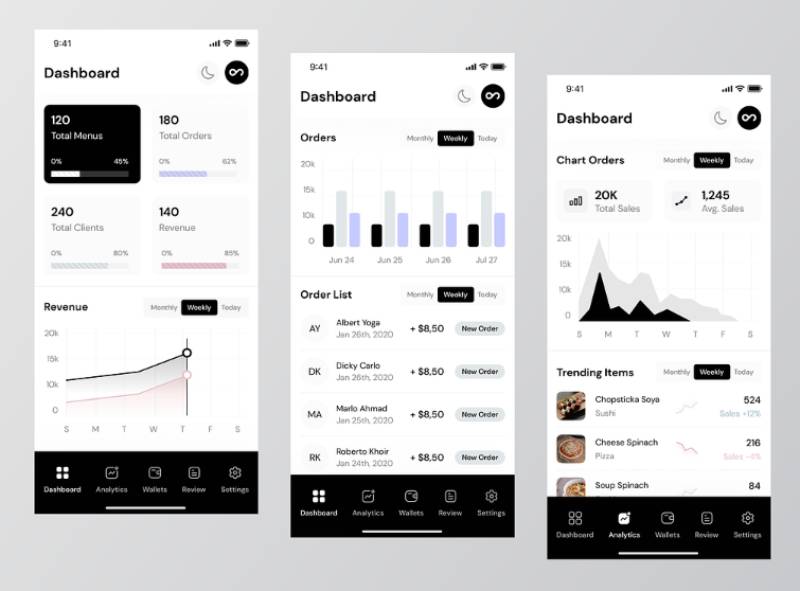
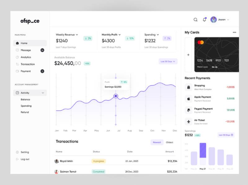
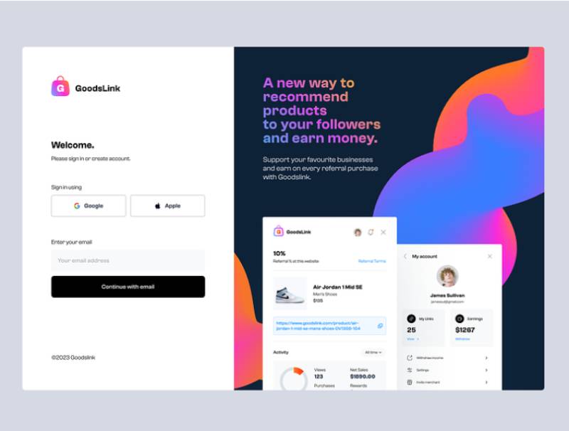
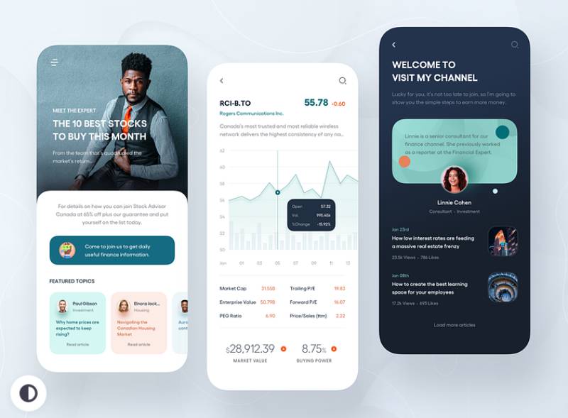
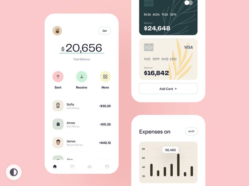
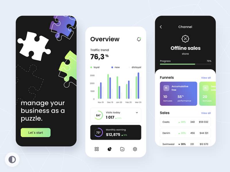
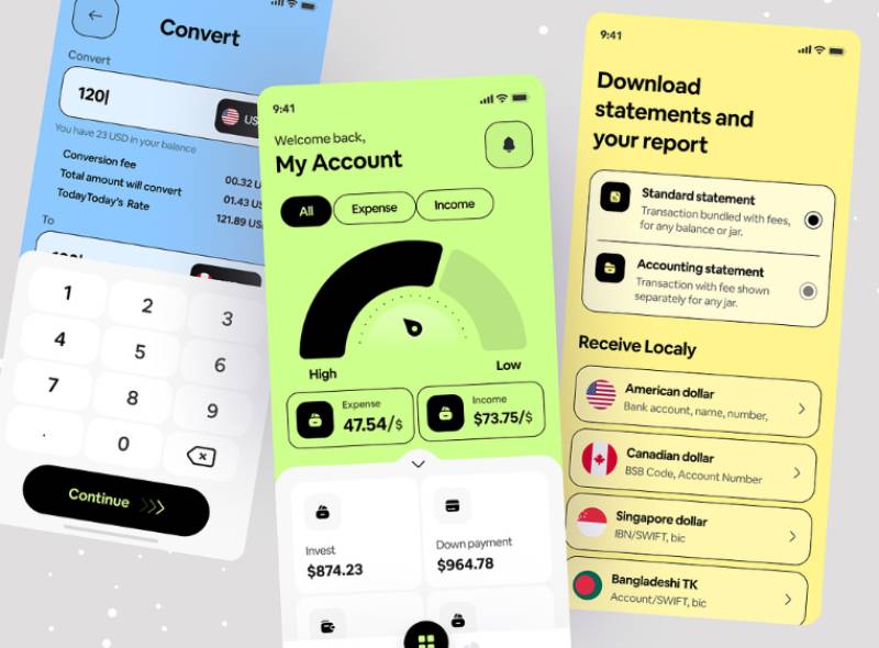
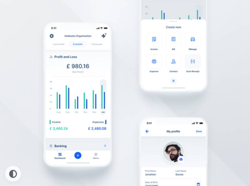
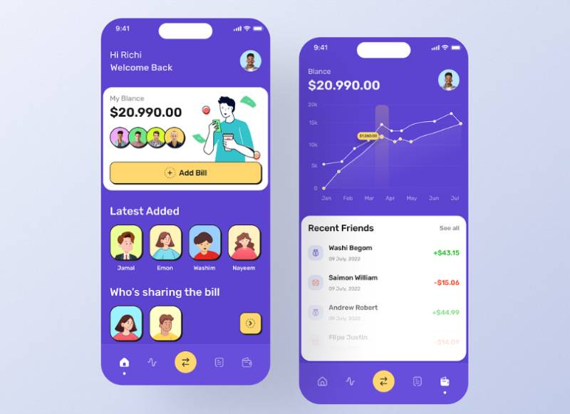
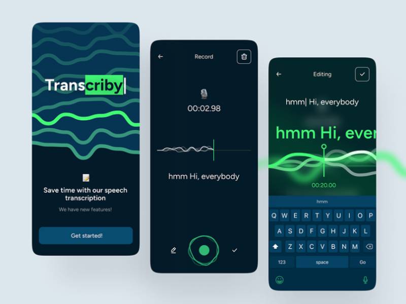
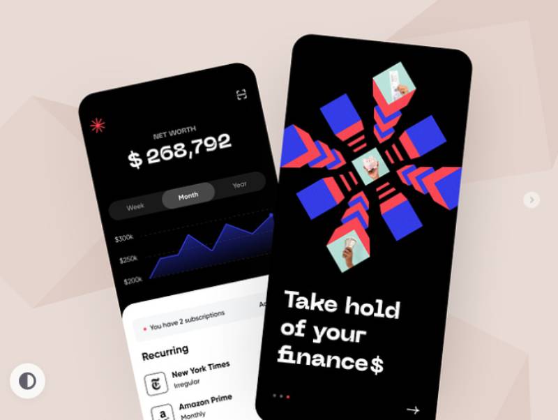
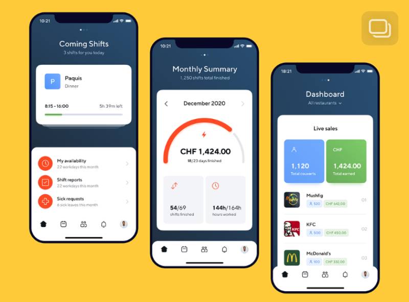
The concepts below are design explorations rather than shipped enterprise software, which is exactly what makes them a useful contrast to everything above: none of them carry a permission model, a legacy data schema, or a procurement committee’s requirements list. Watch how many metrics each dashboard puts on one screen, where the primary action sits, and how much detail gets held back behind a tap.


FAQ on Business App Design
How much does business app design cost?
Cost depends almost entirely on scope, not a fixed formula. A single internal tool with two or three roles costs far less than a multi-module platform with layered permissions, custom dashboards, and integrations across several existing systems.
How long does a business app design process take?
Timelines scale with the number of roles and workflows involved. A tool built around one primary workflow moves fastest, while a platform with several permission tiers and custom reporting takes considerably longer to design and validate with real users.
Do you need a dedicated design team, or can developers design business apps?
Developers can ship a working interface using a system like Carbon or Ant Design. Without dedicated UX work, though, permission structures and workflow sequencing tend to get built around engineering convenience rather than actual task flow.
What’s the difference between RBAC and ABAC for business apps?
Role-based access control assigns permissions by job title. Attribute-based access control layers conditions like department, location, or data sensitivity on top of the role, giving finer control for apps handling regulated or segmented data.
Should a company build a custom design system or license an existing one?
Most teams should start with an existing system like Fluent UI or Ant Design and adjust tokens for branding. Building a fully custom design system only pays off once a company maintains more than a handful of internal products.
What tools do teams use for business app wireframing and prototyping?
Figma and Sketch dominate early wireframing and interactive prototyping. Adobe XD still sees use at enterprises with existing Adobe subscriptions. Prototypes typically move into a shared component library once core workflows get validated with real users.
What triggers a business app redesign process?
Core workflows get reviewed far more often than visual design gets overhauled. A full redesign is rare and usually triggered by a platform migration, a company merger, or usability data showing task completion has quietly stalled.
Is low-code development a substitute for business app design?
Low-code platforms speed up building forms and workflows, but they don’t replace decisions about permission structure, information architecture, or dashboard hierarchy. A poorly planned low-code app inherits the same adoption problems as one built from scratch.
Do business apps need to follow platform guidelines like Material Design?
Only loosely. Guidelines like Material Design matter more for consumer-facing mobile apps. Internal business tools generally follow their own organization’s design system instead, since consistency across modules matters more than matching one operating system’s visual language.
What’s the first thing stakeholders check in a new business app?
Most stakeholders ask how fast a new hire can complete a core task without help. That single question, more than visual polish, predicts whether adoption sticks or whether employees quietly revert to spreadsheets and email.
Conclusion
Most teams start business app design with the dashboard. Start with permissions instead.
Every screen and workflow decision downstream depends on who can see what. Retrofitting access control after launch costs far more than designing it first.
Expect friction in month one regardless of how careful the rollout is. Employees resist reassigned permissions even when the old system was worse.
Budget for a second pass:
- A permission audit at 90 days
- One usability check on the highest-traffic workflow
- A support ticket review tied to specific screens, not general complaints
Permissions first, friction expected, audit scheduled. That sequence outperforms teams chasing polish before the underlying structure is settled. It’s the difference between software people tolerate and software people trust.

Renowned for his expertise in logo design and visual branding, Bogdan has developed a multitude of logos for various clients.
His skills extend to creating posters, vector illustrations, business cards, and brochures. Additionally, Bogdan's UI kits were featured on marketplaces like Visual Hierarchy and UI8.
He also wrote in the past years on sites like Design Your Way, WebDesignerDepot, WPDean, Designmodo, Speckyboy, Slider Revolution, and more.
- Canva vs PowerPoint: Which Is Better for Presentations? - 22 September 2026
- How to Install Fonts on Mac (Step-by-Step Guide) - 20 September 2026
- From Mockup to Code: How AI-Augmented Development Speeds Up the Design Handoff - 19 September 2026

Bogdan Sandu is a seasoned designer who has been designing websites since 2008. Renowned for his expertise in logo design and visual branding, Bogdan has developed a multitude of logos for various clients. His skills extend to creating posters, vector illustrations, business cards, and brochures. Additionally, Bogdan's UI kits were featured on marketplaces like Visual Hierarchy and UI8. He also wrote in the past years on sites like Design Your Way, WebDesignerDepot, WPDean, Designmodo, Speckyboy, Slider Revolution, and more.
You Might Also Like