U.S. Spotify listeners spend more than an hour a day inside the app now, something like 32 hours a month according to Comscore numbers reported by eMarketer. None of that time is an accident. Every minute of it runs through decisions made in music app design long before a single track ever loads.
Some of those decisions are obvious once you notice them: how fast a play button actually responds, whether the app keeps playing after you lock the screen. Others are quieter, like how a queue shows up without breaking whatever you were already listening to.
Get any of that wrong and people notice fast.
Sound makes latency audible in a way most software never has to deal with. A messy navigation menu just looks bad. A sluggish tap here doesn’t only look bad, it sounds bad, and that’s a different kind of failure to design around.
What Is Music App Design
People use the term loosely, but what’s actually being designed is how someone finds, browses, and stays inside audio content once they open a streaming or player app. Interface design, user experience design, and audio interaction design all overlap here, and it’s really that last piece that makes this category different from most other app work.
A banking app can go quiet the second the screen locks. A music app can’t.
Playback has to survive a locked screen, an app switch mid-scroll, an incoming call, a Bluetooth handoff between your phone and your car, all without dropping a beat. That’s not a nice-to-have, it’s the whole point. Compare it to fitness app design, where a session has a clear start and a clear finish. A streaming interface doesn’t really stop. It idles, lines up the next track, and waits for you to come back.
Spotify reported 761 million monthly active users in its Q1 2026 earnings release filed with the U.S. Securities and Exchange Commission, and every one of those sessions leans on that always-ready playback state (Spotify Technology S.A., 2026).
Metadata is the other thing that quietly defines this space. Album art, artist credits, genre tags, lyrics timing, track duration, all of it has to render correctly across dozens of different screen states, or the app starts to feel broken even when the audio itself plays fine.
Worth clearing up one mix-up here: a player is a single screen. Music app design is bigger than that. It’s the player plus discovery, library organization, search, and whatever settings control offline playback and audio quality.
Core Principles That Guide Music App Design
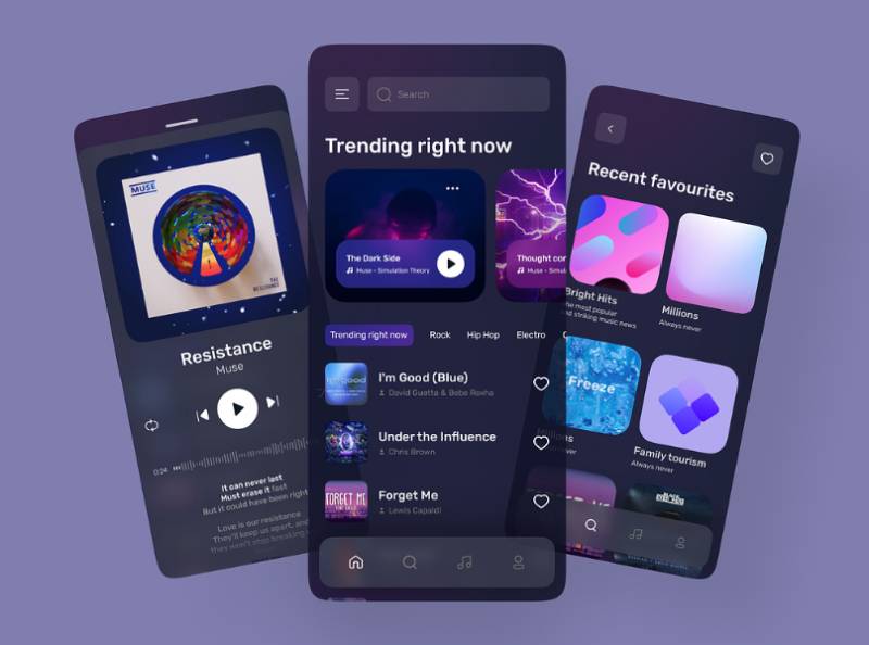
A handful of principles hold up almost every music app that actually works well. Playback needs to stay reachable at all times. Discovery and your own saved library need to coexist without one burying the other. The screen you’re staring at mid-song shouldn’t ask you to think too hard. And whatever screen you land on, the app needs to behave the way it did five minutes ago, not some new way.
None of that is theoretical. People use these apps one-handed, half paying attention, usually while doing something else entirely, so every one of those principles gets tested constantly, not just at launch.
| Principle | What It Solves | Where It Shows Up |
|---|---|---|
| Persistent playback | Losing audio on screen lock | Mini-player, lock screen, notification shade |
| Discovery/library balance | New content burying saved content | Home tab vs. Library tab split |
| Low cognitive load | Decision fatigue mid-listen | Simplified now-playing screen |
Material Design and Human Interface Guidelines Application to Audio Apps
Platform guidelines set a floor here, not much more than that.
Apple’s Human Interface Guidelines call for a minimum touch target of 44×44 points on playback controls, so a thumb can hit play or skip without needing a second try. Google’s Material Design spec lands in a similar place, 48×48 density-independent pixels for Android UI design.
Neither number got picked at random. Both trace back to average adult fingertip contact area, somewhere around 8 to 10mm, and once a target drops below that, taps start missing often enough for people to notice.
Apps that ignore this tend to hear the same complaint over and over: buttons feel fiddly on a run, on a commute, anywhere hands are busy with something else.
Latency and Responsiveness Standards for Playback Controls
Half a second doesn’t sound like much. But a tap on play that takes half a second to register reads as broken here, even though half a second would count as fast in most other software categories. Music apps get held to a tighter bar than most because the feedback loop is audio, not just visual. People notice a delayed beat faster than they’d ever notice a delayed screen transition.
Good visual hierarchy on the player screen helps here too, even before any code changes. When the play button is the most obvious thing on the screen, people find it faster, and the tap reads as instant even with a small buffer running underneath.
Navigation Structure in Music Streaming Apps
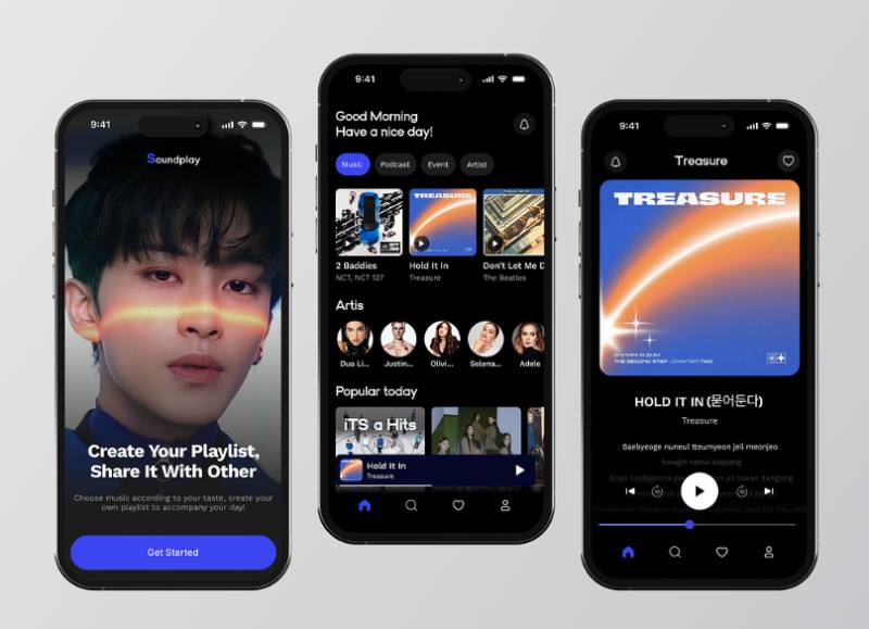
Three tabs. That’s what most major streaming apps have settled on: Home, Search, and Library.
It wasn’t always three. Spotify’s app used to run five navigation buttons, Home, Browse, Search, Radio, and My Library, before a 2018 redesign trimmed that down and folded discovery into the Search page instead (TechCrunch, 2018).
Fewer top-level destinations means less decision fatigue at the exact moment someone opens the app wanting one thing: their music.
- Home: personalized landing page, recently played, recommended playlists
- Search: the discovery engine, browse categories folded in here on most platforms
- Library or “Your Music”: saved albums, playlists, downloaded content
| Platform | Home Tab Focus | Navigation Style |
|---|---|---|
| Spotify | Algorithmic recommendations | Search-forward |
| Apple Music | Personal library | Library-forward |
| YouTube Music | Mixed video and audio feed | Discovery-forward |
The persistent mini-player sits underneath this tab bar on nearly every platform, acting like a fourth, unlabeled navigation point. Tap it and you jump straight to the full player screen. It’s the one piece of UI that stays fixed no matter which tab is active.
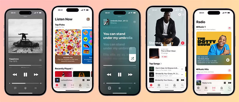
Apple Music tends to lean library-forward, putting a user’s own collection front and center. Spotify goes the other way, and its home tab usually pushes recommended content ahead of anything a user actually went and saved, which is a deliberate bet on the algorithm over someone’s own habits.
Neither approach is objectively better. Search UI design in music apps also has to do double duty, matching typed queries and voice input, sometimes in the same session.
Deep linking rounds out the navigation picture. A shared playlist link, a QR code, an Instagram swipe-up, all of it needs to drop a user directly into the right screen without routing them through the home tab first. Broken deep links are a quiet but common failure point. The link opens the app, not the actual content, and the user ends up searching for what they clicked in the first place.
Onboarding and Personalization Design
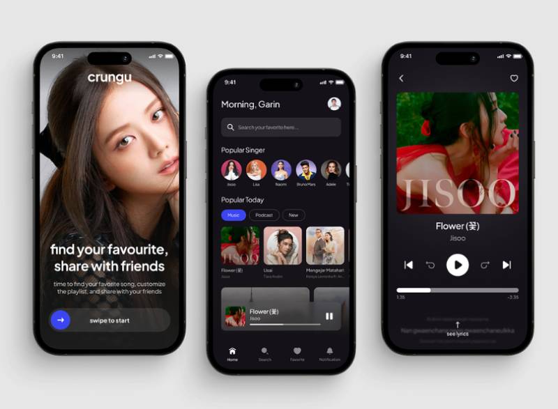
First-use screens in music apps almost always ask the same question in different words: what do you like?
Genre chips, artist grids, a short quiz, the format varies but the goal stays the same. Get a taste profile started before the user hits an empty home screen.
Structured onboarding app design pays off in ways you can actually measure. Apps running onboarding message campaigns saw 20% next-day return rates in Q2 2024, compared to 16% across all apps without them, according to Airship benchmark data reported by eMarketer. The same dataset found a 24% engagement score for onboarded users, against 17% for the general baseline.
Cold-start recommendation logic is the hard technical problem hiding behind that friendly genre-picker screen.
- No listening history yet, so the system leans on stated preferences first
- Early sessions get weighted more heavily than later ones to correct course fast
- Skip and completion signals start reshaping suggestions within the first few sessions
Sign-up itself matters more than it usually gets credit for. A cluttered login form design at the front door of a music app kills momentum before a single song plays. Social login through Apple, Google, or Facebook cuts that first step down to one tap for most people.
Personalization deepens over weeks, not days. Spotify’s Discover Weekly, its first personalized playlist, has generated more than 100 billion streams since 2015 and drives roughly 56 million new artist discoveries every week, 77% of them from emerging artists (Spotify Newsroom, 2025). That’s not a launch-day feature. It’s a system that gets sharper the longer someone sticks around.
Data transparency during onboarding is becoming less optional. Users increasingly expect a plain-language reason for why an app wants access to listening history, not a buried permissions dialog nobody reads.
Player Screen and Playback Control Design
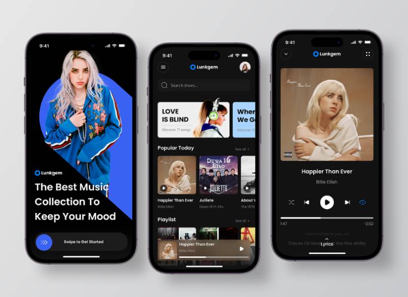
The full-screen player is the one view almost every user visits multiple times per session.
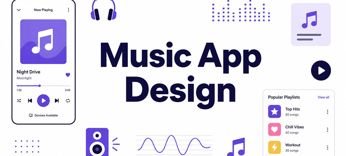
Album art dominates the top half. Track title and artist name sit directly below it, biggest to smallest. Progress bars beat waveforms in adoption across mainstream apps, mostly because a waveform needs pre-processing that a plain scrubber bar doesn’t.
Seek controls generally break down like this, ranked by how forgiving they are of an imprecise tap:
- Standard progress bar with a draggable thumb
- Waveform seek, used by SoundCloud and some DJ-focused apps
- Tap-to-skip in fixed increments, more common on podcasts than music
Queue visibility separates a good player from a great one. Up-next lists let a listener see and reorder what’s coming, rather than discovering it one track at a time. Good list UI design for mobile apps handles this well when it shows enough context, track, artist, duration, without turning the queue into a wall of text.
Lyrics integration has gone from a nice-to-have to a genuine engagement driver. Apple Music and Spotify both sync lyrics to playback in real time now, highlighting the current line as it’s sung.
Gesture controls round out the interaction model. Swipe left or right to skip a track. Long-press to save it or drop it into a playlist. Pull down and the player dismisses. These gestures need to sit alongside, not replace, the visible menus and buttons a first-time user actually sees.
Hidden-only gestures are a common mistake. If the only way to skip a track is an undiscoverable swipe, a chunk of users will simply never find it.
Visual Design System: Color, Typography, and Album Artwork
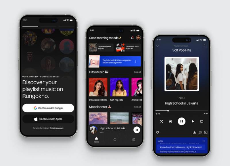
Album covers are the one piece of content every music app inherits from somewhere else, the label, the artist, whoever’s distributing it, and has zero control over. The design system has to work with whatever art shows up, from a stark black-and-white cover to a neon, maximalist one.
Most major apps solve this now with dynamic color extraction, pulling a palette straight out of whatever art happens to be on screen. Apple Music introduced an adaptive background system with iOS 26.4 that pulls dominant tones from the current album art and applies them across the playback screen, shifting the interface’s mood to match what’s playing (9to5Mac, 2026).
It wasn’t universally loved. Dark mode users complained that bright album covers flash the screen white at night, and Apple’s workaround was an Increase Contrast accessibility toggle that keeps the background locked to black regardless of artwork. That tension, adaptive color against a stable dark interface, comes up constantly in this corner of design.
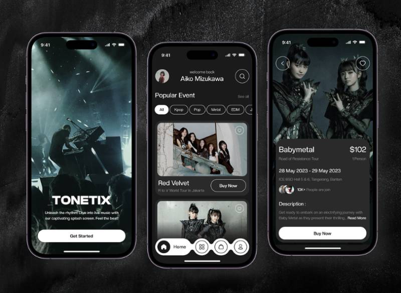
Genre and mood often drive palette choices before a designer even opens a color picker. A lo-fi playlist leans muted and warm. An EDM festival playlist leans saturated and high-contrast. That’s color psychology doing quiet work in the background, most listeners never consciously register why a chill playlist “feels” chill visually too.
Typography carries more weight than it usually gets credit for. Track titles, artist names, and album titles all compete for the same limited space. Typographic hierarchy is what keeps that from turning into visual noise. Track title gets the largest, boldest weight, artist name sits smaller underneath, usually lighter or muted. Choosing the right fonts for mobile apps in this context means picking a typeface family with enough weight variation to build that hierarchy without switching fonts entirely.
Most streaming apps default to dark backgrounds, and there’s a practical reason beyond aesthetics: dark interfaces make album art pop harder by contrast, and they’re easier on the eyes during the long, low-light listening sessions this category is built around.
Accessibility Standards in Music App Design
91.3% of screen reader users now access content on a mobile device, up from roughly 90% in the prior survey, according to WebAIM’s Screen Reader User Survey #10, conducted in December 2023 and January 2024. That’s not a niche audience anymore. It’s the default context accessibility work has to design for.
WCAG 2.1 compliance sets the baseline most music apps get measured against, whether or not the team building them thinks of it in those terms.
| Requirement | Spec | Applies To |
|---|---|---|
| Text contrast | 4.5:1 minimum ratio | Track titles, artist names, labels |
| Touch targets | 44x44pt (iOS) / 48dp (Android) | Play, skip, and volume controls |
| Focus indicators | Visible on all interactive elements | Keyboard and switch-control navigation |
Screen reader labeling is where a lot of music apps fall short. An icon-only play button with no accessible label reads as “button” to a screen reader, nothing more. Every playback control needs a spoken label, “Play,” “Skip to next track,” “Add to library,” not just a silent icon sitting there.
Contrast deserves its own mention here, because album-art-driven interfaces make it genuinely harder to hit than in a typical app. WCAG’s contrast requirement doesn’t bend for a busy background image. Text still needs that 4.5:1 ratio against whatever sits behind it. Apple’s Increase Contrast toggle, mentioned earlier for its effect on Apple Music’s adaptive backgrounds, is a direct response to that exact problem.
Lyrics and captions do double duty as accessibility features, not just engagement ones. A synced lyrics view functions as real-time captioning for anyone who benefits from reading along.
Voice control integration matters too. Google Assistant carries an estimated 92 million U.S. users and Siri around 86.5 million, and a meaningful share of those interactions are playback commands, “play,” “skip,” “pause,” issued hands-free (eMarketer, 2026). Voice commands aren’t a replacement for visual accessibility work. They’re a parallel path for the moments where touch isn’t the easiest option, driving, cooking, or just low vision.
Offline Mode and Low-Bandwidth Design
A downloaded track has to look and behave differently from a streaming one, or users can’t tell what’s actually safe to play without a connection. Most apps solve this with a small checkmark or cloud icon next to any track, playlist, or album that’s been saved locally.
Storage limits differ a lot from platform to platform:
- Spotify Premium caps offline downloads at 10,000 tracks per device, across up to five devices (Spotify Support)
- Apple Music’s offline library caps out at 100,000 songs, ten times Spotify’s per-device limit
- Downloaded content on Spotify goes silent after roughly 30 days without reconnecting, since offline licenses need periodic renewal
That expiration detail catches people off guard. A playlist downloaded for a trip plays fine on the flight out, then quietly stops working weeks later if the app never gets back online.
Bandwidth-adaptive streaming is the other half of this design problem.
| Quality Tier | Bitrate | Typical Use Case |
|---|---|---|
| Low | 24 kbps | Weak signal, data-saving mode |
| High | 160 kbps | Default free-tier streaming |
| Lossless | Up to 24-bit/44.1kHz FLAC | Premium, strong connection |
Spotify rolled out lossless audio to Premium subscribers in more than 50 markets, scaling all the way up to CD-quality FLAC when the connection can support it (Spotify Technology S.A., 2025).
The interface has to communicate all of this without turning into a settings maze. A toggle for downloads over cellular, paired with a visible quality indicator, covers most of what people actually need day to day.
Compare that to travel app design, where offline mode usually means caching an entire map region rather than individual pieces of content chosen one at a time. Music apps hand that granularity to the user instead. Download this album, skip that one, and the interface has to make both choices equally easy to find.
Cross-Platform Design Differences: Mobile, Desktop, and Wearable
The same music app has to shrink down to a watch face and expand out to a desktop window, sometimes within the same user’s day. Each surface strips the interface down to whatever that context actually allows.
Wearables push this the furthest. Apple Watch playback controls reduce to a handful of glanceable elements: play, skip, volume, and a complication showing what’s currently playing.
Apple’s Wearables, Home and Accessories segment, which includes Apple Watch, generated $35.7 billion in revenue in fiscal 2025 (Apple FY2025 Form 10-K), with independent estimates putting unit sales at roughly 33 million watches that year (Counterpoint Research). That’s a lot of wrists checking a now-playing screen with no room for album art detail, just a title, an artist, and three buttons.
Cars trade detail for safety instead. CarPlay and Android Auto strip navigation down further still: larger touch targets, voice-first interaction, text that’s legible at a glance from the driver’s seat.
Among Americans who have CarPlay or Android Auto available in their primary vehicle, 83% actually use it. The share of Americans with either platform in their car climbed to 40% in 2025, up from 32% the year before (Edison Research, Infinite Dial 2025).
Aston Martin became the first automaker to ship CarPlay Ultra, the version of CarPlay that takes over the entire instrument cluster rather than just the center screen. It’s a sign of how much control automakers are now willing to hand over to phone platforms.
Desktop sits at the opposite end of the spectrum. Screen real estate allows for expanded queues, full library grids, multi-pane layouts that would never fit on a phone. The challenge there isn’t fitting more in, it’s deciding what actually deserves the extra space instead of just stretching a mobile layout wider.
Spotify vs Apple Music vs YouTube Music: Design Comparison
| Platform | Subscribers (End of 2025) | Market Share |
|---|---|---|
| Spotify | 289.4 million | 31.4% |
| Apple Music | 116.1 million | 12.6% |
| YouTube Music | 114.3 million | 12.4% |
MIDiA Research’s 2025 subscriber tracking puts global paid music streaming at 921.6 million accounts total, which means these three platforms alone account for more than half the market.
Personalization surface placement is where the design philosophy diverges hardest. Spotify puts algorithmic playlists front and center on the home tab, often ahead of anything a user actually went and saved themselves.
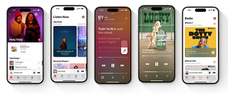
Apple Music takes the opposite bet, and editorial curation still matters there. Human-picked playlists and radio shows sit next to the algorithmic mixes instead of getting replaced by them.
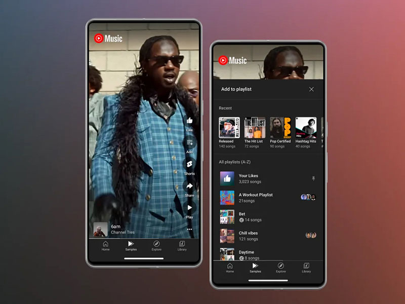
YouTube Music runs into a design problem neither competitor has to solve: every piece of content is also a video.
Its interface has to decide, constantly, whether to show a thumbnail or an album cover, and whether tapping a result should open a video player or a compact audio bar.
That’s a fundamentally different information architecture challenge than pure video app design has to deal with. YouTube Music has to blend both formats without leaving the user confused about which mode they’re actually in.
Visual density follows a similar split. Spotify’s home feed runs card-heavy and colorful, closer to a social feed than a library. Apple Music, on the other hand, keeps its grid closer to a traditional library browser, consistent tile sizes, less algorithmic shuffling of what shows where. Neither approach is wrong exactly. One treats music as a feed to scroll, the other treats it as a collection to browse.
Common Music App Design Mistakes
Entertainment apps as a category already fight an uphill retention battle. Android entertainment apps held just a 3% user retention rate 30 days after install, per Statista’s Q3 2024 data. Bad design decisions inside that window make a hard problem worse.
Burying playback controls tops the list of ways to lose people fast.
- Play and skip buried two or three taps deep instead of one
- No persistent mini-player, forcing users back to a full screen just to pause
- Critical actions hidden behind gestures with zero visual hint they even exist
Metadata inconsistency is the quieter version of the same problem. A missing artist name, a mismatched album cover, a title that truncates differently across screens, all of it chips away at trust in the app over time.
Overloading the home screen is its own category of mistake. When every algorithmic section competes for the same scroll, users can lose track of where their actual saved library even lives. Spotify users on the company’s own community forums have flagged exactly this, describing the home feed as cluttered, with recommendations crowding out quick access to saved playlists.
Good white space around the sections a user actually returns to daily would fix a lot of this without removing a single feature.
Ignoring offline states until late in development rounds out the list. Teams that treat downloads as an afterthought end up bolting on inconsistent icons and confusing error states instead of designing them in from the start.
Every one of these mistakes shares the same root cause, really: prioritizing what the algorithm wants to promote over what the listener actually came to do.
Design and Prototyping Tools for Music Apps
Figma anchors most modern workflows at this point. The platform disclosed 13 million monthly active users and adoption by 95% of the Fortune 500 in its S-1 filing, based on figures as of March 2025 (Figma, 2025). Component libraries built in Figma let teams keep play buttons, progress bars, and album art containers consistent across dozens of screens without redrawing each one by hand.
| Tool | Purpose | Best For |
|---|---|---|
| Figma | UI design, component libraries | Interface layout and design systems |
| Protopie or Principle | Gesture and transition prototyping | Testing swipe and long-press interactions |
| Maze or UserTesting | Usability testing | Validating playback and navigation flows |
Static mockups don’t really capture what a swipe-to-skip gesture feels like in the hand. That’s the gap Protopie and Principle fill, building interactive prototypes that respond to real touch input before a single line of production code exists.
Usability testing platforms like Maze and UserTesting let teams watch real people attempt specific tasks, finding a downloaded playlist, reordering a queue, without a researcher sitting in the room the whole time.
Lottie handles the smallest but most noticeable layer: micro-interactions. A pulsing play button, an animated equalizer bar, a heart icon that bounces when a track gets saved, all lightweight enough to ship without bloating the app.
None of these tools replace the core decisions covered earlier. They just make it faster to test whether those decisions actually hold up once a real thumb is tapping the screen.
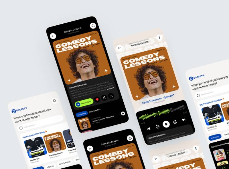
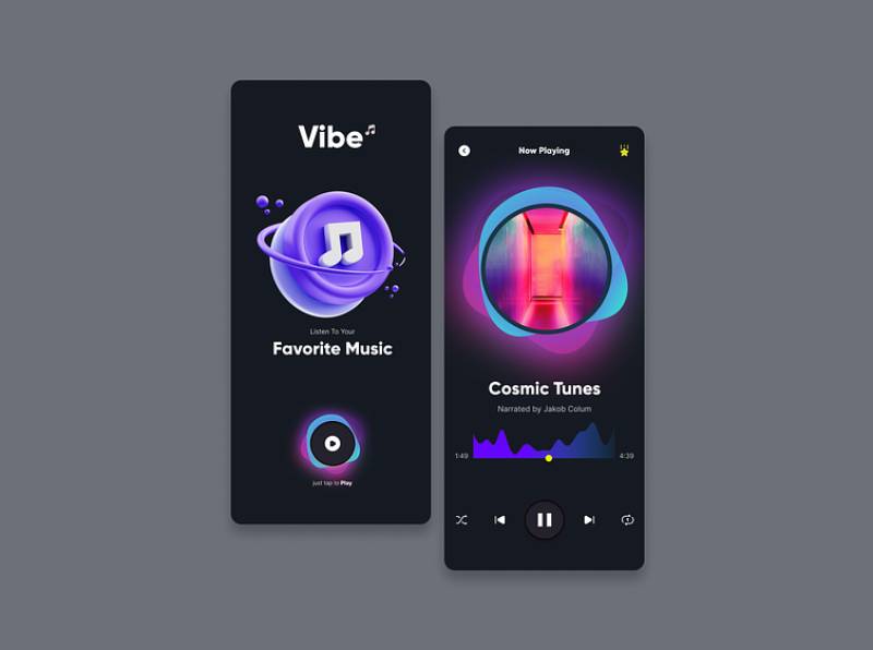
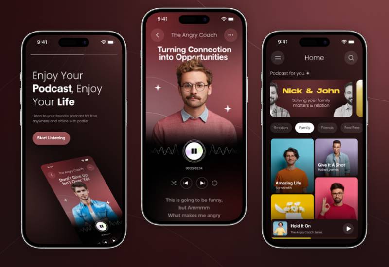
Music App Design Examples
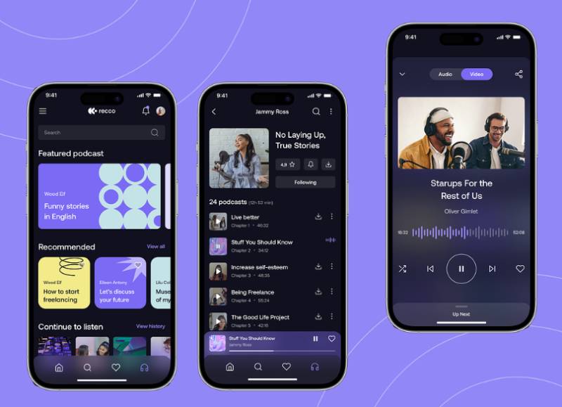
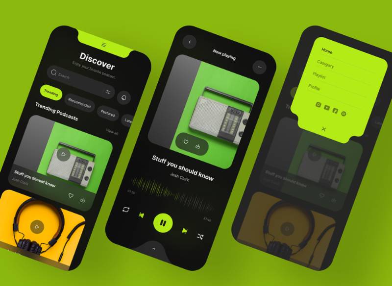
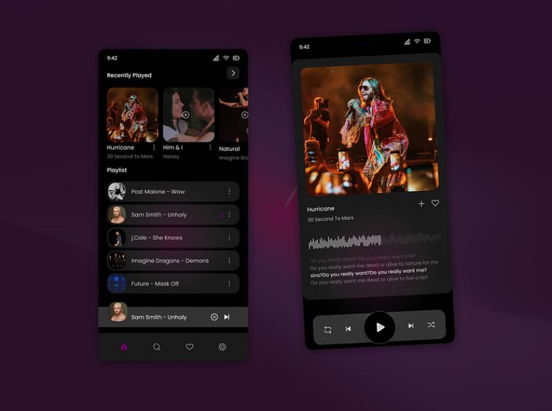
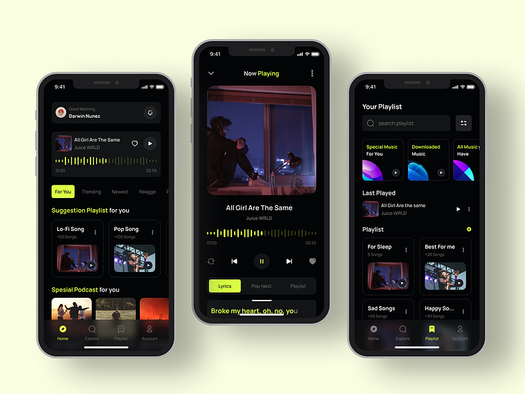
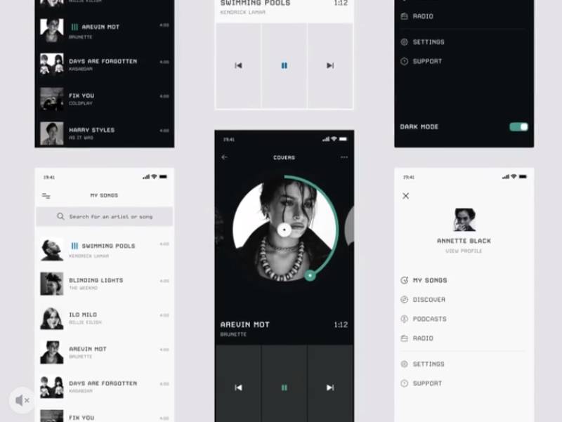
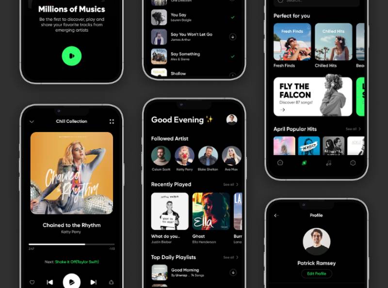
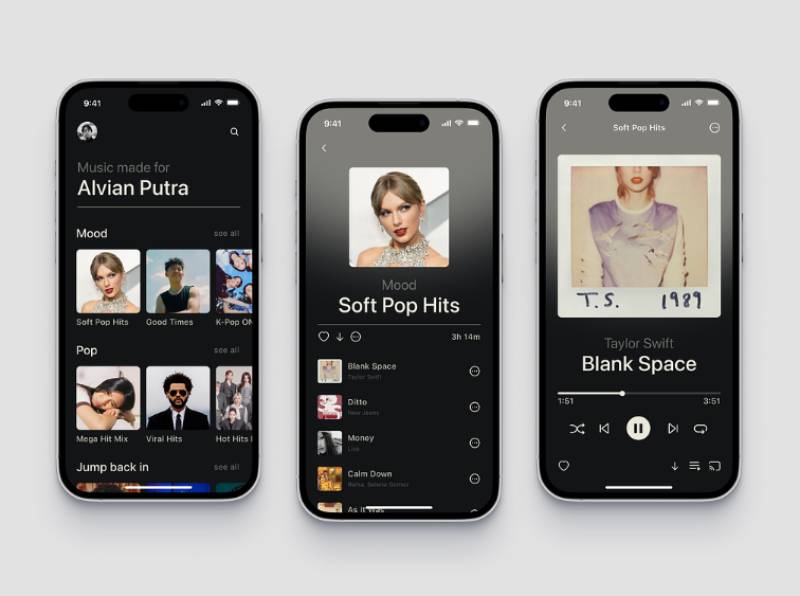

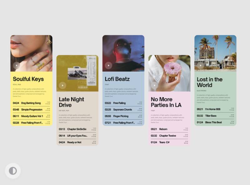
FAQ on Music App Design
How much does it cost to design a music streaming app?
Design costs vary with scope. A minimal player interface can run $10,000 to $20,000, while a full streaming platform with onboarding, personalization, and offline mode commonly reaches $50,000 or more before development even starts, based on industry design-cost estimates.
Does a music app need a dedicated tablet layout?
Yes, though many apps skip it. A tablet layout should use the extra width for a persistent queue panel alongside the player, rather than just stretching a phone layout, similar to how desktop apps expand library grids.
How should a music app design its empty states?
Empty states need direction, not blank space. A new user with no saved playlists should see a prompt toward search or genre picks, not a bare “Library” screen that implies the app itself is broken.
How does interface design differ between music and podcast content in the same app?
Podcasts need episode lists, playback speed controls, and chapter markers, none of which music tracks require. Most apps solve this with a distinct now-playing layout for podcasts while keeping the same tab bar and navigation architecture as music.
Should a music app support landscape orientation?
Rarely, and mostly on tablets. Phone music apps stay locked to portrait because the now-playing screen, queue, and library organization are all designed around a vertical scroll, and landscape adds little beyond a wider album art view.
How do music apps design for kids or family profiles?
Kids profiles restrict explicit content, simplify navigation to icons and large tap targets, and remove open search in favor of curated playlists. Spotify Kids and Apple Music’s family sharing both layer parental controls over the standard player interface.
Should a music app use skeleton screens or spinners for loading states?
Skeleton screens generally win. They preview the shape of album art and track rows before content loads, which feels faster than a spinner even when the actual loading states take the same amount of time to resolve.
How should a music app design its push notification strategy?
Notification design should tie back to listening behavior, a new release from a followed artist, a personalized playlist refresh, not generic re-engagement pings. Over-notifying trains users to swipe away alerts, eroding the retention gains good onboarding worked to build.
How do music apps design volume and equalizer controls?
Volume usually routes through the device’s hardware controls rather than an in-app slider, keeping the interface simpler. Equalizer controls, when offered, sit deeper in settings rather than on the main player screen, since most listeners never touch them.
Can a music app be built as a progressive web app instead of native?
A progressive web app can work for basic streaming, but native builds still win for background playback, lock screen controls, and offline mode, since browsers restrict exactly the persistent audio state music apps depend on most.
Conclusion
Start music app design with the parts users touch under pressure, not the parts that look good in a pitch deck.
Get persistent playback and offline mode working before anything else. A beautiful dynamic color system means nothing if the audio drops the moment a phone screen locks.
Accessibility compliance and touch target sizing belong in the first working prototype, not a later patch. Bolting them on after a redesign gets flagged for WCAG failures costs more than building them in early would have.
Personalized recommendations can wait. A working library, a reliable mini-player, and clean metadata display earn trust faster than any algorithm will.
That order isn’t glamorous, but it keeps listeners around long enough for the smart features to actually get a chance to work.

Renowned for his expertise in logo design and visual branding, Bogdan has developed a multitude of logos for various clients.
His skills extend to creating posters, vector illustrations, business cards, and brochures. Additionally, Bogdan's UI kits were featured on marketplaces like Visual Hierarchy and UI8.
He also wrote in the past years on sites like Design Your Way, WebDesignerDepot, WPDean, Designmodo, Speckyboy, Slider Revolution, and more.
- The Windsurf Logo History, Colors, Font, And Meaning - 10 October 2026
- How to Remove Background From Product Photos (No Photoshop) - 10 October 2026
- How Designers can Build a Stronger Online Creative Identity - 9 October 2026

Bogdan Sandu is a seasoned designer who has been designing websites since 2008. Renowned for his expertise in logo design and visual branding, Bogdan has developed a multitude of logos for various clients. His skills extend to creating posters, vector illustrations, business cards, and brochures. Additionally, Bogdan's UI kits were featured on marketplaces like Visual Hierarchy and UI8. He also wrote in the past years on sites like Design Your Way, WebDesignerDepot, WPDean, Designmodo, Speckyboy, Slider Revolution, and more.
You Might Also Like