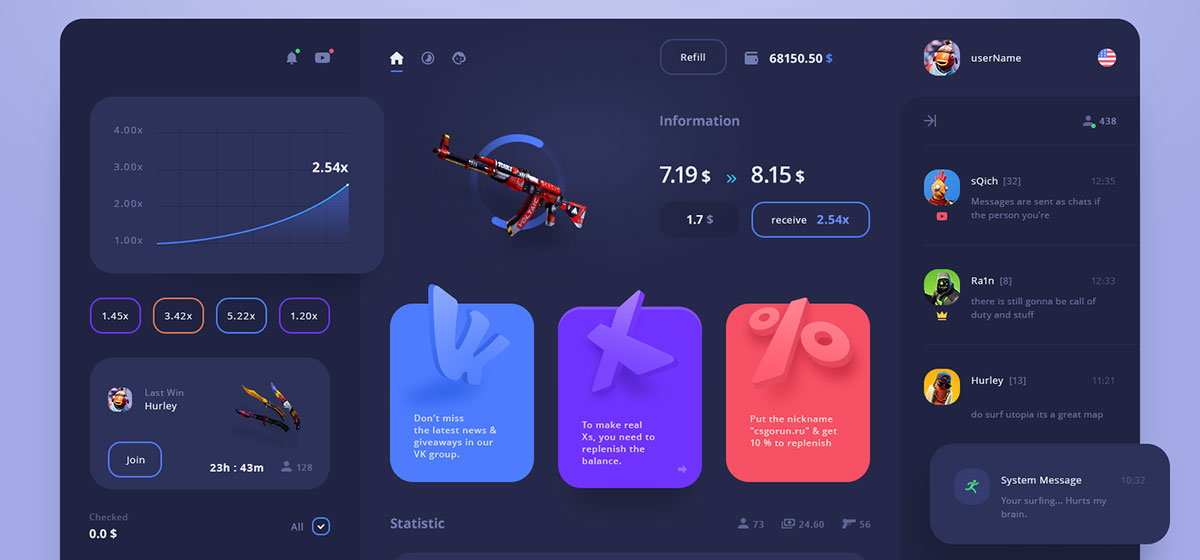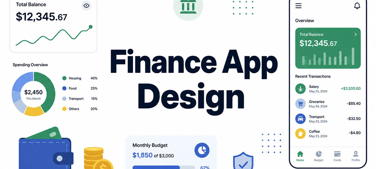
Seventy-seven percent of Americans now manage their bank accounts through a mobile app or computer rather than any other method, according to the American Bankers Association. Mobile app is the single most preferred option among those digital-first users, too. Whatever trust people put in their bank now runs through finance app design.
A cluttered menu is a minor annoyance in a music app. In a digital banking app, that same clutter makes someone wonder if their money is actually safe.
Get the interface wrong and the cost isn’t just a lost session. Sometimes it’s a lost account. Other times it’s a compliance complaint sitting in someone’s inbox, or a customer who quietly switches to a neobank overnight and never bothers explaining why.
Security matters here. So does clarity. Regulatory compliance too, quietly, on every screen a fintech team ships.
What Is Finance App Design
Building an interface for a banking or investment app means balancing usability against regulatory demands that most product categories never have to think about. That’s the discipline sitting underneath the term finance app design.
It sits inside the broader field of UX design, but the stakes are different here. A misread balance or a failed transfer carries a direct financial cost, not just a bad impression.
A few very different product types fall under that umbrella.
- Neobanks and digital-only accounts
- Payment app design for transfers and merchant checkout
- Investment app UX for trading and portfolio tracking
- Budgeting app interface tools for spending and saving
NuBank, now the world’s largest digital-only bank, reported nearly 94 million account holders by the end of 2023 and crossed 100 million customers in 2024, a scale few traditional banks reach through branch networks alone.
Chime, Revolut, N26. Apps like these are chasing the same basic goal even if they look nothing alike: shrink the distance between opening the app and actually understanding your money.
What Makes Finance App Design Different From Standard App Design

Only 59% of US consumers say they feel confident in the security of their mobile banking apps, according to 2025 research from Nimble AppGenie. That’s not a lot of confidence to work with, and it’s fragile enough to lose over one bad screen.
Finance apps carry constraints most product categories never face.
A design error here costs real money, not just a lost session, which changes how carefully every screen gets tested before it ships. Rules like PSD2 and GDPR also shape what a screen is even allowed to show or store, a layer of constraint most product teams never deal with. Then there’s the anxiety factor. Nielsen Norman Group research on banking UX has long documented that money-related tasks trigger more caution in people than shopping or entertainment tasks ever do.
Same idea as before, different screen: clutter that’s forgivable in a music app becomes a red flag the second it shows up next to somebody’s balance.
Core UX Principles for Finance App Design

Every finance interface answers to the same test. Can someone confirm their balance or complete a transfer without hesitating?
A small set of principles keeps that test passing across neobanks, investment apps, and payment tools alike.
Cognitive Load Reduction Techniques
Clarity beats cleverness when someone’s just trying to check whether a bill cleared.
- One primary number per screen, whether that’s a balance, an amount due, or a portfolio value
- Visual hierarchy that puts the account balance display above secondary actions
- Progressive disclosure for transaction details and fee breakdowns
Nielsen Norman Group’s banking UX research found that users scan financial screens faster when the interface holds back detail until it’s actually asked for.
Consistency and Terminology Standards
A transfer should never turn into a payment three screens later in the same flow.
Consistent terminology matters more in a finance app than in almost any other category, mostly because users are cross-checking what they see against a bank statement or a card charge sitting right in front of them.
- Fixed vocabulary for the same action across every screen
- Matching labels between push notifications and in-app transaction history
- Identical currency formatting across dashboards and receipts
Onboarding and Identity Verification Design
The average onboarding app design for a finance product loses more users than any other single screen in the app.
Signicat’s 2022 Battle to Onboard research put the industry-wide average onboarding drop-off rate at 68%, up from 63% in 2020, meaning fewer than one in three users who start signup actually finish it.
Fenergo’s 2025 survey of senior financial executives found that 70% of institutions lost prospective clients to slow or complex onboarding in the past year, up from 67% in 2024 and 48% in 2023.
| Verification Method | Typical Friction | Where It’s Used |
|---|---|---|
| Document upload | High, prone to retries | Account opening, KYC |
| Biometric scan | Low, near-instant | Login, re-authentication |
| Manual review | Highest, adds delay | Flagged or high-risk accounts |
Titan, an investment app, raised its onboarding completion rate from 31% to 78% after redesigning its identity verification flow, according to Saasfactor, the design agency that led the redesign.
Designing for KYC Compliance Without Losing Users
A KYC verification flow is legally required no matter what, but how it’s framed determines whether people actually finish it.
- Explain why a document is needed before asking for it
- Show a progress indicator that reflects real remaining steps
- Offer biometric capture as the default over manual document photos
AI-assisted identity verification can cut onboarding time by 30 to 50 percent compared to manual review, according to a 2026 analysis from INSART.
Dashboard and Data Visualization Design

A finance dashboard design succeeds when someone understands their financial position in about the time it takes to glance at the screen.
Chart choice comes down to what the number actually needs to communicate.
| Chart Type | Best For | Common In |
|---|---|---|
| Line chart | Spending trends over time | Monarch Money, Mint-style dashboards |
| Donut chart | Budget category breakdown | Budgeting app interfaces |
| Bar chart | Portfolio or account comparison | Investment app UX |
Mint’s legacy dashboard model popularized the single-glance spending summary, and most modern budgeting apps still borrow from that pattern in one way or another.
Well-built charts on mobile screens skip the dense axis labeling and lean on color and shape instead to carry the message.
Number formatting carries real weight in financial data visualization.
- Negative balances shown in red with a leading minus sign, not just color
- Currency symbols fixed to one position across every screen
- Percentages rounded to one decimal for portfolio performance
Transaction history UI benefits from the same patterns used across mobile list UI design for mobile apps, grouped by date with the most recent entry sitting at the top.
Security and Compliance Design Patterns
IBM’s 2025 Cost of a Data Breach Report put the average US breach cost at a record $10.22 million, and that figure alone puts real weight behind every security screen a designer ships.
Security in a finance app has to be visible and functional at the same time. A padlock icon by itself doesn’t stop fraud.
Authentication Flow Design
Biometric authentication design has become the default entry point for most banking apps at this point.
As of 2025, 64.2% of mobile banking users rely on fingerprint or facial recognition as their primary login method, and biometric checks have cut unauthorized access by 52.7% across top-tier digital banking platforms (Coderio, 2025).
- Face ID or Touch ID as the primary login, PIN as fallback
- Session timeout after a set period of inactivity
- Re-authentication before any money movement, not just app entry
A clean mobile login form design still matters for the fallback path, since not every device out there supports biometric hardware.
Designing Around PCI DSS Requirements
| Standard | Focus | Applies To |
|---|---|---|
| PCI DSS | Card data handling | Payment app design |
| SOC 2 | Data security controls | Cloud-hosted finance platforms |
| PSD2 | Strong Customer Authentication | EU payment apps |
PCI DSS compliance shows up in the interface as masked card numbers and tokenized input fields. A fully visible card number after entry basically never happens on a compliant app.
Bank of America’s mobile app now layers fingerprint, facial recognition, and planned palm vein scanning into one authentication flow, which says a lot about how far card management interface security has moved past static passwords.
Accessibility Standards in Finance App Design
Seyfarth Shaw recorded 3,117 federal web accessibility lawsuits in 2025, a 27% increase over 2024, and banking and finance apps show up often enough in that data to basically count as their own category.
WCAG 2.1 AA is the baseline most fintech compliance audits reference, even though the ADA itself doesn’t name one specific technical standard.
Login portals and account management tools inside banking apps face frequent accessibility suits, according to 2025 litigation tracking from Webability.io.
Fintech accessibility requirements show up in a handful of concrete design decisions.
- Color contrast that doesn’t rely on red or green alone to signal gains and losses
- Screen reader labels on every transaction history UI row, not just the total
- Keyboard and switch-control support for transfers and bill pay
Running interface colors through a color contrast checker before shipping catches most of the failures that end up triggering legal complaints.
The most recent WebAIM Million Report found that 95.9% of websites still fail basic WCAG checks, up from 94.8% the year before. That reverses several years of small gains and suggests accessibility is still an afterthought industry-wide, not some finance-specific problem.
Navigation and Information Architecture for Finance Apps

A finance app usually has to fit accounts, cards, transfers, and support into a handful of taps.
Bottom tab bars are the standard pattern here, mostly because they keep everyday actions within thumb reach.
| Pattern | Best For | Watch Out For |
|---|---|---|
| Bottom tab bar | 3 to 5 primary destinations | Crowding past 5 items |
| Navigation drawer | Settings, legal, secondary links | Hiding features users need often |
| Search and shortcuts | Finding a transaction or stock fast | Weak filtering on long histories |
Cash App keeps its home screen down to four large, clearly labeled actions: send, request, invest, and bank, according to 2026 design analysis from ProCreator.
Good mobile tab UI design pairs every icon with a text label instead of leaning on symbols alone. Unlabeled icons read as guesswork inside banking app navigation, and guesswork is the last thing you want here.
Secondary items, like account settings or a charge dispute, belong deeper in the hierarchy.
Well-organized mobile menus and buttons keep that secondary layer reachable in two taps at most, without cluttering up the main screen.
Visual Design Elements That Build Trust
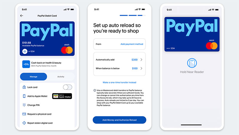
Blue is consistently the color people rate as most trustworthy in published interface research. A widely cited study by Alberts and van der Geest tested identical finance, legal, and medical websites in different color schemes and found blue rated as the most trustworthy and black the least, though color’s effect on trust turned out small compared with other cues on the page.
People are also commonly said to form a color-based judgment within about 90 seconds of seeing an interface, with a large share of that snap judgment attributed to color alone (a figure widely credited to the Institute for Color Research). Worth treating that one as a rule of thumb rather than a precisely sourced statistic.
That’s why color psychology shows up so heavily in finance branding.
Chase, Barclays, and PayPal all lean on blue as a primary brand color to reinforce security and credibility, and that pattern repeats across most major banking apps.
Typography carries its own weight once color is settled.
- Tabular figures so numbers align vertically in a list
- Wider letter spacing on account numbers for scanability
- Restrained use of decorative typography elements anywhere near a balance or amount due
Illustration tends to soften a wealth management interface. Straight photography rarely shows up next to real account data, for what it’s worth.
Micro-interactions and Transaction Feedback Design

A transfer that just spins with no feedback reads as broken, even when it’s processing completely normally.
Skeleton screens during a transfer or payment cut down on that uncertainty better than a generic spinner does, since they at least hint at what’s loading.
- Success state with a confirmation number, not just a checkmark
- Failure state with a specific reason, not a generic error
- A short undo window on money transfer interface screens where the payment rails allow it
Push notifications carry open rates above 90%, compared to roughly 20 to 25% for email, according to 2026 market research from Dataintelo.
Apps that added real-time fraud alerts cut unauthorized activity by 20%, per a 2024 Finextra report on transactional alerts.
That kind of feedback loop supports a financial wellness app just as much as it supports security, since people can act on a notification instead of finding out about a problem days later.
Common Finance App Design Mistakes
The CFPB finalized a rule in March 2024 that would have capped the credit card late fee safe harbor at $8 for large issuers, a direct response to fees consumers said they never saw coming.
The rule never actually took effect. Card issuers sued, and in April 2025 a federal court vacated it at the CFPB’s own request.
Late fees at large issuers remain in the $30 to $41 range consumers were already paying before the rule was finalized.
Most recurring design failures in finance apps trace back to a handful of habits.
Hidden fees are still a big one: a fee that only shows up at the final confirmation screen, after someone’s already committed to the flow, feels like a bait and switch even when it technically isn’t. Overloaded dashboards cause a quieter version of the same problem, cramming in every available metric instead of the two or three numbers a person actually opened the app to check.
Balance displays that don’t agree with each other, home screen says one number, account detail page says another, the push notification says a third, erode trust fast. And a failed transfer that just says something went wrong, with no real reason given, leaves people guessing whether it’s even safe to try again.
The CFPB sued the operator of a major peer-to-peer payment network in December 2024, alleging customers lost more than $870 million to fraud over seven years due to safeguards that were never built into the product. The agency dropped the lawsuit with prejudice in March 2025 after a change in CFPB leadership, though a state regulator has since filed its own suit over the same platform’s fraud safeguards.
Design Systems and Tools Used in Fintech
Figma has become the default design tool across most fintech product teams, used for everything from early wireframes to developer handoff.
91% of developers and 92% of designers still believe the handoff process between design and engineering could be improved, according to Figma’s own 2025 design statistics report.
| Tool Type | Purpose | Example |
|---|---|---|
| Interface design | Wireframes, high-fidelity screens | Figma |
| Component library | Reusable, compliance-checked UI parts | Base design system |
| Prototyping | Testing transaction flows pre-development | Interactive Figma prototypes |
Coinbase built its Base design system as an open-source component library, giving fintech teams pre-built patterns instead of rebuilding buttons and inputs from scratch every time.
Design tokens keep spacing, color, and type consistent across a fintech design system, and that matters more here than in most categories, mostly because compliance forces last-minute copy changes so often.
A well-kept UI design cheat sheet speeds up onboarding for new designers joining an existing fintech product.
Regulatory Requirements That Shape Finance App Design by Region
Design decisions in a finance app change depending on which regulator happens to be reading the screen.
PSD2 and Strong Customer Authentication
Strong Customer Authentication requires two of three proof types before a payment clears.
- Something the user knows, like a PIN
- Something the user has, like a phone
- Something the user is, like a fingerprint
PSD2’s SCA rules helped consumers avoid an estimated €900 billion in fraud losses across the EU, based on an EU-commissioned study covered by Chargebacks911. That’s a large estimate worth treating with some caution, since annual EU-wide reported payment fraud tracked by the European Banking Authority and European Central Bank runs closer to €3 to €4 billion a year.
The same rules created a real cost too. One case study found 3D Secure challenges caused merchants to lose 26 to 39% of transactions to abandonment or failed authentication (CPO Magazine).
PSD2 also underpins Open Banking access across the EU and UK, which shapes how account-linking screens get designed across third-party finance apps.
CFPB and FTC Disclosure Rules
The CFPB finalized a rule in November 2024 that would have put large nonbank digital wallet and payment apps (those handling more than 50 million transactions a year) under its direct supervision. The rule took effect on January 9, 2025, but Congress voted to repeal it under the Congressional Review Act, and the repeal was signed into law in May 2025, so the rule no longer applies.
The FTC’s Junk Fees Rule, effective May 12, 2025, requires the total price of a purchase to be shown upfront rather than assembled from add-on fees at checkout. Its legal scope is narrow (it covers live-event ticketing and short-term lodging, not finance apps directly), but it signals the same disclosure-first direction that federal and state regulators are pushing across financial products generally.
For design, the safest assumption is still that the first price someone sees should be the final one.
- Fee breakdowns shown before the confirmation step, not after
- No optional charges pre-selected by default
- Clear total price displayed above the confirm button
Finance App Design Examples
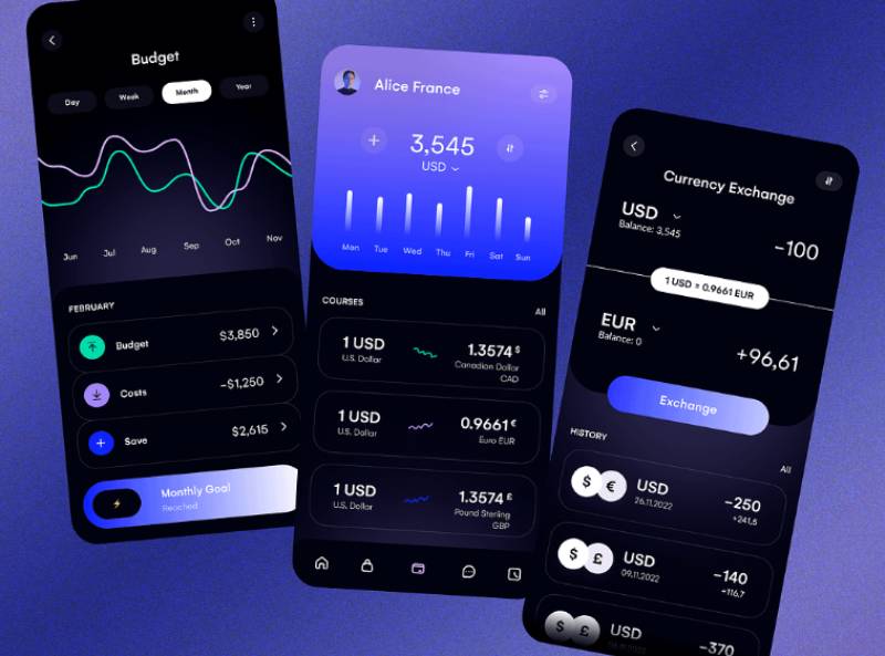
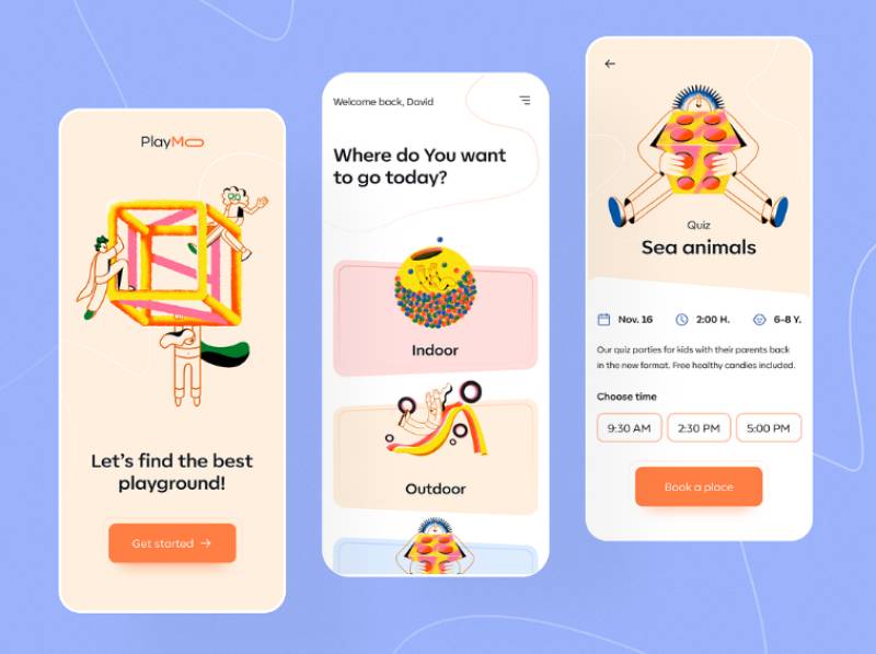
The concepts below are design explorations rather than shipped products, which is what makes them worth a look here: none of them are working around a compliance review, a core banking integration, or a legal team’s copy requirements. Watch how each one handles the primary balance figure, where the authentication step sits, and how much detail the dashboard holds back until it’s asked for.






FAQ on Finance App Design
How much does finance app design cost?
Design alone, covering wireframes and high-fidelity mockups, typically runs $5,000 to $25,000, according to 2025 estimates from Moweb. Most fintech teams put 10 to 15% of a total MVP budget toward UI/UX work (Netguru).
How long does it take to design a finance app?
Timelines range from about three months for a minimal viable product to over nine months for a full banking platform, per 2026 estimates from Creole Studios. Compliance review tends to add time on top of that, and it’s rarely a small amount.
What’s the difference between UX design and UI design in a finance app?
The split between a UI designer and UX designer matters here too, maybe more than usual. UX is the logic underneath everything: the onboarding flow fintech users actually move through, and why it works the way it does. UI is more concrete. It’s the buttons, the colors, the typography, all the stuff a designer physically ships.
Does a finance app need separate designs for iOS and Android?
Mostly no. Layouts, color, and typography stay basically consistent across both platforms. Navigation is where it splits: iOS leans on bottom tabs plus the back-swipe gesture people are used to by now, while Android usually sticks with a visible back button and whatever Material Design conventions the app follows.
Should finance apps use dark mode?
Most do, as an option rather than a default. Dark mode reduces eye strain during evening use and lowers OLED battery drain, but new users usually default to light mode anyway, since red and green loss indicators read more clearly there.
How do finance apps handle offline access?
Most cache the last-loaded account balance display and recent transaction history, so users see something instead of a blank screen. Anything that actually moves money, like a transfer or bill pay, still needs a live connection to confirm.
How often should a finance app redesign its interface?
Most fintech teams ship smaller interface updates continuously and save a full visual overhaul for major rebrands or platform migrations. Regulatory changes, like a new disclosure requirement, often force updates outside of any planned cycle anyway.
What role does user testing play in finance app design?
Usability testing catches confusing balance displays and unclear error states before they ever reach production. Fintech teams typically test identity verification and payment app design flows separately, since one failed step there can end an entire onboarding session on its own.
Where can I find real finance app design examples?
Curated user interface design examples collections are a faster reference point than screenshotting competitor apps one by one. They show patterns across dashboards, onboarding, and authentication screens side by side.
What fonts work best for a finance app?
Highly legible, low-personality typefaces work best here. A finance app is not the place for a display font. Reviewing fonts for apps built for numeral clarity is a good starting point before locking in a typeface.
Conclusion
Good finance app design earns trust one screen at a time, and the order matters more than the polish.
Fix identity verification and biometric authentication design before touching the dashboard. A beautiful spending tracker UI means little if the sign-up flow loses half its users first.
Treat WCAG 2.1 AA and PCI DSS as fixed constraints from the first wireframe, not patches bolted on after a complaint or an audit.
Every new screen answers the same basic question: does it make a money transfer interface or an account balance display easier to trust on sight?
Get the unglamorous parts right. Error states, the KYC verification flow, a working fintech design system, these are what outlast any seasonal redesign.

Renowned for his expertise in logo design and visual branding, Bogdan has developed a multitude of logos for various clients.
His skills extend to creating posters, vector illustrations, business cards, and brochures. Additionally, Bogdan's UI kits were featured on marketplaces like Visual Hierarchy and UI8.
He also wrote in the past years on sites like Design Your Way, WebDesignerDepot, WPDean, Designmodo, Speckyboy, Slider Revolution, and more.
- The Windsurf Logo History, Colors, Font, And Meaning - 10 October 2026
- How to Remove Background From Product Photos (No Photoshop) - 10 October 2026
- How Designers can Build a Stronger Online Creative Identity - 9 October 2026

Bogdan Sandu is a seasoned designer who has been designing websites since 2008. Renowned for his expertise in logo design and visual branding, Bogdan has developed a multitude of logos for various clients. His skills extend to creating posters, vector illustrations, business cards, and brochures. Additionally, Bogdan's UI kits were featured on marketplaces like Visual Hierarchy and UI8. He also wrote in the past years on sites like Design Your Way, WebDesignerDepot, WPDean, Designmodo, Speckyboy, Slider Revolution, and more.
You Might Also Like