In today’s mobile-centric world, designing a slick and secure mobile login form can be the difference between user retention and abandonment.
As more users demand seamless access to their digital experiences, the necessity for user-friendly, secure, and aesthetically pleasing mobile login screens becomes unequivocal.
Did you know that user authentication interfaces are often the first touchpoint where users decide whether to stay or leave? This article delves into captivating mobile login form design examples that illustrate the marriage of functionality and creativity.
By analyzing these modern login form designs, you’ll uncover not just templates but actionable insights into crafting mobile-friendly login screens that resonate with users.
Expect a comprehensive rundown covering responsive login pages, UX for mobile login, and the nuances of secure mobile login practices.
Prepare to transform your approach to mobile app design and elevate your user onboarding screens to a new level of excellence. Ready to rethink your login interface? Let’s dive in and explore these examples that set the standard for the industry.
The process is not exactly easy and involves a concrete understanding of a variety of psychological underpinnings for each practice you choose. Therefore, it is worth learning what is UI vs UX design and the detailed difference between them in the Ramotion blog.
in the end, you should produce an interface that excites users, rather than one that frustrates them. To make matters easier for you, we prepared a guide with several UX stardom strategies you should put into action:
Tips to design mobile forms
Include text input fields
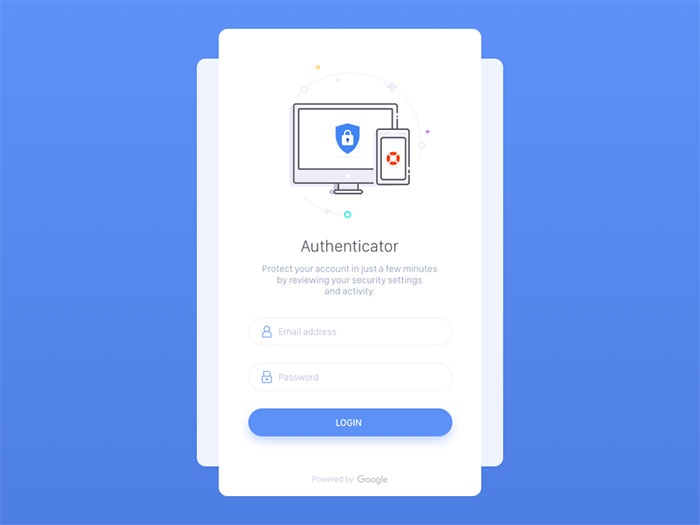
If users have to login in order to use your services, information fields are the primary features you have to work on to create a great UX. This means thinking carefully about your login form.
When constructing your login page design, make your fields visible and clear, and don’t force users to navigate around or take additional steps to enter the app. Once they launch the app, login pages are the first things they should see.
Bonus tip: Instead of going with the traditional ‘Login’ or Sign in’ buttons, be more creative and include direct input fields. Make sure the app will memorize their data so that they won’t always have to re-insert their information on the login templates.
‘Sign Up’ and ‘Sign In’ should not be put in the same section
Most of the time, we see Sign Up and Sign In buttons positioned close to each other on your login screen design, but this can have a reverse effect on users.
Both actions contain the same verb and look similar to each other, so they may confuse users who will choose the wrong option over the right one. With limited time and entry problems, they may get frustrated and leave the app. There is, therefore, a need to think carefully about your login design.
Basically, no element embedded in the app’s interface should make users pause and think. The best login page design should be clear, simple and concise.
If you want their experience to be spotless, divide these fields, and make the difference clearly visible. Additionally, you can use different verbs or explain in brief what each field is about.
Add different input fields in the Login and Registration sections
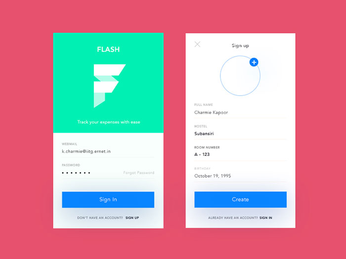
Another thing that confuses users except for the verb ‘Sign’ is the fact that both login and registration sections usually have the same number of input fields (usernames, passwords, and email addresses).
In order to distinguish them entirely, and to minimize the chance for new users to try to log in directly, use different input fields for your login forms.
Make the password visible
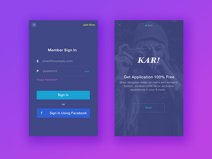
Another problem users frequently have is mistyping their password, as most of the password input fields are masked due to security reasons.
It happens even to the most experienced typists, especially when they’re logging in from mobile devices.
What you can do to prevent this is to include a ‘show password’ checkbox or icon next to the password field in your login page designs. Once users click on it, they’ll have the password unmasked and see where they got wrong. Mobile login pages with small keyboards are the perfect setting for such options.
Let them know what’s wrong
If the app detects a wrong combination of passwords and usernames but doesn’t report exactly what the problem is, the user may try numerous time and get angry enough to quit.
This is why your login UI should consider generic responses (for instance ‘Your password or email doesn’t match), and give them instant feedback on how to fix this problem.
Ask for email addresses or phone numbers instead of unique usernames
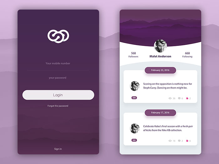
Why complicate your login screen template with usernames people barely remember? In cases like these, you will face many avoidable difficulties:
The username must be a unique one, which means people will repeatedly try to insert one the system doesn’t already have or end up using their real name.
After a while, the user comes up with a unique login name but forgets it only after a while because it doesn’t mean anything to him.
The best login pages present users with several login options, and giving them the chance to choose and try usernames without getting frustrated. A compulsory part of the process is to allow them to register using their email address or password.
Include a ‘Forgot Your Password?’ flow
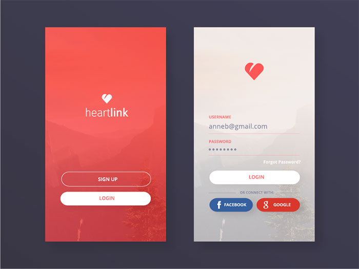
Forgetting passwords happens to all of us, which is why it is imperative for you to give users the chance to restore them and do so directly from the login page.
What it takes is to add a ‘Forgot Your Password’ link right under the input fields of your login form, and enable the system to send recovery codes to users’ emails or phone numbers.
Don’t lock users’ accounts without warning them
In order to avoid forced entry and brute attacks, many websites and apps lock out accounts after a series of mistyped attempts.
Security comes first, but you should at least try to warn users how many attempts they’ve got left before locking them out. You can also share extra details, such as the fact that it will take 10 minutes after the attempt to try again.
UI mobile login form inspiration
If in the past the apps were using the same login form with no style and customization.
According to TCA, a website design company in Sydney “Nowadays the best login screens have a unique login design. This is really important especially if you want to create a brand around your app and its services.”
Designers and developers as well are aware are acknowledging the importance of logical designs.
This is true, especially for mobile login screen design where the user interface plays a much bigger role than on regular ‘desktop’ websites. Mobile phones will need a responsive login form which is easy to use.
Designers are paying a lot of attention when designing this element, making sure the app login page design is both useful and aesthetically pleasing.
In this article, you will see examples of mobile user interface design inspiration to give you a hint on how a login form must be designed for mobile design.
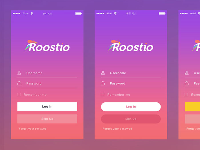
Roostio Login Screen
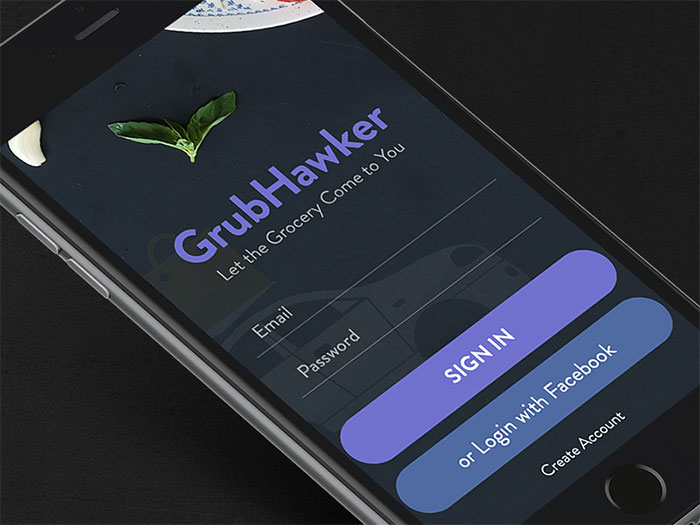
Login Screen
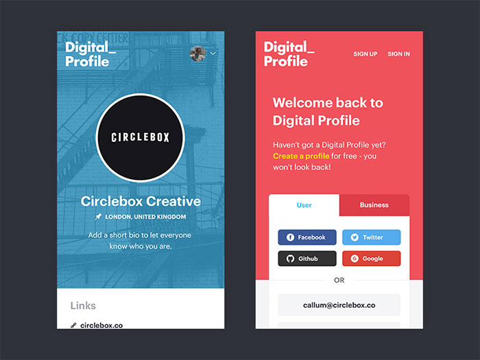
Job Board – Company Profile / Login
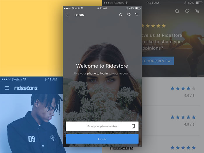
Shopping app
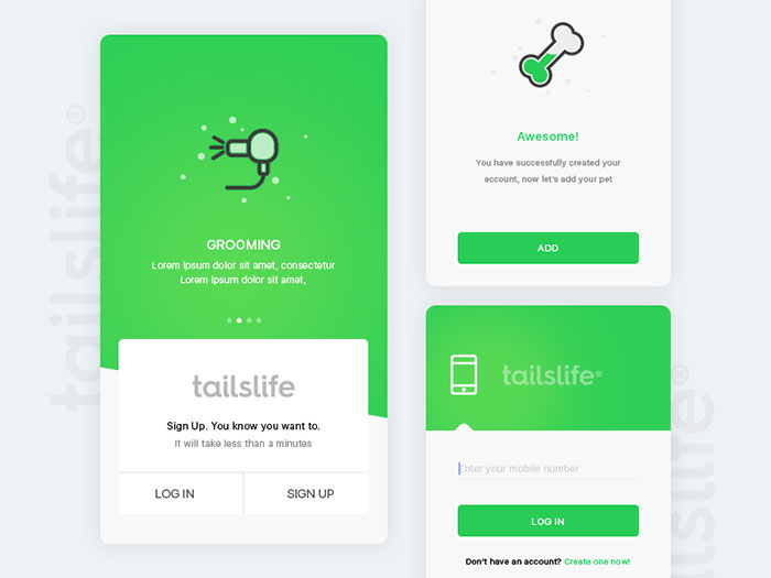
Tailslife: Login
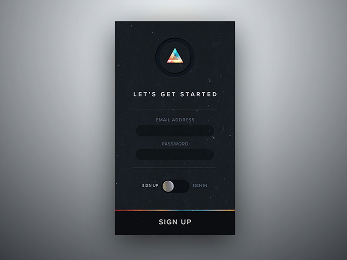
Moody Sign Up/In Screen
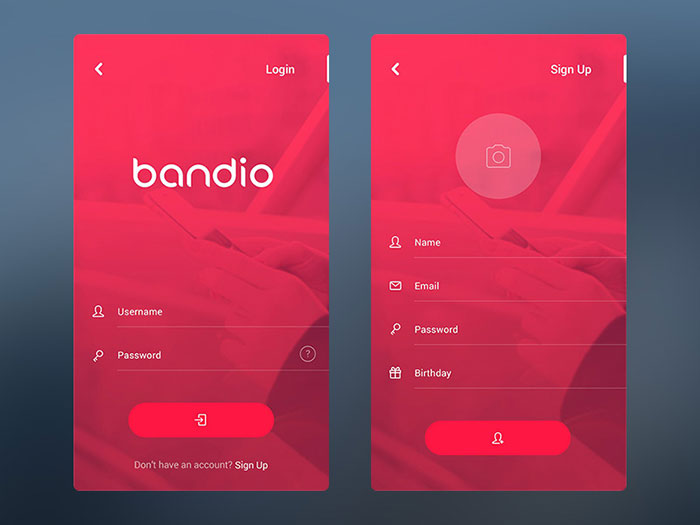
Bandio App Login & Sign Up
Parts – login dark side
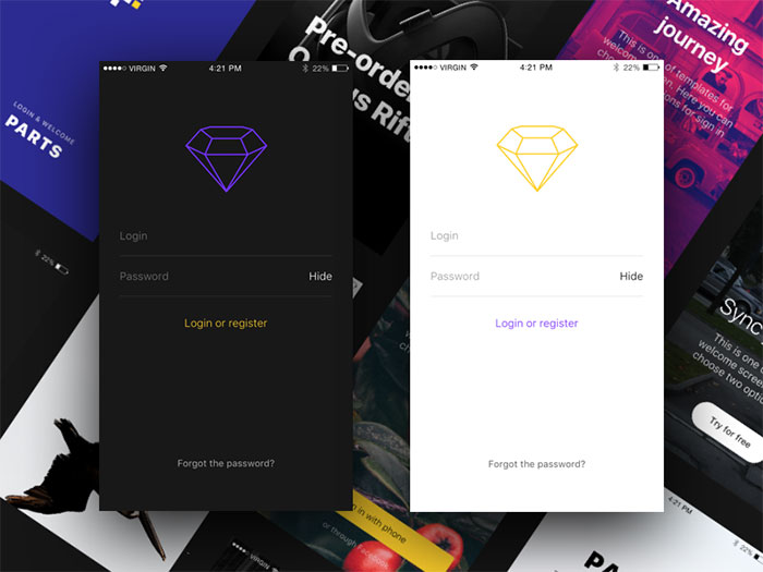
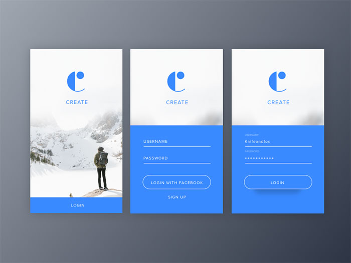
Login Screens
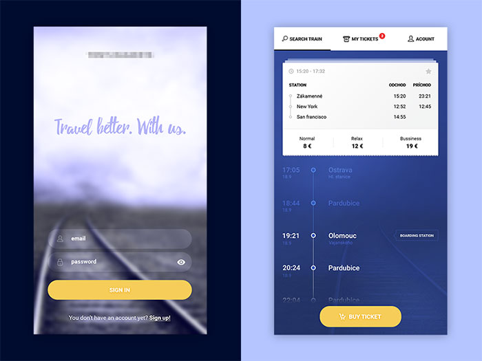
ZSSK – login and route detail
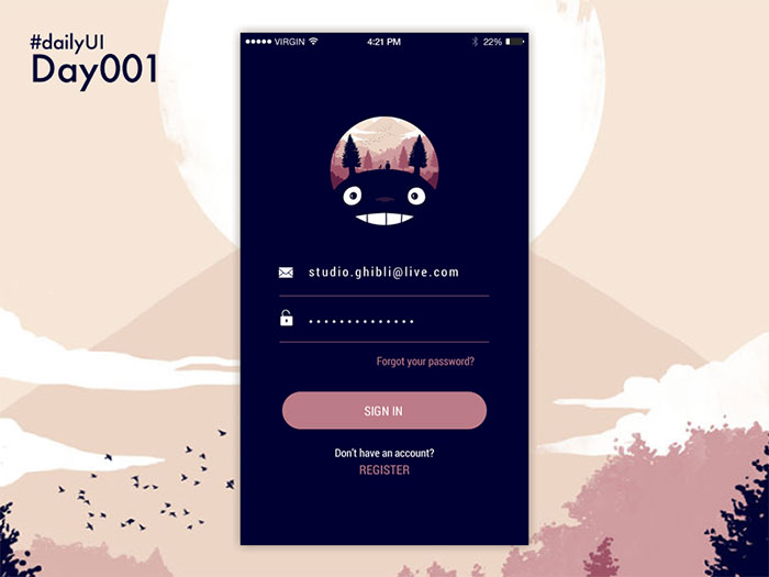
DailyUI Day001
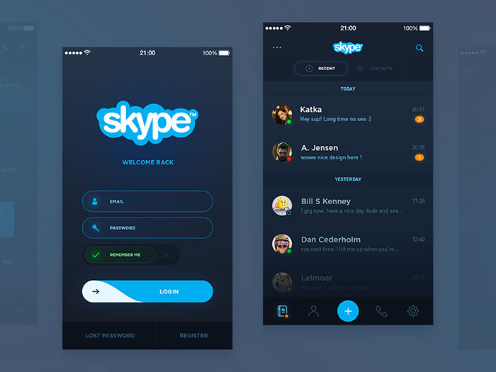
Skype Redesign
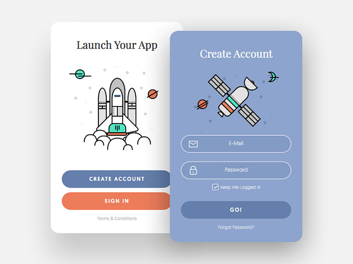
Sign Up Window – Daily UI #001
FAQ On Mobile Login Form Design Examples
What are the essential elements of a mobile login form design?
A mobile login form must include clear input fields for username and password, a prominent login button, optional “remember me” and “forgot password” links, and sometimes a social login option.
Ensure it’s mobile-friendly, with touch-friendly buttons and concise error messages for an optimal user experience.
How can I ensure my mobile login form is secure?
Security starts with using HTTPS to encrypt data. Implement features like two-factor authentication, passwordless authentication, and biometrics login.
Keep user data secure with strong server-side validations and use CAPTCHAs judiciously to protect against bots.
What role does UX play in mobile login forms?
UX for mobile login revolves around clarity, simplicity, and intuitive operations. Users should know what to do at a glance.
Reduce friction with automatic input focus, form validation techniques, and clear error messaging. A good UX reduces dropout rates and builds user trust.
How can I make my login form visually appealing?
Simplicity is key. Use a minimalist form design with ample white space and clear contrast. Incorporate branding elements subtly.
Ensure accessibility by using correct color contrasts and text sizes. The goal is both aesthetic appeal and functional effectiveness.
What are best practices for mobile login form accessibility?
Make sure form accessibility is top-notch with labels, ARIA attributes, and keyboard navigation support. Ensure that the forms are operable via voice commands and screen readers.
Use proper tab indexes and error messages that are easily understood by assistive technologies.
How do I integrate social login options?
Include social login buttons for popular platforms like Google, Facebook, and Apple. Ensure they are clearly visible and don’t overshadow the primary login fields.
Provide clear, concise guidance on what data is being shared and keep the process smooth to avoid user frustration.
How important is it to have a “forgot password” feature?
Vital. Users forget passwords often, so providing an easy-to-find “forgot password” link improves user onboarding screens and retention rates.
Offer a smooth recovery process via email or SMS. This feature is essential for a comprehensive user authentication interface.
What should I consider for form validation?
Effective form validation techniques ensure data integrity and security. Use both client-side and server-side validations to check data formats, required fields, and constraint lengths. Offer real-time feedback to users as they fill in their login details to prevent errors.
Where can I find inspiration for mobile login form designs?
Look at mobile login screen inspiration on design sites like Behance, Dribbble, and Pinterest. Study case studies and best practices shared by industry leaders.
Incorporate modern login form designs by analyzing what’s functional and aesthetic in top-ranked mobile apps.
How should I handle different screen sizes?
Create a responsive login page using flexible layouts and media queries to adapt the design across various devices.
Test on actual devices and use adaptive login design principles to ensure usability on different screen sizes, from small smartphones to large tablets.
Conclusion
Diving into mobile login form design examples reveals the intricate harmony between aesthetics and functionality essential for user retention. Crafting intuitive and secure login interfaces involves more than just creativity-it’s about fostering a seamless user experience.
From employing minimalist designs to ensuring robust form validation techniques, the examples explored provide a comprehensive guide for enhancing mobile-friendly login processes. Ensuring form accessibility and incorporating modern security measures like two-factor authentication and passwordless authentication elevate the usability and trustworthiness of your applications.
By studying top responsive login pages and integrating adaptive login design principles, you’re equipped to create interfaces that not only captivate but also support users across various devices and contexts.
Ready to transform your login forms? Implement these insights and watch your application’s user engagement soar.
In summary, these mobile login form design strategies offer a blueprint for developing intuitive, secure, and visually appealing authentication interfaces.
Transform your user onboarding screens and set new standards in mobile login interface design.

Renowned for his expertise in logo design and visual branding, Bogdan has developed a multitude of logos for various clients.
His skills extend to creating posters, vector illustrations, business cards, and brochures. Additionally, Bogdan's UI kits were featured on marketplaces like Visual Hierarchy and UI8.
He also wrote in the past years on sites like Design Your Way, WebDesignerDepot, WPDean, Designmodo, Speckyboy, Slider Revolution, and more.
- How Designers can Build a Stronger Online Creative Identity - 9 October 2026
- Minecraft Font Generator - 8 October 2026
- How Top Meta Ad Creative Is Designed for E-commerce Brands - 8 October 2026

Bogdan Sandu is a seasoned designer who has been designing websites since 2008. Renowned for his expertise in logo design and visual branding, Bogdan has developed a multitude of logos for various clients. His skills extend to creating posters, vector illustrations, business cards, and brochures. Additionally, Bogdan's UI kits were featured on marketplaces like Visual Hierarchy and UI8. He also wrote in the past years on sites like Design Your Way, WebDesignerDepot, WPDean, Designmodo, Speckyboy, Slider Revolution, and more.
You Might Also Like