Most app typography decisions happen in five minutes and cost months of user experience problems.
Choosing the best fonts for apps is not a stylistic preference. It is a structural decision that affects legibility at 12px, rendering across Android and iOS, dark mode performance, and whether your typography system holds up at every weight in the hierarchy.
This guide covers 10 typefaces tested against real mobile UI conditions, with technical specs, weight ranges, variable font support, license types, and pairing recommendations for each.
By the end, you will know exactly which font suits your app category, why system fonts like SF Pro and Roboto behave differently from loaded custom fonts, and how to make the choice without guessing.
The Best Fonts For Apps
Picking the right font for your app is one of those decisions that quietly affects everything. Readability, hierarchy, load time, dark mode rendering. Get it wrong and users bounce without knowing why.
Below are 10 fonts that hold up in real app UI conditions: small sizes, varied screen densities, cross-platform rendering, and tight hierarchy constraints.
| Font | Classification | Best For | Variable | License |
| Inter | Geometric sans-serif | Cross-platform UI, dashboards | Yes | OFL (Free) |
| Roboto | Neo-grotesque sans-serif | Android apps, Material Design | Yes | OFL (Free) |
| SF Pro | Neo-grotesque sans-serif | iOS / macOS native apps | Yes | Restricted (Apple dev only) |
| Open Sans | Humanist sans-serif | Multilingual, body-heavy apps | Yes | OFL (Free) |
| Poppins | Geometric sans-serif | Consumer apps, onboarding | No | OFL (Free) |
| Montserrat | Geometric sans-serif | Headings, branding-led apps | Yes | OFL (Free) |
| Lato | Humanist sans-serif | Corporate apps, long-form reading | No | OFL (Free) |
| DM Sans | Geometric sans-serif | SaaS, minimal UI, dark mode | Yes | OFL (Free) |
| Figtree | Geometric sans-serif | Consumer apps, friendly UIs | Yes | OFL (Free) |
| General Sans | Geometric sans-serif | Productivity, education apps | Yes | Free (personal & commercial) |
—
Inter
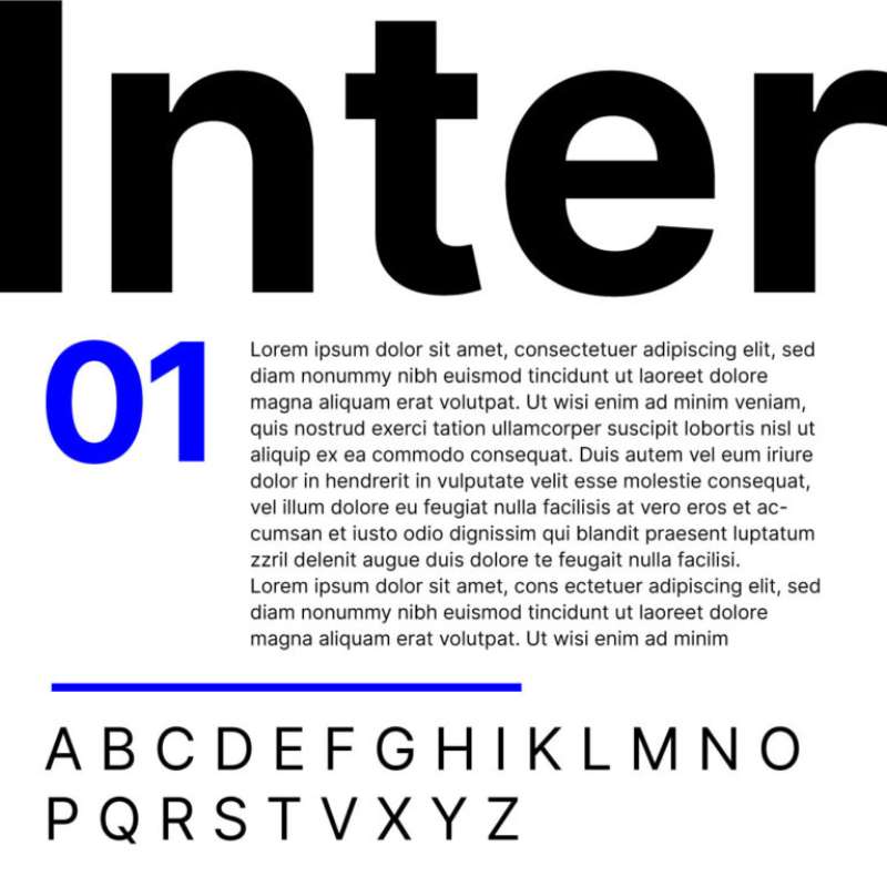
Inter is a geometric sans-serif font designed by Rasmus Andersson, first published in 2017 via Google Fonts. It was built from the ground up for screen rendering, covering 147 languages across 2000+ glyphs.
Inter suits cross-platform app interfaces because it carries a tall x-height (approximately 73% of cap height) that keeps lowercase characters distinct at 11px–14px. Products like Linear and Vercel use it as their primary UI typeface.
What makes Inter suitable for apps?
Inter has a variable optical size axis (opsz 14–32) that automatically adjusts letterform details based on render size. Its weight axis spans Thin 100 to Black 900 in a single variable file, eliminating the need for multiple static font loads. Open apertures in characters like “c,” “e,” and “a” reduce misread glyphs at small display sizes.
Key attributes:
| Attribute | Value |
| Classification | Geometric sans-serif |
| Designer | Rasmus Andersson, 2017 |
| Weight range | Thin 100 – Black 900 |
| Variable font | Yes (wght + opsz axes) |
| Optical sizes | Yes (opsz 14–32) |
| Recommended sizes | 11px–14px for labels; 16px–24px for body; 28px+ for headings |
| Letter-spacing default | 0 (tight at display sizes via opsz) |
| License | OFL – no restrictions |
| Available on | Google Fonts, Adobe Fonts, rsms.me |
| Price | Free |
How does Inter perform at small UI sizes?
Inter renders clearly at 11px on both high-DPI and standard screens. The opsz axis increases stroke weight and opens counters at small sizes automatically, reducing reliance on hinting. For dark mode interfaces, the Grade axis allows weight compensation without reflowing layouts.
What are the best pairings for Inter in apps?
Inter pairs with JetBrains Mono for developer tools and coding contexts, where monospaced alignment is needed for code blocks. It pairs with Merriweather when longer reading sections require serif contrast alongside clean UI elements.
Using Inter Display for headings alongside Inter Regular for body is also common practice in SaaS dashboards. That keeps the font load to a single variable file.
What are the limitations of Inter for apps?
Inter lacks native Devanagari and CJK support, which limits its use in South Asian and East Asian multilingual apps. The 2000+ glyph set still requires a supplementary font for non-Latin scripts.
Inter – Recommended Use Cases Within App Typography
- Best for: Navigation labels, data tables, admin dashboards, cross-platform web apps
- Avoid for: Apps requiring heavy Arabic or Indic script support
- Optimal weight: Regular 400 for body; Medium 500 for labels; Bold 700 for CTAs
- Optimal size range: 12px–14px for UI labels; 16px–18px for body text
—
Roboto
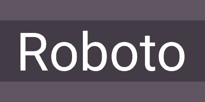
Roboto is a neo-grotesque sans-serif designed by Christian Robertson at Google, released in 2011 as the system font for Android. Redesigned in 2014 for Android 5.0 Lollipop, it now supports Thin 100 through Black 900 and covers Latin, Greek, and Cyrillic scripts.
Roboto together with Open Sans account for 51% of all Google Font views as of 2024, used on tens of millions of websites and apps globally (Wikipedia). It is the default system font on Android and powers Google services including Google Maps, YouTube, and Google Play.
What makes Roboto suitable for apps?
Roboto has a dual structure: a mechanical skeleton with geometric consistency, combined with humanist terminal details that keep characters approachable at small sizes. Its x-height sits at approximately 71% of cap height, comparable to Inter, giving it solid lowercase legibility at Android’s typical 12px–16px interface sizes. The single-story “a” and “g” distinguish it from more classical grotesques and improve character recognition in dense UI layouts.
Key attributes:
| Attribute | Value |
| Classification | Neo-grotesque sans-serif |
| Designer | Christian Robertson, 2011 |
| Weight range | Thin 100 – Black 900 |
| Variable font | Yes (Roboto Flex: 12 axes) |
| Optical sizes | Yes (Roboto Flex only) |
| Recommended sizes | 12px–16px for body; 20px+ for headings |
| Letter-spacing default | 0 |
| License | OFL – no restrictions |
| Available on | Google Fonts, Adobe Fonts |
| Price | Free |
How does Roboto perform at app UI sizes?
Roboto renders reliably across the full Android device spectrum, from low-DPI budget handsets to high-resolution tablets. Its letter spacing defaults are generous relative to Helvetica, which reduces crowding in dense list views and navigation menus. Roboto Flex introduces an optical size axis and 12 variable axes, making it one of the most technically capable free variable fonts available.
What are the best pairings for Roboto in apps?
Roboto Serif pairs naturally as a companion for long-form reading sections, sharing the same vertical metrics. Merriweather pairs well for editorial-style apps where the serif needs more character. Both fonts were designed with screen readability as a primary goal.
What are the limitations of Roboto for apps?
Roboto’s narrow apertures (compared to Inter or Open Sans) reduce its legibility on very low-DPI screens below 150ppi. The standard static Roboto family does not include an optical size axis; that requires switching to Roboto Flex, which has a larger file size and different interpolation behavior.
Roboto – Recommended Use Cases Within App Typography
- Best for: Android-native apps, Material Design systems, Google ecosystem products
- Avoid for: Body text below 12px on low-DPI screens
- Optimal weight: Regular 400 for body; Medium 500 for subheadings; Bold 700 for primary actions
- Optimal size range: 14px–18px for body; 20px–32px for headings
—
SF Pro (San Francisco)
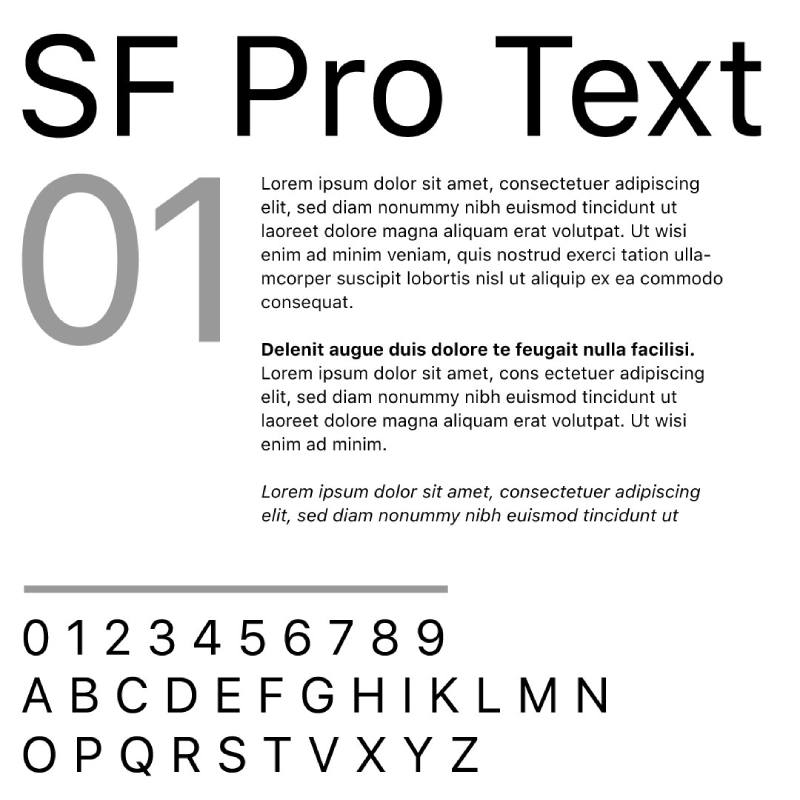
SF Pro is a neo-grotesque sans-serif designed in-house at Apple, first released to developers in November 2014. It functions as the system font across iOS, iPadOS, macOS, and tvOS.
SF Pro features nine weights, four widths, and variable optical sizes that automatically switch between SF Pro Text (below 20pt) and SF Pro Display (20pt and above). It supports over 150 languages across Latin, Greek, and Cyrillic scripts.
What makes SF Pro suitable for apps?
SF Pro’s automatic optical sizing is the standout structural feature. The system selects the correct variant based on the render size, without any manual developer intervention. SF Pro Text uses looser spacing, heavier strokes, and wider counters for legibility at small sizes. SF Pro Display tightens spacing and refines strokes for large headings. The Grade axis allows weight adjustment for dark mode without reflowing layouts.
Key attributes:
| Attribute | Value |
| Classification | Neo-grotesque sans-serif |
| Designer | Apple Inc., 2014 |
| Weight range | Ultralight – Black (9 weights) |
| Variable font | Yes (wght + opsz + wdth + GRAD axes) |
| Optical sizes | Yes – Text (≤19pt), Display (≥20pt); opsz range 9–144pt |
| Recommended sizes | SF Pro Text: ≤19pt; SF Pro Display: ≥20pt |
| Letter-spacing default | Automatically adjusted per optical size |
| License | Restricted – Apple developer license only; permitted only for Apple platform UI mockups and app development |
| Available on | Apple Developer portal (developer.apple.com/fonts) |
| Price | Free (restricted use) |
How does SF Pro perform in iOS app interfaces?
SF Pro integrates with Apple’s Dynamic Type system, allowing users to scale text across all supported apps while the font maintains correct proportions. The Bold Text accessibility setting shifts all system text to a heavier weight without breaking layouts. On Retina and ProMotion displays, SF Pro’s optical size axis produces noticeably cleaner rendering than third-party fonts loaded via @font-face.
What are the best pairings for SF Pro in apps?
SF Pro pairs with SF Mono for developer tools and code-facing features within iOS apps. For apps that mix editorial content with UI, New York (Apple’s companion serif) pairs structurally, sharing the same vertical metrics and optical size behavior.
What are the limitations of SF Pro for apps?
SF Pro is licensed exclusively for Apple platform development. It cannot be used in Android apps, web apps outside Apple platforms, or any non-Apple context. Designers using it outside of mockups for Apple platforms are in violation of the license terms.
SF Pro – Recommended Use Cases Within App Typography
- Best for: Native iOS and macOS apps using SwiftUI or UIKit; any app targeting Apple’s Human Interface Guidelines
- Avoid for: Cross-platform apps targeting Android or web; any non-Apple platform
- Optimal weight: Regular 400 for body; Semibold 600 for navigation; Bold 700 for headings
- Optimal size range: 13pt–17pt for body; 20pt–34pt for titles
—
Open Sans
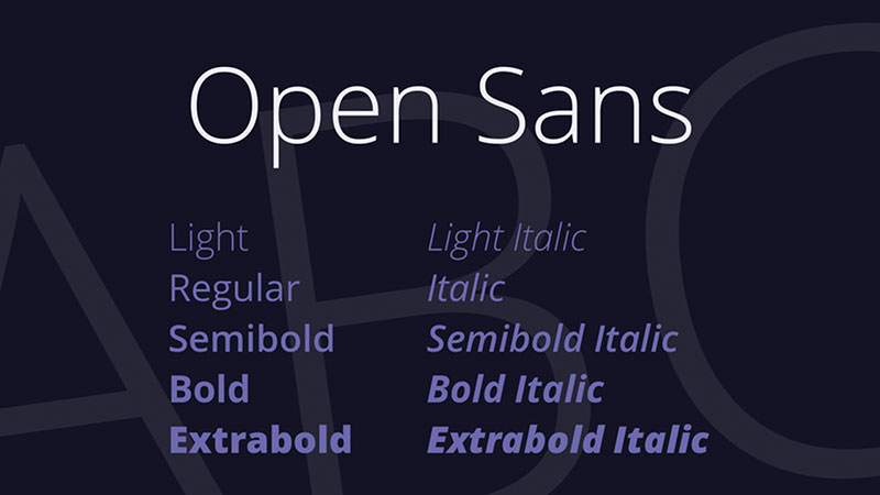
Open Sans is a humanist sans-serif designed by Steve Matteson (Type Director at Ascender Corp) and commissioned by Google, released in 2011. It covers 897 glyphs across Latin, Greek, Cyrillic, and Hebrew scripts.
Alongside Roboto, Open Sans accounts for 51% of all Google Font views as of 2024. It is one of the most deployed typefaces in web and mobile app history.
What makes Open Sans suitable for apps?
Open Sans uses wide, open apertures in characters like “c,” “e,” “a,” and “s” that keep letterforms distinct at small sizes. Its upright stress and neutral baseline make it highly legible across mixed-case UI text. The 2021 update added variable font support covering weights from Light 300 to Extra Bold 800, and Hebrew script support for right-to-left multilingual apps.
Key attributes:
| Attribute | Value |
| Classification | Humanist sans-serif |
| Designer | Steve Matteson, 2011 |
| Weight range | Light 300 – Extra Bold 800 |
| Variable font | Yes (Open Sans v2.0, 2021) |
| Optical sizes | No |
| Recommended sizes | 13px–17px for body; 20px+ for headings |
| Letter-spacing default | 0 (slightly open) |
| License | OFL – no restrictions |
| Available on | Google Fonts, Adobe Fonts |
| Price | Free |
How does Open Sans perform at app UI sizes?
Open Sans renders clearly on screen at sizes from 12px upward, with the open aperture design reducing character confusion in body-heavy interfaces. Its humanist construction gives it slightly more warmth than Inter or Roboto, which makes it a common choice for consumer-facing health, productivity, and communication apps. Tel Aviv University and Haaretz adopted the Hebrew extension, confirming its reliability in bidirectional app interfaces.
What are the best pairings for Open Sans in apps?
Open Sans pairs with Montserrat for heading contrast, a standard combination for consumer-facing product interfaces. It also pairs with Lora when longer reading sections need serif warmth alongside a neutral UI font. Both pairings are widely used in WordPress and mobile app contexts.
What are the limitations of Open Sans for apps?
Open Sans does not include an optical size axis, so it does not auto-adjust letterform details at very small sizes the way Inter or SF Pro do. It also lacks Devanagari and CJK support, limiting its scope in South Asian and East Asian market apps.
Open Sans – Recommended Use Cases Within App Typography
- Best for: Multilingual apps (Latin, Greek, Cyrillic, Hebrew), body-heavy reading experiences, consumer health apps
- Avoid for: Apps targeting CJK language markets; UI labels below 12px
- Optimal weight: Regular 400 for body; Semi-Bold 600 for navigation; Bold 700 for CTAs
- Optimal size range: 14px–17px for body; 22px–28px for section headings
—
Poppins
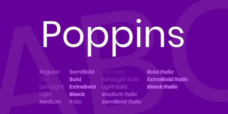
Poppins is a geometric sans-serif designed by Jonny Pinhorn at Indian Type Foundry, released on Google Fonts in 2014. It is one of the few geometric typefaces with simultaneous native support for both Latin and Devanagari scripts, making it a practical choice for apps targeting South Asian markets.
Poppins consistently ranks in the top ten most viewed font families on Google Fonts, with billions of weekly views. Its nine-weight range under a completely free OFL license has driven adoption across startup apps, SaaS products, and consumer interfaces globally.
What makes Poppins suitable for apps?
Poppins uses perfectly circular bowls and uniform stroke widths throughout the family. Its large x-height and even stroke weight maintain legibility at 14px–18px. The nine available weights (Thin 100 through Black 900) allow a complete typographic hierarchy from a single typeface, which reduces font load complexity in mobile apps. Proportional spacing is consistent enough to support both heading and body text roles without optical correction.
Key attributes:
| Attribute | Value |
| Classification | Geometric sans-serif |
| Designer | Jonny Pinhorn, Indian Type Foundry, 2014 |
| Weight range | Thin 100 – Black 900 (9 weights) |
| Variable font | No |
| Optical sizes | No |
| Recommended sizes | 14px–18px for body; 24px+ for headings |
| Letter-spacing default | 0 to slightly wide |
| License | OFL – no restrictions |
| Available on | Google Fonts, Adobe Fonts |
| Price | Free |
How does Poppins perform in app interfaces?
Poppins performs well in consumer-facing apps where a friendly, modern tone is part of the brand. Its rounded circular forms render consistently across Android and iOS screens. Below 13px, the perfectly circular letterforms can lose some distinction between similar characters, so it works better in apps where body text stays at 14px or above.
What are the best pairings for Poppins in apps?
Poppins pairs with DM Sans for body text in minimal UI designs, where DM Sans’s slightly more open apertures complement Poppins’s rounded geometry at smaller sizes. It also pairs with Lora for apps that mix UI screens with editorial or long-form reading content.
What are the limitations of Poppins for apps?
Poppins is not available as a variable font, which means loading multiple static weight files increases HTTP request overhead. At body text sizes below 13px, the uniform stroke contrast reduces character distinction compared to humanist alternatives like Open Sans or Lato.
Poppins – Recommended Use Cases Within App Typography
- Best for: Consumer apps, onboarding flows, fintech UIs, apps targeting Latin and Devanagari language markets
- Avoid for: Dense data tables below 13px; apps requiring CJK or Arabic script
- Optimal weight: Regular 400 for body; Medium 500 for labels; Semi-Bold 600 for subheadings; Bold 700 for primary CTAs
- Optimal size range: 14px–18px for body; 24px–36px for headings
—
Montserrat
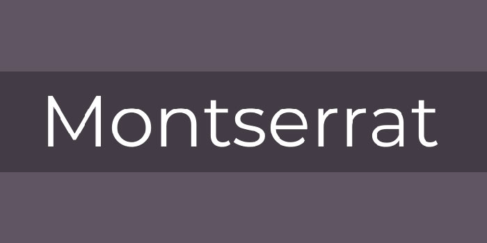
Montserrat is a geometric sans-serif designed by Julieta Ulanovsky, started in 2010 and released on Google Fonts in 2011. It is used on over 19 million websites (Wikipedia). The design draws from early twentieth-century signage and hand-lettered typography in the Montserrat neighborhood of Buenos Aires.
Montserrat is available in 18 styles (9 weights plus matching italics) and includes a variable font implementation and Cyrillic script support.
What makes Montserrat suitable for apps?
Montserrat has a large x-height, wide apertures, and short descenders that contribute to legibility at display sizes. Its 9-weight range from Thin to Black, combined with a variable font file, supports complete heading hierarchies without loading multiple static fonts. Compared to purely theoretical geometric sans-serifs, Montserrat’s letterforms carry more character variation, which improves scanability in hero sections and large UI headings.
Key attributes:
| Attribute | Value |
| Classification | Geometric sans-serif |
| Designer | Julieta Ulanovsky, 2011 |
| Weight range | Thin 100 – Black 900 (9 weights) |
| Variable font | Yes |
| Optical sizes | No |
| Recommended sizes | 16px–20px for body (limited); 24px+ for headings |
| Letter-spacing default | Slightly wide |
| License | OFL – no restrictions |
| Available on | Google Fonts, Adobe Fonts |
| Price | Free |
How does Montserrat perform in app heading contexts?
Montserrat renders with strong visual presence at 24px and above. Its geometric boldness creates clear hierarchy in app headers, landing screens, and modal titles. At body text sizes below 16px, its slightly wider letter spacing and geometric construction can reduce reading flow compared to humanist alternatives designed specifically for small UI text. Using Montserrat Bold 700 to ExtraBold 800 for headings alongside a body-optimized companion produces the strongest results.
What are the best pairings for Montserrat in apps?
Montserrat pairs with Open Sans for a proven heading-body combination widely used in web and mobile design. It pairs with DM Sans when a more minimal, information-dense interface needs Montserrat’s heading impact alongside a cleaner body experience.
What are the limitations of Montserrat for apps?
Montserrat is not optimized for body text at sizes below 16px. Its slightly condensed proportions and geometric consistency reduce character distinction in dense UI elements like data tables and small labels. It works best when paired with a body-specific font rather than used alone across all hierarchy levels.
Montserrat – Recommended Use Cases Within App Typography
- Best for: App headings, hero screens, onboarding titles, branding-led UI sections
- Avoid for: Body text below 16px; dense data lists and navigation labels
- Optimal weight: Bold 700 – ExtraBold 800 for headings; Regular 400 for decorative subtext only
- Optimal size range: 24px–48px for headings; 16px–20px if used for body (with generous line height)
—
Lato
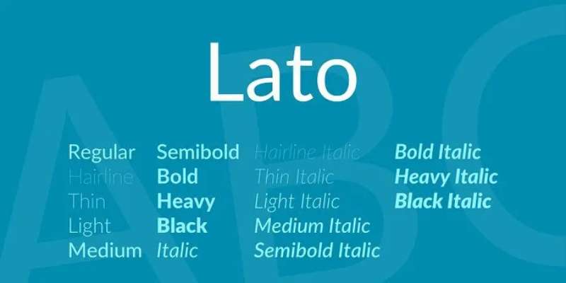
Lato is a humanist sans-serif designed by Warsaw-based type designer Łukasz Dziedzic, released in December 2010 under the OFL by his foundry tyPoland. The name means “Summer” in Polish. Lato supports 100+ Latin-based languages and 50+ Cyrillic-based languages, plus Greek and IPA phonetics.
It was originally designed as a corporate typeface for a large client. When that client changed direction, it became a public release. Good outcome for everyone.
What makes Lato suitable for apps?
Lato blends geometric structure with humanist details. Semi-rounded letter terminals give it warmth while the strong structural skeleton maintains legibility at small sizes. Its 5 base weights (Hairline, Light, Regular, Bold, Black) with matching italics provide enough range for basic app hierarchy. Lato 2.0 expanded to cover 3000+ glyphs per style. For multilingual apps serving European markets, Lato’s script coverage is one of its strongest practical advantages.
Key attributes:
| Attribute | Value |
| Classification | Humanist sans-serif |
| Designer | Łukasz Dziedzic, 2010 |
| Weight range | Hairline 100 – Black 900 (5 primary weights) |
| Variable font | No |
| Optical sizes | No |
| Recommended sizes | 13px–17px for body; 20px+ for headings |
| Letter-spacing default | 0 (slightly neutral) |
| License | OFL – no restrictions |
| Available on | Google Fonts, latofonts.com (v2.0) |
| Price | Free |
How does Lato perform in corporate app interfaces?
Lato Semi-Bold 600 handles subheadings and navigation labels with enough weight to create hierarchy without the heaviness of Bold 700. This makes it practical for enterprise apps with dense information architecture. Its neutral-yet-warm character works in healthcare, legal, and financial apps where professionalism matters but pure clinical coldness is a poor fit. Lato renders consistently across Latin and Cyrillic scripts, reducing fallback font issues in European multilingual deployments.
What are the best pairings for Lato in apps?
Lato pairs with Montserrat for apps needing a bold geometric heading alongside a warm body font. It also pairs with Merriweather for editorial or long-form reading sections, where the serif’s large x-height and screen optimization complement Lato’s warmth in body copy.
What are the limitations of Lato for apps?
Lato does not have a variable font implementation. Loading five separate weight files adds HTTP overhead compared to Inter or DM Sans, which ship as single variable files. The weight range also skips the Medium 500 step, which forces apps to choose between Regular 400 and Bold 700 for mid-hierarchy elements.
Lato – Recommended Use Cases Within App Typography
- Best for: Enterprise apps, corporate tools, multilingual European apps, healthcare and legal interfaces
- Avoid for: Performance-critical apps loading multiple font weights; apps needing CJK or Devanagari script
- Optimal weight: Regular 400 for body; Semi-Bold 600 for navigation; Bold 700 for primary headings
- Optimal size range: 14px–17px for body; 20px–28px for section headings
—
DM Sans
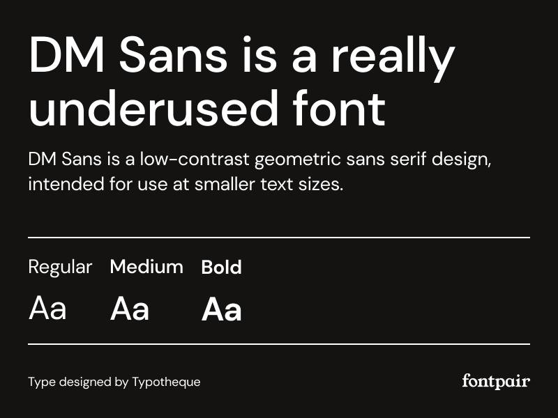
DM Sans is a geometric sans-serif designed by Colophon Foundry, originally created for Google’s DeepMind project. The 2023 update converted it to a variable font with weight (100–700) and optical size axes, making it one of the few Google Fonts entries with a genuine opsz implementation.
DM Sans is a quiet typeface. Where Poppins or Nunito read as friendly, DM Sans stays neutral enough to work in interfaces that need to be taken seriously.
What makes DM Sans suitable for apps?
The opsz axis in DM Sans adjusts letterform details for different render sizes, opening counters slightly at small sizes and refining strokes at display sizes. Its low stroke contrast and geometric structure render consistently in dark mode interfaces, where high-contrast typefaces can create visual noise. The weight axis spans 100–700, covering the range most app interfaces need without the Black weights that can overpower clean UI layouts.
Key attributes:
| Attribute | Value |
| Classification | Geometric sans-serif |
| Designer | Colophon Foundry |
| Weight range | ExtraLight 100 – Bold 700 |
| Variable font | Yes (wght + opsz axes, 2023 update) |
| Optical sizes | Yes |
| Recommended sizes | 12px–16px for body; 20px+ for headings |
| Letter-spacing default | Slightly wide |
| License | OFL – no restrictions |
| Available on | Google Fonts, Adobe Fonts |
| Price | Free |
How does DM Sans perform in minimal and SaaS app interfaces?
DM Sans achieves geometric clarity without the naivety of fully circular fonts like Poppins. This makes it a strong match for SaaS dashboards, admin tools, and developer-facing products. Its low-contrast construction holds up well in dark mode without visual vibration, and the optical size axis means a single variable file handles both 12px labels and 32px headings with appropriate adjustments.
What are the best pairings for DM Sans in apps?
DM Sans pairs with DM Serif Display for apps that need a sharp editorial contrast between heading and body, sharing the same design family for visual coherence. It also pairs with Poppins for consumer-facing products where DM Sans handles small UI text and Poppins brings rounded character to larger headings.
What are the limitations of DM Sans for apps?
DM Sans’s weight axis tops out at Bold 700, which limits options for apps needing heavy Black-weight display text. It also lacks Cyrillic and CJK support, narrowing its use for apps targeting Eastern European or Asian markets.
DM Sans – Recommended Use Cases Within App Typography
- Best for: SaaS dashboards, minimal UI apps, dark mode interfaces, developer tools
- Avoid for: Apps needing Black 900 weight headings; Cyrillic or CJK multilingual apps
- Optimal weight: Regular 400 for body; Medium 500 for labels; SemiBold 600 for headings
- Optimal size range: 12px–16px for body; 20px–32px for headings
—
Figtree
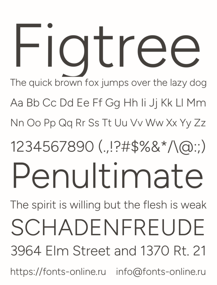
Figtree is a geometric sans-serif designed by Erik Kennedy, introduced in 2022 and available through Google Fonts. It ships as a variable font with 7 weights (Light 300 to Black 900) and supports over 280 Latin languages.
Kennedy is better known as a UI design educator. Figtree came directly from the need to fill a gap he saw in the free font space: a geometric sans-serif with circular forms and a warm double-storey “g” that doesn’t feel sterile. That very specific brief is actually why it works.
What makes Figtree suitable for apps?
Figtree’s open apertures improve character distinction at 12px–16px. Its high x-height relative to cap height keeps lowercase text legible at small display sizes. The double-storey “g” and curved “t” terminals prevent character confusion in UI labels where characters like “a,” “g,” and “q” are often misread in purely monolinear geometric fonts. Its variable weight axis covers 7 stops from Light to Black in a single file.
Key attributes:
| Attribute | Value |
| Classification | Geometric sans-serif |
| Designer | Erik Kennedy, 2022 |
| Weight range | Light 300 – Black 900 (7 weights) |
| Variable font | Yes |
| Optical sizes | No |
| Recommended sizes | 16px+ for body; 24px+ for headings |
| Letter-spacing default | 0 |
| License | OFL – no restrictions |
| Available on | Google Fonts, Adobe Fonts |
| Price | Free |
How does Figtree perform in consumer app UI?
Figtree renders clearly in modern app interfaces where the goal is warmth without losing structure. It has an accessibility grade of approximately 85% in legibility testing (TypeSmith), with distinct letterforms that reduce confusion between similar characters like “I,” “l,” and “1.” At 16px and above, it holds body text readability without eye strain. Below 14px, its relatively narrow apertures compared to Open Sans can reduce clarity on low-DPI screens.
What are the best pairings for Figtree in apps?
Figtree pairs with Inter for apps that need Figtree’s warmth in headings and Inter’s technical precision in dense data layers. It also pairs with a classic serif font for editorial apps where the contrast between geometric sans and humanist serif adds reading rhythm to longer content sections.
What are the limitations of Figtree for apps?
Figtree does not include an optical size axis, so it does not auto-adjust at very small sizes. Its weight axis also lacks the ExtraLight 200 and Thin 100 steps that some apps use for large, lightweight display headings. Korean, Japanese, and Chinese scripts are not supported.
Figtree – Recommended Use Cases Within App Typography
- Best for: Consumer apps, lifestyle and wellness apps, onboarding flows, friendly brand interfaces
- Avoid for: Dense data apps with text below 14px; apps needing CJK language support
- Optimal weight: Regular 400 for body; SemiBold 600 for subheadings; Bold 700 for headings
- Optimal size range: 16px–20px for body; 24px–40px for headings
—
General Sans
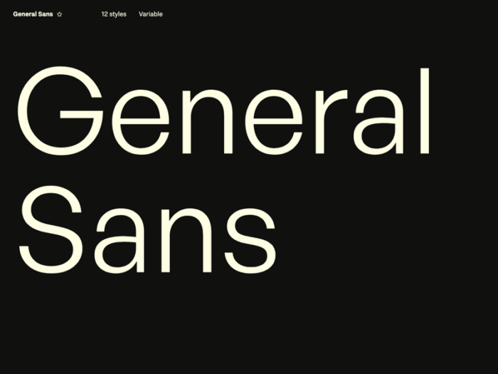
General Sans is a geometric sans-serif designed by Frode Helland at Fontshare (Indian Type Foundry’s free font platform), released in 2022. It supports 5 weights from Light to Bold and comes as a variable font. It is free for both personal and commercial use via Fontshare.
General Sans has picked up serious traction in 2025 among education and productivity app designers looking for an Inter alternative that feels slightly more approachable without losing structure.
What makes General Sans suitable for apps?
General Sans uses a low stroke contrast and neutral letterforms that prioritize readability over personality. Its moderate x-height sits between Inter’s tall x-height and the more compact proportions of classic grotesques, giving it strong legibility in the 13px–18px range most app body text occupies. The variable weight axis spans Light 300 to Bold 700 in a single file. It handles extended reading in educational and productivity contexts without the clinical tone of purely screen-optimized typefaces.
Key attributes:
| Attribute | Value |
| Classification | Geometric sans-serif |
| Designer | Frode Helland, Fontshare / Indian Type Foundry, 2022 |
| Weight range | Light 300 – Bold 700 (5 weights) |
| Variable font | Yes |
| Optical sizes | No |
| Recommended sizes | 13px–18px for body; 22px+ for headings |
| Letter-spacing default | 0 to slightly neutral |
| License | Free for personal and commercial use (Fontshare license) |
| Available on | Fontshare (fontshare.com) |
| Price | Free |
How does General Sans perform in productivity and education apps?
General Sans holds consistent rendering across iOS and Android without relying on system font fallback. Its neutral character works well in note-taking, task management, and e-learning interfaces where the typography should not compete with content. The moderate contrast level reduces eye strain in extended-reading sessions, making it a practical option for apps where users spend more than a few minutes reading at a time.
What are the best pairings for General Sans in apps?
General Sans pairs with Lora for educational apps that mix UI layers with long-form reading, where the serif’s screen-optimized structure complements General Sans’s neutral body treatment. It also pairs with Montserrat Bold for headings when a stronger visual contrast is needed between title and body.
What are the limitations of General Sans for apps?
General Sans’s weight axis tops out at Bold 700, which limits heading impact for apps that need heavy display text. It is only available through Fontshare, not Google Fonts or Adobe Fonts, which adds a dependency outside the standard font delivery infrastructure most app teams use. No CJK or Cyrillic support.
General Sans – Recommended Use Cases Within App Typography
- Best for: Productivity apps, note-taking tools, education platforms, reading-focused interfaces
- Avoid for: Apps requiring Cyrillic, CJK, or heavy Black-weight display text
- Optimal weight: Regular 400 for body; Medium 500 for labels; SemiBold 600 for subheadings
- Optimal size range: 13px–18px for body; 22px–32px for headings
What Makes a Font Work Well in an App?
A font works well in an app when it stays legible at small sizes, scales across weight variants without breaking hierarchy, and renders cleanly on both low and high-density screens.
The 3 core properties that separate a good app typeface from a poor one are x-height ratio, aperture openness, and weight range. Everything else is secondary.
How Screen Pixel Density Affects Font Choice
A font that looks sharp on a 460 PPI display (iPhone 15 Pro) can look muddy on a 160 PPI budget Android screen.
The difference comes down to how hinting instructions guide pixel placement at low resolutions. Fonts built without strong hinting, like many display typefaces, tend to fail below 250 PPI.
| Screen Type | PPI Range | Font Risk |
|---|---|---|
| Budget Android | 160–220 PPI | High: thin strokes break apart |
| Mid-range Android | 280–360 PPI | Medium: most quality fonts hold |
| iPhone / flagship | 400–460 PPI | Low: most fonts render cleanly |
Geometric fonts like Futura suffer most on low-density screens. Their perfectly circular Os and uniform strokes are the first things to fall apart at 160 PPI.
Humanist sans-serif fonts like Inter and Roboto were engineered with screen rendering in mind, and that shows in practice.
Why X-Height Matters More Than You Think
X-height is the single most important legibility factor for small UI text, more than overall type size.
A 2024 study presented at the Society for the Scientific Study of Reading found that x-height ratio directly influences letter recognition speed, particularly at sizes below 14px (Cooreman & Beier, 2024).
Washington Post research from a 2023 reading speed study confirmed that people over 35 read significantly faster when x-height is larger, with Montserrat (the highest x-height in their test) outperforming smaller x-height options.
- Inter x-height ratio: 0.73
- Roboto x-height ratio: 0.72
- SF Pro Text x-height ratio: 0.74
- Futura x-height ratio: 0.62 (notably lower, part of why it underperforms at small sizes)
A font with a 0.73+ x-height ratio at 14px effectively reads like a 0.62 x-height font at 17px. That matters in constrained UI layouts where you cannot just bump the size.
How Many Font Weights Does an App Actually Need?
4 weights minimum: Regular (400), Medium (500), SemiBold (600), and Bold (700).
Without these 4 distinct stops, you cannot build a real type hierarchy across Display, Headline, Body, and Label roles. You end up faking weight with font-size alone, which breaks spacing and density.
Variable fonts solve this cleanly. A single variable font file exposes the full weight axis (100 to 900), so you stop loading multiple static files and gain infinite intermediate weights.
How Do the World’s Most-Used Apps Handle Typography?
Major apps consistently choose humanist or geometric sans-serif typefaces with high x-heights, broad weight ranges, and native platform alignment. Serif and display fonts almost never appear in body text roles.
This is not coincidence. It reflects what survives user testing at scale.
Why Most Apps Avoid Serif Fonts in Body Text
Serifs create pixel aliasing problems below 16px on screens under 300 PPI. The fine horizontal strokes that define a serif font disappear or render as noise at small sizes.
Reading-focused apps are the exception. The Kindle app uses Bookerly, a custom serif designed by Monotype specifically for extended reading on e-ink and LCD screens. That is a deliberate choice for long-form content, not UI text.
For navigation labels, button text, captions, and body copy under 18px, sans-serif fonts outperform serifs on every common mobile screen type.
Platform-Specific Font Conventions on iOS vs. Android
Apple and Google each ship a default system typeface with the OS. Using them adds zero bytes to your app bundle.
| Platform | System Font | Key Advantage |
|---|---|---|
| iOS / macOS | SF Pro | 12 optical size variants, Dynamic Type support |
| Android | Roboto / Roboto Flex | Variable font, Material Design integration |
| Windows | Segoe UI Variable | Variable font since Windows 11 |
The Notion font is Inter, used consistently across its iOS, Android, and desktop apps. That cross-platform consistency is intentional. Inter was designed for screen legibility, not print, and it covers 500+ languages out of the box.
WhatsApp font defaults to SF Pro on iOS and Roboto on Android, following platform conventions rather than imposing a custom typeface. Doing this costs nothing and feels native immediately.
The Airbnb Typography Case Study
Airbnb commissioned a custom typeface in 2018 after years of using Circular.
The switch to Cereal, their proprietary family, gave them tighter control over spacing and weight rendering across iOS and Android simultaneously. The investment makes sense at their scale. For most apps, a well-chosen Google Font gets you 90% of the way there without the custom foundry cost.
What Is the Difference Between Free and Paid App Fonts?
The quality gap between free and paid fonts is real, but it is not always where people expect it.
The gap shows up in 3 specific areas: hinting quality at low resolutions, language coverage breadth, and OpenType feature completeness. Not in raw legibility at standard sizes.
Which Google Fonts Are Actually Used in Major Apps?
Google Fonts appears on about 54% of desktop sites and 47% of mobile sites as of 2025 (Web Almanac, 2024). That number has declined slightly as more developers choose to self-host, but the library remains dominant.
4 Google Fonts that hold up in production app environments:
- Inter: Designed specifically for screen rendering, 9 weights, covers 500+ languages. Used by Notion, Linear, and dozens of SaaS apps.
- Roboto: Android’s default font for over a decade. Roboto Flex (variable) adds continuous weight and width axes.
- Noto Sans: Specifically designed to render on small screens. Covers 800+ languages and scripts, making it the default choice for multilingual apps.
- Poppins: Geometric sans with rounded terminals. Higher at caption-level text than strict geometric alternatives like Futura.
All Google Fonts are released under the SIL Open Font License (or Apache 2.0 for fonts like Roboto). Both licenses allow commercial app deployment with no per-install fees, no royalties, and no user count restrictions.
When a Paid Font Is Worth It
Commercial typefaces from foundries like Monotype, Hoefler&Co, or Linotype charge separately for desktop, web, and mobile app licenses. App licenses typically scale with install count.
3 situations where the cost makes sense:
- Brand differentiation at scale: Spotify uses Circular (now transitioned to a custom family). Airbnb uses Cereal. The font becomes part of brand identity.
- Narrow language support needed with premium rendering: Some commercial families include better hinting for specific scripts (Arabic, Hebrew, Devanagari) than OFL alternatives.
- Extended OpenType features: Old-style numerals, contextual alternates, and discretionary ligatures that free fonts typically omit.
Congruence Market Insights data shows enterprises represent about 44% of total font usage globally, which explains why the commercial font licensing market remains substantial despite Google Fonts’ dominance.
Check font licensing specifics before deploying any commercial typeface in a shipped app. Desktop licenses do not cover app embedding. This mistake shows up constantly.
How Does Font Choice Affect App Performance?
Font loading directly affects Cumulative Layout Shift, First Contentful Paint, and total bundle size. These are not abstract concerns. Google’s own data shows that each 100ms increase in load time reduces conversions by 1%.
Variable Fonts in Apps: Worth It?
Variable fonts are now used on 33% of websites (HTTP Archive, 2024), up from 28% in 2022. iOS 16+ and Android 8+ both support them natively.
The performance case for variable fonts:
- 1 variable font file replaces 6–9 static weight files
- Fewer HTTP requests at app startup
- Continuous weight axis allows micro-adjustments without file overhead
- CSS
font-variation-settingscontrols weight, width, and optical size in a single declaration
The honest trade-off:
A variable font file is larger than a single static weight. If your app uses only Regular and Bold, 2 static files are actually faster than 1 variable file. The breakeven is typically 3 or more weights.
For apps using 4+ weights (which is most apps with a proper type scale), variable fonts reduce total font payload by roughly 30–50% in practice.
Font subsetting is the other performance lever. Removing unused Unicode ranges using tools like pyftsubset can reduce a full font file from 300KB to under 40KB for Latin-only deployments.
Fonts for mobile apps that lean on system defaults (SF Pro on iOS, Roboto on Android) add 0KB to the bundle. That is always the fastest option, just not always the right brand decision.
What Font Properties Matter for Accessibility in Apps?
Poor font choices are the most common cause of accessibility failures in apps, ahead of color contrast and touch target sizing.
WebAIM’s 2024 Million analysis found that color contrast issues affect 83.6% of all websites analyzed — and font weight is directly tied to contrast pass/fail thresholds.
Why Thin Font Weights Fail Accessibility Standards
WCAG 2.1 Level AA requires a minimum contrast ratio of 4.5:1 for normal text (below 18px or 14px bold). Large text drops to 3:1.
Thin font weights (100–300) fail this threshold regularly, even with high-contrast color pairs. A 200-weight stroke at 14px creates insufficient visual mass regardless of color.
Specific failures in common apps:
- Montserrat Thin at 13px on light gray backgrounds: fails 4.5:1 at most gray shades
- Futura Light in caption roles: stroke width drops below the threshold for clear letter recognition
- Any font at weight 300 in dark mode apps where developers underestimate background luminance shifts
The fix is not always color. Sometimes it is font weight. Switching from Regular (400) to Medium (500) at 14px body text can lift you from a borderline pass to a clear pass without touching the color palette.
How Dynamic Type and Scalable Fonts Work on iOS and Android
iOS Dynamic Type scales across 12 text sizes, from xSmall to AX5. SF Pro handles all 12 sizes without layout breaks because Apple designed the optical size variants (SF Pro Text for 20px and below, SF Pro Display for above 20px) to switch automatically.
Android scalable pixels (sp) are the equivalent system. Font sizes set in sp units scale with the user’s system font size preference. Setting body text in dp instead of sp breaks this, which is a common implementation mistake.
Fonts for accessibility that are explicitly designed for readability across sizes include Atkinson Hyperlegible (developed by the Braille Institute) and Lexie Readable, both of which exaggerate letter differentiation to reduce character confusion.
What About Dyslexia?
Research by Rello & Baeza-Yates (2016, ACM TACCESS) found that font type significantly affects reading speed for users with dyslexia, with fonts that have larger openings and weighted letter bottoms performing measurably better.
Fonts for dyslexia like OpenDyslexic use bottom-heavy letterforms to reduce letter rotation confusion. The design research behind them is sound, though mainstream readability studies show mixed results when applied to non-dyslexic users.
How Do You Choose the Right Font Pairing for an App?
Most successful apps use no more than 2 typefaces. More than that, and the interface starts to feel like a design portfolio rather than a product.
The 2-typeface rule is not a stylistic preference. It is a maintenance decision. Every additional typeface adds licensing checks, file size, and rendering edge cases.
Heading Fonts vs. Body Fonts: What Changes at Each Hierarchy Level
Material Design 3 defines 15 type styles across 5 roles: Display, Headline, Title, Body, and Label. Each role has distinct size, weight, and letter-spacing values.
| Role | Size Range | Typical Weight | Tracking |
|---|---|---|---|
| Display | 57–45px | Regular (400) | −0.25px |
| Headline | 36–24px | Regular or SemiBold | 0px |
| Title | 22–14px | Medium (500) | +0.1px |
| Body | 16–12px | Regular (400) | +0.15px |
| Label | 14–11px | Medium (500) | +0.1px |
At Display size (57px+), almost any quality typeface is legible. The font choice here is a brand decision, not a legibility decision. A display font with personality works fine at this scale.
At Label size (11–14px), legibility is everything. Use the same clean sans-serif you use for body text. No exceptions.
4 Proven App Font Pairings
Pairing 1: SF Pro + New York (Apple) Apple’s own combination. SF Pro handles all UI text. New York (their editorial serif) appears in longform reading contexts. Clean split, never confused.
Pairing 2: Inter + Playfair Display Common in editorial and fintech apps. Inter for all functional UI, Playfair Display for hero headings only. Works because the contrast is extreme, so users never mistake the roles.
Pairing 3: DM Sans + DM Serif Display The DM family was designed as a pairing from the start. Both share proportional logic, which means they sit together without fighting. DM Sans font pairing is one of the cleaner free options available right now.
Pairing 4: Nunito + Open Sans Used in apps targeting a general consumer audience. Both are rounded and approachable. Nunito font pairing suits health, education, and lifestyle apps where a formal tone is the wrong call.
Pairing fonts well comes down to one principle: contrast the roles, not just the styles. Heading font and body font should look obviously different in size and weight before you even consider family contrast. If your pairing only works at large sizes, it is not a real pairing.
Font spacing adjustments at the display level (tighter tracking) vs. body level (neutral or slightly open) reinforce hierarchy without changing the typefaces themselves. It is a detail that most apps skip, and it shows.
FAQ on The Best Fonts For Apps
What is the best font for mobile apps?
Inter is the strongest cross-platform choice. It was built for screen rendering, supports 9 weights in a single variable file, and maintains legibility at 11px. SF Pro is the better option for native iOS apps specifically.
What font does Android use by default?
Roboto is Android’s default system font, designed by Christian Robertson at Google in 2011. It renders natively across all Android devices with zero load overhead and covers Latin, Greek, and Cyrillic scripts out of the box.
What font does iOS use?
iOS uses SF Pro, Apple’s proprietary neo-grotesque sans-serif. It automatically switches between SF Pro Text below 20pt and SF Pro Display at 20pt and above, adjusting spacing and stroke weight for optimal legibility at each size.
Are Google Fonts good for apps?
Yes. Inter, Roboto, Poppins, Open Sans, DM Sans, and Montserrat are all on Google Fonts and perform well in mobile UI. All are licensed under the OFL, meaning no restrictions on commercial app development or distribution.
What is the most readable font for small screen text?
Inter and Open Sans lead on small-screen legibility. Both use wide apertures in characters like “c,” “e,” and “a” that reduce misread glyphs at 12px–14px. SF Pro Text is the top performer on Apple hardware specifically.
Should I use a variable font in my app?
Yes, where possible. A variable font replaces multiple static weight files with one, reducing HTTP requests and total load size. Inter, DM Sans, Roboto Flex, and Montserrat all ship as variable fonts.
What font works best for both Android and iOS apps?
Inter is the most practical cross-platform choice. It renders consistently on both platforms, carries a full 9-weight range in a variable file, and uses an OFL license with no platform restrictions. DM Sans is a strong alternative for minimal UI styles.
Can I use Poppins for app body text?
Poppins works for body text at 14px and above. Below that, its perfectly circular letterforms reduce character distinction. It is not available as a variable font, so loading multiple weights increases file overhead compared to Inter or DM Sans.
What font pairing works best for apps?
Montserrat Bold for headings with Open Sans Regular for body is a proven combination. For minimal SaaS interfaces, Poppins headings with DM Sans body text works well. Same-family pairings like Inter Display with Inter Regular eliminate the need for a second font file entirely.
Does font choice affect app performance?
Yes. Loading four static weight files adds more HTTP requests than a single variable font file. System fonts like SF Pro and Roboto have zero load cost. Custom fonts like Inter and DM Sans ship as compact variable files that minimize performance impact when self-hosted.
Conclusion
This conclusion is for an article presenting the best fonts for apps across every major UI category, from native iOS and Android to cross-platform SaaS dashboards and consumer-facing products.
Font selection is a technical decision. Variable fonts reduce load overhead, optical size axes improve small-screen legibility, and OFL licensing removes commercial deployment friction entirely.
Geometric sans-serifs like Inter and DM Sans handle most modern app typography needs. Humanist options like Lato and Open Sans cover multilingual interfaces and body-heavy reading experiences better.
Match classification to use case. Check the weight range, rendering behavior, and font licensing terms before committing to any typeface in production.
The right choice is not the most popular font. It is the one that performs at your app’s actual text sizes, on your users’ actual screens.

Renowned for his expertise in logo design and visual branding, Bogdan has developed a multitude of logos for various clients.
His skills extend to creating posters, vector illustrations, business cards, and brochures. Additionally, Bogdan's UI kits were featured on marketplaces like Visual Hierarchy and UI8.
He also wrote in the past years on sites like Design Your Way, WebDesignerDepot, WPDean, Designmodo, Speckyboy, Slider Revolution, and more.
- The Substack Logo History, Colors, Font, And Meaning - 2 October 2026
- How UX Design Impacts SaaS User Retention and Churn - 1 October 2026
- How to Embed Fonts in PDF for Reliable Printing - 30 September 2026

Bogdan Sandu is a seasoned designer who has been designing websites since 2008. Renowned for his expertise in logo design and visual branding, Bogdan has developed a multitude of logos for various clients. His skills extend to creating posters, vector illustrations, business cards, and brochures. Additionally, Bogdan's UI kits were featured on marketplaces like Visual Hierarchy and UI8. He also wrote in the past years on sites like Design Your Way, WebDesignerDepot, WPDean, Designmodo, Speckyboy, Slider Revolution, and more.
You Might Also Like