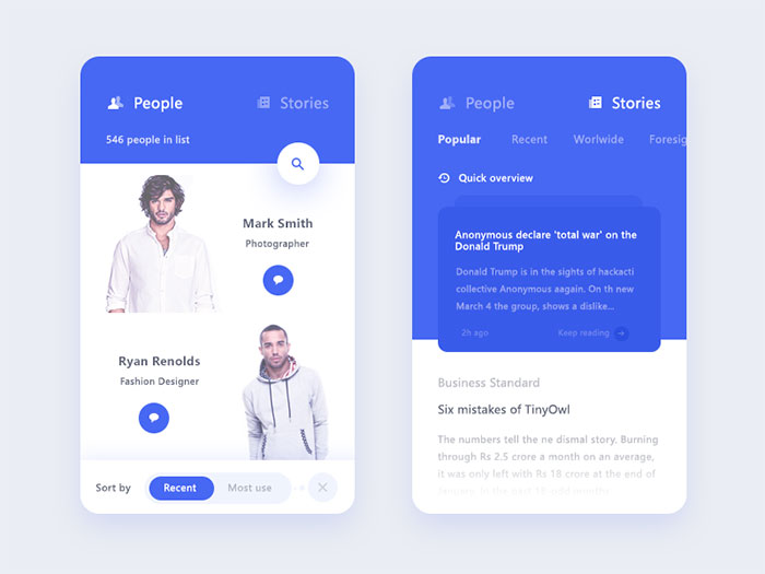
Nearly half of smartphone users hold their phone in one hand, tapping with a single thumb (Steven Hoober, 2013). That stat shaped mobile tab UI design years before anyone had a name for it, pushing navigation down into a strip your thumb can reach without shifting your grip.
Every major platform enforces the same limit today. Apple and Google both cap primary navigation at 3 to 5 destinations, and that’s not a stylistic choice. It’s built directly into their design systems.
Get it wrong and you’ll notice fast: buried sections, icons that don’t quite match what people expect. Users end up hunting through screens for something that should have taken one tap.
Fixing that comes down to a handful of decisions you can actually test, not guesswork.
What Is Mobile Tab UI Design
You’ve used this pattern hundreds of times without thinking about it. Tap the little house icon and you’re back home. Tap the bell and notifications open. The whole app reorganizes itself around a small row of buttons that never moves.
That row is what people mean by mobile tab UI design: a persistent set of selectable controls, usually icons paired with short labels, that let someone switch between an app’s top-level sections with one tap.
Apple built this into iOS as the UITabBar component. Google calls the same idea a bottom navigation bar inside Material Design. Different names, same underlying job.
The pieces that make up a tab bar borrow from ordinary graphic design principles, just applied to a strip of screen a thumb can reach.
- the icon, the main visual identifier for each section
- the label, one or two words confirming what the icon means
- the active state indicator, color, fill, or a pill shape marking the current tab
- the container, the bar itself, usually anchored to the bottom edge
Apple’s Human Interface Guidelines describe the tab bar as a way to put every top-level section on equal footing, rather than nesting sections behind extra taps. And tabs are for navigation only. Something that operates on the current screen belongs in a toolbar, not a tab.
What Are the Main Types of Mobile Tab Navigation
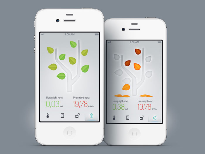
Most of what you’ll run into falls into a small set of patterns: the bottom tab bar, scrollable tabs, the segmented control, and pill-shaped filter tabs.
| Pattern | Item Count | Best For |
|---|---|---|
| Bottom tab bar | 3 to 5 | Top-level app navigation |
| Scrollable tabs | 6 or more | Category browsing |
| Segmented control | 2 to 4 | Toggling one view |
| Pill tabs | 4 to 10 | Filtering search results |
Bottom Tab Bar
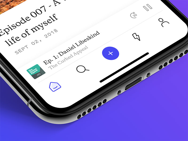
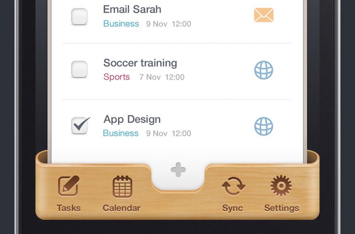
This is the default pattern for top-level navigation. It’s fixed at the screen’s bottom edge and stays visible no matter what screen you’re on. It holds 3 to 5 destinations of equal importance, and each one gets a symmetrical share of the bar’s width.
Instagram, Spotify, and Gmail all use it for primary navigation. Instagram and Spotify stick to 5 icons. Gmail’s bottom bar splits across 4 destinations instead (Gmail, Chat, Spaces, and Meet).
Apple’s Clock app is a good real-world reference here, four tabs: World Clock, Alarms, Stopwatch, and Timers. Apple cites it directly as an example in its own Human Interface Guidelines.
Scrollable and Segmented Tabs
Scrollable tabs exist for the problem a bottom bar can’t solve: too many categories to fit into five slots. X and YouTube both run horizontal, swipeable tab rows for content categories, letting the list run past the edge of the screen instead of forcing everything into an overflow menu.
The segmented control does something different. It toggles between 2 to 4 views of the same content, not different sections of the app, and it shows up constantly in weather apps (Today, Weekly) and messaging apps (Chats, Calls). It’s never used for top-level app navigation, only for switching a single view’s mode.
Airbnb’s search interface adds a related pattern worth naming on its own: rounded pill tabs that filter results by category inside one view, rather than switching between separate app sections.
When Should Tabs Be Used Instead of Other Navigation Patterns
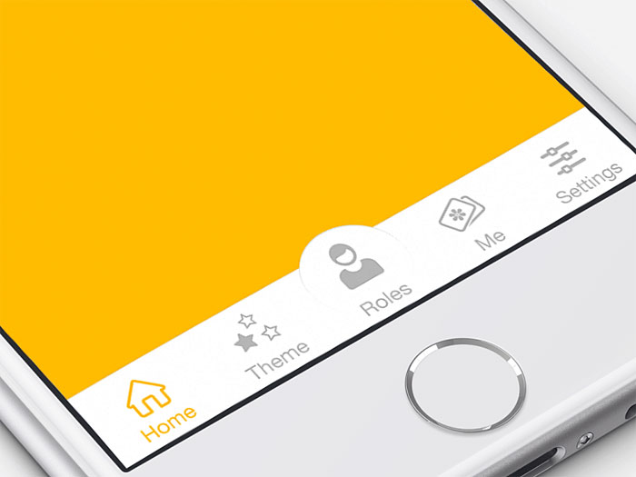
Nielsen Norman Group’s usability testing found that hiding navigation behind a menu icon cuts discoverability almost in half compared to keeping it visible (NN/g, 2016). That one finding explains most of the decision between a tab bar and a hamburger menu.
The choice really comes down to how many sections there are and how often people visit each one. A tab bar fits 3 to 5 destinations of equal, everyday importance. A hamburger menu works better for 6 or more secondary destinations people rarely open. A bottom sheet or modal handles a temporary, contextual action rather than an actual section of the app, and a navigation drawer suits deep, hierarchical structures, common on Android.
NN/g’s study ran across 179 participants and 6 live websites. Hiding navigation made task completion at least 39% slower on desktop compared with visible or partially visible navigation, and 15% slower on mobile against the partially visible (“combo”) condition. Fully visible navigation wasn’t tested on mobile in that study.
The gap shrinks on phones because thumbs are already anchored near the bottom of the screen. It never closes completely, though.
How Many Tabs Should a Mobile App Have
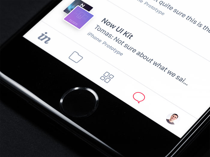
Three to five. Both major platforms land on the same number, independently of each other.
Apple’s Human Interface Guidelines cap the iPhone tab bar at 5 destinations before the trailing item collapses into a More tab. Material Design 3 sets an identical ceiling for its navigation bar, 3 to 5 destinations, with item widths scaling in proportion to however many tabs share the bar.
That overlap isn’t a coincidence. Steven Hoober’s 2013 field study of 1,333 observed smartphone users found 49 percent hold their phone one-handed, relying on the thumb as the primary pointer. Another 36 percent cradle the device in one hand while tapping with the other. The remaining 15 percent use a two-handed grip with both thumbs.
Five slots is roughly where a thumb’s natural arc stops covering the full width of the bar without a grip shift. Instagram runs 5 icons, Gmail runs 4, Spotify runs 5.
Push past five and the bar stops working as a reliable guide to the app. People lose confidence in it and start hunting through screens instead, which defeats the entire point of having a tab bar in the first place.
How Do iOS and Android Tab Design Guidelines Differ
iOS and Android agree on the 3 to 5 tab rule. Almost everything underneath that number is different.
| Attribute | iOS Tab Bar | Android Navigation Bar |
|---|---|---|
| Height | 49pt base height (83pt total on Face ID iPhones once the safe-area inset is included) | 80dp baseline, 64dp Expressive |
| Icon size | 25 x 25pt | 24 x 24dp |
| Label behavior | Always visible | Configurable: always, selected only, or hidden |
| Background | Translucent, blurred (Liquid Glass on iOS 26+) | Solid, tonal surface color |
iOS Tab Bar Specifications
On a standard-width iPhone screen (390 points logical width), the base UITabBar height comes in at 49 points, with icons set at 25 by 25 points. Face ID devices add a safe-area inset of roughly 34 additional points, bringing the total on-screen tab bar area to about 83 points. Either way, the bar clears Apple’s 44 point minimum touch target requirement with room to spare.
Every icon here runs on SF Symbols. They adapt automatically between regular and compact bar states, and because each symbol is a vector graphic, they stay sharp at any Dynamic Type size. Filled versus outline variants mark active tabs against inactive ones.
iOS 26 introduced a Liquid Glass redesign of the tab bar, including a floating accessory shelf above it for mini players and status indicators, rendered in its own separate glass layer.
Android Bottom Navigation Specifications
Material 3’s baseline navigation bar runs 80dp tall. The newer Expressive style trims that down to 64dp with a smaller active indicator (Material Design, Google).
Item width scales between an 80dp minimum and a 168dp maximum, dividing the bar’s total width by however many destinations it holds. Padding tokens control the exact white space around each icon, and Material’s baseline spec uses roughly 12dp above and 16dp below the icon in the default, non-Expressive style.
Icons run at 24 x 24dp, swapped between outlined and filled states depending on whether the tab is active. Active items get a pill-shaped indicator behind the icon. The ceiling is the same as iOS too, 3 to 5 destinations.
How Should Tab Navigation Adapt Across Screen Sizes and Devices
A tab bar built for a 6-inch phone falls apart on a tablet or a folded-open display. Both platforms swap the pattern entirely once the window gets wider.
| Window Width | Material Design Class | Navigation Pattern |
|---|---|---|
| Under 600dp | Compact | Bottom navigation bar |
| 600dp to 839dp | Medium | Navigation rail |
| 840dp and up | Expanded | Navigation rail or drawer |
iPad Sidebar Conversion
Apple redesigned this relationship in iPadOS 18. The tab bar moves to the top of the screen in portrait orientation and converts into a sidebar once you rotate to landscape.
Same tabs, different container depending on orientation. In portrait, a compact tab bar sits near the top next to other navigation controls. In landscape, the sidebar expands and shows labels alongside icons. Podcasts, Apple TV, and Apple Music shipped this pattern first, and third-party apps can now adopt the same UITabBarController-based sidebar support (MacRumors, 2024).
Apple’s own sidebar guidance favors a shallow hierarchy, so the list stays scannable instead of turning into a second app menu.
Android Navigation Rail
Android’s equivalent kicks in at the same 600dp threshold, where a compact bottom bar turns into a vertical rail running up the left edge of the screen. The rail defaults to 80dp wide in Material 3’s standard style, widening to 96dp in the newer Expressive style.
Compact windows under 600dp always use a bottom navigation bar. Material’s own guidance doesn’t carve out an exception for tablets running a narrow split-screen view either.
Medium windows, 600 to 839dp, use a single-pane layout with the rail sitting on the left. Expanded windows, 840dp and up, are wide enough for two-pane layouts to become viable.
How Should Tab Icons and Labels Be Designed
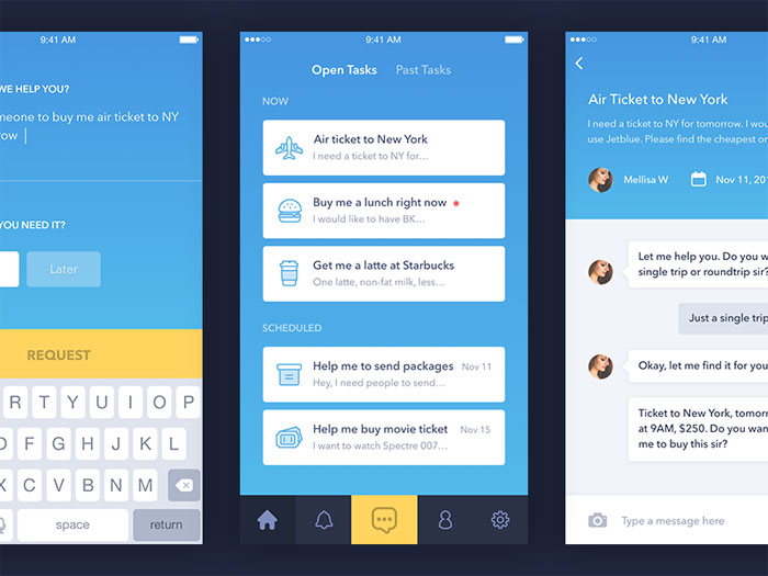
Consistency matters more than any single icon’s cleverness. Icon size stays at 25 x 25pt on iOS and 24 x 24dp on Android. Labels run one or two words with no punctuation, sentence case on Android. Pick one icon style, outline or filled, and hold it across every tab, never mix the two. State changes, a shift in color, fill, or weight, mark the active tab, which is really just basic emphasis applied to an icon.
Icon and label sit close enough together to read as one unit, a direct case of the Gestalt principle of proximity doing the grouping work instead of a border or box around them.
Labels almost always run in the platform’s default sans-serif typeface, San Francisco on iOS and Roboto on Android, chosen for legibility at 10 to 12 points.
Mixing labeled and unlabeled tabs in the same bar breaks the pattern people rely on to scan the row quickly. Every item needs the same treatment. No exceptions.
How Should Tab Bars Behave During Scrolling
A tab bar either stays fixed no matter what happens on screen, or it steps aside while someone scrolls and slides back once they stop.
Persistent bars never move. Hide-on-scroll bars work differently, they collapse heading down and reappear heading back up, leaning on movement to cue the shift rather than redrawing the whole bar.
Persistent fits Gmail-style productivity apps, banking apps, basically anything where losing the bar mid-task causes real friction. Hide-on-scroll shows up in Pinterest and most feed-based apps, where content volume matters more than constant access to navigation.
iOS 26 introduced a minimize behavior controlled by a single line of SwiftUI code, tabBarMinimizeBehavior, that lets developers shrink the tab bar down toward the active tab’s icon as someone scrolls.
In several apps that adopted this on iOS 26, the collapsed bar needed a tap just to restore full navigation before a second tap could actually switch tabs, which is clunky. Reporting on Apple’s iOS 27 update suggests it walks that back, keeping the bar at full width on screen and removing the extra tap, at least in apps like Music, Podcasts, News, and Apple TV (Aprenderhub, 2026). iOS 27 was still in public beta as of this writing, with general release expected in September 2026, so the final shipping behavior could still shift before launch.
How Are Badges and Notification Indicators Used on Tabs
A badge works because it’s small and hard to ignore, a deliberate focal point layered onto an icon that would otherwise blend into the row.
The dot badge is the simpler of the two, a plain circle that signals unread activity without any count attached. The numeric badge adds an actual number inside the circle, capped once it gets long enough to stop being readable.
Material Design 3 documents both as standard components for navigation items, alongside a large badge variant meant for longer labels (Material Design, Google). Most platforms, including eBay’s own design system, cap the visible number at 99, appending a plus sign once activity goes past that.
Color follows a simple rule. Red signals something urgent or unread, the app’s accent color signals routine status, a direct use of hue to carry meaning without adding extra shapes or text.
Badge content isn’t reliably announced by screen readers on its own, which is easy to miss if you’re not testing with one. Material Design’s accessibility guidance recommends pairing every badge with a label that names both the destination and the count, instead of leaving assistive technology to announce a floating, unexplained number.
What Accessibility Requirements Apply to Tab Navigation
A few specific WCAG criteria govern how a tab bar needs to behave to stay usable without sight or fine motor control.
| Criterion | Level | Requirement |
|---|---|---|
| 2.5.8 Target Size (Minimum) | AA | 24 x 24 CSS pixels minimum |
| 2.5.5 Target Size (Enhanced) | AAA | 44 x 44 CSS pixels minimum |
| 1.4.11 Non-text Contrast | AA | 3:1 icon contrast ratio |
WCAG 2.5.8 arrived with WCAG 2.2 in October 2023 (W3C). The stricter 2.5.5 figure, 44 by 44 pixels, matches Apple’s own touch target minimum and sits just under Android’s 48dp equivalent.
Icon contrast against the background has to clear the 3:1 ratio set by WCAG 1.4.11, added back in WCAG 2.1 (W3C, June 2018). The active state can’t rely on color alone either, it needs a fill change, a weight change, or an icon swap paired with it. And every tab needs a programmatically exposed role, label, and selected state for VoiceOver and TalkBack to pick up.
That last point breaks more often than it should. Deque’s accessibility research on Android found that the platform’s default TabWidget, read through TalkBack, announces only the tab’s text label, skipping its role and selected state entirely, a known gap that requires a custom-built tab layout to actually fix.
A sighted person sees which tab is active instantly, no effort involved. A TalkBack user gets none of that without a role or state announcement. The highlighted item doesn’t even register as interactive.
What Are Common Mistakes in Tab UI Design
Most tab bar problems trace back to one root cause: treating the bar as a dumping ground instead of a fixed set of top-level destinations.
- Running a hamburger menu next to a tab bar, giving users two competing systems for the same job
- Using a tab for a one-time action instead of a persistent section, a job a toolbar or a button already handles
- Mixing icon styles across tabs, some filled, some outlined, breaking the repetition that ties the set together
- Forcing every app into 5 tabs when the real structure needs more, then burying the rest in a cramped More screen
- Copying iOS visual conventions onto an Android layout, or the reverse, so neither platform’s users feel at home
The tab-plus-hamburger combination shows up most in large institutional apps, think banks like Chase and Bank of America, or government services like the UK’s HMRC and NHS apps, where dozens of legitimate sections genuinely don’t fit into five slots.
In that specific case, a well-organized hamburger menu next to a lean tab bar isn’t a mistake. It’s the least bad option available.
Which Tools Are Used to Design and Prototype Tab Navigation
Figma’s own documentation lists Apple’s iOS and iPadOS 26 UI kit and Google’s Material 3 Design Kit as enabled by default on Starter teams, with both also available as an opt-in on Professional, Organization, and Enterprise plans. That single fact covers most of a tab bar’s visual design, straight from the platform makers themselves.
- Figma, official UI kits for both platforms, plus community Material libraries when you need deeper customization
- SF Symbols, Apple’s free icon library and desktop app, now past 7,000 symbols and the direct source for pretty much every iOS tab bar icon
- Android Studio, includes the Material Theme Builder for testing navigation bar color tokens against real Material 3 components
- ProtoPie, handles the interactive states a static Figma file can’t, minimize-on-scroll, badge transitions, tab-switch animations
SF Symbols has grown past 7,000 individual symbols at this point, each one built as scalable vector artwork ready to drop straight into a tab bar, according to Apple’s own developer documentation.
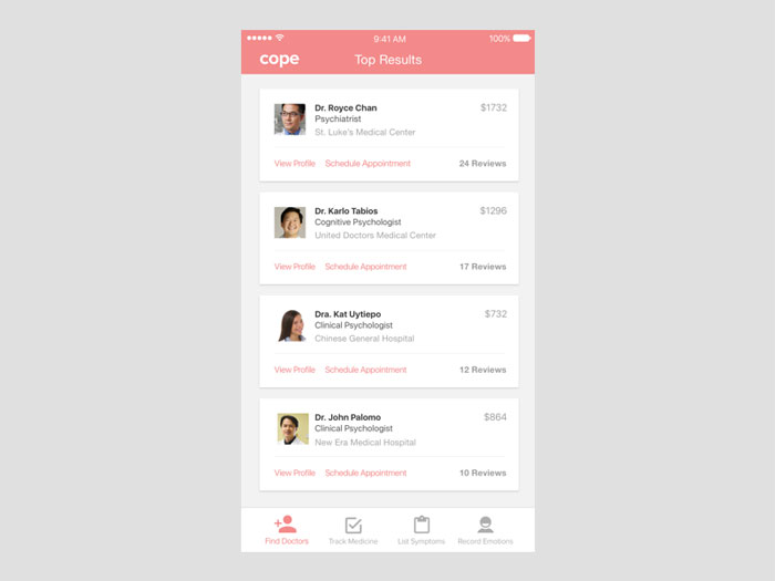
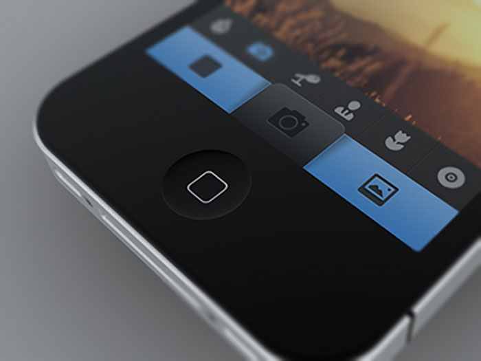
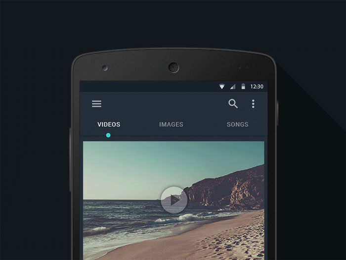
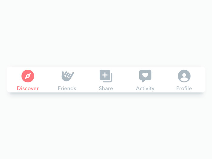
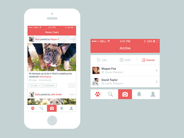
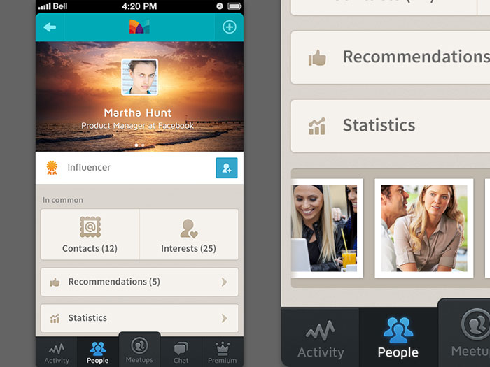
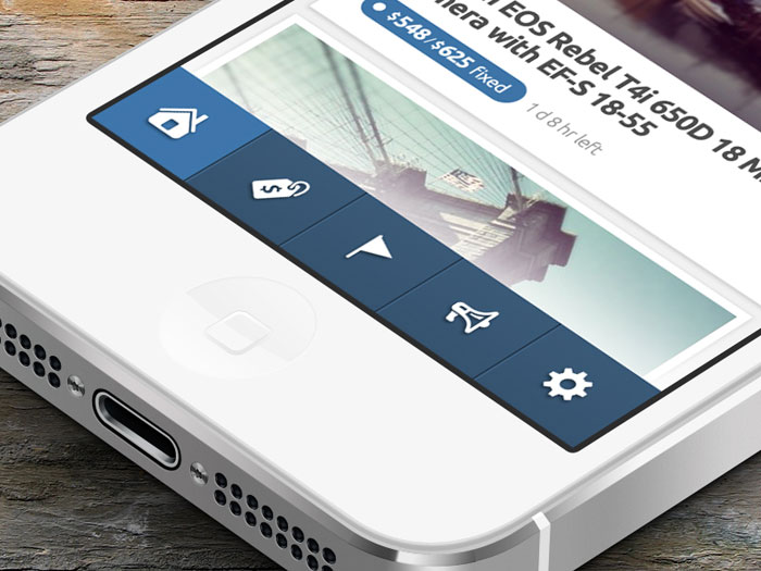
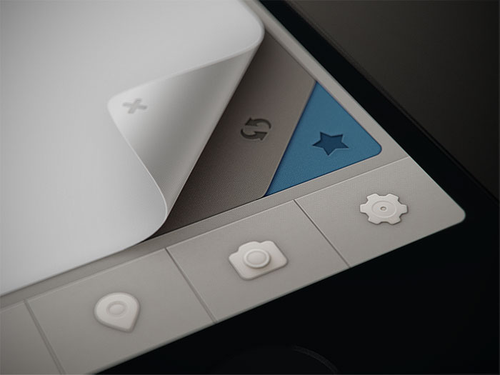
Mobile Tab Design Examples
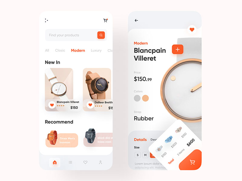
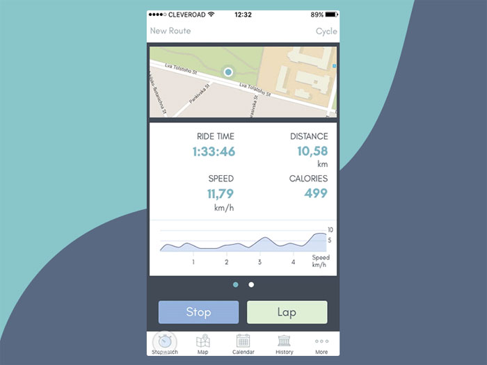
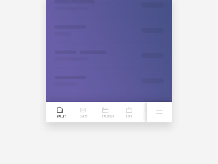
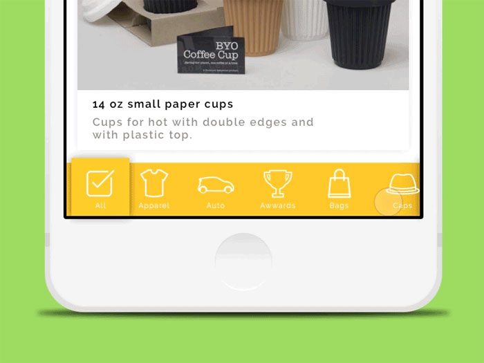
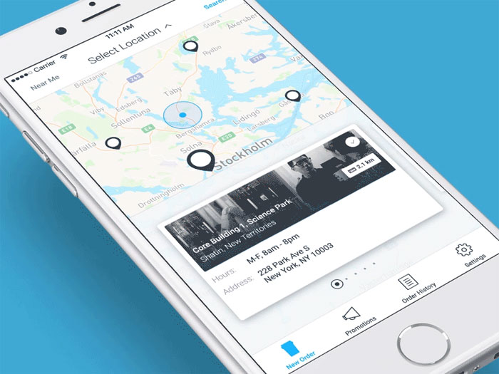
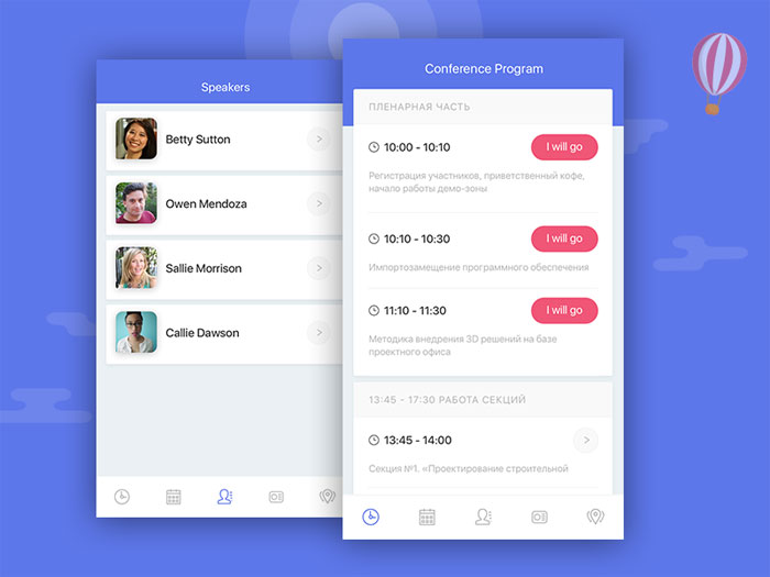
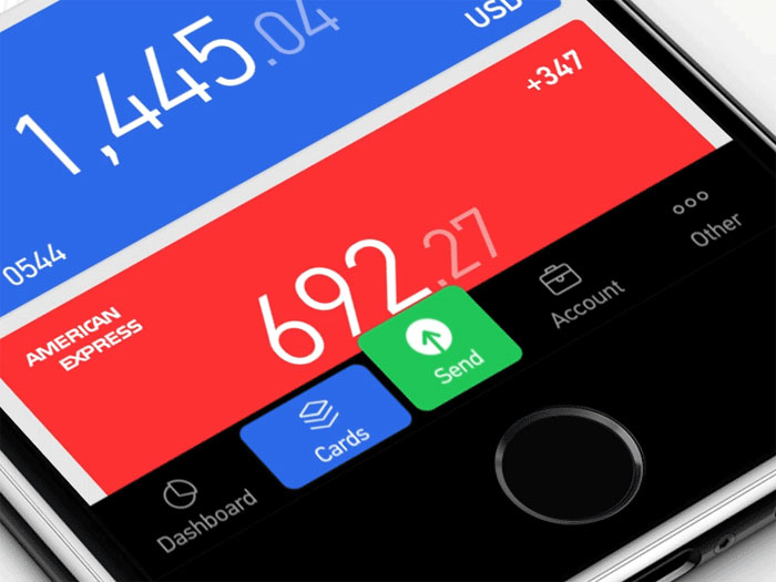

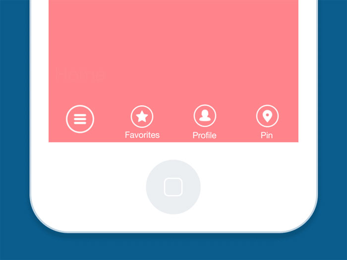

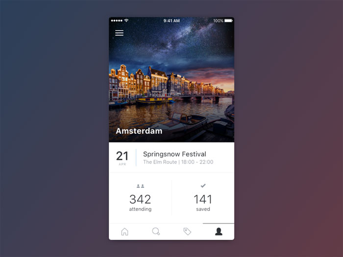
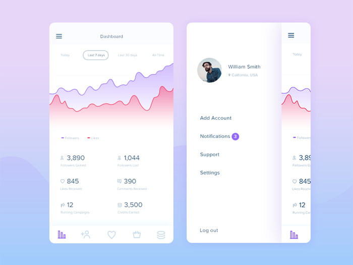
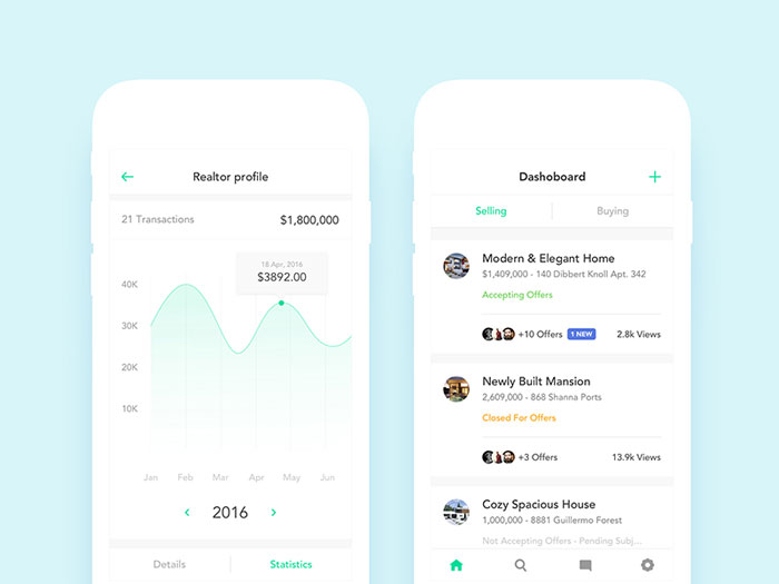
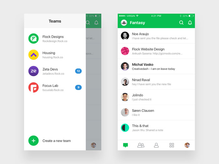
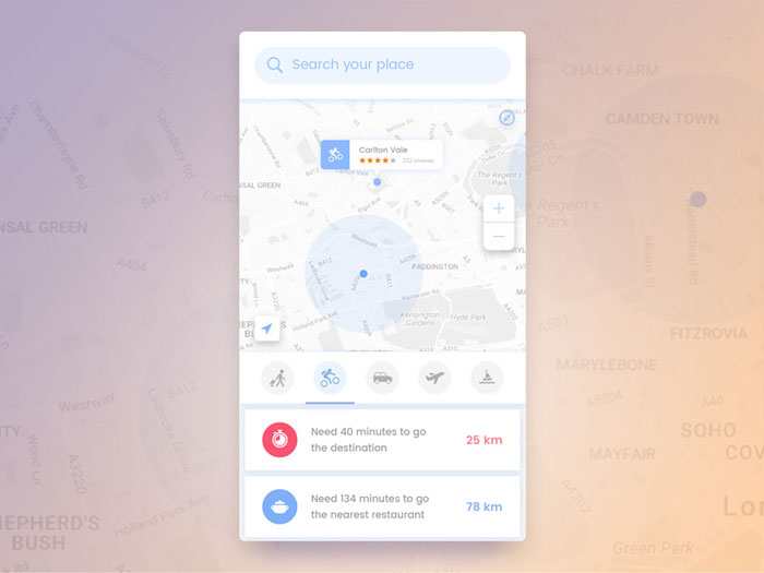
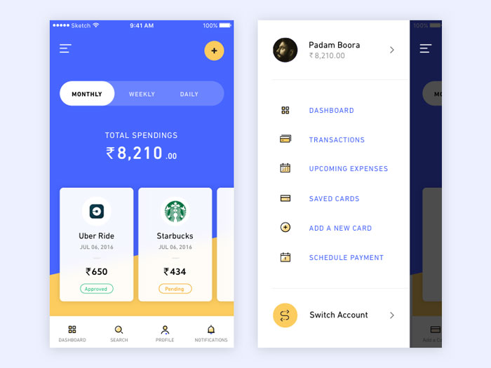
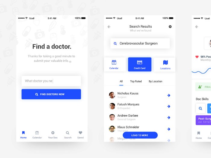
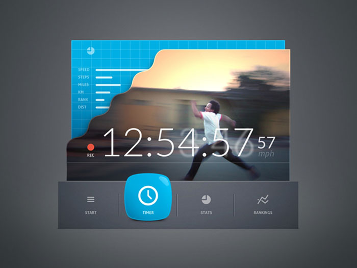
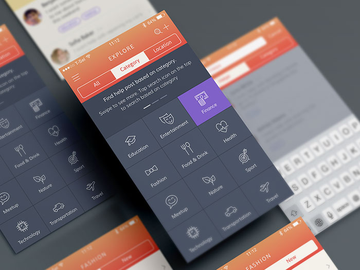
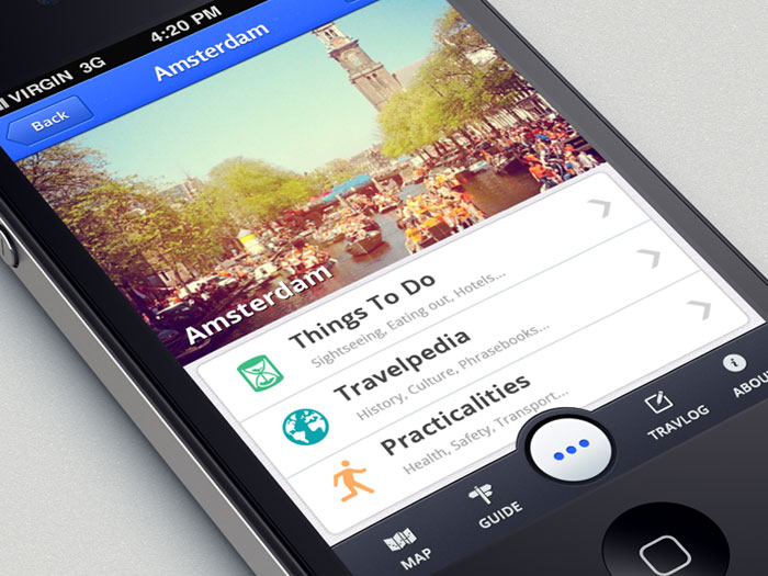
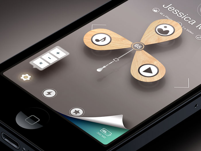
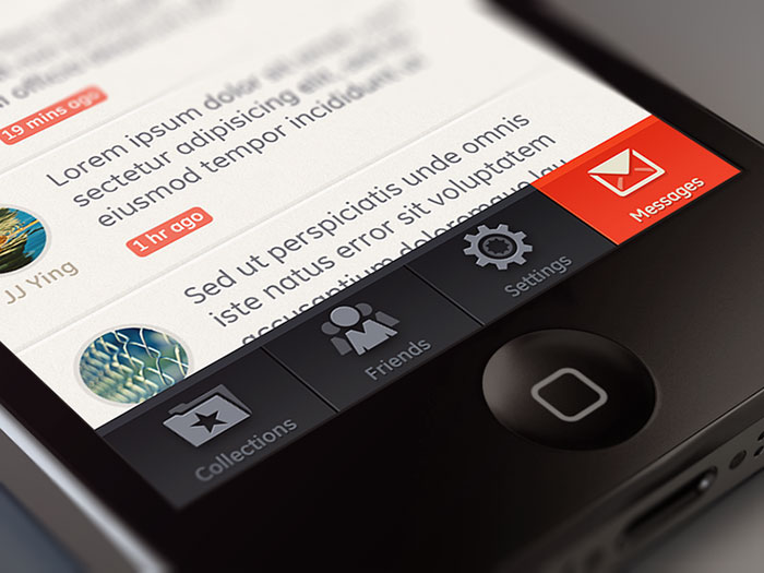
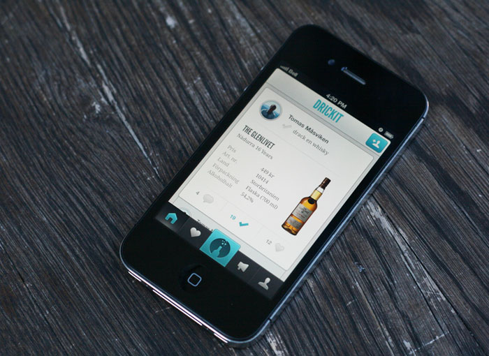
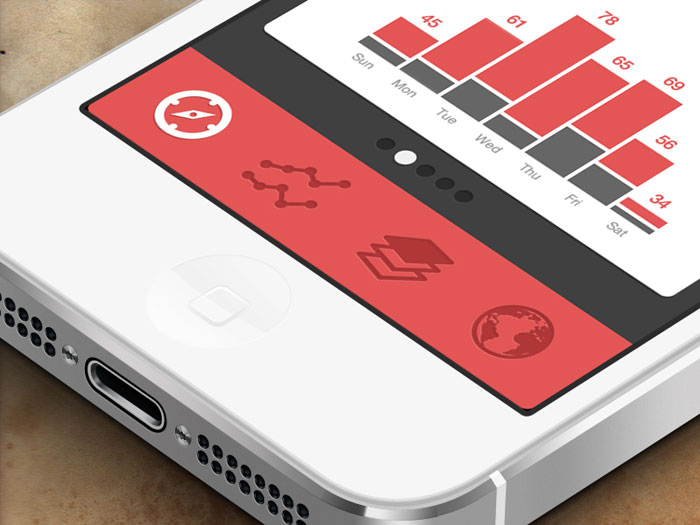
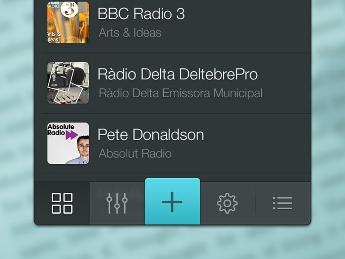

FAQ on Mobile Tab UI Design
Does Tapping the Active Tab Scroll Back to the Top
Yes. Since iOS 18, SwiftUI’s TabView scrolls the current screen back to the top when someone taps an already-selected tab. Earlier iOS versions needed custom code to pull this off. Android’s BottomNavigationView needs a manual reselection listener instead, it isn’t automatic out of the box.
Should a Tab Bar Disappear When the Keyboard Appears
Yes, and Apple is explicit about it. Its Human Interface Guidelines specify that a tab bar hides automatically whenever the on-screen keyboard appears, freeing up vertical space for typing, then reappears once the keyboard dismisses. Android handles the same situation differently, by resizing the layout instead of hiding anything.
Does Each Tab Keep Its Own Navigation History
It does. Apple’s own documentation describes tab bars as preserving each section’s navigation state independently, so drilling deep on one tab and switching away leaves that stack exactly where you left it. Android’s BottomNavigationView works the same way, with separate back stacks per tab.
Should a Tab Bar Persist Through a Multi-Step Checkout Flow
No, and Apple’s guidelines carve out an explicit exception for this. A modal view is temporary and self-contained, and it can cover the tab bar entirely. A linear task like checkout fits a modal flow much better than it fits sitting alongside the other tabs as a peer.
Is It Okay to Temporarily Disable a Tab Instead of Removing It
No. Apple’s Human Interface Guidelines say explicitly not to remove or disable a tab just because its function is temporarily unavailable, since an interface that shifts under someone becomes unpredictable fast. Keep every tab present and enabled, and handle the unavailability inside the section itself instead.
Can a Floating Action Button Sit Inside a Bottom Tab Bar
Yes, though Google’s own Material Design guidance has flagged real usability trade-offs with the pattern. The classic Android cradle places a FAB in a notch cut into the bar, anchored with fabCradleMargin. Current guidance mostly leans toward keeping the FAB fully separate instead.
Should Tab Labels Be Translated for International Audiences
Yes. A one or two word label loses meaning fast once it’s translated, since some languages just need more characters to say the same thing. Test your labels in whatever’s the longest supported language first. Icons alone rarely carry enough meaning on their own to skip text entirely.
Can Web Apps Replicate Native Tab Bar Behavior
Mostly, not entirely. CSS and JavaScript can fake the look well enough, fixed positioning, icons, active states, but they can’t replicate native perks like safe-area insets, haptic feedback, or automatic keyboard avoidance. Progressive web apps get closer using viewport units and the env() safe-area CSS function.
Does React Native Include a Native Tab Bar Component
Yes, through React Navigation’s Native Bottom Tabs Navigator. It wraps UITabBarController on iOS and BottomNavigationView on Android directly, instead of recreating the look from scratch in JavaScript. That includes Liquid Glass support on iOS 26+ and Material 3 theming on Android, provided the app is built with a recent enough toolchain (Xcode 26+ and current React Native and React Navigation versions).
How Does Tab Navigation Interact With Gesture-Based Back Navigation
Android’s system back gesture pops the current tab’s own stack first, and only exits the app once that stack is actually empty. iOS handles it in a similar way through edge-swipe-back inside a navigation-based tab, leaving the tab bar itself untouched by either gesture.
Conclusion
Start with the constraint, not the icon set. Lock the count to 3 to 5, and confirm every touch target clears 44 points before you style a single pixel.
Check an existing bar against WCAG’s target size and contrast requirements before adding a badge or an animation. A broken foundation doesn’t get fixed by decorating it.
Restraint is what makes a tab bar work, not more features. Every extra icon variant and custom transition is one more thing someone has to relearn against platform convention they already know.
Treat Apple’s and Android’s own design systems as the starting spec, not a suggestion you can skip. Straying from them tends to cost more in confused taps than it ever earns back in visual distinction.

Renowned for his expertise in logo design and visual branding, Bogdan has developed a multitude of logos for various clients.
His skills extend to creating posters, vector illustrations, business cards, and brochures. Additionally, Bogdan's UI kits were featured on marketplaces like Visual Hierarchy and UI8.
He also wrote in the past years on sites like Design Your Way, WebDesignerDepot, WPDean, Designmodo, Speckyboy, Slider Revolution, and more.
- From Mockup to Code: How AI-Augmented Development Speeds Up the Design Handoff - 19 September 2026
- The Beehiiv Logo History, Colors, Font, And Meaning - 18 September 2026
- Why Small Teams Wait Too Long to Bring On Specialist Engineers - 17 September 2026

Bogdan Sandu is a seasoned designer who has been designing websites since 2008. Renowned for his expertise in logo design and visual branding, Bogdan has developed a multitude of logos for various clients. His skills extend to creating posters, vector illustrations, business cards, and brochures. Additionally, Bogdan's UI kits were featured on marketplaces like Visual Hierarchy and UI8. He also wrote in the past years on sites like Design Your Way, WebDesignerDepot, WPDean, Designmodo, Speckyboy, Slider Revolution, and more.
You Might Also Like