The Philadelphia 76ers wear one of basketball’s most recognizable emblems on their jerseys.
This logo has survived since 1963, telling the story of American independence through visual design. The franchise began as the Syracuse Nationals in 1946 before relocating to Philadelphia and adopting the 76ers identity.
The team’s visual branding connects directly to 1776 and the signing of the Declaration of Independence. Red, white, and blue dominate the color scheme, mirroring America’s flag.
Seven distinct logo versions have marked the franchise’s 78-year history. Each redesign preserved core elements while adapting to modern design trends.
What is the Philadelphia 76ers Logo?
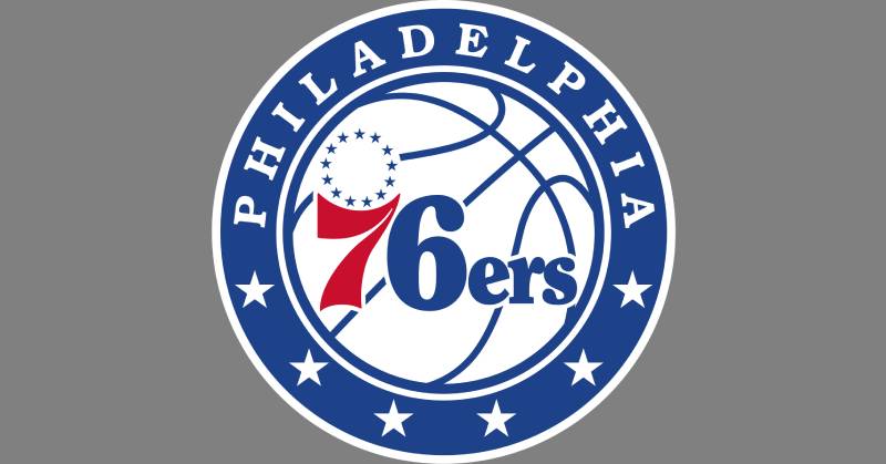
The Philadelphia 76ers logo features a white basketball containing red “76” numerals and blue “ers” lettering, circled by 13 stars representing the original American colonies. Mel Richman designed the iconic “76” element in 1963. The current version, introduced in 2015, adds “PHILADELPHIA” text and six stars within a blue border.
The design functions as a combination mark, blending numeric elements with basketball imagery.
Design Type: Emblem logo with typographic elements
Primary Elements:
- White basketball with seam lines
- Red numeral “7”
- Blue numeral “6” with “ers” suffix
- 13-star circular pattern above the “7”
- Blue border containing “PHILADELPHIA” wordmark
- Six white stars at bottom of border
Official Introduction Date: 1963 (current version: 2015)
Designer/Agency: Mel Richman (original 1963 design)
Trademark Status: Registered trademark of Harris Blitzer Sports & Entertainment
Color Palette:
- Blue: #006BB6 (Pantone PMS 293 C)
- Red: #ED174C (Pantone PMS 199 C)
- Navy: #002B5C (Pantone PMS 289 C)
- Silver: #C4CED4 (Pantone PMS 877 C)
- White: #FFFFFF
Usage Context: The logo appears on uniforms, merchandise, court designs, broadcast graphics, digital platforms, and promotional materials throughout Wells Fargo Center and Philadelphia.
How Has the Philadelphia 76ers Logo Evolved Over Time?
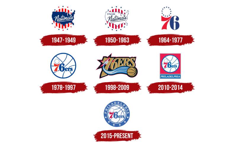
The franchise transitioned from Syracuse Nationals branding to Philadelphia 76ers identity in 1963, marking the first major transformation. Mel Richman’s original “76” design with 13 stars established the template that persists today. Subsequent redesigns refined the concept rather than replacing it entirely.
The logo underwent seven distinct iterations between 1946 and 2015.
Each version maintained patriotic themes while adjusting to contemporary design standards.
Syracuse Nationals Logo (1946-1949)
Years Active: 1946-1949
Design Description: Circular badge featuring vertical red and white stripes with a blue outline of the United States map overlay
Color Scheme: Red, white, and blue
Designer: Unknown
Context: Created when Danny Biasone founded the franchise in Syracuse, New York for $5,000
Key Changes from Previous: Original design, no predecessor
Cultural Significance: Reflected post-war American patriotism and the team’s NBL origins
Refined Syracuse Nationals Logo (1949-1963)
Years Active: 1949-1963
Design Description: Updated version with darker blue and red shades, white USA silhouette with blue outline, “Syracuse” added above “Nationals” wordmark
Color Scheme: Darker blue (Pantone PMS 294 C), darker red, white
Designer: Unknown
Context: Redesigned after joining the NBA in 1949 following the NBL-BAA merger
Key Changes from Previous: Inverted map colors from blue to white, added “Syracuse” text, intensified color saturation
Cultural Significance: Marked the franchise’s NBA entry and 14-year Syracuse era
Original Philadelphia 76ers Logo (1963-1977)
Years Active: 1963-1977
Design Description: Bold red “7” and blue “6” with 13 blue stars arranged in a circle above the “7”
Color Scheme: Red, blue
Designer: Mel Richman
Context: Designed when Ike Richman and Irv Kosloff purchased the franchise and relocated it to Philadelphia
Key Changes from Previous: Complete departure from map-based design, introduction of numeric identity
Cultural Significance: The “76” referenced 1776 and Philadelphia’s role in American independence, winning fan support through a “Name The Team” contest
Basketball-Enhanced Logo (1977-1997)
Years Active: 1977-1997
Design Description: 1963 “76” design placed on white basketball with blue seam lines, “ers” added in blue serif typeface
Color Scheme: Red, blue, white
Designer: Philadelphia 76ers design team
Context: Introduced during an era featuring Julius Erving and the team’s 1983 NBA Championship
Key Changes from Previous: Added basketball graphic, “ers” suffix, and complete team name within design
Cultural Significance: Accompanied two championship victories (1967 used the earlier version, 1983 used this version)
Modern Era Redesign (1997-2009)
Years Active: 1997-2009
Design Description: Gold “76ERS” lettering above a gold basketball with blue motion lines, silver star with red outline behind the “7”
Color Scheme: Black, gold (#BB9754), silver, red accents
Designer: Philadelphia 76ers design team
Context: Attempted to modernize the brand and appeal to hip-hop culture during Allen Iverson’s era
Key Changes from Previous: Abandoned traditional red-white-blue palette, introduced black and gold, removed basketball background
Cultural Significance: Reflected late-1990s design trends but proved unpopular with traditionalist fans
Return to Tradition (2009-2015)
Years Active: 2009-2015
Design Description: 1977 logo design on red square background with gray border, “PHILADELPHIA” in blue rectangle below
Color Scheme: Red, blue, white, silver
Designer: Philadelphia 76ers design team
Context: Reintroduced classic design during the franchise’s 60th anniversary celebrations
Key Changes from Previous: Restored original red-white-blue colors, returned to basketball-centric design
Cultural Significance: Responded to fan demand for historical connection and abandoned the unpopular 1997 redesign
Current Philadelphia 76ers Logo (2015-Present)
Years Active: 2015-Present
Design Description: Refined 1977 design with tilted basketball, blue roundel containing “PHILADELPHIA” text above and six white stars below the basketball
Color Scheme: Blue (#006BB6), red (#ED174C), navy (#002B5C), silver (#C4CED4), white
Designer: Philadelphia 76ers design team
Context: Unveiled as part of brand refresh emphasizing franchise history and Philadelphia heritage
Key Changes from Previous: Removed rectangular frames, added blue circular border, introduced six stars (representing Philadelphia’s civic virtues), slightly rotated basketball seams
Cultural Significance: Balances tradition with modern refinement, used during Joel Embiid era and renewed championship aspirations
What Do the Design Elements of the Philadelphia 76ers Logo Mean?
The “76” numerals reference 1776, the year the Declaration of Independence was signed in Philadelphia. The 13 stars above the “7” represent the original American colonies that formed the United States. These elements create a direct link between basketball identity and national history.
The basketball speaks to athletic competition and the sport’s cultural significance.
Why Did Philadelphia 76ers Choose These Specific Colors?
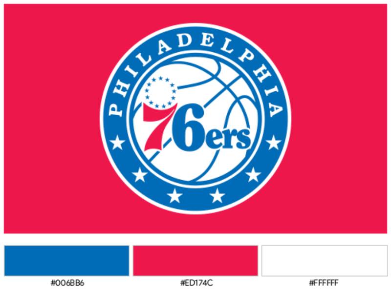
The franchise adopted red, white, and blue to mirror the American flag.
Blue (#006BB6) conveys trust, stability, and professionalism within color psychology. This shade represents the Atlantic Ocean and Pennsylvania’s historical significance.
Red (#ED174C) signals energy, passion, and competitive intensity. The bold hue captures Philadelphia’s fighting spirit and attracts fan attention across arenas.
Navy (#002B5C) adds depth and sophistication to the color palette. This darker tone provides contrast in uniform designs and merchandise applications.
Silver (#C4CED4) represents championship excellence and modernizes the traditional patriotic scheme.
White serves as negative space, improving readability and creating balance within the emblem’s circular composition.
What Typography Style Is Used in the Philadelphia 76ers Logo?
The “ers” lettering employs a custom serif typeface with rounded terminals and moderate stroke weight.
This font choice balances readability with personality. The serif style connects to historical documents and Philadelphia’s colonial heritage.
The “PHILADELPHIA” wordmark uses a bold sans-serif treatment similar to classic condensed faces. Capital letters maintain visual hierarchy while fitting within the circular border.
Rounded angles in the numerals soften the aggressive athletic aesthetic. The curves make the logo more approachable while maintaining authority.
What Are the Hidden Meanings in the Philadelphia 76ers Logo?
The six stars at the logo’s bottom represent Philadelphia’s six civic virtues rather than just decorative elements.
These stars connect the modern franchise to William Penn’s founding principles. The number also creates symmetry with the “76” numerals in a subtle nod to the city’s broader identity.
The 13 stars arranged above the “7” form a circular pattern reminiscent of both a halo and a championship banner. This placement suggests aspiration and historical weight simultaneously.
The basketball’s seam rotation changed in the 2015 redesign. The new angle creates dynamic movement implying forward progress rather than static tradition.
Mel Richman stated the original design intended to shock Philadelphia into embracing a Syracuse transplant team. The bold patriotic imagery successfully converted skeptical fans.
How Does the Philadelphia 76ers Logo Compare to Competitor Logos?
The 76ers logo emphasizes historical narrative over mascot-based identity, contrasting with animal-focused emblems across the NBA. The Boston Celtics logo uses a leprechaun character, while the Chicago Bulls logo features an aggressive bull face, and the Miami Heat logo shows a flaming basketball.
Philadelphia’s numerical approach creates instant recognizability but sacrifices some character personality.
The Los Angeles Lakers logo similarly uses text within a basketball shape. However, the Lakers emphasize purple and gold luxury rather than patriotic themes.
The New York Knicks logo employs text-heavy graphic design movements similar to the 76ers. Both teams represent major East Coast markets with deep basketball traditions.
The Golden State Warriors logo shifted from text to a bridge icon, while Philadelphia maintained numerical consistency. This difference reflects strategic choices about timeless versus trendy branding.
Eastern Conference rivals like the Brooklyn Nets logo favor minimalist design with geometric shields. The 76ers embrace complexity through multiple symbolic layers.
The Toronto Raptors logo underwent dramatic redesigns abandoning cartoon aesthetics. Philadelphia’s commitment to the “76” concept demonstrates brand confidence despite market pressures.
Among NBA logos, the 76ers rank among the most historically grounded. Only the Celtics match this level of symbolic depth tied to geography and heritage.
What Are the Technical Specifications of the Philadelphia 76ers Logo?
Official Color Codes:
Primary Color: Blue
Secondary Color: Red
- Hex: #ED174C
- RGB: (237, 23, 76)
- CMYK: (0, 100, 65, 0)
- Pantone: PMS 199 C
Accent Color: Navy
- Hex: #002B5C
- RGB: (0, 43, 92)
- CMYK: (100, 64, 0, 60)
- Pantone: PMS 289 C
Accent Color: Silver
- Hex: #C4CED4
- RGB: (196, 206, 211)
- CMYK: (5, 0, 0, 20)
- Pantone: PMS 877 C
Accent Color: White
- Hex: #FFFFFF
- RGB: (255, 255, 255)
- CMYK: (0, 0, 0, 0)
- Pantone: N/A
Dimensions and Proportions:
Aspect ratio: Circular format with 1:1 proportions for primary logo
Minimum size requirements: 0.5 inches diameter for print applications, 72 pixels for digital use
Clear space specifications: Maintain space equal to the height of one star around the logo perimeter
Official usage guidelines: Available through Philadelphia 76ers brand guidelines for licensed partners, prohibits color alterations or element separation
What Cultural Impact Has the Philadelphia 76ers Logo Had?
The 76ers emblem appears throughout Philadelphia beyond sports contexts, showing up in street art, fashion, and civic pride displays.
Local businesses incorporate the color scheme and star patterns into storefronts. The logo transcends basketball to represent the city itself in ways few sports emblems achieve.
Hip-hop artists from Philadelphia frequently wear 76ers gear in music videos and performances. Allen Iverson’s era particularly cemented the logo within urban fashion culture during the late 1990s and early 2000s.
Tattoo artists report the 76ers logo among their most requested sports designs. Fans permanently mark themselves with the emblem as identity statements beyond team loyalty.
The logo’s patriotic elements make it popular for Fourth of July celebrations across America. People who’ve never watched basketball recognize the “76” as representing 1776 and American independence.
Visiting teams consistently note Wells Fargo Center’s atmosphere where the logo creates intimidating unity among Philadelphia fans. The visual branding reinforces community identity during games.
How Does the Philadelphia 76ers Logo Fit Into the Overall Brand Identity?
The logo anchors a comprehensive visual system including uniforms, court designs, and merchandise.
The franchise uses three jersey variations: Association (white), Icon (blue), and Statement (red). Each features the “PHILA” wordmark derived from championship teams, creating temporal connections across decades.
Court designs incorporate the 13-star pattern along sidelines and the blue border elements at center court. These repetitions build rhythm throughout the arena environment.
Franklin the Dog, the team mascot, wears a 76ers jersey prominently displaying the logo. This extends the emblem’s reach into family-friendly marketing and community events.
Secondary logos include a simplified “76” without the basketball and a Liberty Bell alternate design. These variations provide flexibility while maintaining brand recognition through shared color and symbolic elements.
The brand style guide mandates specific font spacing and color applications. Partners must follow strict reproduction standards to preserve brand integrity across merchandise and marketing materials.
Digital platforms use animated versions where the basketball rotates and stars illuminate. These motion graphics maintain static logo recognition while adding contemporary polish for social media and broadcast applications.
How Should the Philadelphia 76ers Logo Be Used?
Official usage do’s:
- Reproduce logo from official vector graphics files only
- Maintain minimum size requirements for visibility
- Use approved color codes without modification
- Preserve clear space around logo perimeter
- Apply to white or light backgrounds primarily
Official usage don’ts:
- Never distort proportions or stretch logo elements
- Avoid placing logo on busy backgrounds that reduce readability
- Don’t separate individual elements (stars, numerals, basketball) for standalone use
- Never apply unapproved color combinations or gradients
- Avoid rotating logo except in approved animated applications
Where to access official logos:
Licensed partners receive logo files through the NBA’s official licensing portal. Approved file formats include EPS, AI, PNG, and SVG for various applications.
Media members can download low-resolution versions through the 76ers press site for editorial use. High-resolution files require formal media credential verification.
Licensing information:
Commercial usage requires licensing agreements through Harris Blitzer Sports & Entertainment. Rates vary based on product categories, distribution channels, and sales volumes.
Non-profit organizations may request one-time usage rights for community events. Applications require 30-day advance notice and approval from the team’s community relations department.
Trademark protection details:
The Philadelphia 76ers logo maintains registered trademark status with the USPTO under classes covering athletic apparel, entertainment services, and promotional merchandise. Unauthorized reproduction constitutes trademark infringement subject to legal action.
The franchise actively monitors counterfeit merchandise and pursues cease-and-desist actions against unauthorized sellers. Logo design principles require protecting brand equity through consistent enforcement.
FAQ About the Philadelphia 76ers Logo
When was the Philadelphia 76ers logo created?
Mel Richman created the original Philadelphia 76ers logo in 1963 when the franchise relocated from Syracuse to Philadelphia. The current version debuted in 2015 as a modernized interpretation of the classic design. The 1963 concept established the “76” numerals and 13-star pattern that persist today across all iterations.
Who designed the Philadelphia 76ers logo?
Mel Richman, cousin of team owner Ike Richman, designed the original 1963 logo featuring the red “7” and blue “6” with 13 stars. The Philadelphia 76ers in-house design team created subsequent versions in 1977, 1997, 2009, and 2015. Mel’s original concept provided the foundation for all future redesigns despite stylistic changes.
What do the colors in the Philadelphia 76ers logo mean?
The red, white, and blue colors represent the American flag and Philadelphia’s role in national independence. Blue symbolizes trust and stability, red conveys competitive passion and energy, while white provides white space for visual clarity. Navy and silver accents add sophistication and championship prestige to the traditional patriotic palette.
How many times has the Philadelphia 76ers logo been redesigned?
The Philadelphia 76ers logo underwent six major redesigns since the franchise’s 1946 founding. Two designs served the Syracuse Nationals era (1946-1963), while five distinct versions represented the Philadelphia 76ers period. The 2015 redesign maintains the current look. Each iteration preserved patriotic themes and the “76” concept introduced in 1963.
Where can I download the official Philadelphia 76ers logo?
Licensed partners access official logos through the NBA licensing portal in vector graphics formats. Media members download editorial-use versions from the 76ers press site. Fans can purchase official merchandise featuring accurate logo reproductions through the team store and authorized retailers. Unauthorized downloads from unofficial sources may contain incorrect colors or proportions.
Is the Philadelphia 76ers logo trademarked?
Yes, Harris Blitzer Sports & Entertainment holds registered trademark protection for the Philadelphia 76ers logo with the United States Patent and Trademark Office. The trademark covers athletic apparel, entertainment services, and promotional merchandise categories. Commercial usage requires formal licensing agreements. The franchise actively enforces trademark rights against counterfeit products and unauthorized reproductions.
What font is used in the Philadelphia 76ers logo?
The logo employs a custom serif typeface for the “ers” lettering with rounded terminals and moderate stroke weight. The “PHILADELPHIA” wordmark uses a bold condensed sans-serif treatment. These fonts blend historical references with modern readability. The custom typography prevents exact replication and maintains brand uniqueness across NBA visual identities.
Why did Philadelphia 76ers choose “76” for their logo?
The “76” references 1776, when the Declaration of Independence was signed in Philadelphia. Team owner Ike Richman wanted to connect the franchise to the city’s revolutionary heritage and shock fans into supporting the relocated Syracuse Nationals. The number won a “Name The Team” contest in 1963. This choice honored American independence while creating memorable branding distinct from other NBA teams.
Conclusion
The Philadelphia 76ers logo stands as one of professional sports’ most historically significant emblems.
Mel Richman’s 1963 design created a focal point connecting basketball competition to American independence. The “76” numerals, 13 stars, and red-white-blue palette transformed a relocated Syracuse franchise into a Philadelphia institution.
Seven logo iterations maintained core symbolic elements across 78 years. The current 2015 version balances tradition with contemporary polish, demonstrating how effective logo design principles create enduring brand value.
Looking forward, the 76ers logo will likely undergo subtle refinements rather than radical redesigns. The franchise’s commitment to patriotic themes and Philadelphia heritage ensures the “76” concept remains central to team identity regardless of roster changes or championship pursuits.
If you liked this article about the Philadelphia 76ers logo, you should check out this article about the Portland Trail Blazers logo.
There are also similar articles discussing the San Antonio Spurs logo, the New Orleans Pelicans logo, the Boston Celtics logo, and the Indiana Pacers logo.
And let’s not forget about articles on the Los Angeles Clippers logo, the Oklahoma City Thunder logo, the Phoenix Suns logo, and the Charlotte Hornets logo.

Renowned for his expertise in logo design and visual branding, Bogdan has developed a multitude of logos for various clients.
His skills extend to creating posters, vector illustrations, business cards, and brochures. Additionally, Bogdan's UI kits were featured on marketplaces like Visual Hierarchy and UI8.
He also wrote in the past years on sites like Design Your Way, WebDesignerDepot, WPDean, Designmodo, Speckyboy, Slider Revolution, and more.
- How to Embed Fonts in PDF for Reliable Printing - 30 September 2026
- How to Create Product Design Principles That Evolve With Your Product - 29 September 2026
- Canva vs Midjourney: AI Design Tools Compared - 28 September 2026

Bogdan Sandu is a seasoned designer who has been designing websites since 2008. Renowned for his expertise in logo design and visual branding, Bogdan has developed a multitude of logos for various clients. His skills extend to creating posters, vector illustrations, business cards, and brochures. Additionally, Bogdan's UI kits were featured on marketplaces like Visual Hierarchy and UI8. He also wrote in the past years on sites like Design Your Way, WebDesignerDepot, WPDean, Designmodo, Speckyboy, Slider Revolution, and more.
You Might Also Like