The Indiana Pacers team emblem represents one of professional basketball’s most recognizable symbols. Established in 1967, this NBA franchise identity has undergone five distinct iterations while maintaining its core visual DNA.
The logo connects to Indiana’s racing heritage through the Indianapolis Motor Speedway pace car tradition. Navy blue and gold colors mirror the state flag. The franchise joined the American Basketball Association before merging into the NBA in 1976.
What is the Indiana Pacers Logo?
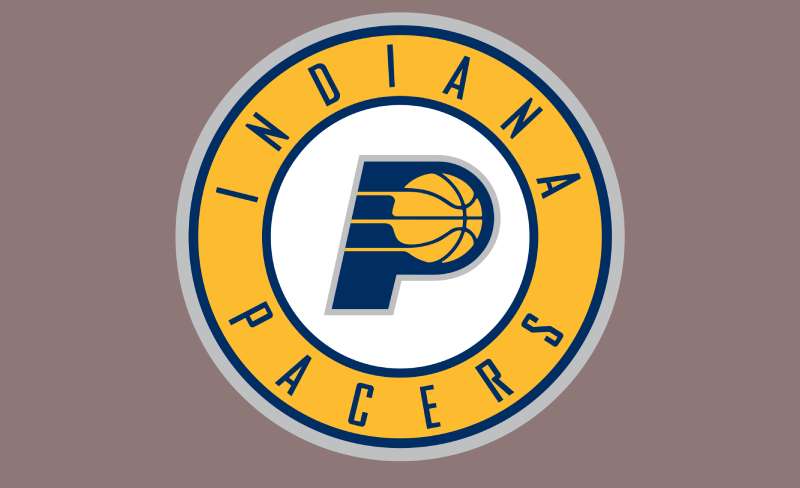
The Indiana Pacers logo is a combination mark featuring a stylized letter “P” with an integrated basketball, introduced in its current circular format in 2017. The design uses navy blue (Pantone 282 C), gold (Pantone 123 C), and silver (Pantone Cool Gray 5 C) as primary colors, with motion lines suggesting speed and athletic energy.
Design Type: Combination mark (letter + icon)
Primary Elements:
- Stylized capital “P”
- Basketball positioned within the letter’s counter
- Motion lines radiating from basketball
- Circular frame containing team wordmark
Official Introduction Date: 1967 (original); 2017 (current version)
Designer/Agency: Not publicly disclosed
Trademark Status: Registered trademark owned by Pacers Sports & Entertainment
Color Palette:
- Navy Blue: Pantone 282 C, Hex #002D62, RGB (0, 45, 98), CMYK (100, 68, 0, 54)
- Gold: Pantone 123 C, Hex #FDBB30, RGB (253, 187, 48), CMYK (0, 15, 94, 0)
- Silver: Pantone Cool Gray 5 C, Hex #BEC0C2, RGB (190, 192, 194), CMYK (0, 0, 0, 29)
Usage Context: Team jerseys, court design, merchandise, digital platforms, marketing materials, broadcast graphics, fan apparel
How Has the Indiana Pacers Logo Evolved Over Time?
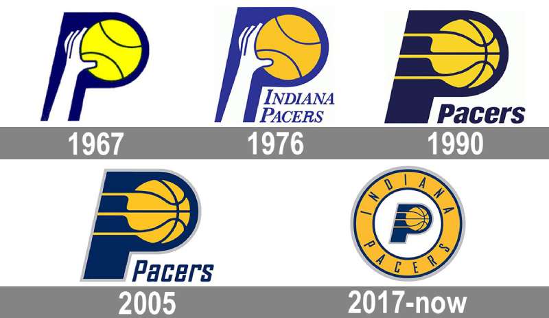
The Pacers brand identity has transformed five times since 1967, each redesign refining the original hand-and-ball concept. Major changes occurred when entering the NBA (1976), modernizing for the 1990s era (1990), adding contemporary touches (2005), and creating the circular badge format (2017).
Original Indiana Pacers Logo (1967-1976)
Years Active: 1967-1976
Design Description: Solid blue letter “P” with white hand holding yellow basketball on right side
Color Scheme: Royal blue and gold (brighter shades than current)
Designer: Unknown
Context: Created for ABA founding, reflected 1960s sports design aesthetics
Key Changes from Previous: First version, established brand foundation
Cultural Significance: Represented team’s three ABA championships (1970, 1972, 1973)
NBA Era Logo (1976-1990)
Years Active: 1976-1990
Design Description: Hand-and-ball design retained with “INDIANA PACERS” wordmark added below in italicized serif font
Color Scheme: Navy blue, gold, white
Designer: Not disclosed
Context: Added when team joined NBA after ABA-NBA merger
Key Changes from Previous: Professional wordmark addition, slightly darker blue shade
Cultural Significance: Worn during Reggie Miller’s early career years
Modernized Logo (1990-2005)
Years Active: 1990-2005
Design Description: Removed hand element, added three motion lines behind basketball, bold “PACERS” wordmark in sans-serif font
Color Scheme: Darker navy blue, gold, white
Designer: Not publicly credited
Context: Coincided with team’s most successful era including 2000 NBA Finals appearance
Key Changes from Previous: Eliminated hand, streamlined design, modernized typography
Cultural Significance: Associated with peak Reggie Miller years and rivalry with New York Knicks logo era
Contemporary Refinement (2005-2017)
Years Active: 2005-2017
Design Description: Added gray outline around “P,” refined typography to geometric sans-serif, increased letter spacing in wordmark
Color Scheme: Navy blue, gold, silver gray, white
Designer: Team design staff
Context: Unveiled after Reggie Miller’s retirement, marking new franchise era
Key Changes from Previous: Silver accent addition, cleaner letterforms, more breathing room in text
Cultural Significance: Represented post-Miller rebuilding phase
Current Circular Badge (2017-Present)
Years Active: 2017-Present
Design Description: “P” logo centered in white circle, surrounded by gold ring with “INDIANA PACERS” text in spaced letterforms
Color Scheme: Navy blue, gold, silver, white
Designer: Team creative department
Context: Modern rebrand maintaining heritage while updating aesthetic
Key Changes from Previous: Circular badge format, restored full team name, balanced composition
Cultural Significance: Current identity worn during 2025 NBA Finals run
What Do the Design Elements of the Indiana Pacers Logo Mean?
The letter “P” serves as both initial and container for the basketball element. Motion lines emanating from the ball reference Indiana’s racing culture, particularly the Indianapolis 500 pace car and harness racing traditions. The design creates kinetic energy through diagonal emphasis.
Why Did Indiana Pacers Choose These Specific Colors?
Navy Blue (Pantone 282 C): The dominant hue represents stability and professionalism. Taken directly from Indiana’s state flag, this shade connects team identity to regional pride. Psychologically, navy blue conveys trust and authority.
Gold (Pantone 123 C): This vibrant yellow reflects championship excellence and energy. Also borrowed from the state flag, gold creates high contrast against navy for optimal visibility. The color evokes Indiana’s agricultural heritage and cornfields.
Silver (Pantone Cool Gray 5 C): Added in 2005, silver provides modern sophistication. This neutral balances the bold primary colors. It suggests speed and mechanical precision, reinforcing racing connections.
What Typography Style Is Used in the Indiana Pacers Logo?
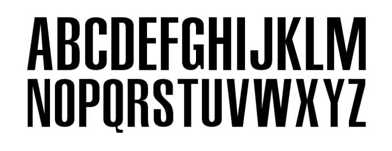
The current typeface resembles Agency FB Bold Italic, a geometric sans-serif designed by David Berlow and Morris Fuller Benton. The font features squared letterforms with slanted angles suggesting forward motion. High legibility makes it effective across scales.
The circular wordmark uses spaced letterforms for elegant presentation. Earlier versions employed tighter tracking and different weights. Typography evolution mirrors broader NBA trends toward cleaner, more versatile branding.
What Are the Hidden Meanings in the Indiana Pacers Logo?
The three motion lines reference both basketball movement and racing speed. Some interpret the “P” negative space as suggesting a basketball hoop. The circular badge format echoes racing championship medals.
Designers intentionally avoided mascot imagery, focusing instead on abstract athleticism. The hand element removal in 1990 streamlined recognition. Clean geometry allows flexible reproduction across media formats.
How Does the Indiana Pacers Logo Compare to Competitor Logos?
The Pacers emblem stands among NBA’s letter-based designs alongside the Milwaukee Bucks logo and Utah Jazz logo. Unlike mascot-heavy identities (Chicago Bulls logo, Memphis Grizzlies logo), it prioritizes typographic solutions.
Compared to the Boston Celtics logo leprechaun or Toronto Raptors logo dinosaur, the Pacers use minimalist abstraction. This approach aligns with contemporary branding like the Brooklyn Nets logo.
The navy and gold scheme differentiates from competitors while maintaining color theory principles. Regional color adoption (state flag) mirrors teams like the Los Angeles Lakers logo purple and gold.
What Are the Technical Specifications of the Indiana Pacers Logo?
Official Color Codes:
Primary Color: Navy Blue (Pacers Blue)
Secondary Color: Gold (Yellow)
- Hex: #FDBB30
- RGB: (253, 187, 48)
- CMYK: (0, 15, 94, 0)
- Pantone: PMS 123 C
Accent Color: Silver (Cool Gray)
- Hex: #BEC0C2
- RGB: (190, 192, 194)
- CMYK: (0, 0, 0, 29)
- Pantone: PMS Cool Gray 5 C
Dimensions and Proportions:
- Primary logo maintains 1:1 aspect ratio in circular format
- Minimum reproduction size: 0.5 inches diameter for print
- Clear space equals half the circle diameter on all sides
- DPI requirements: 300 for print, 72 for web
Official Usage Guidelines:
- Do not alter color values
- Maintain minimum clear space
- Never distort proportions
- Use official file formats only
What Cultural Impact Has the Indiana Pacers Logo Had?
The basketball emblem transcends sports branding as Indianapolis cultural symbol. Reggie Miller’s legendary performances (1987-2005) cemented the logo in NBA history, particularly during fierce playoff battles with New York.
The design appears throughout Indiana on merchandise, murals, and public spaces. Local businesses incorporate navy and gold in tribute. The 2000 NBA Finals appearance elevated national recognition.
Vintage versions attract collectors, with ABA-era designs especially prized. The hand element removal sparked debates about modernization versus tradition. Current players like Tyrese Haliburton represent the logo’s next generation.
How Does the Indiana Pacers Logo Fit Into the Overall Brand Identity?
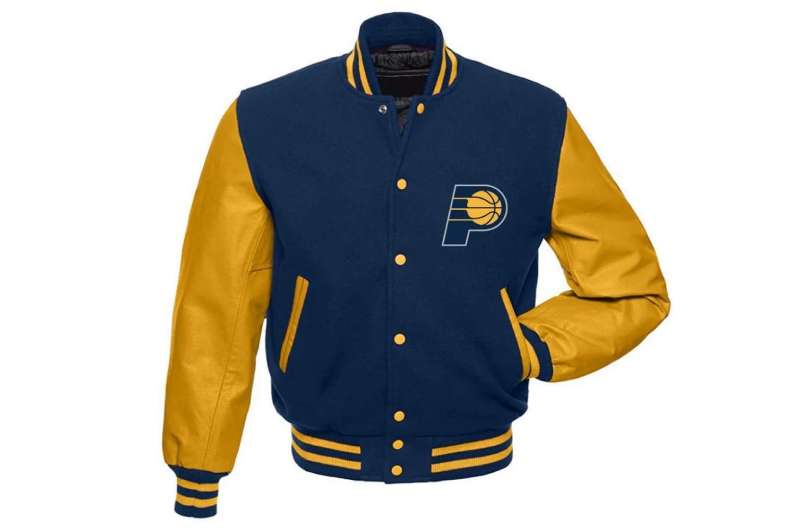
The emblem anchors comprehensive brand guidelines extending to Gainbridge Fieldhouse court design, uniform patterns, and digital presence. Pacers Gaming esports division uses adapted versions.
Supporting marks include state of Indiana silhouette and script wordmarks. The Fort Wayne Mad Ants G League affiliate employs coordinated branding. Consistent application across touchpoints reinforces recognition following logo design principles.
Marketing campaigns leverage the logo’s motion symbolism. Social media graphics maintain visual hierarchy with proper sizing. Partnership activations respect protected clear space.
How Should the Indiana Pacers Logo Be Used?
Official Usage Guidelines:
- Never recreate from scratch – use official files
- Do not change colors or proportions
- Maintain minimum size requirements
- Respect clear space boundaries
- Never add effects, shadows, or gradients
- Do not place on busy backgrounds
- Use appropriate color version for substrate
Where to Access Official Logos: Official files available through Pacers media relations department. Media members request access via press credentials. Commercial licensing requires Pacers Sports & Entertainment approval.
Licensing Information: All rights reserved by Pacers Sports & Entertainment. Unauthorized reproduction prohibited. Commercial use requires written permission. Educational and editorial use may qualify for exemptions.
Trademark Protection Details: Registered trademark with United States Patent and Trademark Office. Protected under federal law. Counterfeit merchandise enforcement ongoing.
FAQ About the Indiana Pacers Logo
When was the Indiana Pacers logo created?
The original Indiana Pacers emblem was created in 1967 when the franchise joined the American Basketball Association. The founding investors chose the hand-and-ball design to represent the team name’s connection to pace cars and racing heritage.
Who designed the Indiana Pacers logo?
The specific designer of the original 1967 Indiana Pacers logo has not been publicly disclosed. Team design staff and external agencies have handled subsequent updates in 1976, 1990, 2005, and 2017, though individual designers remain uncredited.
What do the colors in the Indiana Pacers logo mean?
Navy blue and gold were taken directly from Indiana’s state flag, creating regional identity connection. Navy represents professionalism and stability, while gold symbolizes championship excellence and energy. Silver, added in 2005, provides modern sophistication and suggests speed.
How many times has the Indiana Pacers logo been redesigned?
The Indiana Pacers logo has undergone five major versions since 1967: the original hand design (1967-1976), NBA wordmark addition (1976-1990), modernized streamlined version (1990-2005), silver-outlined refinement (2005-2017), and current circular badge (2017-present).
Where can I download the official Indiana Pacers logo?
Official Indiana Pacers logo files are available through the team’s media relations department for credentialed press. Fans can find approved versions on NBA.com and official Pacers websites. Commercial licensing requires contacting Pacers Sports & Entertainment directly.
Is the Indiana Pacers logo trademarked?
Yes, the Indiana Pacers logo is a registered trademark owned by Pacers Sports & Entertainment and protected under federal trademark law. Unauthorized commercial reproduction is prohibited. The trademark covers team name, logo designs, and associated marks.
What font is used in the Indiana Pacers logo?
The Indiana Pacers wordmark uses a typeface similar to Agency FB Bold Italic, featuring geometric letterforms with forward slant. The squared, contemporary sans-serif provides high legibility and suggests motion, designed by David Berlow and Morris Fuller Benton.
Why did Indiana Pacers choose the “P” with basketball for their logo?
The “P” represents the team name initial while the integrated basketball clearly identifies the sport. This design efficiently combines typography with sport symbolism. The concept dates to 1967 and has remained the foundation through all updates, providing instant recognition.
Conclusion
The Indiana Pacers emblem stands as enduring symbol of Hoosier basketball pride. Since 1967, the logo has evolved through five iterations while maintaining core identity elements.
The navy blue, gold, and silver color scheme connects regional heritage with modern athletic branding. Motion lines and circular badge format reference Indiana’s racing culture.
Technical specifications ensure consistent reproduction across platforms from print materials to digital applications. The trademark protects one of basketball’s most recognizable marks.
As the franchise continues competing at the highest level, the logo remains central to team identity and fan connection. Its design balances tradition with contemporary sports branding trends.
If you liked this article about the Indiana Pacers logo, you should check out this article about the Portland Trail Blazers logo.
There are also similar articles discussing the San Antonio Spurs logo, the New Orleans Pelicans logo, the Philadelphia 76ers logo, and the Boston Celtics logo.
And let’s not forget about articles on the Los Angeles Clippers logo, the Oklahoma City Thunder logo, the Phoenix Suns logo, and the Charlotte Hornets logo.

Renowned for his expertise in logo design and visual branding, Bogdan has developed a multitude of logos for various clients.
His skills extend to creating posters, vector illustrations, business cards, and brochures. Additionally, Bogdan's UI kits were featured on marketplaces like Visual Hierarchy and UI8.
He also wrote in the past years on sites like Design Your Way, WebDesignerDepot, WPDean, Designmodo, Speckyboy, Slider Revolution, and more.
- The Windsurf Logo History, Colors, Font, And Meaning - 10 October 2026
- How to Remove Background From Product Photos (No Photoshop) - 10 October 2026
- How Designers can Build a Stronger Online Creative Identity - 9 October 2026

Bogdan Sandu is a seasoned designer who has been designing websites since 2008. Renowned for his expertise in logo design and visual branding, Bogdan has developed a multitude of logos for various clients. His skills extend to creating posters, vector illustrations, business cards, and brochures. Additionally, Bogdan's UI kits were featured on marketplaces like Visual Hierarchy and UI8. He also wrote in the past years on sites like Design Your Way, WebDesignerDepot, WPDean, Designmodo, Speckyboy, Slider Revolution, and more.
You Might Also Like