The New York Knicks logo represents one of basketball’s most recognizable franchise identities. Since the team’s founding in 1946, the logo has evolved from a playful cartoon character to a bold, modern emblem that captures New York City’s energy.
The current design features an orange basketball with the “KNICKS” wordmark superimposed over it, set against a silver triangle with blue trim. Designer Michael Doret created this version in 1992, introducing dimensional lettering and geometric elements that redefined the franchise’s visual identity.
The logo has undergone eight major revisions throughout the franchise’s history. Only three primary versions have defined the team’s brand: Father Knickerbocker (1946-1964), the Classic Roundball Logo (1964-1992), and the Modern Triangle Logo (1992-present). The basketball element has remained constant since 1964, providing visual continuity across different eras while the team evolved its identity for modern audiences.
What is the New York Knicks Logo?
The New York Knicks logo is an emblem-style design featuring a stylized orange basketball with blue seams positioned beneath the team name “KNICKS” in custom three-dimensional lettering. Designer Michael Doret created the current logo in 1992, working with NBA creative director Tom O’Grady. The design sits on a downward-pointing silver triangle with blue trim.
Design Type: Emblem with wordmark and basketball element
Primary Elements: Custom “KNICKS” lettering with dimensional shading, orange basketball with blue seams, silver triangle backdrop with blue outline, optional “NEW YORK” wordmark (added 1995)
Official Introduction Date: 1992-93 NBA season
Designer: Michael Doret (primary logo), Tom O’Grady (NBA creative director)
Trademark Status: Registered trademark of Madison Square Garden Sports Corp.
Color Palette: Knicks Blue (#006BB6), Knicks Orange (#F58426), Silver (#BEC0C2), Black (#000000)
Usage Context: Uniforms, court design, merchandise, digital media, Madison Square Garden branding, team marketing materials
How Has the New York Knicks Logo Evolved Over Time?

The Knicks logo transformed from a whimsical cartoon character to a sophisticated modern emblem across eight iterations. Each redesign reflected changing aesthetic trends while maintaining the franchise’s blue and orange colors. The basketball element has appeared in every version since 1964, connecting modern designs to the team’s visual heritage.
Original New York Knicks Logo (1946-1964)
Years Active: 1946-1964
Design Description: A cartoon character dubbed “Father Knickerbocker” dribbling an orange basketball.
The figure wore colonial-era clothing including a black tricorn hat, blue coat and knickerbockers, orange vest, and black buckle boots.
Color Scheme: Blue, orange, black, white
Designer: Willard Mullin, cartoonist for the New York World-Telegram
Context: The team needed an identity that connected to New York’s Dutch colonial heritage.
The name “Knickerbockers” referenced Washington Irving’s satirical 1809 book about New York history.
Key Changes from Previous: First logo design for the franchise
Cultural Significance: Established the team’s connection to New York City’s founding settlers.
The playful character reflected the entertainment-focused approach to professional sports marketing in the 1940s and 1950s.
Classic Roundball Logo (1964-1979)
Years Active: 1964-1979
Design Description: Brown basketball with three-dimensional “KNICKS” lettering arched across the top.
Simple, clean design without additional geometric elements.
Color Scheme: Brown basketball with darker brown seams, burgundy-red lettering
Designer: Bud Freeman, J.C. Bull advertising agency
Context: Mid-1960s design trends favored minimalist approaches.
The team wanted a more mature, professional appearance as the NBA gained mainstream popularity.
Key Changes from Previous: Eliminated cartoon character entirely.
Introduced the basketball element that would persist through all future designs.
Cultural Significance: This logo era coincided with the team’s championship years (1970, 1973), cementing its association with success.
Updated Roundball Logo (1979-1983)
Years Active: 1979-1983
Design Description: Orange basketball with blue outline replaced the brown version.
Burgundy-red “KNICKS” lettering gained white and blue double outline with enhanced shadow effects.
Color Scheme: Orange, blue, burgundy-red, white
Designer: In-house modification of Freeman’s design
Context: The late 1970s saw teams brightening their color palettes for better television visibility.
Key Changes from Previous: Basketball changed from brown to orange.
Added more pronounced dimensional effects to lettering.
Cultural Significance: Reflected the era’s bold graphic design trends and increased emphasis on color television broadcasts.
Refined Roundball Logo (1983-1989)
Years Active: 1983-1989
Design Description: Light brown basketball with darker seams.
Orange “KNICKS” lettering with blue trim became the focal point.
Color Scheme: Light brown, orange, blue
Designer: Team design staff modification
Context: Teams experimented with muted tones during the 1980s as part of broader design trends.
Key Changes from Previous: Subdued basketball color.
Simplified lettering outline.
Cultural Significance: Represented the team’s identity during Patrick Ewing’s early years with the franchise.
Dual-Color Roundball Logo (1989-1992)
Years Active: 1989-1992
Design Description: Orange basketball with blue outline.
“KNICKS” wordmark in matching orange and blue with sky-blue shadow.
Color Scheme: Orange, blue, sky blue
Designer: Team design staff
Context: Final iteration before the major 1992 redesign.
Teams were beginning to explore more complex logo structures.
Key Changes from Previous: Unified color scheme across all logo elements.
Lighter shadow treatment.
Cultural Significance: Bridge design between classic and modern eras.
Modern Triangle Logo (1992-1995)
Years Active: 1992-1995
Design Description: Orange basketball with blue seams positioned beneath bold “KNICKS” wordmark.
Silver triangle pointing downward frames the design. Custom three-dimensional lettering extends beyond triangle edges.
Color Scheme: Orange, blue, silver (lighter shades than current version)
Designer: Michael Doret
Context: The NBA contracted Doret in Spring 1991 to create a modernized identity.
The league initially requested incorporation of the Empire State Building, but this element was removed during development. The design process took approximately six months with extensive revisions.
Key Changes from Previous: Added geometric triangle element.
Completely redesigned custom lettering with pronounced dimensional effects. More dynamic, angular aesthetic.
Cultural Significance: Debuted during the Pat Riley coaching era and the team’s intense rivalries with the Chicago Bulls logo, Indiana Pacers logo, and Miami Heat logo.
The logo’s bold, aggressive style matched the team’s defensive identity in the 1990s.
Complete Triangle Logo (1995-2011)
Years Active: 1995-2011
Design Description: Added “NEW YORK” wordmark in blue capital letters above the “KNICKS” text.
All other elements remained identical to 1992 version.
Color Scheme: Orange, blue, silver
Designer: Michael Doret (addition to original design)
Context: Teams increasingly emphasized city identity in their branding.
The NBA requested this modification several years after the original design.
Key Changes from Previous: “NEW YORK” text addition between the “K” and “S” of “KNICKS”
Cultural Significance: Enhanced the logo’s connection to New York City identity during a period when the team struggled to maintain its 1990s success.
Current Logo (2011-Present)
Years Active: 2011-Present
Design Description: Identical structure to 1995 version with updated color values.
Brighter, more vibrant orange and blue replaced the muted tones.
Color Scheme: Knicks Blue (#006BB6), Knicks Orange (#F58426), Silver (#BEC0C2), Black (#000000)
Designer: Color refinement of Doret’s design
Context: The team returned to brighter, more saturated versions of their traditional colors.
Fans had expressed preference for the classic blue shade over the lighter versions used since 1992.
Key Changes from Previous: Lightened orange shade.
Adjusted blue to closer match historical team colors. Removed gray shadow in favor of cleaner appearance.
Cultural Significance: Represents the franchise’s modern era while honoring its championship heritage through color choices.
What Do the Design Elements of the New York Knicks Logo Mean?

The New York Knicks logo combines basketball imagery with geometric stability and bold typography to convey strength and New York City’s dynamic energy. Each element serves a specific symbolic purpose while contributing to the overall brand identity. The design reflects both the team’s heritage and its competitive spirit in the NBA’s Eastern Conference.
What Does the Primary Symbol Represent?
The basketball anchors the design as the sport’s universal symbol. Its prominent placement and orange color create immediate recognition across all NBA branding contexts.
The blue seams add dimensional depth while reinforcing the team’s color identity. The basketball has appeared in every Knicks logo since 1964, providing visual continuity across different eras.
This element connects the logo directly to the game itself. Unlike team mascots or abstract symbols, the basketball leaves no ambiguity about the sport or the franchise’s purpose.
Why Did New York Knicks Choose These Specific Colors?
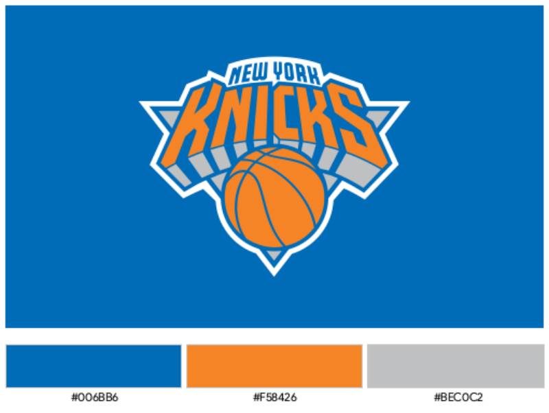
Knicks Blue (#006BB6)
- Pantone: PMS 293 C, RGB: (0, 107, 182), CMYK: (100, 56, 0, 0)
- Symbolic meaning: Stability, trust, professionalism
- Psychological impact: Conveys confidence and authority in basketball team branding
- Regional connection: Matches the blue in New York City’s flag
Knicks Orange (#F58426)
- Pantone: PMS 165 C, RGB: (245, 132, 38), CMYK: (0, 59, 96, 0)
- Symbolic meaning: Energy, enthusiasm, action
- Psychological impact: Creates excitement and draws attention on merchandise
- Regional connection: Reflects New York City’s vibrant character
Silver (#BEC0C2)
- Pantone: PMS COOL GRAY 5, RGB: (190, 192, 194), CMYK: (0, 0, 0, 29)
- Symbolic meaning: Modernity, sophistication
- Psychological impact: Adds elegance and refinement to the basketball emblem
- Regional connection: Evokes Manhattan’s urban architecture
The blue and orange combination originated from the New York City flag. Dutch settlers first brought these colors to the region in the 1600s.
What Typography Style Is Used in the New York Knicks Logo?

The “KNICKS” lettering features custom three-dimensional characters designed specifically for this logo.
Michael Doret drew inspiration from 1930s and 1940s lettering styles when hand-crafted dimensional type was at its creative peak. The font doesn’t match any commercial typeface.
Each letter has unique characteristics including beveled edges, drop shadows, and dimensional shading that create depth.
What Are the Hidden Meanings in the New York Knicks Logo?
The downward-pointing triangle creates stability and grounding. This geometric choice suggests a strong foundation and connection to the city itself.
Designer Michael Doret’s original concepts included the Empire State Building as a prominent element.
The NBA ultimately rejected this direction, but the vertical emphasis in the final design still evokes New York’s towering skyline. The basketball’s position at the triangle’s base reinforces the foundation metaphor.
How Does the New York Knicks Logo Compare to Other NBA Logos?
The Knicks logo stands among the NBA’s most enduring modern designs. While the Chicago Bulls logo achieved iconic status with its aggressive bull imagery and the Los Angeles Lakers logo maintained elegant simplicity, the Knicks chose bold dimensional typography as their defining characteristic. The 1992 redesign sparked a wave of similar approaches across the league.
The Boston Celtics logo relies on a mascot character (Lucky the Leprechaun), creating instant personality. The Knicks abandoned their Father Knickerbocker character for a more abstract, typographic approach. The Miami Heat logo uses a flaming basketball, adding motion through illustration. The Knicks’ basketball remains static but achieves dynamism through color and dimensional shading.
Among Eastern Conference rivals, the Brooklyn Nets logo takes a minimalist design approach. The Knicks’ bold colors and dimensional effects create the opposite aesthetic. The Philadelphia 76ers logo incorporates historical references to American independence. Both franchises draw from their cities’ rich histories, though the Knicks express this connection through color theory rather than literal imagery.
The Knicks logo’s longevity surpasses many contemporaries. While teams like the Washington Wizards logo, Orlando Magic logo, and Charlotte Hornets logo underwent multiple major redesigns since the 1990s, the Knicks maintained consistency.
What Are the Technical Specifications of the New York Knicks Logo?
Official Color Codes:
Primary Color: Knicks Blue – Hex: #006BB6, RGB: (0, 107, 182), CMYK: (100, 56, 0, 0), Pantone: PMS 293 C
Secondary Color: Knicks Orange – Hex: #F58426, RGB: (245, 132, 38), CMYK: (0, 59, 96, 0), Pantone: PMS 165 C
Accent Color: Silver – Hex: #BEC0C2, RGB: (190, 192, 194), CMYK: (0, 0, 0, 29), Pantone: PMS COOL GRAY 5
Additional Color: Black – Hex: #000000, RGB: (35, 31, 32), CMYK: (30, 0, 0, 100), Pantone: PMS Black 6 C
Dimensions and Proportions:
The logo maintains a roughly square aspect ratio with the triangle serving as the primary container.
The “KNICKS” wordmark extends approximately 15% beyond the triangle’s left and right edges. Minimum size requirements specify 0.5 inches in height for print applications and 72 pixels for digital usage.
Clear space specifications mandate empty space equal to at least 25% of the logo’s height on all sides. Official usage guidelines prohibit altering the logo’s proportions, colors, or arrangement.
What Cultural Impact Has the New York Knicks Logo Had?
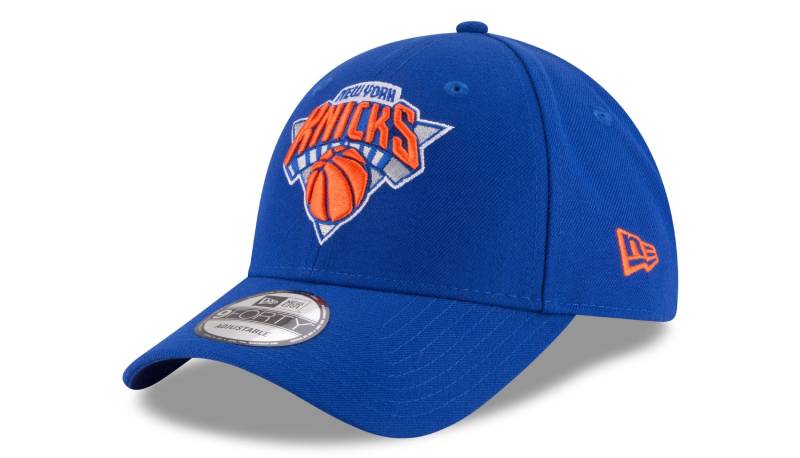
The Knicks logo became a fashion statement beyond sports. Hip-hop artists and New York celebrities popularized Knicks merchandise throughout the 1990s, making the logo synonymous with city pride. Director Spike Lee’s courtside presence at Madison Square Garden, consistently wearing Knicks gear, elevated the logo’s cultural status.
The logo represents more than basketball. It symbolizes New York resilience, especially during challenging periods for the franchise. Fans wear Knicks apparel as a statement of loyalty to the city itself. International recognition demonstrates New York’s global influence. The design appears in streetwear collections worldwide, often styled by people who have never watched an NBA game.
How Does the New York Knicks Logo Fit Into Overall Brand Identity?
The logo serves as the cornerstone of a comprehensive visual system. Brand guidelines dictate how the emblem interacts with other team elements including uniforms, court design, and marketing materials. Madison Square Garden’s iconic status amplifies the logo’s impact. The team’s secondary logo features a circular design inspired by New York City subway tokens, also created by Michael Doret.
How Should the New York Knicks Logo Be Used?
Official Usage Guidelines:
DO: Use official logo files, maintain proper clear space, reproduce colors using official values, keep proportions intact, use approved single-color versions when necessary
DON’T: Alter logo colors, distort proportions, rotate at non-standard angles, add effects like drop shadows or glows, place logo elements separately
Where Fans Can Access Official Logos: Official high-resolution files are available through the NBA’s media resources and Knicks’ press materials in vector graphics (EPS, SVG) and raster formats (JPEG, PNG).
Licensing Information: The logo is a registered trademark of Madison Square Garden Sports Corp. Commercial use requires explicit written permission. Personal, non-commercial fan use receives more flexibility.
Trademark Protection Details: The logo receives protection under both trademark and copyright law. The NBA and Madison Square Garden actively enforce intellectual property rights against unauthorized manufacturers.
FAQ About the New York Knicks Logo
When was the New York Knicks logo created?
The current Knicks logo debuted in 1992, designed by Michael Doret. The franchise’s first logo appeared in 1946 when the team was founded. The 1992 design received minor updates in 1995 (adding “NEW YORK” text) and 2011 (adjusting colors), but the core design has remained consistent for over 30 years.
Who designed the New York Knicks logo?
Michael Doret designed the current logo, working with NBA creative director Tom O’Grady. Doret, a New York-raised designer based in Los Angeles, received the assignment in Spring 1991. The project took approximately six months with extensive revisions. Willard Mullin created the original 1946 Father Knickerbocker logo, while Bud Freeman designed the 1964 Classic Roundball logo.
What do the colors in the New York Knicks logo mean?
Blue (#006BB6) represents stability and trust while connecting to the New York City flag. Orange (#F58426) conveys energy and reflects the city’s dynamic character. Silver (#BEC0C2) adds modernity and sophistication. The colors originated from New York City’s flag, brought by Dutch settlers in the 1600s. This palette has remained consistent throughout franchise history.
How many times has the New York Knicks logo been redesigned?
The Knicks logo has undergone eight versions since 1946. Three primary designs have defined different eras: Father Knickerbocker (1946-1964), Classic Roundball Logo (1964-1992), and Modern Triangle Logo (1992-present). The basketball element has appeared consistently since 1964, providing visual continuity across redesigns while the typography and geometric elements evolved.
Where can I download the official New York Knicks logo?
Official high-resolution logo files are available through the NBA’s media resources section and the Knicks’ press materials page. Files come in vector formats (EPS, SVG) and raster formats (PNG, JPEG) at various resolutions. Fans should reference official sources to ensure accurate colors and proportions. Commercial use requires licensing from Madison Square Garden Sports Corp.
Is the New York Knicks logo trademarked?
Yes, the Knicks logo is a registered trademark of Madison Square Garden Sports Corp. The design receives protection under trademark and copyright law. Commercial use requires explicit written permission and licensing agreements. The NBA and team ownership actively enforce intellectual property rights through legal action against unauthorized manufacturers and counterfeit merchandise sellers.
What font is used in the New York Knicks logo?
The “KNICKS” lettering features custom three-dimensional characters designed specifically for this logo. No commercial font matches this typeface. Michael Doret hand-crafted each letter with unique beveled edges, drop shadows, and dimensional shading. He drew inspiration from 1930s-1940s dimensional lettering styles, creating bold characters that ensure readability at any size while maintaining dynamic visual impact.
Why did New York Knicks choose a basketball for their logo?
The basketball serves as the sport’s universal symbol, creating immediate recognition. The element was introduced in 1964 when Bud Freeman redesigned the logo, replacing the Father Knickerbocker cartoon character. The basketball has appeared in every version since, providing visual continuity across eras. Its prominent placement directly connects the logo to the game itself, unlike abstract symbols or mascots.
Conclusion
The New York Knicks logo stands as one of professional basketball’s most enduring visual identities. From Willard Mullin’s playful Father Knickerbocker to Michael Doret’s bold dimensional typography, the design evolution reflects changing aesthetic trends while maintaining the franchise’s core identity.
The current logo’s key attributes include custom three-dimensional lettering, an orange basketball element, a downward-pointing silver triangle, and the iconic blue and orange color palette derived from New York City’s flag. These elements combine to create immediate brand recognition across uniforms, merchandise, and Madison Square Garden.
Within the broader NBA logos landscape, the Knicks emblem influenced numerous 1990s redesigns through its dimensional typography approach. The logo transcended sports to become a cultural symbol of New York City pride, appearing in fashion, entertainment, and global streetwear.
As the franchise continues into its eighth decade, the 1992 logo design demonstrates remarkable staying power, requiring only minor color adjustments since its introduction. This longevity speaks to Doret’s understanding of logo design principles and the team’s commitment to visual consistency.

Renowned for his expertise in logo design and visual branding, Bogdan has developed a multitude of logos for various clients.
His skills extend to creating posters, vector illustrations, business cards, and brochures. Additionally, Bogdan's UI kits were featured on marketplaces like Visual Hierarchy and UI8.
He also wrote in the past years on sites like Design Your Way, WebDesignerDepot, WPDean, Designmodo, Speckyboy, Slider Revolution, and more.
- Canva vs PowerPoint: Which Is Better for Presentations? - 22 September 2026
- How to Install Fonts on Mac (Step-by-Step Guide) - 20 September 2026
- From Mockup to Code: How AI-Augmented Development Speeds Up the Design Handoff - 19 September 2026

Bogdan Sandu is a seasoned designer who has been designing websites since 2008. Renowned for his expertise in logo design and visual branding, Bogdan has developed a multitude of logos for various clients. His skills extend to creating posters, vector illustrations, business cards, and brochures. Additionally, Bogdan's UI kits were featured on marketplaces like Visual Hierarchy and UI8. He also wrote in the past years on sites like Design Your Way, WebDesignerDepot, WPDean, Designmodo, Speckyboy, Slider Revolution, and more.
You Might Also Like