


The San Antonio Spurs logo is one of professional basketball’s most recognizable symbols.
It represents a franchise that’s won five NBA championships and built a legacy on consistency. The logo features a distinctive spur replacing the letter “U” in the team name, connecting the franchise to Texas cowboy heritage.
Since relocating from Dallas to San Antonio in 1973, the Spurs have maintained this core visual identity. The team began as the Dallas Chaparrals in 1967 under the American Basketball Association before joining the NBA in 1976. The current version, refined in 2017, marks the sixth major iteration of the franchise’s branding.
What is the San Antonio Spurs Logo?
The San Antonio Spurs logo is a double-arched wordmark featuring “SAN ANTONIO” above “SPURS” in black, with a stylized silver and black spur replacing the letter “U.” Designed by Finis Collins in 1973, the mark symbolizes Texas cowboy culture and has been trademarked since the team’s NBA entry in 1976.
Design Type: Combination mark (wordmark with symbolic element)
Primary Elements:
- Double-arched wordmark configuration
- Stylized spur graphic replacing the letter “U”
- Custom typography based on Eurostile
- Silver and black color palette
Official Introduction Date: 1973 (ABA), 1976 (NBA)
Designer/Agency: Finis Collins, working for the Pitluk Group advertising agency
Trademark Status: Registered with the United States Patent and Trademark Office since 1976, with multiple subsequent registrations for variations and updates
Color Palette:
- Silver: Pantone PMS 877 C, Hex #C4CED4, RGB (196, 206, 211), CMYK (5, 0, 0, 20)
- Black: Pantone PMS BLACK 6 C, Hex #000000, RGB (6, 25, 34), CMYK (30, 0, 0, 100)
Usage Context:
- Team jerseys and merchandise
- Court branding at AT&T Center
- Marketing materials and digital platforms
- Official team communications
- Licensed products and apparel
How Has the San Antonio Spurs Logo Evolved Over Time?
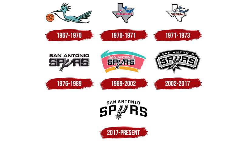
The Spurs logo has undergone six major redesigns since 1973, shifting from the Chaparrals bird to the iconic spur wordmark. Each version refined the typography and color application while maintaining the signature spur element that defines the franchise identity.
Original Dallas Chaparrals Logo (1967-1970)
Years Active: 1967-1970
Design Description: Cartoonish light blue roadrunner bird running while holding an orange basketball
Color Scheme: Light blue, orange, black
Designer: Unknown
Context: Created for the team’s inaugural ABA season in Dallas, reflecting a playful approach to sports branding common in the late 1960s
Key Changes from Previous: Original design, no predecessor
Cultural Significance: Represented the team’s attempt to establish basketball in Dallas, a city dominated by football culture
Texas Chaparrals Logo (1970-1973)
Years Active: 1970-1973
Design Description: Refined roadrunner on gray Texas state outline with red, white, and blue basketball
Color Scheme: Blue, gray, red, white
Designer: Unknown
Context: Name change to emphasize broader Texas identity during financial struggles
Key Changes from Previous: Added Texas state outline background, changed basketball to patriotic colors
Cultural Significance: Attempted to appeal to statewide fanbase before relocation
First San Antonio Spurs Logo (1973-1989)
Years Active: 1973-1989
Design Description: Bold black wordmark “SPURS” with silver and black spur replacing the “U,” with “SAN ANTONIO” in smaller text above
Color Scheme: Black, silver, gray
Designer: Finis Collins
Context: Created immediately after relocation to San Antonio, reflecting ownership’s desire to embrace cowboy heritage
Key Changes from Previous: Complete departure from bird mascot to spur symbolism
Cultural Significance: Established the visual identity that would define the franchise for decades, connecting basketball to West Texas culture
Fiesta Colors Logo (1989-2002)
Years Active: 1989-2002
Design Description: Same spur wordmark on vibrant curved background featuring turquoise, pink, and orange arches
Color Scheme: Turquoise, pink, orange, black, white, silver
Designer: Unknown
Context: Introduced during David Robinson era to celebrate San Antonio’s diverse Mexican and Chicano population
Key Changes from Previous: Added colorful “Fiesta” background stripes, changed “SAN ANTONIO” to white
Cultural Significance: Most beloved variation among longtime fans, representing the city’s cultural diversity and the team’s 1999 championship season
Silver Flag Logo (2002-2017)
Years Active: 2002-2017
Design Description: Arched wordmark on silver background with jagged black border resembling a flag or banner
Color Scheme: Silver, black, white
Designer: Unknown
Context: Return to minimalist aesthetic during Tim Duncan dynasty years
Key Changes from Previous: Removed Fiesta colors, added geometric background shape, refined typography
Cultural Significance: Accompanied three NBA championships (2003, 2005, 2007) and established the team’s modern sophisticated identity
Current Logo (2017-Present)
Years Active: 2017-Present
Design Description: Clean double-arched wordmark without background elements, featuring refined custom typeface
Color Scheme: Black, silver
Designer: Unknown
Context: Minimalist design trend influence, focus on typography clarity
Key Changes from Previous: Removed background banner, straightened letter orientation, unified typeface between “SAN ANTONIO” and “SPURS”
Cultural Significance: Represents the team’s maturity and timeless brand identity entering the Victor Wembanyama era
What Do the Design Elements of the San Antonio Spurs Logo Mean?
The spur graphic represents Texas cowboy heritage and the competitive spirit of spurring opponents into action. It connects the franchise to San Antonio’s history as a frontier town and cattle ranching center.
The spur itself is a pointed wheel attached to a cowboy’s boot heel, used to direct horses. In the logo context, it symbolizes speed, control, and the aggressive pursuit of victory.
The arched wordmark creates movement suggesting forward momentum. The double-arch layout provides visual hierarchy that emphasizes both city and team identity equally.
The metal spur’s three-dimensional rendering adds depth. It stands as the focal point while integrating seamlessly into the letterform.
Why Did San Antonio Spurs Choose These Specific Colors?
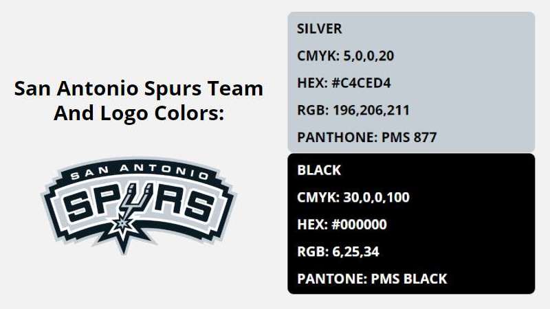
Silver (PMS 877 C, Hex #C4CED4)
Silver represents the metal construction of actual spurs worn by cowboys. It conveys sophistication, modernity, and the team’s polished playing style under coach Gregg Popovich.
The metallic quality suggests strength and durability. According to color psychology, silver communicates prestige and high value.
Black (PMS BLACK 6 C, Hex #000000)
Black provides power and authority. It creates maximum contrast against the silver, ensuring legibility across applications.
The color choice aligns with the team’s “Silver and Black” nickname. Black also references the team’s no-nonsense, fundamental approach to basketball that defined the Tim Duncan era.
What Typography Style Is Used in the San Antonio Spurs Logo?
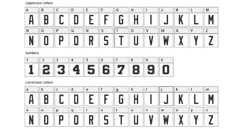
The Spurs use a custom typeface inspired by Eurostile, designed by Italian typographer Aldo Novarese in 1962.
The sans-serif font features squared letterforms with rounded corners. Diamond-shaped angles appear on the S, O, P, and R, creating distinctive geometric character.
The 2017 update unified the typeface between both text elements. Earlier versions used Helvetica Bold for “SAN ANTONIO,” creating visual inconsistency that the redesign corrected.
What Are the Hidden Meanings in the San Antonio Spurs Logo?
The spur’s star wheel contains exactly five points, potentially representing the franchise’s five NBA championships (1999, 2003, 2005, 2007, 2014).
Designer Finis Collins revealed his only instruction was “show the spur as part of the symbol.” The team’s name came from Red McCombs, but Collins created the visual integration that made it memorable.
The arched arrangement mirrors the shape of a saddle or the curve of a spur’s shank. This subtle reinforcement of the cowboy theme operates at a subconscious level for viewers.
How Does the San Antonio Spurs Logo Compare to Competitor Logos?
The Spurs logo stands among the most restrained designs in professional basketball.
While the Chicago Bulls logo features a charging animal and the Los Angeles Lakers logo uses purple and gold, the Spurs embrace austerity. The Dallas Mavericks logo shares Texas heritage but opts for a horse head rather than equipment symbolism.
Among NBA logos, the Spurs approach resembles the Brooklyn Nets logo in its geometric simplicity. Both use monochrome colors and clean typography.
The Memphis Grizzlies logo and Minnesota Timberwolves logo feature aggressive animal mascots. The Spurs’ tool-based symbol represents function over ferocity, matching the team’s systematic approach.
The Houston Rockets logo provides the strongest regional comparison. Both Texas teams use red, white, and blue or silver and black palettes, but the Rockets emphasize aerospace themes while the Spurs reference ranching history.
What Are the Technical Specifications of the San Antonio Spurs Logo?
Official Color Codes:
Primary Color – Silver:
- Pantone: PMS 877 C
- Hex: #C4CED4
- RGB: (196, 206, 211)
- CMYK: (5, 0, 0, 20)
Secondary Color – Black:
- Pantone: PMS BLACK 6 C
- Hex: #000000
- RGB: (6, 25, 34)
- CMYK: (30, 0, 0, 100)
Dimensions and Proportions:
The logo maintains a horizontal orientation with the “SPURS” text approximately 1.5 times larger than “SAN ANTONIO.”
The spur element extends slightly below the baseline of surrounding letters. Proper alignment requires the star wheel to sit at a 45-degree angle.
Minimum size requirements specify the logo should not appear smaller than 0.5 inches in height for print applications. For digital use, 72 pixels minimum ensures legibility.
Clear space equals the height of the letter “A” in “SAN ANTONIO” on all sides. This white space prevents visual crowding and maintains brand integrity.
Official usage guidelines prohibit color alterations, rotation, or dimensional distortion. The team provides vector graphics files in EPS and AI formats for professional reproduction.
What Cultural Impact Has the San Antonio Spurs Logo Had?
The logo became synonymous with fundamental basketball and sustained excellence throughout the 1990s and 2000s.
It appeared on five NBA championship teams, cementing its association with winning culture. Tim Duncan, Tony Parker, and Manu Ginobili wore the mark during their Hall of Fame careers.
The Fiesta colors version sparked a nostalgia movement. Fans successfully campaigned for the team to reintroduce those colors on alternate jerseys in 2020, demonstrating the design’s emotional resonance with the community.
San Antonio’s diverse population sees the logo as representing their city’s identity. The spur connects to the city’s Spanish colonial history and its role in Texas cattle drives.
The design influenced NBA branding trends toward cleaner, more sophisticated marks. Its longevity proves that simple, well-executed concepts outlast trendy alternatives.
How Does the San Antonio Spurs Logo Fit Into the Overall Brand Identity?
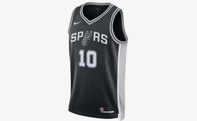
The logo anchors a comprehensive visual system that includes the secondary basketball mark, introduced in 2017, featuring “S” and “A” initials inside a basketball silhouette.
The Coyote mascot operates separately from the logo system. This balance allows family-friendly content without diluting the mark’s professional presentation.
Jersey designs follow strict brand guidelines that specify color application and logo placement. The Association uniform uses white with black trim, while the Icon uniform inverts to black with white trim.
Court designs at AT&T Center feature the logo at center court. The arched text follows the three-point arc’s curve, creating visual unity across branded touchpoints.
Marketing campaigns emphasize “Go Spurs Go,” integrating the spur symbol into motion graphics and digital content. The consistency builds brand recognition that extends beyond basketball fans.
How Should the San Antonio Spurs Logo Be Used?
Official Usage Do’s:
- Use official vector files from team-approved sources
- Maintain specified clear space around all sides
- Reproduce in official silver and black colors only
- Ensure proper DPI (300 minimum) for print design applications
- Download files in appropriate formats (file formats for printing logos include EPS, PDF, and AI)
Official Usage Don’ts:
- Never alter colors or apply gradients
- Don’t rotate, skew, or distort proportions
- Avoid placing on busy backgrounds that reduce legibility
- Never recreate or trace the logo manually
- Don’t combine with unauthorized graphics or text
Where to Access Official Logos:
The San Antonio Spurs official website provides approved logo files for media and partner use. Applications require submission through the team’s media relations department.
Licensing Information:
Commercial use requires licensing through Spurs Sports & Entertainment. The NBA also maintains licensing programs for manufacturers producing official merchandise.
Trademark Protection Details:
The logo is protected under federal trademark law. Unauthorized commercial use constitutes infringement and may result in legal action. Fair use provisions allow editorial and news coverage without permission.
FAQ About the San Antonio Spurs Logo
When was the San Antonio Spurs logo created?
The logo was created in 1973 by Finis Collins when the franchise moved from Dallas to San Antonio. Collins worked for the Pitluk Group advertising agency and received approval on his first submission. The design has remained essentially unchanged for over 50 years.
Who designed the San Antonio Spurs logo?
Finis Collins, a 93-year-old artist who worked for the Pitluk Group for two decades, designed the original logo. He received minimal direction beyond incorporating a spur into the design. Collins also designed logos for La Quinta Inns and Suites during his career.
What do the colors in the San Antonio Spurs logo mean?
Silver represents the metal material of actual cowboy spurs and conveys sophistication and modernity. Black provides power, authority, and creates strong contrast for visibility. Together, these colors earned the team its “Silver and Black” nickname and reflect the franchise’s professional, no-nonsense approach.
How many times has the San Antonio Spurs logo been redesigned?
The logo has undergone six major versions since 1973. The Fiesta colors addition (1989-2002) and the minimalist 2017 update represent the most significant changes. However, the core spur element replacing the letter “U” has remained constant throughout all iterations.
Where can I download the official San Antonio Spurs logo?
Official logo files are available through the San Antonio Spurs media relations department for approved editorial use. The NBA website provides logos for licensed partners. High-resolution files require permission for commercial applications. Fans can find lower-resolution versions on team social media for personal use.
Is the San Antonio Spurs logo trademarked?
Yes, the logo has been federally trademarked with the United States Patent and Trademark Office since 1976. Multiple registrations cover various applications including merchandise, broadcasts, and digital media. San Antonio Spurs, LLC holds the trademark rights and enforces them through licensing agreements.
What font is used in the San Antonio Spurs logo?
The logo uses a custom typeface inspired by Eurostile, with modifications including diamond-shaped angles on certain letters. The official Spurs brand style guide specifies Helvetica Bold for secondary applications, but the primary wordmark features the custom design created specifically for the team.
Why did San Antonio Spurs choose a spur for their logo?
Team owner Red McCombs named the franchise “Spurs” to reflect Texas cowboy heritage and San Antonio’s frontier history. Designer Finis Collins was instructed to incorporate the spur visually, resulting in the innovative letter replacement solution. The choice connected the team to regional identity and differentiated them from other NBA franchises.
Conclusion
The San Antonio Spurs logo stands as a masterclass in sustained brand identity.
Its core design has remained intact for over 50 years while allowing subtle refinements. The spur symbol effectively communicates Texas heritage, competitive spirit, and the franchise’s commitment to fundamental basketball excellence.
Key attributes include the silver and black color scheme, the innovative typographic integration of the spur into the wordmark, and the clean double-arched layout. These elements work together following graphic design principles of contrast, balance, and unity.
Within NBA branding, the Spurs logo represents timeless sophistication over trendy redesigns. As the franchise enters a new era with Victor Wembanyama, the mark continues connecting past championships to future aspirations while honoring the cowboy culture that defines San Antonio.
If you liked this article about the San Antonio Spurs logo, you should check out this article about the Portland Trail Blazers logo.
There are also similar articles discussing the New Orleans Pelicans logo, the Philadelphia 76ers logo, the Boston Celtics logo, and the Indiana Pacers logo.
And let’s not forget about articles on the Los Angeles Clippers logo, the Oklahoma City Thunder logo, the Phoenix Suns logo, and the Charlotte Hornets logo.

Renowned for his expertise in logo design and visual branding, Bogdan has developed a multitude of logos for various clients.
His skills extend to creating posters, vector illustrations, business cards, and brochures. Additionally, Bogdan's UI kits were featured on marketplaces like Visual Hierarchy and UI8.
He also wrote in the past years on sites like Design Your Way, WebDesignerDepot, WPDean, Designmodo, Speckyboy, Slider Revolution, and more.
- The Cursor Logo History, Colors, Font, And Meaning - 24 September 2026
- Top 7 Web Design Subscription Services That Replace Full-Time Hires - 24 September 2026
- Canva vs PowerPoint: Which Is Better for Presentations? - 22 September 2026

Bogdan Sandu is a seasoned designer who has been designing websites since 2008. Renowned for his expertise in logo design and visual branding, Bogdan has developed a multitude of logos for various clients. His skills extend to creating posters, vector illustrations, business cards, and brochures. Additionally, Bogdan's UI kits were featured on marketplaces like Visual Hierarchy and UI8. He also wrote in the past years on sites like Design Your Way, WebDesignerDepot, WPDean, Designmodo, Speckyboy, Slider Revolution, and more.
You Might Also Like


