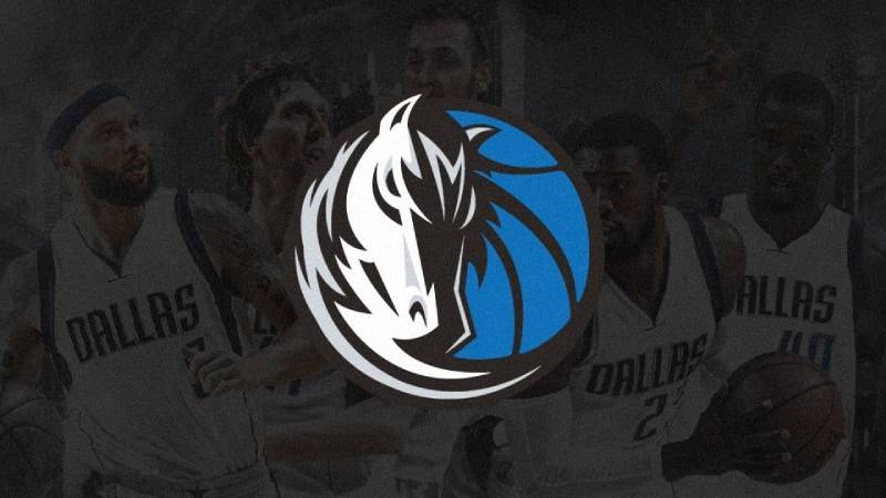
The Dallas Mavericks Logo History, Colors, Font, and Meaning
Imagine a symbol that captures the essence of high-flying dunks, the roar of an electrifying crowd, and the spirit of a city rallying behind its heroes.
This is no ordinary design—it’s the heart of an identity, pulsating vividly across jerseys, fan gear, and the pulsing digital screens of the American Airlines Center. Welcome to an exploration of the Dallas Mavericks logo, an emblem that transcends sport into a phenomenon of branding and allegiance.
Through the course of this piece, you’ll unfurl the layers of creativity and strategy that shape this iconic insignia. We’ll dive under the skin of its creation, unraveling the tale of Texas-sized ambition merged into one graphic representation.
Expect revelations on how the Mavericks emblem evolved—a dance of color, form, and symbolism relaying the trajectory of an NBA titan’s branding journey.
By the article’s culmination, you’ll have gleaned insights into the intricate craft of sports branding, and why the Dallas Mavericks merchandise adorned with this logo stands as more than mere fabric or novelty—it’s the banner of a basketball culture, the weave of a narrative told in hues of blue, silver, and black.
The Meaning Behind the Dallas Mavericks Logo
Diggin’ Deep
Ah, the Dallas Mavericks logo! It’s not just a simple emblem on a jersey, you know? It’s like, a story in itself. Every curve, every color, and every sharp angle has a tale to tell.
The logo represents the spirit and determination of the team – the fighting spirit, the speed, the agility, and the undying passion.
It’s like they’re saying, “Hey, we’re here, and we ain’t backing down.” And trust me, it does its job pretty dang well!
Mavericks? Why Mavericks?
So, why the name “Mavericks”? A maverick refers to an independent thinker, someone who doesn’t conform. And the Dallas Mavericks?
Well, they sure ain’t your ordinary team. The horse in the logo? That’s not just any horse.
That’s a representation of strength, of power. It’s like the team’s spirit animal, galloping ahead, leading the charge. The silver outline? Speaks of their class, their elite status in the league.
The History of the Dallas Mavericks Logo
The Birth of the Logo
Way back when, the Dallas Mavericks logo has seen its share of evolution. It’s grown, and transformed, yet retained its core essence. Every change, every tweak, was made to better represent the team, the city, and the fans.
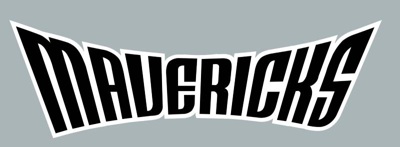
The Evolution
Over the years, the design saw several changes. From the cowboy hat-tipping days to the more sleek and dynamic horse representation we see today.
It’s like watching your favorite band evolve, right? Each change was a fresh album drop, keeping the essence but always with a fresh vibe.
The Colors of the Dallas Mavericks Logo
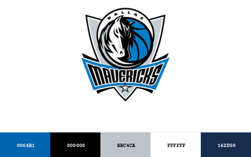
Blue like the Texan Sky
Ever notice the dominant blue in the logo? It’s not there just ’cause it looks good. That blue is the depth, the vastness, kinda like the Texas sky. It embodies trust, loyalty, and wisdom.
The Silver Lining
The silver? Ah, it’s more than just a lining! It’s elegance, sophistication, and, of course, victory. When you spot that silver on the court, you know things are about to get real stylish.
The Font Used in the Dallas Mavericks Logo
Bold and Beautiful
When we talk about fonts, we’re not just talking letters. We’re talking personality. The font used in the Dallas Mavericks logo is bold, assertive, and speaks of a legacy.
It stands tall, announcing its presence. It’s not shouty, but it doesn’t whisper either. It’s like that friend with the perfect comeback – sharp and on point.
The Design Elements
Balance and Symmetry
If you’ve ever tried doodling the logo (come on, we’ve all been there), you’d know it’s a harmonious blend of balance and symmetry. The design elements come together to form a cohesive look, making it aesthetic yet full of purpose.
The Versatility Game
One thing that’s absolutely rad about the Mavericks logo? Its versatility. Slap it on merchandise, paint it on a court, or flaunt it on a cap – it looks epic everywhere!
The Impact on Fans
More Than Just an Emblem
For the fans, this logo isn’t just an emblem. It’s an emotion. It’s the palpable energy in the stadium, the roaring support, and the collective heartbeats during the final seconds of a close game.
Tattoos, Merch, and More
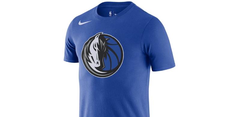
You know you’ve struck gold when fans ink your logo on themselves. From tattoos to merchandise, the Dallas Mavericks logo is everywhere, carried with pride, symbolizing love for the game and the team.
FAQ On The Dallas Mavericks Logo
Who designed the Dallas Mavericks logo?
The current iteration, a crisp portrayal of a horse’s head merged with a basketball, emerged from an intensive rebranding exercise. It’s the brainchild of a collaboration between creative teams, intent on melding athleticism with the heritage of Dallas.
What do the colors in the Dallas Mavericks logo represent?
Blue signifies loyalty; silver reflects sophistication and high-tech, mirroring Dallas’ modernity; black injects an edge of power and intensity. Together, they encapsulate the dynamism of the Maverick spirit, both on and off the basketball court.
When was the Dallas Mavericks logo last updated?
The logo has held steadfast since the early 2000s. It has weathered the ebb and flow of design trends, much like the team’s enduring presence in the heart of the NBA saga, steadfast in the face of relentless change within the league.
Where can I purchase official Dallas Mavericks merchandise?
For genuine articles adorned with the revered emblem, direct your attention to the Mavericks Pro Shop. Here, amongst hallowed halls of e-commerce or within the physical shrine at the American Airlines Center, fans converge to claim a piece of the legacy.
How has the Dallas Mavericks logo changed over the years?
Since the team’s inception, the logo has undergone a metamorphosis—from a simple basketball and hat motif to today’s nuanced equine emblem, transitioning through various palettes and forms to arrive at the contemporary symbol of Dallas basketball culture.
Is the Dallas Mavericks logo trademarked?
Indeed, this token of basketball valor is safeguarded under the vigilant wings of intellectual property laws. A bastion against unwarranted mimicry, this ensures the logo’s use remains exclusive to the valorous narrative of the Dallas Mavericks and their associated entities.
Can I use the Dallas Mavericks logo for a personal project?
Best tread lightly here; copyright laws are stringent. Personal, non-commercial projects often fall under fair use, but the line is gossamer-thin. It’s prudent to seek permission from the Mavericks’ legal guardians before the creative winds take hold.
What different versions of the Dallas Mavericks logo exist?
Variations are scarce, preserving the integrity of the emblem. Yet, specialty logos do surface, embellishing limited edition merchandise, commemorating milestones, and captivating the hearts of the fan base with the promise of exclusivity.
How is the Dallas Mavericks logo incorporated into the team’s brand strategy?
As the nucleus of the team’s visual identity, it commands a prominent station across marketing and sponsorships, merchandising, and digital footprints.
The logo serves as a beacon for the brand, shepherding a diverse flock of admirers towards unity under the Mavericks’ banner.
What cultural significance does the Dallas Mavericks logo hold in the city of Dallas?
Perched high upon the city’s cultural mosaic, the logo is more than mere graphic—it’s a totem, embodying the spirit of Dallas itself. It signifies unity, pride, and a shared journey through the highs and lows of championship quests.
Conclusion
So we’ve journeyed around the key arcs and aesthetic strokes that give life to the Dallas Mavericks logo.
From its bolds and contours, through to the evocative colors that sweep across it, and its trademarked distinction, we’ve uncovered the symbol’s narrative—a tapestry of ambition and adrenaline stitched against the backdrop of the NBA.
As these elements coalesce—a melody of sports branding fine-tuned to the heartbeats of Dallas—what emerges is more than a logo. It is, undeniably, the resonant crest of a community.
As enthusiasts clad in Mavs insignia, we share a bond deeper than fabric—a collective breath held in last-second shots, a crescendo of cheers reverberating within the American Airlines Center.
Carry forward the insight gleaned here. Whether it’s etched on merchandise or emblazoned across the cityscape, the Mavericks logo stands not just as a marker of a basketball franchise, but as an enduring emblem of unity, pride, and the restless pursuit of excellence.
If you liked this article about the Dallas Mavericks logo, you should check out this article about the Sacramento Kings logo.
There are also similar articles discussing the Washington Wizards logo, the Atlanta Hawks logo, the Brooklyn Nets logo, and the New York Knicks logo.
And let’s not forget about articles on the Orlando Magic logo, the Denver Nuggets logo, the Los Angeles Lakers logo, and the Minnesota Timberwolves logo.
Bogdan Sandu, a seasoned designer with 15 years of diverse experience, has been designing websites since 2008.
Renowned for his expertise in logo design and visual branding, Bogdan has developed a multitude of logos for various clients.
His skills extend to creating posters, vector illustrations, business cards, and brochures. Additionally, Bogdan's UI kits were featured on marketplaces like Visual Hierarchy and UI8.
Latest posts by Bogdan Sandu (see all)
- After Dark: Night Color Palettes for Mysterious Designs - 27 April 2024
- The Capcom Logo History, Colors, Font, And Meaning - 26 April 2024
- Earth Color Palettes Grounded in Nature: 40 Examples - 26 April 2024