The Minnesota Timberwolves logo stands as one of professional basketball’s most recognizable brand marks, representing the NBA franchise based in Minneapolis.
Since the team’s founding in 1989, the Timberwolves emblem has evolved through four distinct iterations, each capturing the spirit of Minnesota’s wilderness and the competitive nature of the sport. The current logo, introduced in 2017 by designer Rodney Richardson of RARE Design, features a howling wolf profile against a basketball backdrop with the iconic North Star, blending traditional elements with modern design sensibilities.
The Timberwolves compete in the NBA’s Western Conference Northwest Division and play home games at Target Center.
What is the Minnesota Timberwolves Logo?
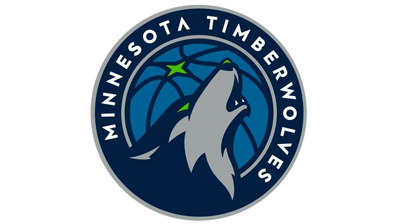
The Minnesota Timberwolves logo is a combination mark featuring a howling wolf in profile set against a blue basketball with a green North Star, officially introduced on April 11, 2017. Designed by Rodney Richardson of RARE Design, the emblem symbolizes the team’s fierce competitive spirit and Minnesota’s natural heritage.
Design Type: Combination mark (icon + wordmark)
Primary Elements:
- Howling wolf head in profile
- Blue basketball background
- Four-pointed North Star in aurora green
- Team wordmark “MINNESOTA TIMBERWOLVES”
- Custom typography with modified “A” lacking horizontal bar
Official Introduction Date: April 11, 2017
Designer: Rodney Richardson, RARE Design (Mississippi-based)
Trademark Status: Registered trademark of the Minnesota Timberwolves organization
Color Palette:
- Midnight Blue (#0C2340)
- Lake Blue (#236192)
- Aurora Green (#78BE20)
- Moonlight Grey (#9EA2A2)
- Frost White (#FFFFFF)
Usage Context:
The mark appears across team uniforms, court designs at Target Center, merchandise, marketing materials, digital platforms, and official NBA broadcasting. The franchise retired previous logos entirely when introducing this version.
How Has the Minnesota Timberwolves Logo Evolved Over Time?

The Timberwolves have used four primary logos since 1989, each reflecting shifts in team identity and design trends. The evolution moved from playful to aggressive, then to contemporary sophistication, mirroring the franchise’s maturation in professional basketball.
Original Minnesota Timberwolves Logo (1989-1996)
Years Active: 1989-1996
Design Description: A gray wolf’s head positioned on the left side of a blue basketball with green outline. The wolf featured pale green glowing eyes and a graceful, non-threatening expression.
Color Scheme: Acid blue, green, silver, white
Designer: Mark Thompson (Austin, Minnesota)
Context: Selected from over 2,600 public submissions in a franchise contest. Team President Bob Stein described it as “aggressive, but not sinister.” The design was unveiled on a $20,000 check presented to United Way on September 17, 1987.
Key Design Features: The wordmark appeared below the circular emblem with “Minnesota” in green cursive script and “TIMBERWOLVES” in bold sans-serif capitals.
Cultural Significance: Represented Minnesota’s large wolf population (the largest in the United States) and honored the International Wolf Center located in Ely, Minnesota.
Second Minnesota Timberwolves Logo (1996-2008)
Years Active: 1996-2008
Design Description: A more aggressive wolf head with open mouth showing sharp fangs, emerging from shadows created with black shading. Green trees flanked both sides of the wolf’s head.
Color Scheme: Navy blue, black, green, white
Designer: Peter Thornburgh (Los Angeles-based Mednick Design Group)
Context: Owner Glen Taylor described the redesign as “a step towards being more competitive, more aggressive.” Unveiled at Mall of America’s main rotunda on May 18, 1996, with lasers and smoke effects.
Key Changes from Previous: Darker color palette, menacing expression replacing graceful look, addition of forest elements, stylized serif font with sharp edges for “TIMBERWOLVES.”
Cultural Significance: Reflected the team’s desire to shed its expansion team image and establish itself as a serious NBA competitor.
Third Minnesota Timberwolves Logo (2008-2017)
Years Active: 2008-2017
Design Description: Refinement of the 1996 design with a gray wolf featuring white facial markings and black outline. Trees rendered in lighter green shade.
Color Scheme: Gray, black, pale green, white with blue accents
Designer: Modification of Peter Thornburgh’s original
Context: Represented a modernization effort without completely abandoning the established identity.
Key Changes from Previous: Lighter green tones, white added to wolf’s face, cleaner lines, white “TIMBERWOLVES” lettering with blue-black stroke, more polished appearance reflecting advances in graphic design technology.
Cultural Significance: Maintained brand recognition while updating aesthetics for the digital age.
Current Minnesota Timberwolves Logo (2017-Present)
Years Active: 2017-Present
Design Description: Howling wolf in profile (not snarling) positioned on left side of a blue basketball containing a four-pointed aurora green star. The wolf’s mouth is open in a howl, symbolizing territorial marking and pack communication.
Color Scheme: Midnight blue, lake blue, aurora green, moonlight grey, frost white
Designer: Rodney Richardson (RARE Design)
Context: Part of complete franchise overhaul including new uniforms, court design, and Target Center renovations. Development took 12 months with collaboration between Richardson, NBA executives, and team ownership.
Key Changes from Previous: Howling posture instead of snarling, return to basketball element, addition of North Star (Minnesota state symbol), simplified composition, contemporary sans-serif wordmark with modified “A” resembling upside-down “V.”
Cultural Significance: Represents franchise looking forward while honoring past elements. The howl signals territorial dominance and collective team spirit rather than individual aggression.
What Do the Design Elements of the Minnesota Timberwolves Logo Mean?
The wolf howl represents territorial marking and pack communication rather than fear or defensiveness. Research conducted during the design process revealed that wolves howl to rally the pack and warn competitors, aligning with concepts of home court advantage and team unity.
The basketball element returns to the franchise’s original 1989 design, creating visual continuity across decades.
Why Did Minnesota Timberwolves Choose These Specific Colors?
Midnight Blue (#0C2340)
- Pantone: PMS 289 C
- RGB: (12, 35, 64)
- CMYK: (100, 76, 12, 70)
Represents the depth of Minnesota’s winter nights and midnight forests. Creates strong contrast as the primary background color.
Lake Blue (#236192)
- Pantone: PMS 647 C
- RGB: (35, 97, 146)
- CMYK: (96, 54, 5, 27)
References Minnesota’s “Land of 10,000 Lakes” nickname. Provides secondary depth in the basketball element.
Aurora Green (#78BE20)
- Pantone: PMS 368 C
- RGB: (120, 190, 32)
- CMYK: (65, 0, 100, 0)
Inspired by northern lights visible in Minnesota, reflection of ice crystals in winter, and flourishing tree buds in spring. Serves as the focal point in the wolf’s eyes and the North Star.
Moonlight Grey (#9EA2A2)
- Pantone: PMS 422 C
- RGB: (158, 162, 162)
- CMYK: (19, 12, 13, 34)
Represents moonlight on snow and wolf fur coloring.
Designer Richardson described the palette as “color with a sense of place,” directly tying the team’s visual identity to Minnesota’s landscape and natural phenomena.
What Typography Style Is Used in the Minnesota Timberwolves Logo?

The wordmark uses a custom sans-serif typeface with bold weight and tight letter spacing. The distinctive feature is the modified “A” which lacks a horizontal crossbar, appearing as an inverted “V.”
This unusual character originated from Nordic rune experiments during the design process. The team retained this single element from the rejected rune-based concepts.
The typography presents a clean, modern aesthetic that contrasts with the previous serif fonts used from 1996-2017.
What Are the Hidden Meanings in the Minnesota Timberwolves Logo?
The four-pointed North Star directly references the Minnesota state flag and the state’s motto, “L’Étoile du Nord” (The Star of the North). Minnesota is the northernmost state outside Alaska.
The wolf’s howl rather than snarl emerged from behavioral research showing snarling often indicates fear or defensiveness. The howl signals confidence, territory marking, and pack rallying.
The profile orientation symbolizes the team looking forward rather than dwelling on past struggles. The franchise had missed playoffs since 2004 when the redesign launched.
Focus groups rejected earlier concepts featuring “Minnesota nice” aesthetics, demanding something more aggressive after years of losing seasons.
How Does the Minnesota Timberwolves Logo Compare to Competitor Logos?
The Timberwolves logo sits within a subset of NBA teams using animal mascots, including the Memphis Grizzlies logo, Milwaukee Bucks logo, Chicago Bulls logo, and Toronto Raptors logo.
Unlike the Bulls’ straightforward profile or the Raptors’ stylized dinosaur, the Timberwolves integrate multiple symbolic elements (wolf, basketball, star) into a cohesive composition.
The color scheme distinguishes them from typical red-and-blue NBA palettes. The aurora green particularly stands out in league-wide branding.
Some critics noted similarity to the NHL’s Arizona Coyotes logo, both featuring canines in profile with open mouths.
Among Northwest Division rivals, the Denver Nuggets logo and Portland Trail Blazers logo use abstract geometric designs, while the Oklahoma City Thunder logo and Utah Jazz logo incorporate typography-forward approaches.
The Timberwolves’ combination of realistic animal rendering with symbolic elements creates middle ground between abstract and representational design strategies.
What Are the Technical Specifications of the Minnesota Timberwolves Logo?
Official Color Codes:
Primary Color: Midnight Blue
- Hex: #0C2340
- RGB: (12, 35, 64)
- CMYK: (100, 76, 12, 70)
- Pantone: PMS 289 C
Secondary Color: Lake Blue
- Hex: #236192
- RGB: (35, 97, 146)
- CMYK: (96, 54, 5, 27)
- Pantone: PMS 647 C
Accent Color: Aurora Green
- Hex: #78BE20
- RGB: (120, 190, 32)
- CMYK: (65, 0, 100, 0)
- Pantone: PMS 368 C
Accent Color: Moonlight Grey
- Hex: #9EA2A2
- RGB: (158, 162, 162)
- CMYK: (19, 12, 13, 34)
- Pantone: PMS 422 C
Accent Color: Frost White
- Hex: #FFFFFF
- RGB: (255, 255, 255)
- CMYK: (0, 0, 0, 0)
Dimensions and Proportions:
The logo maintains consistent proportions across all applications. The basketball element serves as the baseline for scaling. Clear space requirements mandate empty area around the logo equal to the height of the North Star.
Minimum reproduction size specifications prevent detail loss at small scales. Vector graphics files ensure scalability without quality degradation.
For digital applications, the logo performs well against both light and dark backgrounds using appropriate color variations.
Print specifications require attention to CMYK values for accurate color reproduction, while screen displays use RGB codes.
What Cultural Impact Has the Minnesota Timberwolves Logo Had?
The 2017 rebrand generated significant fan discussion, with some supporters comparing it unfavorably to the Arizona Coyotes’ NHL logo due to similar canine profiles. Others praised the modern aesthetic and Minnesota-specific symbolism.
The logo coincided with the franchise’s return to playoff relevance, ending a 14-year postseason drought in 2018. This timing associated the new visual identity with competitive success.
Merchandise sales increased following the rebrand, suggesting strong consumer response to the updated design.
The logo appears prominently in Minneapolis street culture and social media, particularly during playoff runs. The simplified wolf head serves effectively as a social media avatar and app icon.
The design influenced the team’s alternate uniforms and court designs, creating comprehensive brand consistency across all touchpoints at Target Center.
How Does the Minnesota Timberwolves Logo Fit Into the Overall Brand Identity?

The logo serves as the cornerstone of a complete visual system including uniforms, court design, digital assets, and marketing materials. Richardson and RARE Design developed riskier design concepts that appear in alternate jerseys and special edition merchandise.
The franchise uses multiple logo variations:
- Primary mark (wolf on basketball with wordmark)
- Secondary mark (wolf head alone)
- Wordmark (typography without imagery)
- Alternate marks for specific applications
Each variation maintains the established color palette and design language, ensuring brand recognition across contexts.
The rebrand aligned with broader organizational changes including Tom Thibodeau’s arrival as head coach and the development of young stars Karl-Anthony Towns and Andrew Wiggins (later Anthony Edwards).
Brand guidelines specify proper logo usage, prohibited modifications, color combinations, and placement rules. The team maintains strict control over reproduction quality and context.
How Should the Minnesota Timberwolves Logo Be Used?
Official Usage Guidelines:
Do:
- Maintain proper clear space around the logo
- Use official color specifications for reproduction
- Scale proportionally without distorting aspect ratio
- Use approved logo files in appropriate formats (vector graphics for print, optimized files for web)
- Respect minimum size requirements
Don’t:
- Alter colors or apply unauthorized color combinations
- Add effects like shadows, outlines, or gradients
- Rotate or skew the logo
- Place logo on busy backgrounds that reduce legibility
- Separate logo elements or rearrange composition
- Use low-resolution or pixelated versions
Where to Access Official Logos:
Official logo files are available through the Minnesota Timberwolves media relations department and the NBA’s official brand resources portal. High-resolution versions require proper licensing for commercial use.
Licensing Information:
The Minnesota Timberwolves logo is a registered trademark. Commercial reproduction requires licensing through NBA Properties. Fan art and editorial use fall under different guidelines than commercial merchandise production.
Trademark Protection:
The logo receives protection under U.S. trademark law. The organization actively enforces trademark rights against unauthorized commercial use.
FAQ About the Minnesota Timberwolves Logo
When was the Minnesota Timberwolves logo created?
The current logo was created and officially unveiled on April 11, 2017, after 12 months of development. The franchise’s original logo debuted in 1987, before the team played its first NBA game in 1989.
Who designed the Minnesota Timberwolves logo?
Rodney Richardson of RARE Design, a Mississippi-based branding agency, designed the current logo. Richardson previously worked on rebrands for the Charlotte Hornets, New Orleans Pelicans, Atlanta Hawks, and Memphis Grizzlies. The original 1989 logo was designed by Mark Thompson of Austin, Minnesota.
What do the colors in the Minnesota Timberwolves logo mean?
The colors reference Minnesota’s natural landscape. Midnight blue represents winter nights and forests, lake blue honors the state’s lakes, aurora green reflects northern lights and seasonal foliage, moonlight grey suggests snow and moonlight, and frost white completes the palette. Richardson called it “color with a sense of place.”
How many times has the Minnesota Timberwolves logo been redesigned?
The Timberwolves have used four primary logos since 1989. Major redesigns occurred in 1996 (aggressive wolf with trees), 2008 (refined version with lighter colors), and 2017 (current howling wolf design). Each iteration maintained the wolf as the central element while updating style and symbolism.
Where can I download the official Minnesota Timberwolves logo?
Official logos are available through the Timberwolves media relations department and NBA brand resources. Websites like SportsLogos.Net and Chris Creamer’s Sports Logos Page offer logo archives for reference and educational purposes. Commercial use requires proper licensing from NBA Properties.
Is the Minnesota Timberwolves logo trademarked?
Yes, the logo is a registered trademark of the Minnesota Timberwolves organization and protected under NBA Properties. Unauthorized commercial use violates trademark law. Editorial and fan art usage follows different guidelines than commercial merchandise production.
What font is used in the Minnesota Timberwolves logo?
The wordmark uses a custom sans-serif typeface created specifically for the 2017 rebrand. The distinctive feature is the modified “A” without a horizontal crossbar, derived from Nordic rune experiments during the design process. Previous logos used serif fonts with sharp edges.
Why did Minnesota Timberwolves choose a wolf for their logo?
The wolf represents Minnesota’s distinction as home to the largest wolf population in the United States outside Alaska. The team name “Timberwolves” was selected through public voting in 1986, winning over “Polars” by a 2-to-1 margin. The International Wolf Center in Ely, Minnesota, further connects wolves to state identity.
Conclusion
The Minnesota Timberwolves logo represents sophisticated logo design principles applied to professional sports branding, combining regional symbolism with contemporary aesthetics.
From Mark Thompson’s original 1989 design through Peter Thornburgh’s aggressive 1996-2008 versions to Rodney Richardson’s current interpretation, each iteration balanced team identity with evolving design trends.
The 2017 logo successfully integrates the howling wolf, North Star, basketball element, and Minnesota-inspired color palette into a cohesive mark that functions across multiple applications. Its emphasis on forward-looking confidence rather than defensive aggression reflects both wolf behavior research and franchise aspirations.
Within the broader landscape of NBA logos, the Timberwolves’ approach combines realistic animal rendering with symbolic elements, creating a distinctive visual identity among Northwest Division competitors and league-wide branding.
If you liked this article about the Minnesota Timberwolves logo, you should check out this article about the Sacramento Kings logo.
There are also similar articles discussing the Dallas Mavericks logo, the Washington Wizards logo, the Atlanta Hawks logo, and the Brooklyn Nets logo.
And let’s not forget about articles on the New York Knicks logo, the Orlando Magic logo, the Denver Nuggets logo, and the Los Angeles Lakers logo.

Renowned for his expertise in logo design and visual branding, Bogdan has developed a multitude of logos for various clients.
His skills extend to creating posters, vector illustrations, business cards, and brochures. Additionally, Bogdan's UI kits were featured on marketplaces like Visual Hierarchy and UI8.
He also wrote in the past years on sites like Design Your Way, WebDesignerDepot, WPDean, Designmodo, Speckyboy, Slider Revolution, and more.
- How to Embed Fonts in PDF for Reliable Printing - 30 September 2026
- How to Create Product Design Principles That Evolve With Your Product - 29 September 2026
- Canva vs Midjourney: AI Design Tools Compared - 28 September 2026

Bogdan Sandu is a seasoned designer who has been designing websites since 2008. Renowned for his expertise in logo design and visual branding, Bogdan has developed a multitude of logos for various clients. His skills extend to creating posters, vector illustrations, business cards, and brochures. Additionally, Bogdan's UI kits were featured on marketplaces like Visual Hierarchy and UI8. He also wrote in the past years on sites like Design Your Way, WebDesignerDepot, WPDean, Designmodo, Speckyboy, Slider Revolution, and more.
You Might Also Like