The Miami Heat logo represents a professional basketball team based in South Florida that joined the NBA in 1988.
This flaming basketball emblem has become one of the most recognizable symbols in professional sports branding. The design captures Miami’s intense energy and the heat of competitive basketball through a simple yet powerful visual statement. Since its debut, the logo has undergone only one minor redesign, maintaining remarkable consistency in an industry where teams frequently rebrand.
What is the Miami Heat Logo?
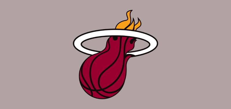
The Miami Heat logo features a flaming basketball passing through a white hoop with the wordmark “MIAMI HEAT” displayed below, designed by Mark Henderson and Richard Lyons in 1988. The emblem won 34% of fan votes from approximately 13,000 submissions in a public contest held by the Miami Herald Newspaper.
Design Type: Combination mark featuring both symbol and wordmark
Primary Elements: Flaming basketball, basketball hoop, two-line text treatment
Official Introduction Date: 1988 (inaugural season)
Designer/Agency: Mark Henderson and Richard Lyons (contest winners)
Trademark Status: Protected NBA franchise trademark
Color Palette:
- Heat Red: #98002E (Pantone PMS 202 C)
- Heat Yellow: #F9A01B (Pantone PMS 137 C)
- Black: #000000 (Pantone PMS Process Black C)
- White: #FFFFFF
Usage Context: Team jerseys, merchandise, court floor design, broadcast graphics, digital platforms, arena signage
How Has the Miami Heat Logo Evolved Over Time?

The Miami Heat emblem has remained remarkably stable since 1988, undergoing only one color palette adjustment in 1999.
This consistency is unusual among NBA franchises and reflects strong initial design execution.
Original Miami Heat Logo (1988-1999)
Years Active: 1988-1999
Design Description: Flaming basketball in bright orange gradient tones passing through a black hoop
Color Scheme: Bright orange, gradients of yellow-orange, black
Designer: Mark Henderson and Richard Lyons
Context: Created for the franchise’s inaugural NBA season, reflecting Miami’s hot climate and vibrant cultural energy
Key Changes from Previous: Initial design, no previous version
Cultural Significance: Established immediate brand recognition in South Florida, resonated with fans who voted it as their top choice
The original design used bold orange flames that mimicked fire’s natural movement.
The basketball showed white lines representing standard ball seams.
The wordmark “MIAMI HEAT” appeared in slanted, italicized black letters below the graphic.
Current Miami Heat Logo (1999-Present)
Years Active: 1999-Present
Design Description: Refined flaming basketball in deep red tones with orange flame tips passing through white hoop with black outline
Color Scheme: Dark red (brick red below rim), orange-yellow (flame tips), white (hoop), black (outline and text)
Designer: Modified by franchise design team
Context: Updated to align with jersey redesign and new millennium rebranding efforts
Key Changes from Previous: Basketball changed from bright orange gradient to deeper red tones, hoop shifted from solid black to white with black outline, flames refined with more stylized curves
Cultural Significance: Modernized look coincided with team’s rise as championship contender under Pat Riley
The 1999 refinement created better contrast and improved visibility across digital and print applications.
The white hoop provided stronger visual separation between elements.
What Do the Design Elements of the Miami Heat Logo Mean?
The flaming basketball symbolizes competitive intensity, Miami’s tropical heat, and the burning passion players bring to the court.
The design connects the literal meaning of “Heat” with basketball’s fast-paced energy.
Symbolic Meaning
The flames represent more than temperature. They embody the franchise’s fiery determination and aggressive playing style.
The basketball passing through the hoop suggests success and scoring. It’s a focal point that communicates achievement and forward motion.
Historical Context
Miami’s climate and vibrant nightlife culture influenced the design direction. The city’s reputation for heat, both literally and culturally, made “Heat” a natural team name.
Why Did Miami Heat Choose These Specific Colors?
Heat Red (Pantone PMS 202 C, #98002E)
The deep red symbolizes passion, vitality, and determination.
Color psychology associates red with energy, power, and competitive drive. Players consider it a lucky color that represents strength on the court.
Heat Yellow/Orange (Pantone PMS 137 C, #F9A01B)
Orange-yellow tones represent Miami’s sun, energy, and youthful enthusiasm.
These warm hues connect to Florida’s tropical environment and beach culture. The gradient effect mimics natural fire movement.
Black (Pantone PMS Process Black C, #000000)
Black adds sophistication, dominance, and authority to the design.
It provides strong contrast and grounding balance against the bright warm colors.
What Typography Style Is Used in the Miami Heat Logo?

The wordmark uses a modified version of Antique Olive Nord Italic, creating dynamic forward motion.
The slanted sans-serif font suggests speed and athleticism. The two-line treatment breaks “MIAMI” and “HEAT” across separate lines with intentional misalignment, adding movement to the static text.
A small flame extends from the top of the final “T” in “HEAT,” reinforcing the fire theme throughout the composition.
What Are the Hidden Meanings in the Miami Heat Logo?
The asymmetrical composition creates dynamic visual tension that mirrors basketball’s unpredictable nature.
The basketball’s downward angle toward “MIAMI” subtly emphasizes the team’s geographic identity. Negative space around the misaligned text balances the dominant flaming ball image.
Some observers note the hoop’s circular form suggests the sun setting into Miami’s ocean horizon, though designers haven’t officially confirmed this interpretation.
How Does the Miami Heat Logo Compare to Competitor Logos?
The Miami Heat stands apart from other NBA franchises through its literal interpretation of the team name and consistent fire imagery.
Unlike teams that changed emblems multiple times, Miami maintained visual continuity.
Comparison to Other NBA Logos
The Chicago Bulls logo uses aggressive animal imagery while Miami chose elemental fire.
The Los Angeles Lakers logo emphasizes text-based branding over symbolic graphics.
The Boston Celtics logo relies on mascot character representation versus Miami’s abstract flame concept.
Among Southeast Division rivals, Miami’s design is boldest in color saturation and dynamic motion. The Orlando Magic logo uses cooler blue tones, while the Charlotte Hornets logo employs teal and purple.
Miami’s warm color palette differentiates it immediately from competitors using traditional sports colors like blue, green, or purple.
What Are the Technical Specifications of the Miami Heat Logo?

Official Color Codes:
Primary Color: Heat Red
Secondary Color: Heat Yellow
- Pantone: PMS 137 C
- Hex: #F9A01B
- RGB: (249, 160, 27)
- CMYK: (0, 43, 100, 0)
Accent Color: Black
- Pantone: PMS Process Black C
- Hex: #000000
- RGB: (6, 25, 34)
- CMYK: (30, 0, 0, 100)
Additional Color: White
- Hex: #FFFFFF
- RGB: (255, 255, 255)
- CMYK: (0, 0, 0, 0)
Dimensions and Proportions:
The flaming basketball occupies roughly 60% of the total emblem height, creating visual dominance.
The wordmark accounts for approximately 30% of the composition, positioned below with strategic spacing. Alignment between the basketball’s angle and text creates cohesive directional flow.
Minimum Size Requirements:
Digital applications require minimum 150 pixels width to maintain flame detail legibility.
Print applications need minimum 1 inch width at 300 DPI for clear reproduction.
Clear Space Specifications:
Official brand guidelines mandate clear space equivalent to the height of the “M” in “MIAMI” surrounding all sides of the emblem.
Official Usage Guidelines:
The emblem must appear on solid backgrounds without interference. Vector graphics formats are required for professional reproduction to maintain crisp edges and scalability.
What Cultural Impact Has the Miami Heat Logo Had?
The Miami Heat emblem became a street fashion icon beyond sports apparel, appearing in hip-hop culture, urban fashion, and international markets.
Its bold aesthetic resonated with Miami’s multicultural population and Latin American fan base.
The design influenced sports branding by demonstrating that simple, bold concepts could achieve lasting recognition without frequent updates. Many teams studied Miami’s consistency when evaluating their own logo strategies.
The Vice City alternate uniforms introduced in 2018 expanded the brand while maintaining core flame elements, becoming the NBA’s top-selling jersey that season. This showed the original logo design was flexible enough to support variations.
How Does the Miami Heat Logo Fit Into Overall Brand Identity?

The flaming basketball serves as the central visual anchor for all Heat branding initiatives, from digital platforms to arena experience.
The team’s brand style guide extends the fire theme through complementary graphics and typography choices. Court designs, broadcast packages, and merchandise all reference the logo’s color scheme and dynamic energy.
Mascot Burnie reinforces the fire concept through character design and game-day entertainment. The Kaseya Center (formerly American Airlines Arena) incorporates logo elements throughout architectural details and wayfinding signage.
How Should the Miami Heat Logo Be Used?
Official Usage Do’s:
- Reproduce from official vector files only
- Maintain specified clear space around all edges
- Use on solid backgrounds that provide adequate contrast
- Apply correct color values from official specifications
- Preserve original proportions without distortion
Official Usage Don’ts:
- Never alter colors or substitute with non-approved shades
- Never rotate, skew, or distort the emblem’s proportions
- Never place on busy patterns or photographic backgrounds
- Never recreate or redraw the logo manually
- Never separate elements or use partial sections independently
Where to Access Official Logos:
Official high-resolution files are available through NBA Media Ventures for licensed partners. The Miami Heat official website provides approved versions for editorial and news usage.
Licensing Information:
The emblem is registered trademark property of the Miami Heat and NBA Properties, Inc. Commercial usage requires official licensing agreements. Unauthorized reproduction for merchandise or profit violates trademark law and can result in legal action.
Trademark Protection Details:
The Miami Heat actively enforces trademark rights to prevent counterfeit merchandise and unauthorized commercial usage. The NBA maintains strict standards for logo design principles across all franchises.
FAQ About the Miami Heat Logo
When was the Miami Heat logo created?
The Miami Heat logo was created in 1988 for the team’s inaugural NBA season. Mark Henderson and Richard Lyons designed the winning entry from a public contest that received approximately 13,000 submissions, with their design capturing 34% of fan votes to become the official team emblem.
Who designed the Miami Heat logo?
Mark Henderson and Richard Lyons designed the Miami Heat logo, winning a public contest organized by the Miami Herald Newspaper in 1988. Henderson, a graduate of The Art Institute of Fort Lauderdale, created the now-iconic flaming basketball design that has represented the franchise since its founding.
What do the colors in the Miami Heat logo mean?
Heat Red symbolizes passion, vitality, and determination, while Heat Yellow represents Miami’s sun, energy, and youthful enthusiasm. Black adds sophistication and dominance, and white provides contrast and clarity. Together, these colors create a warm palette that reflects Miami’s tropical climate and the team’s fiery competitive spirit.
How many times has the Miami Heat logo been redesigned?
The Miami Heat logo has been redesigned only once since its 1988 debut. The 1999 modification changed the color palette from bright orange tones to deeper red with orange flame tips and switched the hoop from black to white with a black outline, while maintaining the original structure and concept.
Where can I download the official Miami Heat logo?
Official Miami Heat logo files are available through the team’s official website for editorial and news purposes. Licensed partners can access high-resolution versions through NBA Media Ventures. Commercial usage requires proper licensing agreements through NBA Properties, Inc., as the logo is protected trademark property.
Is the Miami Heat logo trademarked?
Yes, the Miami Heat logo is a registered trademark protected by the team and NBA Properties, Inc. Unauthorized commercial usage, reproduction for merchandise, or any profit-generating application without proper licensing violates trademark law and can result in legal consequences. The NBA actively enforces these protections.
What font is used in the Miami Heat logo?
The Miami Heat logo uses a modified version of Antique Olive Nord Italic for its wordmark. The slanted sans-serif typeface creates dynamic forward motion, with intentional misalignment between “MIAMI” and “HEAT” across two lines. A small flame extends from the top of the final “T” to reinforce the fire theme.
Why did Miami Heat choose a flaming basketball for their logo?
Miami Heat chose a flaming basketball to literally interpret the team name while symbolizing competitive intensity and Miami’s hot climate. The design emerged from a 1988 public contest where Henderson and Lyons’ concept resonated with fans, representing both the city’s tropical energy and basketball’s fast-paced, heated competition on the court.
Conclusion
The Miami Heat logo stands as one of professional sports’ most enduring and recognizable emblems, maintaining visual consistency for over three decades.
Its flaming basketball design successfully captures Miami’s geographic identity, competitive spirit, and cultural vibrancy through simple yet powerful imagery.
The logo’s longevity demonstrates that strong initial graphic design principles can transcend trends. By using warm colors, dynamic composition, and clear symbolism, the design remains relevant across generations.
As the Miami Heat continues competing in the NBA, this iconic emblem will keep burning as a symbol of South Florida basketball excellence and the franchise’s championship legacy.
If you liked this article about the Miami Heat logo, you should check out this article about the Chicago Bulls logo.
There are also similar articles discussing the Golden State Warriors logo, the Houston Rockets logo, the Detroit Pistons logo, and the Milwaukee Bucks logo.
And let’s not forget about articles on the Cleveland Cavaliers logo, the Utah Jazz logo, the Toronto Raptors logo, and the Memphis Grizzlies logo.

Renowned for his expertise in logo design and visual branding, Bogdan has developed a multitude of logos for various clients.
His skills extend to creating posters, vector illustrations, business cards, and brochures. Additionally, Bogdan's UI kits were featured on marketplaces like Visual Hierarchy and UI8.
He also wrote in the past years on sites like Design Your Way, WebDesignerDepot, WPDean, Designmodo, Speckyboy, Slider Revolution, and more.
- The Cursor Logo History, Colors, Font, And Meaning - 24 September 2026
- Top 7 Web Design Subscription Services That Replace Full-Time Hires - 24 September 2026
- Canva vs PowerPoint: Which Is Better for Presentations? - 22 September 2026

Bogdan Sandu is a seasoned designer who has been designing websites since 2008. Renowned for his expertise in logo design and visual branding, Bogdan has developed a multitude of logos for various clients. His skills extend to creating posters, vector illustrations, business cards, and brochures. Additionally, Bogdan's UI kits were featured on marketplaces like Visual Hierarchy and UI8. He also wrote in the past years on sites like Design Your Way, WebDesignerDepot, WPDean, Designmodo, Speckyboy, Slider Revolution, and more.
You Might Also Like