The Milwaukee Bucks Logo History, Colors, Font, and Meaning
A single emblem, woven into the fabric of a community, can rise to embody far more than the athletes it represents. Enter the Milwaukee Bucks logo: a convergence of history, pride, and design ingenuity.
Each stroke, a silent testament to Milwaukee’s heritage and the unbridled spirit of a basketball titan, this icon is not merely a visual—it’s a beacon for Wisconsin’s NBA franchise, a symbol that resonates with fans far beyond mere sportsmanship.
Within this exploration, we’ll delve into the tapestry that crafts such an influential sports emblem, unveiling the nuances that empower symbols to transcend the physical and become anchors for identity.
Unpack the layers of the Bucks emblem, from its green and cream color palette mirroring Wisconsin’s lush landscapes to the fierce deer, standing as a guardian of unity and perseverance.
By article’s end, a richer understanding of how the elements of graphic design coalesce to forge a sports logo that’s compelling, memorable, and deeply interconnected with its community’s heart will be yours—an insight not just into Milwaukee’s visual identity, but also the significance such icons hold in the world of NBA branding and fan engagement.
The Meaning Behind the Milwaukee Bucks Logo
![]()
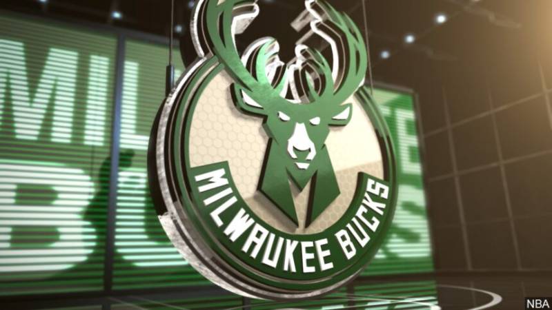
Ah, the Milwaukee Bucks logo. Ever gazed at it and wondered, “Hey, what’s the story here?” Let’s break it down together.
Deer Design
Okay, so first things first. That stunning deer – it’s not just any deer. It’s a Buck.
A strong, assertive buck that’s meant to represent athleticism, power, and of course, the spirit of Milwaukee. It’s like the team saying, “We’re fierce, we’re fast, and we’ve got game.”
The Circle & Basketball
Have you noticed the circle that encapsulates the Buck and the basketball? That circle, my friends, signifies unity and wholeness.
The basketball in the logo? Well, that’s a no-brainer. It’s the game itself, the passion, the madness!
The History of the Milwaukee Bucks Logo
![]()
Man, logos have stories, just like people. Let’s dive deep into this one.
The Beginning
Back in the days, 1968 to be precise, the Bucks logo was, well, a tad different. Imagine a buck, dressed in a sweater (yes, a sweater), dribbling a basketball. Adorable? Yes. Intimidating? Not so much.
Evolution Spree
As years rolled on, the design evolved. By the ’90s, the Buck had ditched the sweater and looked much fiercer. Fast forward to today, and we’ve got a logo that’s sleek, modern, and oozing confidence.
The Colors of the Milwaukee Bucks Logo

Color me impressed! Let’s chat about the hues and what they scream out.
Green and Cream
Green, apart from being oh-so-pleasant on the eyes, symbolizes growth, harmony, and freshness. And the cream? It’s all about richness, purity, and smoothness.
Together, they bring out the vibe of the team – fresh, growing, and pure in their love for the game.
The Font Used in the Milwaukee Bucks Logo
Fonts, they say a lot, without saying anything. Here’s the scoop on this one.
Sleek & Strong
The font in the Milwaukee Bucks logo is sleek yet assertive. It’s like the designers wanted it to shout, “We’re here, and we mean business”, without actually shouting. It complements the rest of the logo’s elements perfectly.
Fan Reactions to the Logo
Alright, the logo is cool, but what do the fans think?
Old-school Vs. New-school
You’ve got the fans who reminisce about the old designs, especially that sweater-wearing Buck. Nostalgia, you know?
Then there’s the new generation, loving the sleek, modern design, feeling it represents the Bucks of today.
Overall Vibes
The consensus? Fans love what it represents. The strength, the passion, and that unmistakable Milwaukee spirit.
How the Logo Stands Out in the NBA
In a sea of NBA logos, how does this one measure up?
Uniqueness Factor
There aren’t many teams using animals in their logos, and certainly, none with a buck. This gives Milwaukee an edge. It’s instantly recognizable.
Simplicity is Key
While some logos can be complex, the Milwaukee Bucks logo keeps things simple, making it easily memorable. You see it once, you won’t forget it.
FAQ On The Milwaukee Bucks Logo
What inspired the Milwaukee Bucks logo design?
The desire to mesh tradition with modernity spurred the logo’s inception. Designers sought to reference Milwaukee’s rich history and its connective tissue to the sport, while the fierce deer symbolizes agility and strength, much like the athletes.
The antler span represents each decade the Bucks have existed, marrying past and present.
How does the color scheme represent the Bucks?
Green stands for Wisconsin’s lushness; cream honors Milwaukee’s ‘Cream City’ nickname. These elements of the team color palette dovetail with the region’s identity.
The visual synergy creates an immediate association with the land and the NBA team, grounding the Milwaukee Bucks logo in something larger than basketball alone.
What’s the significance of the hidden basketball in the logo?
Subtlety breeds sophistication. The negative space in the antlers cradles a basketball, a nod to the enduring spirit of the game.
This integration emphasizes the essence of the Bucks as a professional basketball insignia, a clever twist befitting an artful and thoughtful sports logo design.
What does it mean when fans say ‘Fear the Deer’?
An evocative team battle cry. ‘Fear the Deer’ encapsulates the Bucks emblem—a sentiment of competitive spirit and the unstoppable nature of a buck in its prime. It’s a rallying call, steeped in pride, beckoning fans to embrace the emblem’s implicit ferocity.
Are there any other animals in the Bucks logo besides the deer?
The focus is singular, much like the animal itself—a deer. The Milwaukee basketball icon employs no other fauna, channeling the full power of attention to one animal that best represents the team’s aspirations and characteristics, echoing the qualities of speed, agility, and graceful command.
How often has the Milwaukee Bucks logo changed over the years?
Evolution is a certainty in branding. Since inception, the Bucks have reimagined their visual identity to stay contemporary.
Changes reflect shifts in design trends, team dynamics, and the desires of an evolving fan base, ensuring the logo evolution over time remains as dynamic as the sport itself.
What elements from older logos are retained in the current Bucks logo?
Honoring legacy while steering forward. The deer persists through each iteration, with the current version refining its form to embody Fear the Deer quite literally.
Colors have been deepened or adjusted, but the fundamental spirit inherent to the earlier Milwaukee Bucks logo breathes through unchanged.
Has the Bucks logo received any design awards?
Discussions in design circles reveal admiration, but specifics of awards elude the public domain. The Bucks emblem is lauded for its bold lines, clever use of negative space, and iconic representation of the team and its values, all marks of a strong sports merchandise design.
How do the Bucks’ branding efforts compare with other NBA teams?
Each NBA franchise carves its niche; the Bucks march with vigor. Their branding, a tapestry interweaving local landmarks and the spirited animal, stands robust within the league.
Comparatively, the franchise holds its own with a distinctive, memorable team branding that resonates with sports fandom.
What cultural impact does the Milwaukee Bucks logo have on the community?
More than a logo; it’s a beacon for unity. The Milwaukee basketball icon serves not just the team, but as an anchor for Milwaukee itself.
It fosters a sense of sports fandom, bringing together disparate voices in support of a singular, passionate pursuit, mirroring the unity and strength of the deer it portrays.
Conclusion
In the realm where design and sports fervor intertwine, the Milwaukee Bucks logo stands as a stately exemplar. The journey through its storied past, the depth of its emblematic presence, and its pulsating effect on fan engagement fosters a profound appreciation. This emblem transcends mere aesthetics; it encapsulates an entire franchise’s soul, mirroring Milwaukee’s heritage with every line and shade.
The deer—majestic, unfaltering, and resolute—its essence captures in singular form the spirit of a team and its supporters. As we’ve traversed the team branding and dissected the facets of graphic design that coalesce to forge such a potent symbol, a vivid tapestry emerges. That this sports logo design is cherished by its city, inspiring devotion in countless hearts, speaks to its success far beyond the confines of a basketball court.
Take a final gaze upon the Bucks’ insignia, where green, cream, and the spirit of competition are immortalized. Here lies more than an NBA team logos; here stands a beacon of unity and fierce ambition.
If you liked this article about the Milwaukee Bucks logo, you should check out this article about the Chicago Bulls logo.
There are also similar articles discussing the Golden State Warriors logo, the Miami Heat logo, the Houston Rockets logo, and the Detroit Pistons logo.
And let’s not forget about articles on the Cleveland Cavaliers logo, the Utah Jazz logo, the Toronto Raptors logo, and the Memphis Grizzlies logo.
Bogdan Sandu, a seasoned designer with 15 years of diverse experience, has been designing websites since 2008.
Renowned for his expertise in logo design and visual branding, Bogdan has developed a multitude of logos for various clients.
His skills extend to creating posters, vector illustrations, business cards, and brochures. Additionally, Bogdan's UI kits were featured on marketplaces like Visual Hierarchy and UI8.
Latest posts by Bogdan Sandu (see all)
- The Bethesda Logo History, Colors, Font, And Meaning - 28 April 2024
- Out of This World: Space Color Palettes for Cosmic Designs - 28 April 2024
- The Bungie Logo History, Colors, Font, And Meaning - 27 April 2024