

The Memphis Grizzlies represent one of professional basketball’s most recognizable franchises through their fierce bear-based branding.
Since relocating from Vancouver in 2001, the team has refined its visual identity while maintaining the aggressive grizzly bear as its central logo symbol.
The current Memphis Grizzlies emblem showcases a snarling bear head rendered in multiple blue tones with piercing yellow eyes. This design captures the team’s grit and determination that defined their playing style throughout the years.
The franchise originally launched as the Vancouver Grizzlies in 1995, making it one of two Canadian NBA expansion teams alongside the Toronto Raptors logo. After six seasons in British Columbia, financial struggles led to the team’s relocation to Memphis, Tennessee, where it became the city’s first major professional sports franchise from the big four leagues.
What is the Memphis Grizzlies Logo?
The Memphis Grizzlies logo features a fierce grizzly bear head design in navy and light blue tones with bright yellow eyes, officially introduced in its current form in 2018 as a refined version of the 2004 emblem. The mascot-based combination mark includes custom typography displaying “MEMPHIS GRIZZLIES” beneath the bear icon.
Design Type: Mascot-based combination mark
Primary Elements:
- Snarling grizzly bear head facing forward
- Custom wordmark displaying team name and city
- Sharp, angular linework creating aggressive aesthetic
- Yellow eyes providing focal point and intensity
Official Introduction Date: Current version launched 2018 (original Memphis adaptation debuted 2001)
Designer/Agency: Specific designer information not publicly disclosed for Memphis iterations
Trademark Status: Registered trademark protected by the NBA and Memphis Grizzlies ownership
Color Palette:
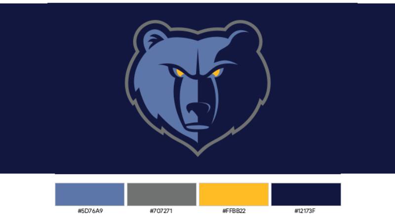
- Memphis Midnight Blue: #12173F (Pantone 289 C)
- Beale Street Blue: #5D76A9 (Pantone 652 C)
- Grizzlies Gold: #FDB927 (Pantone 123 C)
- Steel Gray: #707271 (Pantone 424 C)
Usage Context: The emblem appears across jerseys, court designs, merchandise, digital platforms, marketing materials, and broadcast graphics throughout the franchise’s branding ecosystem.
How Has the Memphis Grizzlies Logo Evolved Over Time?
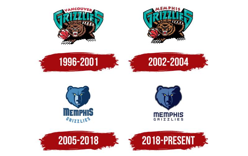
The franchise logo journey spans four distinct eras from Vancouver’s teal-and-burgundy beginnings through Memphis’s navy-and-gold transformation. Each redesign reflected the team’s geographical identity and cultural positioning within its community.
Original Vancouver Grizzlies Logo (1995-2001)
Years Active: 1995-2001
Design Description: An aggressive grizzly bear gripping a basketball with exposed teeth and claws, rendered in teal and burgundy tones
Color Scheme: Turquoise teal, rust red, brown, black accents
Designer: Created for Vancouver expansion franchise
Context: Designed when the NBA expanded into Canada, selecting the grizzly as representative of British Columbia’s wildlife
Key Changes from Previous: First logo for the expansion franchise
Cultural Significance: Represented Canada’s second NBA team and Pacific Northwest identity
The Vancouver design emphasized a cartoonish, energetic bear that held a basketball between its paws. The wordmarks “VANCOUVER” and “GRIZZLIES” appeared in bold letters with enlarged G and S characters creating visual interest.
This original emblem established the bear mascot that would define the franchise through multiple iterations.
Memphis Transition Logo (2001-2004)
Years Active: 2001-2004
Design Description: Identical Vancouver bear design with “MEMPHIS” replacing “VANCOUVER” in the wordmark
Color Scheme: Maintained turquoise, red, brown from Vancouver era
Designer: Adapted from Vancouver original
Context: Quick rebrand following relocation, maintaining visual continuity during transition period
Key Changes from Previous: Only city name modified in wordmark
Cultural Significance: Bridge between Canadian origins and Tennessee identity
The team kept Vancouver’s color scheme during the initial Memphis seasons while playing at the Pyramid Arena. This approach minimized immediate rebranding costs while the franchise established its new market presence.
Memphis Bear Head Logo (2004-2018)
Years Active: 2004-2018
Design Description: Refined grizzly bear head with more stoic, focused expression featuring three shades of blue and glowing yellow eyes
Color Scheme: Memphis Midnight Blue, Beale Street Blue, Smoke Blue, Grizzlies Gold
Designer: Created for FedExForum move and complete Memphis rebrand
Context: Launched when team relocated to FedExForum, establishing distinct Memphis identity separate from Vancouver heritage
Key Changes from Previous: Completely new color palette referencing Memphis culture, simplified bear head replacing full-body illustration, arched “GRIZZLIES” wordmark
Cultural Significance: Beale Street Blue honored Memphis’s blues music heritage, while the color scheme reflected the city’s gritty character
This version introduced the three-blue color palette that connected the team to Memphis’s cultural identity. The Smoke Blue shade created softer gradient transitions across the bear’s features.
The bear’s expression shifted from aggressive snarling to determined focus, matching the “Grit and Grind” playing style that defined successful Memphis teams featuring Zach Randolph, Marc Gasol, and Tony Allen.
Current Memphis Grizzlies Logo (2018-Present)
Years Active: 2018-present
Design Description: Sharpened bear head with darker tones, gray outline replacing smoke blue, straightened horizontal wordmark
Color Scheme: Memphis Midnight Blue, Beale Street Blue, Grizzlies Gold, Steel Gray (replacing Smoke Blue)
Designer: In-house refinement of 2004 design
Context: Modernization maintaining core visual identity while enhancing digital reproduction and merchandise clarity
Key Changes from Previous: Gray outline added for definition, Smoke Blue eliminated, “GRIZZLIES” wordmark straightened horizontally instead of arched, custom typography refined with geometric precision
Cultural Significance: Reflects contemporary Memphis while honoring established franchise identity
The 2018 update strengthened the emblem’s visual impact through increased contrast and sharper edges. The removal of Smoke Blue simplified color reproduction across various media formats.
Typography changes brought geometric consistency, with the “MEMPHIS” wordmark featuring smooth curves while “GRIZZLIES” adopted angular letterforms.
What Do the Design Elements of the Memphis Grizzlies Logo Mean?
The grizzly bear symbolizes strength, resilience, and territorial dominance, qualities reflecting both the team’s competitive approach and Memphis’s cultural character as a city that overcame adversity. The aggressive forward-facing posture communicates intimidation toward opponents.
Why Did Memphis Grizzlies Choose These Specific Colors?
Memphis Midnight Blue (#12173F, Pantone 289 C)
The deep navy represents strength, stability, and authority. This dominant shade anchors the visual identity while conveying professional legitimacy within the NBA landscape.
Midnight Blue connects to Memphis nightlife culture and the city’s musical heritage that flourished after dark on Beale Street.
Beale Street Blue (#5D76A9, Pantone 652 C)
Named after Memphis’s famous blues music district, this medium blue directly honors the city’s cultural significance as the birthplace of blues music legends.
The shade balances the darker midnight blue while providing visual hierarchy separation in design applications.
Grizzlies Gold (#FDB927, Pantone 123 C)
The vibrant gold symbolizes championship aspirations, victory, and excellence. As an accent color, gold creates dynamic energy against the blue foundation.
This hue provides high visibility for jersey numbers and emphasizes key branding elements.
Steel Gray (#707271, Pantone 424 C)
Gray replaced the previous Smoke Blue in 2018, representing industrial toughness and the grit associated with Memphis’s blue-collar identity.
The neutral tone improves outline definition and ensures consistent reproduction across digital and print media.
What Typography Style Is Used in the Memphis Grizzlies Logo?
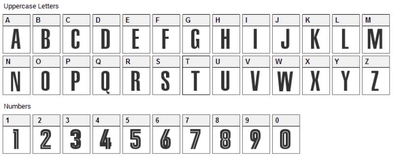
The Memphis Grizzlies utilize custom typeface designs specifically created for team branding. The “MEMPHIS” wordmark features smooth, rounded angles suggesting approachability, while “GRIZZLIES” employs geometric letterforms with sharp corners communicating aggression and precision.
Both wordmarks use sans-serif font structures for modern clarity and legibility across various scales.
The uppercase lettering ensures maximum impact and readability on jerseys, merchandise, and digital applications.
What Are the Hidden Meanings in the Memphis Grizzlies Logo?
The bear’s yellow eyes create an otherworldly, almost supernatural intensity that suggests vigilance and constant awareness. This design choice positions the team as perpetually alert and dangerous.
The forward-leaning posture implies motion and momentum, suggesting the team is always advancing rather than static or defensive.
While grizzly bears don’t inhabit Tennessee naturally, the team retained the name from its Vancouver origins, creating an interesting disconnect that some fans view as honoring franchise history rather than local wildlife.
The three-shade blue system originally employed in 2004 referenced the Mississippi River’s various water tones visible throughout Memphis, though this connection was never officially confirmed by team leadership.
How Does the Memphis Grizzlies Logo Compare to Competitor Logos?
The Memphis emblem stands among aggressive animal-based NBA designs alongside the Chicago Bulls logo and Toronto Raptors logo. Where Chicago employs minimalist geometric abstraction and Toronto features prehistoric ferocity, Memphis balances detailed illustration with contemporary styling.
Compared to Western Conference rivals, the Grizzlies logo uses more intricate linework than simplified designs like the Golden State Warriors logo or Los Angeles Lakers logo.
The color theory behind Memphis’s blue-and-gold scheme creates visual connections to the Utah Jazz logo and Denver Nuggets logo, though each team applies these hues differently.
Memphis’s mascot-forward approach differs significantly from text-focused designs like the Brooklyn Nets logo or abstract concepts seen in the Miami Heat logo.
The grizzly bear provides stronger regional storytelling than generic animal choices, positioning Memphis uniquely within NBA logos despite the species not being native to Tennessee.
What Are the Technical Specifications of the Memphis Grizzlies Logo?
Official Color Codes
Memphis Midnight Blue (Primary)
Beale Street Blue (Secondary)
- Hex: #5D76A9
- RGB: (93, 118, 169)
- CMYK: (64, 38, 7, 2)
- Pantone: PMS 652 C
Grizzlies Gold (Accent)
- Hex: #FDB927
- RGB: (253, 185, 39)
- CMYK: (0, 23, 91, 0)
- Pantone: PMS 123 C
Steel Gray (Outline)
- Hex: #707271
- RGB: (112, 114, 113)
- CMYK: (30, 20, 19, 58)
- Pantone: PMS 424 C
Dimensions and Proportions
The logo maintains specific scale and proportion requirements for consistent reproduction. Official usage mandates minimum size specifications to preserve legibility and visual impact.
Clear space surrounding the emblem prevents visual clutter and maintains brand integrity across applications.
Vector graphics formats ensure scalability without quality loss, supporting everything from small merchandise tags to large arena displays.
What Cultural Impact Has the Memphis Grizzlies Logo Had?
The Grizzlies emblem became synonymous with the “Grit and Grind” era that defined Memphis basketball from 2010-2017. This period established the franchise as a consistent playoff contender built on defensive intensity and physical play.
The logo appeared throughout Memphis during the team’s most successful years, becoming a symbol of civic pride for a city often overlooked by national media coverage.
FedExForum displays the bear prominently, creating an intimidating home court atmosphere that contributed to Memphis’s strong home record during competitive seasons.
The emblem’s visibility increased nationally during playoff runs, particularly memorable series against the San Antonio Spurs logo team and Oklahoma City Thunder logo squads.
Ja Morant’s emergence as a franchise star brought renewed attention to the logo, with his highlight-reel performances making the Grizzlies brand more recognizable to younger basketball fans globally.
How Does the Memphis Grizzlies Logo Fit Into the Overall Brand Identity?
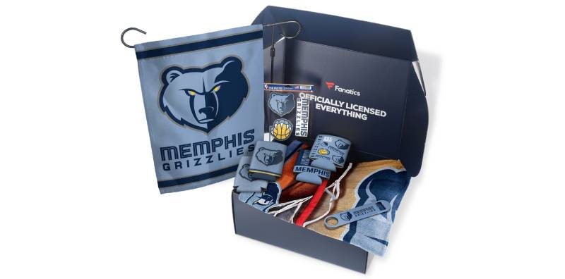
The bear mascot extends beyond the primary logo into the team’s broader visual ecosystem. Grizz, the live mascot introduced in Vancouver, maintains consistency with the illustrated bear while adding personality during games and community events.
Secondary logos featuring bear claws, partial bear heads, and alternate wordmarks provide flexibility for merchandise and marketing applications while maintaining brand cohesion.
Brand guidelines specify exact color usage, minimum sizing, clear space requirements, and approved variations, ensuring consistent presentation across all touchpoints.
The franchise’s social media presence incorporates the logo prominently while expanding the visual language through custom graphics that reference Memphis culture, blues music, and team achievements.
Jersey designs integrate the logo strategically, with the bear head appearing on warm-up gear and the wordmark featured across game uniforms.
Court design at FedExForum prominently displays the logo at center court, creating a branded environment that reinforces team identity throughout the fan experience.
How Should the Memphis Grizzlies Logo Be Used?
Official logo files are available through NBA licensing channels for approved commercial use. Unauthorized reproduction violates trademark protections enforced by the league office.
Proper usage requires maintaining specified clear space around the emblem, avoiding distortion or recoloring, and adhering to minimum size requirements that preserve legibility.
The bear head should never be separated from its gray outline or presented in non-approved colors. Merchandise manufacturers must obtain proper licensing agreements before producing branded products.
Digital applications should use provided vector graphics files rather than compressed bitmap or JPEG formats that reduce quality at various scales.
For print applications, CMYK color values ensure accurate reproduction, while RGB specifications maintain consistency across screens and digital displays.
FAQ About the Memphis Grizzlies Logo
When was the Memphis Grizzlies logo created?
The original Grizzlies logo was created in 1995 for the Vancouver franchise, with the Memphis-specific version launching in 2001. The current design iteration debuted in 2004 and received refinements in 2018.
Who designed the Memphis Grizzlies logo?
Specific designer attribution for the Memphis versions has not been publicly disclosed by the franchise or NBA. The original Vancouver design came from the expansion branding process, while Memphis iterations appear to be in-house refinements.
What do the colors in the Memphis Grizzlies logo mean?
Memphis Midnight Blue represents strength and stability, Beale Street Blue honors the city’s blues music heritage, Grizzlies Gold symbolizes championship ambition, and Steel Gray reflects Memphis’s gritty character and industrial work ethic.
How many times has the Memphis Grizzlies logo been redesigned?
The franchise has used four primary logo versions: Vancouver original (1995-2001), Memphis transition (2001-2004), Memphis bear head (2004-2018), and current refined design (2018-present). Minor updates occurred within these periods.
Where can I download the official Memphis Grizzlies logo?
Official logos are available through NBA licensing channels for approved commercial use. Fans should access logo files through the Memphis Grizzlies official website or NBA.com for personal, non-commercial purposes only.
Is the Memphis Grizzlies logo trademarked?
Yes, the Memphis Grizzlies logo is a registered trademark protected by the NBA and franchise ownership. Unauthorized commercial use violates intellectual property rights and faces legal enforcement.
What font is used in the Memphis Grizzlies logo?
The Memphis Grizzlies use custom typography specifically designed for the franchise rather than standard commercial typefaces. These proprietary letterforms ensure unique brand identity and legal protection.
Why did Memphis Grizzlies choose a grizzly bear for their logo?
The bear originated with the Vancouver franchise, selected to represent British Columbia’s indigenous wildlife. Memphis retained the mascot after relocation to maintain franchise continuity, though grizzlies don’t naturally inhabit Tennessee.
Conclusion
The Memphis Grizzlies logo represents successful sports branding that balances historical continuity with regional identity.
The fierce grizzly bear head communicates competitive intensity, Memphis Midnight Blue anchors the color system with authority, Beale Street Blue honors local cultural heritage, and Grizzlies Gold emphasizes championship aspirations.
This emblem distinguishes itself within NBA visual identity through detailed illustration, culturally meaningful color choices, and consistent evolution that maintains brand recognition across multiple redesigns.
As the franchise continues developing young talent around Ja Morant, the logo will represent Memphis basketball to new generations while honoring the grit-and-grind tradition that established the team’s competitive identity.
If you liked this article about the Memphis Grizzlies logo, you should check out this article about the Chicago Bulls logo.
There are also similar articles discussing the Golden State Warriors logo, the Miami Heat logo, the Houston Rockets logo, and the Detroit Pistons logo.
And let’s not forget about articles on the Milwaukee Bucks logo, the Cleveland Cavaliers logo, the Utah Jazz logo, and the Toronto Raptors logo.

Renowned for his expertise in logo design and visual branding, Bogdan has developed a multitude of logos for various clients.
His skills extend to creating posters, vector illustrations, business cards, and brochures. Additionally, Bogdan's UI kits were featured on marketplaces like Visual Hierarchy and UI8.
He also wrote in the past years on sites like Design Your Way, WebDesignerDepot, WPDean, Designmodo, Speckyboy, Slider Revolution, and more.
- How to Embed Fonts in PDF for Reliable Printing - 30 September 2026
- How to Create Product Design Principles That Evolve With Your Product - 29 September 2026
- Canva vs Midjourney: AI Design Tools Compared - 28 September 2026

Bogdan Sandu is a seasoned designer who has been designing websites since 2008. Renowned for his expertise in logo design and visual branding, Bogdan has developed a multitude of logos for various clients. His skills extend to creating posters, vector illustrations, business cards, and brochures. Additionally, Bogdan's UI kits were featured on marketplaces like Visual Hierarchy and UI8. He also wrote in the past years on sites like Design Your Way, WebDesignerDepot, WPDean, Designmodo, Speckyboy, Slider Revolution, and more.
You Might Also Like


