The Los Angeles Lakers logo stands as one of basketball’s most recognizable marks of excellence.
Founded in 1947 as the Minneapolis Lakers, the franchise relocated to Los Angeles in 1960 and has won 17 NBA championships. The current logo features purple wordmark lettering over a gold basketball with black outlines, a design that has remained largely consistent since 1976. The team has used six major logo iterations throughout its history.
What is the Los Angeles Lakers Logo?
The Lakers logo is a wordmark design featuring “Los Angeles Lakers” in purple Bauer Bodoni Black Italic typeface over a gold basketball with black outlines and distinctive horizontal speed lines. Introduced in its current form in 2001, the emblem uses Lakers Purple (Pantone PMS 526 C) and Lakers Gold (Pantone PMS 123 C). The design is trademarked and owned by the Lakers organization.
Core Design Attributes:
Design Type: Wordmark emblem with basketball background
Primary Elements: Italicized serif lettering, stylized basketball, motion lines
Official Introduction: Current version launched 2001 (based on 1976 design)
Designer/Agency: Created in-house by Lakers branding department
Trademark Status: Registered trademark of Los Angeles Lakers, LLC
Color Palette:
- Lakers Purple: HEX #552583, RGB (85, 37, 130), CMYK (79, 100, 0, 12), Pantone PMS 526 C
- Gold: HEX #FDB927, RGB (253, 185, 39), CMYK (0, 30, 94, 0), Pantone PMS 123 C
- Black: HEX #000000, RGB (6, 25, 34), CMYK (30, 0, 0, 100), Pantone PMS Process Black C
Usage Context: Uniforms, court designs, merchandise, digital media, marketing materials
The basketball features distinctive curved seams and serves as the foundation for the entire composition. The speed lines extending from the “Lakers” wordmark create a sense of forward momentum.
How Has the Los Angeles Lakers Logo Evolved Over Time?
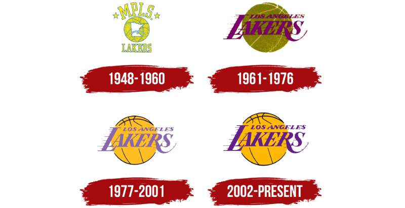
The Lakers logo has undergone six major redesigns since 1947, transitioning from a Minneapolis-focused emblem to the iconic purple and gold design recognized globally. Each version reflected the team’s location, era, and basketball culture shifts.
Original Minneapolis Lakers Logo (1947-1960)
Years Active: 1947-1960
Design Description: Yellow basketball with blue lines featuring a white outline of Minnesota with a yellow star marking Minneapolis
Color Scheme: Yellow, blue, white
Designer: Minneapolis Lakers front office
Context: Created after Ben Berger and Morris Chalfen purchased the defunct Detroit Gems franchise for $15,000 and relocated to Minneapolis
Key Elements: “MPLS” wordmark above the basketball with stars, “Lakers” below
Cultural Significance: Represented Minnesota’s “Land of 10,000 Lakes” nickname and established regional identity
The original design connected the team directly to its geographic roots. The Minnesota state outline served as the focal point, immediately communicating location to fans.
Early Los Angeles Logo (1960-1967)
Years Active: 1960-1967
Design Description: Dark greenish-brown basketball with “Los Angeles Lakers” wordmark in red-purple
Color Scheme: Green-brown basketball, red-purple text
Context: Created immediately after the team’s 1960 relocation to California
Key Changes from Previous: Removed Minnesota map, added “Los Angeles” text, introduced motion lines
Cultural Significance: Marked the franchise’s transformation into a West Coast powerhouse
This transitional design retained the basketball element but completely reimagined the team’s visual identity. The forward-leaning typography with speed lines first appeared in this version.
Chartreuse Era Logo (1967-1976)
Years Active: 1967-1976
Design Description: Chartreuse (acid-green) basketball with deep purple wordmark and horizontal motion lines
Color Scheme: Chartreuse green, deep purple, black outlines
Context: Reflected 1960s design trends when chartreuse was popular
Key Changes from Previous: Dramatic color shift to green basketball, darker purple text, more prominent speed lines
Cultural Significance: Represented the team during its rivalry development with Boston Celtics and acquisition of Wilt Chamberlain
The bold color choices aligned with 1960s aesthetic preferences but created low visual contrast between elements.
Purple and Gold Introduction (1976-2001)
Years Active: 1976-2001
Design Description: Gold basketball with light purple lilac wordmark and black outline added to basketball
Color Scheme: Gold, light purple, black, white
Designer: Lakers branding team under owner Jerry Buss
Context: Introduced during Jerry Buss ownership and the beginning of the Showtime era
Key Changes from Previous: Changed chartreuse to gold, lightened purple shade, added black outline for clarity, reversed basketball seam direction
Cultural Significance: Established the iconic purple and gold color scheme that became synonymous with Lakers championships in the 1980s
This version remained unchanged for 24 years, the longest-lasting logo in franchise history. The addition of black outlines significantly improved legibility.
Modern Lakers Logo (2001-Present)
Years Active: 2001-Present
Design Description: Vibrant gold basketball with dark purple wordmark, black outlines, and refined motion lines
Color Scheme: Lakers Purple (#552583), Lakers Gold (#FDB927), black
Context: Updated during the Shaq and Kobe championship era
Key Changes from Previous: Darkened purple to more saturated shade, brightened gold to richer tone, enhanced black outline contrast
Cultural Significance: Modernized classic design while maintaining brand recognition through championship years
The color palette adjustments created superior visual clarity. The more saturated colors reproduce better across digital platforms and merchandise.
What Do the Design Elements of the Los Angeles Lakers Logo Mean?
The Lakers logo communicates speed, excellence, and championship tradition through its symbolic basketball, dynamic motion lines, and regal color choices. The italicized serif typography and forward-reaching speed lines represent fast-paced Showtime basketball style. The basketball itself symbolizes the sport while serving as a foundation that unifies the design elements.
The speed lines extending horizontally from the wordmark were intentionally designed to create visual movement. This design choice reflected the Lakers’ up-tempo playing style and dynamic offense that became their trademark.
Why Did the Lakers Choose These Specific Colors?
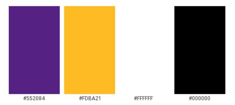
Lakers Purple (Pantone PMS 526 C)
Purple represents royalty, luxury, and prestige.
The shade was originally called “Forum Blue” when introduced in the late 1960s by owner Jack Kent Cooke after the team moved to The Forum arena. The hue creates psychological associations with excellence and championship pedigree. Purple also provided strong differentiation from other NBA teams, most of which used primary colors.
Lakers Gold (Pantone PMS 123 C)
Gold symbolizes success, achievement, and California sunshine.
The bright yellow-gold shade evokes championship trophies and winner medals. This analogous color pairs naturally with purple to create high visual contrast. The warmth of gold connects to Los Angeles’s sunny climate and Hollywood glamour.
What Typography Style Is Used in the Los Angeles Lakers Logo?
The Lakers wordmark uses Bauer Bodoni Black Italic, a neoclassical serif font designed by Giambattista Bodoni and Heinrich Jost.
The team purchased licensing rights to use this commercial typeface. The italic slant creates forward momentum while the serif styling adds sophistication and timelessness. The bold weight ensures readability across all applications from arena signage to mobile screens. Custom modifications include the distinctive horizontal speed lines that extend from the letterforms.
What Are the Hidden Meanings in the Los Angeles Lakers Logo?
The speed lines contain multiple layers of symbolism beyond simple motion.
They represent the team’s Showtime era fast-break offense pioneered by Magic Johnson. The lines point toward the future, suggesting progress and ambition. Their horizontal orientation mimics the court’s sidelines, subconsciously reinforcing basketball context. Some design analysts interpret the lines as visual echoes of California’s freeways and the city’s constant motion.
How Does the Los Angeles Lakers Logo Compare to Other NBA Logos?
The Lakers emblem ranks among the NBA’s most sophisticated wordmark-based designs, distinguished by its elegant typography elements and premium color palette compared to mascot-heavy alternatives.
Comparative Analysis with Similar Logos:
The Chicago Bulls logo uses aggressive mascot imagery versus the Lakers’ refined wordmark approach. The Boston Celtics logo features a leprecot mascot with green color dominance, while Lakers purple and gold create more regal associations. The Miami Heat logo incorporates a flaming basketball with black and red, contrasting with the Lakers’ more traditional basketball representation.
Among NBA logos, the Lakers design prioritizes minimalist design principles. The New York Knicks logo shares a similar wordmark-over-basketball structure but uses orange and blue instead. The Golden State Warriors logo evolved from wordmark to bridge iconography, while Lakers maintained consistent brand identity.
The Lakers logo demonstrates superior visual hierarchy through color saturation and spatial relationships. Purple wordmark dominates while gold basketball provides complementary support.
What Are the Technical Specifications of the Los Angeles Lakers Logo?
Official Color Codes:
Lakers Purple:
- Pantone: PMS 526 C
- HEX: #552583
- RGB: (85, 37, 130)
- CMYK: (79, 100, 0, 12)
Lakers Gold:
- Pantone: PMS 123 C
- HEX: #FDB927
- RGB: (253, 185, 39)
- CMYK: (0, 30, 94, 0)
Black:
- Pantone: PMS Process Black C
- HEX: #000000
- RGB: (6, 25, 34)
- CMYK: (30, 0, 0, 100)
Dimensions and Proportions:
The logo maintains specific aspect ratios for consistent reproduction. Minimum size requirements ensure legibility at small scales. Clear space specifications mandate protected areas around the logo equal to the height of the letter “L” in “Lakers.” Official usage guidelines prohibit color alterations, distortions, or unauthorized modifications.
Digital files are available in vector graphics formats (SVG, EPS) for scalability and bitmap formats (JPEG, PNG) for web use. DPI requirements vary by application, with print materials requiring 300 DPI minimum.
What Cultural Impact Has the Los Angeles Lakers Logo Had?
The Lakers logo has transcended sports to become a global fashion and cultural icon, appearing in streetwear, hip-hop culture, and international markets far beyond basketball fandom.
The purple and gold color combination became synonymous with Los Angeles itself, rivaling even Hollywood imagery for city recognition. Celebrities, musicians, and international fans wear Lakers merchandise regardless of basketball interest. The logo’s color psychology creates associations with luxury brands and premium products.
Fashion collaborations with streetwear brands have elevated the logo beyond sports apparel. The design has influenced other sports franchises’ branding approaches, particularly the use of sophisticated color theory rather than primary colors.
How Does the Los Angeles Lakers Logo Fit Into Overall Brand Identity?
The logo serves as the cornerstone of a comprehensive brand guidelines system that extends across all Lakers touchpoints.
The franchise maintains strict brand style guide standards for logo application. The basketball emblem connects to court design elements, where purple and gold dominate the playing surface at Crypto.com Arena. Uniform designs feature the wordmark prominently across jerseys in multiple colorways. Marketing materials maintain consistent alignment and spacing parameters.
The logo works in monochrome colors for single-color applications while maintaining recognition. Alternate logo versions include a standalone “Lakers” wordmark and an “LA” monogram for secondary uses. Proximity relationships between elements create cohesive unity across the brand system.
How Should the Los Angeles Lakers Logo Be Used?
Official Usage Guidelines:
The Lakers organization maintains strict usage standards. Never alter colors, stretch proportions, or add effects like shadows or gradients. Always maintain minimum clear space around the logo. Use only official logo files from approved sources. Do not place the logo on busy backgrounds that compromise legibility.
Where Fans Can Access Official Logos:
Official logo files are not publicly available for general download. Licensed partners receive files directly from Lakers licensing department. Fans seeking logos for personal projects should contact the team’s licensing office.
Licensing Information:
Commercial use requires licensing agreements through Lakers organization. Merchandise manufacturers must obtain official approval. Unauthorized use violates trademark protection.
Trademark Protection Details:
The Lakers logo is a registered trademark protected under federal law. The organization actively enforces trademark rights against unauthorized usage. Proper trademark symbols (TM or ®) must accompany logo usage per licensing agreements.
FAQ About the Los Angeles Lakers Logo
When was the Lakers logo created?
The Lakers logo originated in 1947 with the Minneapolis Lakers. The current Los Angeles version debuted in 1960 after relocation, with the most recent update in 2001. The iconic purple and gold color scheme was introduced in 1976.
Who designed the Lakers logo?
The Lakers logo was designed in-house by the team’s branding and marketing department. No single designer is credited publicly. The typography uses Bauer Bodoni Black Italic font created by Giambattista Bodoni and Heinrich Jost.
What do the colors in the Lakers logo mean?
Lakers Purple (Pantone PMS 526 C) represents royalty, excellence, and prestige. Gold (Pantone PMS 123 C) symbolizes championship success and California sunshine. Together they create a regal, premium brand identity.
How many times has the Lakers logo been redesigned?
The Lakers logo has been redesigned six major times: 1947 (Minneapolis), 1960 (LA relocation), 1967 (chartreuse era), 1976 (purple and gold introduction), 2001 (modern version), with minor refinements in 2002.
Where can I download the official Lakers logo?
Official Lakers logos are not publicly available for free download. The team maintains strict licensing control. Commercial use requires licensing agreements. Fans should contact the Lakers licensing department for authorized usage.
Is the Lakers logo trademarked?
Yes, the Lakers logo is a registered trademark owned by Los Angeles Lakers, LLC. The emblem is protected under federal trademark law. Unauthorized commercial use is prohibited and actively enforced.
What font is used in the Lakers logo?
The Lakers wordmark uses Bauer Bodoni Black Italic, a neoclassical serif typeface. The team purchased licensing rights for this commercial font. Custom modifications include the distinctive horizontal speed lines.
Why did the Lakers keep their name after moving to Los Angeles?
The Lakers retained their name despite Los Angeles having no lakes because of established brand recognition. The franchise had won multiple championships as the Minneapolis Lakers. Changing the name would have discarded valuable brand equity.
Conclusion
The Lakers logo represents one of professional sports’ most enduring and recognizable brand marks.
Its evolution from Minneapolis state outline to Los Angeles wordmark reflects franchise growth while maintaining design consistency. The purple and gold color scheme established in 1976 created a timeless identity that transcends basketball. The italic Bauer Bodoni typeface with speed lines communicates motion and excellence. With 17 championship titles, the emblem symbolizes sustained athletic achievement and global cultural influence.
As the NBA continues evolving, the Lakers logo stands as a masterclass in logo design principles that balance tradition with contemporary relevance.

Renowned for his expertise in logo design and visual branding, Bogdan has developed a multitude of logos for various clients.
His skills extend to creating posters, vector illustrations, business cards, and brochures. Additionally, Bogdan's UI kits were featured on marketplaces like Visual Hierarchy and UI8.
He also wrote in the past years on sites like Design Your Way, WebDesignerDepot, WPDean, Designmodo, Speckyboy, Slider Revolution, and more.
- The Windsurf Logo History, Colors, Font, And Meaning - 10 October 2026
- How to Remove Background From Product Photos (No Photoshop) - 10 October 2026
- How Designers can Build a Stronger Online Creative Identity - 9 October 2026

Bogdan Sandu is a seasoned designer who has been designing websites since 2008. Renowned for his expertise in logo design and visual branding, Bogdan has developed a multitude of logos for various clients. His skills extend to creating posters, vector illustrations, business cards, and brochures. Additionally, Bogdan's UI kits were featured on marketplaces like Visual Hierarchy and UI8. He also wrote in the past years on sites like Design Your Way, WebDesignerDepot, WPDean, Designmodo, Speckyboy, Slider Revolution, and more.
You Might Also Like