The Boston Celtics Logo History, Colors, Font, and Meaning
Leaping off the fabric of a jersey, the Boston Celtics logo captures more than just a visual symbol; it represents a storied legacy etched in the annals of the NBA.
With the precision of a point guard, I weave a thread of understanding through the rich tapestry of this iconic emblem. Picture the vibrant green shamrock, as synonymous with Boston’s pride as the legendary Larry Bird‘s unwavering gaze upon the hardwood.
Through a designer’s lens, one unravels the intricate marriage of color, legacy, and design. The Celtics logo isn’t merely an identifier; it’s a beacon of Celtic Pride, an emblem that embodies the relentless spirit of a city and its enduring love affair with the game of basketball.
In dissecting the logo’s elements, a narrative unfolds – one of championships, of Red Auerbach‘s visionary leadership, and of a fandom woven into the city’s very fabric.
By the conclusion, you’ll grasp more than the artistry behind this emblem; you’ll fathom the essence of a cultural phenomenon, transcending mere sports branding or team mascot; it is a symbol of unity, history, and aspiration.
The Meaning Behind the Boston Celtics Logo
![]()
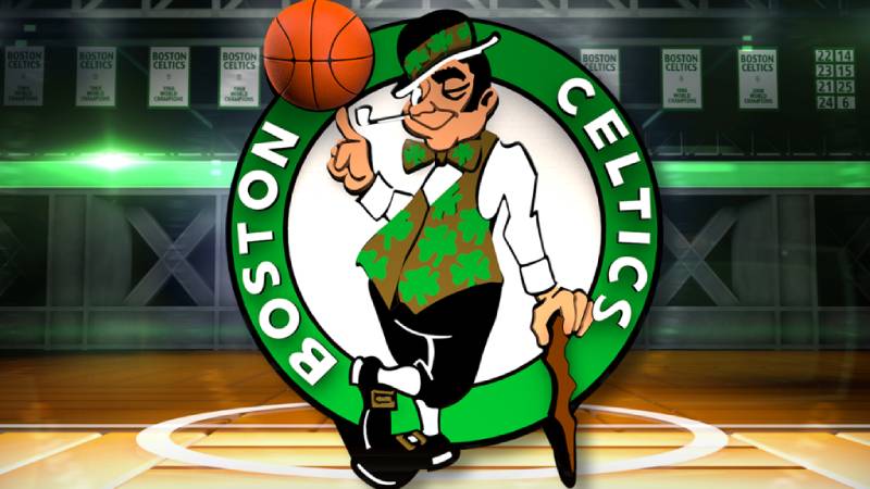
Ever stopped and stared at the Boston Celtics logo and wondered what’s the deal? Why a clover? Why the leprechaun?
Deep Irish Roots
Well, let’s chat. The Boston Celtics is more than just basketball; it’s a tribute to a deep-seated culture. Boston, as a city, has dense Irish roots. The leprechaun and the shamrock are direct nods to Irish folklore and symbolism.
Boston’s Irish history is intertwined with the Celtics’ identity. No wonder they picked an emblem that says “Irish” as loud as a leprechaun’s laugh.
Power and Luck
Shamrocks and leprechauns aren’t just there for show. They’re symbols of luck, fortune, and a bit of that mischievous spirit.
Every time the team takes the court, it’s as if they’re calling upon the power of these legends to help them take the win.
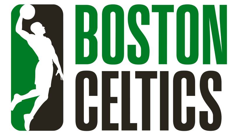
The History of the Boston Celtics Logo
![]()
I’ve got to say, it’s quite a tale.
Humble Beginnings
Back in 1949, a guy named Walter Brown chose the team name “Celtics”, giving a shoutout to Boston’s strong Irish population. But here’s the tea – the logo started as just a simple clover. No fanfare. No frills.
The Leprechaun’s Entrance
Come the 1950s, and Red Auerbach decides they need some zing. Enter our leprechaun, with his mischievous grin and iconic cane.
But he wasn’t just any leprechaun, he was designed by Zang Auerbach, Red’s brother. Talk about keeping it in the family!
The Colors of the Boston Celtics Logo
![]()
Colors are everything in design, trust me.
Green and White – Simple yet Deep
Green. White. That’s it. But oh, what a statement! Green stands for growth, harmony, freshness.
White? Purity, innocence, and brilliance. Together, they’re an unstoppable duo, representing vitality and a clean slate, each game, every time.
The Font Used in the Boston Celtics Logo
Let’s nerd out on typography, shall we?
Bold and Timeless
Fonts convey emotion. The Celtics went for a bold, unmistakably classic font.
It’s like they’re screaming, “We’re here, and we’re not going anywhere.” It’s robust, it’s in-your-face, and it’s timeless – just like their gameplay.
The Impact on Pop Culture
Oh boy, where do I even start?
Merch Madness
Caps, shirts, mugs – you name it. The logo has grown beyond the court, becoming a cultural icon. It’s not just sport; it’s a statement. Wearing that logo? You’re not just a fan; you’re part of a legacy.
Tattoos and Murals
I’ve seen some rad tats out there, inspired by the logo. It’s like taking a piece of that spirit with you, wherever you go. And those street murals? Man, some artists take the logo and just run wild, creating masterpieces that combine Boston’s street vibe with the Celtics’ legacy.
Evolution vs. Consistency
In a world where branding changes faster than you can say “dunk”, the Celtics logo stays winning.
A Constant Amidst Change
Sure, there have been tweaks, but the core? Unchanged.
It’s like they’ve found the sweet spot between staying relevant and honoring tradition. They’re playing in the big leagues of branding – keeping the essence, adjusting the peripherals.
FAQ On The Boston Celtics Logo
What’s the story behind the Boston Celtics logo?
Draped in the annals of history, the Celtics logo traces back to its Irish roots. The leprechaun and shamrock signify luck and the cultural heritage of Boston, evoking a fiercely proud lineage. It’s not just a badge; it’s a visual homage to an entire community’s spirit, steeped in the thrills of NBA basketball.
How has the Celtics logo evolved over the years?
Over decades, the emblem has seen subtle refinements while maintaining its core identity.
From simple redesigns to incorporate a more dynamic leprechaun, to sophistication in graphic techniques, the logo has evolved, mirroring the team’s progress yet holding firm to the essence of that initial Celtics pride.
Why is a leprechaun used in the Celtics logo?
Embedded in Boston’s rich Irish heritage, the leprechaun stands as the ultimate symbol of Celtic folklore and good fortune.
The feisty character, complete with his pipe and cane, breathes life into the team’s emblem, signifying more than luck—an unwavering competitive spirit.
Are there different versions of the Celtics logo?
Indeed, there are variants with subtle distinctions—a testament to the Celtics’ adaptability. On merchandise, for example, the logo occasionally simplifies to stand out on fan gear.
Special editions reflect the zeitgeist of different NBA seasons or celebrate milestones of the franchise’s storied chronicle.
What do the colors of the Celtics logo represent?
The green and white palette nods to Ireland’s vivid hues and contrasts—synonymous with vitality and freshness. This color scheme encapsulates an uninterrupted lineage, a confluence of hope, renewal, and the eternal pursuit of excellence within the NBA’s arena.
How is the Celtics logo incorporated into team merchandise?
The logo leaps from players’ jerseys onto a medley of merchandise. Think caps, hoodies, and pennants.
Everywhere you see it, the branding ignites a collective memory of buzzer-beaters and championship banners dancing in Boston Garden triumphs, unleashing waves of nostalgia and zeal.
Has the logo influenced the team culture?
Emphatically, yes. Logos are more than visual cues; they’re the embodiment of ethos and camaraderie. The Celtics logo has rallied players and fans alike, echoing through the corridors of TD Garden, an unshakable anchor of solidarity and identity for everyone in its shadow.
What was the role of Red Auerbach in creating the Celtics logo?
Red Auerbach’s influence stretched beyond the court—he commissioned his brother Zang to craft the team’s visual identity.
Their collaborative effort birthed an enduring symbol that captures the franchise’s fight and flair, crystallized into that iconic shamrock-wielding leprechaun.
How does the Boston Celtics logo compare to other NBA team logos?
While comparison isn’t the focus, the Celtics logo stands out for its classic appeal and the continuity it enjoys in the ever-evolving landscape of NBA branding.
It represents a blend of time-honored tradition and a standard of excellence that resonates with fans and players alike.
What impact has the logo had on the team’s branding efforts?
It’s seismic. The Celtics logo transcends physical representation; it’s a storytelling vessel. Successfully generating global recognition, the emblem encapsulates the team’s saga, cementing its place in the lexicon of sports memorabilia and marketing far beyond the basketball court.
Conclusion
As the final stitch in our exploration of the Boston Celtics logo, we pull the threads tight, encapsulating the vibrant essence of the team’s identity. To the untrained eye, it may appear just a mark; to the ardent supporter, it’s an emblem that’s endured, echoing the echo of basketballs in TD Garden, the roars for each triumph, and each moment of defeat turned lesson.
- It’s a patch sewn with pride onto the jersey of greatness.
- A beacon that has witnessed the evolution of the sport within the NBA.
- A narrative knitted in the colors of green and white.
As designers, we strive to capture such legacies within our work, shaping symbols that resonate, elevate, and endure. The Celtics logo does just that, bridging generations of fans and encapsulating the spirit of a city—a craft that demands both reverence and ambition. With every glance at that silhouette, remember, you’re not just seeing a logo; you’re beholding history in its most distilled, resonant form.
If you liked this article about the Boston Celtics logo, you should check out this article about the Portland Trail Blazers logo.
There are also similar articles discussing the San Antonio Spurs logo, the New Orleans Pelicans logo, the Philadelphia 76ers logo, and the Indiana Pacers logo.
And let’s not forget about articles on the Los Angeles Clippers logo, the Oklahoma City Thunder logo, the Phoenix Suns logo, and the Charlotte Hornets logo.
Bogdan Sandu, a seasoned designer with 15 years of diverse experience, has been designing websites since 2008.
Renowned for his expertise in logo design and visual branding, Bogdan has developed a multitude of logos for various clients.
His skills extend to creating posters, vector illustrations, business cards, and brochures. Additionally, Bogdan's UI kits were featured on marketplaces like Visual Hierarchy and UI8.
Latest posts by Bogdan Sandu (see all)
- The Bungie Logo History, Colors, Font, And Meaning - 27 April 2024
- After Dark: Night Color Palettes for Mysterious Designs - 27 April 2024
- The Capcom Logo History, Colors, Font, And Meaning - 26 April 2024