The Portland Trail Blazers logo stands as one of the most unique designs in professional basketball.
This pinwheel emblem has represented the franchise since 1970, making it one of the longest-running logos in NBA history. The design was created by Frank Glickman, a Boston-based graphic designer and cousin of team founder Harry Glickman.
The franchise joined the NBA as an expansion team in 1970 and immediately established a distinct visual identity. While most NBA logos feature mascots or basketballs, Portland chose an abstract approach that captures the essence of basketball through pure geometry. This logo has undergone refinements over five decades but maintains its core pinwheel concept.
What is the Portland Trail Blazers Logo?
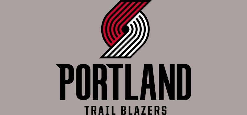
The Portland Trail Blazers logo is an abstract pinwheel design consisting of five red and five black curved lines that intersect at a central point, introduced in 1970 by designer Frank Glickman. The design represents two basketball teams of five players each converging in competition on the court.
Design Type: Abstract icon with wordmark
Primary Elements: Ten curved lines forming a pinwheel pattern, team wordmark
Official Introduction Date: 1970
Designer: Frank Glickman (Boston-based graphic designer)
Trademark Status: Registered trademark of the Portland Trail Blazers franchise
Color Palette:
- Red: #E03A3E (Pantone PMS 186 C)
- Black: #000000 (Pantone PMS BLACK 6 C)
- White (accent)
Usage Context: Team jerseys, court design, merchandise, digital platforms, arena branding, promotional materials
The pinwheel operates as both primary logo and standalone icon. It appears across all franchise branding materials and has become synonymous with Rip City basketball culture. The curved lines create movement and speed, essential characteristics of basketball.
How Has the Portland Trail Blazers Logo Evolved Over Time?
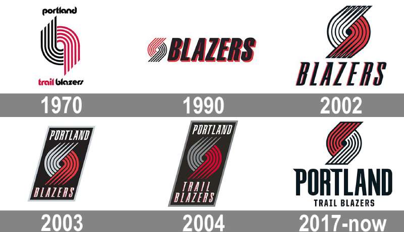
The Portland Trail Blazers have maintained remarkable consistency with their pinwheel logo since 1970, implementing only subtle refinements rather than complete redesigns. This stability makes it one of the most enduring logos in professional sports.
Original Portland Trail Blazers Logo (1970-1990)
Years Active: 1970-1990
Design Description: Five red lines intersecting with five black lines in a vertical pinwheel orientation, with “Portland” above and “Trail Blazers” below in lowercase letters
Color Scheme: Red, black, white
Designer: Frank Glickman
Context: Created when “pure geometry” was trending in graphic design movements, this logo launched with the franchise’s expansion entry into the NBA
Key Changes from Previous: First logo, no predecessor
Cultural Significance: Represented pioneering spirit of Oregon trail blazers who carved paths through the Pacific Northwest
Slanted Pinwheel Era (1990-2002)
Years Active: 1990-2002
Design Description: Pinwheel rotated 45 degrees with reversed colors (red on left, black on right), italic “BLAZERS” wordmark placed beside the icon
Color Scheme: Red, black
Designer: In-house design team
Context: Modernization effort to create more dynamic appearance during franchise’s successful playoff runs
Key Changes from Previous: 45-degree rotation, color reversal, removal of “Portland” from primary mark, added italic typography
Cultural Significance: Coincided with peak Blazermania era and deep playoff runs in 1990 and 1992
Three-Dimensional Update (2002-2003)
Years Active: 2002-2003
Design Description: Five gray stripes with black outlines and central hole, creating dimensional appearance, logo placed within black parallelogram
Color Scheme: Gray, black, silver accents
Designer: Steve Sandstrom (Portland native)
Context: Brief experiment with three-dimensional styling and silver color introduction
Key Changes from Previous: Added silver as team color, created volumetric effect, removed wordmark from primary mark
Cultural Significance: Short-lived design that attempted modernization during franchise rebuilding period
Parallelogram Badge Design (2003-2017)
Years Active: 2003-2017
Design Description: Gray and red pinwheel inside black parallelogram frame with silver trim, “Portland” above “Trail Blazers” in italic font with serifs
Color Scheme: Red, gray, black, silver
Designer: Steve Sandstrom with refinements by in-house team
Context: Added “Trail” back to wordmark in 2004, maintained dimensional styling
Key Changes from Previous: Reintroduced full team name, refined parallelogram container, adjusted typography
Cultural Significance: Spanned Damian Lillard era beginning, including his franchise-defining moments
Modern Refined Design (2017-Present)
Years Active: 2017-present
Design Description: Red lines positioned upward, white lines downward, unified under single black contour, “PORTLAND” in large black letters with serifs at 45-degree angle on “P” and “T,” “Trail Blazers” below in smaller sans-serif
Color Scheme: Red (#E03A3E), black (#000000), white
Designer: In-house design team with fan input
Context: Following focus group feedback, team kept pinwheel while refining execution
Key Changes from Previous: Eliminated silver, returned to red/black/white palette, refined line work, modernized typography, 45-degree serif angles reference 45th Parallel North
Cultural Significance: Represents return to classic roots while maintaining contemporary polish
What Do the Design Elements of the Portland Trail Blazers Logo Mean?
The Portland Trail Blazers pinwheel represents two teams of five players converging at center court in competition. The ten curved lines symbolize basketball’s fundamental structure while the circular motion captures the game’s speed and continuous action.
What Is the Symbolism Behind the Pinwheel Design?
The pinwheel serves as an abstract representation of basketball itself.
Five lines on each side represent the five offensive and five defensive players on the court. The intersection point symbolizes center court where tip-off occurs and teams clash.
The curved shape creates a sense of rotation and movement. Basketball involves constant motion, quick transitions, and flowing plays. The pinwheel captures this dynamic energy without literal representation.
Why Did Portland Trail Blazers Choose These Specific Colors?
Red – Pantone PMS 186 C
- Hex: #E03A3E
- RGB: (224, 58, 62)
- CMYK: (0, 91, 76, 6)
- Symbolic meaning: Passion, energy, intensity, competitive fire
- Color psychology: Red evokes excitement and aggression, perfect for sports branding
- Team connection: Represents the heat of competition and Rip City’s fervent fan base
Black – Pantone PMS BLACK 6 C
- Hex: #000000
- RGB: (6, 25, 34)
- CMYK: (30, 0, 0, 100)
- Symbolic meaning: Strength, elegance, authority, sophistication
- Psychological impact: Creates powerful contrast and establishes serious, professional identity
- Team connection: Portland’s no-nonsense basketball tradition
White (accent)
- Used for jerseys and secondary applications
- Provides clean balance between red and black
- Enhances readability and versatility
The color palette works as a complementary color scheme that maximizes visual impact.
What Typography Style Is Used in the Portland Trail Blazers Logo?

The current logo uses custom sans-serif font with selective serifs on the “P” and “T” of “PORTLAND.”
These 45-degree serifs reference the 45th Parallel North, the latitude line passing through Salem, Oregon. The angled elements connect typography to Pacific Northwest geography. Below, “Trail Blazers” appears in clean sans-serif that prioritizes legibility on jerseys and merchandise.
What Are the Hidden Meanings in the Portland Trail Blazers Logo?
The pinwheel contains no hidden messages or subliminal imagery.
Frank Glickman designed it with straightforward intent. The ten lines mean exactly what they represent – two teams of five players. The circular void at center represents the basketball court’s center circle where games begin.
Some fans interpret the spinning motion as representing Portland’s trailblazing spirit. The abstract nature allows personal interpretation while maintaining universal recognition. Designer intention focused on capturing basketball’s essence through minimal geometry rather than embedding secret symbols.
How Does the Portland Trail Blazers Logo Compare to Competitor Logos?
The Portland Trail Blazers logo stands apart from other NBA team identities through its abstract, geometric approach while most franchises favor literal mascots or text-based designs.
The Chicago Bulls logo features a red bull’s head, the Boston Celtics logo shows a leprechaun, and the Los Angeles Lakers logo includes a basketball. Portland’s pinwheel contains neither mascot nor ball.
This abstraction aligns more with corporate branding than sports design. The Miami Heat logo uses a flaming basketball while the Milwaukee Bucks logo depicts a deer, both incorporating clear imagery. Portland relies on conceptual representation.
Among Pacific Northwest teams, the Memphis Grizzlies logo (originally Vancouver) uses a bear, and the departed Seattle SuperSonics featured a basketball. Portland’s geometric design predated the minimalist design trend by decades yet feels contemporary.
The pinwheel shares aesthetic philosophy with Swiss design principles – clean lines, geometric forms, functional purpose. While the Golden State Warriors logo and Utah Jazz logo have modernized with simplified designs, Portland’s 1970 creation already embodied these principles.
What Are the Technical Specifications of the Portland Trail Blazers Logo?
Official Color Codes:
Primary Color: Red
Secondary Color: Black
- Hex: #000000
- RGB: (6, 25, 34)
- CMYK: (30, 0, 0, 100)
- Pantone: PMS BLACK 6 C
Accent Color: White
- Hex: #FFFFFF
- RGB: (255, 255, 255)
- CMYK: (0, 0, 0, 0)
Dimensions and Proportions:
The pinwheel follows precise geometric construction. Lines curve at consistent radius with uniform thickness. The 45-degree tilt creates dynamic asymmetry while maintaining visual balance.
Minimum size requirements ensure legibility across applications. The logo shouldn’t reproduce smaller than 0.5 inches in print or 72 pixels digitally. Clear space around the logo equals the height of one pinwheel line.
When preparing files, designers should use vector graphics for scalability. For print design applications, maintain proper DPI standards and follow brand guidelines for file formats for printing logos.
What Cultural Impact Has the Portland Trail Blazers Logo Had?
The pinwheel logo has become synonymous with Portland basketball culture and Rip City identity since 1970.
Its longevity makes it one of the most recognizable symbols in Pacific Northwest sports. Fans have tattooed the design, incorporated it into street art, and adopted it as a regional emblem beyond basketball.
The logo’s abstract nature allows broad interpretation. It represents pioneering spirit, competitive fire, and Portland’s distinct character. During the 1977 championship season, the pinwheel became a rallying symbol for the city.
Its 814-consecutive-game sellout streak from 1977 to 1995 cemented the logo’s connection to fan dedication. The design survived the “Jail Blazers” era and thrived during Damian Lillard’s tenure, proving its resilience through franchise highs and lows.
How Does the Portland Trail Blazers Logo Fit Into the Overall Brand Identity?
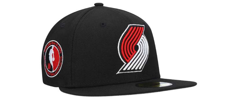
The pinwheel serves as the foundation of a comprehensive brand system.
It appears on jerseys, court designs, arena signage, and merchandise. The team uses the primary logo for official communications while deploying standalone icon variations for social media and apparel.
Secondary marks include text-only wordmarks and the “Rip City” nickname branding. These elements complement rather than compete with the pinwheel. The entire system maintains consistent color theory and typography elements across touchpoints.
Portland’s brand style guide dictates logo usage rules, color applications, and typographic treatments. This ensures unity across platforms while allowing variety in execution.
How Should the Portland Trail Blazers Logo Be Used?
Official Usage Guidelines:
The Portland Trail Blazers enforce strict rules protecting their trademark. Reproduce the logo only from official files without modification. Don’t alter colors, proportions, or elements. Maintain clear space around the mark equal to one line height.
Don’t place the logo on busy backgrounds that reduce legibility. Avoid stretching, rotating (except official 45-degree orientation), or adding effects. The pinwheel shouldn’t combine with other logos without approval.
Where to Access Official Logos:
Official logos are available through the Portland Trail Blazers media relations department. High-resolution files come in various formats including vector graphics (EPS, AI, SVG) and raster formats (JPEG, PNG). Media members can request files for editorial use.
Licensing Information:
Commercial use requires licensing through NBA Properties. The logo is a registered trademark protected under U.S. intellectual property law. Unauthorized reproduction for merchandise or commercial purposes violates trademark rights.
Trademark Protection Details:
The Portland Trail Blazers actively defend their intellectual property. The pinwheel design, wordmarks, and color combinations all carry trademark protection. Fair use allows editorial and news coverage without permission, but commercial exploitation requires licensing agreements.
FAQ About the Portland Trail Blazers Logo
When was the Portland Trail Blazers logo created?
The Portland Trail Blazers logo was created in 1970 when the franchise joined the NBA as an expansion team. Frank Glickman designed the original pinwheel concept that has remained the team’s primary logo for over 50 years with only refinements to the basic design.
Who designed the Portland Trail Blazers logo?
Frank Glickman, a Boston-based graphic designer, designed the Portland Trail Blazers logo. He was the cousin of Harry Glickman, the team’s founder and first general manager. Frank created the pinwheel concept influenced by the “pure geometry” trend popular in 1970s design.
What do the colors in the Portland Trail Blazers logo mean?
The red (#E03A3E) in the Portland Trail Blazers logo represents passion, competitive fire, and energy. Black (#000000) symbolizes strength, elegance, and authority. Together, these colors create powerful contrast that embodies the team’s fierce, no-nonsense basketball tradition and Rip City’s dedicated fan base.
How many times has the Portland Trail Blazers logo been redesigned?
The Portland Trail Blazers logo has been refined five times since 1970 but never completely redesigned. Updates occurred in 1990 (45-degree tilt), 2002 (three-dimensional styling), 2003 (parallelogram frame), 2004 (added “Trail” to wordmark), and 2017 (current streamlined version). The core pinwheel concept has remained unchanged for 55 years.
Where can I download the official Portland Trail Blazers logo?
Official Portland Trail Blazers logos can be requested through the team’s media relations department for editorial use. Commercial use requires licensing through NBA Properties. High-resolution files in vector and raster formats are available to authorized media members and licensed partners through proper channels.
Is the Portland Trail Blazers logo trademarked?
Yes, the Portland Trail Blazers logo is a registered trademark protected by U.S. intellectual property law. The pinwheel design, team wordmarks, and color combinations all carry trademark protection. The NBA and Portland Trail Blazers actively enforce these rights against unauthorized commercial use.
What font is used in the Portland Trail Blazers logo?
The Portland Trail Blazers logo uses a custom typeface rather than a standard font. The wordmark features modified sans-serif letterforms with distinctive serifs on the “P” and “T” of “PORTLAND” at 45-degree angles, referencing the 45th Parallel North latitude line that passes through Oregon.
Why did Portland Trail Blazers choose a pinwheel for their logo?
Portland Trail Blazers chose the pinwheel to represent two teams of five players converging in competition on the basketball court. The abstract design captures basketball’s essence through geometry rather than literal imagery. The curved lines symbolize the sport’s speed and continuous motion, creating a unique identity distinct from mascot-based NBA logos.
Conclusion
The Portland Trail Blazers logo represents one of professional basketball’s most enduring and distinctive brand identities.
Designed by Frank Glickman in 1970, the pinwheel has survived over five decades with its core concept intact. The ten curved lines symbolizing two teams of five players remain instantly recognizable across the NBA landscape.
The logo’s abstract geometry set it apart from mascot-based designs common in sports branding. Its red and black color palette creates powerful visual impact while embodying the franchise’s competitive spirit. The design’s longevity proves that strong conceptual foundations transcend trends.
Portland’s commitment to this identity through refinements rather than redesigns demonstrates respect for heritage while maintaining contemporary relevance. The pinwheel will continue representing Rip City basketball as the franchise builds its future.
If you liked this article about the Portland Trail Blazers logo, you should check out this article about the San Antonio Spurs logo.
There are also similar articles discussing the New Orleans Pelicans logo, the Philadelphia 76ers logo, the Boston Celtics logo, and the Indiana Pacers logo.
And let’s not forget about articles on the Los Angeles Clippers logo, the Oklahoma City Thunder logo, the Phoenix Suns logo, and the Charlotte Hornets logo.

Renowned for his expertise in logo design and visual branding, Bogdan has developed a multitude of logos for various clients.
His skills extend to creating posters, vector illustrations, business cards, and brochures. Additionally, Bogdan's UI kits were featured on marketplaces like Visual Hierarchy and UI8.
He also wrote in the past years on sites like Design Your Way, WebDesignerDepot, WPDean, Designmodo, Speckyboy, Slider Revolution, and more.
- The Windsurf Logo History, Colors, Font, And Meaning - 10 October 2026
- How to Remove Background From Product Photos (No Photoshop) - 10 October 2026
- How Designers can Build a Stronger Online Creative Identity - 9 October 2026

Bogdan Sandu is a seasoned designer who has been designing websites since 2008. Renowned for his expertise in logo design and visual branding, Bogdan has developed a multitude of logos for various clients. His skills extend to creating posters, vector illustrations, business cards, and brochures. Additionally, Bogdan's UI kits were featured on marketplaces like Visual Hierarchy and UI8. He also wrote in the past years on sites like Design Your Way, WebDesignerDepot, WPDean, Designmodo, Speckyboy, Slider Revolution, and more.
You Might Also Like