


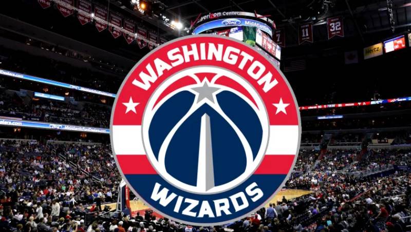
The Washington Wizards Logo History, Colors, Font, and Meaning
Imagine unboxing a fresh pair of sneakers—the crisp scent of untouched leather, the sleek design catching your eye, the unmistakable logo promising peak performance.
Now, envision those sensations while discovering the Washington Wizards logo, an emblem that’s more than just a symbol; it’s a narrative woven into the fabric of the National Basketball Association.
Navigating through the sea of sports identities, the Wizards’ logo stands as a bastion of D.C. basketball heritage. This article beckons you into the world where sports branding and basketball iconography converge with history and fandom.
Unlock the secrets behind an image that encapsulates the essence of a team, a city, and its passionate followers.
By article’s end, the layers of the Wizards’ insignia will unravel, revealing stories etched in every curve and hue.
Expect to delve into everything from the team’s branding evolution to its influence on fan apparel, and the unique ties that bind this logo to the heart of Washington D.C..
The Meaning Behind the Washington Wizards Logo
![]()
Yo! Ever stare at a logo and wonder, what’s that all about? Well, if you’ve had that thought with the Washington Wizards logo, stick around and we’ll dive deep.
Symbolism and All That Jazz
Here’s a little known fact. The Wizards weren’t always “The Wizards”. They were the Bullets once upon a time.
When they switched up the name, they didn’t just pick “Wizards” outta thin air. Magic, mysticism, and that wonderful world of wizardry vibes resonated through.
The Ball and the Crescent Moon
Ever notice the basketball silhouette against a crescent moon? That ain’t there just for looks. The merging of sports and magic, reality and fantasy – that’s the jam they’re throwing down.
The History of the Washington Wizards Logo
From Bullets to Wizards
Back in the day, like before most of us were even a thing, they were known as the Washington Bullets. Not as whimsical, right? The change to Wizards brought about a big transformation in their branding.
The Evolution
The logo has had its fair share of makeovers. From the gun-toting bullet (yup, you heard that right) to a more streamlined basketball with a stylized wizard. The aim? Stay fresh, stay relevant.
The Colors of the Washington Wizards Logo
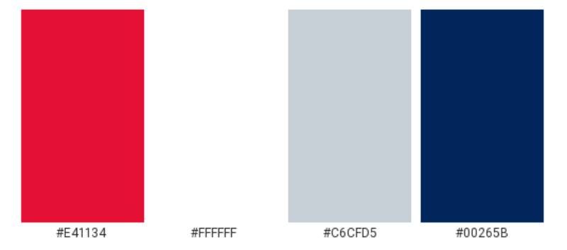
Colors ain’t just colors, peeps. They tell a story.
Royal Blue
Makes you think of depth, stability, and trust. Kinda like that player who always makes the shot when it matters.
Red
Energy. Passion. Desire. The drive these players bring onto the court? That’s what red’s all about.
The Font Used in the Washington Wizards Logo
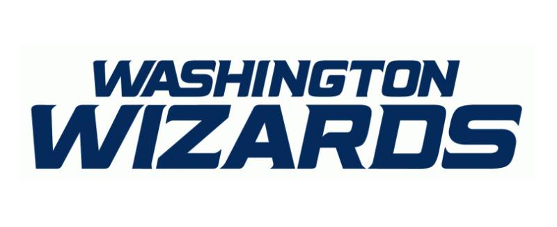
Font’s kinda like the unsung hero. Doesn’t grab all the attention, but man, does it make a difference.
Curvy and Dynamic
Ever notice the curves in the lettering? That’s no accident. It complements the energy and movement that basketball is all about. It’s slick, it’s modern, and it ties the whole thing together.
The Subtleties in Design
Negative Spaces
Okay, bear with me. Negative space is like the silence between musical notes. It shapes the design as much as the more ‘obvious’ elements. The use of these spaces in the logo brings out details you wouldn’t see otherwise.
Balancing Act
The logo’s not just throwing stuff together. There’s a balance – between the old and the new, between the basketball world and the magical realm. It’s a juggling act, and they’ve nailed it.
The Impact of the Washington Wizards Logo
Beyond the Court
A logo isn’t just for the team or the fans. It’s bigger. It represents a city, its culture, and its spirit. The Wizards logo has become iconic, not just in the NBA, but in representing Washington D.C. in a fresh and exciting way.
Merch and Gear
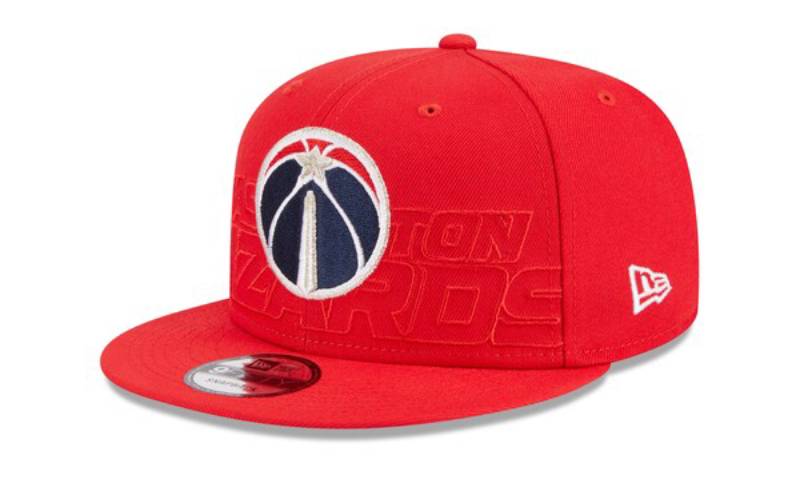
Let’s be real – a big part of sports today is the merch. The design’s versatility means it looks equally dope on jerseys, caps, and all that swag. They’ve hit the jackpot with a logo that translates so well across the board.
FAQ On The Washington Wizards Logo
What inspired the design of the Washington Wizards logo?
The logo draws from the vibrant energy and monumental legacy of Washington D.C. Its patriotic color scheme mirrors the city’s national significance, while the wizard figure conjures a sense of magic and excitement, reflecting both the team’s aspiration and the city’s historical enchantment.
How has the Wizards’ logo evolved over the years?
Since the team’s rebranding from the Bullets to the Wizards, the logo has undergone subtle yet impactful transformations. The evolution embraces modern aesthetics while honoring the past, with each iteration refining the wizard imagery and the iconic stars and stripes to capture the team’s competitive spirit.
What do the colors in the Wizards’ logo represent?
Rooted in American tradition, the red, white, and blue palette of the logo is a nod to the national flag. The red symbolizes passion, the blue signifies loyalty, and the white stands for purity—each color harmoniously reflecting the team’s and the city’s pride and values.
Is there symbolism in the Washington Wizards logo?
Absolutely. The wizard’s outstretched crescent moon embodies the team’s reach for excellence. The basketball in hand signifies focus and drive, while the three stars are a direct tribute to the District of Columbia’s flag, representing unity and determination.
Can the Washington Wizards logo be used commercially?
For commercial use, one must secure permissions and rights from the Washington Wizards’ franchise. The logo is a registered trademark, protected rigorously to avoid misuse and to maintain the integrity and value of the team’s brand.
How does the Wizards logo compare to other NBA team logos?
It’s distinctive for its dynamic storytelling. While all NBA logos serve to epitomize their franchise’s essence, the Wizards’ logo stands out with its unique blend of sportsmanship and regional homage, coupled with an air of mystique that’s rare in sports logo design.
What merchandise features the Washington Wizards logo?
From the team’s authentic jerseys and warm-up gear to fan favorites like caps, T-shirts, and keychains. The Wizards’ logo adorns a wide array of merchandise, making it easy for fans to wear their pride and support the team in style.
How do fans perceive the Washington Wizards logo?
Fans hold the logo in high esteem, seeing it as a rallying point that encapsulates the thrill of the game and the unity of the Wizards community. It’s a symbol they wear proudly, a beacon for the shared passion spanning generations of basketball enthusiasts.
Have there ever been any controversies regarding the Washington Wizards logo?
In the realm of sports branding, debates often arise. The Wizards’ logo has seen its share of critique and praise, with every redesign sparking conversations about artistic direction and brand identity. Yet, it consistently remains a respected emblem within the league.
What aspects of the Washington Wizards logo appeal to graphic designers?
Designers appreciate the logo for its clever intertwining of local patriotism with the mystical element of a wizard. The smart use of symbolism and the balance between legacy and modernity provide a rich case study in successful sports branding and the power of visual storytelling.
Conclusion
Closing the curtain on our journey through the Washington Wizards logo, we’ve traced lines that go beyond aesthetics, diving into a rich narrative where design meets legacy. It stands not merely as an image, but as a beacon of sportsmanship, dressed in the iconic red, white, and blue, transcending the court to become a symbol of communal spirit and drive.
We’ve unwrapped the layers that make this artwork resonate with fans and graphic aficionados alike, each thread in the design’s fabric telling its own story—of a city, a team, and the magical allure of basketball. As the emblem proudly sits atop merchandise, echoing Washington D.C.’s heritage, it serves as a reminder that good design doesn’t just sell, it captivates and unifies.
So, the next time this emblem catches your eye, remember, it’s not just representing a team, it’s hoisting a storied history, one where every dribble and cheer is encapsulated within its craft.
If you liked this article about the Washington Wizards logo, you should check out this article about the Sacramento Kings logo.
There are also similar articles discussing the Dallas Mavericks logo, the Atlanta Hawks logo, the Brooklyn Nets logo, and the New York Knicks logo.
And let’s not forget about articles on the Orlando Magic logo, the Denver Nuggets logo, the Los Angeles Lakers logo, and the Minnesota Timberwolves logo.
Bogdan Sandu, a seasoned designer with 15 years of diverse experience, has been designing websites since 2008.
Renowned for his expertise in logo design and visual branding, Bogdan has developed a multitude of logos for various clients.
His skills extend to creating posters, vector illustrations, business cards, and brochures. Additionally, Bogdan's UI kits were featured on marketplaces like Visual Hierarchy and UI8.
Latest posts by Bogdan Sandu (see all)
- The Amstel Logo History, Colors, Font, And Meaning - 3 May 2024
- Deep Dive: Sea Color Palettes for Tranquil Designs - 3 May 2024
- The Stella Artois Logo History, Colors, Font, And Meaning - 2 May 2024