Google put a number on it a while back: 53% of mobile users leave a screen that takes more than three seconds to load. That statistic gets thrown around a lot in ecommerce contexts, but it applies just as hard to news apps, maybe harder.
Nobody opens a news app the way they open a shopping app. There’s no browsing, no comparing options. Someone pulls it out on a train platform or between meetings, wants the top headline in about two seconds, and forms an opinion about the whole publication based on how long that took.
Layout and navigation carry more of that judgment than most editorial teams want to admit. Notification timing too, though that one’s easy to get wrong in a different way. A hundred year old masthead doesn’t automatically win against a five second video clip on someone’s lock screen anymore. It has to earn that attention every time the app opens.
Get any of this wrong and readers leave before they’ve read a word. Not dramatically. They just stop opening the app as often, and eventually stop opening it at all.
What Is News App Design
Ask five people in a product meeting what this actually covers and you’ll get five different answers, ranging from “just the visual layout” to “everything the reader touches.” The honest answer sits somewhere in between. It’s how layout, navigation, and interaction patterns get structured across a mobile app built specifically to deliver news, which is a narrower job than it sounds.
Headline placement counts. So does how a breaking alert lands on someone’s lock screen at 11pm.
It’s technically a subset of UX design, but the constraints are different from most other app categories. Content changes constantly, the audience is unusually sensitive to trust signals, and a typical session lasts something like 30 seconds.
Most publishers end up chasing the same handful of things even when their editorial voice couldn’t be more different. Fast access to the latest stories matters, obviously. So do visible trust signals: bylines, sourcing, a timestamp that actually means something. And there needs to be enough pull to bring someone back tomorrow without making them feel nagged into it.
The New York Times app and the BBC News app land on nearly identical structural choices here, despite having almost nothing in common editorially.
How Should Navigation Be Structured in a News App
Two taps. That’s roughly the ceiling for reaching any major section before readers start getting annoyed, and it’s a good rule to hold onto when a design meeting starts stacking menu types on top of each other. Pick one primary pattern and stick with it.
| Pattern | Discoverability | Best For |
|---|---|---|
| Bottom tab bar | High, always visible | 3 to 5 core sections |
| Hamburger menu | Low, hidden by default | Long lists of secondary categories |
| Swipe gestures | Medium, needs onboarding | Moving between individual stories |
Bottom Navigation vs Side Menu Patterns
Thumb reach decides most of this on a modern phone. Bottom tabs sit right where a thumb naturally lands on larger screens, which is exactly why hamburger menus lose out. They hide options behind an extra tap, and discoverability suffers for it. There’s a practical ceiling too, somewhere around five sections before the icons start looking cramped and the labels get unreadable.
Apple News and Google News both anchor their core sections to a persistent bar instead of a hidden drawer, a pattern documented pretty extensively in this examples of tab bar design across mobile apps.
Platform habit still matters here too. Android UI design conventions used to put tabs at the top of the screen. iOS has always kept them fixed to the bottom, and that history still shapes what feels “normal” to users on each platform.
Search Bar Placement and Function
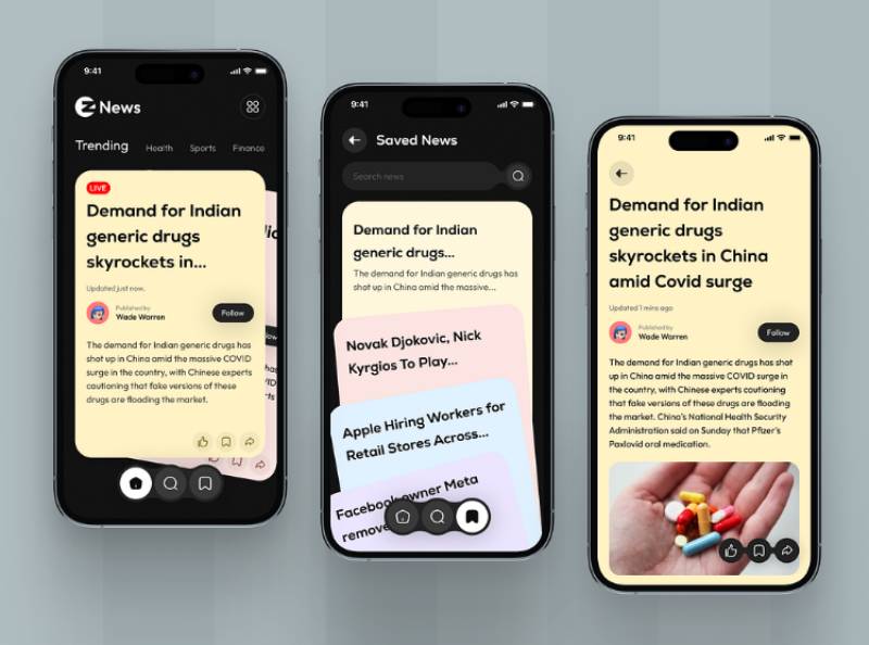
A search bar in a news app has a harder job than it looks like. It needs to surface topics and specific articles, not just match keywords against a headline.
Burying it inside a menu adds friction for someone chasing one specific story, which is why most apps put it at the top of the home screen, or fold it directly into the tab bar.
Topic and tag matching should sit alongside plain headline text search. Recent searches and trending queries help too, and autocomplete that surfaces live coverage first tends to save readers a step when a story is actively developing.
The roundup of search interfaces in mobile apps collected here shows how differently publishers balance a compact search bar against an already crowded header.
How Should Article Layout Be Formatted for Readability
Whether a story survives past its second paragraph, or gets abandoned for the home feed, usually comes down to layout choices made before the reader even opens it. The way headlines and thumbnails sit inside a scrollable list of stories decides whether anyone taps through at all.
Typography Standards for News Content
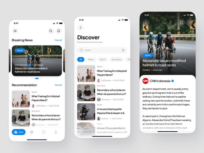
Apple’s Human Interface Guidelines put the default body text at 17 points for iOS apps. Google’s Material Design lands at 16sp for Android (Apple Developer documentation; Google Material Design). Neither number is arbitrary. They’re both close to the smallest size that still lets someone read comfortably without zooming, and dropping below that range breaks the scroll rhythm of a feed almost immediately.
A workable type hierarchy usually starts with the headline, bold, the biggest thing on screen, then a subhead or dek one size down. Body copy sits somewhere between 16 and 18 points at a regular weight. Captions and bylines go smallest and muted, since they’re supporting information rather than the main draw.
Pairing typefaces across those levels gets its own coverage in this guide to fonts built for mobile apps, if you want to go deeper on that specifically.
Media Placement Within Articles
A lead image or video anchors the top of nearly every article, usually ahead of the headline text loading on a slow connection. That ordering isn’t an accident.
Inline images then break up longer pieces roughly every three to five paragraphs, giving the eye somewhere to rest before it drifts off entirely.
Axios took this further than most, building its whole format around short paragraphs and bulleted takeaways. It’s a layout choice that keeps scroll depth noticeably higher on mobile.
Headline weight and size follow similar logic, covered in more depth in this breakdown of typographic hierarchy, where scale ends up signaling importance before anyone’s actually read a word.
How Should Personalization Work in News App Design
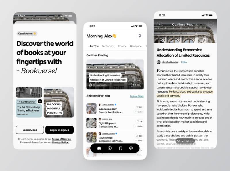
Personalization works when it narrows a large volume of stories without narrowing the reader’s worldview. Easy to say, harder to get right.
Apple News and Google News both let users follow specific topics rather than relying purely on algorithmic ranking.
The skepticism around this is real, and it shows up consistently in the data. Comfort with personalized news selection runs well behind comfort with personalization in other parts of digital life. People are far more at ease with automated recommendations for weather, music, or TV than they are for news, and many say in open responses that they worry algorithmic selection means missing important stories or a broader range of viewpoints (Reuters Institute Digital News Report, 2025).
Globally, close to half of survey respondents say they’re comfortable with personalized news selection, a lower comfort level than for most other content categories, with comfort consistently lower across much of Western and Northern Europe than in Latin America, Asia, or Africa (Reuters Institute Digital News Report, 2025).
Trust seems to follow a pattern here. Topic-following earns more of it than full algorithmic curation does. Location-based surfacing does fine too, mostly for something concrete like local weather or traffic. Lightweight AI features, summarization being the obvious one, are picking up real interest as well, with 27% of readers saying they’d find it useful (Reuters Institute Digital News Report, 2025).
Editorial curation still outperforms pure algorithmic feeds on trust, which is why most news apps blend the two instead of picking one model outright.
How Should Push Notifications Be Designed
Notifications are one of the few channels a publisher fully controls, and readers are quick to shut them off when the channel gets misused.
The tolerance threshold is genuinely low. One push notification a week already leads 10% of users to disable notifications and 6% to uninstall the app entirely (Business of Apps, citing Airship platform data).
| Weekly News Alerts | 2014 | 2025 |
|---|---|---|
| UK users | 3% | 18% |
| US users | 6% | 23% |
Growth has slowed sharply since 2017. 79% of people surveyed globally currently receive no news alerts at all, either because they never signed up in the first place or because they actively switched them off (Reuters Institute Digital News Report, 2025).
Of that group who don’t get alerts, 43% say they actively disabled them, most often because they felt they were getting too many or found them unhelpful.
A few design choices reduce that fatigue reliably. Granular settings by topic beat a single on/off toggle every time. A daily or weekly cap on non-urgent alerts helps, and so does batching related updates into one notification instead of firing off five separate ones.
BBC News is mentioned by 46% of UK alert users when asked which brands send them alerts, the equivalent of roughly 4 million people, largely because it caps volume and leans on its reputation for breaking news (Reuters Institute Digital News Report, 2025).
How Should Breaking News Alerts Differ From Standard Notifications
Breaking alerts need to look and feel different the instant they land on a lock screen, not just read differently.
A standard notification stays low-key. Muted tone, ordinary banner, grouped in with the rest of the app’s alerts, sent inside whatever daily cap is already in place.
Breaking news works differently across nearly every dimension that matters. The sound is distinct, the banner uses high contrast so it’s hard to miss at a glance, it skips grouping entirely, and it goes out regardless of any cap that’s normally in effect for that day.
Publishers with deep roots in broadcast news tend to earn more trust for breaking alerts than digital-only outlets, a pattern that holds across most markets surveyed (Reuters Institute Digital News Report, 2025).
Editorial teams typically set a strict threshold for what counts as breaking, since treating routine updates as urgent trains readers to ignore the distinction entirely.
What actually clears that bar tends to narrow down to a short, fairly predictable list: loss of life or major casualty events, election results and major political developments, market-moving financial news, and natural disasters or severe weather warnings.
The New York Times and CNN both cap true breaking alerts well below their standard notification volume, reserving the format for events that clear a newsroom-defined bar.
What Accessibility and Dark Mode Standards Apply to News Apps
Accessibility in a news app is not optional polish. It decides whether a meaningful share of the audience can read the app at all.
An estimated 2.2 billion people worldwide live with some form of vision impairment, according to World Health Organization data.
Contrast and Color Requirements
WCAG 2.2 sets the baseline numbers here.
| Level | Normal Text | Large Text / UI |
|---|---|---|
| AA (legal baseline) | 4.5:1 | 3:1 |
| AAA (enhanced) | 7:1 | 4.5:1 |
Most publishers design to AA, since it is the standard referenced by the EU’s European Accessibility Act and US Section 508.
Frequent failures include light gray captions on white backgrounds and category tags that rely on color as the only signal.
Ratios can be checked directly with a contrast checking tool before a design ships.
Dark Mode Implementation
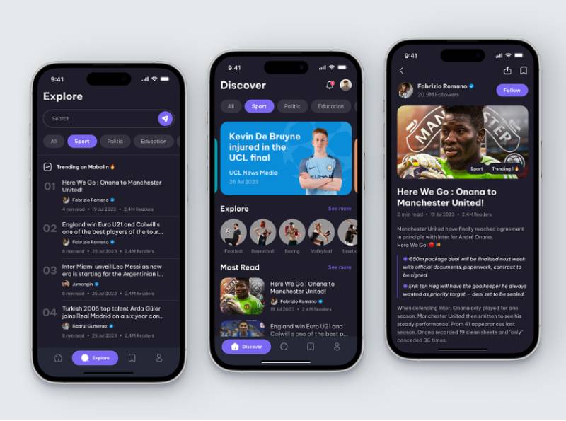
Dark mode is not just an aesthetic preference. On OLED and AMOLED screens it changes how much power the display actually draws.
Purdue University researchers found that switching from light to dark mode saves only 3% to 9% of power at typical indoor brightness levels of 30% to 50%, but that figure jumps to roughly 42% at full brightness, with some analyses of the same data putting savings as high as 46% to 47% in bright, sunlit conditions (Purdue University, MobiSys 2021).
The catch is that those savings only apply to true OLED panels. LCD screens keep their backlight running regardless of pixel color, so dark mode barely moves the needle there.
Most news apps now ship dark mode as a system-linked setting rather than a manual toggle, matching whatever theme the phone itself is already set to.
How Should Offline Reading Be Designed
Offline reading solves a problem push notifications can’t: a subway tunnel, a flight, a dead zone with no signal at all.
A workable offline system layers a few pieces together. Recently viewed stories cache automatically without the reader lifting a finger. There’s a manual save or download option for specific articles worth keeping. And everything syncs cleanly once a connection comes back, refreshing whatever’s changed.
The Guardian app lets subscribers download articles directly for offline access, bundled with ad-free reading as part of its paid tier rather than the free version.
Storage limits matter here too. Cached images and video eat space fast, so most apps expire cached articles after a set window instead of holding them indefinitely.
What Onboarding Flow Increases News App Retention
The gap in permission timing is pretty stark. Android push opt-in rates average around 91%, compared with roughly 44% on iOS, where the system prompt can be declined outright (izooto platform data).
That gap alone justifies rethinking when the notification prompt appears during setup.
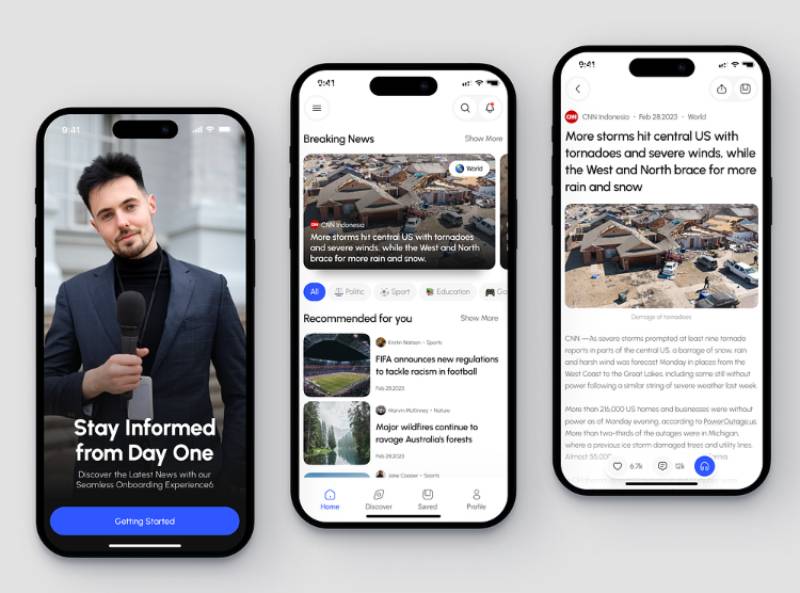
Topic selection usually comes first, before anything else, so the initial feed already feels relevant instead of generic. Account creation gets pushed later, after the reader’s actually seen some value. The notification prompt lands after that value moment too, not on the splash screen where it used to sit by default. And there’s a visible skip option at every step along the way, since forcing people through a flow only increases early drop-off.
Flipboard’s setup flow asks readers to pick topics and follow specific outlets before it ever shows a personalized feed, a sequencing choice that shapes day-one relevance.
These sequencing decisions sit inside the wider discipline of onboarding app design, which applies well beyond news products alone.
How Should Paywalls and Ads Be Designed Without Hurting the Reading Experience
| Model | Reader Access | Typical Use |
|---|---|---|
| Hard paywall | No free content at all | Niche, high-value publications |
| Metered paywall | Set number of free articles | General-interest news apps |
| Freemium | Some sections free, rest locked | Mixed news and lifestyle apps |
Metered paywalls dominate general news apps because they keep the app discoverable to casual readers while still converting the most engaged ones.
Conversion stays modest even when the design works well. A well-tuned metered paywall converts 5% to 10% of the most engaged readers into paying subscribers (Lenfest Institute research).
Only 18% of respondents across a basket of 20 richer media markets paid for any online news in the past year, a figure that has held roughly steady in recent years (Reuters Institute Digital News Report, 2025).
The Economist built a lower-friction entry point around its podcast coverage rather than the main news subscription, drawing roughly 30,000 subscribers paying around $5 a month for the add-on package.
Ad placement follows a simpler logic. Native ads formatted to match the surrounding article cards perform better than banner ads that interrupt the scroll, and neither should show up inside the first two paragraphs of a story.
Which News Apps Set the Design Standard
| App | Standout Design Choice |
|---|---|
| Apple News | Human-edited Top Stories alongside an algorithmic Trending tab |
| Google News | Full Coverage panel aggregating every outlet on one story |
| BBC News | Broadcast-grade trust applied to a first-ever metered paywall |
| The New York Times | A single subscription bundling news, games, and cooking content |
Apple News runs its Top Stories tab through an editorial team of roughly 30 journalists based in New York, London, Sydney, and Silicon Valley who hand-select the day’s leading stories, a deliberate counterweight to the algorithmically ranked Trending tab running alongside it.
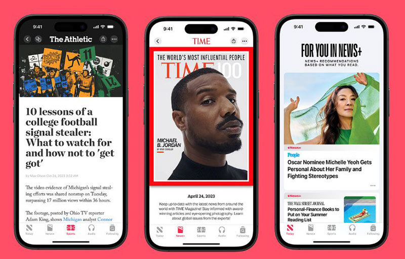
A Northwestern University audit of the app (ICWSM 2020) found that editorial picks pulled from a noticeably wider range of outlets than the algorithm did, which leaned more heavily on a handful of high-traffic sources such as CNN and Fox News.
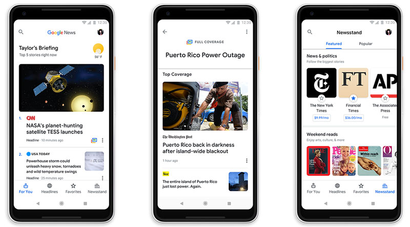
Google News takes the opposite approach with its Full Coverage panel, pulling every major outlet covering a given story into one unpersonalized view (Google News Help documentation). Google deliberately excludes personalization from this panel, so two readers researching the same event see identical source coverage.
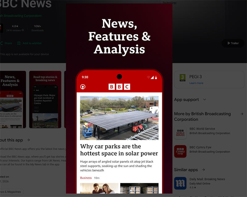
BBC News launched its first-ever news paywall in the US market in 2025, priced at $49.99 a year (under $1 a week) or $8.99 a month, leaning on its reputation as a trusted broadcast news brand to justify the ask; the paywall later expanded to the BBC’s US app as well.
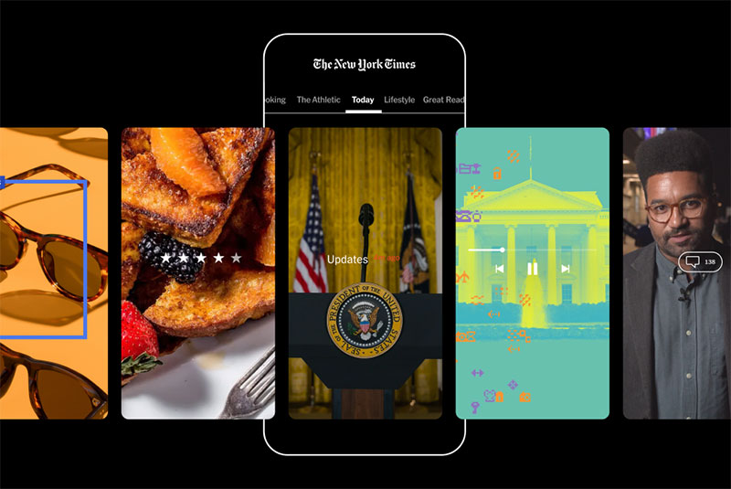
The New York Times app bundles its core news subscription with Games, Cooking, and The Athletic inside one login, and the company has surpassed 13 million digital and print subscribers in total, with a stated goal of reaching 15 million by 2027 (The New York Times Company earnings reports, 2026).
What Design Mistakes Cause Users to Abandon News Apps
Most abandonment traces back to a small set of repeatable failures, not one dramatic flaw.
Load time tops the list. 53% of mobile visits get abandoned once a page or screen takes longer than 3 seconds to load (Google, Think with Google research).
Paywalls that trigger before a reader’s sampled enough content to see the value cause an obvious problem. So does navigation that shifts structure between app updates, forcing people to relearn a layout they already knew. Excessive notification volume trains readers to mute the app instead of opening it, which defeats the entire point of having notifications in the first place. And slow-loading article pages, especially on image-heavy homepages, lose people before anything even renders.
A meter set too tight backfires, catching casual visitors before they have sampled enough to see the subscription’s value. It is why most metered paywalls default to five or more free articles a month rather than one or two.
Redesigns that move core navigation without warning tend to produce the sharpest short-term drop in daily active use, even when the new layout tests well in isolation.
News App Design Examples
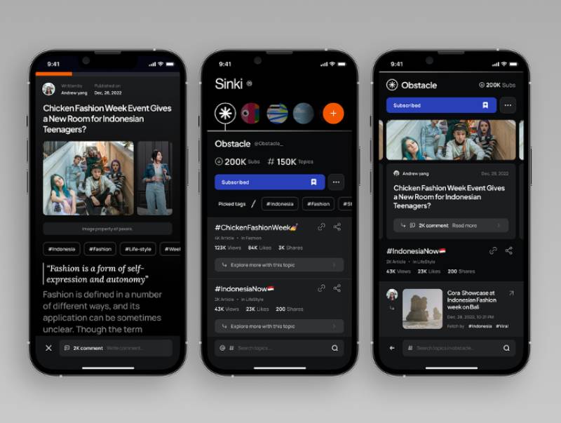
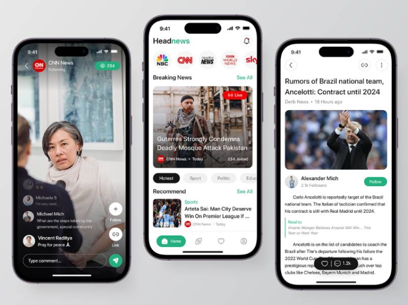
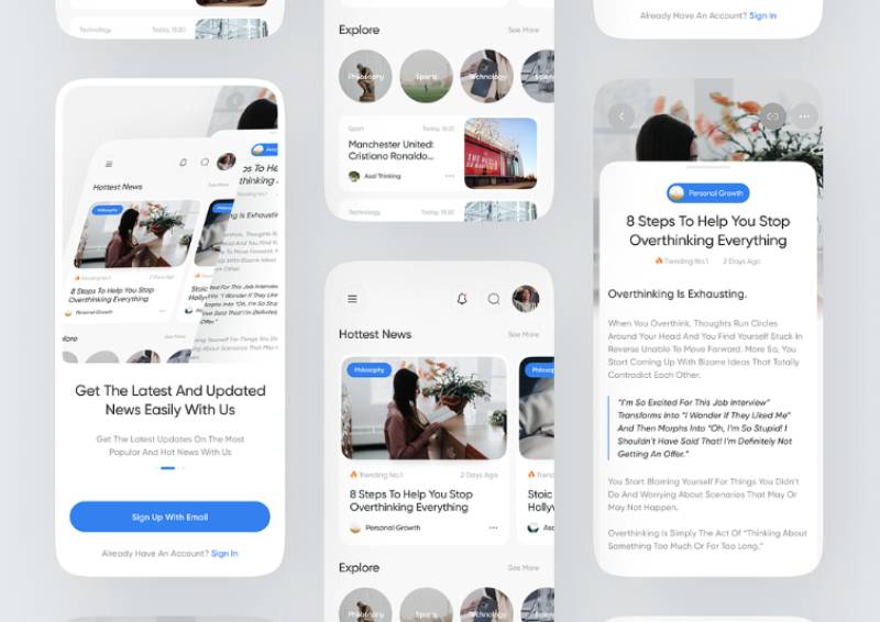
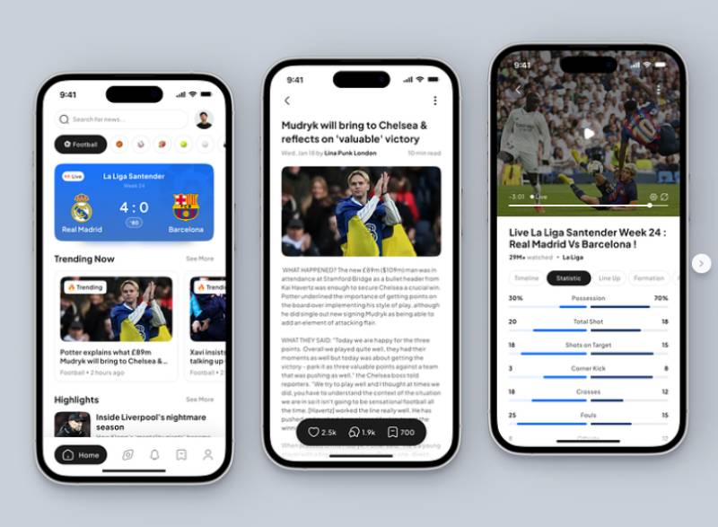
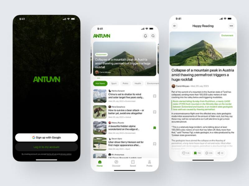
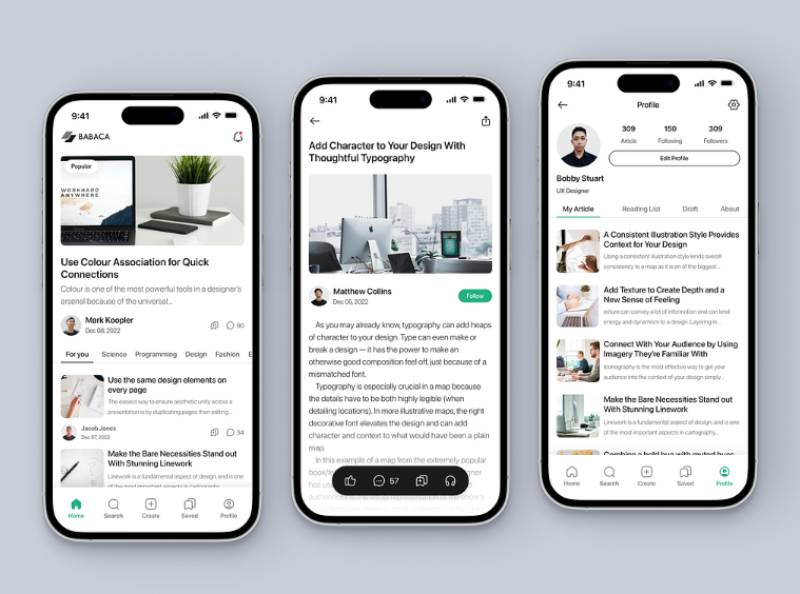
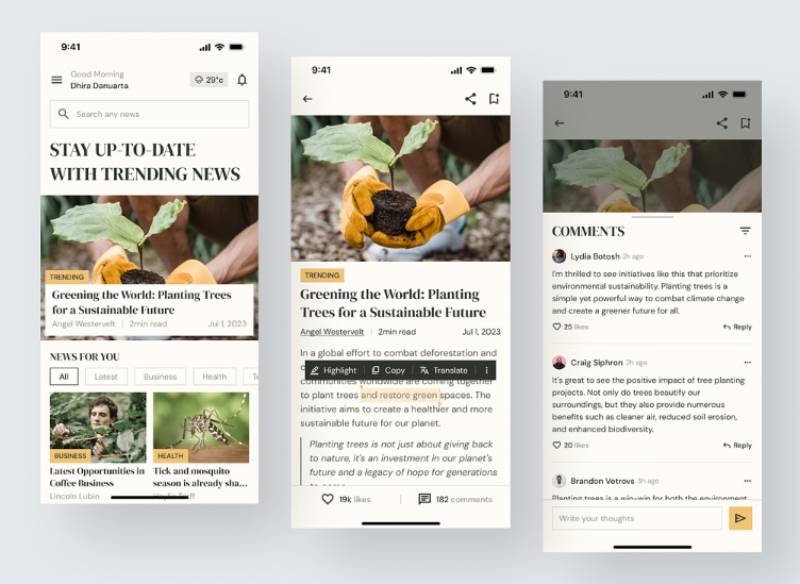
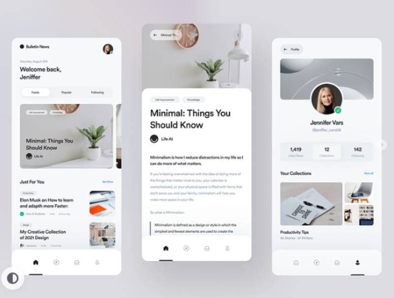
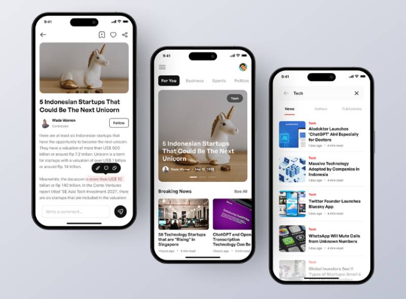
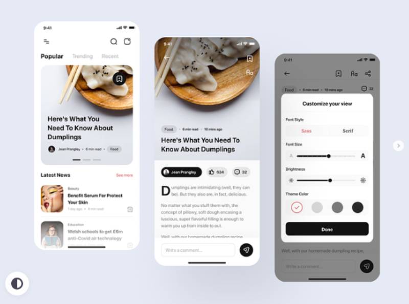
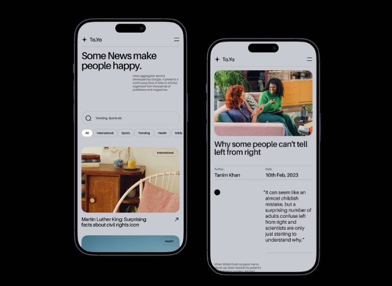
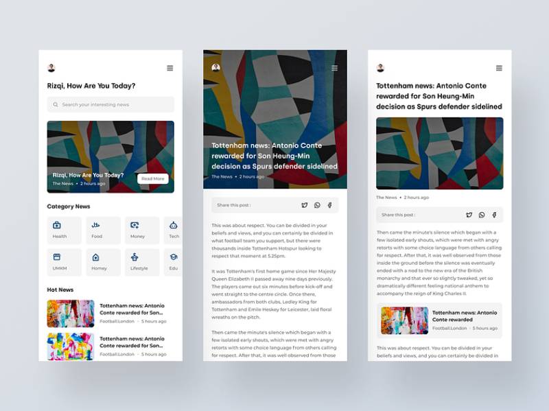
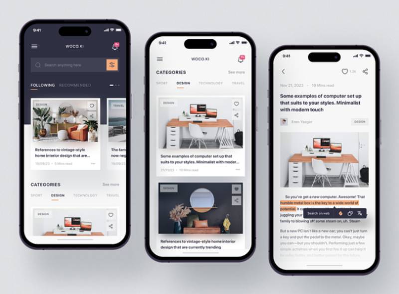
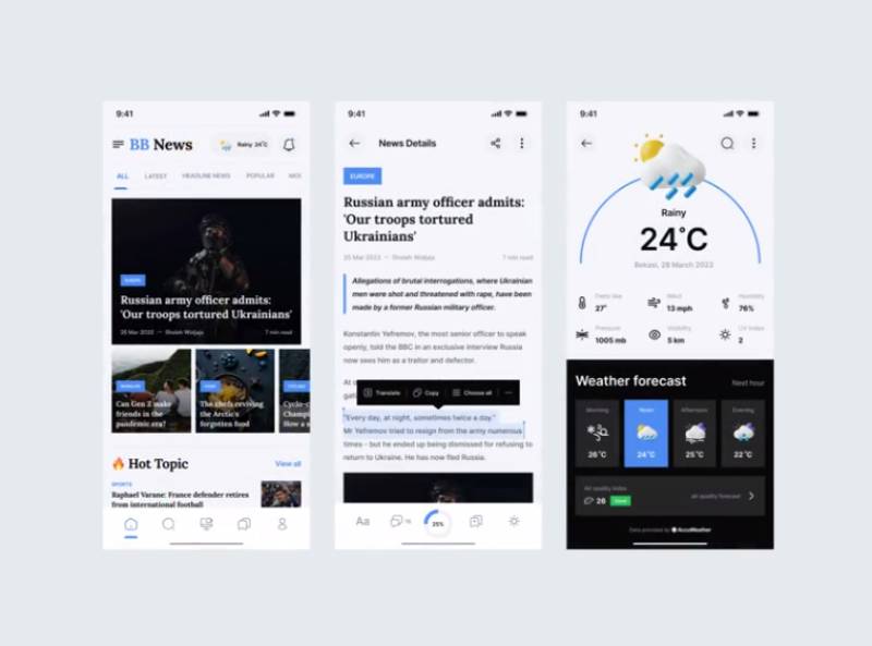
The concepts below are design explorations rather than shipped apps, which is exactly what makes them worth scanning: nothing here is constrained by a legacy CMS, an ad stack, or an editorial team’s existing workflow. Watch where the search bar sits, how many sections the tab bar carries, and how much of the first screen goes to a single lead story versus a headline list.

FAQ on News App Design
What is the difference between news app design and news website design?
A news app relies on touch gestures, push notifications, and offline caching that a browser can’t replicate. A responsive news website resizes for the screen but can’t access lock screen alerts or biometric login the way a native app can.
What design tools do most news app teams use?
Most teams design in Figma, prototype interactions there too, then hand off specs to iOS and Android developers. Sketch remains common on legacy projects. Shared component libraries and design tokens keep typography and spacing consistent across both platforms.
Should a news app require login before reading articles?
Forcing login before any content loads drives casual readers away. Most publishers let people browse freely, then prompt account creation after a few articles, or when saving a story, personalizing a feed, or enabling notifications.
How should live blog updates be designed inside a news app?
Live blogs need a reverse-chronological feed that auto-refreshes without forcing a manual reload. A sticky timestamp on each entry, a jump-to-latest button, and a visible “live” badge keep readers oriented during fast-moving stories.
Does a news app need a dedicated tablet layout?
Stretching a phone layout across a tablet screen wastes space and reads awkwardly. A proper tablet layout adds a two or three column grid, letting a headline list sit beside the open article instead of replacing it.
How should news apps support screen readers beyond color contrast?
Every button, icon, and image needs a VoiceOver or TalkBack label, not just visible text. Reading order should follow headline, byline, then body. Skipping this leaves an app WCAG-compliant on contrast alone but still unusable for blind readers.
What is the ideal app icon size for a news app?
iOS expects a 1024×1024 px master icon that the system scales down automatically. Android’s adaptive icon system uses a 108x108dp canvas with a 72x72dp safe zone, so logos need padding to avoid getting clipped.
How often should a news app be redesigned?
A full visual overhaul every 2 to 3 years keeps pace with platform guideline changes without disorienting loyal readers. Smaller, iterative updates tested with a subset of users first work better than one sudden full-app redesign.
Should push notifications include images?
Yes, where the story supports it. Rich push notifications with an image attached have historically seen as much as a 56% higher direct open rate than plain text alerts in Airship’s analysis of its own notification data. A relevant photo gives readers a reason to tap before reading the headline.
What analytics should guide ongoing news app design decisions?
Track scroll depth per article, tab switch frequency, and push notification opt-out rate, not just raw downloads. These reveal whether the navigation and alert strategy are actually working, rather than just how many people installed the app.
Conclusion
News app design rewards the boring fixes before the exciting ones, and most roadmaps get that order backwards.
Personalization gets the roadmap attention, but a slow load screen or a hidden settings menu will cost more daily active users than any recommendation algorithm ever recovers.
Start with what’s measurable and boring. Run a contrast audit. Check notification opt-out rates. Time the cold start on a three-year-old phone, not whatever flagship happens to sit in the design team’s pocket.
Expect trade-offs. Accessibility compliance and dark mode implementation will not fully offset a redesign that breaks a reader’s muscle memory around a familiar tab bar.
Get those sorted before touching anything else.
Everything else, from breaking alerts to paywall placement, performs better once the foundation stops leaking readers.

Renowned for his expertise in logo design and visual branding, Bogdan has developed a multitude of logos for various clients.
His skills extend to creating posters, vector illustrations, business cards, and brochures. Additionally, Bogdan's UI kits were featured on marketplaces like Visual Hierarchy and UI8.
He also wrote in the past years on sites like Design Your Way, WebDesignerDepot, WPDean, Designmodo, Speckyboy, Slider Revolution, and more.
- Versatile Work Sans Font Pairing for Every Project - 16 September 2026
- Organize Digital Files Like a Pro Before Your Next Client Handoff - 16 September 2026
- How to Set Up a Digital Menu Board: Hardware to Layout - 15 September 2026

Bogdan Sandu is a seasoned designer who has been designing websites since 2008. Renowned for his expertise in logo design and visual branding, Bogdan has developed a multitude of logos for various clients. His skills extend to creating posters, vector illustrations, business cards, and brochures. Additionally, Bogdan's UI kits were featured on marketplaces like Visual Hierarchy and UI8. He also wrote in the past years on sites like Design Your Way, WebDesignerDepot, WPDean, Designmodo, Speckyboy, Slider Revolution, and more.
You Might Also Like