A shopper sizes up your clothing brand in about three seconds, and they do it with a thumb, not by reading the page closely. Fashion app design happens in that gap, the short stretch between a swipe and a decision nobody really thinks through.
The category is bigger than most people expect. Fashion and beauty apps pulled in over 290 million downloads in 2025 alone, according to AppTweak.
Every screen carries some of that weight, the product grid, the size chart, the detail page, the checkout button. A slow-loading image or a filter that breaks in a crowded catalog doesn’t just cost patience. It costs an order.
None of this is guesswork, either. Return rates, conversion lift, retention numbers, all of it gets tracked and tested, not just argued about in a meeting.
What Is Fashion App Design
Building an app that lets someone browse, size up, and actually buy clothing without touching it first, that’s the job. It falls under UX design broadly, but the problems are specific to this category: fit, color accuracy that has to survive a phone screen, trend cycles that move faster than most product roadmaps, and the plain fact that nobody can feel the fabric before checkout.
Global fashion e-commerce revenue is forecast to pass $920 billion in 2025, according to Statista. That’s a big enough number that brands like ASOS, Zara, Farfetch, and StitchFix don’t treat app design as some side task tossed over to marketing. At that scale, it’s core product work, full stop.
What Makes Fashion App Design Different From General E-Commerce App Design

No other commerce category leans on imagery quite the way fashion does. Compare it to finance app design, which lives or dies on numbers and clarity, or travel app design, where maps and itineraries do most of the heavy lifting.
Fashion cares about something harder to pin down: how a garment looks on a body, how it moves when someone walks, how it actually photographs under normal lighting instead of a studio setup.
| Dimension | General E-Commerce App | Fashion App |
|---|---|---|
| Primary content | Specs, comparisons | Imagery, video, styling |
| Top return driver | Damage, defects | Size and fit mismatch |
| Inventory cycle | Stable, restocked | Seasonal, trend-driven |
Size and fit trouble sits at the center of why people return clothes they bought online.
McKinsey’s fashion research puts online return rates somewhere in the 20% to 30% range, and fit and sizing issues get blamed for anywhere from half to as much as 70% of those returns, depending on how a given study defines “fit-related.” US retail returns hit $890 billion in 2024, according to the National Retail Federation and Happy Returns, and apparel return rates commonly land between 20% and 40% depending on the subcategory.
Brand identity carries more weight here too, oddly enough, before anyone’s even looked at a product. A layout, a color palette, a font choice, together they tell a shopper whether they’ve landed on something premium, fast-fashion, or streetwear.
What Core UI Components Every Fashion App Needs
A handful of interface pieces show up across pretty much every fashion app, just arranged differently depending on the brand’s priorities.
| Component | Function | Common Failure Point |
|---|---|---|
| Product grid | Browsing and scanning | Too few thumbnails per item |
| Filters | Narrowing by size, color, price | Missing essential filter types |
| Product detail page | Fit and fabric info | No size chart or model data |
Product Grid and Card Design

Scanning speed matters most here. Cards typically show one hero image, a price, and a color-swatch row. A lot of teams now add a second hover or tap image showing the garment on a model, which sounds minor until you notice how much it slows down the bounce.
Baymard Institute’s 2025 benchmark found that 80% of ecommerce sites don’t show three or more product thumbnails in list view, a gap that hurts fashion more than most categories.
Good list UI design for mobile apps treats the grid as the primary discovery tool, not something to rush past on the way to the product page.
Filtering and Sorting Logic

Filters are where most fashion apps lose people. Not dramatically, just quietly, one abandoned session at a time.
- Size, color, price, and brand as baseline filters
- Fit type: slim, regular, oversized
- Fabric or material
- Sale and new-arrival toggles
Baymard Institute found 57% of sites don’t provide five essential filter types, and 78% of mobile ecommerce sites score “mediocre” or worse on product list and filtering UX overall.
Real-time result counts matter more on mobile than desktop, since screen space punishes dead-end filter combinations a lot harder there.
Product Detail Page Layout

A product detail page carries a lot of pressure in a short scroll. It has to say what the thing is, whether it’ll fit, and what it looks like when someone’s actually moving in it, ideally without making the shopper hunt for any of that.
Size chart, model height and measurements worn, fabric composition, care instructions, a zoomable image set, these show up again and again, and skipping any one of them tends to show.
Brands that skip model measurements just push more sizing questions into returns and customer support instead. It’s not a savings, it’s a deferral.
Studying real user interface design examples from top fashion retailers is a fast way to see which detail-page layouts actually cut down on hesitation at checkout.
How Product Discovery and Navigation Are Structured

Navigation in a fashion app has to serve two pretty different shoppers at once: the one who knows exactly what they want and the one who’s just browsing to see what’s out there.
Category structure usually splits by department first (women, men, kids), then by garment type, then by occasion or trend collection.
Search carries more weight than in most categories, mostly because product names rarely match what people actually type into the box.
Baymard Institute’s 2026 benchmark found 56% of sites have “mediocre or worse” search UX, and in usability testing, shoppers needed more than one search attempt 65% of the time.
A well-built search UI design handles typos, synonyms, and increasingly, visual search (a photo of a jacket someone liked on the street) instead of relying purely on exact keyword matches.
Bottom navigation and mobile menus and buttons carry the weight of getting people from browse to cart in as few taps as possible.
Most fashion apps front-load a short style quiz during onboarding app design, using those early taps to seed the recommendation engine before a single purchase even happens.
How Visual Merchandising Shapes the Fashion App Experience

Photography carries more purchase weight in fashion than in almost any other product category, which is probably obvious to anyone who’s shopped from a phone recently.
Flat lay shots handle texture, on-model shots handle scale and drape, and increasingly, 360-degree spins cover shoes and bags. Short video clips add another layer on top: how a fabric moves, how a hemline falls, details a static photo just can’t show.
Shopify’s merchant data shows products with professional-quality photos convert 33% higher on average than ones with low-quality images.
Editorial or lookbook sections, styled outfit spreads rather than single-item listings, give the app a magazine feel and often drive multi-item cart adds.
None of this comes free, though. High-resolution, video-heavy content demands a loading strategy that doesn’t stall the scroll, and that tradeoff gets more visible the deeper someone browses into the catalog.
How Virtual Try-On and AR Features Work in Fashion Apps
Virtual try-on uses a phone camera, a body scan, or both to show how a garment would look on a specific person before they buy it.
| Method | How It Works | Best For |
|---|---|---|
| 2D overlay (AR) | Camera-tracked image layer | Shoes, glasses, accessories |
| 3D avatar | Body measurements mapped to a model | Full outfits, sizing guidance |
| Photorealistic scan | Full-body capture, garment physics | High-value or made-to-order pieces |
The virtual try-on market was valued at $11.38 billion in 2024 and is projected to reach $46.42 billion by 2030, according to Grand View Research.
Zalando’s AI-driven sizing tool asks shoppers for a full-body photo and matches body shape to garment specifications. It’s a working example of the 3D-avatar approach running at real commercial scale, not just a demo.
Nike Fit and Snap AR land in pretty different places on that spectrum. Nike’s tool is built around foot scanning to nail down size accuracy, while Snap’s camera-based overlay handles apparel and accessories in a more visual, try-before-you-buy way.
Return reduction is the real business case underneath all of it. Industry research puts the drop in returns at roughly 25% to 40% when virtual try-on is available, and 71% of consumers say they’d shop more often if AR options existed, per Threekit’s 2024 survey.
How Personalization and Recommendation Engines Influence Design
Personalization changes what a shopper sees before they’ve even started scrolling.
- Browsing history and past purchases
- Saved items and wishlist activity
- Style quiz answers collected at signup
- Body type or fit preferences, where disclosed
McKinsey research shows companies that grow faster than their peers pull 40% more of their revenue from personalization.
71% of consumers expect personalized experiences, and 76% get frustrated when a brand doesn’t deliver one, per that same research. Personalization overall lifts revenue by 5% to 15%.
StitchFix built its entire product around this idea. A style quiz drives every recommendation, rather than sitting off to the side as a bolt-on feature added after the fact.
The tradeoff is real, though. Lean too hard into “recommended for you” sections and the catalog itself gets harder to actually browse, which is why most fashion apps keep a plain, filterable grid one tap away from any personalized feed.
How Checkout and Cart Design Affect Conversion in Fashion Apps

Checkout is where interest turns into revenue. Or it doesn’t.
The average cart abandonment rate sits at 70.22% across ecommerce, based on Baymard Institute’s aggregate of 50 studies.
Forced account creation alone drives 24% of US shoppers to abandon a cart, according to Baymard Institute survey data. That’s one line item on a checklist somewhere costing a quarter of your would-be customers.
Letting shoppers change size or color directly from the cart, without a full trip back to the product page, removes one of the more common reasons people quit mid-purchase.
Wayfair’s checkout uses an email-first pattern: enter an email, get recognized or guided into a guest flow, no upfront login-or-register decision forced on the shopper. Good mobile login form design makes the difference between a shopper who taps through and one who bounces at the password field.
| Checkout Friction | Shopper Impact | Fix |
|---|---|---|
| Forced account creation | 24% abandon | Guest checkout as default |
| Multi-step size changes | Extra taps, lost momentum | Inline size or color edit in cart |
| Manual card entry | Mobile form friction | Apple Pay, Shop Pay, PayPal |
How Social and User-Generated Content Features Are Integrated
Shoppers trust other shoppers more than they trust brand photography. That’s not a new insight, but fashion apps are finally building around it properly.
- Star ratings and written reviews on the product page
- Customer photos and try-on videos submitted post-purchase
- Shoppable galleries pulled from tagged social posts
- Wishlist sharing and outfit-building tools
PowerReviews found that shoppers who engage with user-generated photos and videos convert 91.4% more often, with apparel among the categories showing the strongest lift.
Bazaarvoice research shows that adding just 10 product reviews can raise conversion by 45%.
Instagram Shopping and TikTok Shop integrations extend that same discovery loop outside the app entirely, feeding a product straight into a wishlist from a tagged post instead of a screenshot and a manual search.
Aerie’s #AerieREAL campaign, unretouched customer photos running alongside product listings, turned that unfiltered feedback into a core part of brand identity rather than a bolted-on review widget somewhere near the footer.
What Accessibility and Inclusive Design Require in Fashion Apps
WCAG accessibility standards are not optional anymore. This is one of the most litigated areas of accessibility compliance in ecommerce right now.
E-commerce accounted for roughly 70% of all ADA digital accessibility lawsuits filed in 2025, according to UsableNet.
The WebAIM Million 2025 study found 94.8% of homepages had at least one detectable WCAG failure, with low-contrast text the most common issue at 79.1% of pages.
| Requirement | What It Covers | Common Gap |
|---|---|---|
| Contrast and text size | Readable product info | Low-contrast overlays on images |
| Screen reader support | Alt text, labeled controls | Missing alt text on product images |
| Extended sizing display | Sizes shown up front, not hidden | Buried behind extra taps |
Runway representation hasn’t kept pace with demand, for what it’s worth. Statista found only 0.6% of looks shown across New York, London, Paris, and Milan fashion weeks for fall/winter 2023 were sized 14 and above.
Universal Standard built its entire assortment around inclusive sizing instead, offering sizes 00 to 40 in the same styles rather than splitting off a separate “plus” line.
Legible fonts for mobile apps matter as much as contrast for anyone reading a size chart with low vision. Running product pages through a color contrast checker catches most of these failures before they ship.
How Performance and Load Speed Are Optimized for Image-Heavy Fashion Apps
Fashion apps carry more visual weight per screen than almost any other commerce category, which makes load speed a constant, low-grade fight.
Lazy-loading images below the fold, serving compressed formats like WebP, and routing files through a CDN to shorten the distance between an image and the shopper’s device, these are the usual moves, and none of them are exotic.
Google and Deloitte’s joint “Milliseconds Make Millions” study found a 0.1-second improvement in mobile speed lifted retail conversions by 8.4% and average order value by 9.2%.
Skeleton screens (gray placeholder shapes that load before real content) reduce the feeling of waiting, even when the actual load time hasn’t changed at all.
Standardizing crop dimensions with an aspect ratio calculator before export avoids having to re-process thousands of images after the fact.
The tradeoff never fully goes away, honestly. Richer imagery sells clothes better, and richer imagery is heavier to load, so every decision here ends up being a negotiation between the two.
Which Design Mistakes Reduce Conversion in Fashion Apps
Most conversion problems in fashion apps trace back to a handful of repeat offenders, the same ones showing up audit after audit.
Baymard Institute’s 2024 checkout research found 39% of US shoppers who abandoned a cart for a fixable reason blamed costs that appeared too late in the process.
- Size guides that differ by product line or don’t exist at all
- Filters that don’t update result counts in real time
- Shipping costs revealed only at the final checkout step
- Compressed, blurry product images on slow connections
Hiding real product measurements behind a generic S/M/L label is its own quiet conversion killer, since shoppers without a fit reference just default to guessing.
When every badge, banner, and price callout competes for attention, visual hierarchy collapses and shoppers stop scanning the page altogether.
Which Tools and Platforms Power Fashion App Design
Figma leads design and prototyping by a wide margin at this point, used as the primary tool by 82.3% of designers surveyed in the UX Tools 2024 Design Tools Survey.
| Category | Tools | Role |
|---|---|---|
| Design | Figma, Sketch | Wireframes, prototypes, design systems |
| Commerce infrastructure | Shopify Plus, Salesforce Commerce Cloud | Catalog, checkout, inventory |
| Behavior analytics | Hotjar, Amplitude | Heatmaps, funnel tracking |
Commerce infrastructure choices shape what’s even possible in the interface. Shopify Plus and Salesforce Commerce Cloud both handle catalog and checkout at scale, but the plugin ecosystems and customization depth differ enough to affect what a design team can actually ship on a given timeline.
Typography decisions get tested early too, often run through a font pairing generator before anything reaches production.
Heatmap and session-recording tools like Hotjar show where filter clicks stall out or where people rage-tap a broken size selector, which is data that’s genuinely hard to get from conversion numbers alone.
Amplitude and similar analytics platforms track funnel drop-off by step. That’s how a team catches one specific screen bleeding users instead of just watching “checkout” underperform as a vague whole.
Fashion App Design Examples
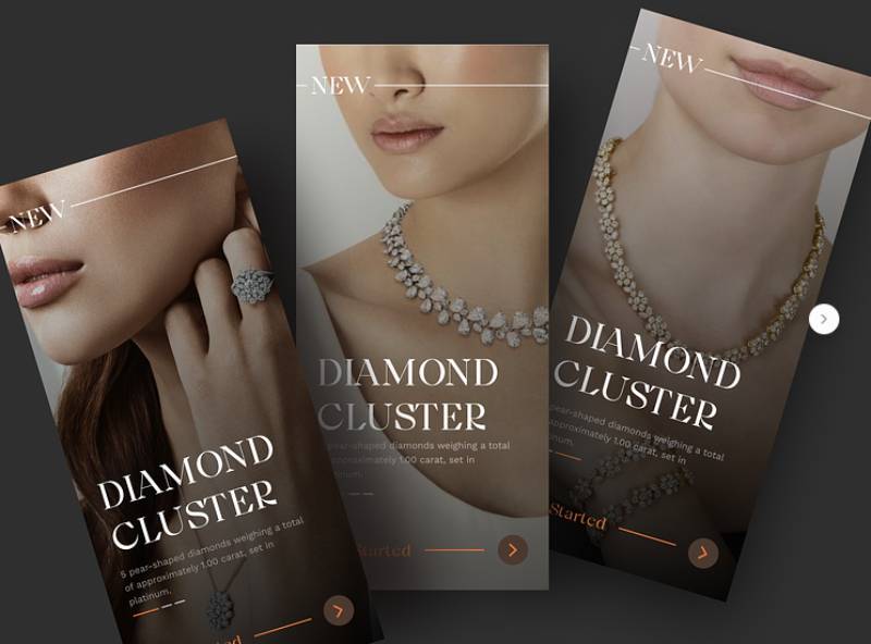
The concepts below are design explorations rather than shipped products, which makes them useful for a specific reason: nothing here is constrained by a legacy inventory system or a merchandising team’s quarterly targets. What you’re seeing is what a designer reaches for when the brief is open.
Three things are worth watching as you scroll: how dense the product grid is, where the size selector sits, and how many taps stand between the first screen and the cart.




FAQ on Fashion App Design
How much does it cost to design a fashion app?
Costs vary by scope. A single-brand app with a custom design system, virtual try-on, and personalization can run from the low hundreds of thousands into seven figures, depending on catalog size and whether AR is built in-house or licensed.
How long does a fashion app redesign typically take?
A focused redesign, covering navigation, product pages, and checkout, usually takes three to six months from research to launch. Full rebuilds that add virtual try-on or a new recommendation engine stretch past nine months once integration and testing are included.
Does a fashion brand need a native app instead of a mobile website?
Native apps win on speed, push notifications, and camera access for virtual try-on, all of which drive repeat visits. A mobile website still works for smaller catalogs or brands testing demand before committing to app store maintenance.
How do fashion apps handle international sizing and currency differences?
Most convert entered measurements into a size chart matched to the shopper’s region (US, UK, EU) automatically at the product detail page. Currency and duties get calculated at checkout using the device’s detected location, not a manual dropdown.
Can virtual try-on work without a full body scan?
Yes. 2D overlay AR, the kind used for shoes and glasses, only needs a live camera feed and doesn’t require stored body measurements. Full outfit fitting and sizing guidance, though, depend on some form of body data to be accurate.
What KPIs matter most after a fashion app launches?
Conversion rate, cart abandonment, and Day 30 retention tell the fastest story. Return rate by category and average session length on the product grid reveal whether people are actually finding what they came for.
Should a fashion marketplace app work differently from a single-brand app?
Yes. A marketplace app needs seller-level filtering, trust signals like ratings, and separate return policies per vendor. A single-brand app can lean harder into one visual identity and a simpler, more opinionated navigation structure.
How often should a fashion app update its product photography?
Seasonal drops usually mean refreshed visual merchandising every four to eight weeks. Fast-fashion catalogs with weekly new arrivals often shoot continuously, since stale imagery next to genuinely new stock creates a quality gap shoppers notice fast.
Do fashion apps need separate experiences for men’s and women’s shopping?
Most keep one app but split the top-level category structure by department right after login or onboarding. A handful of brands run fully separate apps when the two audiences buy so differently that shared navigation stops making sense.
What happens to fashion app design when a brand sells secondhand or resale items?
Resale apps add condition ratings, seller profiles, and often peer-to-peer messaging that a first-hand retailer never needs. Product photography shifts too: real, unedited photos of the actual item replace styled studio imagery almost entirely.
Conclusion
Most teams get the order wrong here. They chase virtual try-on before fixing the stuff that’s quietly losing them money every single day.
A checkout that forces account creation, filters that don’t update their result counts, sizing info buried two taps deep, any one of these costs more in the long run than a missing AR feature ever will.
Start with the boring fixes. Get the checkout flow right, clean up the filtering logic, make sure product listings load fast even on a bad connection. Cart abandonment drops before augmented reality ever ships, and honestly, nobody notices the boring work, which is sort of the point.
Budget for accessibility standards from day one too, not as a response to a lawsuit. Retrofitting contrast and alt text later almost always costs more than building them into the design system upfront.
Pick one metric. Watch it for 90 days. Then decide what actually earns the next build cycle.

Renowned for his expertise in logo design and visual branding, Bogdan has developed a multitude of logos for various clients.
His skills extend to creating posters, vector illustrations, business cards, and brochures. Additionally, Bogdan's UI kits were featured on marketplaces like Visual Hierarchy and UI8.
He also wrote in the past years on sites like Design Your Way, WebDesignerDepot, WPDean, Designmodo, Speckyboy, Slider Revolution, and more.
- Beautiful Fonts Similar to Poppins You Should Try - 22 October 2026
- Website Redesign: How to Improve Your Website without Losing SEO Rankings - 22 October 2026
- The Coda Logo History, Colors, Font, And Meaning - 20 October 2026

Bogdan Sandu is a seasoned designer who has been designing websites since 2008. Renowned for his expertise in logo design and visual branding, Bogdan has developed a multitude of logos for various clients. His skills extend to creating posters, vector illustrations, business cards, and brochures. Additionally, Bogdan's UI kits were featured on marketplaces like Visual Hierarchy and UI8. He also wrote in the past years on sites like Design Your Way, WebDesignerDepot, WPDean, Designmodo, Speckyboy, Slider Revolution, and more.
You Might Also Like