Over 900 million people used a travel app to plan a trip in 2024, according to Business of Apps. Most decided whether to trust that app inside the first three seconds, and that decision came down to the screen in front of them, not the logo above it.
Nobody scrolls past the search bar first. They notice how it responds, whether the filters make sense, whether the price on screen still matches the price they end up paying at checkout.
A clunky booking flow shows up in the numbers fast. Refund requests climb, reviews turn one-star, carts get abandoned mid-checkout. A booking flow that actually works becomes something closer to a reason someone picks one airline over another sitting two apps down on the same phone.
What Is Travel App Design
Travel app design sits inside the wider field of UX design, though it narrows fast: trip planning, booking, and getting around once you’ve landed, all built into one product.
What sets it apart from a shopping app or a to-do list is that the user’s situation keeps shifting underneath it. Somebody opens it from their couch, comparing three hotels on a slow evening. Weeks later they’re opening the exact same app from a departure gate with half a bar of signal, boarding in eleven minutes.
| Phase | User State | Design Priority |
|---|---|---|
| Pre-trip | Researching, comparing, budgeting | Search clarity, price transparency |
| In-trip | Rushed, distracted, often offline | Speed, offline access |
| Post-trip | Reflecting, reviewing, rebooking | Personalization, retention |
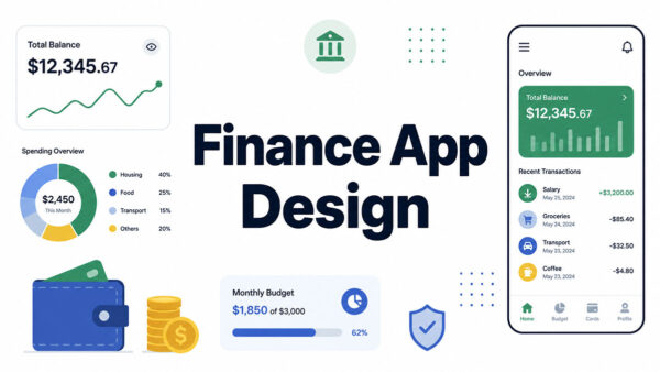
Compare that to fitness app tracking, which mostly plays out in one steady environment built around habit loops and workout logs. Or finance app design, where the security screen usually matters more than how fast someone can move around the rest of the app.
Travel apps don’t get that luxury. Pre-trip, in-trip, and post-trip modes are stacked into one product instead of a single continuous session, which is basically why the same app can feel like three different apps depending on when someone opens it.
Scale is part of why this matters. Airbnb alone pulled in over 70 million downloads in 2024, the most of any travel app that year (Business of Apps, 2024), and travel apps combined generated over $1 trillion in booking value over the same twelve months.
What UX Principles Define Effective Travel App Design

Every screen inside a travel app has to answer to time, trust, speed, and consistency all at once. Miss on any one of those and the whole thing starts to wobble.
| Principle | Why It Matters |
|---|---|
| Clarity under pressure | Users book while distracted, rushed, or mid-transit |
| Trust signaling | Price and cancellation terms must show before commitment |
| Speed | Slow screens cost bookings, not just patience |
| Consistency | Pre-trip and in-trip modes need to feel like one app |
Kayak keeps its search bar and filter layout visually identical across flights, hotels, and cars. Switching modes mid-trip doesn’t force a traveler to relearn the interface every time.
Slower load times reliably correlate with higher bounce and lower conversion across mobile commerce, travel included. Speed isn’t a nice-to-have here. It’s the difference between a completed booking and a closed tab.
For a broader look at how these same pressures play out across other product categories, this breakdown of UX design statistics is worth a look.
Baymard Institute Findings on Booking Flow Abandonment
Baymard Institute ran the numbers across 49 separate studies in 2025 and landed on a global cart abandonment rate of 70.19%. That figure isn’t travel-specific, it spans ecommerce broadly, but travel checkout tends to sit close to it.
The single biggest reason shoppers gave for walking away was extra costs showing up late in the process, cited by 39% of them (Baymard Institute, 2025). Not confusing navigation. Not a clunky form. Just money appearing that wasn’t there a screen ago.
Fix the usability issues Baymard actually documents and the upside is real. Large ecommerce sites picked up as much as a 35.26% lift in conversion, often just from cutting 20 to 60% of the form fields sitting in the default checkout flow.
How Travel Apps Structure Onboarding and Account Creation
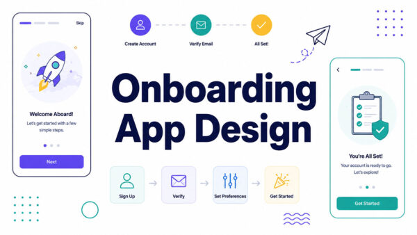
The first session decides whether a traveler ever opens the app again. Effective onboarding app design for travel products defers commitment instead of front-loading it.
Most booking apps let people search flights or hotels as a guest before any account exists.
Account creation gets pushed to right after a booking confirms, when the traveler already has a reason to save the itinerary.
A few onboarding patterns show up across almost every major travel app:
- Guest checkout as the default path, account creation deferred until after booking
- Progressive profiling that collects preferences over several sessions instead of one long form
- Single sign-on through Google or Apple ID at the login screen
- Location and notification permissions requested in context, not at first launch
The login screen itself tends to follow patterns common across strong mobile login form design: two fields, one-tap SSO, nothing else competing for attention.
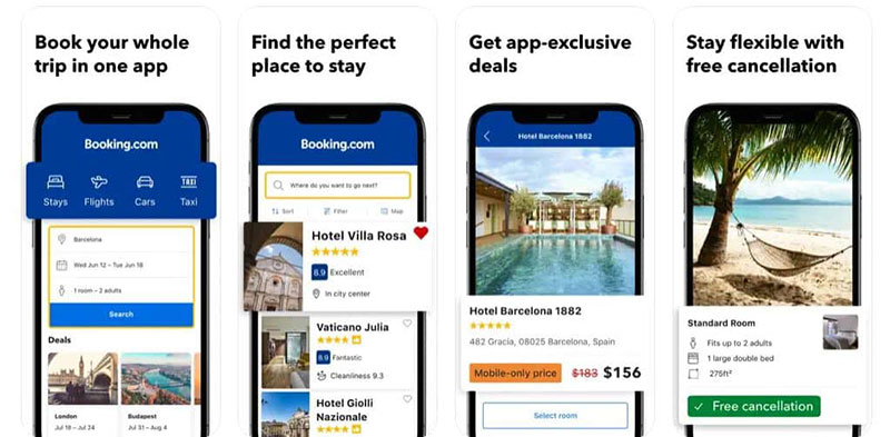
Booking.com lets travelers browse and shortlist hotels with no account at all, pushing sign-up to the payment step instead.
Travel and local apps post the lowest day-30 onboarding completion of any category, tied with food and drink, against a global average of just 8.4% (Business of Apps, 2025).
How Search and Booking Flows Are Structured

Search and booking form the core transaction inside every travel app. If this path breaks, nothing else in the product matters much.
Date pickers, filter order, and price transparency all sit inside what’s usually called search UI design, and travel apps lean on it harder than almost any other category.
Filter Design for Flights vs. Filter Design for Hotels
Flight search and hotel search solve different problems, so the filters can’t be identical.
| Filter | Flights | Hotels |
|---|---|---|
| Primary sort | Price, then duration | Price, then distance |
| Date input | Flexible date grid | Fixed check-in and check-out range |
| Secondary filters | Stops, airline, cabin class | Star rating, amenities, guest score |
Google Flights popularized the flexible-date grid, showing a calendar heat-map of prices instead of one static fare.
Filter menus themselves borrow heavily from standard mobile menus and buttons patterns: chips, toggles, and bottom sheets that expand without leaving the results screen.
Results then render as a scrollable list, following the same conventions covered in list UI design for mobile apps.
Checkout Steps and Abandonment Correlation
Step count matters less than most teams assume. What actually matters is whether costs stay visible the whole way through.
Baymard’s checkout research consistently ranks hidden fees and late-stage price changes above step count as an abandonment driver, a pattern that holds across booking-heavy verticals like travel.
Fare summaries in apps like Delta and Skyscanner typically show taxes and service fees before the traveler reaches final payment, not tacked on at the last screen.
How Personalization Improves Travel App Design

Personalization works in travel apps because past behavior predicts near-term intent better than demographics ever did.
A traveler who searched Lisbon three times last month isn’t a random user. They’re mid-decision.
Recommendation logic built on search history, saved destinations, and past bookings turns that signal into a shortlist instead of a blank search bar.
Hopper built its entire product around this idea, using historical fare data to predict whether a price will rise or fall and nudging travelers to book now or wait.
Roughly 40% of travelers worldwide used an AI-based tool to help plan a trip in 2025, according to Travala’s traveler survey.
Gen Z leans into this fastest. 62% say they’ve used AI tools specifically to cut travel costs, per EMerchant research.
Personalization has a ceiling, though. Recommendation engines that over-filter can hide valid options a traveler would have picked if they’d just been shown them, a version of the filter bubble problem well documented in recommender-systems research.
Why Offline Functionality Matters in Travel App Design
Connectivity is the one variable a travel app can’t control. Design has to assume it will disappear.
25% of mobile sessions globally run into connection drops, slow networks, or a handoff between cellular and Wi-Fi, according to AppDynamics’ 2026 Mobile Experience Report.
For a travel app, that’s not an edge case. It’s a subway platform. Or a signal that dies out somewhere over open water, right when the boarding pass still hasn’t finished loading.
Offline-first patterns that matter most:
- Downloaded maps for the destination, so navigation survives a dead connection
- Boarding passes and confirmation numbers cached locally, not fetched live
- Itinerary details stored on-device once they’ve been viewed once
Google Maps lets travelers download entire regions before they ever leave home. TripIt works a bit differently, it stores full itineraries offline automatically once a confirmation email has been forwarded to it.
It’s not always about coverage either. Plenty of travelers flip on airplane mode just to dodge roaming charges, signal or no signal, and the app still has to keep working through that.
How Real-Time Data Gets Integrated Into Travel App Design
Live data is what separates a travel app from a static brochure. Flight status, gate changes, and price shifts have to arrive before the traveler needs them, not after.
Flighty built its reputation on beating airline gate-change announcements, pulling from aircraft-tracking data instead of waiting on the carrier’s own feed.
Roughly 1 in 4 flights runs delayed, and passengers collectively lose around 7 million hours a year waiting on them, according to AirHelp.
Real-time layers in a travel app commonly cover:
- Flight status and gate-change alerts
- Price-drop and price-rise notifications
- Local weather and currency conversion shown at the point of relevance
None of it works if it fires constantly. Apps that alert on every minor status change train travelers to mute them within a week.
What Role Visual Design Plays in Travel App Design

A traveler decides whether to trust a listing before reading a single word of description. The photo grid does the convincing.
Hotels with more images of rooms and facilities saw booking conversion climb by 46%, according to a VFM Leonardo survey.
Listings with more than 20 high-quality photos per room converted 136% better than listings with fewer, the same research found.
| Visual Element | Purpose |
|---|---|
| Photo-first listing cards | Build trust before any text is read |
| Map-based results view | Anchors decisions in geography, not just price |
| Standardized iconography | Speeds recognition across airlines and hotel brands |
| Status color coding | Flags delayed, confirmed, or cancelled at a glance |
Vrbo leans almost entirely on large, swipeable photo galleries instead of long written descriptions to sell a rental.
That image-first logic borrows heavily from fashion app design, where the photo has to do the selling before any copy even loads.
Citymapper treats the map as the primary interface rather than a secondary feature, with routes layered directly onto it instead of hidden behind a list.
Typography carries weight here too. The same principles covered in fonts for mobile apps apply directly to fare tables that need to read clearly at a glance and hold up in bad lighting.
How Trust and Security Are Designed Into Travel Apps
Payment screens get judged fast. 72% of travelers factor a company’s payment security reputation into their booking decision, according to Outpayce’s 2025 research.
That number alone justifies putting visible security signals on the payment screen, not burying them in a settings menu.
Credit-card trust concerns account for 19% of cart abandonments industry-wide (Baymard Institute, 2025), a separate driver from the pricing-transparency issues covered earlier in this piece.
Security expectations here sit closer to medical app design than to a typical retail cart, given how much personal and payment data moves through a single booking.
What builds trust at the payment step:
- Visible SSL and PCI compliance indicators near the card entry field
- Recognized payment logos (Visa, Mastercard, PayPal, Apple Pay)
- Refund and cancellation terms stated before the final tap, not after
- Verified review counts shown next to the property or route, not just a star average
Tripadvisor’s 2025 Transparency Report disclosed the removal of 2.7 million fraudulent reviews and flagged 214,000 AI-generated submissions, the kind of enforcement that keeps review-based trust signals credible.
What Accessibility Standards Apply to Travel App Design
Accessibility in a travel app isn’t a checkbox. It decides whether more than a billion people can book a trip at all.
1.3 billion people globally live with some form of disability, according to the World Health Organization.
WCAG 2.1 Level AA is the practical benchmark courts and regulators point to, even though the guidelines were written for the web first and adapted to mobile later.
Government-facing apps in the US are now working against a hard deadline, April 26, 2027 for entities serving 50,000 people or more, and April 26, 2028 for everyone smaller.
Where travel apps most often fail:
- Custom date pickers that announce nothing meaningful to a screen reader
- Low-contrast fare tables that are unreadable in direct sunlight at a gate
- Map interfaces with no non-visual way to select a pin
- Font sizes that don’t scale when a user increases system text size
Right-to-left layout support and multilingual text expansion matter just as much here as screen reader compatibility, since travel apps serve international audiences by default.
How Performance Optimization Affects Travel App Design
Google reviewed 316 travel, retail, and finance sites across seven European countries to measure how speed actually affects behavior.
Pages that loaded one second faster saw conversion rates climb by up to 27%, the study found.
Bounce rates back this up from the other angle. Sites loading in under three seconds averaged a 13% bounce rate, while slower ones climbed toward almost 60%.
Image weight is usually the biggest lever available. A single unoptimized destination photo can outweigh an entire screen’s worth of code.
- Compress and serve images in modern formats before anything else
- Lazy-load photos below the fold instead of pulling them all at once
- Cache static content like maps and itineraries, fetch only live prices in real time
- Test on an actual 4G connection, not just office Wi-Fi
None of this is exotic. It’s the same short list every performance audit lands on, and travel apps still skip half of it.
What Are the Most Common Travel App Design Mistakes
| Mistake | Why It Hurts |
|---|---|
| Late fee reveal | Breaks trust right before the moment of commitment |
| Heavy onboarding forms | Delays first value, invites early abandonment |
| Silent offline failure | App goes blank instead of degrading gracefully |
| Notification overload | Trains users to mute or delete the app |
Late fee reveal is the most cited complaint in checkout research, and it gets worse when the reveal happens after payment details are already typed in rather than earlier in the flow.
Heavy onboarding forms that ask for passport numbers or frequent-flyer IDs before showing a single price push people out before they’ve seen any value at all.
Silent offline failure is its own category of mistake. A blank screen with no cached content reads as broken, not just slow.
Notification overload has numbers behind it. One weekly push causes 10% of users to disable notifications entirely.
Sending three to six a week pushes that number to 40% saying no more, per Airship’s benchmark data.
How Travel App Design Gets Tested and Validated
Design decisions in a travel app should survive contact with real users before they ship to everyone.
Common validation methods:
- Moderated usability testing on the booking flow specifically, not the whole app at once
- A/B testing on checkout steps, filter order, and price display format
- Session replay and heatmap analysis to catch friction after launch
- Field testing on an actual mobile connection, not a lab Wi-Fi network
One boutique hotel chain raised booking conversion from 2% to 7% within three months after redesigning its room-selection page based on usability testing findings, according to Zigpoll’s travel-tech research.
A separate checkout redesign informed by the same kind of testing improved bookings by 12%, while an unrelated FAQ rearrangement in the same test batch showed no measurable impact.
Expedia Group’s product teams are known for running structured experiments on booking flow changes before rolling them out globally, rather than shipping redesigns on instinct.
Travel App Design Examples
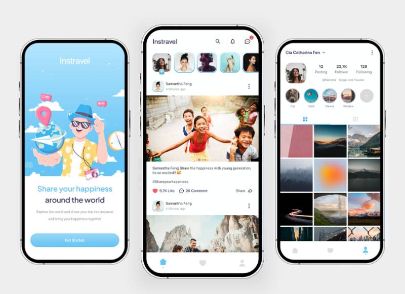
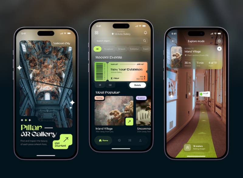
The concepts below are design explorations rather than shipped travel products, which is what makes them a useful contrast to the apps named above: none of them are wired into a GDS, a payment processor, or an airline’s fare rules. Watch where the price first appears, how the search bar and filters are weighted against the photo grid, and how much of the screen the map is allowed to take.





FAQ on Travel App Design
How Much Does Travel App Design Cost?
Cost depends far more on scope than on design polish.
A booking engine with live pricing and GDS integration costs more than a simple itinerary app, and design work itself usually runs a smaller share of the budget than payment integration and backend architecture.
Should a Travel App Be Built Native or Cross-Platform?
Most booking apps rely on cross-platform development with React Native or Flutter to hit iOS and Android at once.
Native development still wins when an app leans heavily on maps, camera-based passport scanning, or offline GPS navigation, where platform-specific performance matters more.
How Long Does Travel App Design Take From Concept to Launch?
A basic booking app with core search and payment flows typically takes three to five months to design and build.
Adding GDS integration, loyalty programs, or AI-driven personalization extends that timeline well past six months.
What’s the Difference Between OTA App Design and Airline App Design?
An OTA app has to stay neutral, since it’s comparing dozens of airlines and hotels inside one interface and can’t visibly favor any of them.
Airline apps don’t bother with that restraint. They push one carrier’s brand, loyalty tier, and check-in flow front and center, and price comparison barely shows up at all.
Does a Travel App Need In-App Chat Support?
Not always, but it helps during disruption.
Travelers rebooking a cancelled flight or resolving a refund tend to abandon email support entirely, and in-app chat with human handoff reduces churn during exactly the moments an app risks losing trust.
How Do Travel Apps Handle Multiple Currencies and Languages?
Currency conversion usually runs on the device’s detected locale, with a manual override available in settings.
Language localization means more than swapping words though. Date formats, right-to-left layouts, even icon meanings shift by region, and each one needs its own design review.
What KPIs Matter Most After a Travel App Design Launches?
Day-30 retention and booking conversion rate matter more than download counts.
Session length can mislead in travel, since a long session often signals confusion rather than engagement, and cart abandonment at payment remains the clearest sign something in the flow is broken.
How Often Should a Travel App Be Redesigned?
A full visual redesign every two to three years keeps pace with platform guideline changes from Apple and Google.
Smaller flow-level adjustments, informed by usability testing and session data, should happen continuously rather than waiting for a major overhaul.
What’s the Difference Between a Travel App and a Responsive Travel Website?
A responsive website, even a genuinely well-built progressive web app, still needs a live connection for most of what it does.
Native apps don’t have that problem the same way. They cache itineraries offline, fire push notifications, remember payment details, things a browser tab just can’t pull off no matter how well it’s built.
Does Gamification Have a Place in Travel App Design?
Loyalty tiers, streak-based badges for frequent flyers, and progress bars toward a free night all count as light gamification.
It works best applied to retention features, not the booking flow itself, where added friction costs more than it earns.
Conclusion
Most teams start travel app design with the visual layer, the colors, the icons, a polished splash screen. That instinct is backwards, and the data backs that up.
Offline functionality and price transparency fix more churn than any home-screen redesign ever will.
Budget for checkout abandonment fixes before personalization work.
A traveler who can’t see the full fare before payment won’t stick around long enough to benefit from a smarter recommendation engine.
Expect this to feel unglamorous. The fixes that move retention numbers rarely photograph well for a portfolio, and that’s fine.
Here’s a good use of five minutes this week: check exactly where your app first reveals the total price.
If that moment sits three taps deep instead of one, move it. Ship the boring fixes first.

Renowned for his expertise in logo design and visual branding, Bogdan has developed a multitude of logos for various clients.
His skills extend to creating posters, vector illustrations, business cards, and brochures. Additionally, Bogdan's UI kits were featured on marketplaces like Visual Hierarchy and UI8.
He also wrote in the past years on sites like Design Your Way, WebDesignerDepot, WPDean, Designmodo, Speckyboy, Slider Revolution, and more.
- The Cursor Logo History, Colors, Font, And Meaning - 24 September 2026
- Canva vs PowerPoint: Which Is Better for Presentations? - 22 September 2026
- How to Install Fonts on Mac (Step-by-Step Guide) - 20 September 2026

Bogdan Sandu is a seasoned designer who has been designing websites since 2008. Renowned for his expertise in logo design and visual branding, Bogdan has developed a multitude of logos for various clients. His skills extend to creating posters, vector illustrations, business cards, and brochures. Additionally, Bogdan's UI kits were featured on marketplaces like Visual Hierarchy and UI8. He also wrote in the past years on sites like Design Your Way, WebDesignerDepot, WPDean, Designmodo, Speckyboy, Slider Revolution, and more.
You Might Also Like