A misread dosage screen doesn’t just annoy a user. It can kill someone.
That’s the pressure sitting behind every screen in medical app design. The global software as a medical device market already tops $29.6 billion (Roots Analysis, 2025), and it’s not slowing down.
Health software lives in a different category than a shopping app or a game. It carries protected health information and answers to FDA classification. Usability standards get applied here that most consumer products never touch.
Get the interface wrong and the cost isn’t a bad review. It’s a patient safety incident. Sometimes it’s a HIPAA violation, or a lawsuit under accessibility law, depending on what broke and who got hurt.
What Is Medical App Design
Strip away the regulatory language and it’s still interface design at its core, aimed at software that handles clinical, diagnostic, or patient data under oversight most apps never see.
General UX design thinking still applies here. Wireframes, user flows, information architecture, none of that goes away. What changes is the moment protected health information or a treatment decision shows up on the screen, because that’s when the stakes shift. This borrows heavily from general UX design practice at its foundation.
Patient facing apps handle symptom tracking or medication management. Clinician facing tools sit inside clinical workflow. Then there’s a middle category, hybrid platforms like remote patient monitoring dashboards, that serve both sides without really belonging to either.
| Aspect | Wellness App | Regulated Medical App |
|---|---|---|
| Oversight | None required | FDA, HIPAA, or both |
| Data type | General fitness metrics | Protected health information |
| Design failure risk | Poor engagement | Patient safety incident |
The global software as a medical device market reached $29.6 billion in 2024 and is projected to hit $36.92 billion in 2025 (Roots Analysis, 2025).
Growth in this category is not abstract. A 2025 peer-reviewed analysis of FDA authorization records found the agency cleared a record 168 AI/ML-enabled medical devices in 2024 alone, continuing a surge that took annual clearances from single digits in the mid-2010s into the hundreds within less than a decade.
Livongo (now folded into Teladoc Health) is a decent reference point here. Its diabetes management app treated the interface as a monitored medical function tied to glucose data, not a generic tracker with a health theme slapped on it.
What Makes Medical App Design Different From Standard App Design
A misread step counter costs nothing. A misread dosage screen can cost a life, and that single fact reshapes almost every design decision downstream.
Regulatory review adds constraints most product teams never touch. FDA classification, ISO 62366 usability engineering, and country specific privacy law, GDPR in the EU, HIPAA in the US, all sit upstream of the first wireframe.
What actually separates this category from a typical consumer build comes down to a few things. Error tolerance sits near zero for anything touching diagnosis or dosing. Users often interact with the app under physical stress, cognitive load, or with low health literacy, conditions a typical product team rarely designs around. And data sensitivity reshapes information architecture and permission structures from day one, not as an afterthought bolted on before launch.
The scale of what’s at stake shows up in the breach numbers. OCR’s 2024 report to Congress found protected health information for 242,908,056 individuals, about 69.5% of the US population, was exposed or impermissibly disclosed that year (HHS Office for Civil Rights, 2025). A single incident, the Change Healthcare ransomware attack, accounted for roughly 192.7 million of those records.
Put the pieces together and a pattern shows up. Breach counts past 240 million records. ADA digital accessibility lawsuits topping 4,000 filings a year. FDA clearing a record number of AI enabled devices. None of these are isolated trends, they’re three enforcement regimes tightening on medical software at the same time.
What Regulatory Standards Govern Medical App Design
| Standard | Governs | Applies To |
|---|---|---|
| HIPAA | Protected health information handling | US covered entities |
| FDA SaMD framework | Risk based software classification | Diagnostic or treatment software |
| HHS Section 504 / WCAG 2.1 AA | Digital accessibility | Federally funded providers |
| HL7 FHIR | Health data exchange structure | Interoperable systems |
How HIPAA Affects Interface and Data Display Rules
HIPAA shows up in specific interface choices, not abstract policy language. Screens showing PHI need session timeouts and re-authentication built in. Consent flows should be split by data category instead of bundled into one blanket checkbox. And the display itself should follow minimum necessary rules, meaning a screen shows only what the current task actually requires.
Enforcement is not theoretical. OCR closed 22 HIPAA investigations with financial penalties in 2024, collecting $9.94 million (HHS Office for Civil Rights, 2025). Risk analysis failures were the most cited violation.
How FDA Risk Classification Changes Design Validation
FDA sorts software into Class I, II, or III based on potential harm if it fails, and the class assigned determines how much usability testing and documentation a design team owes before launch.
Class II software, cleared through the 510(k) pathway, makes up the bulk of regulated medical apps and requires demonstrated equivalence to an existing predicate device.
Class III is reserved for software where a design flaw could plausibly cause death or serious injury. That tier demands the deepest human factors engineering documentation, not just a usability report tucked into an appendix.
What Core UX Principles Apply to Patient-Facing Medical Apps
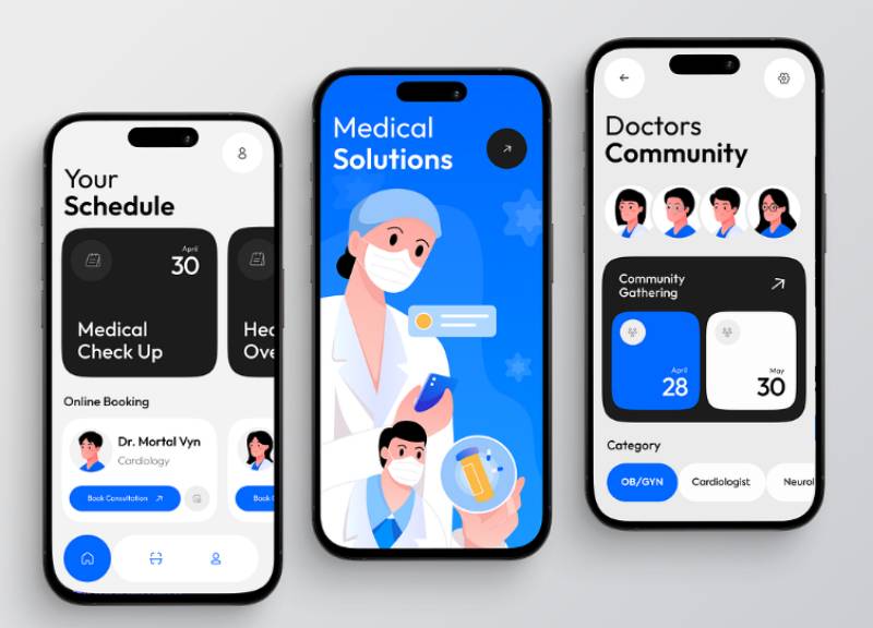
Instructions need to sit at a sixth to eighth grade reading level. That’s not dumbing anything down, it’s matching how most adults actually process unfamiliar medical terms once stress enters the picture.
Onboarding matters more here than in most categories. A solid onboarding app design separates consent, account creation, and clinical intake into distinct steps instead of dumping everything into one long form. The account creation step usually leans on straightforward login and signup screens, nothing clever needed there.
Health literacy research backs this up with hard numbers, though the most commonly cited figure is a state-level one rather than a national one. A 2023 peer-reviewed trend analysis of Kansas’s Behavioral Risk Factor Surveillance System data found the share of Kansas adults reporting low health literacy fell from 67% in 2012 to 51% in 2018.
That still leaves roughly half the surveyed population struggling with routine medical text, a pattern researchers describe as broadly consistent with health literacy challenges seen nationally.
Progressive disclosure does a lot of the heavy lifting here. Complex lab data or treatment plans get layered instead of dumped on one screen, and that layering depends on a clear visual hierarchy that tells a stressed reader what matters first.
Apple Health leans on summary dashboards, the kind that surface trends without burying the user in detail. MyChart, Epic’s patient portal, went a different way and built appointment booking and lab results as a linear flow instead of a dashboard.
How Does Accessibility Shape Medical App Design
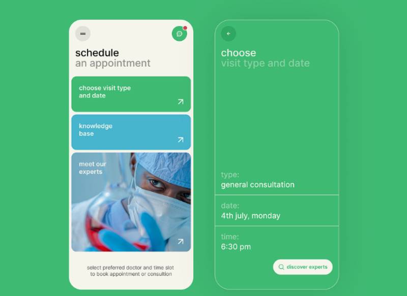
Most hospital digital properties fail accessibility standards outright. A 2022 study by the AHIMA Foundation and Mathematica evaluated 106 top-ranked US hospital websites and found only 4.9% were fully WCAG 2.1 compliant, with nearly 80% landing somewhere in semi-compliant limbo.
The web at large isn’t much better. The WebAIM Million 2026 report found 95.9% of scanned homepages carried at least one WCAG failure, averaging 56.1 errors per page.
A few failure types show up again and again in a medical context. Low contrast text turns medication instructions and lab values into guesswork for low vision users. Missing focus indicators block keyboard only navigation completely. Color coded status indicators with no secondary signal leave colorblind users with no real way to tell what a status actually means.
Contrast failures are avoidable with the right tooling. Teams that run every screen through a proper color contrast checker before shipping catch most of this before a patient ever does. Legibility choices matter just as much, and picking from a curated set of fonts for apps built for small screens beats guessing.
HHS’s Section 504 rule originally set a WCAG 2.1 AA compliance deadline of May 11, 2026 for larger healthcare organizations (those with 15 or more employees), with smaller entities given until May 2027. In May 2026, HHS pushed both deadlines back a year, to May 11, 2027 for larger entities and May 10, 2028 for smaller ones, after concluding that many recipients, including community health centers and hospitals, wouldn’t hit the original timeline.
The underlying non-discrimination obligation itself wasn’t delayed. That deadline, combined with an ADA digital accessibility lawsuit count that topped 4,000 filings in 2024 (UsableNet, 2024), makes accessibility one of the least optional line items on a medical app roadmap.
What Design Patterns Support Clinician-Facing Medical Apps
Clinician tools live or die on how much friction they remove from an already overloaded shift. This is a different design problem than patient facing work, closer to reducing cognitive load than teaching a new user anything.
A few patterns keep showing up in the clinician tools that actually work well. Information architecture that mirrors the real order of clinical decisions, not a generic form layout borrowed from a different industry. Role based permissions, so a nurse view, a physician view, and an admin view each show different defaults instead of the same crowded screen for everyone. And interoperable data pulled straight from systems like Epic, Cerner, or Athenahealth, displayed without forcing a context switch to some other window.
The cost of getting this wrong is well documented. Outpatient physicians now spend up to twice as much time interacting with the EHR as they do with patients, and symptoms of burnout affect more than 500,000 US physicians, costing the health system roughly $5.6 billion a year (Mayo Clinic Proceedings, 2024). Up to 75% of physicians point to the EHR itself as a primary contributor.
There’s a live counterexample worth noting. A 2025 study in JAMA Network Open found that after 30 days using an ambient AI scribe, essentially removing manual documentation from the clinician’s screen entirely, burnout among ambulatory clinicians dropped from 51.9% to 38.8%. Design that removes a task can move the number more than design that just reorganizes it.
How Does Data Visualization Work in Medical App Design
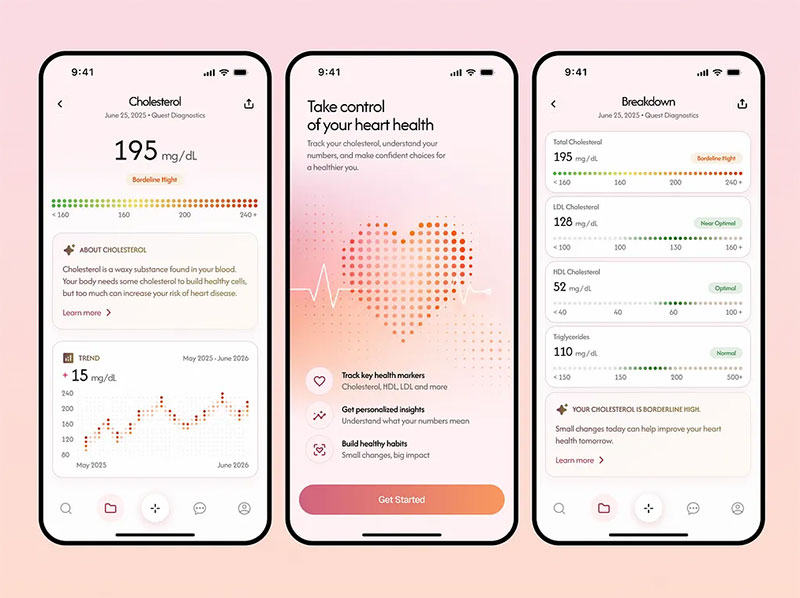
Raw numbers on a screen don’t tell a patient or a clinician anything useful on their own. Visualization is what turns a glucose reading or a blood pressure log into something a person can act on in three seconds.
| Data Type | Common Display | Example Source |
|---|---|---|
| Heart rate, activity | Trend line with baseline band | Apple Watch, Fitbit |
| Blood glucose | Continuous curve with target range | Dexcom, Abbott Libre |
| Lab results | Reference range overlay, not a raw table | Patient portal exports |
Reference ranges matter more than the raw figure itself. A number floating with no visible normal band forces the patient to go searching elsewhere, which defeats the point of showing it at all.
Good trend charts on mobile handle this by pairing the line with a shaded target zone, so a spike or a dip reads instantly without a caption underneath it.
Wearable and connected device data has become the backbone of this category. Nearly 60% of US adults now report owning at least one wearable or connected health device, according to a 2026 survey by Rock Health, up sharply from prior years.
That volume of incoming data means normalization matters as much as the chart itself. A continuous glucose monitor feed and a manually logged blood pressure reading need to sit on the same visual scale, or the dashboard starts lying by omission.
How Should Medical Apps Design Alert and Notification Systems
ICU monitors alone generate roughly 820 alarm signals per patient every day, a figure that can climb past 1,503 in the busiest units (Journal of Clinical Nursing, 2025).
Most of that noise carries little clinical weight, and clinicians learn fast which sounds to tune out. That’s the exact mechanism that turns a safety feature into a liability.
Alert tiering fixes part of the problem. Splitting notifications by actual urgency, instead of treating every ping the same, is the single biggest lever a design team has here.
| Tier | Example | Expected Response |
|---|---|---|
| Critical | Oxygen desaturation, cardiac event | Immediate, interrupts current task |
| Urgent | Abnormal lab flag, missed dose | Response within a defined window |
| Informational | Appointment nudge, routine reminder | No interruption required |
A centralized alert management dashboard pulling from biomedical devices, the EHR, and facility systems into one view cuts the scattershot pinging that drives most of this fatigue.
A 2023 secondary analysis of nurse survey data from 213 New York and Illinois hospitals found 83% of respondents felt overwhelmed by alarms, and 76% had delayed responding to one because they couldn’t step away from another task (Ruppel et al., 2023).
The Joint Commission’s NPSG.06.01.01 patient safety goal exists specifically because of this pattern. It requires hospitals to actively manage alarm safety rather than leave device defaults untouched.
What Security and Privacy Design Practices Are Required
Privacy obligations don’t stop at the backend. A well encrypted database doesn’t do much good if the interface itself leaks information through a careless screen left open in a waiting room.
Session timeouts and re-authentication need to sit on any screen showing protected health information. Consent flows should split by data category rather than bundling everything into one blanket agreement, and data minimization means the screen shows only what the current task requires, nothing extra sitting there for no reason. Encryption and privacy status indicators work better visible in the interface itself than buried a few menus deep in settings.
Patients often don’t know what they’ve agreed to. A study reviewed in a 2024 Journal of Medical Internet Research systematic review of mHealth app privacy research found 60.9% of surveyed patients did not know who had the right to access their medical records.
Cost and weak security features were named as adoption barriers by two-thirds of respondents in a separate study included in that same 2024 JMIR review.
GDPR and HIPAA diverge here in a way that actually matters for design work. GDPR wants detailed, itemized consent before any data gets recorded. HIPAA takes a different angle, leaning on administrative, physical, and technical safeguards instead of granular consent screens. A build aimed at one market usually needs a second consent flow for the other, not just a translated label.
How Is Usability Testing Conducted for Medical Apps
FDA’s official human factors guidance, “Applying Human Factors and Usability Engineering to Medical Devices,” has governed this process since the Center for Devices and Radiological Health issued it on February 3, 2016.
The guidance sets a two-stage model that differs sharply from a standard product usability process, and it applies to any software where a use error could cause serious harm.
Formative Testing Versus Summative Testing
Formative testing happens throughout development, iterative and exploratory by nature. It mixes expert reviews, heuristic analysis, and early prototype sessions with real representative users, catching problems while they’re still cheap to fix.
Summative testing is different. It’s the formal validation study at the end, the one confirming intended users can actually complete critical tasks safely under realistic conditions, and it’s what goes into the 510(k) or PMA submission itself.
A fast track study with a single user group can be completed in about 10 weeks if the team is fully prepared going in (UX Firm, 2026). Most projects take longer.
Testing With Clinicians Versus Testing With Patients
Clinician testing and patient testing don’t look anything alike once you get into the room.
Clinician sessions focus on task completion speed and error rates under interruption, because that’s the actual condition a device gets used in on a real shift, not a quiet lab.
Patient sessions lean harder on comprehension. Can someone with no clinical background read a result, follow an instruction, or recognize a warning without help? That’s the real question, and it rarely gets a clean yes.
Both tracks trace back to the same use-related risk analysis required under ISO 62366. Recruitment criteria, task scripts, and pass or fail thresholds still rarely line up between the two though.
What Design Systems and Frameworks Are Used in Medical App Design
Most teams don’t build every component from scratch. They start from an existing system and adapt it to clinical constraints.
| System | Maintainer | Best For |
|---|---|---|
| Carbon for Health | IBM | Clinical data tables, enterprise EHR tools |
| Material Design | Android-based patient apps | |
| U.S. Web Design System | U.S. government | Federally funded health portals |
IBM’s Carbon Design System ships more than 40 production-ready components, documented directly by IBM, alongside matching menus and buttons built for accessibility out of the box.
Carbon also ships Figma files alongside the coded components, so design and engineering stay on the same version without a separate handoff step.
Google’s Material Design guidelines, the foundation most Android interfaces rely on, extend into health-specific components for data entry and status indicators too.
USWDS was built for government sites, and its accessibility defaults meet Section 508 requirements out of the box, which matters directly for any federally funded patient portal.
How Does Telehealth Interface Design Differ From Standard Medical App Design
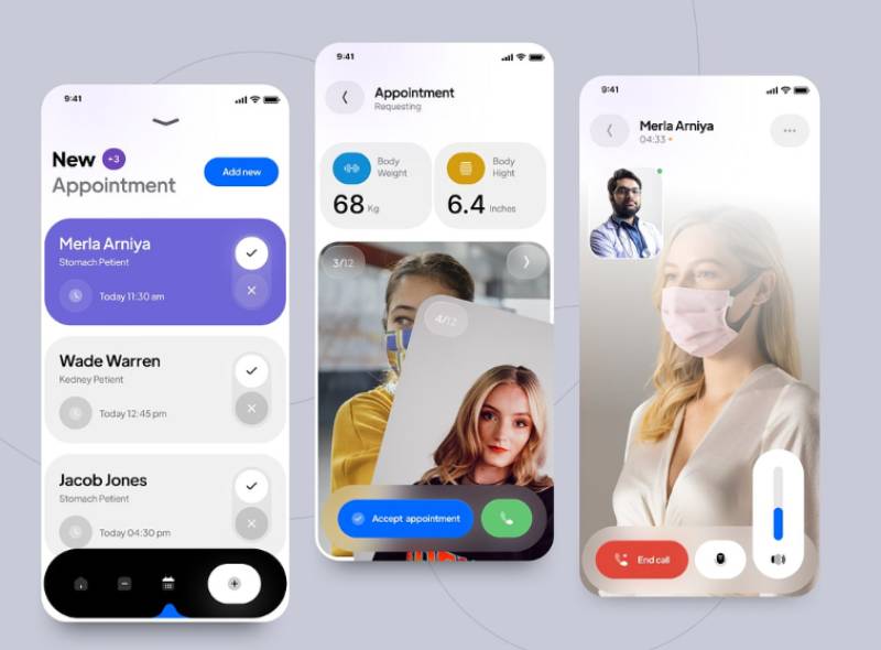
Telehealth swaps the interface problem entirely. Instead of designing for a static screen, the product has to hold up over a live video connection that might drop, lag, or arrive on a five-year-old phone.
Adoption is broad but uneven by specialty. Telemedicine use among primary care physicians fell from 91.4% in 2021 to 86.2% in 2024, while surgical specialists saw a steeper drop, from 74.8% to 60.1%, over the same period (CDC/NCHS, 2024 survey data).
Federally funded care hasn’t slowed the same way. 95% of HRSA-funded health centers used telehealth to provide primary care in 2024 (HRSA Uniform Data System, 2024).
A few design problems only show up once video enters the picture. Waiting room screens need to set honest expectations about connection delays instead of showing a spinner with zero context, because nothing frustrates a patient faster than staring at a loading icon with no idea what’s happening. Low bandwidth fallback modes matter too, dropping to audio-only beats freezing entirely. And pre-visit intake forms that collect symptoms and vitals before the call even starts mean the actual visit time doesn’t get eaten up by data entry.
Platform specific patterns matter more here than in most categories. A telehealth app built around one clinic chain’s Android UI design conventions will feel foreign to a patient used to iOS.
Amwell runs its platform around this exact constraint, maintaining separate design tracks for iOS and Android rather than forcing one interaction model onto both.
What Common Design Failures Cause Medical App Errors
A multisite study across children’s hospitals observed errors in 36.2% of medication administrations, with wrong-unit mix-ups, such as mg written where mcg was intended, among the documented failure types (The Journal of Pediatrics, 2024).
The unit confusion isn’t really a caregiver problem. It’s a design and communication gap.
A CDC survey found most primary care providers incorrectly believed patients preferred spoon-based dosing units, and more than half of family medicine physicians said they’d include teaspoon or tablespoon units on a new prescription anyway (CDC, cited by Medscape, 2024).
| Failure | Consequence | Fix |
|---|---|---|
| Ambiguous unit labeling | Dosing errors, especially in pediatrics | Milliliter-only display, no dual units |
| Undifferentiated alerts | Alert fatigue, missed critical warnings | Tiered priority, tied to patient context |
| Inconsistent navigation across updates | Disrupted habits in long-term users | Preserve core layout across releases |
None of these failures trace back to a single bad developer.
They trace back to a design process that skipped the step where someone asks what happens when a stressed, tired, or unfamiliar user meets this screen at 2 a.m.
Medical App Design Examples
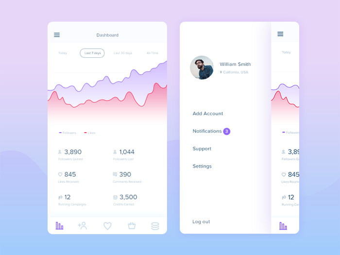
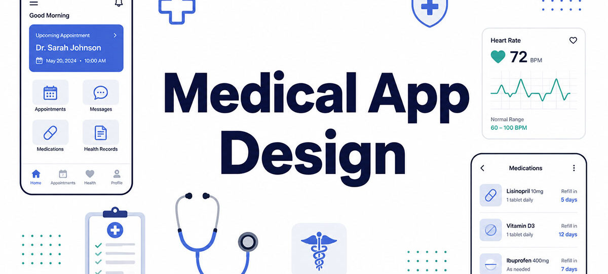
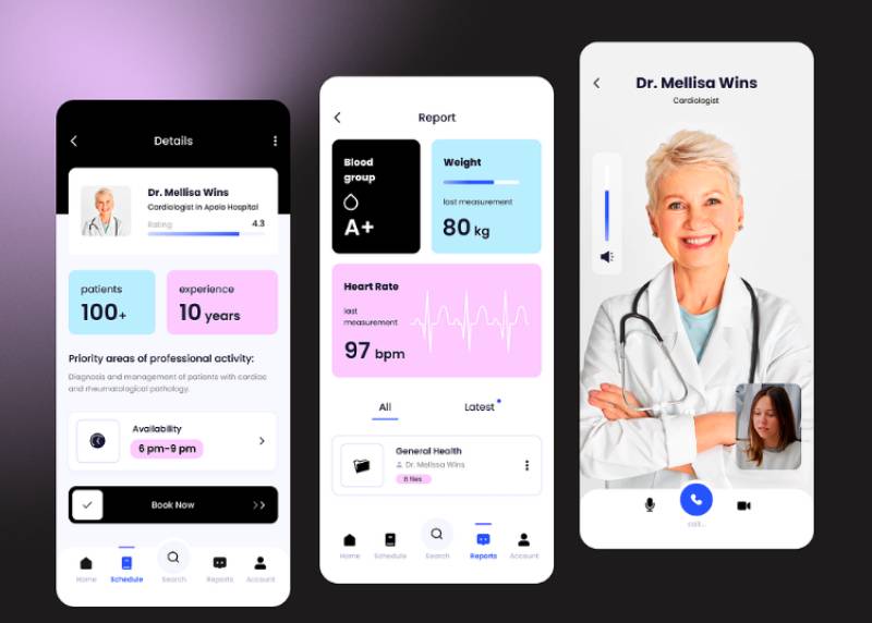
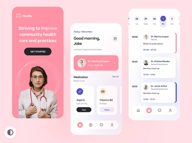
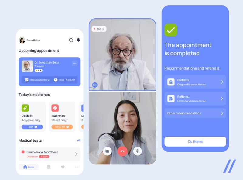
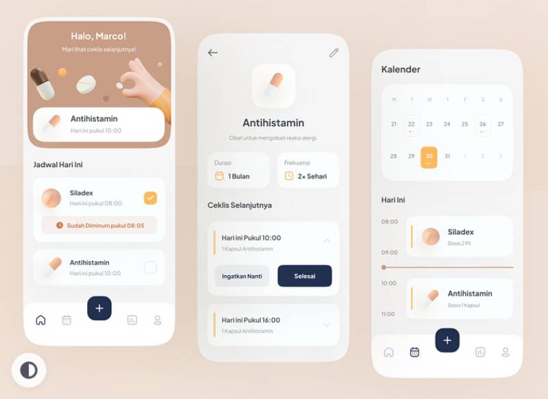
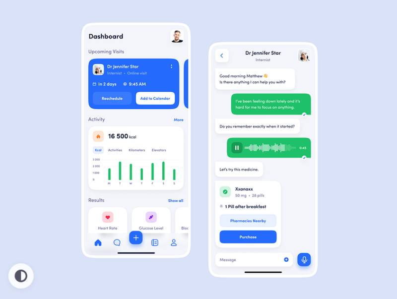
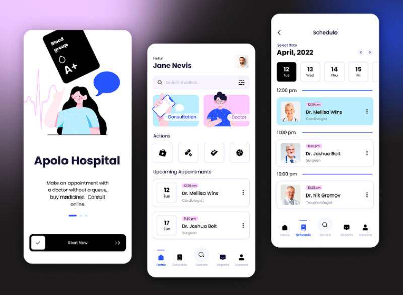
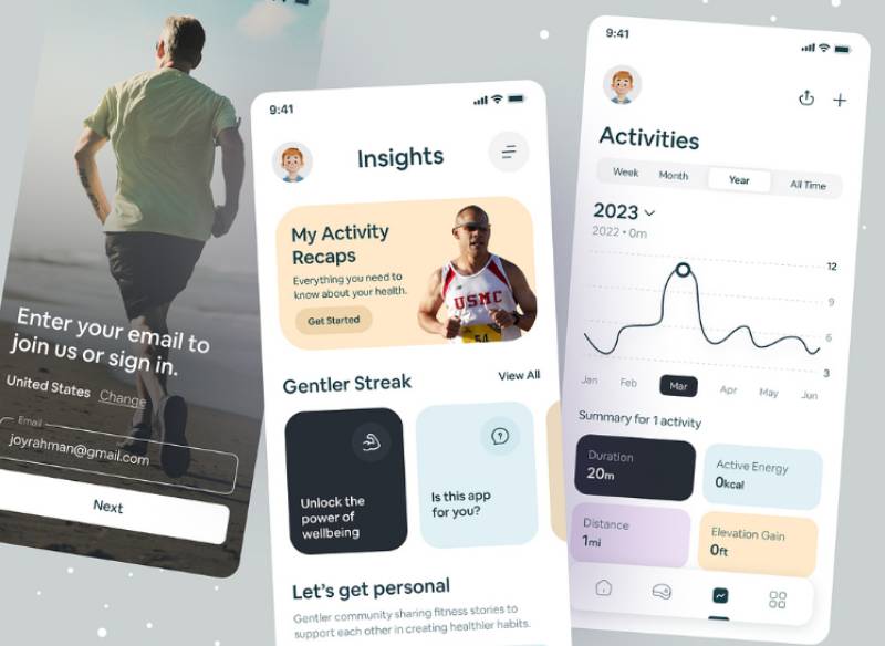
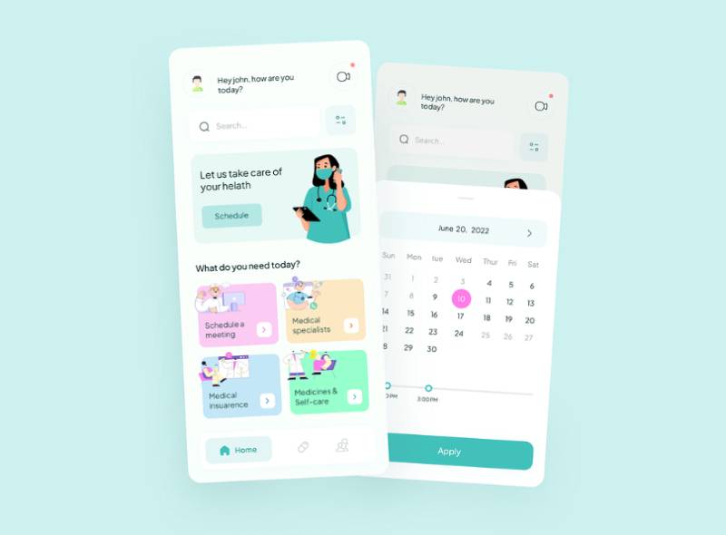
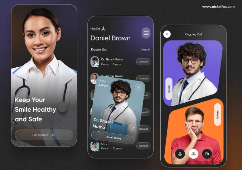
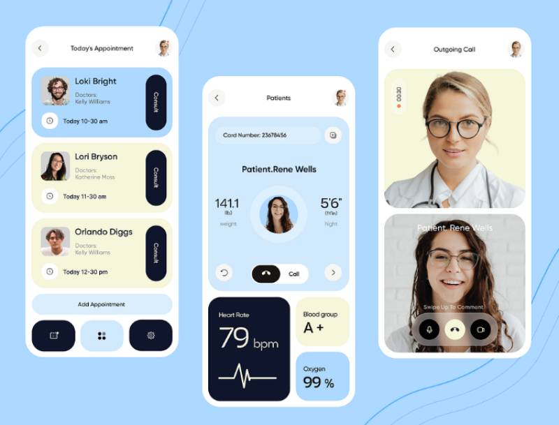
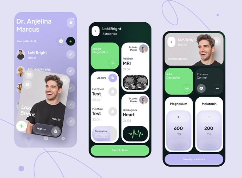
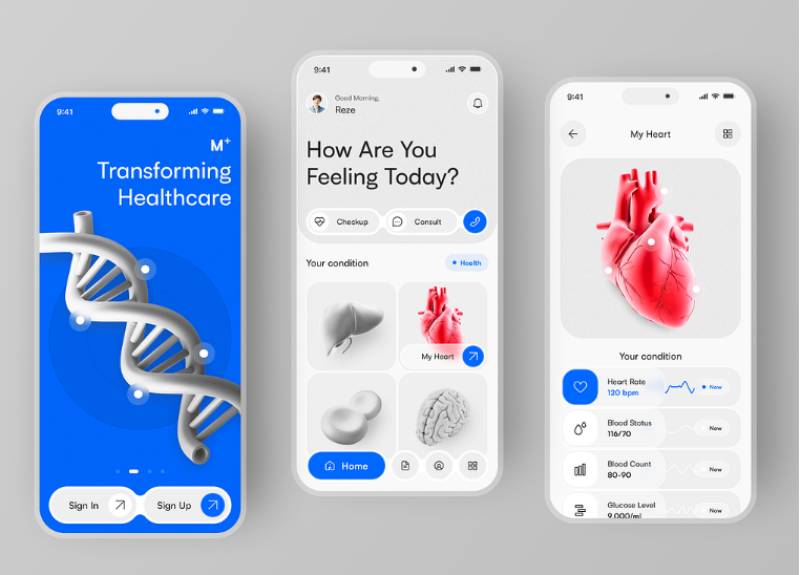
The concepts below are design explorations rather than shipped products, which is worth keeping in mind here more than anywhere else: none of them carry an FDA classification, a human factors validation study, or a HIPAA consent flow behind the screens shown. Read them for layout and hierarchy, not for regulatory patterns. Watch where the primary reading sits, how status gets signalled beyond colour alone, and how much detail each screen holds back.
FAQ on Medical App Design
How much does it cost to design a medical app?
Regulatory scope drives the price more than anything else. A wellness app with no FDA involvement usually lands between $50,000 and $150,000. Add full human factors documentation and clinical validation for a Class II SaMD product, and that number regularly climbs past $500,000 before launch.
How long does a typical medical app design project take?
Three to six months covers most unregulated wellness apps. Regulated medical apps run longer, usually nine to eighteen months, once formative usability testing, risk analysis, and FDA submission timelines get folded into the schedule.
Who should be on a medical app design team?
UX designers alone won’t get this done. A strong team also needs a regulatory affairs specialist, a clinical subject matter expert, and a human factors engineer in the room early, not brought in after the fact. Skipping either the clinical or regulatory role at the start is the most common reason designs get sent back for rework later.
Do app stores review medical apps differently than other apps?
Yes, and both platforms take it seriously. Apple’s App Store Review Guidelines and Google Play’s health policies flag medical claims, require accurate FDA status disclosure, and reject any app making diagnostic promises the developer can’t back up with clearance documentation.
Should a medical app be built natively or cross platform?
Native development, Swift or Kotlin, gives tighter control over accessibility APIs and device sensors, and regulated apps often need that level of control. Cross platform frameworks like React Native or Flutter hold up fine for wellness apps that don’t carry strict human factors requirements.
How do FDA-cleared apps handle software updates after launch?
A Predetermined Change Control Plan handles this, finalized in FDA guidance back in December 2024. It lets manufacturers pre-specify how an algorithm or interface may change after launch without triggering a full resubmission every time something gets updated.
Does a children’s health app need extra privacy protections?
Yes. Apps aimed at users under 13 in the US fall under COPPA, and that requires verifiable parental consent before any data gets collected, on top of whatever HIPAA or GDPR already requires for general patient information handling.
Should patient data be stored locally or in the cloud?
Local storage cuts breach exposure but makes care coordination across providers harder. Most regulated apps end up on encrypted cloud storage with strict access controls instead, mainly because interoperability with EHR systems needs centralized, standards based data exchange to work at all.
How does HealthKit or Health Connect integration affect app design?
Pulling data through Apple HealthKit or Android’s Health Connect means designing around data the app has no control over. The interface has to handle missing fields, inconsistent units, and syncing delays without the display breaking every time something’s off.
What’s the difference between an MVP and a full regulated release for a medical app?
An MVP tests core value with a minimal feature set, and often skips FDA submission entirely if it’s not making clinical claims. A full regulated release is a different animal: completed summative usability testing, risk documentation, and premarket clearance, all required before anything reaches a patient facing launch.
Conclusion
Teams that stall out on medical app design usually made the same mistake early. They started sketching screens before locking the regulatory classification.
That one decision, wellness app or SaMD, sets the depth of usability testing and the shape of the consent flow. It also decides the accessibility budget, and it does all of this before a single component gets built.
Get the classification wrong and the rework doesn’t stay contained. Clinical workflow diagrams get redone. Alert tiering gets redone. EHR integration gets redone. Pretty much everything downstream of that first bad call.
So the order matters more than the checklist does. Classify first. Map the human factors engineering plan second. Only then open Figma.
Everything else, wearable integration, care coordination between clinician and patient views, inherits whatever got decided in that first meeting, for better or worse.

Renowned for his expertise in logo design and visual branding, Bogdan has developed a multitude of logos for various clients.
His skills extend to creating posters, vector illustrations, business cards, and brochures. Additionally, Bogdan's UI kits were featured on marketplaces like Visual Hierarchy and UI8.
He also wrote in the past years on sites like Design Your Way, WebDesignerDepot, WPDean, Designmodo, Speckyboy, Slider Revolution, and more.
- The Windsurf Logo History, Colors, Font, And Meaning - 10 October 2026
- How to Remove Background From Product Photos (No Photoshop) - 10 October 2026
- How Designers can Build a Stronger Online Creative Identity - 9 October 2026

Bogdan Sandu is a seasoned designer who has been designing websites since 2008. Renowned for his expertise in logo design and visual branding, Bogdan has developed a multitude of logos for various clients. His skills extend to creating posters, vector illustrations, business cards, and brochures. Additionally, Bogdan's UI kits were featured on marketplaces like Visual Hierarchy and UI8. He also wrote in the past years on sites like Design Your Way, WebDesignerDepot, WPDean, Designmodo, Speckyboy, Slider Revolution, and more.
You Might Also Like