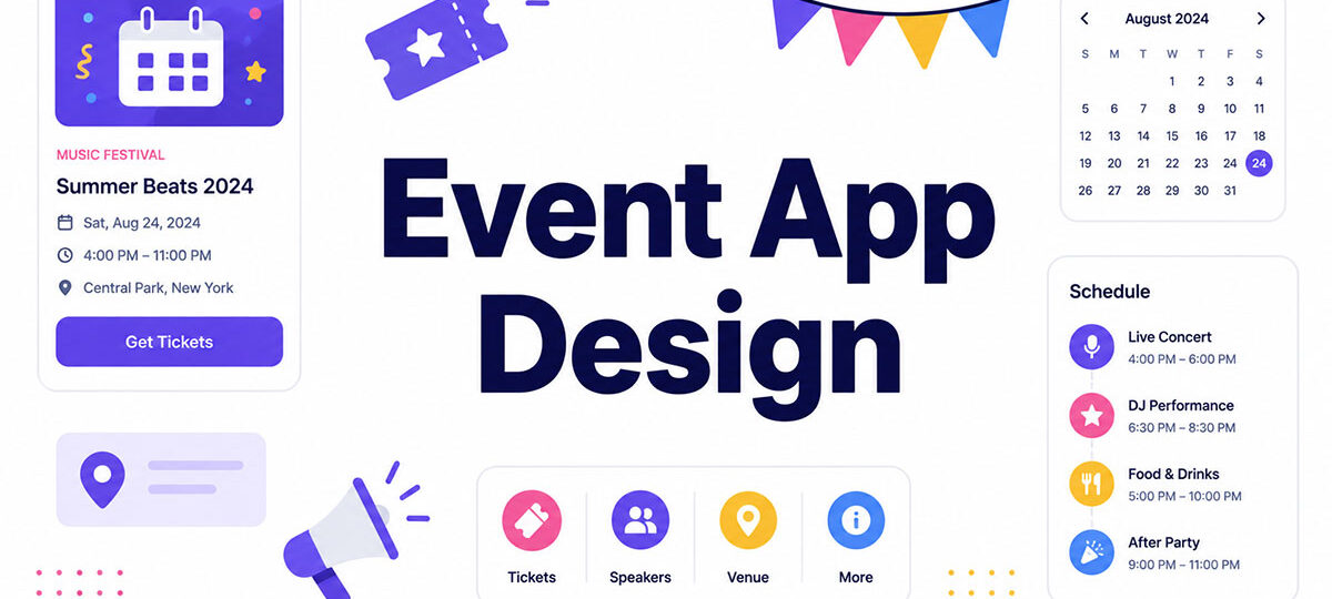
Event app design is the difference between an app people actually open and one they delete by lunch on day one. One 2025 conference tracked by Nunify’s benchmarking research hit 99% app adoption, and the trick wasn’t some clever feature buried in a settings menu. It came down to well-timed contests and early-bird prize emails.
Most events never get anywhere close to that number.
The gap usually has nothing to do with the feature list bolted onto the back end. It’s whether the agenda still loads when venue Wi-Fi chokes, and whether check-in takes three seconds instead of thirty. A printed program can’t do either of those things, and it definitely can’t push a room change straight to someone’s pocket the moment it happens.
Get any of that wrong and the download just sits there, untouched, by day two.
What Is Event App Design
Most product design gets months, sometimes years, to earn a habit. Event app design gets one weekend to earn a download, a login, and enough trust that someone opens it again on day two. That compressed timeline is really what sets the discipline apart. It covers the mobile and web interfaces attendees use for the entire life of a single event, from registration through the final session, and usage spikes hard around check-in and session times instead of spreading out evenly like it would in a normal app.
The discipline borrows from broader UX design practice, but the constraints don’t map over cleanly. There’s no slow build toward a routine here, no gradual onboarding funnel spread across weeks. Everything gets compressed into a few days.
Event apps also sit apart from other single-purpose categories. Travel app design is built for a multi-week itinerary, juggling flights and hotels and plans that shift constantly. Habit loops matter more for fitness app design, since that category depends on repeat use stretching across months, not days. And workflows that never really end are the whole point of business app design.
| App Category | Typical Usage Window | Core Focus |
|---|---|---|
| Event apps | Single event, days | Schedule and on-site networking |
| Travel apps | Multi-week trip | Itinerary and logistics |
| Fitness apps | Ongoing, daily | Habit tracking |
| Business apps | Continuous | Workflow and productivity |
This work tends to land with one of a few groups, and which one matters more than people assume, since it shapes how much design freedom is actually on the table.
- Event tech teams at platforms like Whova, Cvent, or Bizzabo, building essentially the same product for many organizers at once
- Agencies brought in for a single flagship event with custom branding requirements
- In-house UX designers at large companies running recurring internal conferences
The app itself rarely stands alone. It’s wired into a wider event technology stack that includes registration platforms, CRM tools, and on-site hardware like badge printers and beacon technology.
Why Do Events Need Dedicated App Design

55% of attendees say the mobile event app can make or break their overall experience, according to Bizzabo’s 2026 event marketing research.
That single number is probably why organizers stopped treating the app as an afterthought tacked onto a static event website.
Printed programs go stale the moment a room changes. A dedicated app pushes the update the second a swap happens, instead of forcing someone to go find a staff member and hope they know the answer.
Organizers get something out of this too, not just attendees.
- Live attendance data replaces guesswork about which sessions actually filled up
- Sponsor visibility becomes measurable instead of assumed
- 79% of organizers now integrate their event platform with CRM tools or marketing automation (Bizzabo, 2026), which turns session interest into an actual sales pipeline instead of a stack of business cards nobody follows up on
Adoption is really the number that separates a good rollout from a wasted one. Nunify’s 2025 benchmarking puts a healthy event app adoption rate at 55% to 65% with active promotion, climbing to 80 to 95% among the top-performing events.
Uncubed switched its internal conference app to Yapp and cut more than $100,000 in costs annually while lifting attendee engagement across more than 5,000 attendees, per Yapp’s own case reporting.
What Core Features Define Effective Event App Design

A handful of features show up in nearly every serious event app build, and they earn their place for practical reasons.
- The agenda and session builder is the interactive schedule attendees check most, usually built as a scrollable list rather than a calendar grid
- The push notification system handles alerts for room changes, delayed starts, and last-call reminders
- Wayfinding maps cover indoor navigation for convention centers, where GPS alone falls apart
- The speaker and exhibitor directory is a searchable set of profiles tied back into the session listings
- Live polling and audience response power real-time Q&A during keynotes
The agenda screen is where list-based interface patterns matter most. Attendees scan it dozens of times a day hunting for the next session, often while walking, so it needs to hold up under that kind of quick glance.
Push notifications are worth tuning with some care rather than blasting out on instinct. Converve’s 2026 review of event networking apps found that events sending 11 to 14 notifications hit roughly 20% higher adoption than events that under-notify or bury attendees in alerts.
Typography inside these screens matters more than most teams expect. Attendees read session titles and room numbers in low light or mid-stride, so picking typefaces built for small mobile screens is what keeps that information legible at a glance.
Must-Have vs Nice-to-Have Features
| Feature | Priority | Notes |
|---|---|---|
| Agenda and session builder | Must-have | Core reason attendees open the app |
| Push notifications | Must-have | Drives repeat opens during the event |
| Live polling and Q&A | Nice-to-have | High value for keynotes, less for breakouts |
| Gamification layer | Nice-to-have | Boosts engagement, needs a real prize budget |
Smaller events under 200 attendees can usually skip the gamification layer and the full exhibitor directory without hurting adoption much.
How Does Information Architecture Work in Event App Design

Information architecture decides whether an attendee finds the next session in two taps or gives up and flags down a volunteer instead.
Tab-based navigation works best for event apps because it keeps agenda, map, and directory one thumb-tap away at all times. Menu-based navigation, tucked behind a hamburger icon, adds a hidden step. That extra tap costs opens during rush moments like intermission, when people are moving fast and don’t want to hunt for a button.
Designers lean heavily on established tab bar patterns and menu and button conventions already proven across thousands of consumer apps, rather than inventing new navigation metaphors from scratch.
Placement follows attendee intent pretty closely.
- Agenda and check-in status sit on the home screen, always
- Maps and directories sit one tap deep
- Settings and account details sit two taps deep, since attendees rarely touch them anyway
Large events with hundreds of sessions need real search and filter tools, not just a scroll bar and good luck. Filtering by track, room, or speaker turns an unusable wall of sessions into something an attendee can actually plan a day around.
Offline access matters more than most teams budget for. Convention centers routinely choke on Wi-Fi during peak check-in, so agenda data and maps need to cache locally instead of depending on a live connection that might not be there when it’s needed most.
What Design Process Do Event Apps Follow
The process runs in a fixed order, mostly because event apps don’t get a soft launch. There’s no slow rollout to a percentage of users. Everything has to work on day one, for everyone, at once.
Research to Launch, Step by Step
- Start by interviewing organizers and last year’s attendees about what actually went wrong.
- Sketch the navigation and screen flow before anyone touches a visual design tool.
- Build a clickable prototype in Figma or Adobe XD.
- Run usability sessions with real attendees, not just whoever’s in the office that day.
- Push it to the Apple App Store and Google Play, with review lead time built in.
- Watch crash reports and adoption numbers live once the event actually starts.
Skipping step four is the most expensive shortcut on this list, and it’s usually the first one cut when timelines get tight. The Nielsen Norman Group found it’s up to 100 times cheaper to fix a usability problem during design than after launch.
Reviewing real interface design examples from past events during the wireframe stage saves a lot of reinventing. Agenda screens and check-in flows already follow patterns that have been tested at scale.
How Should Registration and Check-In Be Designed

Nothing else in the app matters much if registration goes badly, because that’s the first moment an attendee has with it, and it decides whether they open it again at all.
LineUpr’s 2026 analysis of conference networking apps found that an app only 40% of attendees install underperforms a simpler one that 80% actually open, regardless of which one has the smarter feature set. Adoption beats sophistication here.
That gap almost always traces back to friction at the door. Good onboarding flow design gets attendees past sign-up in under a minute, ideally through a magic link or QR code rather than a forced app-store download.
Single sign-on and ticketing sync remove a second layer of friction. When registration data from Eventbrite or Cvent flows straight into the app through API integration, attendees skip re-entering their name and ticket type entirely, which sounds small until you’ve watched someone fumble through it at a check-in line.
Check-in itself has a few competing methods, and most events end up using more than one.
- QR code scanning is the default for most events, fast, and it works on any smartphone camera
- RFID badge taps show up mostly at large trade shows, pairing well with lead-retrieval hardware
- Bluetooth Low Energy and NFC handle proximity check-in and beacon-triggered wayfinding
Login screen design deserves its own attention too. A clean login form design, with large touch targets and minimal required fields, cuts the number of attendees who give up before finishing sign-in.
On-site kiosks need a different flow than personal-device check-in. Kiosks handle walk-up registrants who never downloaded the app, while personal-device check-in just confirms someone who already registered days earlier.
How Does Networking and Matchmaking Design Work in Event Apps
Networking features are what turn an event app into something worth opening between sessions, rather than a digital version of the printed program.
Swapcard’s own platform data shows around 60% of networking activity at trade shows and conferences happens before the event even starts. That’s why profile-building can’t wait until attendees walk through the door.
Profile and interest tagging forms the backbone of any matchmaking system. Attendees list goals, focus areas, and interests, and the matchmaking algorithm uses that data to suggest people worth meeting, though the quality of those suggestions depends heavily on how much effort attendees put into the profile in the first place.
AI-driven matching has moved from differentiator to baseline pretty quickly. Converve’s 2026 review of event networking platforms notes that AI matching now ships as a standard feature across most serious tools, not a premium add-on.
| Platform | Networking Focus | Best For |
|---|---|---|
| Swapcard | Exhibitor-driven matchmaking | Trade shows with sponsor booths |
| Grip | Deep AI-based matching | Tech and finance conferences |
| Brella | Structured 1:1 meeting scheduling | Large enterprise B2B events |
In-app messaging and meeting schedulers round out the system. Some platforms add a lightweight video calling layer, echoing patterns from video app design, so hybrid attendees can take a scheduled meeting without leaving the app.
Privacy controls matter just as much as the matching logic. Attendees need a clear way to turn off visibility or opt out of the directory entirely. Not everyone at a conference wants to be found.
What Accessibility Standards Apply to Event App Design
More than 1.3 billion people worldwide live with some form of disability, roughly 16% of the global population, according to the World Health Organization.
Event apps that ignore this audience lock out a meaningful share of every attendee list. It’s not a hypothetical edge case.
WCAG 2.1 Level AA is the baseline most organizers design toward. The U.S. Department of Justice named this exact version the technical standard for Title II government entities in its 2024 final rule, even though WCAG 2.2 has been published since 2023.
Independent academic research analyzing thousands of mobile apps keeps landing on similar failure rates. Yan and Ramachandran ran the IBM Mobile Accessibility Checker against 479 Android apps across 23 business categories and found 94.8% carried at least one accessibility violation (ACM Transactions on Accessible Computing, 2019). Ross, Zhang, Fogarty and Wobbrock’s large-scale analysis of thousands of free Android apps found missing labels on image-based buttons to be pervasive rather than occasional (ACM Transactions on Accessible Computing, 2020). Those are the same categories of problems event teams keep running into: unlabeled buttons, weak color contrast, layouts that fall apart under a screen reader.
A handful of areas need direct attention inside an event app.
- Screen reader compatibility means agenda items, speaker bios, and directory entries need proper labels, not just visual text a screen reader skips past
- Color contrast and font scaling matter because convention hall lighting swings between glare and dim rooms, and text needs to hold up in both
- Touch target sizing follows WCAG 2.2 AA’s 24×24 CSS pixel minimum, while Apple recommends 44×44 points and Google recommends 48×48 dp
- Captioning on embedded live-stream sessions needs to run in real time, not show up as a transcript posted after the fact
The European Accessibility Act took effect in June 2025, requiring mobile apps and other digital services sold into the EU to meet comparable conformance levels.
Native Development vs White-Label Event App Platforms
Custom native builds cost far more and take far longer to ship than a white-label platform, and the gap between the two isn’t close.
Average custom mobile app development lands around $171,450 across 2025 and 2026, per AppInstitute’s analysis of industry project data, with a typical six to twelve month timeline on top of that cost.
White-label platforms flip both numbers. Branded event apps built on an existing platform typically launch in four to eight weeks, and Swapcard’s own pricing shows entry tiers starting around $610 a year, with enterprise deployments running well into five figures once implementation is added in.
Native development still wins in a few specific cases.
- Custom hardware pairing, like proprietary RFID scanners tied to unique venue systems
- Deep integration with an internal enterprise app ecosystem that white-label vendors can’t reach
- A recurring flagship event large enough, generally 1,000-plus attendees, to amortize the build cost across several years of reuse
Native builds also mean separate Android UI design and iOS design work, since the two platforms follow different interaction conventions rather than sharing one codebase.
Platform Comparison by Cost and Fit
Pricing across these platforms spans a range of tiers, from mid-range tools built for a few hundred attendees up to enterprise deployments meant for four-figure headcounts.
| Platform | Customization | Cost Tier | Best-Fit Size |
|---|---|---|---|
| Whova | Moderate | Mid-range | 200+ attendees |
| Cvent | High | Enterprise | 1,000+ attendees |
| Bizzabo | High | Enterprise | 1,000+ attendees |
| EventMobi | Moderate | Mid-range | 500+ attendees |
| Swapcard | High, exhibitor-focused | Enterprise | 1,000+ attendees |
Momentive’s 2026 event technology guide notes that budget-tight, one-day, or small events (50 to 200 attendees) often do better with a lightweight progressive web app than either option, since download friction can outweigh whatever benefit a native build offers at that size.
How Does Personalization and Data Use Work in Event App Design

Personalization inside an event app runs on behavior, not guesswork. Session check-ins, saved agenda items, and browsing history feed a recommendation engine that suggests the next session or connection worth an attendee’s time.
On the organizer side, that same data surfaces on a real-time dashboard, showing which sessions are filling up and which sponsors are getting foot traffic, often rendered through live charts and graphs rather than a raw spreadsheet.
Consent architecture matters just as much as the recommendation logic itself. One documented case from Secure Privacy’s research maintained 85% of recommendation effectiveness while reaching a 95% consent opt-in rate, just by making the data trade-off transparent up front.
GDPR sets the baseline pattern most event platforms design around, even outside the EU.
- Consent gets collected before behavioral tracking starts, not buried in a terms-of-service wall
- Data minimization means collecting only what the recommendation engine actually uses
- There’s a clear deletion path once the event ends
Post-event, attendee data typically hands off to the organizer’s CRM. Salesforce and HubSpot integrations are the two most common destinations, turning session interest signals into follow-up sales or membership outreach.
What Design Mistakes Reduce Event App Adoption
Most low-adoption event apps fail for the same handful of reasons, and they repeat across different platforms and different events almost identically.
| Mistake | Why It Hurts Adoption | Fix |
|---|---|---|
| Overloaded home screen | Buries the agenda under promotional widgets | Lead with agenda and check-in status only |
| Mandatory account creation upfront | Blocks value before trust is earned | Let attendees browse before requiring sign-up |
| No offline fallback | Venue Wi-Fi fails right when attendees need the agenda most | Cache schedule and maps locally on load |
| Inconsistent branding | Attendees aren’t sure the app matches the registration site | Reuse the same visual system end to end |
Forcing account creation before showing any value is probably the single most expensive onboarding mistake on this list, according to Vmobify’s 2026 mobile app growth data.
Each additional screen placed before that first moment of value drops completion by roughly 10 to 15%. A six-screen pre-value flow, not uncommon in early event app builds, loses more than half of everyone who got past the install.
The fix isn’t complicated. Defer registration until after an attendee sees the actual agenda, and keep the pre-value flow to three screens or fewer.
How Is Event App Design Success Measured
A few numbers tell organizers whether the app design actually worked, and they’re worth tracking separately rather than lumping into one vague engagement score.
- The download-to-registration ratio shows what share of registered attendees actually installed the app
- Daily active use tracks how many of those users open the app again on day two and beyond, which is really the number that matters most
- Session check-in rate measures the share of attendance captured through in-app QR scanning versus manual headcounts
- Post-event survey completion is the percentage who respond when prompted through the app itself
Survey completion benchmarks vary quite a bit by source, and that’s worth naming directly. Glue Up’s research puts the general post-event survey benchmark at 20% to 30% across industries, while Explori’s research on conferences and corporate events specifically found a typical range closer to 10% to 20%.
The difference likely comes down to audience type and delivery method, not a contradiction in the underlying data.
ELX, an invite-only community for heads of events studied in Explori’s 2026 research, runs its surveys with no incentives at all and still lands response rates above 80%. Attendees simply know their feedback shapes next year’s event.
Timing changes the outcome more than almost anything else. Surveys sent within 24 to 48 hours after the event catch attendees while impressions are still fresh, and response rates drop off noticeably once that window closes.
When Does Event App Design Not Apply
A dedicated event app isn’t always the right call, and forcing one onto a small event wastes budget that belongs somewhere in the actual experience instead.
Small, single-day events with 50 to 200 attendees generally do better with a lightweight web page than a downloadable app. A browser-based option removes install friction entirely for a crowd that size.
Eventleaf’s free Starter plan, which covers events up to 100 attendees at no cost, is built around roughly this scale, though customization narrows noticeably once an event grows past a few dozen attendees.
Recurring internal meetings are a different case entirely.
- Weekly or monthly team meetings don’t need session scheduling or attendee networking features
- Internal tools like a shared calendar or chat app already cover the communication need
- The complexity of a dedicated app outweighs any benefit at that frequency
Budget sets a hard floor too. Event platform pricing that requires $15,000 or more a year in spend is hard to justify below 1,000 attendees, since the cost per attendee stops making sense at smaller scales.
Events without a session-based structure, a single keynote dinner, a product launch party, a one-room panel, rarely need an agenda-first app design at all. A simple registration confirmation and a printed program often do the same job for less money and less setup time.
Event App Design Examples
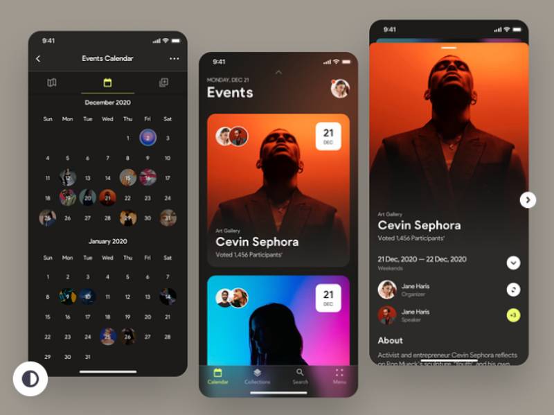
The concepts below are design explorations rather than shipped event apps, which is what makes them a useful counterweight to the platform comparison above: none of them are working around a registration provider’s API, a venue’s Wi-Fi, or a sponsor’s placement contract.
Watch what each one puts on the home screen, how many taps sit between opening the app and the next session, and whether the agenda survives being glanced at mid-stride.




FAQ on Event App Design
Do Event Apps Work Without an Internet Connection?
Most event apps cache the agenda, maps, and speaker directory locally, so core content stays reachable when venue Wi-Fi drops. Live features like push notifications and matchmaking still need a connection, but offline functionality keeps attendees from losing the schedule.
Can One Event App Be Reused for Multiple Events?
Yes, and it’s fairly common. Many white-label event platforms offer a multi-event hub, so organizations running several events a year can reuse the same shell with new branding and content each time instead of starting over. That cuts setup cost compared to a fresh native app development cycle.
What’s the Difference Between an Event App and Event Management Software?
An event app is what attendees actually touch, the agenda, networking, check-in, all crammed onto a phone screen. On the organizer’s side, there’s event management software instead, covering registration, speaker management, and exhibitor coordination behind the scenes. Most platforms bundle both together under one event technology stack, so in practice the line blurs.
How Do Organizers Boost Event App Adoption Before the Event Starts?
Promotion really needs to start in the registration confirmation email, with a direct download link or QR code rather than sending people off to search the app store on their own. Early access to the interactive agenda before doors open also gives attendees an actual reason to install ahead of day one.
Do Attendees Need to Create an Account to Use an Event App?
Not always, and the best platforms avoid it. Many offer a guest mode that unlocks the agenda and maps right away, pushing full event app onboarding steps like profile creation until an attendee actually wants to network. Forcing a full account upfront is exactly what tanks first-session completion.
Can Sponsors Track Engagement Through the Event App?
Yes. Booth visit counts, session attendance tied to sponsor talks, and content downloads all feed sponsor visibility reporting. That data usually shows up on the same organizer dashboard used for overall event data analytics, giving sponsors actual numbers instead of a vague sense of how things went.
What Happens to the Event App After the Event Ends?
Some organizers keep the app running as an on-demand hub for session recordings and slide decks, stretching its life another few weeks. Others just shut it down and rely on a digital event program or recap email instead.
Is It Safe to Scan Unfamiliar QR Codes at Events?
Official event QR code links route through the organizer’s registration platform, so scanning one at a staffed check-in desk is safe enough. Codes posted outside official signage, or handed out by a stranger in the hallway, are worth skipping, since QR links can be spoofed pretty easily.
Do Event Apps Support Multiple Languages?
Larger platforms like Whova and Cvent support multi-language interfaces, translating menus and session titles automatically. Smaller white-label builders vary a lot on this, so confirming language support matters before locking in a platform for an event drawing an international crowd.
Can an Event App Be Used for Virtual or Hybrid Sessions?
Yes. Most modern platforms embed live streaming directly into the session screen, so remote attendees can watch alongside the in-person crowd. A hybrid event app usually layers chat and Q&A on top of the stream too, so virtual attendees aren’t just watching in silence.
Conclusion
Start event app design with the two screens attendees touch under stress: registration and the agenda. Everything else, matchmaking, gamification, sponsor widgets, can wait for a second release.
Budget should follow that same order. A working offline-first agenda beats a polished networking layer nobody opens because the download never finished.
Expect the first live event to expose gaps no wireframe caught, because it always does. Treat day one as a testing round, not a launch, and fix the pre-value flow before bolting on anything new.
Teams that get this right aren’t chasing every integration on the market. They protect fast check-in, a reliable interactive agenda, and a login screen attendees can clear in under a minute, and leave the rest for later. Everything downstream depends on those holding up first.

Renowned for his expertise in logo design and visual branding, Bogdan has developed a multitude of logos for various clients.
His skills extend to creating posters, vector illustrations, business cards, and brochures. Additionally, Bogdan's UI kits were featured on marketplaces like Visual Hierarchy and UI8.
He also wrote in the past years on sites like Design Your Way, WebDesignerDepot, WPDean, Designmodo, Speckyboy, Slider Revolution, and more.
- The Windsurf Logo History, Colors, Font, And Meaning - 10 October 2026
- How to Remove Background From Product Photos (No Photoshop) - 10 October 2026
- How Designers can Build a Stronger Online Creative Identity - 9 October 2026

Bogdan Sandu is a seasoned designer who has been designing websites since 2008. Renowned for his expertise in logo design and visual branding, Bogdan has developed a multitude of logos for various clients. His skills extend to creating posters, vector illustrations, business cards, and brochures. Additionally, Bogdan's UI kits were featured on marketplaces like Visual Hierarchy and UI8. He also wrote in the past years on sites like Design Your Way, WebDesignerDepot, WPDean, Designmodo, Speckyboy, Slider Revolution, and more.
You Might Also Like