Fitness apps get downloaded by the billions and deleted almost as fast. Sensor Tower counted 3.6 billion health and fitness app downloads across iOS and Google Play in 2024, up 6% year-over-year, and in-app purchase revenue in the category was on pace to top $4 billion in 2025.
Most of those installs don’t make it past the first few weeks. What separates a keeper from a delete usually comes down to fitness app design, more than the workout content sitting behind it.
It’s the layer between a plan and someone actually finishing the workout. Glanceable metrics matter here. So does onboarding that doesn’t waste anyone’s time. And honestly, so does the basic decision to build screens for someone who’s moving around, not sitting at a desk scrolling with two thumbs.
Get that mix wrong, and the app becomes one more icon nobody taps twice.
What Is Fitness App Design
Shaping the interface, the interaction patterns, and the data architecture of an exercise or wellness app around how people actually move, sweat, and glance at their phone mid-workout, that’s the job. It sits inside the broader field of UX design, but it carries constraints most other app categories skip entirely.
Four pieces usually show up: information architecture (how screens, tabs, and workout data get organized), interaction design (what happens when someone taps, swipes, or talks to the app mid-set), visual design (whether the color, type, and icons still hold up under bad gym lighting or outdoor glare), and data design (getting heart rate, reps, and calories on screen without turning it into noise).
Grand View Research puts the global fitness app market at $10.6 billion in 2024, climbing toward $33.58 billion by 2033.
That kind of growth drags health data sensitivity straight into the design process. HIPAA and GDPR compliance shape how biometric fields get stored, not just how they look on the screen.
Strava and Peloton are worth looking at here. Same category, same term technically applies to both, and yet the products barely resemble each other. Strava leans almost entirely on raw performance data. Peloton built its whole identity around community motivation instead.
What Are the Core UX Principles Behind Fitness App Design
Fitness apps get judged in seconds. Someone glancing at a screen mid-set has zero patience for a cluttered dashboard or a menu buried three taps deep.
A handful of things hold true across almost the entire category. Navigation stays shallow, usually a bottom tab bar instead of a hamburger menu. Screens follow platform conventions rather than inventing new gestures nobody’s seen before. Metrics stay big enough to read while moving. And layouts get built around one-handed use, not a seated, two-thumb session at a desk.
Steven Hoober’s mobile-grip research, still the reference point most UX teams cite, found roughly 49% of users hold their phone with one hand and use their thumb as the primary pointer.
Screen Hierarchy and Information Priority
Current exercise first. Then the timer. Then whatever’s next. Everything else can wait its turn.
Strong visual hierarchy pushes secondary data (weekly totals, badges, the social feed) below the fold or off into its own tab entirely.
Peloton’s workout screen keeps the timer and heart rate zone as the only two elements above the fold. Everything else waits until the set ends, and that restraint is probably harder to design than it looks.
Touch Target Sizing for Active Use
Sweaty fingers after a set need bigger targets than a banking app ever has to worry about.
Apple’s Human Interface Guidelines set a 44×44 point minimum for tappable controls. Google’s Material Design lands close behind at 48x48dp.
Well-placed buttons and menus sit in the lower third of the screen, inside what researchers call the thumb zone. Put anything critical up in the top corner and you’ve basically built a design mistake into the app on purpose.
How Does Onboarding Design Affect Fitness App Retention
Onboarding decides whether someone becomes a real user or an uninstall statistic within 24 hours. There isn’t much room in between.
Business of Apps found health and fitness apps activate just 26% of first-day users, a number that drops to 10% by day 28.
| Milestone | Typical Retention |
|---|---|
| Day 1 | 20-26% |
| Day 7 | 7-8.5% |
| Day 30 | 3.5-4% |
Snoopr’s 2026 benchmark data ties that steep drop-off to a delayed-value problem. Fitness results take weeks to show up, while a banking app or a messaging app proves its worth the first time you open it.
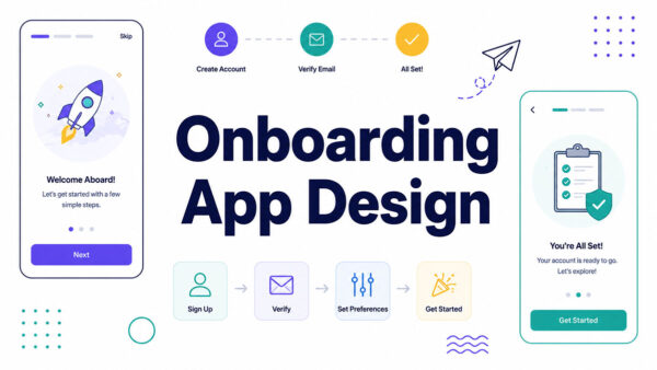
A few design decisions actually move that needle. Progressive disclosure helps, collecting goals and injury history across a few sessions instead of dumping one long form on someone right away. A visible first-session win matters too, something like a completed short workout before the app asks for a subscription. Health-data and notification permissions land better after someone’s already seen value than before it. And clean sign-up and login screens that skip unnecessary account friction help more than most teams give them credit for.
Fitbod’s onboarding only asks about training experience before showing a first suggested workout. Equipment and detailed goals get pushed to later sessions, once the user’s already committed to trying it.
Airship’s Q2 2024 data, reported by EMARKETER, found apps running onboarding campaigns saw a 20% next-day return rate versus 16% for apps that skipped one.
There’s a deeper breakdown of these flows in a dedicated onboarding app design guide, if you want to go further into it.
How Does Personalization Shape Fitness App Design
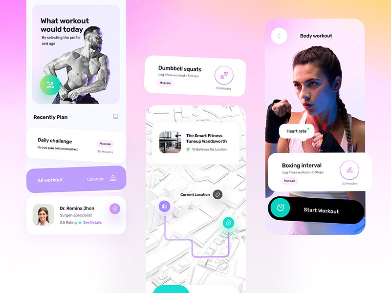
Personalization runs on activity history, biometric data, and whatever goals someone stated during signup. The interface has to turn all of that into a plan that actually adjusts, not a static PDF with someone’s name pasted at the top.
That same principle matters when you create your own workout plan app, since the experience needs to adapt to each user’s goals, progress, and training history rather than serve everyone the same routine.
ABC Fitness’ Summer 2025 Wellness Watch report found 49% of consumers use AI-powered fitness apps daily, with another 30% using them weekly.
AI fitness tracking leads adoption at 61%, ahead of nutrition AI (49%) and virtual training (36%), per the same report.
Zing Coach, an AI platform backed by health tech company Palta, adjusts workout plans in real time as users log sessions, instead of handing out one fixed program upfront and calling it done.
ABC Trainerize’s 2026 State of the PT Industry Report found 64% of personal trainers already use AI tools regularly. Personalization stopped being a purely consumer-facing feature a while ago, whether trainers advertise that or not.
It breaks down fastest at the start, though. A brand-new account has no workout history to learn from, so early recommendations lean on stated goals and demographic averages until real usage data builds up. There’s no way around that gap. It just has to be designed for.
How Is Progress Tracked Through Data Visualization Design
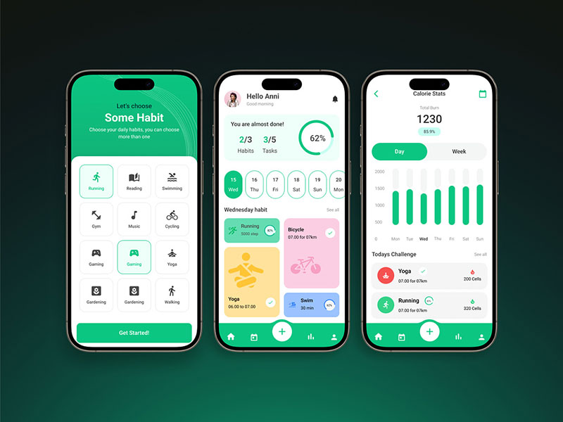
Raw numbers don’t move anyone. A trend line does.
The chart format follows what the data actually needs to communicate.
| Data Type | Chart Format | Example |
|---|---|---|
| Weight or body metrics | Line chart | Long-term trend tracking |
| Daily goal completion | Ring or radial chart | Apple Fitness+ activity rings |
| Workout consistency | Calendar heatmap | Streak visualization |
| Recovery and readiness | Composite score gauge | Whoop recovery score |
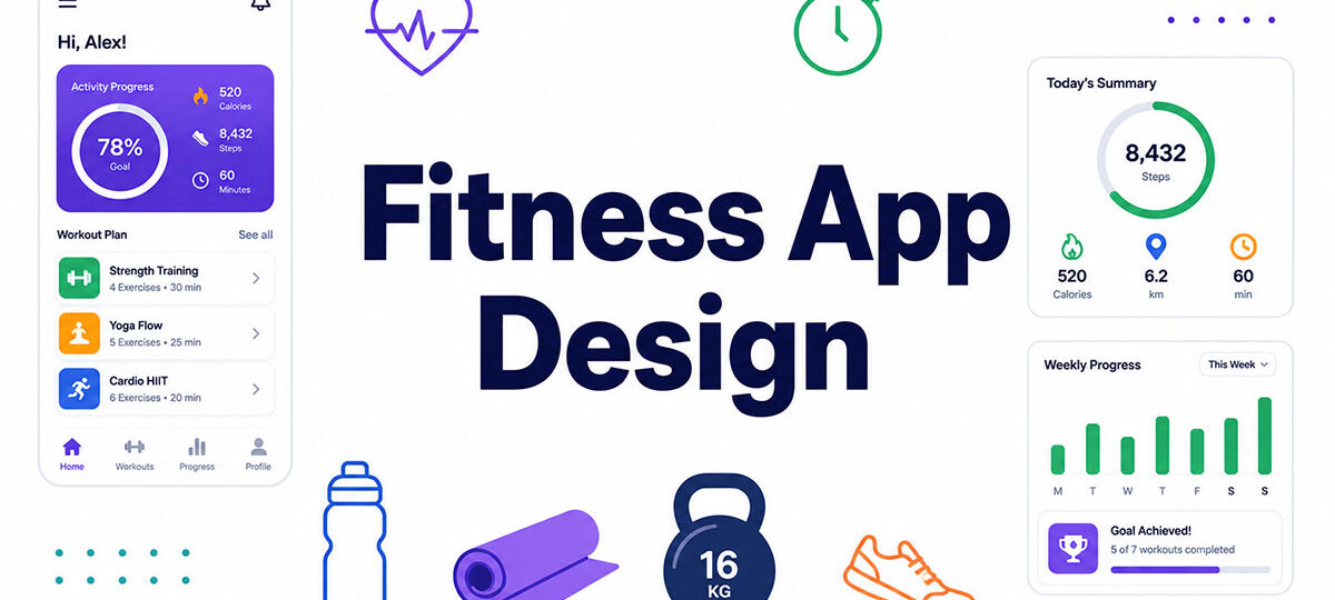
Apple Fitness+ built its whole retention hook around three closing rings. Simple enough to read at a glance, specific enough to feel earned once they actually close.
Whoop takes the opposite route, compressing sleep, strain, and recovery into one daily score instead of a wall of separate charts and graphs. Fewer numbers, more trust placed in the algorithm doing the compressing.
A small peer-reviewed diary study of 34 Fitbit and Jawbone users found that goal-progress dashboards and summary emails helped participants feel more competent and in control of their activity over a four-week period (MDPI, 2017).
A 2026 study in JMIR mHealth and uHealth collected data from 5,858 fitness app users (2,771 with complete, analyzable records) and found that retention had less to do with the app’s features than with who was using it. Subscribers, previously active exercisers, and people with autonomous, self-directed motivation stuck around measurably longer than everyone else, regardless of which app they were on.
Time-range controls matter almost as much as the chart itself. Daily views motivate short-term action, weekly views reveal patterns, monthly views justify the subscription in someone’s head. Good dashboard design lets people move between all three without losing their place.
One thing worth saying plainly: a ring that closes regardless of effort stops meaning anything after a few weeks. Motivational framing only works when it stays honest, and users notice faster than most product teams expect.
How Do Fitness Apps Integrate Wearable and Health Data
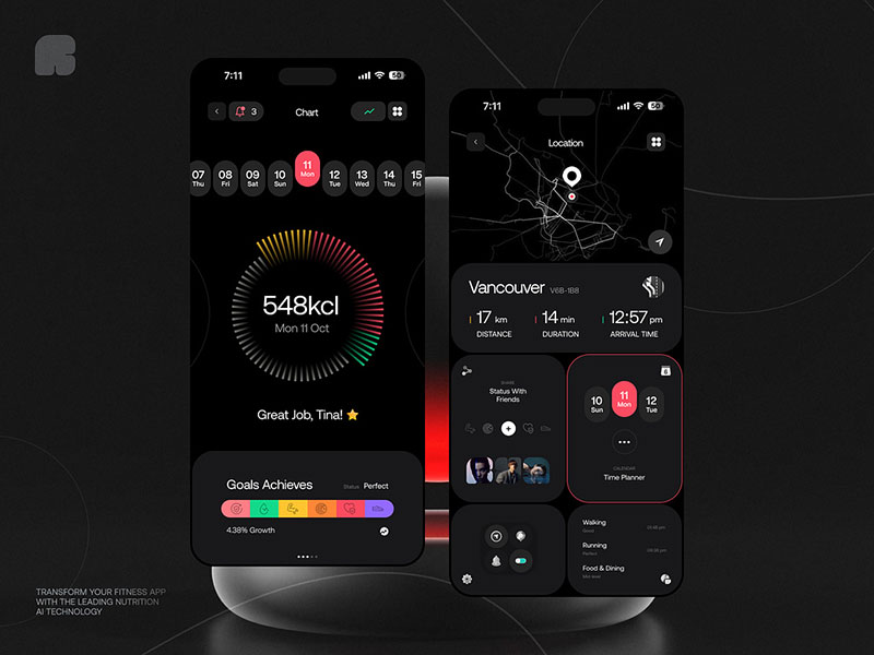
A fitness app without wearable sync is basically a manual log wearing a fitness app’s clothes.
| Platform | Integration Point | Data Synced |
|---|---|---|
| Apple | HealthKit | Heart rate, workouts, sleep |
| Android | Health Connect | Steps, activity, biometrics |
| Garmin | Garmin Connect API | GPS routes, training load, recovery |
Market tracking data from IDC’s Worldwide Quarterly Wearable Device Tracker shows the global wrist-worn device market shipped 45.6 million units in the first quarter of 2025 alone, a 10.5% year-over-year increase.
Market size estimates for wearable medical devices vary widely by research firm, but Polaris Market Research puts the category at roughly $32 billion in 2023, headed toward $222.93 billion by 2032.
A few design questions follow directly from that kind of scale. Real-time sync versus batch sync changes how reliable the app feels mid-workout, even when the underlying data ends up identical. Two connected devices reporting different step counts for the same hour is its own problem, and a common one. And permission and data-sharing disclosures need a real spot inside the connection flow, not a buried settings toggle nobody finds.
Samsung Health folded virtual doctor visits (through a new partnership with HealthTap) and Walgreens prescription tracking into its wearable data starting in September 2025, connecting fitness metrics directly to clinical care. It’s part of a broader convergence that Feed.fm’s 2026 Digital Fitness Ecosystem Report describes across the whole category.
WHOOP’s 5.0 and WHOOP MG wearables, launched in 2025, shipped with 14-day battery life. The higher-tier WHOOP MG added ECG and blood pressure tracking exclusive to that model, pushing the category further from step-counter toward actual health monitor.
Apple previewed watchOS 26 with AI-powered “Workout Buddy” features rolling out in fall 2025, folding real-time coaching into the wearable layer itself instead of leaving all of that to the phone.
How Do Fitness Apps Use Gamification to Drive Engagement
Streaks, badges, and leaderboards turn a single workout into evidence of who someone is becoming, or at least that’s the pitch.
A peer-reviewed review of 132 health and fitness apps found 67% used at least one gamification element, most often social competition, feedback loops, or digital rewards, according to M/C Journal.
- Streaks lean on loss aversion, framing a missed day as losing progress rather than just pausing for a day
- Badges hand out milestone recognition for personal bests or consistency goals
- Leaderboards run on social comparison, the whole backbone of Strava’s segment rankings
- Challenges create time-bound goals that spike short-term activity, like Strava’s monthly distance events
RetentionCheck’s 2026 churn analysis found apps with challenges, leaderboards, or friend connections see 20-35% lower monthly churn than solo-tracking apps.
Peloton’s community model backs that up, though the numbers depend on which product you’re actually looking at. The company’s shareholder letters put Average Net Monthly Paid Connected Fitness Subscription churn (the figure tied to its hardware-plus-community model) at just 1.9% in fiscal Q4 2024, well below the category average. Its app-only subscription tier, without the bike or the community layer, churned at a much higher 8.4% in the same quarter. That gap suggests most of Peloton’s retention advantage comes from the hardware and community combination, not the app on its own.
None of this is a permanent fix, either. Peer-reviewed research on gamification notes that curiosity toward game elements tends to fade over time, and some studies find competitive features fail to sustain the loyalty they were built to create in the first place.
What Push Notification and Behavioral Trigger Design Drives Retention
Localytics found 46% of users disable push notifications after receiving just 2-5 messages in a single week. Separately, 32% will stop using an app entirely if it sends 6-10 messages in a week.
Frequency is the whole game here. Fitness apps that treat every rest day as an excuse to nag lose the permission fastest, usually without realizing it happened.
- Reminder-based triggers cover a scheduled workout time, sent once, never repeated
- Achievement-based triggers fire right after a personal best or completed streak, not hours later
- Re-engagement nudges dormant users after 5-7 days of inactivity, not daily
- Contextual triggers tie into location-based gym check-in prompts through geofencing, not clock time alone
Android opt-in medians sit at 81% versus 51% on iOS, per Airship’s benchmark data reported by Business of Apps. That gap changes how hard a notification strategy can lean on push versus in-app messaging depending on the platform.
Noom builds its re-engagement messages around one specific missed action, a logged meal, a check-in, instead of a generic “come back” nudge. Keeping the trigger tied to something concrete tends to work better than a vague prompt ever does.
How Does Monetization Design Impact Fitness App Conversion Rates
Paywall placement decides whether a free trial ever gets a real chance to prove itself.
RevenueCat’s 2026 State of Subscription Apps report, built from over 115,000 apps, found hard paywalls convert 5x better than freemium models: 10.7% versus 2.1% download-to-paid by day 35.
| Paywall Model | D35 Download-to-Paid |
|---|---|
| Hard paywall | 10.7% |
| Freemium | 2.1% |
Health & Fitness apps in the top-performer tier convert over 23% of downloads to trial, according to the same RevenueCat data.
Pricing pages lean on a familiar anchor trick, and it works often enough that most apps still use it. RevenueCat’s 2025 report put the category’s median annual plan at $29.65, a 3.8x multiple over the $7.73 monthly price, which makes the annual option look like the obvious savings even before someone does the math themselves.
Ladder, a strength-training app, runs a reverse trial that gives new users full premium access with no payment info required upfront. It’s a bet that product fit will carry the conversion once the trial actually ends.
Free trial reminders sent a day or two before renewal cut down on the “surprise charge” complaints that drive refund requests and one-star reviews. Small thing, outsized effect on how the app gets talked about.
What Accessibility Standards Apply to Fitness App Design
WCAG 2.2 sets the baseline most fitness apps design against, requiring a minimum 4.5:1 contrast ratio for normal text and 3:1 for large text.
That comes down to basic contrast. Dark gray text on a black background fails the ratio no matter how good it looks in Figma, and outdoor glare only makes weak contrast worse.
Vision-health organizations estimate roughly 8% of men and less than 1% of women have some form of color vision deficiency, which rules out color as the only signal for “on track” versus “behind.”
A few accommodations show up in fitness apps specifically. VoiceOver and TalkBack labels need to sit on every workout control, not just navigation menus. Voice-guided cues let someone train without looking at the screen at all. Larger tap zones matter more for post-workout use, when grip and precision both take a hit. And icons paired with text labels, instead of color alone, actually mark progress in a way that works for everyone.
Nike Training Club leans on voice cueing through entire workouts, letting the phone stay in a pocket or on a shelf instead of propped up for visual reference the whole time.
What Are the Design Differences Between iOS and Android Fitness Apps
iOS held 52% of fitness app revenue in 2025, according to Grand View Research, enough that most teams still design the iOS version first and adapt second.
Adapting is more than a reskin, though. Android’s own interface conventions differ enough that a straight port from iOS rarely feels native to Android users.
| Element | iOS | Android |
|---|---|---|
| Guideline | Human Interface Guidelines | Material Design 3 |
| Home screen widget | WidgetKit / Live Activities | App widgets via Health Connect |
| Watch companion | Apple Watch app | Wear OS app |
Live Activities keep a running workout timer visible on the lock screen without reopening the app. Android’s widget system handles the same basic need differently, through persistent notifications instead of a lock-screen activity.
Font choice compounds the split further. iOS defaults to San Francisco, Android to Roboto, and picking fonts for apps that stay legible at small sizes on both matters more than chasing whatever typeface looks trendy this year.
Google Fit’s Android widget surfaces daily step count directly on the home screen, a pattern Android users expect that iOS handles through a completely different lock-screen mechanism.
What Design Mistakes Cause Fitness App Churn
Most churn traces back to a handful of repeatable mistakes, not one catastrophic failure everyone can point to.
- Overloaded dashboards showing every metric at once instead of the one that matters right now
- Inconsistent data across synced devices, which erodes trust faster than any single bug ever could
- Notification fatigue from alerts that repeat the same message with no new information attached
- Paywalls placed before the user has felt any real value at all
A dashboard cramming ten metrics onto one screen skips basic white space, and the eye has nowhere to rest before deciding what to even look at first.
Two connected devices reporting different step counts for the same walk sounds like a small technical inconsistency. It isn’t. Once a user catches the app being “wrong” once, every other number it shows gets questioned after that.
Fixing this rarely means removing features, by the way. It usually just means hiding most of them until the user actually asks for more.
What Tools Do Designers Use to Prototype Fitness Apps
Figma is the default starting point for nearly any fitness app design project right now.
UX Tools’ 2024 Design Tools Survey of 2,220 designers, fielded November 2024 through January 2025, found 82.3% name Figma their primary interface design tool.
The typical workflow moves through a few tools in sequence. Figma covers wireframes, high-fidelity screens, and interactive prototypes in one file. Figma Dev Mode or Zeplin handles handoff, turning design specs into something engineers can actually build from. And Maze or UserTesting cover pre-launch usability testing with real participants before anything ships.
Design systems built in Figma keep iOS and Android versions consistent without duplicating every screen twice over. A single component library updates both platforms the moment a button style changes.
Usability testing catches problems a design team stops noticing somewhere around the fiftieth internal review. An outsider tapping through a workout flow for the first time still finds the button that’s two pixels too small, every single time.
Fitness App Design Examples
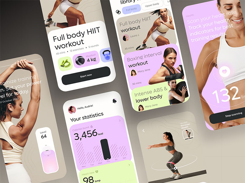
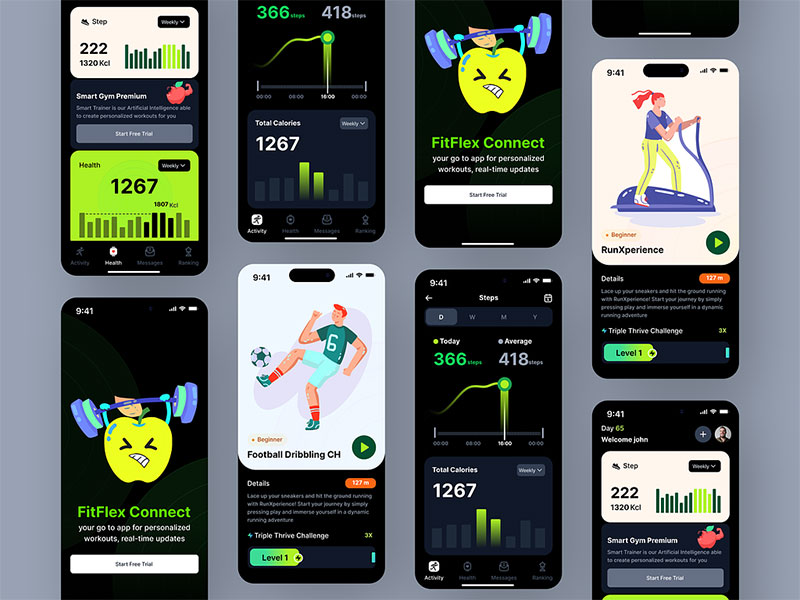
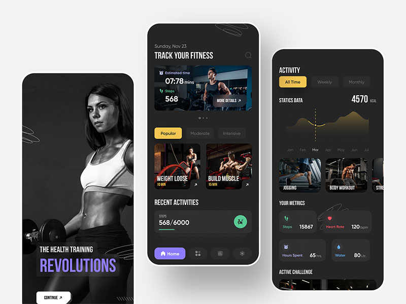
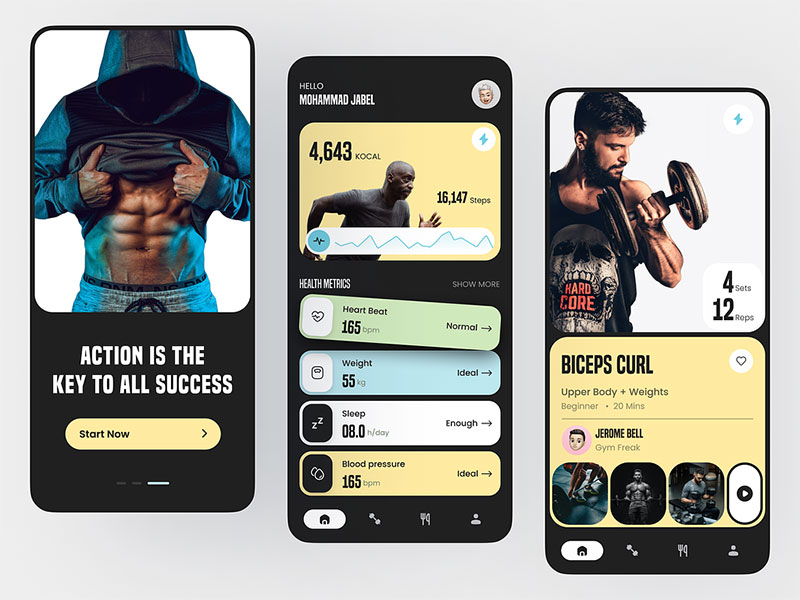
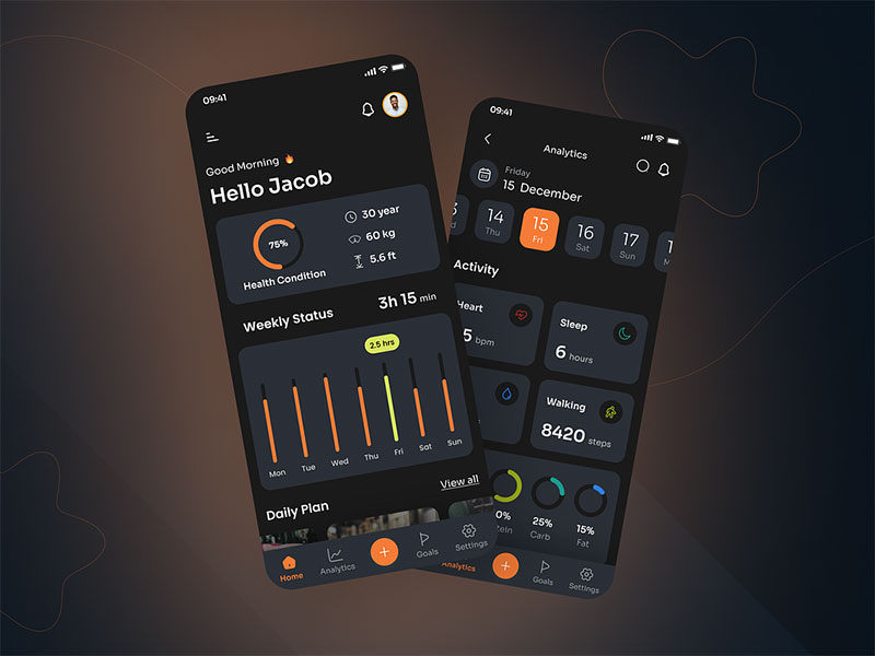
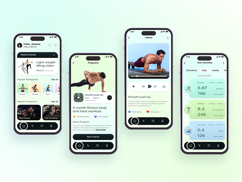
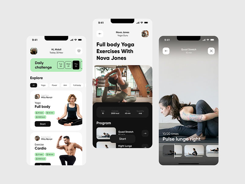
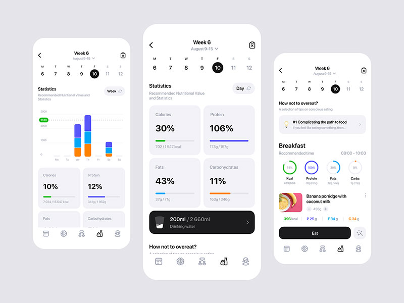
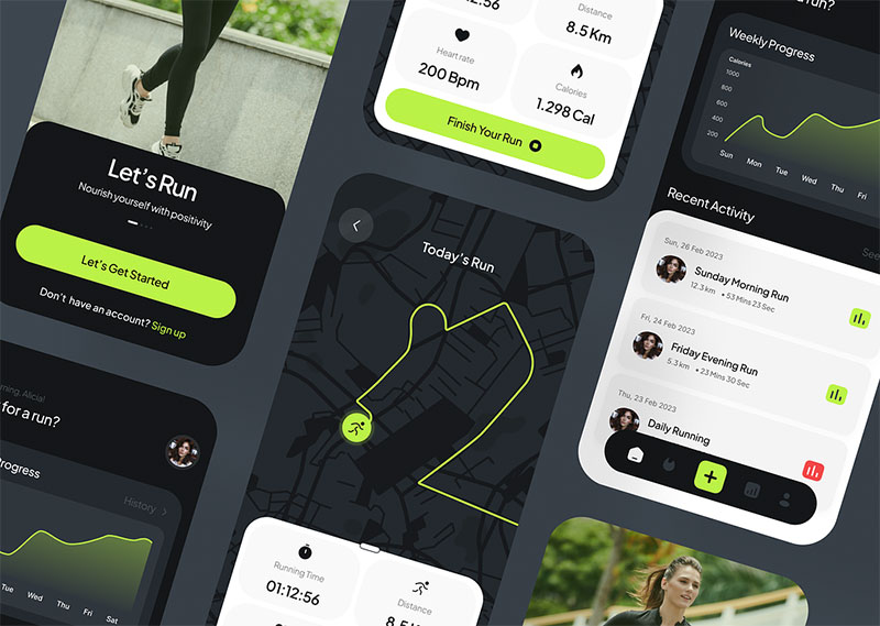
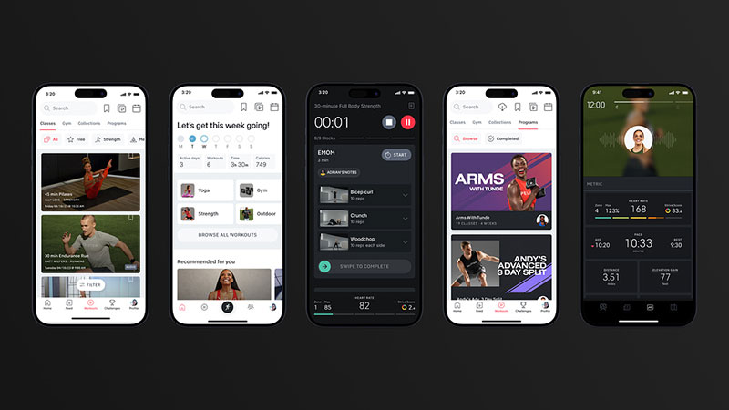
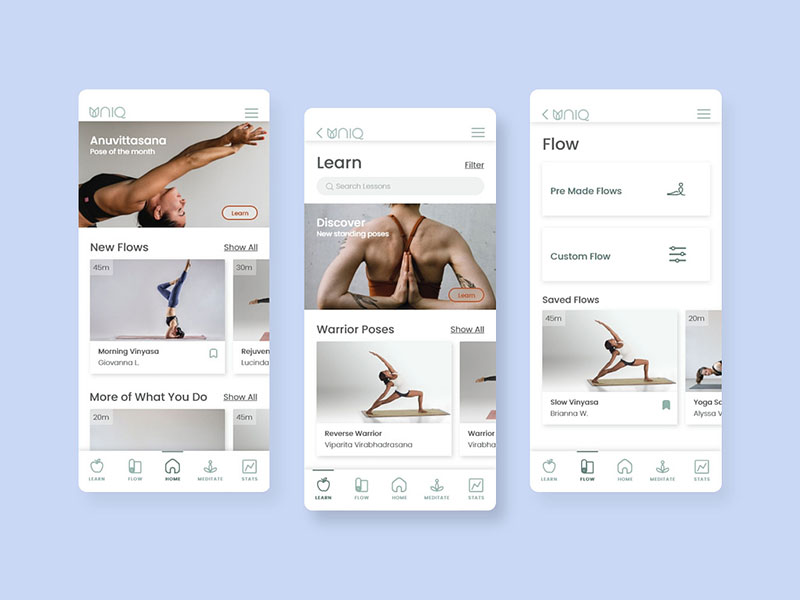
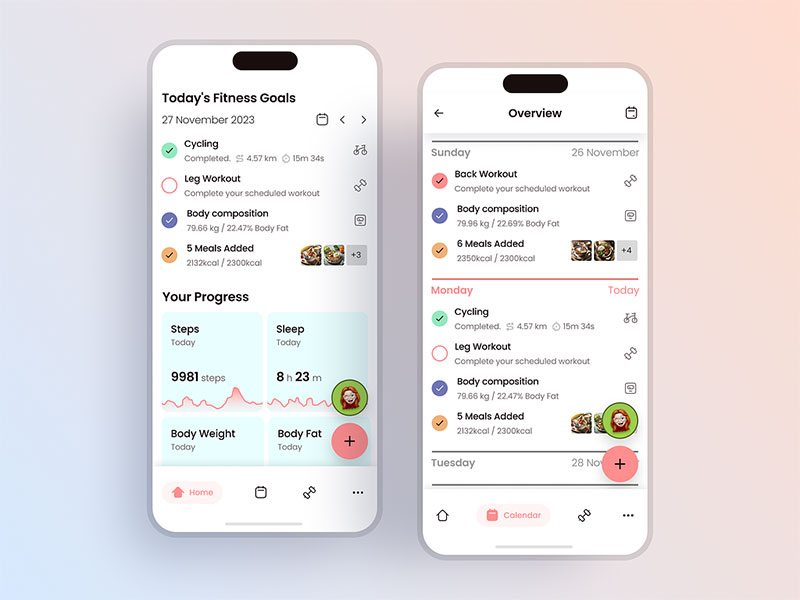
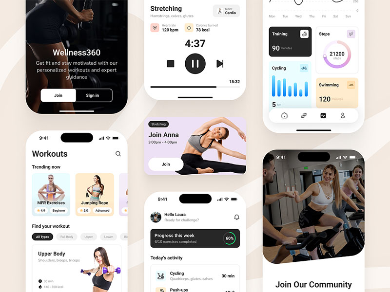
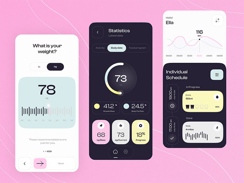
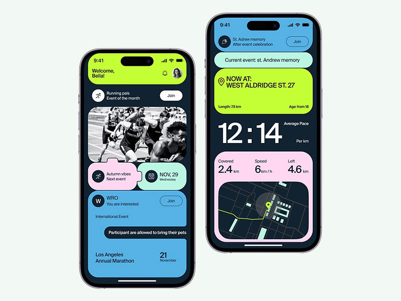
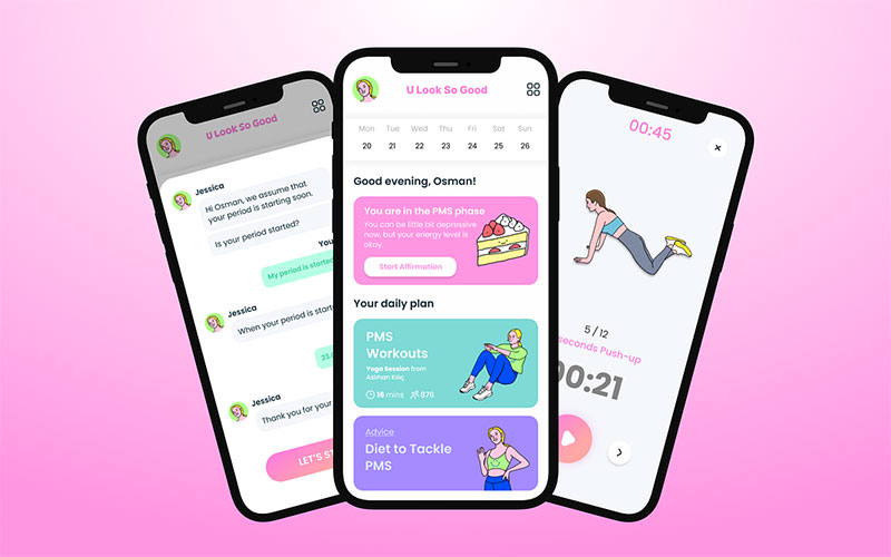
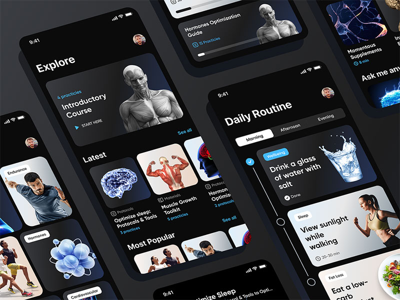
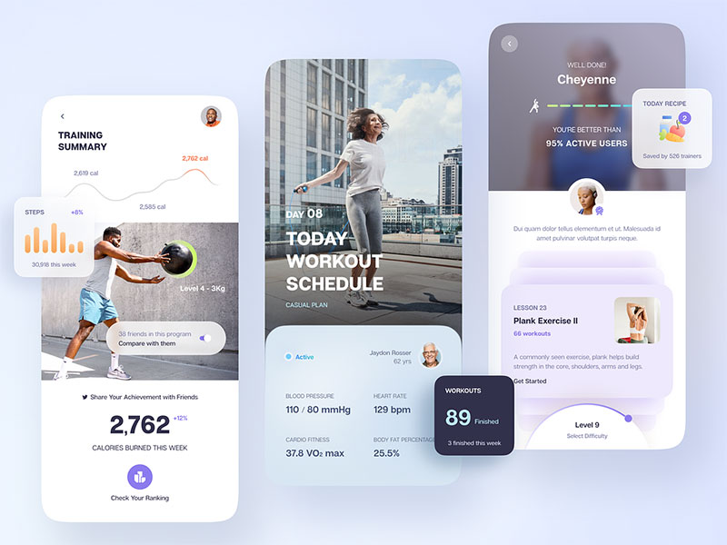
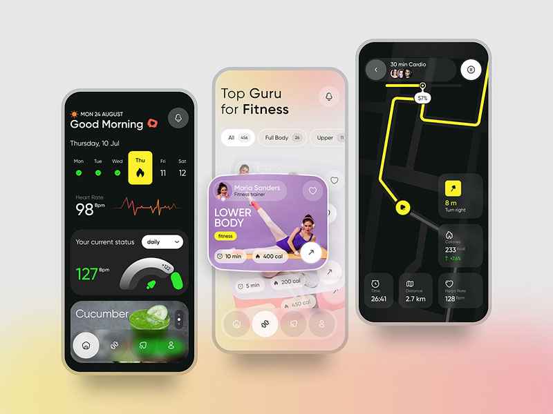
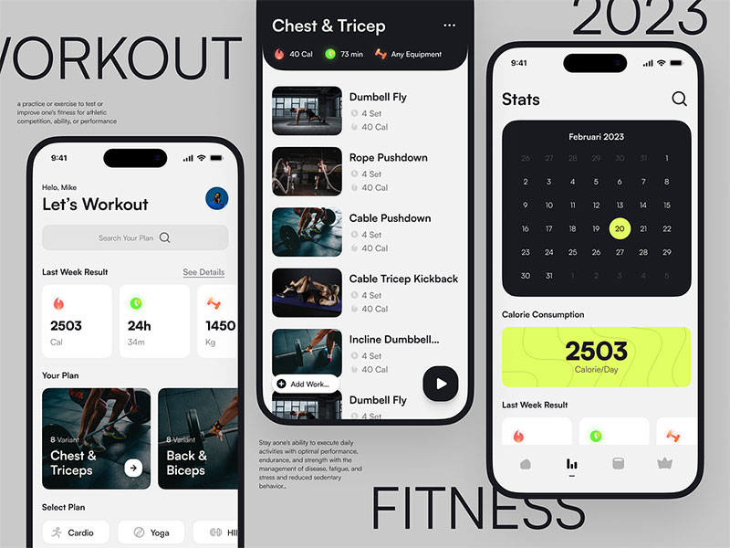
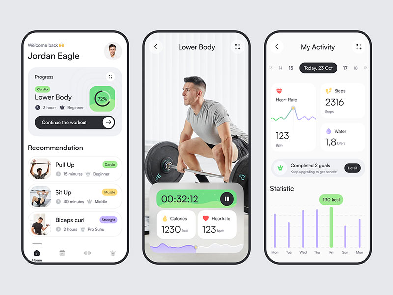
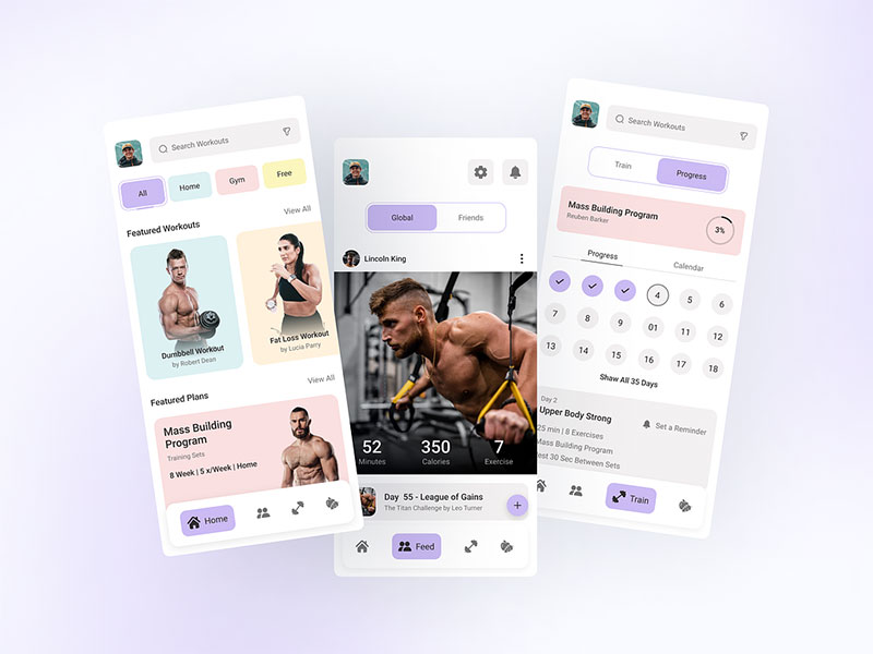
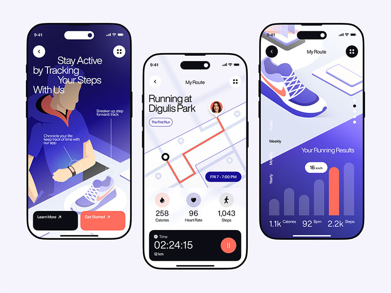
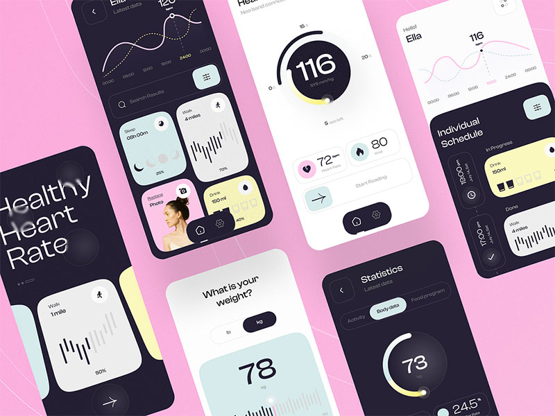
The concepts below are design explorations rather than shipped products, which is what makes them worth a scroll after everything above: none of them are constrained by a wearable partner’s API, a subscription tier already sold, or a retention metric someone has to defend next quarter. Watch how large the primary metric is, how much sits above the fold during an active workout, and whether the paywall shows up before the first session ends.
FAQ on Fitness App Design
How Much Does Fitness App Design Cost
Fitness app design cost ranges from $15,000 for a basic MVP to $150,000 or more for a full-featured build with wearable sync and AI personalization. Complexity, screen count, and platform coverage (iOS, Android, or both) drive most of the variation.
How Long Does Fitness App Design Take
A typical fitness app design phase runs 8 to 14 weeks, covering research, wireframes, high-fidelity screens, and a clickable prototype. Complex apps with wearable integration or AI-driven personalization can push that timeline past four months.
Does A Fitness App Need A Native Build Or A Web App
Native apps win for fitness specifically, since wearable syncing, background tracking, and push notifications need deeper OS access than a web app can offer. A web app works fine for simple content libraries but struggles with live workout tracking.
How Many Screens Does A Typical Fitness App Design Include
Most fitness apps ship with 25 to 40 core screens: onboarding, home dashboard, workout library, active workout view, progress charts, settings, and account management. Apps with social or nutrition features often add another 10 to 15 on top of that.
Do Fitness Apps Need A Dedicated UX Writer
Not always, but it helps. Motivational copy, error messages, and notification text carry more emotional weight in a fitness context than in most app categories, and a dedicated writer keeps that tone consistent across every screen instead of drifting.
How Do Fitness Apps Design For Offline Use
Workout data gets cached locally and synced once a connection returns, since gyms and trails often have weak signal. A well-designed offline mode never blocks the current workout. It only delays the sync of completed data until later.
What Is The Ideal Color Palette For A Fitness App
There’s no single ideal palette, but high-contrast combinations with one strong accent color for calls to action tend to perform best. Energetic tones like reds and oranges suit high-intensity apps, while cooler palettes suit recovery and mindfulness-focused ones.
How Do Fitness Apps Design For Beginners Versus Advanced Users
Beginners get simplified dashboards, guided tutorials, and fewer visible metrics. Advanced users unlock detailed analytics, custom workout builders, and raw data exports. Most apps handle this through a difficulty setting chosen during onboarding rather than building two separate products.
Can One Team Design Both The iOS And Android Versions Together
Yes, and most teams do exactly that, using a shared design system with platform-specific components swapped in for navigation, widgets, and typography. Designing both from one Figma file keeps the core experience consistent while still respecting each platform’s conventions.
What Metrics Do Fitness App Designers Track After Launch
Onboarding completion rate, Day 1 and Day 30 retention, session length, and paywall conversion top the list. Heatmaps and session recordings reveal where users hesitate or drop off, which guides the next round of design iteration.
Conclusion
Fitness app design succeeds or fails in a narrow window: the first session, before a single feature actually matters yet.
Teams that get this backwards spend months polishing gamification and AI personalization while onboarding drop-off quietly bleeds out most of the new users underneath them. Fix that leak first. Everything else can wait.
Start with the thumb zone and the first-session win, not the dashboard. Wearable sync, streaks, and paywalls only pay off once someone actually survives week one.
Expect to revisit the interface every 12 to 18 months as iOS and Android guidelines shift underneath the product, and treat design system consistency as ongoing maintenance, not a one-time deliverable you finish and forget.
Pull up analytics for the first sixty seconds of app use before scheduling any other design sprint. That’s where the real signal shows up, pretty much every time.

Renowned for his expertise in logo design and visual branding, Bogdan has developed a multitude of logos for various clients.
His skills extend to creating posters, vector illustrations, business cards, and brochures. Additionally, Bogdan's UI kits were featured on marketplaces like Visual Hierarchy and UI8.
He also wrote in the past years on sites like Design Your Way, WebDesignerDepot, WPDean, Designmodo, Speckyboy, Slider Revolution, and more.
- The Windsurf Logo History, Colors, Font, And Meaning - 10 October 2026
- How to Remove Background From Product Photos (No Photoshop) - 10 October 2026
- How Designers can Build a Stronger Online Creative Identity - 9 October 2026

Bogdan Sandu is a seasoned designer who has been designing websites since 2008. Renowned for his expertise in logo design and visual branding, Bogdan has developed a multitude of logos for various clients. His skills extend to creating posters, vector illustrations, business cards, and brochures. Additionally, Bogdan's UI kits were featured on marketplaces like Visual Hierarchy and UI8. He also wrote in the past years on sites like Design Your Way, WebDesignerDepot, WPDean, Designmodo, Speckyboy, Slider Revolution, and more.
You Might Also Like