Open ten different Android apps and the buttons, spacing, and colors follow the same underlying rules almost every time. That’s not an accident. It’s Android UI design, the grid, the type scale, and the color system Google built so an app looks right on a five year old budget phone and a brand new foldable alike.
Google Play now hosts more than 2.3 million apps, and nearly every one of them answers to the same design language (DemandSage, 2026).
Material Design is what enforces that. Not a house style someone picked, an actual rulebook, and you can usually tell within a few seconds when an app ignores it. The grid looks off. The spacing feels cramped or weirdly loose. Nobody names the problem out loud, they just bounce.
What Is Android UI Design
Two paths get you there. Native development runs on Kotlin, through Jetpack Compose or the older XML layout system, while cross-platform frameworks like Flutter or React Native draw their own UI on top of the Android runtime instead of using the platform’s native views.
Either way, the job covers everything a person actually touches on screen: layout, color, type, icons, and the components holding it together, all built against Google’s Material Design system rather than whatever a team feels like doing that week.
Scale is the reason this can’t stay loose. Android runs 70.36% of the global mobile market, something like 3.9 billion active devices (StatCounter, 2026), and every one of them renders through that same underlying design system. Consistency matters more here than on almost any other platform, mostly because there’s nowhere to hide inconsistency across that many screens.
Android UI Design vs Android UX Design
People use these interchangeably all the time, and job listings don’t help, since most of them blur the two into one role. They’re not the same thing though. UI handles the visual layer: color, spacing, icons, how components are styled.
UX handles the structure underneath that, onboarding order, how tasks flow, where things sit in the app’s hierarchy. A screen can be genuinely well designed and still confuse people, which is basically the whole reason the split exists in the first place. For more on where flow and structure diverge from surface styling, UX design covers that territory in more depth.
What Are the Core Principles Behind Android UI Design
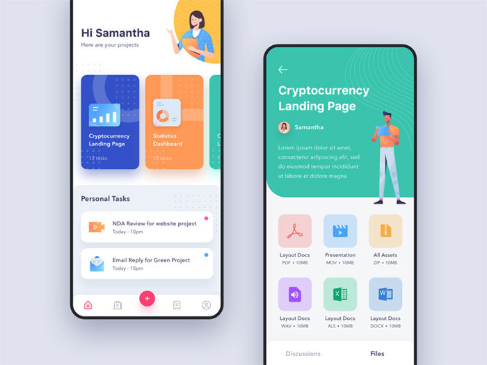
Material Design 3, also known as Material You, launched with Android 12 in 2021. It reorganized Android’s visual language, and the shift mostly comes down to three things working together: color that adapts to the user’s actual wallpaper, layouts that respond to window size instead of assuming a phone-shaped screen, and motion that behaves like physics rather than a fixed animation curve.
Hierarchy still sits underneath everything else, no matter how much the color system changes. Google’s own research backs that up directly: across 46 studies with more than 18,000 participants, people spotted key UI elements up to four times faster in interfaces built around clear visual weighting (Google Design, 2025).
That research fed straight into Material 3 Expressive, which landed on Pixel devices with the Android 16 QPR1 update in September 2025. Google’s already pushing the same ideas into apps outside Android itself, Gmail and Google Photos being the obvious examples so far.
None of this replaces plain old visual hierarchy. Material just wraps it in a fixed token system so the same grammar renders the same way across a few billion different screens, which is the part most design systems never quite manage to pull off.
Material Design 3 vs Material Design 2
Material 2 launched back in 2018, and the jump to Material 3 changed more than just the color palette.
| Aspect | Material Design 2 | Material Design 3 |
|---|---|---|
| Released | 2018 | 2021 (with Android 12) |
| Color system | Static brand palette | Dynamic, wallpaper-derived palette |
| Layout | Fixed breakpoints | Adaptive window size classes |
| Motion | Duration and easing curves | Physics-based springs |
Material 2 apps still run fine, for what it’s worth. They just don’t pick up dynamic theming or the newer adaptive layout tools without migrating to Material 3 components.
What Components Make Up an Android User Interface
Material ships a defined library of components for building an Android screen, and each one comes with its own spec: exact size, spacing, expected behavior. Split them roughly into two groups. One handles moving people from screen to screen. The rest capture input, or trigger something to actually happen once tapped.
Navigation Components
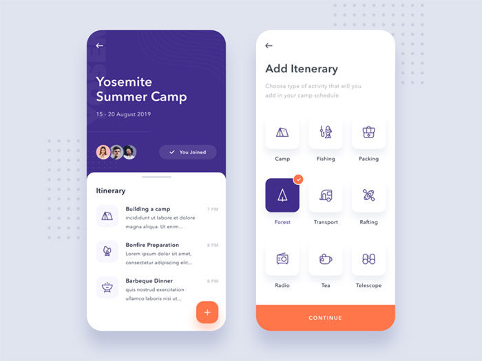
A handful of components carry most of the navigation weight on a typical screen:
- The top app bar holds the screen title and whatever primary actions belong there
- Bottom navigation switches between top-level destinations
- A navigation drawer, when it’s used, exposes secondary or account-level destinations
- The floating action button surfaces whichever single action matters most on that screen
Each one ships as a ready-made component in both the old XML view system and Jetpack Compose, and the Compose versions pick up Material 3 styling automatically without extra work. Worth flagging early: Material 3 Expressive has since moved away from the navigation drawer as the default phone pattern. An expanded navigation rail takes that job now on medium and larger screens. More on that later, in the navigation section below.
Input and Action Components
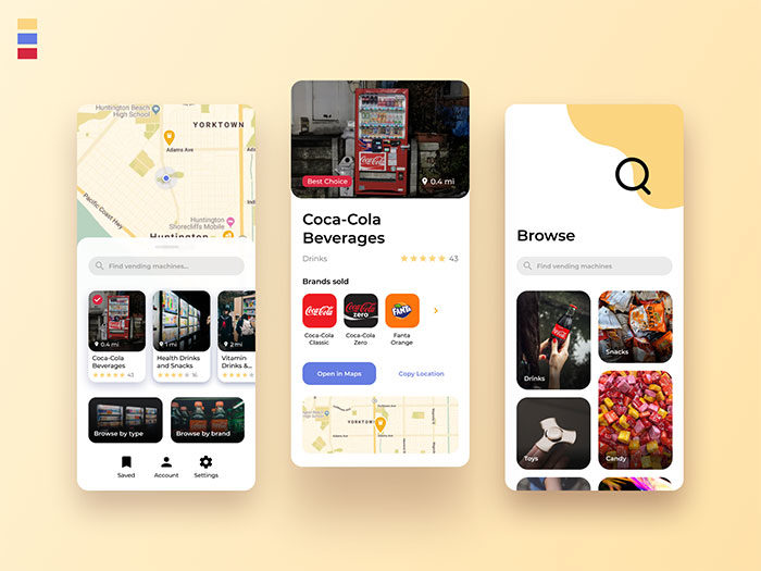
Buttons carry most of the interaction weight on a typical screen. Material 3 defines four styles, filled, outlined, text, and icon buttons, running from highest to lowest visual emphasis.
Cards, chips, bottom sheets, dialogs, and snackbars round out the rest of the interactive surface. Each one is scoped to a single job: grouping content, filtering, showing temporary detail, blocking for confirmation, or giving brief feedback after something happens.
Every interactive element needs to clear a minimum size. Android Developers documentation sets the floor at 48 by 48dp, and Compose’s built-in Button and IconButton components enforce that minimum on their own (Android Developers, 2026).
Icons across this component set render as vector graphics, which keeps them sharp across every screen density Android supports.
How Does Layout Structure Work in Android UI Design
Google settled a long-running argument in 2026. As of Google I/O 2026, Android UI development is officially Compose-first: all new UI work happens in Jetpack Compose, and the older View-based toolkit (XML layouts and ConstraintLayout included) has been moved into maintenance mode (Android Developers Blog, 2026).
That wasn’t exactly a shock. Compose was already powering 60% of the top 1,000 apps on the Play Store as of Google I/O 2025, Google Drive among them, and Google’s own Play Store app made the same jump back in 2022. The rewrite cut the Play Store app’s UI code by up to 50% compared to the old View-based version (Google, 2022), a number that tends to get an engineering org’s attention fast.
Spacing across both systems still follows the same rule regardless of which one you’re writing. Material Design fixes component spacing to an 8dp grid system, with icons dropping to a finer 4dp grid for internal detail.
Adaptive layout carries more weight than it used to, too. Google counted more than 580 million large-screen Android devices active worldwide. Multi-device users spend up to 9 times more on apps than phone-only users on average, and that multiplier climbs as high as 14 times more specifically among foldable owners (Android Developers Blog, Google I/O 2026).
Window size classes give layout code a way to actually react to that range: compact covers widths under 600dp, medium runs from 600dp to 840dp, and expanded picks up everything above 840dp (Android Developers, Material Design 3).
ConstraintLayout vs Jetpack Compose
| Aspect | ConstraintLayout (XML) | Jetpack Compose |
|---|---|---|
| Approach | Imperative view hierarchy | Declarative functions |
| Core building blocks | Constraints between views | Column, Row, Box, LazyColumn |
| Current status | Maintenance mode | Recommended toolkit |
The practical takeaway is simple. New Android layout code belongs in Compose, and existing ConstraintLayout screens keep working fine without anyone being forced into a rewrite.
What Role Does Typography Play in Android UI Design
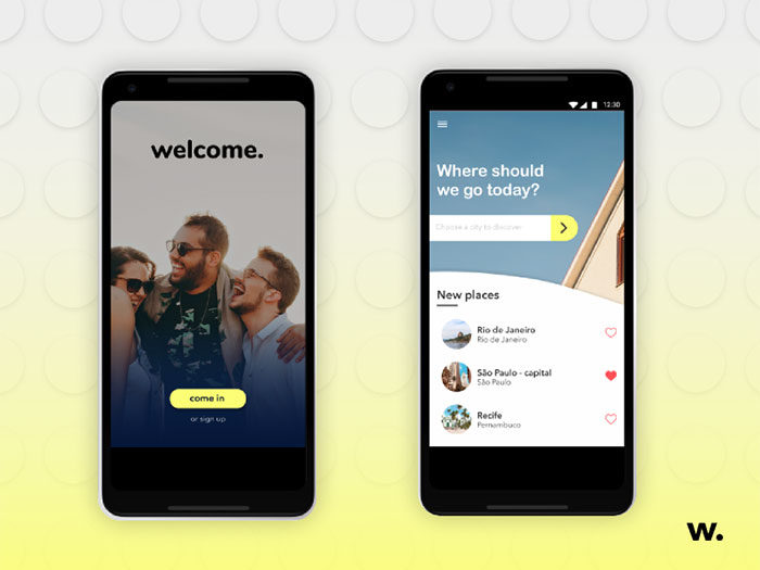
Roboto has been Android’s default typeface since 2011, and it’s still the face of the Material Design spec today. The bigger constraint, honestly, is the type scale itself, a fixed set of sizes and weights that everyone building on Material 3 pulls from instead of picking fonts freehand. That’s what keeps text hierarchy consistent from one app to the next, even when the apps have nothing else in common.
The scale breaks into five roles, and each role comes in three sizes. Display covers the largest, shortest strings on a screen. Headline handles section-level titles. Title sits at medium emphasis, card headers and similar. Body carries the bulk of actual reading content, and Label covers buttons, chips, anything short and interactive.
That gives Material 3 15 total type styles (Android Developers, 2026). Title Large, for reference, ships at 22sp with Regular weight by default.
Material 3 Expressive doubled that count in 2025, adding a parallel emphasized set for a combined 30 styles across the same five roles.
Roboto Flex, released in 2022, extended the family into a full variable font with five tunable user axes: weight, width, optical size, grade, and slant.
Designers pull those axes to hit an editorial tone without switching typefaces entirely, something the old static Roboto cuts never really allowed.
How Is Color Used in Android UI Design
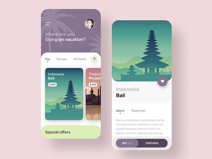
Color on Android runs through Material 3’s dynamic color system, and it pulls a palette straight from whatever the user’s wallpaper happens to be rather than leaning on a fixed brand palette alone. The underlying logic still follows the same fundamentals as color theory, it’s just applied through an algorithm now instead of a designer eyeballing it.
Since Android 12, that algorithm, which Google calls Monet, picks a single source color from the wallpaper. It then expands that source into 5 tonal palettes containing 13 colors each, 65 distinct values total (Android Open Source Project documentation).
| Color Role | Typical Use |
|---|---|
| Primary | Key actions, FAB, active states |
| Secondary | Less prominent UI elements |
| Tertiary | Accents and contrasting emphasis |
| Surface | Backgrounds and containers |
| Error | Validation and destructive states |
None of that flexibility waives the accessibility math, though. WCAG 2.2’s Success Criterion 1.4.3 sets a minimum 4.5:1 contrast ratio for normal text and 3:1 for large text (W3C, 2023).
Dark theme sits inside this same system as a full color scheme in its own right, not some stripped-down alternative bolted on afterward. Every color palette Material generates, light or dark, gets built from the same source color and the same role structure.
How Does Navigation Work in Android UI Design
Navigation on Android runs through a short list of standard patterns, and which one an app uses mostly comes down to how many top-level destinations it needs.
Bottom navigation bars handle three to five destinations and stay fixed at the bottom of every screen (Material Design component documentation). Below three, tabs work better. Above five, the tap targets start crowding together and usability drops off fast.
Navigation drawers used to be the default answer for anything past five destinations. Current Material 3 guidance has moved away from that. The navigation drawer isn’t recommended as the primary phone pattern anymore, and an expanded navigation rail has taken over that role on medium and larger screens instead.
Beyond destination count, Android draws a hard line between the in-app up button and the system back function. The up button moves within an app’s own hierarchy. Back retraces the user’s actual navigation history, and it’ll happily cross app boundaries to do it.
Predictive Back Gesture
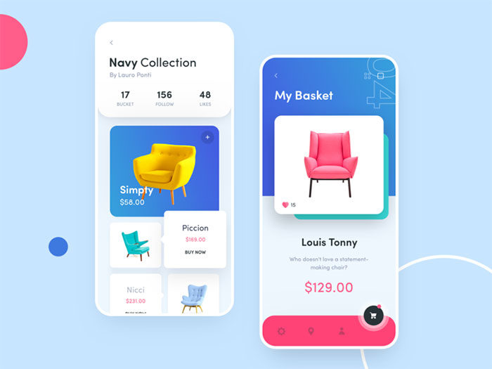
The feature shows a live preview of where a gesture will land before the swipe actually finishes, and it rolled out across three separate Android versions rather than arriving all at once. Android 13 introduced a limited version, just a back-to-home animation. Android 14 made it the default behavior for apps targeting API level 34. Android 16 turned it on by default for any app that supports it (Android Developers).
Notability’s 2026 Android debut runs on Jetpack Compose, Navigation 3, and Kotlin Multiplatform, an early example of the newer navigation stack showing up in a shipping, production app (Android Developers Blog, Google I/O 2026).
How Does Motion and Animation Fit into Android UI Design
Motion in Android UI design signals a state change. It confirms an action actually registered, it’s not just decoration sitting on top of an otherwise static screen.
Material Design groups transitions into a handful of named patterns, and each one solves a specific handoff between screens or elements.
| Pattern | What It Does | Typical Use |
|---|---|---|
| Container transform | Morphs one element into another | Card expanding into a detail screen |
| Shared axis | Moves along X, Y, or Z | Sequential steps, tabs |
| Fade through | Cross-fades unrelated content | Bottom nav destination swaps |
Timing follows a fixed range. Official Material motion guidance sets smaller animations at 150 to 200 milliseconds, with larger, screen-level transitions running 300 to 400 milliseconds. Dip below that and things feel abrupt, rushed. Go much past 400ms and the interface starts to feel like it’s dragging its feet, at least per Material’s own motion documentation.
Jetpack Compose exposes this through dedicated animation APIs: animateFloatAsState for simple value tweens, and AnimatedVisibility for enter and exit transitions tied to composable state.
Material 3 Expressive pushes further, swapping the older duration-plus-easing model for physics-based springs, stiffness and damping values that react to how far an element actually needs to travel rather than following a preset curve.
That physics-based approach lines up with the broader design principle of movement, pulling a person’s eye toward whatever just changed on screen.
What Accessibility Standards Apply to Android UI Design
Android UI design answers to two overlapping standards: Google’s own Material guidance, and the W3C’s WCAG 2.2 specification. They don’t always set the same floor, and where they differ, both numbers are worth naming rather than just picking one and moving on.
| Standard | Requirement | Source |
|---|---|---|
| Material touch target (covered earlier) | 48 x 48dp | Android Developers |
| WCAG 2.5.8 Target Size | 24 x 24 CSS px minimum | W3C, Level AA |
| WCAG 1.4.11 Non-text Contrast | 3:1 minimum | W3C, Level AA |
That gap is real. WCAG’s Level AA floor for touch targets sits at 24 by 24 CSS pixels, exactly half of what Material’s own guidance recommends as the default. That’s not really a contradiction of WCAG though, more a platform choosing to clear a higher bar than the legal minimum actually requires.
Non-text elements get a separate rule entirely. WCAG 2.2’s Success Criterion 1.4.11 requires a 3:1 contrast ratio against adjacent colors for icons, borders, and other components that carry meaning (W3C, 2023). That’s a different bar than the text-contrast ratio covered above. Icons and buttons get more contrast leeway than paragraphs of body text do.
TalkBack, Android’s built-in screen reader, ships inside the Android Accessibility Suite, and it depends entirely on interactive elements carrying a content description. Skip that label and TalkBack has nothing to announce, no matter how the element looks on screen.
How Does Android UI Design Adapt Across Screen Sizes and Foldables
Window size classes cover more ground than the three-way split most developers know about. Material 3’s breakpoint system actually runs five categories: compact, medium, and expanded for phones and tablets, plus large and extra-large for desktop and connected displays (Material Design 3 documentation).
Foldables push all of this further. Devices like the Galaxy Z Fold and Pixel Fold need layouts that react to a hinge, not just a static width, and a layout built once and forgotten just won’t hold up as that category keeps growing.
IDC’s Worldwide Quarterly Mobile Phone Tracker counted 20.6 million foldable phone shipments in 2025. Its initial outlook called for 30% year-over-year growth in 2026, though that forecast was later trimmed to roughly 20% after a broader memory-chip shortage cut into overall smartphone shipments for the year (IDC, December 2025 and June 2026).
Google’s own Reply sample app shows the practical version of this: a canonical list-detail layout that collapses to a single pane on compact widths and splits into two panes once the window crosses into expanded territory.
Foldable-Specific Design Patterns
A few patterns exist specifically because of the hinge, not despite it. Table-top mode splits the screen right at the fold so the device can stand on its own, hands-free. Book mode treats the two unfolded halves as separate readable pages, more or less. Hinge angle sensors let an app detect a partial fold and adjust what’s on screen accordingly, instead of just rendering one flat rectangle regardless of how the phone is actually being held.
Supporting pane layouts put secondary content, a preview or a details panel, directly across the hinge rather than stacking it below the fold.
Which Tools Are Used to Design Android Interfaces
Design and code stay closer together on Android than on most platforms, mainly because Google maintains official tooling on both sides of that line.
| Tool | Purpose | Best For |
|---|---|---|
| Figma | High-fidelity mockups | Screen design, prototyping |
| Android Studio | Layout Editor, Compose Preview | In-context UI building |
| Material Theme Builder | Generates color schemes | Dynamic color setup |
Figma’s official Material 3 kit ships more than 1,000 components, built to mirror the real Material Design Components library rather than just approximate it (Figma Community, 2026).
Material Theme Builder takes that further for color specifically. Feed it a seed image or a single color and it generates a full tonal palette that matches what a device would produce from a wallpaper on its own.
Android Studio handles the code side. Its Layout Editor previews XML screens, and Compose Preview renders composable functions without needing a full app build.
Google added agent-based AI support directly inside Android Studio at I/O 2026, letting developers hand off architecture planning, coding, and bug fixing to a model of their choice, including options from Google, Anthropic, and OpenAI, or a local Gemma 4 model for offline work (Android Developers Blog, 2026). That’s a real shift from autocomplete toward actual task delegation, inside the same IDE designers hand their specs to in the first place.
How Do You Test and Validate Android UI Design

Testing an Android interface really breaks down into three layers: structural, accessibility, and real-device validation. Skip any one of them and it tends to surface in reviews eventually, usually the hard way.
Android Studio’s Layout Inspector handles the structural layer, showing the live view hierarchy of a running app so mismatched constraints or unexpected nesting show up right away instead of three screens later.
Accessibility Scanner handles the second layer. It flags text and image elements with a contrast ratio below 3.0 by default, along with touch targets that fall short of the recommended size (Android Accessibility Help). Neither tool replaces manual testing, and Google says as much directly in its own Accessibility Scanner documentation: automated scans don’t guarantee accessibility, they just narrow down where to look next.
Espresso covers automated UI interaction testing, driving taps, swipes, and assertions against real view state rather than screenshots. The newer Espresso Device API extends that into device configuration itself, and it can simulate screen rotation and foldable states, including partial unfolding, inside a single automated test run (Android Developers, 2026).
Physical-device coverage still matters past that point. Firebase Test Lab runs recorded Espresso tests across hundreds of real device configurations, with a free daily quota available on the Spark plan.
What Common Mistakes Weaken Android UI Design
Most Android UI problems trace back to the same handful of mistakes, not exotic edge cases nobody could’ve predicted.
- Shipping touch targets under the 48dp floor covered earlier, then dealing with mis-taps as the predictable result
- Treating dark theme as an optional extra instead of the first-class color scheme it actually is
- Copying iOS navigation conventions, like a permanently visible top tab bar, instead of Android’s own bottom navigation and back gesture model
- Ignoring the 8dp spacing grid, which usually shows up later as inconsistent white space between components
- Locking a layout to phone width, so tablets and foldables get a stretched, unadapted phone screen instead of a proper two-pane layout
Most of these trace back to the same root cause. A team builds for one reference device and never actually tests the range Android ships across. None of it is exotic. It’s mostly just skipped steps in a spec that already exists.
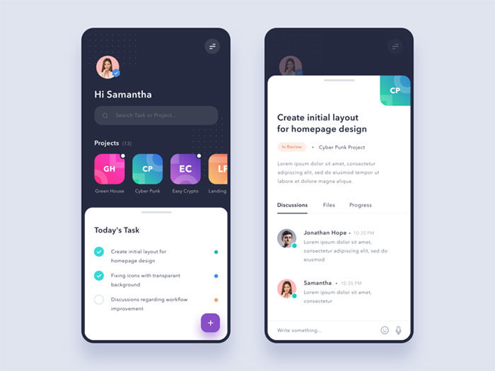
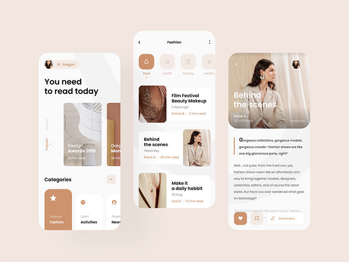
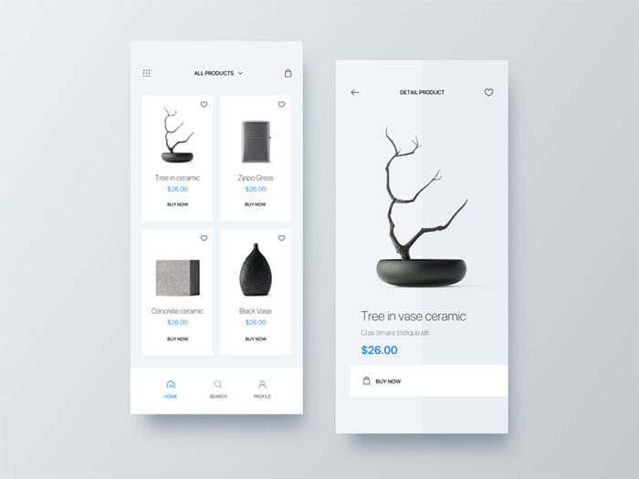
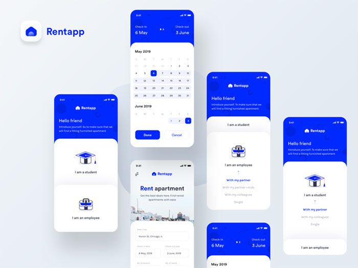
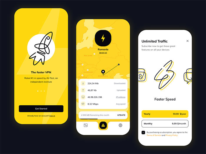
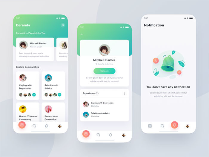
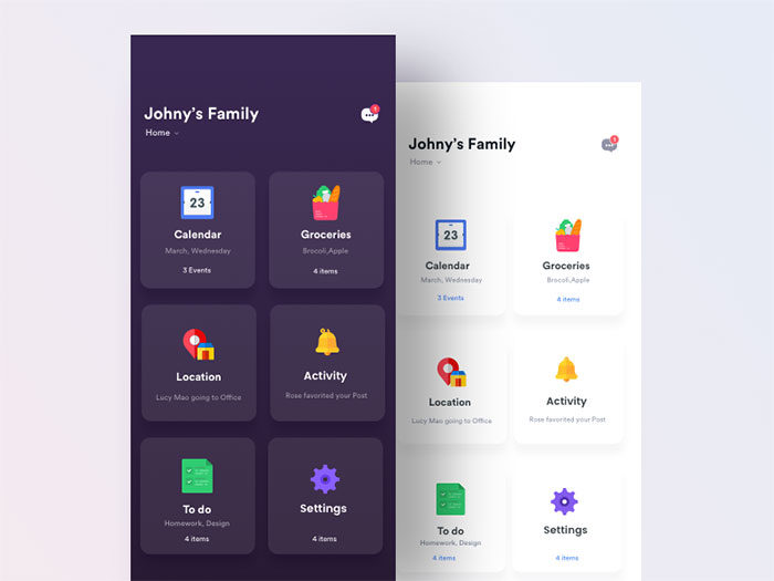
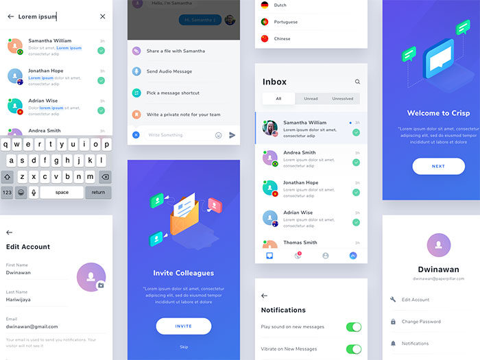
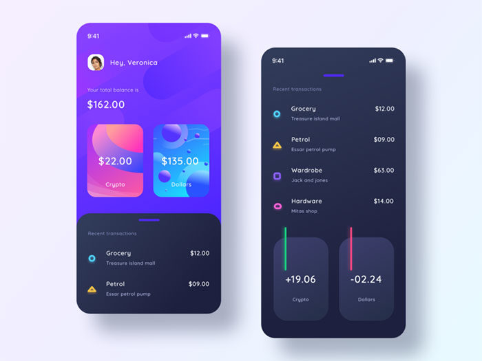
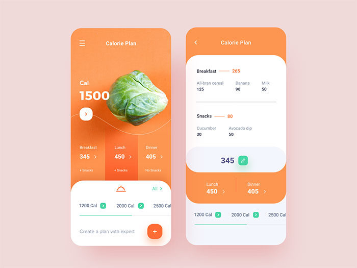
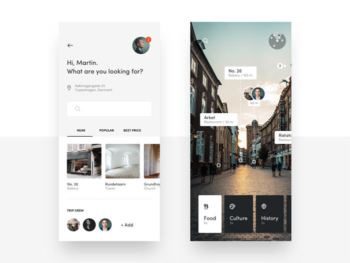
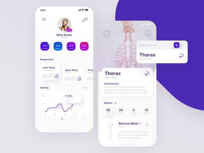
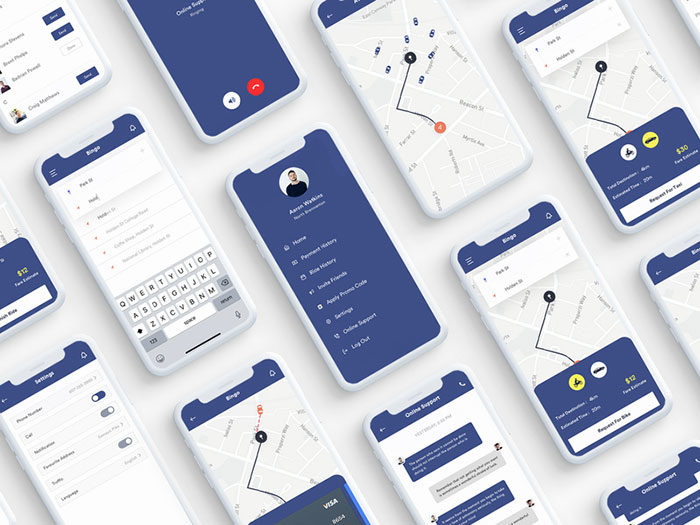
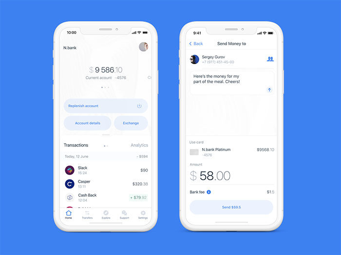
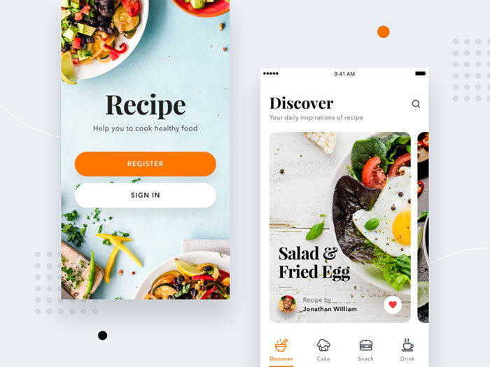
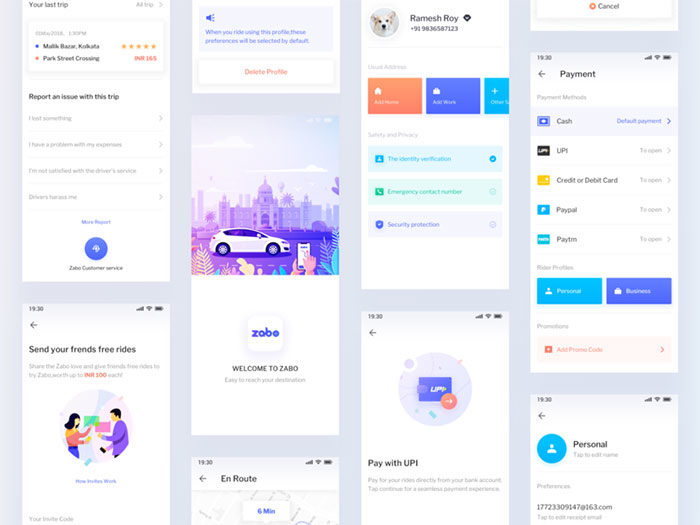
Android UI Design inspiration
FAQ on Android UI Design
What programming language is used for Android UI design?
Kotlin is Google’s preferred language for Android development, including UI code written in Jetpack Compose. XML layouts still accept Java, but Google named Kotlin its recommended language for new Android projects back in 2019.
What screen density should Android UI design target?
Mdpi, roughly 160 DPI, is the baseline density Android targets by default. Every other bucket, hdpi, xhdpi, xxhdpi, scales from that single reference point, so a component sized correctly for mdpi renders consistently no matter which bucket Android auto-scales it into on a given device.
Is Material Design used outside of Android?
Yes. Material Design also styles Google’s web products, Google Workspace, and Flutter apps across iOS, web, and desktop. Android just applies the system most visibly, through dynamic color, the type scale, and component behavior tied directly to the OS itself.
Why don’t all Android phones look the same?
Manufacturers layer their own skins over stock Android, and those skins often diverge from Material Design quite a bit. Samsung’s One UI, for example, shifts spacing, navigation placement, and icon shapes, all while still running on the same underlying Android platform underneath.
What is elevation in Android UI design?
Shadows do the work here. Material Design uses elevation to show depth along the z-axis, and the higher the value, the bigger the shadow, which is the visual cue that a card, dialog, or FAB is sitting above the rest of the interface rather than flat against the surface.
What file format do Android app icons use?
Modern Android icons ship as adaptive icons: separate foreground and background vector drawable layers that the system can mask, resize, or animate per device. This format replaced flat PNG launcher icons starting with Android 8.0.
Does Android UI design require coding skills?
No. Designers typically work in Figma using the Material 3 kit and hand off specs to developers, who build the actual screens in Jetpack Compose. Understanding platform constraints, like the 8dp grid, still makes those handoffs go faster.
How is Android UI design different from iOS design?
Android leans on elevation and shadow for depth, where iOS favors translucency and blur instead. Android also uses ripple feedback on taps rather than iOS’s haptic-first response, and Roboto replaces San Francisco as the default system typeface.
What is a design token in Android UI design?
Material components read from named values instead of hardcoded numbers, and that named value, a color role, a type scale entry, whatever it happens to be, is the design token. Change the token once and every component using it updates automatically. Nobody has to go hunting through individual screens to fix it by hand.
What is the difference between dp and sp in Android UI design?
Dp (density-independent pixels) sizes layout dimensions, and it stays fixed no matter what the user changes in their accessibility settings. Sp works differently. It’s meant for text specifically, and unlike dp, it grows or shrinks along with the user’s font-size setting, on purpose.
Where This Leaves Android UI Design
Every rule covered here points back to the same idea. Material Design isn’t a suggestion, it’s the thing that makes 3.9 billion devices render consistently without every team reinventing spacing and color from scratch.
That doesn’t mean the work is static. Compose replaced XML as the default. Material 3 Expressive rewired typography and motion. Foldables forced layout logic that didn’t exist five years ago. The platform keeps moving, and the teams that keep up are the ones checking Android Developers Blog instead of working off what they learned in 2021.
A few things stay fixed no matter what changes around them:
- 48dp touch targets. Non-negotiable, and skipping it shows up in mis-taps within a week of shipping.
- The 8dp grid. Ignore it and the whole screen starts feeling slightly wrong, even if nobody on the team can say why.
- Contrast ratios. 4.5:1 for text, 3:1 for the rest. WCAG doesn’t bend for a nice color palette.
- Testing across real devices. A layout that only works on the one Pixel sitting on a desk isn’t actually finished.
None of this is complicated in isolation. Where teams get into trouble is skipping steps because the deadline’s close and “it looks fine on my phone.” It does look fine, on that one phone. Then a tablet user opens the app and gets a stretched, unadapted mess, or someone running TalkBack hits a button with no label and just gives up.
Good Android UI design isn’t really about knowing every token in the Material spec by heart. It’s about building for the actual range of screens people carry, phones, folds, tablets, and treating accessibility as part of the layout work instead of a pass you do at the end if there’s time left. There usually isn’t time left. So it has to happen from the start.

Renowned for his expertise in logo design and visual branding, Bogdan has developed a multitude of logos for various clients.
His skills extend to creating posters, vector illustrations, business cards, and brochures. Additionally, Bogdan's UI kits were featured on marketplaces like Visual Hierarchy and UI8.
He also wrote in the past years on sites like Design Your Way, WebDesignerDepot, WPDean, Designmodo, Speckyboy, Slider Revolution, and more.
- Canva AI Features Reviewed: Are They Actually Useful? - 4 October 2026
- The Substack Logo History, Colors, Font, And Meaning - 2 October 2026
- How UX Design Impacts SaaS User Retention and Churn - 1 October 2026

Bogdan Sandu is a seasoned designer who has been designing websites since 2008. Renowned for his expertise in logo design and visual branding, Bogdan has developed a multitude of logos for various clients. His skills extend to creating posters, vector illustrations, business cards, and brochures. Additionally, Bogdan's UI kits were featured on marketplaces like Visual Hierarchy and UI8. He also wrote in the past years on sites like Design Your Way, WebDesignerDepot, WPDean, Designmodo, Speckyboy, Slider Revolution, and more.
You Might Also Like