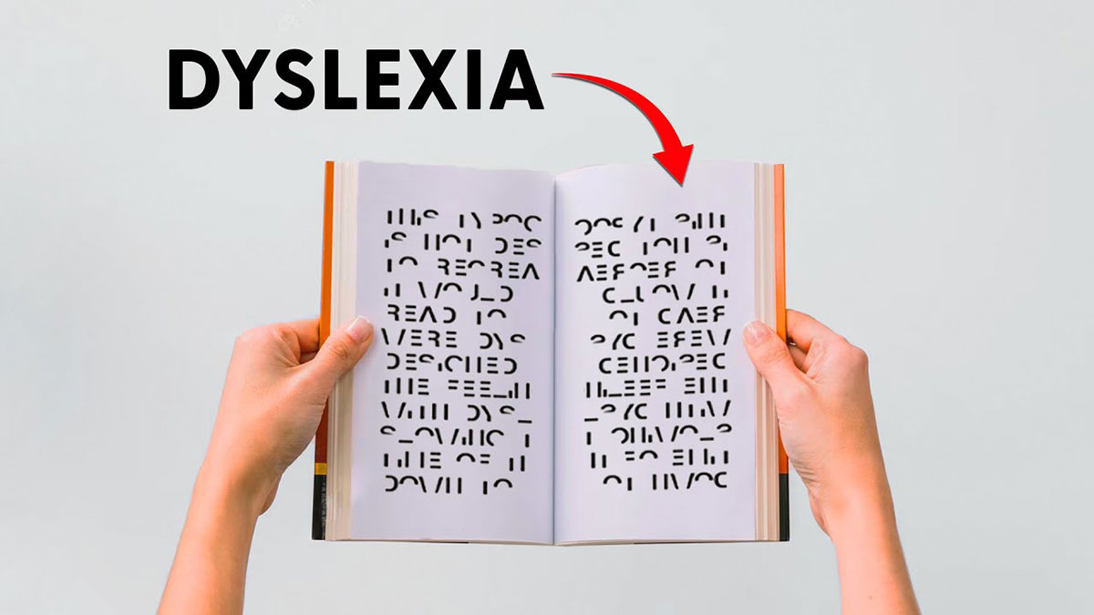
The font on your screen right now could be making reading harder for 1 in 5 people.
Dyslexia affects up to 20% of the population, yet most websites, documents, and apps still default to typefaces that increase letter confusion and visual stress for dyslexic readers.
Font choice matters. The right typeface reduces crowding effects, prevents letter reversal errors, and lowers the cognitive load that makes reading exhausting for people with dyslexia.
This guide covers the best fonts for dyslexia based on research from the British Dyslexia Association, eye-tracking studies, and accessibility guidelines including WCAG 2.1. You’ll learn which typefaces work, why they work structurally, and how to apply them across web, print, and digital reading platforms.
The Best Fonts For Dyslexia
Around 15–20% of the population shows symptoms of dyslexia, according to the International Dyslexia Association. Font choice doesn’t fix dyslexia, but it directly affects how hard a reader has to work. The right typeface reduces letter confusion, lowers cognitive load, and improves reading fluency for dyslexic readers.
The British Dyslexia Association’s style guide recommends sans-serif fonts with clear, open letterforms, generous spacing, and distinct character shapes. No single font works for everyone. That said, the ten below are the strongest starting points based on research, accessibility guidelines, and community use.
| Font | Type | Designed For Dyslexia | License |
| OpenDyslexic | Specialized sans-serif | Yes | Free (OFL) |
| Dyslexie | Specialized sans-serif | Yes | Freemium |
| Lexend | Variable sans-serif | Yes | Free (OFL) |
| Arial | Humanist sans-serif | No | Bundled / Commercial |
| Verdana | Humanist sans-serif | No | Free (Core Web Fonts) |
| Comic Sans | Casual sans-serif | No | Bundled (Microsoft) |
| Helvetica | Neo-grotesque sans-serif | No | Commercial |
| Trebuchet MS | Humanist sans-serif | No | Bundled (Microsoft) |
| Century Gothic | Geometric sans-serif | No | Commercial |
| Calibri | Humanist sans-serif | No | Bundled (Microsoft) |
—
OpenDyslexic
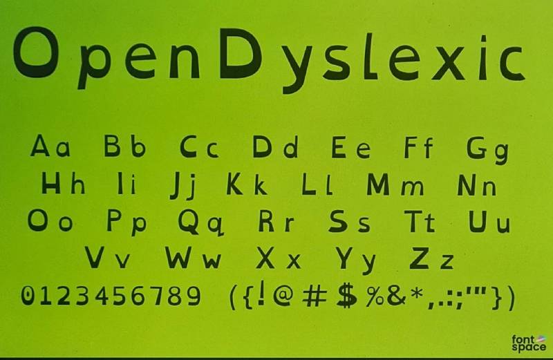
OpenDyslexic is a specialized sans-serif typeface designed by Abelardo Gonzalez in 2012, available through opendyslexic.org under the SIL Open Font License. It uses bottom-weighted letterforms to reduce letter flipping and rotation errors.
OpenDyslexic works best in personal reading environments and assistive technology contexts because each letter carries exaggerated bottom weight, giving the eye a clear anchor point. It’s built into Amazon Kindle Paperwhite, Wikipedia’s reading mode, and Kobo eReaders.
What makes OpenDyslexic suitable for dyslexia?
Each letterform has a heavier baseline stroke than the top, so the letter resists visual rotation. Letter spacing is wider than standard sans-serif defaults, reducing crowding effects. The design intentionally avoids mirrored character pairs, which addresses the b/d and p/q confusion common in dyslexic reading.
Key attributes:
| Attribute | Value |
| Classification | Specialized sans-serif |
| Designer | Abelardo Gonzalez, 2012 |
| Weight range | Regular, Bold, Italic, Bold Italic, Mono |
| Variable font | No |
| Recommended sizes | 14px–18px for body text |
| Letter-spacing default | Wide |
| License | OFL (fully free, including commercial) |
| Available on | opendyslexic.org, Itch.io, GitHub |
| Price | Free |
How does OpenDyslexic perform for dyslexic readers?
A 2023 study by Liz Broadbent found that 58% of participants who expressed a preference chose OpenDyslexic over Arial, citing aesthetics and ease of reading. That said, a 2013 eye-tracking study by Rello and Baeza-Yates found no statistically significant improvement in reading time over standard sans-serif fonts.
The benefit is more consistent in comfort and confidence than raw speed. Many readers report it feels easier to track, even when speed doesn’t measurably change.
What are the best pairings for OpenDyslexic in dyslexia contexts?
OpenDyslexic pairs with Lexend for body text contrast when OpenDyslexic is used for headings, and with Arial for fallback rendering in mixed environments where OpenDyslexic may not load.
What are the limitations of OpenDyslexic for dyslexia?
Research findings on reading speed improvement are mixed. The font’s visual character is distinctive, which some adult readers find unprofessional in formal document contexts like workplace reports or academic papers.
OpenDyslexic – Recommended Use Cases Within Dyslexia Typography
- Best for: Personal e-readers, accessibility overlays, classroom reading tools
- Avoid for: Formal documents, print at sizes below 12pt
- Optimal weight: Regular 400 for body; Bold for headings
- Optimal size range: 14px–18px for continuous reading
—
Dyslexie
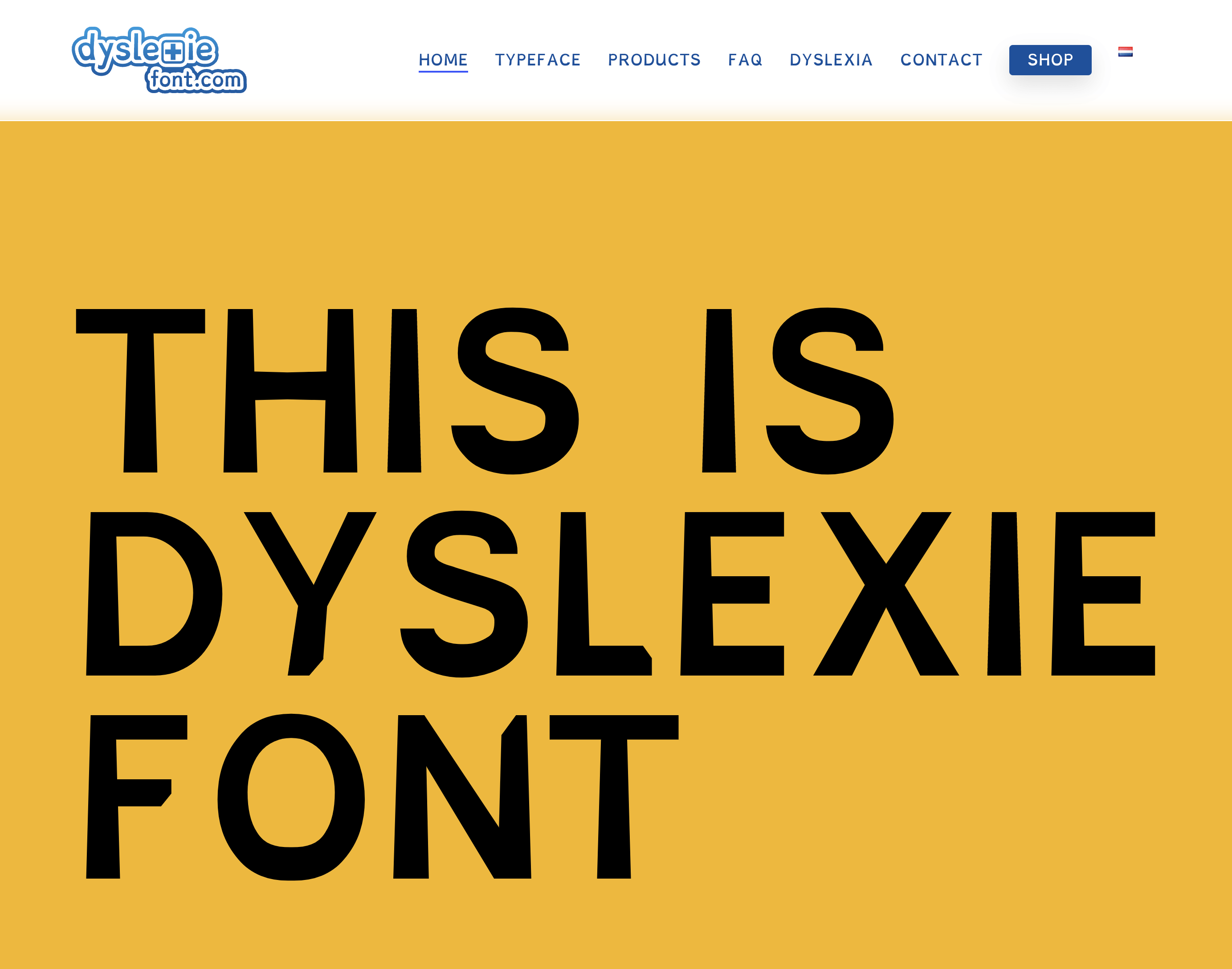
Dyslexie is a specialized sans-serif typeface designed by Christian Boer, a Dutch graphic designer with dyslexia, in 2008. It’s available through dyslexiefont.com with free options for personal and educational use, and a paid commercial license.
Dyslexie suits classroom and educational publishing contexts because its letterforms combine bottom weighting, elongated ascenders and descenders, enlarged letter openings, and subtle inclination on similar characters. The University of Padova (2012) found that increased character spacing of the type used in Dyslexie improves legibility.
What makes Dyslexie suitable for dyslexia?
Capital letters and punctuation are set in bold, creating natural visual cues for sentence boundaries. Ascenders in letters like b, d, f, h, k, l, t are longer than standard to increase distinction between similar characters. Openings in letters like e and g are wider than conventional typefaces, reducing character crowding.
Key attributes:
| Attribute | Value |
| Classification | Specialized sans-serif |
| Designer | Christian Boer, 2008 |
| Weight range | Regular, Bold, Italic, Bold Italic |
| Variable font | No |
| Recommended sizes | 14px–20px for body; 20px+ for headings |
| Letter-spacing default | Wide (increased tracking built in) |
| License | Freemium (free personal/education; paid commercial) |
| Available on | dyslexiefont.com |
| Price | Free (personal/education) / Subscription (commercial) |
How does Dyslexie perform for dyslexic readers?
A 2016 study published in the journal Dyslexia found that low-progress readers read 7% more words per minute in Dyslexie compared to standard Arial. The Institute of Visual Design (2024) also found that Dyslexie’s elongated ascenders improve legibility during reading.
Note: separate Dutch studies with 170 and 147 students showed no measurable reading speed improvement over Arial in those cohorts. Results vary by reader age, reading level, and prior font exposure.
What are the best pairings for Dyslexie in dyslexia contexts?
Dyslexie pairs with Open Sans in web contexts where Dyslexie is used for body content and Open Sans serves as the UI fallback. For print-heavy educational materials, pairing it with Verdana for supplementary annotations maintains consistent accessibility across the layout.
What are the limitations of Dyslexie for dyslexia?
Commercial use requires a paid license, which limits deployment in business websites and apps without a subscription. The font is not available on Google Fonts or Adobe Fonts, requiring direct download and manual installation in most platforms.
Dyslexie – Recommended Use Cases Within Dyslexia Typography
- Best for: Classroom worksheets, educational apps, personal reading tools
- Avoid for: Commercial web use without a license; body text below 12pt in print
- Optimal weight: Regular for body; built-in bold punctuation handles emphasis
- Optimal size range: 14px–20px for screen; 12pt–14pt for print
—
Lexend
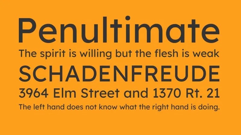
Lexend is a variable sans-serif typeface system created by Dr. Bonnie Shaver-Troup in 2001, digitized and expanded by Thomas Jockin and Font Bureau with Google Fonts funding in 2018. It reduces visual stress by calibrating letter spacing to a reader’s words-correct-per-minute score.
Lexend works best for web body text and educational platforms because its variable weight axis spans Thin to Black in a single file, and its seven sub-families (Deca, Exa, Giga, Mega, Peta, Tera, Zetta) offer graduated spacing levels. A controlled study found that 90% of students scored better on Lexend than Times New Roman, with nearly a 20% improvement in correctly identified words per minute.
What makes Lexend suitable for dyslexia?
Hyper-expansion of character spacing is Lexend’s defining structural feature. It creates additional lag time between characters, reducing crowding and masking effects that cause letter confusion in dyslexic readers. Enclosed letterforms like a, e, and g have enlarged internal counters, which reduces misread characters at smaller display sizes. The Peta, Tera, and Zetta variants carry the widest spacing and work best for struggling or early readers.
| Attribute | Value |
| Classification | Variable humanist sans-serif |
| Designer | Bonnie Shaver-Troup (2001), Thomas Jockin / Font Bureau (2018) |
| Weight range | Thin 100 – Black 900 |
| Variable font | Yes |
| Recommended sizes | 16px–22px for web body; 12px+ for UI labels |
| Letter-spacing default | Wide (varies by sub-family) |
| License | OFL (fully free) |
| Available on | Google Fonts, Google Docs, Google Workspace |
| Price | Free |
How does Lexend perform for dyslexic readers?
Lexend has over 500,000 downloads and more than 2 billion web views through Google Fonts. It’s been referenced in research by Adobe and tested at Stanford and HP. Its integration into Google Docs and Google Workspace makes it one of the most accessible dyslexia-friendly fonts in practical daily use.
Apple listed Lexend on K–12 Assistive Technology resources from 2003 to 2005. It renders cleanly across Chrome, Safari, and Firefox at variable weights without additional configuration.
What are the best pairings for Lexend in dyslexia contexts?
Lexend pairs with Open Sans for UI labels and navigation when Lexend is used for body content, and with Verdana in offline document contexts where variable font support may be limited. The Lexend Deca sub-family is the most used in mixed-audience web design.
What are the limitations of Lexend for dyslexia?
The seven sub-families require deliberate selection. Using the wrong spacing variant (e.g., Deca for struggling readers) undercuts the font’s accessibility advantage. No Arabic, Hebrew, or CJK character support in the base Lexend families.
Lexend – Recommended Use Cases Within Dyslexia Typography
- Best for: Web body text, educational platforms, Google Docs documents
- Avoid for: Multilingual content requiring non-Latin scripts
- Optimal weight: Regular 400 for body; SemiBold 600 for headings
- Optimal size range: 16px–22px for continuous reading on screen
—
Arial
Arial is a humanist sans-serif font designed by Robin Nicholas and Patricia Saunders for IBM in 1982, released through Monotype and later bundled with every major Microsoft and Apple operating system. It reduces letter confusion through open, rounded letterforms and uniform stroke width.
Arial works best as a document and screen reading font for dyslexic readers because it requires no installation, is available on virtually every device, and has a higher x-height than Times New Roman at equivalent point sizes, which improves legibility. A 2013 eye-tracking study (Rello and Baeza-Yates) found Arial produced the fastest reading times among 12 tested fonts for dyslexic readers.
What makes Arial suitable for dyslexia?
Arial has a large x-height relative to its cap height, which keeps lowercase letters visually prominent at small sizes. Its stroke width is uniform with no thick-to-thin contrast, removing one source of visual complexity. Letter spacing defaults to slightly open tracking, reducing crowding between adjacent characters.
Key attributes:
| Classification | Humanist sans-serif |
| Designer | Robin Nicholas, Patricia Saunders, 1982 |
| Weight range | Light 300 – Black 900 (full family) |
| Variable font | No |
| Recommended sizes | 12px–16px for body; 18px+ for headings |
| Letter-spacing default | 0 (standard) |
| License | Bundled with Windows/macOS; commercial license required for embedding |
| Available on | System fonts (Windows, macOS), Google Docs, Microsoft Office |
| Price | Free (bundled) |
How does Arial perform for dyslexic readers?
In the University of Michigan eye-tracking study, Arial produced the shortest average reading time across all 12 tested fonts. A 2016 Dutch study with 170 dyslexic students showed children preferred Arial over the specialized Dyslexie font in both reading speed and preference. Arial renders consistently across all major browsers and operating systems at sizes from 10px upward without hinting issues.
What are the best pairings for Arial in dyslexia contexts?
Arial pairs with Verdana when a secondary body weight is needed for supplementary text or captions, and with Lexend as a system-font fallback in web stacks where Lexend may not load. This is actually a very common practice in accessibility-focused web design.
What are the limitations of Arial for dyslexia?
Capital I, lowercase l, and digit 1 are visually similar in Arial, which is a known issue for dyslexic readers. Arial Italic measurably increases reading difficulty and should not be used for dyslexic readers. Arial Narrow reduces letter spacing and should also be avoided.
Arial – Recommended Use Cases Within Dyslexia Typography
- Best for: Documents, email, accessible web body text, printed educational materials
- Avoid for: Italic text for dyslexic readers; condensed variants
- Optimal weight: Regular 400 for body; Bold 700 for emphasis
- Optimal size range: 12pt–14pt for print; 14px–18px for screen
—
Verdana
Verdana is a humanist sans-serif typeface designed by Matthew Carter for Microsoft Corporation in 1996, released as part of Microsoft’s Core Fonts for the Web initiative. It improves on-screen legibility through wide character spacing, high x-height, and distinct letterforms at pixel level.
Verdana suits web body text and digital reading environments because Matthew Carter designed its bitmap structure at the pixel level first, then built vector outlines around it. This means it renders clearly at sizes as small as 8ppem. The British Dyslexia Association recommends Verdana as an alternative to Comic Sans for accessible typography.
What makes Verdana suitable for dyslexia?
Verdana has one of the widest default character spacings among system fonts, which reduces the crowding effect that causes letter confusion in dyslexic readers. Its lowercase i, j, l, and the numeral 1 are all visually distinct through unique stroke details, which directly addresses a common confusion point. The font’s high x-height makes lowercase letters nearly as tall as capitals, maintaining visual weight consistency across a line of text.
Key attributes:
| Attribute | Value |
| Classification | Humanist sans-serif |
| Designer | Matthew Carter, 1996 |
| Weight range | Regular, Bold, Italic, Bold Italic (Verdana Pro adds condensed and small caps) |
| Variable font | No |
| Recommended sizes | 12px–16px for body; 8px minimum for UI |
| Letter-spacing default | Wide |
| License | Free (Microsoft Core Web Fonts) |
| Available on | System fonts (Windows, macOS), Google Fonts |
| Price | Free |
How does Verdana perform for dyslexic readers?
Verdana’s wide spacing renders individual characters as visually separate units rather than a continuous flow, which reduces crowding-related errors. The 2013 Rello and Baeza-Yates eye-tracking study ranked Verdana among the top-performing fonts for dyslexic readers alongside Arial and Helvetica. It’s still one of the few system fonts that passes all British Dyslexia Association character distinctiveness criteria.
What are the best pairings for Verdana in dyslexia contexts?
Verdana pairs with Arial for mixed-weight document layouts and with Open Sans in web contexts where Verdana’s wider spacing needs a narrower companion for UI elements. The wider tracking can create spacing issues in justified text, so pair it with left-aligned layouts only.
What are the limitations of Verdana for dyslexia?
Verdana’s wide character spacing can make headline text feel loose and unbalanced in tightly designed layouts. It also has limited weight range in the standard version (no thin or light weights), which restricts typographic hierarchy options.
Verdana – Recommended Use Cases Within Dyslexia Typography
- Best for: Web body text, low-resolution screen reading, accessible document design
- Avoid for: Justified text blocks; headlines above 36px where spacing reads as loose
- Optimal weight: Regular for body; Bold for key terms or labels
- Optimal size range: 12px–16px for body; 8px minimum for small UI labels
—
Comic Sans
Comic Sans is a casual sans-serif typeface designed by Vincent Connare and released by Microsoft in 1994, bundled with Windows operating systems and the Microsoft Office suite. It reduces letter-mirror confusion through irregular, handwriting-inspired letterforms that give each character a distinct visual identity.
Comic Sans works for classroom and informal reading materials aimed at dyslexic readers because its characters have fewer rotationally symmetric shapes than geometric sans-serif fonts. The British Dyslexia Association explicitly recommends it, noting that letters appear less crowded than in many alternatives.
What makes Comic Sans suitable for dyslexia?
Comic Sans uses wide letter spacing and an informal baseline variation that prevents characters from merging visually. Almost every character has a unique shape, with only b and d remaining near-mirrors. Its irregular stroke widths mimic handwriting, which some dyslexic readers find easier to track because the letterforms match what they learned to write.
Key attributes:
| Attribute | Value |
| Classification | Casual sans-serif |
| Designer | Vincent Connare, 1994 |
| Weight range | Regular, Bold |
| Variable font | No |
| Recommended sizes | 12pt–14pt for print; 14px–18px for screen |
| Letter-spacing default | Wide |
| License | Bundled with Microsoft Windows and Office |
| Available on | System fonts (Windows, macOS, Office) |
| Price | Free (bundled) |
How does Comic Sans perform for dyslexic readers?
Its informal design performs well in primary school contexts. Many dyslexic adults report using it for personal notes and drafts because its casual appearance reduces reading anxiety. That said, it’s largely seen as unprofessional in formal contexts, which limits its use to personal, educational, and informal settings.
What are the best pairings for Comic Sans in dyslexia contexts?
Comic Sans pairs with Arial for secondary text in classroom materials where Comic Sans handles the main reading content and Arial handles labels and navigation. It’s rarely paired in web design due to professional perception.
What are the limitations of Comic Sans for dyslexia?
Lowercase b and d remain near-mirrors, which is a specific failure point for dyslexic readers who struggle with that exact confusion. Its informal appearance restricts use to casual or educational contexts, making it unsuitable for workplace documents, professional reports, or most digital products.
Comic Sans – Recommended Use Cases Within Dyslexia Typography
- Best for: Primary school reading materials, personal notes, informal worksheets
- Avoid for: Workplace documents, websites, any formal publication
- Optimal weight: Regular for body
- Optimal size range: 12pt–14pt for print; 14px–18px for screen
—
Helvetica
Helvetica is a neo-grotesque sans-serif typeface designed by Max Miedinger and Eduard Hoffmann at the Haas Type Foundry in 1957, originally named Neue Haas Grotesk and renamed Helvetica in 1961. It delivers clean, even letter spacing and consistent stroke weight across all characters.
A 2013 study by Rello and Baeza-Yates (University of Michigan) ranked Helvetica among the top five fonts for dyslexic readers, alongside Arial, Courier, Verdana, and Computer Modern. Its even spacing and clear character structure support text comprehension in both print and screen contexts.
What makes Helvetica suitable for dyslexia?
Helvetica’s letter-spacing defaults are consistent and slightly open, preventing crowding between adjacent characters. Its stroke width is uniform with no thick-to-thin contrast, reducing visual complexity per character. Character height is consistent across the full typeface, maintaining a stable reading rhythm.
Key attributes:
| Attribute | Value |
| Classification | Neo-grotesque sans-serif |
| Designer | Max Miedinger, Eduard Hoffmann, 1957 |
| Weight range | Thin 25 – Black 95 (full Neue Helvetica family) |
| Variable font | No |
| Recommended sizes | 12px–16px for body; 24px+ for display |
| Letter-spacing default | Standard (0) |
| License | Commercial (Monotype) |
| Available on | Adobe Fonts, Monotype direct, bundled on macOS |
| Price | Subscription (Adobe Fonts) / One-time purchase |
How does Helvetica perform for dyslexic readers?
Helvetica’s clean structure performs well in signage and wayfinding, which is why it appears in airports, transit systems, and public institutions globally. For dyslexic readers, it provides reliable on-screen rendering at standard body sizes, though it lacks the built-in accessibility-specific features of specialized fonts like Lexend or OpenDyslexic.
What are the best pairings for Helvetica in dyslexia contexts?
Helvetica pairs with Verdana for body text in print-heavy contexts, and with Open Sans as a web-safe fallback when Helvetica is specified in CSS font stacks. Using Helvetica font pairing well matters here since its neutrality can make body text feel dense without a contrasting companion.
What are the limitations of Helvetica for dyslexia?
Capital I and lowercase l are nearly identical in Helvetica, which is a critical failure point for dyslexic readers. It also requires a paid commercial license, which makes it less accessible for schools and nonprofits compared to free alternatives like Lexend or Arial.
Helvetica – Recommended Use Cases Within Dyslexia Typography
- Best for: Signage, large-format print, institutional materials with strong design budgets
- Avoid for: Body text where I/l confusion is a concern; low-budget or open-source projects
- Optimal weight: Regular 400 for body; Medium 500 for subheadings
- Optimal size range: 14px–18px for screen body; 10pt+ for print
—
Trebuchet MS
Trebuchet MS is a humanist sans-serif typeface designed by Vincent Connare for Microsoft in 1996, bundled with Internet Explorer 4.0 and included in all Windows and macOS systems. It provides clear character distinction between commonly confused letters through unique stroke details.
Trebuchet MS works well in web body text and accessible document design because it distinguishes capital I, lowercase l, and the numeral 1 through distinct letterforms, directly addressing a core dyslexia-related confusion point. The British Dyslexia Association includes it in its recommended font list.
What makes Trebuchet MS suitable for dyslexia?
Trebuchet MS uses a humanist structure with slight variation in stroke width, giving each character a more distinct profile than pure geometric sans-serifs. Its letterforms have open apertures on letters like c, e, and a, which reduces character confusion at standard body sizes. Letter spacing is slightly wider than Arial, providing better separation between adjacent characters.
Key attributes:
| Attribute | Value |
| Classification | Humanist sans-serif |
| Designer | Vincent Connare, 1996 |
| Weight range | Regular, Bold, Italic, Bold Italic |
| Variable font | No |
| Recommended sizes | 12px–16px for body; 18px+ for headings |
| Letter-spacing default | Slightly wide |
| License | Bundled (Windows, macOS) |
| Available on | System fonts (Windows, macOS) |
| Price | Free (bundled) |
How does Trebuchet MS perform for dyslexic readers?
Trebuchet MS renders clearly at screen sizes from 12px upward and performs consistently across Windows and macOS without hinting issues. Its BDA-recommended status means it appears frequently in UK educational materials and government accessibility guidelines as a safe system font choice.
What are the best pairings for Trebuchet MS in dyslexia contexts?
Trebuchet MS pairs with Georgia for heading contrast in print-oriented educational documents, and with Arial in web-safe font stacks as a close companion. It’s a reliable pairing partner for documents that need to work across all devices without custom font loading.
What are the limitations of Trebuchet MS for dyslexia?
The font has no variable weight axis and only four styles, which limits typographic hierarchy options. It also mirrors p and q, and b and d, which are the specific pairs most relevant to dyslexic letter confusion.
Trebuchet MS – Recommended Use Cases Within Dyslexia Typography
- Best for: Web body text, accessible HTML emails, UK government and educational documents
- Avoid for: Contexts requiring more than 4 font weights
- Optimal weight: Regular for body; Bold for headings
- Optimal size range: 12px–16px for body text
—
Century Gothic
Century Gothic is a geometric sans-serif typeface released by Monotype in 1991, designed to maintain the aesthetic of 20th Century by Sol Hess while adapting it for digital output. It improves letter distinction through rounded, open letterforms with consistent stroke width.
Century Gothic works for educational materials and print-focused dyslexia typography because its letterforms are fully rounded with high open apertures on letters like c, e, a, and g. The British Dyslexia Association includes it in its recommended font list as an alternative to Arial and Verdana.
What makes Century Gothic suitable for dyslexia?
Century Gothic’s circular letter construction gives each character a wide, open visual profile, which slows crowding between adjacent characters. Its consistent stroke weight (no thick-to-thin contrast) removes visual complexity. Spacing between letters is wider than most system sans-serif defaults, which helps dyslexic readers track individual characters without letter merging.
Key attributes:
| Attribute | Value |
| Classification | Geometric sans-serif |
| Designer | Monotype Design Studio, 1991 |
| Weight range | Regular, Bold, Italic, Bold Italic |
| Variable font | No |
| Recommended sizes | 12pt–14pt for print; 14px–18px for screen |
| Letter-spacing default | Wide |
| License | Commercial (Monotype); bundled with some Microsoft and Adobe products |
| Available on | Adobe Fonts, Microsoft Office (some versions) |
| Price | Subscription (Adobe Fonts) / varies |
How does Century Gothic perform for dyslexic readers?
Century Gothic performs well for print reading materials at 12pt–14pt where its wide proportions aid character separation. At very small screen sizes (below 11px), some of its thin strokes reduce contrast and legibility. For classroom handouts and printed worksheets, it’s a solid choice that doesn’t carry the stigma of Comic Sans while providing comparable spacing benefits.
What are the best pairings for Century Gothic in dyslexia contexts?
Century Gothic pairs with Calibri for secondary text where Century Gothic handles headings and Calibri provides slightly tighter body text. It also pairs naturally with Arial as a body text companion in mixed-layout documents.
What are the limitations of Century Gothic for dyslexia?
Century Gothic’s wide proportions use significantly more horizontal space than other sans-serif fonts, increasing page count in print documents. Some characters like lowercase l and uppercase I are not strongly differentiated. Commercial licensing adds cost for institutional and business use.
Century Gothic – Recommended Use Cases Within Dyslexia Typography
- Best for: Print educational materials, classroom handouts, accessible brochures
- Avoid for: Body text at screen sizes below 12px; space-constrained layouts
- Optimal weight: Regular for body; Bold for section headings
- Optimal size range: 12pt–14pt for print; 14px–18px for screen
—
Calibri
Calibri is a humanist sans-serif typeface designed by Lucas de Groot for Microsoft in 2002–2004, released with Windows Vista and Microsoft Office 2007, where it became the default body font. It uses soft curves, open counters, and wide letter spacing designed specifically for on-screen reading.
Calibri works best in document-based dyslexia accessibility because it’s already the default in Microsoft Word, meaning dyslexic readers encounter it in most educational and workplace documents without any configuration needed. Its soft rounded terminals reduce the harsh stroke endings that can cause visual stress for sensitive readers.
What makes Calibri suitable for dyslexia?
Calibri’s open counters on letters like a, e, and g prevent visual closure at standard body sizes, which reduces character confusion. Its letter spacing is wider than Times New Roman at equivalent sizes, reducing crowding. The font’s slight rounding on stroke terminals softens individual characters, which lowers visual stress during extended reading sessions.
Key attributes:
| Attribute | Value |
| Classification | Humanist sans-serif |
| Designer | Lucas de Groot, 2004 |
| Weight range | Light 300 – Bold 700 |
| Variable font | No |
| Recommended sizes | 11pt–14pt for print; 14px–18px for screen |
| Letter-spacing default | Slightly wide |
| License | Bundled with Microsoft Office and Windows |
| Available on | System fonts (Windows), Microsoft Office |
| Price | Free (bundled) |
How does Calibri perform for dyslexic readers?
Calibri renders consistently in Microsoft Word, Google Docs (when embedded), and most PDF readers. Its comfortable default size of 11pt in Office is slightly below the 12pt–14pt recommended for dyslexic readers, so bumping the size is a simple first adjustment. The British Dyslexia Association includes Calibri in its recommended font list alongside Arial and Verdana.
What are the best pairings for Calibri in dyslexia contexts?
Calibri pairs with Arial for section headings in accessible Word documents, and with Lexend in web contexts where Calibri handles fallback rendering. For anyone looking at fonts for accessibility broadly, Calibri plus Lexend covers most document and screen use cases.
What are the limitations of Calibri for dyslexia?
Calibri’s light weight (300) is too thin for dyslexic readers and should be avoided. The font is not available on Google Fonts and requires manual embedding for consistent web rendering, which introduces layout risk when the system font isn’t available.
Calibri – Recommended Use Cases Within Dyslexia Typography
- Best for: Microsoft Word documents, Office-based educational materials, workplace email
- Avoid for: Web body text without a fallback stack; Light weight for any continuous reading
- Optimal weight: Regular 400 for body; Bold 700 for emphasis
- Optimal size range: 12pt–14pt for print; 14px–18px for screen
What Makes a Font Readable for Dyslexic Users?
Dyslexia affects an estimated 15–20% of the population, making it the most common learning disability worldwide, according to the International Dyslexia Association. For that portion of readers, font choice isn’t a matter of aesthetics. It directly determines how hard the brain has to work to decode each character.
No typeface cures dyslexia. But the structural properties of a font can either reduce or amplify the letter confusion, crowding effects, and reversal errors that dyslexic readers experience.
| Font attribute | Dyslexia-friendly | Problematic |
| Stroke style | Sans-serif, uniform weight | Serif, thick-thin contrast |
| Letter style | Roman (upright) | Italic, oblique |
| Spacing | Wide, open tracking | Condensed, tight kerning |
| Character distinction | Unique i/l/1 shapes | Mirror-image b/d/p/q pairs |
What does the British Dyslexia Association recommend in its font style guide?
The British Dyslexia Association’s Dyslexia Style Guide (2023) recommends sans-serif fonts with clear, open letterforms, generous character spacing, and distinct shapes for commonly confused characters.
Its recommended font list includes Arial, Comic Sans, Verdana, Tahoma, Century Gothic, Trebuchet MS, Calibri, and Open Sans. The BDA specifically advises against italics, condensed widths, and justified text alignment.
- Minimum font size: 12pt for print, 14px for screen
- Line spacing: at least 1.5x font size
- Left-aligned text only (no justified alignment)
- Bold for emphasis only, never italics
How does letter spacing affect reading fluency for dyslexic readers?
Dyslexic readers are especially sensitive to perceptual crowding, where individual letters become visually masked by surrounding characters.
A landmark study published in PNAS (Zorzi et al., University of Padova) found that wider-than-standard letter spacing enabled dyslexic children to read 20% faster and make half as many errors, with no training required. A separate study by Anglia Ruskin University found a 13% increase in reading speed for dyslexic children with increased letter spacing, compared to a 5% gain for non-dyslexic children.
WCAG 2.1 SC 1.4.12 requires that text remain functional when users adjust letter spacing to at least 0.12x the font size, word spacing to at least 0.16x, and line height to at least 1.5x.
—
Which Fonts Are Specifically Designed for Dyslexia?
Three typefaces exist specifically to reduce letter confusion and visual stress for dyslexic readers: OpenDyslexic, Dyslexie, and Lexend. Each uses a different structural approach. None should be treated as a guaranteed fix because individual response varies significantly.
Does OpenDyslexic improve reading speed? What the research actually shows
OpenDyslexic uses bottom-weighted letterforms to prevent visual rotation and letter flipping. The theory is that heavier baselines anchor each character to the reading line.
The evidence is split. A 2023 study by Liz Broadbent found that 58% of participants who expressed any preference chose OpenDyslexic over Arial. But a 2013 eye-tracking study by Rello and Baeza-Yates found no statistically significant improvement in reading time or fixation duration compared to standard sans-serif fonts.
Where it clearly performs: comfort, confidence, and perceived ease, particularly in personal reading environments. Amazon Kindle Paperwhite, Kobo eReaders, and Wikipedia all offer OpenDyslexic as an optional reading mode.
- License: SIL-OFL (fully free, including commercial use)
- Styles: Regular, Bold, Italic, Bold Italic, Mono
- Available at: opendyslexic.org, GitHub
How does Lexend’s variable spacing system work?
Lexend was developed by educational therapist Dr. Bonnie Shaver-Troup starting in 2001, then digitized by Font Bureau with Google Fonts funding in 2018. Its core mechanism is hyper-expansion of character spacing, calibrated to a reader’s words-correct-per-minute score.
It ships as seven sub-families (Deca, Exa, Giga, Mega, Peta, Tera, Zetta) with progressively wider spacing. Shaver-Troup’s research shows struggling readers perform best with Peta, Tera, and Zetta. In a controlled study, 90% of students outperformed their Times New Roman reading scores with Lexend, with nearly 20% improvement in correctly identified words per minute.
Lexend has over 500,000 downloads and more than 2 billion web views through Google Fonts. It’s the only dyslexia-oriented typeface built directly into Google Docs and Google Workspace.
| Font | Designed for dyslexia | License | Variable font | Research evidence |
| OpenDyslexic | Yes | Free (OFL) | No | Mixed (preference, not speed) |
| Dyslexie | Yes | Freemium | No | Mixed (7% gain in one study) |
| Lexend | Yes | Free (OFL) | Yes | Strong (90% outperformed baseline) |
Dyslexie (Christian Boer, 2008) adds elongated ascenders and descenders, enlarged letter openings, and bold capitals, targeting the specific visual distinctions that help dyslexic readers separate similar characters. Free for personal and educational use; paid license for commercial deployment.
—
Which Standard System Fonts Work Best for Dyslexia?
Most dyslexic readers encounter Arial, Verdana, or Calibri in their daily reading long before they find a specialized font. That’s not a problem. Research consistently places these system fonts at the top of dyslexia readability rankings, often outperforming purpose-built alternatives.
The British Dyslexia Association includes all six fonts below in its official recommendations. None require installation or licensing for everyday use.
Arial vs. Verdana for dyslexia: which performs better?
Arial produced the fastest reading times in the Rello and Baeza-Yates 2013 eye-tracking study across 12 tested fonts with 48 dyslexic participants aged 11–50. In a Dutch study with 170 dyslexic children, the majority preferred Arial over Dyslexie, with no measurable speed advantage for the specialized font.
Verdana (Matthew Carter, Microsoft, 1996) was built pixel-first, with its bitmap structure designed before vector outlines were drawn. This gives it unusually distinct letterforms at small sizes. Its capital I, lowercase l, and numeral 1 are visually differentiated through unique stroke details, which directly addresses a core dyslexia confusion point.
Both perform well. The practical difference:
- Arial runs slightly narrower, fitting more text per line
- Verdana has wider default tracking, better for crowding-sensitive readers
- Arial is faster to render as a system default in most browsers
- Verdana distinguishes i/j/l/1 more clearly
For most contexts, Verdana edges ahead on character distinction. For speed-first environments like email and Office documents, Arial is the more pragmatic default.
The remaining BDA-recommended system fonts and their key dyslexia attributes:
| Font | Key dyslexia attribute | Default in |
| Helvetica | Even spacing, uniform stroke weight | macOS system font |
| Trebuchet MS | Open apertures on c/e/a; distinct i/l/1 | Windows, macOS |
| Century Gothic | Rounded, wide letters; high open apertures | Microsoft Office (some versions) |
| Calibri | Open counters; soft rounded terminals | Microsoft Office (default) |
Calibri’s default size in Microsoft Office is 11pt, which sits below the 12pt–14pt range recommended for dyslexic readers. Increasing it to 12pt or 14pt is the first adjustment worth making in any Office document.
—
How Do Font Settings Affect Readability Beyond the Typeface?
Spacing is more important than the typeface itself. A 2018 study published in Annals of Dyslexia found that when Arial was given the same expanded spacing as Dyslexie font, it produced the same readability improvements as the specialized font. The letterform was secondary. The spacing was doing the work.
WebAIM’s 2025 accessibility analysis found that 79.1% of home pages still fail low-contrast text requirements, the most common accessibility barrier. That number directly affects dyslexic users, who are sensitive to both contrast and visual crowding.
These are the spacing, size, and contrast settings that actually move the needle for dyslexia readability:
Letter spacing (tracking): Set to at least 0.12x the font size. WCAG 2.1 SC 1.4.12 requires that users can apply this without content breaking.
Line height: 1.5x font size minimum. The BDA recommends this as the baseline for comfortable reading. Going to 1.8x–2x helps readers with more severe crowding sensitivity.
Font size: 12pt minimum for print. 14px–18px for screen body text. 18px+ for primary content aimed at readers with significant reading difficulty.
Text alignment: Left-aligned only. Justified alignment creates variable word spacing that disrupts the eye’s tracking rhythm. This is consistently flagged in dyslexia style guides including the BDA (2022) and CAST guidelines.
Background: Dark text on a light (not bright white) background. Glossy white backgrounds can create visual stress. Cream or light yellow backgrounds are frequently reported as more comfortable by dyslexic readers.
Emphasis: Bold only. Italics worsen reading performance across all dyslexia research. Rello and Baeza-Yates found that italic fonts, including OpenDyslexic Italic, showed significantly reduced readability compared to their roman equivalents. Never use italics for emphasis in dyslexia-accessible content.
—
Which Fonts Should Dyslexic Readers Avoid?
Some fonts measurably reduce reading performance for dyslexic users. The issue isn’t always obvious from looking at them casually. The problems appear at reading speed, when the brain is processing characters automatically rather than inspecting them deliberately.
Serif and decorative typefaces
Times New Roman and Georgia are the two most common problematic fonts in educational and workplace settings.
Serif terminals reduce the space between adjacent characters because the decorative strokes extend into the spacing zone. This increases crowding. Research from the University of Padova notes that “the reduced space between letters due to the ornaments of serif fonts can lead to the crowding effect affecting reading fluency and accuracy.”
Avoid these entirely for dyslexia-accessible content:
- Times New Roman
- Georgia
- Garamond
- Bodoni and Didot (high stroke-weight contrast compounds the issue)
- Any decorative or display font with irregular stroke widths
Script, connected, and condensed fonts
Script fonts (Brush Script, Lobster, Pacifico) connect letterforms, eliminating the visual separation between characters that dyslexic readers depend on for identification.
Condensed variants of otherwise acceptable fonts are a less obvious trap. Arial Narrow, condensed Helvetica, and tight-tracked Trebuchet eliminate the spacing advantage that makes those fonts accessible in the first place. A dyslexia-friendly font set to tight tracking is no longer dyslexia-friendly.
All-caps text removes ascender and descender variation, flattening every word into a uniform rectangular shape. Word shape recognition (the visual pattern of tall, short, and descending letters) is a key reading aid. All-caps text removes it entirely.
Italic versions of any font present a separate problem. The Rello and Baeza-Yates eye-tracking study ranked Arial Italic as the single worst-performing font variant in their 12-font comparison, outperforming even OpenDyslexic Italic as the most readable italic, but still significantly worse than the roman equivalents of every font tested.
—
How Do You Apply Dyslexia-Friendly Fonts Across Different Platforms?
Font choice only matters if it renders correctly where the reader actually sees the text. A well-chosen typeface that falls back to Times New Roman due to a missing font stack provides no benefit. Implementation across the four most common reading environments follows different logic for each.
How to set a dyslexia-friendly font as the default in Microsoft Word
Calibri at 11pt is Word’s default. Both the font and the size sit below optimal for dyslexic readers.
To change the default in Word:
- Select all text (Ctrl+A / Cmd+A)
- Choose your font (Arial or Verdana at 12pt–14pt)
- Open the Font dialog (Ctrl+D / Cmd+D)
- Click “Set As Default” and select “All documents based on the Normal template”
For classroom use: the fonts for accessibility that hold up best in Word are Arial at 12pt and Verdana at 12pt. Both render consistently across Windows and macOS without embedding issues in shared documents.
How to enable OpenDyslexic on Kindle and Kobo
Amazon and Rakuten have both built dyslexia-specific font options directly into their e-reader interfaces.
Kindle Paperwhite: Go to Reading Settings (Aa icon while reading), select “Font,” and choose OpenDyslexic from the font list. Also increase letter spacing to “wide” and line spacing to “large” in the same menu.
Kobo: Open a book, tap the center of the screen, select the text formatting icon, and choose OpenDyslexic from the font options. Kobo also allows independent control of line spacing and margin width.
Both platforms provide these settings without additional downloads. The fonts are already embedded in the device firmware.
For web reading, the Dyslexie Chrome Extension applies Dyslexie font across any website in Chrome or Edge. Users can adjust font size, spacing, line height, and color from the extension panel without any site-side configuration.
Web implementation: CSS and Google Fonts
For web projects, Lexend and Open Sans are the most practical choices. Both are free via Google Fonts and load with a single link tag.
A reliable dyslexia-accessible font stack in CSS:
“ font-family: 'Lexend', Arial, Verdana, sans-serif; font-size: 1rem; / minimum 16px base / line-height: 1.6; letter-spacing: 0.05em; word-spacing: 0.1em; `
This stack loads Lexend when available, falls back to Arial (system font, no request), then Verdana, then any system sans-serif. All three fallbacks are BDA-recommended. The spacing values meet WCAG 2.1 SC 1.4.12 minimum thresholds.
As of 2025, 94.8% of websites still fail at least one WCAG 2.1 accessibility criterion (WebAIM Million Report, 2025). Font and spacing choices are among the fastest wins available to close that gap for dyslexic users.
FAQ on The Best Fonts For Dyslexia
What is the best font for dyslexia?
Arial consistently ranks highest in eye-tracking research for dyslexic readers. Lexend and Verdana are strong alternatives. No single font works for everyone, but sans-serif fonts with open letterforms and wide spacing perform best across most studies.
Does font choice actually help dyslexic readers?
Yes, but spacing matters more than the typeface itself. Research from the University of Padova shows wider letter spacing alone improved dyslexic children’s reading speed by 20% and halved error rates, regardless of the font used.
Is OpenDyslexic a good font for dyslexia?
OpenDyslexic helps some readers but not all. Its bottom-weighted letterforms reduce letter flipping. However, controlled studies found no consistent improvement in reading speed over standard sans-serif fonts like Arial or Verdana.
Is Comic Sans actually good for dyslexia?
Surprisingly, yes. The British Dyslexia Association recommends Comic Sans because its irregular letterforms make characters visually distinct. Only lowercase b and d remain near-mirrors. Its wide spacing also reduces the crowding effect common in dyslexic reading.
What fonts should dyslexic readers avoid?
Avoid serif fonts like Times New Roman and Georgia, all italic variants, condensed typefaces, and script fonts. Italic text consistently performs worst in dyslexia readability research, including OpenDyslexic Italic, which ranked last in the Rello and Baeza-Yates study.
What font size is best for dyslexia?
The British Dyslexia Association recommends 12pt–14pt for print and 14px–18px for screen body text. Smaller sizes increase perceptual crowding. Readers with severe reading difficulty benefit from 18px or larger for primary content.
Is Lexend a good font for dyslexia?
Lexend is one of the strongest options available. It’s a variable font with seven spacing variants designed specifically for reading proficiency. In testing, 90% of students outperformed their baseline reading scores compared to Times New Roman.
What is the difference between Dyslexie font and OpenDyslexic?
Both use bottom-weighted letterforms to reduce rotation errors. Dyslexie (Christian Boer, 2008) adds elongated ascenders, bold capitals, and enlarged letter openings. OpenDyslexic is fully free under the OFL license. Dyslexie requires a paid license for commercial use.
Do dyslexia-friendly fonts help non-dyslexic readers too?
Yes. Wider spacing and open letterforms improve reading comfort for tired readers, people with low vision, and children learning to read. Anglia Ruskin University found that increased letter spacing improved reading speed by 5% even in non-dyslexic children.
Which Google Fonts are best for dyslexia?
Lexend is the top choice and is built directly into Google Docs. Open Sans, Arial, and Verdana are also available and BDA-recommended. All four are free, load without performance issues, and render clearly across browsers and screen sizes.
Conclusion
This conclusion is for an article presenting the best fonts for dyslexia, and the core takeaway is straightforward: typeface selection, letter spacing, and line height together determine how accessible your text actually is for dyslexic readers.
Lexend, Arial, and Verdana consistently lead on readability research. OpenDyslexic and Dyslexie suit personal reading environments, but spacing adjustments deliver more measurable gains than any specialized typeface alone.
For web, use a sans-serif font stack with 1.5x line height and 0.12em letter spacing minimum. For print and documents, 12pt–14pt with left alignment covers most dyslexia-friendly typography requirements.
Font psychology plays a role too. Readers with dyslexia respond differently to visual stress, contrast, and character distinction. Test with your actual audience when possible.
Accessible typography is not a niche concern. It benefits every reader.

Renowned for his expertise in logo design and visual branding, Bogdan has developed a multitude of logos for various clients.
His skills extend to creating posters, vector illustrations, business cards, and brochures. Additionally, Bogdan's UI kits were featured on marketplaces like Visual Hierarchy and UI8.
He also wrote in the past years on sites like Design Your Way, WebDesignerDepot, WPDean, Designmodo, Speckyboy, Slider Revolution, and more.
- Canva vs PowerPoint: Which Is Better for Presentations? - 22 September 2026
- How to Install Fonts on Mac (Step-by-Step Guide) - 20 September 2026
- From Mockup to Code: How AI-Augmented Development Speeds Up the Design Handoff - 19 September 2026

Bogdan Sandu is a seasoned designer who has been designing websites since 2008. Renowned for his expertise in logo design and visual branding, Bogdan has developed a multitude of logos for various clients. His skills extend to creating posters, vector illustrations, business cards, and brochures. Additionally, Bogdan's UI kits were featured on marketplaces like Visual Hierarchy and UI8. He also wrote in the past years on sites like Design Your Way, WebDesignerDepot, WPDean, Designmodo, Speckyboy, Slider Revolution, and more.
You Might Also Like