The font on your Facebook ad is doing more work than you think.
Most advertisers obsess over targeting, budget, and copy, then pick a typeface in the last 30 seconds of production. That decision directly affects how fast someone reads your headline, whether they trust your brand, and whether they stop scrolling at all.
Choosing the best fonts for Facebook ads comes down to structure, not style. X-height, weight range, mobile rendering, and ad format compatibility all matter more than personal preference.
This guide covers the top 10 ad typography choices used across static image ads, carousel ads, and story formats, with pairing recommendations, size guidelines, and licensing rules for each.
The Best Fonts for Facebook Ads
Font choice in Facebook ad creatives is not a cosmetic decision. It directly affects how fast a viewer processes your message, whether they trust your brand, and whether they stop scrolling. Understanding font psychology is the first step toward making smarter ad typography choices.
The fonts below are selected based on structural attributes: x-height, weight range, optical spacing, and mobile rendering. Each entry includes performance notes specific to Facebook ad formats, including static image ads, carousel ads, and story ads.
—
Montserrat
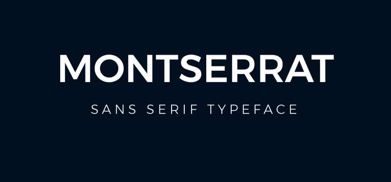
Montserrat is a geometric sans-serif font designed by Julieta Ulanovsky in 2011, available through Google Fonts under the SIL Open Font License. It delivers high legibility across small and large display sizes through a tall x-height and wide apertures.
Montserrat suits Facebook ad headlines because its 9-weight range (Thin 100 to Black 900) covers the full ad hierarchy from body copy to bold CTAs in a single typeface family. It is used on over 19 million websites and was ranked the third most popular font on Google Fonts as of 2023.
What makes Montserrat suitable for Facebook ads?
Montserrat has a tall x-height relative to its cap height, which keeps letterforms open and legible at the compressed sizes used in Facebook mobile ad thumbnails. Its wide apertures in letters like “c”, “e”, and “a” reduce misread characters on low-DPI mobile screens. The geometric structure maintains clarity even when text is rendered over image backgrounds.
Key attributes:
| Attribute | Value |
| Classification | Geometric sans-serif |
| Designer | Julieta Ulanovsky, 2011 |
| Weight range | Thin 100 – Black 900 (9 weights) |
| Variable font | No |
| Recommended sizes | 16px–20px body; 28px+ headlines |
| Letter-spacing default | 0 (normal) |
| License | OFL – free for commercial use |
| Available on | Google Fonts, Adobe Fonts, Font Squirrel |
| Price | Free |
How does Montserrat perform in Facebook ad contexts?
Montserrat renders clearly at 16px–20px on mobile screens, which covers the body copy range in most static Facebook ad formats. Bold and ExtraBold weights produce high contrast against image backgrounds without requiring additional letter-spacing adjustments. Its geometric structure also holds well in video ad text overlays at compressed bitrates.
What are the best pairings for Montserrat in Facebook ads?
Montserrat pairs with Merriweather for headline-body combinations where editorial credibility matters, using Merriweather as the body font for longer ad copy. It pairs with Open Sans when a warmer, more neutral body tone is needed in e-commerce or service-based ads.
What are the limitations of Montserrat for Facebook ads?
Montserrat’s wide letter proportions consume more horizontal space than condensed alternatives like Oswald, making it less efficient for tight text overlays on square ad images. The Thin and ExtraLight weights (100–200) drop legibility significantly below 18px on mobile screens.
Montserrat – Recommended Use Cases Within Facebook Ads
- Best for: Headline text in static image ads; CTA buttons in carousel ads
- Avoid for: Small disclaimer text below 12px; reversed-out text on busy or textured backgrounds
- Optimal weight: SemiBold 600 for headlines; Regular 400 for body copy
- Optimal size range: 28px–48px for headlines; 16px–20px for body copy
—
Helvetica
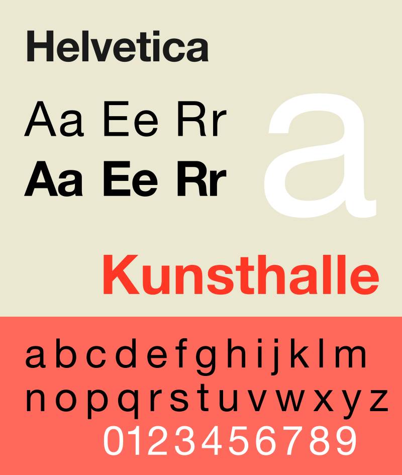
Helvetica is a neo-grotesque sans-serif typeface designed by Max Miedinger and Eduard Hoffmann in 1957, released by the Haas Type Foundry in Switzerland. It delivers neutral, high-density letterforms suited to brand-aligned ad headlines.
Helvetica works best for brand-awareness Facebook ads because its tight letter-spacing and high x-height produce a dense, authoritative appearance that aligns with established corporate identities. BMW, Lufthansa, and Toyota have all used it in long-running ad campaigns.
What makes Helvetica suitable for Facebook ads?
Helvetica’s stroke terminations land on strict horizontal and vertical axes, which produces consistent visual weight across all ad headline sizes. Its unusually tight default letter-spacing creates a compact appearance that fits more characters per line than most comparable sans-serifs. Helvetica Now (2019) adds three optical sizes, including a Micro variant optimized for small screen rendering.
Key attributes:
| Attribute | Value |
| Classification | Neo-grotesque sans-serif |
| Designer | Max Miedinger & Eduard Hoffmann, 1957 |
| Weight range | Thin – Black (51 weights in Neue; variable in Helvetica Now) |
| Variable font | Yes (Helvetica Now Variable) |
| Optical sizes | Yes – Display, Text, Micro (Helvetica Now) |
| Recommended sizes | 24px+ for headlines; 14px+ for body copy |
| Letter-spacing default | Tight |
| License | Commercial – Monotype license required |
| Available on | Adobe Fonts (subscription), Monotype direct |
| Price | Subscription or one-time purchase via Monotype |
How does Helvetica perform in Facebook ad contexts?
Helvetica’s narrow apertures limit legibility at small sizes on screen, a known structural limitation for mobile ad formats. At 24px and above, its high x-height produces strong headline impact in static ads. The Micro optical size in Helvetica Now partially addresses the small-text legibility issue, but requires the paid Helvetica Now license.
What are the best pairings for Helvetica in Facebook ads?
Helvetica pairs with Garamond for ads targeting premium or heritage brand audiences, where the serif body creates editorial contrast. It pairs with Roboto as a free system alternative when Helvetica licensing is not available for ad production at scale.
What are the limitations of Helvetica for Facebook ads?
Helvetica requires a paid commercial license, which adds cost for agencies producing high-volume ad creative. Its narrow apertures reduce character-level legibility below 14px on mobile screens, making it a poor choice for body copy in text-heavy Facebook ad formats.
Helvetica – Recommended Use Cases Within Facebook Ads
- Best for: Brand awareness headlines in static ads; logo-adjacent typography in banner ads
- Avoid for: Body text below 14px; ad formats requiring high-volume, low-cost font production
- Optimal weight: Medium or Bold for headlines; Regular for short subheadings
- Optimal size range: 24px–60px for display use in ads
—
Open Sans

Open Sans is a humanist sans-serif typeface designed by Steve Matteson (Type Director of Ascender Corp) in 2011, released through Google Fonts under the Apache License. It provides consistent legibility across print, mobile, and web interfaces through open letter forms and upright stress.
Open Sans optimizes body copy in Facebook ads because its open apertures and upright stroke stress maintain readability at 14px–18px on compressed mobile displays. Google selected it as a core interface font, a decision based on its broad language support and rendering consistency across platforms.
What makes Open Sans suitable for Facebook ads?
Open Sans has a notably open aperture design, meaning letters like “c”, “e”, “s”, and “a” have wide openings that reduce character confusion at small sizes. Its upright stress (no diagonal slant in stroke weight) produces uniform rendering across both serif-friendly and sans-friendly screen types. The family supports 897 characters, covering most multilingual ad campaigns without font substitution.
Key attributes:
| Attribute | Value |
| Classification | Humanist sans-serif |
| Designer | Steve Matteson, 2011 |
| Weight range | Light 300 – ExtraBold 800 (6 weights) |
| Variable font | Yes |
| Recommended sizes | 14px–18px for body copy; 24px+ for headlines |
| Letter-spacing default | 0 (normal) |
| License | Apache License 2.0 – free for commercial use |
| Available on | Google Fonts, Adobe Fonts |
| Price | Free |
How does Open Sans perform in Facebook ad contexts?
Open Sans renders with high consistency across Android and iOS, which matters when Facebook serves the same ad creative to users on different device types. Its open forms reduce visual compression on low-resolution screens. It has accumulated nearly 30 billion uses across Google Fonts, which reflects its cross-platform rendering reliability rather than any single design advantage.
What are the best pairings for Open Sans in Facebook ads?
Open Sans pairs with Montserrat for geometric-meets-humanist ad typography, using Montserrat as the headline and Open Sans for body copy. It pairs with Oswald for ads that need a condensed, high-impact headline against a neutral body, a common structure in performance-focused ad creative.
What are the limitations of Open Sans for Facebook ads?
Open Sans lacks a Black weight (900), capping at ExtraBold 800, which limits maximum visual impact for attention-capture headlines. Its neutral, all-purpose design provides little brand differentiation when used without a contrasting display font.
Open Sans – Recommended Use Cases Within Facebook Ads
- Best for: Body copy in text-heavy static ads; multilingual ad campaigns requiring broad character support
- Avoid for: Solo use as headline font where strong brand personality is required
- Optimal weight: Regular 400 for body; SemiBold 600 for subheadings
- Optimal size range: 14px–18px for body; 22px–32px for subheads
—
Oswald
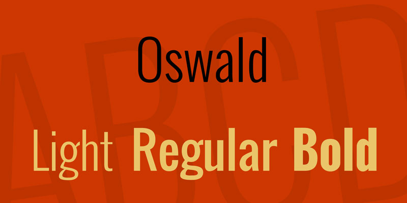
Oswald is a condensed sans-serif typeface designed by Vernon Adams in 2011, released through Google Fonts under the OFL. It compresses Alternate Gothic–style letterforms into a tight, vertically oriented structure built for headline impact.
Oswald works best for Facebook ad headlines because its condensed proportions allow longer text strings to fit within image overlay constraints without line breaks. Its tall x-height and 6 available weights make it effective for attention-capture text on both square and story ad formats.
What makes Oswald suitable for Facebook ads?
Oswald’s condensed width packs more characters per line than standard-width sans-serifs at the same point size. Its tall x-height relative to cap height keeps letterforms open even at compressed sizes. Adobe Fonts lists it in 7 styles, and Google Fonts provides 6 weights (ExtraLight 200 to Bold 700), covering the key headline and subheading range for ad creatives.
Key attributes:
| Attribute | Value |
| Classification | Condensed sans-serif |
| Designer | Vernon Adams, 2011 |
| Weight range | ExtraLight 200 – Bold 700 (6 weights) |
| Variable font | No |
| Recommended sizes | 20px–48px for ad headlines |
| Letter-spacing default | Tight (condensed) |
| License | OFL – free for commercial use |
| Available on | Google Fonts, Adobe Fonts |
| Price | Free |
How does Oswald perform in Facebook ad contexts?
Oswald’s condensed structure renders with high visual punch at large display sizes (30px–60px), making it effective for scroll-stopping ad headlines. Its aggressive vertical proportions work particularly well in portrait-oriented Story ads where vertical space is limited. At body copy sizes (below 16px), the tight letter-spacing reduces readability on low-DPI screens.
What are the best pairings for Oswald in Facebook ads?
Oswald pairs with Open Sans for a high-contrast headline-body combination where the condensed headline anchors the layout and the open humanist body carries detail copy. It pairs with Lato when a warmer, less aggressive body tone is needed for lifestyle or wellness brand ads.
What are the limitations of Oswald for Facebook ads?
Oswald caps at Bold 700, which limits maximum stroke weight for extreme high-contrast ad headlines. It lacks an ExtraBold or Black variant, making it less effective than Montserrat or Roboto for brands that require maximum visual weight at headline level.
Oswald – Recommended Use Cases Within Facebook Ads
- Best for: Short, high-impact headlines in static image ads; Story ad text overlays
- Avoid for: Body copy below 16px; ads with long headline strings requiring multiple lines
- Optimal weight: Medium 500 or Bold 700 for headlines
- Optimal size range: 24px–60px for headline use
—
Lato
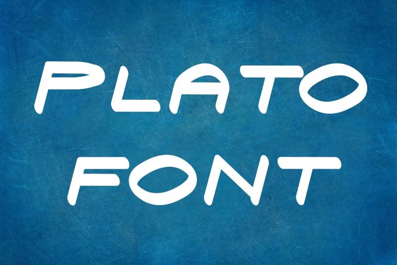
Lato is a humanist sans-serif typeface designed by Łukasz Dziedzic in 2010, released through Google Fonts under the OFL. Its semi-rounded letterforms and precise corners produce professional readability across ad body copy and subheading sizes.
Lato suits Facebook ad body copy because its slightly rounded terminals soften the appearance compared to strictly geometric sans-serifs, which reduces visual fatigue in longer ad text. It supports 5 weights with matching italics, covering the typical hierarchy in multi-line ad creatives.
What makes Lato suitable for Facebook ads?
Lato uses a humanist structure with slightly rounded stroke endings that render clearly at 14px–18px on compressed mobile ad displays. Its consistent stroke weight across Regular and Medium avoids the ink-trap artifacts that affect thin-stroked fonts at small screen sizes. The Bold weight produces strong CTA button text contrast without the visual heaviness of Black-weight alternatives.
Key attributes:
| Attribute | Value |
| Classification | Humanist sans-serif |
| Designer | Łukasz Dziedzic, 2010 |
| Weight range | Thin 100 – Black 900 (5 weights) |
| Variable font | No |
| Recommended sizes | 14px–18px for body; 22px+ for subheads |
| Letter-spacing default | 0 (normal) |
| License | OFL – free for commercial use |
| Available on | Google Fonts |
| Price | Free |
How does Lato perform in Facebook ad contexts?
Lato accumulates nearly 10 billion uses on Google Fonts, reflecting its broad adoption in digital interfaces where screen rendering consistency matters. Its neutral but approachable character makes it effective for e-commerce Facebook ads where the copy needs to feel professional without being cold. The Black weight (900) provides maximum headline contrast for promotional or discount-focused ad creatives.
What are the best pairings for Lato in Facebook ads?
Lato pairs with Oswald for ads requiring a condensed, punchy headline over a clean body font, standard practice for direct-response ad formats. It pairs with Playfair Display when a contrast between editorial serif headlines and neutral sans-serif body copy is needed for lifestyle or fashion brand ads.
What are the limitations of Lato for Facebook ads?
Lato’s 5-weight family skips SemiBold and ExtraBold, which limits intermediate weight options for ad hierarchy between Regular and Bold. Its Thin weight (100) drops legibility below 20px, making it unsuitable for small ad copy without weight adjustment.
Lato – Recommended Use Cases Within Facebook Ads
- Best for: Body copy and subheadings in e-commerce and service ads; CTA button text at Bold 700
- Avoid for: Thin-weight text below 20px; single-font ads requiring 6+ weight variations
- Optimal weight: Regular 400 for body; Bold 700 for CTAs; Black 900 for promotional headlines
- Optimal size range: 14px–18px for body; 28px–48px for headlines
—
Proxima Nova
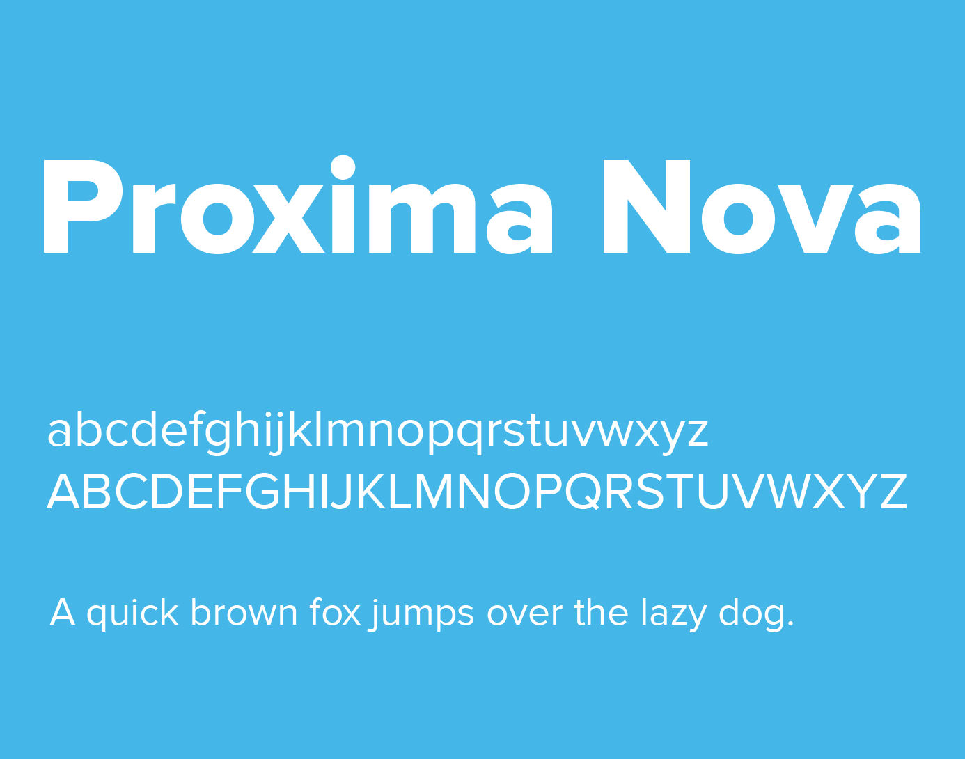
Proxima Nova is a geometric sans-serif typeface designed by Mark Simonson in 2005 (originally 1994), available through Adobe Fonts and Mark Simonson Studio. It bridges geometric structure with grotesque proportions, producing a typeface used by BuzzFeed, Mashable, NBC, TikTok, and Wired.
Proxima Nova works best for premium brand Facebook ads because its hybrid geometry-grotesque structure reads as both modern and authoritative across a full 8-weight range. Its x-height and open apertures produce strong legibility in compressed mobile ad formats without sacrificing brand-level visual quality.
What makes Proxima Nova suitable for Facebook ads?
Proxima Nova supports 8 weights from Thin to Black, with condensed and extra-condensed variants that expand its utility across multiple ad formats. Its letterforms use slightly rounded stroke joints that improve rendering on anti-aliased mobile screens compared to strictly geometric alternatives. The condensed variants allow longer headline strings in square or story ad formats without reducing font size.
Key attributes:
| Attribute | Value |
| Classification | Geometric / grotesque hybrid sans-serif |
| Designer | Mark Simonson, 2005 |
| Weight range | Thin 100 – Black 900 (8 weights + condensed variants) |
| Variable font | No |
| Recommended sizes | 14px–18px for body; 24px+ for headlines |
| Letter-spacing default | 0 (normal) |
| License | Commercial – Adobe Fonts subscription or direct purchase |
| Available on | Adobe Fonts, Mark Simonson Studio |
| Price | Adobe Fonts subscription / from ~$29 direct |
How does Proxima Nova perform in Facebook ad contexts?
Proxima Nova renders with high visual quality at headline sizes (24px–60px) in static image ads, producing clear stroke contrast against both light and dark ad backgrounds. Its brand associations with major digital media companies mean it carries implicit credibility signals for ads targeting tech-savvy audiences. At body copy sizes, it performs comparably to Montserrat but with slightly warmer grotesque proportions.
What are the best pairings for Proxima Nova in Facebook ads?
Proxima Nova pairs with Georgia for ads targeting older demographics or premium service audiences, where the serif body adds trust signals. It pairs with Playfair Display in luxury or fashion ads where an editorial contrast between geometric headline and high-contrast serif body is appropriate.
What are the limitations of Proxima Nova for Facebook ads?
Proxima Nova requires a paid license, which adds production cost for agencies running high-volume Facebook ad campaigns across multiple clients. Free alternatives like Montserrat or Nunito cover similar structural territory for teams without an Adobe Fonts subscription.
Proxima Nova – Recommended Use Cases Within Facebook Ads
- Best for: Brand-level headlines in premium or tech-adjacent Facebook ads; multi-format campaigns requiring condensed and standard width variants
- Avoid for: Budget-constrained ad production without Adobe Fonts access
- Optimal weight: Regular 400 for body; Bold or Semibold for headlines; Black for promotional CTAs
- Optimal size range: 16px–20px for body; 28px–52px for headlines
—
Raleway
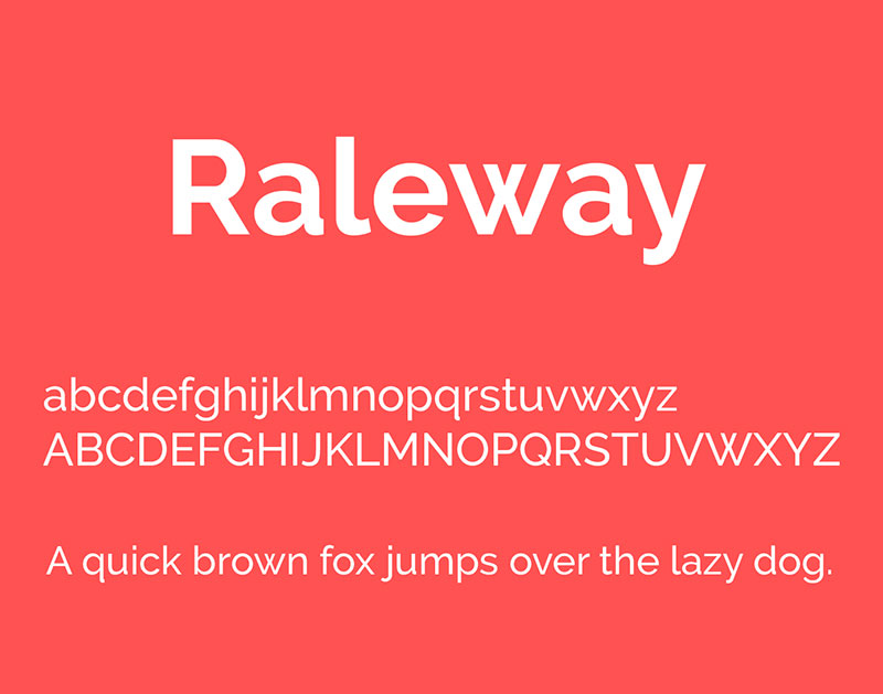
Raleway is an elegant display sans-serif typeface originally designed by Matt McInerney in 2010 as a single Thin weight, later expanded to 9 weights by Pablo Impallari and Rodrigo Fuenzalida in 2012. It is available through Google Fonts under the SIL OFL.
Raleway suits high-end or lifestyle Facebook ads because its thin-to-Black weight range spans from ultra-refined display text to bold headlines, covering the full visual hierarchy of premium brand ad creatives in a single family. Brands in fashion, wellness, and real estate commonly use it in social ad formats.
What makes Raleway suitable for Facebook ads?
Raleway’s 9 weights from Thin 100 to Black 900 provide broad typographic control within a single typeface, reducing the need for secondary font pairings. Its elegant, slightly geometric structure maintains legibility at large display sizes while the lighter weights add refinement to supporting text. The SIL OFL license makes it fully free for commercial ad production at any scale.
Key attributes:
| Attribute | Value |
| Classification | Display sans-serif (elegant geometric) |
| Designer | Matt McInerney, 2010; expanded by Impallari & Fuenzalida, 2012 |
| Weight range | Thin 100 – Black 900 (9 weights) |
| Variable font | Yes |
| Recommended sizes | 22px+ for headlines; 15px+ for body in lighter weights |
| Letter-spacing default | Slightly wide |
| License | OFL – free for commercial use |
| Available on | Google Fonts, Font Squirrel |
| Price | Free |
How does Raleway perform in Facebook ad contexts?
Raleway’s elegant Thin and Light weights produce high visual refinement at large headline sizes (32px+) in premium static ads, but drop legibility quickly below 18px on compressed mobile screens. The Bold and ExtraBold weights (700–800) render with strong contrast for promotional headlines in square and carousel ad formats. Its slightly wide default letter-spacing adds breathing room in text-over-image layouts.
What are the best pairings for Raleway in Facebook ads?
Raleway pairs with Lato for contrast in weight and structural warmth, using Raleway for headlines and Lato for body copy in lifestyle or fashion ads. It pairs with Open Sans when a more neutral, widely supported body font is needed alongside Raleway’s refined headlines.
What are the limitations of Raleway for Facebook ads?
Raleway’s Thin and ExtraLight weights (100–200) lose legibility below 20px on mobile screens, which limits their use in any Facebook ad format with small supporting text. Its display-oriented design makes it a weaker choice for body-heavy ad formats like lead generation ads with multi-line copy.
Raleway – Recommended Use Cases Within Facebook Ads
- Best for: Premium brand headlines in fashion, wellness, or real estate static ads; single-line headline overlays in Story ads
- Avoid for: Body copy below 15px; budget or discount promotion ads where refinement conflicts with the brand message
- Optimal weight: SemiBold 600 or Bold 700 for ad headlines; Medium 500 for subheadings
- Optimal size range: 28px–56px for headline use
—
Roboto

Roboto is a humanist sans-serif typeface designed by Christian Robertson and released by Google in 2011, available through Google Fonts under the Apache License. It combines a mechanical skeleton with open, friendly curves to produce the default Android system font.
Roboto optimizes Facebook ad body copy and interface-adjacent creatives because its mechanical skeleton and open curves were specifically engineered for screen rendering across variable display densities. It has accumulated over 6.3 trillion views on Google Fonts, making it the most widely rendered sans-serif on digital screens.
What makes Roboto suitable for Facebook ads?
Roboto supports 12 styles across 6 weights (Thin 100 to Black 900) with matching italics, providing complete typographic hierarchy in a single family. Its mechanical skeleton maintains consistent stroke weight across weight variants, which reduces rendering inconsistency when the same ad creative is served across iOS and Android devices. The regular weight renders clearly at 14px on both Retina and standard-density mobile screens.
Key attributes:
| Attribute | Value |
| Classification | Humanist / neo-grotesque sans-serif |
| Designer | Christian Robertson, 2011 |
| Weight range | Thin 100 – Black 900 (6 weights, 12 styles) |
| Variable font | Yes |
| Recommended sizes | 14px–18px for body; 24px+ for headlines |
| Letter-spacing default | 0 (normal) |
| License | Apache License 2.0 – free for commercial use |
| Available on | Google Fonts, Adobe Fonts |
| Price | Free |
How does Roboto perform in Facebook ad contexts?
Roboto’s origins as an Android system font mean it renders with high fidelity on Android devices, which account for a large share of Facebook’s mobile user base. Its open curves and dual-nature design (geometric structure, humanist proportions) produce consistently readable text in both headline and body copy positions within ad creatives. The Condensed variant extends its utility to tight text-overlay situations in square and portrait ad formats.
What are the best pairings for Roboto in Facebook ads?
Roboto pairs with Playfair Display for ads that need editorial contrast between a neutral body and a high-contrast serif headline. It pairs with Oswald for direct-response ads where the condensed headline draws immediate attention and Roboto body copy delivers the supporting message efficiently.
What are the limitations of Roboto for Facebook ads?
Roboto’s ubiquity as a system font limits its brand differentiation in Facebook ads where visual distinctiveness matters. Brands in premium or luxury categories risk appearing generic when using Roboto without a strong contrasting display font.
Roboto – Recommended Use Cases Within Facebook Ads
- Best for: Body copy in performance-focused ads; app-install or tech-adjacent ad creatives where system-native feel adds trust
- Avoid for: Solo use as headline font in premium brand campaigns; luxury or fashion ads where generic appearance undermines brand value
- Optimal weight: Regular 400 for body; Medium 500 or Bold 700 for CTAs and subheadings
- Optimal size range: 14px–18px for body; 24px–44px for subheadings and headlines
—
Merriweather
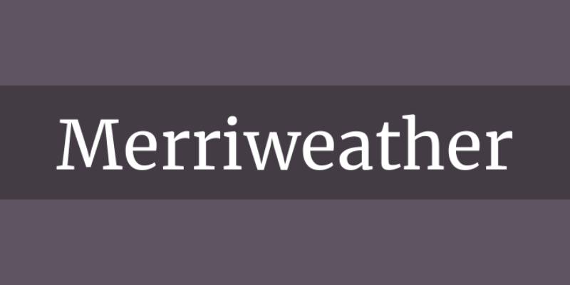
Merriweather is a humanist serif font designed by Eben Sorkin in 2010, released through Google Fonts under the OFL. It was built specifically for screen readability, with tall x-height, wide counters, and sturdy serifs that hold at compressed display sizes.
Merriweather suits Facebook ads for trust-sensitive categories (finance, healthcare, legal services) because its serif structure and humanist proportions signal authority and credibility. The 4-weight family covers body copy through bold headline use within a single typeface.
What makes Merriweather suitable for Facebook ads?
Merriweather was designed with slightly diagonal strokes and open, rounded forms that retain character definition at screen resolutions from 72 DPI to Retina-level displays. Its sturdy serifs do not break down at body copy sizes the way high-contrast serif fonts like Bodoni do on mobile screens. The x-height is tall relative to cap height, which keeps text open and legible in compressed ad image formats.
Key attributes:
| Attribute | Value |
| Classification | Humanist serif |
| Designer | Eben Sorkin, 2010 |
| Weight range | Light 300 – Black 900 (4 weights) |
| Variable font | No |
| Recommended sizes | 16px–20px for body; 28px+ for headlines |
| Letter-spacing default | 0 (normal) |
| License | OFL – free for commercial use |
| Available on | Google Fonts, Adobe Fonts, Font Squirrel |
| Price | Free |
How does Merriweather perform in Facebook ad contexts?
Merriweather renders with strong legibility at 16px–20px on mobile screens, a key advantage for body-heavy Facebook lead generation ads where multiple lines of copy must remain readable. Its sturdy serif construction produces good contrast on both white and lightly colored ad backgrounds. At headline sizes (32px+), the Bold and Black weights produce authoritative visual weight for trust-building brand messages.
What are the best pairings for Merriweather in Facebook ads?
Merriweather pairs with Montserrat for a classic serif-body plus geometric-headline combination, effective in finance, education, and professional service Facebook ads. It pairs with Open Sans when a fully neutral, sans-serif headline is preferred and Merriweather carries the body copy role.
What are the limitations of Merriweather for Facebook ads?
Merriweather’s 4-weight family (Light, Regular, Bold, Black) skips Medium and SemiBold, creating a large visual jump between Regular 400 and Bold 700. This limits subtle weight differentiation in multi-level ad typographic hierarchies.
Merriweather – Recommended Use Cases Within Facebook Ads
- Best for: Body copy in trust-sensitive ad categories (finance, healthcare, legal); headline text for editorial or content-marketing Facebook ads
- Avoid for: Ads with complex 4-level typographic hierarchy requiring intermediate weights; high-energy promotional ads where serif formality conflicts with brand tone
- Optimal weight: Regular 400 for body copy; Bold 700 for headlines; Black 900 for high-contrast promotional text
- Optimal size range: 16px–20px for body; 28px–48px for headlines
—
Futura

Futura is a geometric sans-serif font designed by Paul Renner and released in 1927 by the Bauer Type Foundry in Frankfurt, Germany. It is based on near-perfect geometric forms (circle, triangle, square) and remains one of the most widely used typefaces in advertising after nearly 100 years.
Futura suits premium and aspirational Facebook ads because its geometric precision and low x-height produce a distinct visual signature that brands like Volkswagen, FedEx, Red Bull, and Supreme have used to convey authority and modernity. Its stroke uniformity makes it highly effective at large display sizes in static ad creatives.
What makes Futura suitable for Facebook ads?
Futura uses strokes of near-even weight with very low contrast between thick and thin strokes, which produces consistent rendering across different screen brightness levels and ad image compression settings. Its geometric capital forms match the proportions of classical Roman capitals, making it effective for brand wordmarks and headline text in the same creative. The Futura Now release (2019, Monotype) adds 102 styles and a variable font version.
Key attributes:
| Attribute | Value |
| Classification | Geometric sans-serif |
| Designer | Paul Renner, 1927 |
| Weight range | Light – ExtraBlack (varies by version; Futura Now: 102 styles) |
| Variable font | Yes (Futura Now Variable) |
| Recommended sizes | 20px+ for headlines; 14px+ for body (with caution at small sizes) |
| Letter-spacing default | Slightly wide |
| License | Commercial – Bauer Types / Monotype license required |
| Available on | Adobe Fonts (subscription), Bauer Types direct, Monotype |
| Price | Subscription or one-time purchase |
How does Futura perform in Facebook ad contexts?
Futura’s low x-height relative to cap height means it reads as smaller than most sans-serifs at equivalent point sizes, which requires slightly larger size settings in Facebook ad image text to maintain the same perceived legibility as Montserrat or Open Sans at the same px value. At large display sizes (36px+), its geometric precision produces high visual impact for premium brand headlines. Its low stroke contrast holds well across JPEG-compressed ad images.
What are the best pairings for Futura in Facebook ads?
Futura pairs with Merriweather for a contrast between geometric modernism and humanist serif warmth, effective in tech or lifestyle brand ads that target trust-building with visual sophistication. It pairs with Open Sans when a free, highly legible body font is needed to offset Futura’s premium-licensed headline position.
What are the limitations of Futura for Facebook ads?
Futura requires a paid commercial license, which adds cost for ad production at scale. Its low x-height reduces legibility at body copy sizes below 16px on mobile screens, making it a weaker choice for text-heavy Facebook ad formats compared to high-x-height alternatives like Montserrat or Lato.
Futura – Recommended Use Cases Within Facebook Ads
- Best for: Premium brand headlines in static image ads; single-line CTA text in story ads for fashion, automotive, or tech brands
- Avoid for: Body copy below 16px; high-volume ad production requiring free font licensing
- Optimal weight: Book or Medium for headlines; Bold for CTAs
- Optimal size range: 28px–60px for headline use (size up 10–15% vs. comparable sans-serifs to compensate for low x-height)
—
Font Comparison: Quick Reference for Facebook Ad Typography
Use this table to match font choice to your specific ad objective and budget constraints.
| Font | Classification | License | Best Ad Use | Avoid For |
| Montserrat | Geometric sans-serif | Free (OFL) | Headlines, CTAs | Small text <12px |
| Helvetica | Neo-grotesque sans-serif | Paid | Brand awareness headlines | Body copy <14px |
| Open Sans | Humanist sans-serif | Free (Apache) | Multilingual body copy | Solo headline font |
| Oswald | Condensed sans-serif | Free (OFL) | Short, punchy headlines | Multi-line body copy |
| Lato | Humanist sans-serif | Free (OFL) | E-commerce body copy | Text below 14px |
| Proxima Nova | Geometric/grotesque hybrid | Paid | Premium brand ads | No Adobe Fonts access |
| Raleway | Display sans-serif | Free (OFL) | Premium lifestyle headlines | Body copy <15px |
| Roboto | Humanist/neo-grotesque | Free (Apache) | Tech and app-install ads | Luxury brand campaigns |
| Merriweather | Humanist serif | Free (OFL) | Trust-sensitive categories | High-energy promo ads |
| Futura | Geometric sans-serif | Paid | Premium brand headlines | Body copy <16px |
For ads where pairing fonts is part of the creative strategy, the general rule is one display font for the headline and one high-legibility sans-serif for body copy. Limiting your ad to two typefaces reduces visual noise and keeps the message hierarchy clear at a glance.
Understanding the difference between serif vs sans-serif fonts is useful when selecting ad typography for different audience segments. Serifs (Merriweather) tend to perform better in trust-sensitive categories; sans-serifs (Montserrat, Lato, Roboto) generally outperform in conversion-focused and mobile-first ad formats.
If you want to test combinations before committing, a font pairing generator can speed up the evaluation process. Also check fonts for ads for a broader overview of advertising-specific typeface choices beyond the Facebook platform.
For context on how major platforms handle their own typography, the Facebook font itself has changed over time and reflects many of the same legibility priorities discussed in this article.
How Does Font Choice Affect Facebook Ad Performance?
88% of Facebook users access the platform on a mobile device (Invoca, 2024). Every font decision in your ad creative is, by default, a mobile typography decision.
Facebook feed engagement drops after 3 seconds of scroll time, and the average session has dropped from 39 minutes in 2018 to around 33 minutes by 2022 (RecurPost). Your ad text has a narrow window to register.
Font readability directly controls how fast a viewer processes ad copy. A slower processing time increases the likelihood of a scroll-past before the message lands.
Google found that ads using clean, legible fonts produced 12% more clicks than equivalents with decorative or harder-to-read typefaces (Content and Marketing, 2023).
Two distinct dimensions apply here: legibility (how clearly individual letters are distinguished) and readability (how easily a full text block is scanned). Both matter in Facebook ads, but they apply differently by format.
- Legibility governs headline recognition at thumbnail size
- Readability governs body copy scanning in carousel and lead generation ad formats
- Both fail simultaneously when font weight is too thin or letter-spacing is too tight on low-DPI mobile screens
Understanding the psychology behind typeface choices adds another layer. Fonts carry emotional signals that influence whether a viewer pauses or keeps scrolling, independent of the words they contain.
Monotype’s 2024 Font Use and Forecasting Survey found that 83% of designers acknowledge typography as critical to brand identity. In ad creative, that signal reaches the viewer before the headline is even read.
The practical output: font selection in a Facebook ad is not a stylistic afterthought. It is a performance variable with measurable impact on click-through rate, brand recognition, and cognitive processing speed.
—
What Font Classification Works Best for Facebook Ads?
Monotype’s 2024 survey found that 76% of designers prioritize readability and accessibility in font selection, with sans-serif consistently ranking as the top classification choice for digital contexts.
That preference is structural, not aesthetic. Sans-serif fonts have open apertures and uniform stroke weight, which means they hold up under JPEG compression and low screen density better than high-contrast alternatives.
| Classification | Key Structural Trait | Best Ad Format Fit | Risk |
| Geometric sans-serif | Uniform stroke weight, open apertures | Static image, carousel headlines | Low personality differentiation |
| Humanist sans-serif | Open forms, upright stress | Body copy, multilingual ads | Weaker at very large headline sizes |
| Condensed sans-serif | Narrow width, tall x-height | Story ads, text-heavy overlays | Poor body copy legibility below 16px |
| Humanist serif | Sturdy serifs, wide counters | Trust-category ads (finance, legal) | Breaks down under heavy JPEG compression |
| Display / script | Decorative stroke variation | Single-word or logo-adjacent use only | Fails legibility at compressed ad sizes |
Around 70% of Fortune 500 companies use sans-serif fonts in their logos (Linearity). The pattern reflects the same structural reason that applies to ad creatives: uniform stroke weight survives compression and small-screen rendering better than serif alternatives.
A display font is a format-specific tool, not a general-purpose ad typeface. It works for a single headline line in a Story ad. It fails as body copy in a carousel or lead generation format.
Do Serif Fonts Work in Facebook Ads?
Serif fonts work in specific conditions. They do not work as a default choice.
When serifs perform in Facebook ads:
- Trust-sensitive categories: finance, healthcare, legal services, insurance
- Headline sizes at 28px or above, where serifs render without breaking down
- Humanist serif subtypes only (Merriweather, Georgia) rather than high-contrast designs like Bodoni or Didot
Monotype’s global typography research (2023) found that sans-serif fonts scored highest for conveying trust in 7 out of 8 countries surveyed. Serif fonts outperformed only in Germany for the trust dimension.
Avoid for Facebook ads: high-contrast serifs (Bodoni, Didot) at any size, and any serif used as body copy below 16px. JPEG compression collapses thin serif strokes into artifacts.
—
What Font Size and Weight Produce the Best Results in Facebook Ads?
Body text at 16px minimum is the consistent recommendation across digital ad typography standards (Content and Marketing, 2024). Below that, mobile rendering on standard-density screens drops legibility regardless of font choice.
Headline range: 28px–48px for static image ads. Body copy range: 14px–18px for carousel and lead ad formats. These are not soft guidelines. They are the thresholds where legibility holds across the device density range Facebook serves ads to.
Font weight controls visual hierarchy in ad creative. The jump from Regular 400 to Bold 700 is the most commonly used contrast in performance ad creatives. Black 900 is reserved for maximum-impact promotional headlines where the ad’s sole goal is attention capture.
| Weight | Numeric Value | Ad Use Case |
| Regular | 400 | Body copy, supporting text |
| SemiBold | 600 | Subheadings, secondary CTAs |
| Bold | 700 | Primary headlines, CTA buttons |
| Black | 900 | Promotional headlines, discount ads |
Font spacing matters too. Good spacing reduces reading fatigue by 25%, according to Smashing Magazine (2024). For ad creatives, a line height of 1.2–1.5x the font size keeps text overlay legible without crowding the image.
Weights below 300 (Thin, ExtraLight) fail legibility below 20px on compressed mobile ad displays. Raleway Thin and Helvetica Light are frequent offenders in poorly performing ad creatives where the designer prioritized elegance over render reliability.
Venngage’s platform data shows 94% of designers choose larger font sizes over heavier weights when emphasizing content, and 76% combine both in final designs (Toner Buzz, 2024). For ad creative production, that combination (size increase plus weight increase) is the most reliable approach to hierarchy clarity.
—
How Do Font Pairings Work in Facebook Ad Design?
Limit your ad to two typefaces. One display or headline font, one high-legibility body font.
Three or more typefaces in a single ad creative increase cognitive load without adding hierarchy clarity. The viewer’s brain registers visual noise rather than a clear message.
Font pairing in ad creative follows a different logic than pairing for editorial design. The constraint is compression: the pairing must hold up as a JPEG at 1080x1080px, rendered at 3x DPI on a 6-inch screen, in under 3 seconds of exposure.
Geometric headline + humanist body: The most reliable pattern for Facebook ads. Geometric sans-serifs (Montserrat, Futura) provide headline impact while humanist sans-serifs (Open Sans, Lato) carry body copy with open forms and screen-optimized spacing.
Condensed headline + standard body: Effective for Story ads and square formats with long headline text. Oswald Bold as headline, Lato Regular as body. The width contrast creates immediate visual separation without needing color or size difference to separate hierarchy levels.
Serif headline + sans-serif body: Use only in trust-sensitive ad categories. Merriweather Bold or Georgia Bold as headline, Open Sans as body. This combination works for financial services, healthcare, and legal ads where the serif signals authority and the sans-serif keeps body copy legible.
Canva’s platform data consistently shows Montserrat and Open Sans as the most-paired combination in social media ad templates. It is not the most distinctive choice, but it is the most failure-proof one for teams without dedicated typography expertise.
Production constraint worth noting: 47% of respondents in Monotype’s 2024 survey cited font licensing as challenging to navigate. Pairing two free OFL-licensed fonts (both from Google Fonts) removes that variable entirely for high-volume ad production.
Use a font pairing generator to test combinations visually before committing to a campaign. Pairing decisions that look good in a design tool often behave differently at compressed ad dimensions.
—
What Are the Licensing Rules for Fonts Used in Facebook Ads?
A single font file can cost $150,000 in a licensing dispute. That is the per-infringement amount Production Type demanded from Nike in 2023 for using a typeface outside its license terms (DesignYourWay, 2026).
Font licensing is the legal framework defining how a typeface can be used. Desktop, web, app, and print each carry separate license requirements. Ad creative production falls under commercial desktop and/or print use, depending on the output format.
About 70% of websites now use some form of self-hosted font (HTTP Archive, 2024), which signals how common unauthorized font deployment has become. The same risk applies to ad production teams reusing design files with fonts whose licenses were never verified for commercial use.
| Font / Source | License Type | Ad Creative Use | Key Restriction |
| Google Fonts | OFL / Apache 2.0 | Fully permitted, commercial use included | None for ad creatives |
| Adobe Fonts | CC Subscription | Permitted for static and video ad creatives | Requires active CC subscription; not transferable to clients |
| Proxima Nova | Per-user commercial | Permitted per license holder | Each user in an agency team needs a separate license |
| Helvetica / Futura | Monotype / Bauer Types commercial | Permitted under valid commercial license | Not included in most free or subscription bundles |
All Google Fonts are open-source, free, and carry no use restrictions for ad creative production (Cowan, DeBaets, Abrahams & Sheppard). No attribution is required. This makes Google Fonts the lowest-friction option for agencies producing ads across multiple client accounts.
Adobe Fonts covers commercial use for static and video ad creatives under a Creative Cloud subscription. The license does not transfer to clients. If a client receives design files containing Adobe Fonts and modifies them without their own CC subscription, that constitutes a license violation.
Common mistake: downloading fonts from third-party aggregators that strip original license files. The font file is identical to the original, but the EULA is absent. Using it in paid ad creative creates legal exposure regardless of intent.
Around 80% of professional designers pay for font licenses (Linearity, 2024). The 20% who do not are primarily working in contexts where free OFL fonts cover all production needs, not relying on unlicensed commercial fonts.
—
How Do Facebook Ad Formats Affect Font Selection?
Video accounts for over 60% of time spent on Facebook, and vertical video ads with audio see a 35% higher CTR than other Reels ad formats (IncRev, 2024). Font selection for video ad text overlays carries higher performance stakes than most advertisers account for.
Each Facebook ad format imposes different constraints on typography. A font that performs well in a static 1:1 image ad often fails in a 9:16 Story format, and vice versa.
Static image ads (1:1, 1.91:1): Standard-width fonts (Montserrat, Open Sans, Lato) fit the horizontal layout. Headlines at 28px–48px, body copy at 14px–18px. Text-to-image ratio is the primary constraint.
Carousel ads: Font consistency across all cards matters more than individual card optimization. Using a single font family across all weights (e.g., Roboto Thin for labels, Roboto Bold for headlines) reduces production time and maintains brand recognition as the viewer swipes.
Story ads (9:16 vertical): Horizontal space is limited. Condensed fonts (Oswald, Bebas Neue) pack more headline characters per line without reducing size. Standard-width fonts require either smaller size or line breaks, both of which reduce legibility.
Video ad text overlays: H.264 compression damages thin-stroked fonts. Raleway Thin and Helvetica Light break into JPEG-style artifacts at standard video bitrates. Bold and SemiBold weights (600–900) hold their form under compression.
Meta Ads Manager’s Advantage+ Creative Image Template offers a limited native font selection. Most brand-aligned ad creatives override it entirely with custom-designed assets in Canva, Figma, or Adobe Express.
Nike’s Facebook ad creative consistently uses bold, high-weight sans-serif fonts (close to Futura or Helvetica) at large headline sizes against minimal backgrounds. The weight and contrast hold across all four ad formats without requiring format-specific redesign.
The practical implication: choose fonts with a broad weight range (Thin 100 to Black 900) when building a multi-format campaign. A single family covering all weights eliminates consistency problems across format variants and reduces the licensing surface area to one typeface instead of several.
For a broader view of typeface decisions in paid media, the fonts for ads guide covers cross-platform advertising typography beyond the Facebook ecosystem.
FAQ on The Best Fonts For Facebook Ads
What is the best font for Facebook ads?
Montserrat is the most reliable choice. Its tall x-height, wide apertures, and 9-weight range cover every ad hierarchy level. It renders cleanly on mobile screens and works across static image ads, carousel formats, and story overlays without size adjustments.
Should I use a serif or sans-serif font in Facebook ads?
Sans-serif fonts perform better in most Facebook ad formats. Their open apertures survive JPEG compression and mobile rendering better than serif designs. Use a humanist serif like Merriweather only for trust-sensitive categories such as finance, healthcare, or legal services.
What font size works best for Facebook ad headlines?
Set headlines between 28px and 48px for static image ads. Body copy sits best at 14px–18px. Below 16px, most fonts drop legibility on standard-density mobile screens, which account for the majority of Facebook ad impressions.
Are Google Fonts free to use in Facebook ads?
Yes. All Google Fonts are licensed under the OFL or Apache 2.0 license, both of which permit commercial use with no restrictions. No attribution is required. Montserrat, Lato, Open Sans, Oswald, and Roboto are all fully free for paid ad creative production.
Can I use Helvetica or Futura in Facebook ads?
Both require paid commercial licenses. Helvetica is available through Monotype; Futura through Bauer Types and Adobe Fonts. Using either without a valid license creates legal exposure. Free alternatives like Roboto or Montserrat cover similar structural territory without licensing cost.
How many fonts should I use in one Facebook ad?
Two typefaces maximum. One display font for the headline, one legible sans-serif for body copy. Three or more fonts increase cognitive load without adding hierarchy clarity, which reduces the speed at which a viewer processes the ad message during scroll.
What font weight is best for Facebook ad CTAs?
Bold 700 is the standard for CTA button text. It produces strong contrast against most background colors without the visual heaviness of Black 900. SemiBold 600 works for secondary CTAs where you want emphasis without competing with the primary call to action.
Do fonts affect Facebook ad click-through rates?
Yes. Research from Content and Marketing (2023) found that ads using clean, legible fonts generated 12% more clicks than ads with decorative or hard-to-read typefaces. Font legibility directly affects how quickly a viewer processes the headline, which influences the decision to click.
What fonts work best for Facebook Story ads?
Condensed fonts like Oswald and bold-weight geometric sans-serifs like Montserrat Black perform best. The 9:16 vertical format limits horizontal space, so condensed widths allow longer headline text without reducing font size below the legibility threshold for mobile screens.
What is the best font pairing for Facebook ads?
Montserrat Bold for headlines paired with Open Sans Regular for body copy is the most reliable combination. Both are free OFL fonts, both render consistently across Android and iOS, and the geometric-to-humanist contrast creates clear visual hierarchy without requiring size or color differences to separate levels.
Conclusion
This conclusion is for an article presenting the best fonts for Facebook ads, and the core takeaway is simple: typeface selection is a performance variable, not a design preference.
Ad creative typography affects legibility, brand recognition, and how quickly a viewer processes your message before scrolling past.
Stick to two typefaces per ad. Prioritize x-height, weight range, and mobile rendering over visual novelty.
Free options like Montserrat, Open Sans, Lato, and Roboto cover the full range of ad formats without licensing risk. Paid options like Proxima Nova and Futura add differentiation, but only when the license is properly in place.
Get the font pairing right, set your sizes correctly, and the typography works for you, not against you.

Renowned for his expertise in logo design and visual branding, Bogdan has developed a multitude of logos for various clients.
His skills extend to creating posters, vector illustrations, business cards, and brochures. Additionally, Bogdan's UI kits were featured on marketplaces like Visual Hierarchy and UI8.
He also wrote in the past years on sites like Design Your Way, WebDesignerDepot, WPDean, Designmodo, Speckyboy, Slider Revolution, and more.
- Canva vs PowerPoint: Which Is Better for Presentations? - 22 September 2026
- How to Install Fonts on Mac (Step-by-Step Guide) - 20 September 2026
- From Mockup to Code: How AI-Augmented Development Speeds Up the Design Handoff - 19 September 2026

Bogdan Sandu is a seasoned designer who has been designing websites since 2008. Renowned for his expertise in logo design and visual branding, Bogdan has developed a multitude of logos for various clients. His skills extend to creating posters, vector illustrations, business cards, and brochures. Additionally, Bogdan's UI kits were featured on marketplaces like Visual Hierarchy and UI8. He also wrote in the past years on sites like Design Your Way, WebDesignerDepot, WPDean, Designmodo, Speckyboy, Slider Revolution, and more.
You Might Also Like