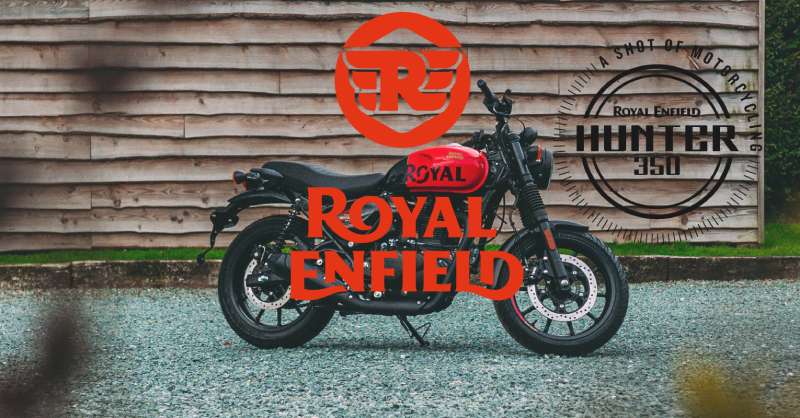
The Royal Enfield logo is one of the most recognized emblems in motorcycling. It combines a bold wordmark with a circular crest that carries over a century of brand heritage. The logo has gone through careful refinements while keeping its core identity intact.
Within motorcycle industry branding, few marks carry the same weight of history. Royal Enfield sits alongside brands like Harley-Davidson and Triumph as one of the oldest continuously operating motorcycle manufacturers in the world.
The current logo version was refined under Eicher Motors following the brand’s revival in the 1990s and 2000s. The Enfield Cycle Company was founded in 1893 in Redditch, England, and the logo has gone through roughly five major iterations across its history.
What is the Royal Enfield Logo?
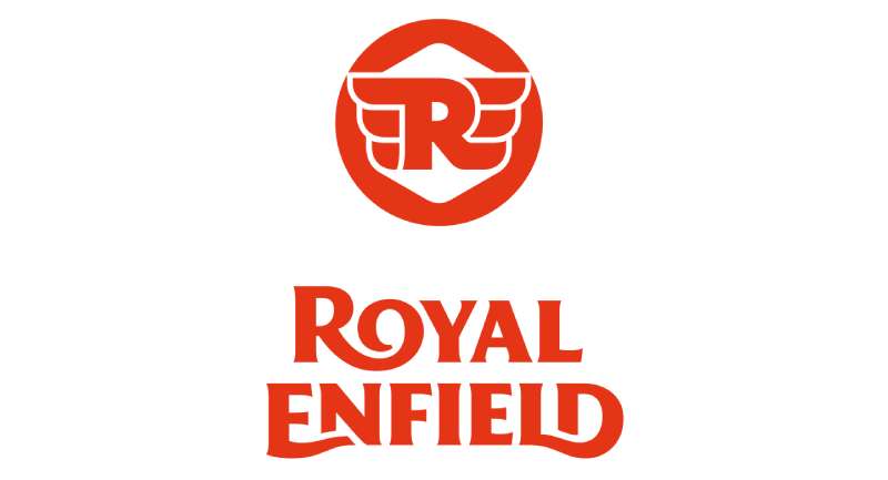
The Royal Enfield logo is a combination mark featuring a circular crest with the brand wordmark. It uses deep red and black as primary colors, draws from British heraldic design traditions, and has been in its current refined form since the early 2000s. No single external agency is officially credited for the current version.
- Design Type: Combination mark (emblem + wordmark)
- Primary Elements: Circular shield crest, “Royal Enfield” wordmark, lightning bolt motif, and the “Made Like A Gun” cannon symbol in certain badge variants
- Official Introduction Date: Current version refined circa 2002-2008; roots trace to early 1900s
- Designer/Agency: Developed internally; no single public-facing design agency credited
- Trademark Status: Registered trademark under Eicher Motors Ltd.
- Color Palette: Primary red (#C8102E), black (#000000), and gold/cream accents (#C9A84C)
- Usage Context: Motorcycle fuel tanks, apparel, dealership signage, digital platforms, merchandise, and marketing materials
How Has the Royal Enfield Logo Evolved Over Time?
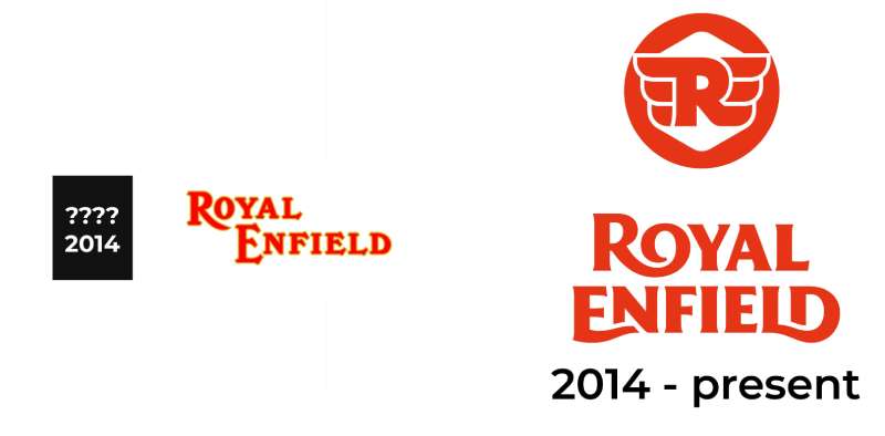
The Royal Enfield logo started as a straightforward British industrial mark in the late 1800s and gradually took on more heraldic character through the 20th century.
The cannon and the “Made Like A Gun” tagline became defining elements by the mid-1900s. Later versions under Indian ownership simplified certain details while keeping the shield and wordmark structure.
Original Royal Enfield Logo (1890s-1920s)
- Years Active: ~1893-1920s
- Design Description: Simple text-based mark with early crest elements; minimal ornamentation
- Color Scheme: Black and white (primarily for print)
- Designer: Unknown; developed by the Enfield Cycle Company in-house
- Context: Introduced during the company’s early years producing bicycles and rifles in Redditch, England
- Key Changes from Previous: N/A (first version)
- Cultural Significance: Reflected British industrial craftsmanship and the company’s military supply roots
Mid-Century Royal Enfield Logo (1930s-1960s)
- Years Active: ~1930s-1960s
- Design Description: More structured crest design; cannon motif appears more prominently; “Made Like A Gun” tagline in active use
- Color Scheme: Red and black introduced on physical badging
- Designer: Internal design, Enfield Cycle Company
- Context: Aligned with Royal Enfield’s peak British production era and military motorcycle contracts
- Key Changes from Previous: Added cannon iconography and more structured heraldic framing
- Cultural Significance: The cannon became a symbol tied directly to the brand’s military heritage
Indian Era Royal Enfield Logo (1970s-1990s)
- Years Active: ~1970s-1990s
- Design Description: Simplified version of the crest; adapted for production in India under Madras Motors/Enfield India
- Color Scheme: Red and black retained
- Designer: Adapted internally by Enfield India
- Context: British operations wound down; Indian manufacturing took over full production
- Key Changes from Previous: Slight simplification of crest detail for local production needs
- Cultural Significance: Marked the shift of the brand’s center of gravity from England to India
Modern Royal Enfield Logo (2000s-Present)
- Years Active: ~2002-present
- Design Description: Refined circular crest with cleaner lines, bold wordmark, and consistent red/black/gold color application
- Color Scheme: Red (#C8102E), black (#000000), gold accents (#C9A84C)
- Designer: Developed under Eicher Motors’ brand management team
- Context: Eicher Motors acquired Royal Enfield and repositioned it as a premium heritage motorcycle brand targeting global markets
- Key Changes from Previous: More refined proportions, consistent digital-ready color codes, cleaner typography treatment
- Cultural Significance: Signals the brand’s transition from a niche Indian manufacturer to a globally recognized heritage motorcycle company
What Do the Design Elements of the Royal Enfield Logo Mean?
The Royal Enfield logo pulls from British heraldic traditions, military history, and a century of motorcycling culture.
Each element, from the circular shield to the wordmark treatment, carries a specific connection to the brand’s identity and its “Made Like A Gun” legacy.
What Does the Crest Shape Symbolize in the Royal Enfield Logo?
The circular crest format signals heritage and authority.
It’s the same visual language used by British royal warrants and military insignia, which is exactly the association Royal Enfield wants.
The shape communicates that this isn’t a brand chasing trends. It’s a brand with a long record behind it.
What Is the Historical Context Behind the Logo’s Military References?
Royal Enfield supplied motorcycles to the British and Indian armies across both World Wars.
The cannon motif directly references the company’s origins manufacturing the Enfield rifle and supplying military equipment.
This history isn’t just background. It’s deliberately kept visible in the badge design.
What Cultural References Does the Logo Carry?
The logo sits at a crossroads between British imperial design and Indian motorcycling culture.
In India particularly, Royal Enfield carries strong associations with road trips, the Himalayas, and a certain kind of independence that other motorcycle brands haven’t managed to claim.
The badge has become a cultural shorthand for that identity.
How Does the Logo Connect to the Brand’s Core Values?
Royal Enfield’s positioning is built around the idea of “pure motorcycling.” The logo reinforces this through its traditional structure.
No gradients, no abstract shapes. Just a clean, confident mark that says this brand has been doing this for a long time and plans to keep doing it.
Why Did Royal Enfield Choose These Specific Colors?

- Red (#C8102E)
- Symbolic meaning: Power, passion, and action
- Psychological impact: Commands attention; associated with speed and energy in color psychology
- Brand connection: Longstanding Royal Enfield tank color; deeply embedded in brand recognition
- Black (#000000)
- Symbolic meaning: Strength, authority, and timelessness
- Psychological impact: Adds weight and seriousness to the mark
- Brand connection: Used across black logo applications and dark colorway variants of the badge
- Gold/Cream (#C9A84C)
- Symbolic meaning: Heritage, quality, and premium positioning
- Psychological impact: Elevates the mark; adds a sense of craftsmanship
- Brand connection: Appears in crest detailing and tank badge trim; reinforces the brand’s premium heritage tier
What Typography Style Is Used in the Royal Enfield Logo?
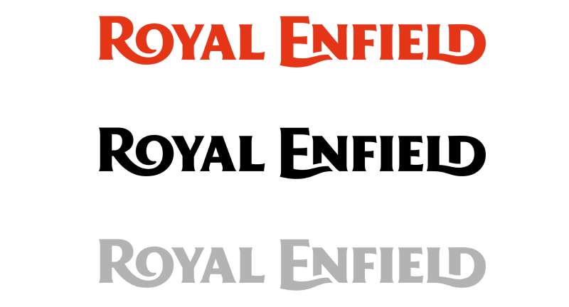
The wordmark uses a customized serif-style treatment with strong, even strokes.
It reads as a serif font with slightly condensed letterforms, giving it a sturdy, no-nonsense appearance.
The typography hasn’t chased any of the thin-weight trends that other brands have adopted. It stays thick and readable even at small sizes on a motorcycle tank.
The font choice aligns with the brand’s overall positioning: traditional, dependable, and not trying too hard.
What Are the Hidden Meanings in the Royal Enfield Logo?
The cannon, when it appears in the full badge version, is a direct nod to the brand’s original military manufacturing roots and not just decorative.
The circular framing subtly mirrors the shape of a wheel, which is either intentional or a very convenient coincidence.
There’s also the “Made Like A Gun” tagline embedded in some badge versions, which ties the physical product quality claim directly into the visual identity.
No officially stated “hidden” elements exist beyond these, but the layering of military, heraldic, and motorcycle references creates a mark that rewards close reading.
How Does the Royal Enfield Logo Compare to Competitor Logos?
Royal Enfield’s logo leans harder into heritage than most of its direct competitors. Where brands like KTM use aggressive, sharp geometry, Royal Enfield stays with its circular crest and traditional structure.
Compared to the Ducati logo, which uses a clean, modern wordmark with bold red, Royal Enfield’s badge is more ornate and deliberately old-world.
The Indian Motorcycle logo is the closest comparison in terms of heritage positioning. Both use red prominently and both lean into historical American and British identity respectively. Indian’s mark is slightly more illustrative; Royal Enfield’s stays more structured and crest-based.
Against Kawasaki or Yamaha, Royal Enfield looks almost antique by comparison. That’s not a weakness. It’s the entire point. Those brands compete on performance specs; Royal Enfield competes on character.
The Suzuki logo and Aprilia logo both use abstract or stylized letterform marks, which reads as more modern but loses the storytelling that Royal Enfield’s crest carries naturally.
What Are the Technical Specifications of the Royal Enfield Logo?
Official Color Codes
- Primary Color: Red
- Hex: #C8102E
- RGB: (200, 16, 46)
- CMYK: (0, 92, 77, 22)
- Pantone: 186 C
- Secondary Color: Black
- Hex: #000000
- RGB: (0, 0, 0)
- CMYK: (0, 0, 0, 100)
- Pantone: Black C
- Accent Color: Gold
- Hex: #C9A84C
- RGB: (201, 168, 76)
- CMYK: (0, 16, 62, 21)
- Pantone: 7556 C (approximate)
Dimensions and Proportions
- Aspect ratio: The circular crest version maintains a roughly 1:1 ratio; horizontal lockup versions run approximately 3:1 (width to height)
- Minimum size requirements: Badge version not recommended below 20mm diameter for print; minimum 60px for digital use
- Clear space specifications: A minimum clear space equal to the height of the “R” in “Royal” should be maintained on all sides
- Official usage guidelines: Full brand guidelines are available to authorized dealers and licensees through Royal Enfield’s official brand portal; not publicly distributed
For digital applications, the logo is available as vector graphics in SVG and EPS formats to maintain sharpness at any size. Raster versions in JPEG format are used for web contexts where vector files aren’t supported. Print-ready files require a minimum of 300 DPI for quality reproduction.
What Cultural Impact Has the Royal Enfield Logo Had?
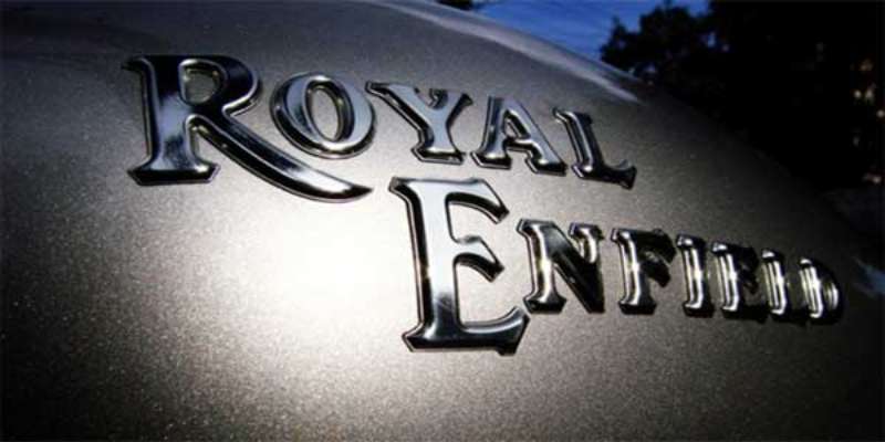
The Royal Enfield badge has crossed from product mark to cultural symbol, particularly across South Asia.
In India, it appears on everything from helmet stickers to tattoos. That’s not something a brand can manufacture through a marketing budget.
The logo has become tied to a specific lifestyle identity: long-distance riding, self-reliance, and a rejection of the kind of hyper-modern motorcycle culture that dominates other segments.
Globally, as Royal Enfield has expanded into Europe, North America, and Southeast Asia, the crest has started carrying similar weight. Riders who choose Royal Enfield often cite the badge itself as part of the appeal.
It’s one of the few motorcycle logos where the design itself communicates a genuine point of view rather than just a brand name. That kind of resonance takes decades to build and is very hard to replicate.
How Does the Royal Enfield Logo Fit Into the Overall Brand Identity?
The logo sits at the center of a broader identity system that includes the “Pure Motorcycling” brand platform, a consistent red-and-black color palette, and a design language that runs through every touchpoint from bike design to apparel.
The brand guidelines keep the crest tightly controlled across applications.
Royal Enfield’s retail environments, packaging, and digital presence all draw from the same visual vocabulary the logo establishes. The heritage crest sets a tone and everything else follows it.
This kind of coherent system is what separates brands with real identity from brands that just have a logo. Royal Enfield’s mark isn’t decorative. It’s load-bearing for the entire brand structure.
The logo also connects directly to Royal Enfield’s product naming conventions. Models like the Bullet, Thunderbird, Meteor, and Himalayan all carry names that fit within the same rugged, purposeful brand world the badge represents.
How Should the Royal Enfield Logo Be Used?
Official Usage Guidelines
- Do’s:
- Use official files sourced directly from Royal Enfield’s brand portal or authorized dealership resources
- Maintain the minimum clear space around the logo at all times
- Use approved color versions: full color, all-black, and all-white (on dark backgrounds)
- Reproduce at approved minimum sizes to maintain legibility
- Follow the brand style guide when placing the logo on co-branded or partner materials
- Don’ts:
- Do not stretch, distort, or alter the proportions of the crest or wordmark
- Do not apply unauthorized colors or gradient effects to the logo
- Do not place the logo on busy backgrounds without a clear field or container
- Do not recreate the logo from memory or screenshots; always use official vector files
- Do not use the logo to imply endorsement by Royal Enfield without written authorization
Where to Access Official Logos
Official Royal Enfield logo files are available to authorized dealers, media contacts, and licensed partners through the company’s official brand resources. Press and media inquiries can request assets through Royal Enfield’s official communications team at royalenfield.com.
Licensing and Trademark Protection
The Royal Enfield name, crest, and all associated marks are registered trademarks of Eicher Motors Ltd. Unauthorized commercial use, reproduction, or modification of the logo is a trademark infringement. Licensed merchandise partners operate under formal agreements with the brand. Independent use of the logo on products, merchandise, or commercial materials without authorization is not permitted regardless of intent.
FAQ on The Royal Enfield Logo
What does the Royal Enfield logo represent?
The Royal Enfield emblem represents over a century of motorcycle heritage rooted in British military history.
The circular crest, wordmark, and cannon motif collectively signal craftsmanship, durability, and the brand’s original identity as a military supplier.
What is the meaning behind the “Made Like A Gun” cannon in the Royal Enfield badge?
The cannon directly references the Enfield Cycle Company’s origins manufacturing rifles and military equipment in Redditch, England.
It’s not decorative. The cannon symbol is a deliberate reminder of the brand’s production standards and its deep military supply history.
What colors are used in the Royal Enfield logo?
The Royal Enfield logo colors are red (#C8102E), black (#000000), and a gold accent (#C9A84C).
Red signals power and action. Black adds authority. The gold trim reinforces the brand’s premium heritage positioning across tank badges and apparel.
What font is used in the Royal Enfield logo?
The Royal Enfield logo font is a customized serif-style wordmark with condensed, even strokes.
It isn’t a standard retail typeface. The letterforms were adapted to stay readable at small sizes on motorcycle tanks and still feel consistent across digital platforms.
How has the Royal Enfield logo changed over time?
The logo has gone through roughly five major iterations since the 1890s.
The core structure, a crest with wordmark, has stayed consistent. What changed across the Royal Enfield logo evolution was refinement: cleaner lines, tighter proportions, and digital-ready color codes under Eicher Motors.
Who owns the Royal Enfield logo trademark?
The Royal Enfield name and all associated marks are registered trademarks of Eicher Motors Ltd.
Unauthorized commercial use or reproduction is a trademark infringement. Licensed partners operate under formal agreements with the brand.
How does the Royal Enfield logo compare to other motorcycle brand logos?
Most competitors use geometric marks or clean wordmarks. Royal Enfield sticks with its heraldic crest, which immediately sets it apart from brands like Moto Guzzi or Husqvarna.
The closest comparison is the MV Agusta logo, which also uses a crest format, though with a very different visual tone.
Is the Royal Enfield logo available as a vector file?
Official vector files are available to authorized dealers and media contacts through Royal Enfield’s brand portal.
Public downloads of the Royal Enfield logo vector from third-party sites are unofficial and may not match current brand specifications. Always request files directly from the brand for commercial use.
What design type is the Royal Enfield logo?
It’s a combination mark: a circular heraldic crest paired with a wordmark.
This design type is common in heritage motorcycle branding because it carries both visual identity and brand name recognition in a single, self-contained mark.
Has Royal Enfield ever done a full logo redesign?
No complete overhaul has happened. The brand has refined its visual identity consistently rather than replacing it.
The most significant update came under Eicher Motors in the 2000s, which cleaned up proportions and standardized the Royal Enfield brand identity for global markets without changing the core crest structure.
Conclusion
The Royal Enfield logo is more than a motorcycle brand mark. It’s a visual record of over 130 years of heritage, military history, and motorcycling culture that has survived long after most of its British contemporaries disappeared.
From the original Enfield Cycle Company crest to the refined Eicher Motors version, the logo evolution shows a brand that understood what to keep and what to clean up.
The red, black, and gold color scheme, the heraldic crest structure, and the serif wordmark all work together as a coherent motorcycle brand identity that holds up across tank badges, apparel, and digital platforms equally well.

Renowned for his expertise in logo design and visual branding, Bogdan has developed a multitude of logos for various clients.
His skills extend to creating posters, vector illustrations, business cards, and brochures. Additionally, Bogdan's UI kits were featured on marketplaces like Visual Hierarchy and UI8.
He also wrote in the past years on sites like Design Your Way, WebDesignerDepot, WPDean, Designmodo, Speckyboy, Slider Revolution, and more.
- The Cursor Logo History, Colors, Font, And Meaning - 24 September 2026
- Top 7 Web Design Subscription Services That Replace Full-Time Hires - 24 September 2026
- Canva vs PowerPoint: Which Is Better for Presentations? - 22 September 2026

Bogdan Sandu is a seasoned designer who has been designing websites since 2008. Renowned for his expertise in logo design and visual branding, Bogdan has developed a multitude of logos for various clients. His skills extend to creating posters, vector illustrations, business cards, and brochures. Additionally, Bogdan's UI kits were featured on marketplaces like Visual Hierarchy and UI8. He also wrote in the past years on sites like Design Your Way, WebDesignerDepot, WPDean, Designmodo, Speckyboy, Slider Revolution, and more.
You Might Also Like