The Indian Motorcycle logo is one of the most recognized emblems in American motorsport history. Built around a Native American headdress motif paired with bold script lettering, it has represented the brand since its earliest days in the early 1900s. Few logos in the motorcycle industry carry this level of historical weight.
Within vehicle brand identity, Indian Motorcycle sits in a category of its own. Founded in 1901 in Springfield, Massachusetts, it is one of the oldest American motorcycle manufacturers, and its visual identity has gone through roughly a dozen documented iterations across more than 120 years.
What Is the Indian Motorcycle Logo?
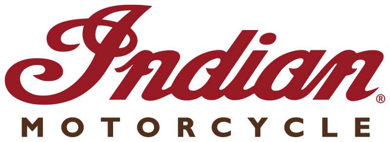
The Indian Motorcycle logo is an emblem-style mark combining a Native American war bonnet symbol with a custom red script wordmark. The current version was refined following Polaris Industries’ acquisition of the brand in 2011, with formal relaunch branding introduced in 2013. It communicates American heritage, strength, and road culture.
- Design Type: Combination mark (emblem + wordmark)
- Primary Elements: Feathered war bonnet, custom script lettering, shield-shaped badge on tank applications
- Official Introduction Date: Current version introduced 2013
- Designer/Agency: Developed in-house under Polaris Industries design team
- Trademark Status: Registered trademark under Indian Motorcycle International, LLC
- Color Palette: Indian Red (#B22222 approximate), Cream/Ivory (#F5F0E1 approximate), Black (#000000)
- Usage Context: Tank badges, apparel, marketing materials, dealership signage, digital platforms, licensed merchandise
How Has the Indian Motorcycle Logo Evolved Over Time?
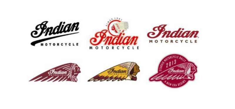
The Indian Motorcycle logo has changed significantly across 12+ decades, shifting from hand-painted script and illustrative Native American figures in the early 1900s to a refined, structured emblem used today. Each redesign reflected either a change in ownership, a production restart, or a deliberate push to modernize the brand’s visual identity.
Original Indian Motorcycle Logo (1901-1920s)
- Years Active: 1901-early 1920s
- Design Description: Simple hand-drawn script lettering spelling “Indian,” often applied directly to the fuel tank in a curved style
- Color Scheme: Red and gold on dark backgrounds
- Designer: Attributed to George M. Hendee and Carl Oscar Hedstrom’s early production team
- Context: Brand was just establishing itself as Hendee Manufacturing Company; visual identity was functional rather than formal
- Key Changes from Previous: N/A, first version
- Cultural Significance: Marked the birth of one of America’s first motorcycle manufacturers; the script alone became shorthand for the brand
Classic Headdress Era Logo (1920s-1953)
- Years Active: 1920s-1953
- Design Description: A full Native American chief figure or headdress was incorporated alongside the script; tank badges became metal, often teardrop-shaped
- Color Scheme: Deep red, black, chrome
- Designer: Internal design, no single attributed designer on record
- Context: The brand was at its commercial peak, competing directly with Harley-Davidson; the imagery reinforced the “Indian Chief” model line
- Key Changes from Previous: Addition of figurative Native American iconography; move from painted script to metal badge
- Cultural Significance: This era defined the visual language most people associate with vintage Indian Motorcycle branding
Post-Bankruptcy Revival Logos (1953-2010)
- Years Active: Various revival attempts from 1953 through 2010
- Design Description: Multiple ownership changes led to inconsistent branding; some versions retained the war bonnet, others stripped it back to wordmark-only treatments
- Color Scheme: Varied by ownership period
- Designer: Multiple parties across different revival companies
- Context: The original company folded in 1953; several investors attempted to revive the name with inconsistent results
- Key Changes from Previous: Loss of brand consistency; logo treatment differed across licensing deals
- Cultural Significance: This fragmented period actually increased the nostalgic value of the original pre-1953 branding among collectors
Current Polaris-Era Logo (2013-Present)
- Years Active: 2013-present
- Design Description: Refined headdress emblem combined with bold, clean script wordmark; tank badge version features a circular or shield-shaped metal badge
- Color Scheme: Indian Red, ivory/cream, black
- Designer: Polaris Industries internal design and brand team
- Context: Polaris acquired the brand in 2011 and relaunched production in 2013 with the Chief model; needed a logo that felt heritage-authentic while being production-ready
- Key Changes from Previous: Standardized, consistent system; headdress refined for scalability across digital and physical uses
- Cultural Significance: Restored credibility to the Indian Motorcycle name after decades of inconsistent revival attempts
What Do the Design Elements of the Indian Motorcycle Logo Mean?
The Indian Motorcycle logo draws meaning from two core sources: American frontier mythology and early motorsport culture. The headdress symbol points directly to the brand’s name and model lineup, while the script wordmark carries the visual weight of over a century of road history.
Together, they form a mark that reads as both historic and active.
What Does the Headdress Symbol Represent?
The war bonnet (feathered headdress) is tied to the brand’s naming convention, specifically the Indian Chief model launched in 1922.
It was used to signal power and leadership in early American cultural imagery, which aligned with what the brand wanted to project in motorsport competition.
The symbol has also attracted criticism over the decades for its use of Native American iconography as a commercial trademark, a tension the brand has never fully resolved publicly.
From a pure visual emphasis standpoint, the headdress functions as the logo’s dominant anchor, giving the mark its distinctive silhouette.
Why Did Indian Motorcycle Choose These Specific Colors?
- Indian Red
- Hex: #B22222 (approximate; exact shade varies by application)
- Pantone: Closest match Pantone 485 C
- Symbolic meaning: Strength, urgency, American identity
- Psychological impact: High visibility, commands attention, associated with speed and passion
- Brand connection: Red has been the dominant tank color since the early production era; it is inseparable from the brand’s visual identity
- Cream/Ivory
- Hex: #F5F0E1 (approximate)
- Symbolic meaning: Heritage, craftsmanship, classic Americana
- Psychological impact: Softens the aggression of red; adds a vintage, handcrafted feel
- Brand connection: Used heavily in script lettering and badge backgrounds; reinforces the heritage positioning
- Black
- Hex: #000000
- Symbolic meaning: Authority, precision, road culture
- Psychological impact: Grounds the composition; gives the logo weight and contrast
- Brand connection: Standard in motorcycle culture branding; works across all applications from tank badges to apparel
Understanding how these colors interact comes down to basic color theory. The red-on-black contrast is aggressive and intentional. It is not subtle branding.
What Typography Style Is Used in the Indian Motorcycle Logo?
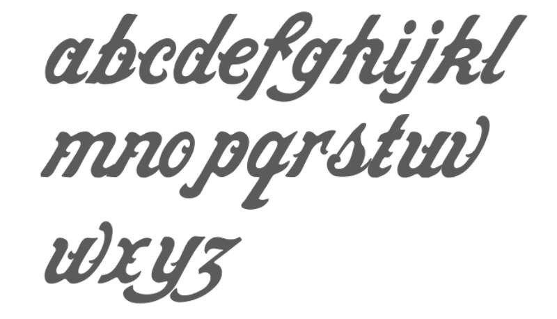
The Indian Motorcycle wordmark uses a custom script-style lettering that has been refined over multiple eras.
It is not a standard off-the-shelf typeface. The letterforms have a hand-drawn quality, with slightly irregular stroke weights that reference early 20th-century sign painting traditions.
The current version cleaned up the script considerably compared to older iterations, improving legibility at small sizes without losing its vintage character.
The font choice signals personality immediately: this is not a corporate sans-serif. It is deliberate, heritage-forward, and built to look good on a fuel tank at 70 mph.
What Are the Hidden Meanings in the Indian Motorcycle Logo?
There are no widely documented subliminal design tricks in the Indian Motorcycle logo. What you see is largely what you get.
That said, the combination of the headdress above the wordmark creates an unspoken visual hierarchy that places cultural symbolism above the brand name. Whether intentional or not, it positions the mythology above the product.
The script lettering’s slight forward lean is worth noting. It suggests motion and direction, which for a motorcycle brand is about as on-the-nose as it gets.
Some brand historians also point to the circular badge format used on tank applications as a reference to sheriff or military insignia, reinforcing themes of authority and American identity.
How Does the Indian Motorcycle Logo Compare to Competitor Logos?
Indian Motorcycle and Harley-Davidson have always been the two poles of American motorcycle branding. Both use heritage-heavy visual systems, both lean on black and red, and both rely on strong wordmarks. The differences matter, though.
Harley-Davidson uses a bar-and-shield emblem that reads as industrial and mechanical.
Indian leans more into the illustrative and the cultural, with the headdress giving it a more figurative, almost ornamental quality.
Look at how other global brands handle this. The Ducati logo is sharp and minimal, built for speed associations. The Triumph logo uses a clean wordmark that feels more modern European than American frontier. The Kawasaki logo goes fully abstract with its stylized “K,” stripping out any narrative content entirely.
Indian’s approach is the most narrative-heavy of the group. It asks you to feel something about American history before you even read the brand name. That is a deliberate positioning choice, and it mostly works. Though it does make the logo harder to use cleanly at very small sizes compared to, say, the Yamaha logo or the KTM logo, both of which are built for modern digital scale from the ground up.
The Royal Enfield logo is probably the closest stylistic parallel globally: heritage-based, emblem-driven, colonial-era visual language. Different market, same instinct.
What Are the Technical Specifications of the Indian Motorcycle Logo?
Official Color Codes
- Primary Color: Indian Red
- Hex: #B22222
- RGB: (178, 34, 34)
- CMYK: (0, 81, 81, 30)
- Pantone: 485 C (closest match)
- Secondary Color: Cream/Ivory
- Hex: #F5F0E1
- RGB: (245, 240, 225)
- CMYK: (0, 2, 8, 4)
- Pantone: 9180 C (closest match)
- Accent Color: Black
- Hex: #000000
- RGB: (0, 0, 0)
- CMYK: (0, 0, 0, 100)
- Pantone: Black C
Note: Indian Motorcycle does not publicly publish its exact color values. The codes above are derived from visual sampling of official brand materials and should be verified against official brand guidelines before any production use. For print work, always use Pantone references over hex conversions.
For screen use, the difference between RGB and CMYK values matters more than people expect with a saturated red like this. What looks correct on screen can print noticeably darker.
Dimensions and Proportions
- Aspect ratio: Varies by lockup version; horizontal wordmark version runs approximately 4:1 (width to height)
- Minimum size requirements: Not officially published; general industry practice suggests no smaller than 1 inch / 72px wide for the full lockup
- Clear space specifications: Standard brand practice applies a clear space equal to the cap-height of the wordmark on all sides
- Official usage guidelines: Available to licensed partners and dealers through Indian Motorcycle’s brand portal; not publicly available for download
- File formats distributed: Vector files (vector graphics in AI/EPS/SVG) for production use; PNG with transparent background for digital applications
- Resolution guidance: For any print application, assets should be prepared at a minimum of 300 DPI; screen use at 72-96 DPI standard
What Cultural Impact Has the Indian Motorcycle Logo Had?
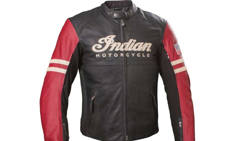
The Indian Motorcycle logo has crossed well beyond motorcycle culture into broader American iconography. It appears on vintage posters, custom art prints, tattoos, and collector memorabilia with a frequency that very few vehicle brand logos can match.
The headdress emblem in particular became a visual shorthand for a certain strain of American road mythology: pre-war, handbuilt, frontier-adjacent.
That cultural reach has a complicated side too. The use of Native American imagery as a commercial trademark has been a recurring point of criticism, particularly as broader conversations about indigenous representation in branding have grown louder since the 2010s. Indian Motorcycle has largely avoided direct public engagement on this topic, unlike some sports franchises that have faced more direct pressure to rebrand.
Among collectors, pre-1953 Indian Motorcycle badges and tank emblems are genuinely valuable objects. The logo’s physical form, as cast metal rather than a printed graphic, gave it an artifact quality that digital-era branding simply does not produce. You can hold a 1940s Indian tank badge. That materiality matters to how the logo is remembered and valued.
The brand’s revival under Polaris also carried the logo into a new generation of riders who had no direct experience with the original company. For them, the headdress emblem represents something slightly different: a manufactured heritage, carefully restored rather than continuously lived. That is not a criticism. It is just a different kind of cultural relationship.
How Does the Indian Motorcycle Logo Fit Into the Overall Brand Identity?
The logo is the anchor point for a broader brand system that connects motorcycle design, apparel, accessories, dealership environments, and event marketing into one coherent visual story. Every element in that system traces back to the same core palette and the same heritage positioning.
The headdress emblem appears on tank badges as a physical cast object, not just a graphic. That distinction matters.
It creates a direct link between the two-dimensional brand identity and the physical product, which is harder to achieve than it sounds. Most brand logos exist separately from the product. Indian’s emblem is literally bolted onto the motorcycle.
The script wordmark handles the softer side of brand communication: apparel, lifestyle marketing, digital content. It is more flexible and scales better across those contexts than the full emblem.
Together, the two elements give the brand system enough range to cover both a cast metal tank badge and a social media thumbnail without feeling inconsistent. That flexibility is a real achievement in brand guidelines terms, especially for a heritage brand where the visual identity predates modern design systems by several decades.
The brand style guide that governs current usage is tightly controlled through the dealer and licensing network, which keeps the mark from drifting the way it did during the fragmented revival period between 1953 and 2011.
How Should the Indian Motorcycle Logo Be Used?
Official Usage Guidelines
- Do: Use approved files obtained directly from Indian Motorcycle’s official brand resources or dealer portal
- Do: Maintain the full color lockup when possible; avoid color substitutions that aren’t part of the approved alternate versions
- Do: Respect clear space rules around the emblem to prevent it from being visually crowded
- Don’t: Stretch, distort, or rotate the logo
- Don’t: Recreate the logo from scratch using stock fonts or clip art; the script and headdress are proprietary
- Don’t: Use the logo on unofficial merchandise or in commercial contexts without a licensing agreement
- Don’t: Place the logo over complex backgrounds that reduce legibility
Where to Access Official Logo Files
- Authorized Indian Motorcycle dealers receive brand assets through the official dealer portal
- Media and press inquiries can access approved assets through Indian Motorcycle’s press/media relations team
- Licensed merchandise partners work directly with Indian Motorcycle International, LLC’s licensing department
- The general public does not have access to official production-ready files through the brand’s website
Licensing and Trademark Protection
- The Indian Motorcycle name and logo are registered trademarks of Indian Motorcycle International, LLC, a subsidiary of Polaris Inc.
- Any commercial use of the logo, name, or headdress emblem requires explicit written licensing permission
- Trademark protection covers the wordmark, the headdress emblem, and the combined lockup across multiple international jurisdictions
- Infringement cases have been actively pursued historically, particularly during the brand’s revival period when multiple parties attempted to claim rights to the Indian Motorcycle name
- Fan art and personal, non-commercial uses exist in a legal gray area; when in doubt, contact Indian Motorcycle’s legal team directly
FAQ on The Indian Motorcycle Logo
What does the Indian Motorcycle logo represent?
The logo combines a Native American war bonnet with a custom script wordmark.
Together they signal American heritage, road culture, and the brand’s century-old identity. The headdress ties directly to the Indian Chief model lineup introduced in 1922.
How old is the Indian Motorcycle logo?
The brand was founded in 1901 in Springfield, Massachusetts. Some form of the script wordmark has existed since those earliest days.
The headdress emblem in its recognizable form became standard through the 1920s and 1930s.
Who designed the current Indian Motorcycle logo?
The current version was developed by the Polaris Industries internal design team following their 2011 acquisition of the brand.
It launched publicly with the 2013 production relaunch. No single external designer or agency has been officially credited.
What colors does the Indian Motorcycle logo use?
The primary color is Indian Red, paired with cream and black. Red has been tied to the brand since its early production era.
These three colors form the complete official palette across tank badges, apparel, and marketing materials.
What font is used in the Indian Motorcycle logo?
The wordmark uses a custom script lettering style, not a commercially available typeface.
It references early 20th-century sign painting traditions. The stroke weights are slightly irregular, giving it a handcrafted quality that off-the-shelf fonts simply don’t replicate.
Has the Indian Motorcycle logo changed over time?
Yes, significantly. The logo went through roughly a dozen iterations across 120-plus years, shaped by ownership changes, production shutdowns, and deliberate rebranding efforts.
The most disruptive period was between 1953 and 2011, when inconsistent revival attempts fractured the visual identity.
Is the Indian Motorcycle logo trademarked?
Yes. Both the wordmark and headdress emblem are registered trademarks held by Indian Motorcycle International, LLC, a subsidiary of Polaris Inc.
Commercial use without a licensing agreement is an infringement. The brand has historically pursued legal action to protect the mark.
How does the Indian Motorcycle logo compare to the Harley-Davidson logo?
Harley-Davidson uses a bar-and-shield emblem that reads as mechanical and industrial. Indian leans more illustrative, with the headdress giving it a figurative, heritage-heavy character.
Both use red and black, but the visual personalities are clearly distinct.
What is the meaning behind the headdress in the logo?
The feathered war bonnet connects directly to the Indian Chief motorcycle model and early American frontier imagery the brand deliberately adopted.
It functions as the logo’s visual anchor, giving the mark its recognizable silhouette across tank badges and brand merchandise.
Where can I download the official Indian Motorcycle logo?
Official files are not publicly available for download. Authorized dealers access brand assets through the official dealer portal.
Press and media can request approved files through Indian Motorcycle’s media relations team. Unlicensed reproduction for commercial use is a trademark violation.
Conclusion
The Indian Motorcycle logo is more than a trademark. It is a direct record of American motorcycle heritage, from the early Hendee Manufacturing Company script to the refined Polaris-era headdress emblem used on every Indian Chief and Scout rolling off the line today.
The war bonnet insignia, the custom script lettering, the Indian Red color scheme. Each element carries specific weight in the brand’s visual identity system.
Few motorcycle manufacturer emblems have survived this much history and still feel coherent. That staying power says something about the original design instincts behind it.

Renowned for his expertise in logo design and visual branding, Bogdan has developed a multitude of logos for various clients.
His skills extend to creating posters, vector illustrations, business cards, and brochures. Additionally, Bogdan's UI kits were featured on marketplaces like Visual Hierarchy and UI8.
He also wrote in the past years on sites like Design Your Way, WebDesignerDepot, WPDean, Designmodo, Speckyboy, Slider Revolution, and more.
- The Windsurf Logo History, Colors, Font, And Meaning - 10 October 2026
- How to Remove Background From Product Photos (No Photoshop) - 10 October 2026
- How Designers can Build a Stronger Online Creative Identity - 9 October 2026

Bogdan Sandu is a seasoned designer who has been designing websites since 2008. Renowned for his expertise in logo design and visual branding, Bogdan has developed a multitude of logos for various clients. His skills extend to creating posters, vector illustrations, business cards, and brochures. Additionally, Bogdan's UI kits were featured on marketplaces like Visual Hierarchy and UI8. He also wrote in the past years on sites like Design Your Way, WebDesignerDepot, WPDean, Designmodo, Speckyboy, Slider Revolution, and more.
You Might Also Like