The Kawasaki logo is the official visual mark of Kawasaki Heavy Industries and its motorcycles division, representing one of Japan’s most recognized industrial brands. It combines a bold wordmark with the iconic “Rivers Mark” symbol, built to signal speed, precision, and Japanese engineering heritage. The current identity has remained largely consistent since the 1960s, making it one of the more stable marks in the powersports world.
Within industry branding history, Kawasaki sits alongside a handful of motorcycle manufacturers that turned their logo into a cultural shorthand for performance. The lime green color alone is now instantly tied to racing, which is something very few brands manage to pull off.
The current logo uses a custom bold sans-serif wordmark paired with the Rivers Mark emblem. It was formally standardized in the late 1960s and has seen only minor refinements since. No single external design agency is publicly credited for its creation. Kawasaki was founded in 1896 by Shozo Kawasaki, and the motorcycle division was established in 1963. The logo has gone through roughly four distinct iterations.
What Is the Kawasaki Logo?
![]()
The Kawasaki logo is a combination mark featuring a bold, custom uppercase wordmark and the Rivers Mark symbol. Formally standardized around 1967, it was developed internally by Kawasaki Heavy Industries. The design reflects the brand’s engineering identity and its connection to speed and industrial strength.
- Design Type: Combination mark (wordmark + emblem)
- Primary Elements: Bold uppercase “KAWASAKI” wordmark, Rivers Mark symbol (stylized “K” river motif)
- Official Introduction Date: Standardized circa 1967; current refined version adopted in the 1990s
- Designer/Agency: Developed internally by Kawasaki Heavy Industries
- Trademark Status: Registered trademark held by Kawasaki Heavy Industries, Ltd.
- Color Palette: Kawasaki Green (#00A850), Black (#000000), White (#FFFFFF)
- Usage Context: Motorcycles, ATVs, watercraft, motorsport apparel, marketing materials, digital platforms, merchandise
How Has the Kawasaki Logo Evolved Over Time?
The Kawasaki logo has gone through four main phases since the brand’s motorcycle division launched in 1963.
Each version moved closer to the stripped-back, high-contrast mark used today.
Early designs leaned on traditional Japanese lettering conventions before the brand shifted hard toward Western industrial typography as it expanded into global markets.
Original Kawasaki Logo (1963-1966)
- Years Active: 1963-1966
- Design Description: Simple text-based wordmark with no accompanying symbol; relatively thin letterforms
- Color Scheme: Black and white
- Designer: Internal, unknown
- Context: Introduced when Kawasaki Aircraft Co. spun off its motorcycle division; needed a fast, functional mark
- Key Changes from Previous: First dedicated motorcycle brand mark, separate from the parent industrial company identity
- Cultural Significance: Marked Japan’s entry into the global motorcycle market as a serious competitor
Second Kawasaki Logo (1967-1980s)
- Years Active: 1967-late 1980s
- Design Description: Introduction of the Rivers Mark alongside a bolder wordmark; letterforms became heavier and more assertive
- Color Scheme: Black, white, and early use of green on racing applications
- Designer: Internal design team
- Context: Kawasaki was aggressively growing its US and European market share; needed stronger brand recognition
- Key Changes from Previous: Added the Rivers Mark symbol; increased typographic weight significantly
- Cultural Significance: Coincided with the Kawasaki Z1 era, which put the brand on the map as a performance leader
Refined Kawasaki Logo (1990s-2000s)
- Years Active: Early 1990s-mid 2000s
- Design Description: Cleaner version of the combination mark; tighter spacing, more consistent proportions across applications
- Color Scheme: Kawasaki Green introduced as a primary brand color alongside black
- Designer: Internal brand team
- Context: Racing success in World Superbike drove the need for a more polished, merchandise-ready identity
- Key Changes from Previous: Green officially adopted as brand color; letterforms modernized slightly
- Cultural Significance: Lime green became synonymous with Kawasaki performance bikes during this period
Current Kawasaki Logo (2000s-Present)
- Years Active: Mid 2000s-present
- Design Description: Current refined combination mark with optimized Rivers Mark proportions and digitally consistent wordmark
- Color Scheme: Kawasaki Green (#00A850), Black, White
- Designer: Internal
- Context: Digital age required consistent rendering across screens, merchandise, and vehicle decals
- Key Changes from Previous: Subtle refinements for digital clarity; no structural overhaul
- Cultural Significance: The mark is now globally recognized as a symbol of high-performance motorcycles and motorsport heritage
What Do the Design Elements of the Kawasaki Logo Mean?
The Kawasaki logo uses two core elements: the Rivers Mark symbol and the bold wordmark.
Together, they communicate engineering precision, speed, and the brand’s roots in Japanese industrial manufacturing.
Nothing in the design is decorative for its own sake. Every element carries functional and symbolic weight that has been reinforced through decades of racing and product identity.
What Does the Rivers Mark Symbol Represent?
The Rivers Mark is a stylized symbol derived from the Japanese character for river (“kawa”), which is also the first part of the Kawasaki name.
It references the rivers near Kawasaki City, where the company was founded.
The mark also visually suggests forward motion, which is fitting for a brand built on speed.
In Japanese corporate culture, connecting a brand mark to a geographic or natural reference carries deep traditional meaning, and Kawasaki has leaned into that quietly for decades.
Why Did Kawasaki Choose These Specific Colors?
- Kawasaki Green
- Hex: #00A850
- Pantone: Pantone 354 C (approximate)
- Symbolic Meaning: Speed, energy, distinctiveness on the track
- Psychological Impact: High visibility, associated with performance and freshness; stands out in motorsport contexts dominated by red, blue, and orange
- Brand Connection: Became the signature racing color after Kawasaki’s early motocross success in the 1970s
- Black
- Hex: #000000
- Symbolic Meaning: Power, precision, industrial strength
- Psychological Impact: Adds authority and weight to the wordmark; contrasts sharply with green for maximum readability
- Brand Connection: Reflects the engineering-focused, no-nonsense side of the brand
- White
- Hex: #FFFFFF
- Symbolic Meaning: Clarity, cleanliness
- Psychological Impact: Used as background and knockout version; keeps the mark legible across all surfaces
- Brand Connection: Standard utility color for reverse logo applications on dark backgrounds
The psychological effect of these colors working together is pretty deliberate. Green grabs attention; black grounds it. That combination works especially well on bikes and racing gear where you need instant recognition from a distance.
What Typography Style Is Used in the Kawasaki Logo?
The wordmark uses a custom bold sans-serif typeface with tight, uniform letterforms.
It is not based on a standard commercial font available to the public.
The letters are wide, heavy, and capitalized throughout, which reinforces the brand’s industrial identity.
Readability is prioritized at small sizes and at speed, which matters when the logo appears on a motorcycle tank or a racing fairing. The typography has not changed dramatically since the 1960s, only been refined for digital consistency.
What Are the Hidden Meanings in the Kawasaki Logo?
The most intentional “hidden” element is the Rivers Mark’s dual reference: it nods to “kawa” (river in Japanese) while visually suggesting motion and flow.
Some designers note that the angular forms in the Rivers Mark echo the shape of a “K,” reinforcing the initial of the brand name.
There are no confirmed subliminal elements beyond these, though the overall visual emphasis on bold geometry is clearly deliberate.
The designer’s stated intentions were never made fully public, which is fairly common for marks developed internally during that era.
How Does the Kawasaki Logo Compare to Competitor Logos?
Kawasaki’s logo is more aggressive and color-forward than most of its direct competitors.
Where brands like Honda and Yamaha use wings and tuning forks respectively, Kawasaki leans on typographic weight and color recognition above all else.
That green is doing a lot of work that other brands rely on symbols to accomplish.
| Brand | Design Type | Primary Color | Key Symbol | Design Tone |
|---|---|---|---|---|
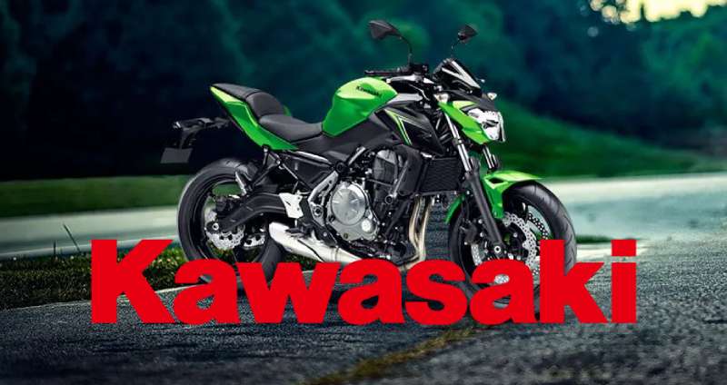
| Kawasaki | Combination mark | Green | Rivers Mark | Aggressive, industrial |
| Yamaha | Emblem + wordmark | Red / Blue | Tuning fork emblem | Balanced, heritage-focused |
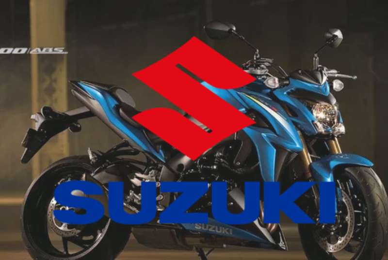
| Suzuki | Lettermark + wordmark | Blue / Silver | Stylized “S” | Clean, modern |
| Ducati | Wordmark + shield | Red | Shield emblem | Sporty, Italian premium |
| Harley-Davidson | Emblem / badge | Orange / Black | Bar and Shield | Heritage, Americana |
| KTM | Wordmark | Orange | None | Bold, off-road focused |
| Triumph | Wordmark + script | Gold / Black | None | British classic, premium |
Kawasaki’s approach to visual hierarchy in its logo is notably different from the badge-heavy approach of Harley or Ducati. The wordmark does the heavy lifting, and the green color is what actually burns into memory. That is a more modern, less nostalgic strategy than most of its rivals use.
What Are the Technical Specifications of the Kawasaki Logo?
Official Color Codes
- Primary Color: Kawasaki Green
- Hex: #00A850
- RGB: (0, 168, 80)
- CMYK: (100, 0, 52, 34)
- Pantone: 354 C (approximate)
- Secondary Color: Black
- Hex: #000000
- RGB: (0, 0, 0)
- CMYK: (0, 0, 0, 100)
- Pantone: Process Black C
- Accent Color: White
- Hex: #FFFFFF
- RGB: (255, 255, 255)
- CMYK: (0, 0, 0, 0)
- Pantone: N/A
Dimensions and Proportions
- Aspect Ratio: Approximately 4:1 (wordmark alone); varies with Rivers Mark placement
- Minimum Size Requirements: Wordmark minimum 25mm width for print; 80px width for digital use
- Clear Space: Minimum clear space equal to the cap height of the “K” on all sides
- File Formats: Official assets available as vector graphics (EPS, SVG) and raster formats (PNG, JPEG)
- Resolution: Print files require minimum 300 DPI; digital assets at 72-96 PPI
- Usage Guidelines: Do not stretch, recolor outside approved palette, or place on busy backgrounds that reduce legibility
What Cultural Impact Has the Kawasaki Logo Had?
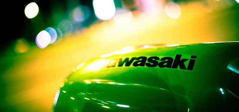
The Kawasaki logo has become one of the most recognized marks in motorsport globally.
That green, specifically, has done something most brands only dream about: it got adopted by the fan base as a color identity, not just a corporate mark.
Walk into any motorcycle gear shop and the Kawasaki green sections are easy to find from across the room.
The brand’s dominance in World Superbike racing through the 2010s and 2020s, largely through Jonathan Rea’s six consecutive championship wins, put the logo in front of millions of viewers repeatedly. That kind of sustained exposure reinforces brand recognition in ways that advertising budgets alone cannot replicate.
The logo also carries cultural weight in Japan as a symbol of post-war industrial success. Kawasaki Heavy Industries built ships, aircraft, and trains before it built motorcycles, and that industrial heritage gives the mark a sense of credibility that younger powersports brands simply don’t have yet.
Beyond racing, the Kawasaki mark appears heavily in customization culture. Modified Kawasaki bikes often retain or exaggerate the green and black color scheme, which shows how deeply the brand’s visual identity has been absorbed by its community.
How Does the Kawasaki Logo Fit Into the Overall Brand Identity?
The logo is the anchor point for a broader brand identity that connects Kawasaki Motorcycles back to Kawasaki Heavy Industries as a whole.
The Rivers Mark appears across jet engines, rolling stock, and industrial robots, not just bikes.
That consistency across wildly different product categories is actually unusual and speaks to how deliberately the parent company manages its visual identity.
For the motorcycles division specifically, the logo works within a full set of brand guidelines that govern color usage, typography, and co-branding with racing teams. The Kawasaki Racing Team (KRT) operates its own visual system built on top of the core brand, using the same green and black but layered with sponsor identities and race livery elements.
The brand style guide also covers how the logo interacts with product sub-brands like Ninja, Z Series, and Versys. Each sub-brand has its own visual treatment, but the parent Kawasaki mark always maintains dominance in the hierarchy. That structure keeps the brand cohesive across a wide product range without diluting the core identity.
How Should the Kawasaki Logo Be Used?
Official Usage Guidelines
- Do use the logo in approved green, black, or white (knockout) versions only
- Do maintain the required clear space around the mark at all times
- Do use official vector files for print applications to avoid quality loss
- Do not alter, stretch, rotate, or add effects to the logo
- Do not recolor the mark outside the approved palette
- Do not place the logo on backgrounds that reduce contrast and legibility
- Do not combine the Rivers Mark with third-party symbols or logos without authorization
Where to Access Official Logo Files
- Official press and media assets are available through Kawasaki’s regional press portals (US, Europe, Japan)
- Authorized dealers and racing partners receive logo packages directly from Kawasaki Motors Corp.
- General public use for editorial and journalistic purposes typically falls under fair use; commercial use requires written authorization
Licensing and Trademark Protection
- The Kawasaki name and Rivers Mark are registered trademarks of Kawasaki Heavy Industries, Ltd.
- Unauthorized commercial use, including merchandise, decals, and apparel, requires a licensing agreement
- Trademark infringement cases are actively pursued by Kawasaki’s legal teams globally
- Fan art and non-commercial uses exist in a gray area; commercial sale of fan-made Kawasaki-branded items is generally prohibited without a license
FAQ on The Kawasaki Logo
What does the Kawasaki logo represent?
The Kawasaki logo represents speed, precision, and Japanese industrial heritage.
The Rivers Mark references “kawa,” the Japanese word for river, connecting the brand to its geographic and cultural origins. The bold wordmark signals engineering strength.
What is the Kawasaki logo called?
The symbol portion is officially called the Rivers Mark.
Together with the uppercase wordmark, the full mark is referred to as the Kawasaki combination mark. Both elements appear across motorcycles, industrial equipment, and racing merchandise.
What colors are used in the Kawasaki logo?
The three official colors are Kawasaki Green (#00A850), black (#000000), and white (#FFFFFF).
Green became the dominant brand color through decades of motocross and superbike racing. It is now one of the most recognized colors in the powersports industry.
When was the Kawasaki logo designed?
The motorcycle division launched its first mark in 1963.
The combination mark featuring the Rivers Mark and bold wordmark was standardized around 1967. The current refined version has been in use since the mid-2000s with only minor adjustments.
What font does the Kawasaki logo use?
The wordmark uses a custom bold sans-serif font developed internally.
It is not a publicly available typeface. The letters are wide, fully capitalized, and built for high visibility at speed on motorcycle fairings and racing gear.
Has the Kawasaki logo changed over the years?
Yes, but not drastically. The Kawasaki logo evolution spans roughly four versions since 1963.
Each iteration kept the core wordmark intact while refining weight, spacing, and the Rivers Mark proportions. No full rebranding has ever occurred, which is unusual for a brand this old.
How does the Kawasaki logo compare to other motorcycle brand logos?
Most competitors rely on emblems or shields. Kawasaki leans on typographic weight and color recognition instead.
Brands like Ducati and Harley-Davidson use badge-based designs rooted in heritage. Kawasaki’s approach is more direct and works especially well in high-speed visual contexts like racing. Check out the Indian Motorcycle logo for a strong contrast in styling philosophy.
What is the meaning behind the Kawasaki green color?
Kawasaki green started as a racing livery choice in the early 1970s motocross era.
It stuck because it worked. The distinctive green color stood out on tracks dominated by red and blue. Over time it became inseparable from the brand’s performance identity.
Can I use the Kawasaki logo for my own projects?
Not without permission. The Kawasaki name and Rivers Mark are registered trademarks of Kawasaki Heavy Industries, Ltd.
Editorial and journalistic use generally falls under fair use. Commercial applications, including merchandise or decals, require a formal licensing agreement from Kawasaki Motors Corp.
Where can I download the official Kawasaki logo?
Official logo files are distributed through Kawasaki’s regional press portals in the US, Europe, and Japan.
Authorized dealers receive asset packages directly. High-resolution vector files are available to media and partners. Public downloads from third-party sites are not officially sanctioned by Kawasaki Motors Corp.
Conclusion
The Kawasaki logo is one of the most consistent and recognizable marks in motorcycle branding, built on decades of racing credibility and deliberate visual identity decisions.
From the Rivers Mark symbolism to the custom bold wordmark, every element earns its place.
The Kawasaki corporate logo works across motorcycles, industrial equipment, and motorsport merchandise without losing coherence, which is a rare thing for a brand operating at this scale.
That lime green is not going anywhere either. It has become part of the powersports culture itself, not just a color on a bike tank.
Renowned for his expertise in logo design and visual branding, Bogdan has developed a multitude of logos for various clients.
His skills extend to creating posters, vector illustrations, business cards, and brochures. Additionally, Bogdan's UI kits were featured on marketplaces like Visual Hierarchy and UI8.
He also wrote in the past years on sites like Design Your Way, WebDesignerDepot, WPDean, Designmodo, Speckyboy, Slider Revolution, and more.
- The Airtable Logo History, Colors, Font, And Meaning - 12 July 2026
- How to Blur Background in Canva: A Quick Tutorial - 11 July 2026
- Typography Trends - 10 July 2026
Bogdan Sandu is a seasoned designer who has been designing websites since 2008. Renowned for his expertise in logo design and visual branding, Bogdan has developed a multitude of logos for various clients. His skills extend to creating posters, vector illustrations, business cards, and brochures. Additionally, Bogdan's UI kits were featured on marketplaces like Visual Hierarchy and UI8. He also wrote in the past years on sites like Design Your Way, WebDesignerDepot, WPDean, Designmodo, Speckyboy, Slider Revolution, and more.
You Might Also Like