The Triumph logo is one of motorcycling’s most recognized brand marks, carrying over a century of British engineering heritage in a deceptively simple design. It functions as the visual anchor of Triumph Motorcycles Ltd., the Hinckley-based manufacturer that rebuilt itself from the ground up in the 1980s. The current wordmark-based identity has gone through several distinct phases, each one reflecting where the company stood at that moment in its history.
Triumph’s branding sits in a specific corner of the motorcycle industry, alongside names like Harley-Davidson and Ducati, where heritage and authenticity carry serious weight. The logo isn’t just decoration. For riders, it signals something about what kind of machine they’re choosing.
The current logo was refined following the brand’s 2013 identity refresh. The founding year of the company dates to 1902, and the mark has gone through at least six meaningful iterations since then.
What is the Triumph Motorcycles Logo?
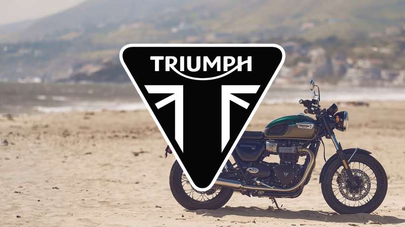
The Triumph logo is a bold, custom wordmark using a modified sans-serif typeface in black or white. Introduced in its current refined form around 2013, it replaced earlier versions featuring shields and eagles. The design communicates directness and confidence, stripped of the ornamental details that defined earlier eras.
- Design Type: Wordmark (primary), with occasional combination mark usage pairing the wordmark with a crest or eagle emblem in heritage contexts
- Primary Elements: Custom-modified bold lettering; historically paired with an eagle motif and shield crest in earlier versions
- Official Introduction Date: Current wordmark refined and standardized circa 2013; original branded mark dates to early 1900s
- Designer/Agency: Not publicly credited; developed internally with brand consultancy input during the 2013 refresh
- Trademark Status: Registered trademark held by Triumph Motorcycles Ltd.; protected across major global markets
- Color Palette: Primary Black (#000000), White (#FFFFFF); gold accents (#C9A84C) used in heritage and special edition contexts
- Usage Context: Motorcycle fuel tanks, fairings, dealership signage, apparel, marketing materials, digital platforms, and licensed merchandise
How Has the Triumph Motorcycles Logo Evolved Over Time?
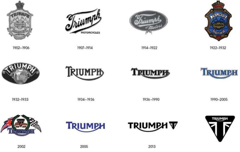
The Triumph logo has shifted from ornate Victorian-era crests to a clean, modern wordmark across roughly six major phases between 1902 and today.
Each change tracked something real: a factory move, a change in ownership, a near-death and revival.
The brand nearly disappeared in the 1980s before John Bloor bought the name and relaunched production in Hinckley. That context matters when reading the logo’s current confidence.
Original Triumph Logo (1902-1930s)
- Years Active: 1902 to mid-1930s
- Design Description: Ornate crest-style emblem with lettering framed by decorative Victorian elements; shield shape prominent
- Color Scheme: Black, gold, and red; typical of early 20th-century enamel badge production
- Designer: Unknown; likely produced by a Birmingham-area trade badge maker
- Context: Triumph was founded by Siegfried Bettmann in Coventry in 1902. The brand initially sold bicycles before moving into motorcycles
- Key Changes from Previous: First formal brand mark; no predecessor
- Cultural Significance: Reflected the Edwardian taste for heraldic identity; positioned Triumph as a proper British manufacturer, not a backyard operation
Eagle and Shield Era Logo (1930s-1950s)
- Years Active: Mid-1930s to early 1950s
- Design Description: A spread-wing eagle above or integrated with the Triumph name; shield element retained but simplified
- Color Scheme: Black, chrome, and gold
- Designer: Unknown
- Context: Edward Turner’s era at Triumph, including the launch of the Speed Twin in 1938. The brand was ascending fast
- Key Changes from Previous: Eagle motif introduced; overall mark became more dynamic and less static than the original crest
- Cultural Significance: The eagle became one of Triumph’s most iconic visual symbols. Riders still associate it with the pre-unit engine era
Postwar Wordmark Logo (1950s-1970s)
- Years Active: Early 1950s to mid-1970s
- Design Description: Simplified bold lettering, often italicized; tank badges moved toward cleaner, more aerodynamic shapes reflecting the jet age
- Color Scheme: Black lettering on chrome or painted backgrounds; red and white variants common on racing machines
- Designer: Unknown; evolved through in-house decisions at the Meriden factory
- Context: Triumph’s peak export years to the US market; the Bonneville T120 launched in 1959 and the brand dominated American roads
- Key Changes from Previous: Eagle largely dropped from primary usage; wordmark stood alone more frequently
- Cultural Significance: This is the logo generation that appeared in Steve McQueen films and defined Triumph’s rebel image in America
BSA-Era and Decline Logo (1970s-1983)
- Years Active: Mid-1970s to 1983
- Design Description: Various inconsistent applications during the turbulent BSA Group years and subsequent worker cooperative period at Meriden
- Color Scheme: Black and white primary; reduced budget for badge quality visible on later production bikes
- Designer: No consistent oversight
- Context: The British motorcycle industry was collapsing under Japanese competition. Triumph’s identity suffered from corporate instability
- Key Changes from Previous: No coherent redesign; fragmentation and inconsistency defined this period
- Cultural Significance: Despite the chaos, the name retained enough goodwill that John Bloor purchased the rights in 1983
Hinckley Revival Logo (1990s-2012)
- Years Active: 1990 to 2012
- Design Description: Reintroduced bold wordmark with a returning eagle crest for certain models; mix of heritage and contemporary styling
- Color Scheme: Black and white core; gold used for premium and classic range applications
- Designer: Internal brand team under Triumph Motorcycles Ltd.
- Context: Bloor’s new factory in Hinckley opened in 1990. The brand needed to reestablish credibility quickly against Japanese and German competition
- Key Changes from Previous: Clean restart; consistent application standards reintroduced across all touchpoints
- Cultural Significance: Proved the revival was real. By the mid-2000s Triumph was back in the conversation with serious motorcycle buyers
Current Logo (2013-Present)
- Years Active: 2013 to present
- Design Description: Refined bold wordmark; custom-modified letterforms with tight spacing and strong horizontal weight; no eagle in primary applications
- Color Scheme: Black (#000000) and white (#FFFFFF) as primary; gold (#C9A84C) in Bonneville and heritage contexts
- Designer: Not publicly disclosed; brand consultancy involvement confirmed
- Context: Aligned with Triumph’s push into new markets including Asia and renewed focus on the premium segment
- Key Changes from Previous: Tighter, more confident letterforms; cleaner spacing; simplified for better digital and small-scale reproduction
- Cultural Significance: Positions Triumph as a modern premium brand without abandoning its British heritage roots
What Do the Design Elements of the Triumph Motorcycles Logo Mean?
The Triumph logo communicates through restraint. The bold wordmark drops ornament in favor of directness, signaling that the machines speak for themselves.
The weight of the letterforms references industrial strength. Nothing about it feels fragile or decorative.
When the eagle crest appears in heritage applications, it reconnects the brand to its 1930s-1950s peak, the era most deeply embedded in motorcycle culture.
What Symbolic Meaning Does the Triumph Wordmark Carry?
The name itself does a lot of work. “Triumph” is a direct declaration.
The bold, unembellished letterforms reinforce that claim without overexplaining it.
The tight tracking in the current version reads as precision, which aligns with how Triumph positions its engineering. The emphasis is on solidity over style.
What Historical References Are Built Into the Logo?
The eagle motif, when used, references British imperial iconography common in early 20th-century manufacturing badges.
It connected Triumph to a tradition of craft and national pride at a time when “Made in England” carried enormous weight in export markets.
That reference still works today in the Bonneville range, where the heritage crest appears on tank badges alongside the core wordmark.
How Does the Logo Connect to Motorcycle Culture?
Triumph’s logo became shorthand for a specific kind of riding identity, British, independent, slightly rebellious, but rooted in proper engineering rather than outlaw mythology.
That distinction separates it from Harley’s bar-and-shield, which carries stronger countercultural associations.
Triumph sits closer to the rider who values performance history alongside style. The logo reflects that positioning consistently.
Why Did Triumph Choose These Specific Colors?
- Black (#000000)
- Symbolic meaning: Authority, precision, timelessness
- Psychological impact: Conveys seriousness and premium positioning; avoids trend-chasing
- Brand connection: Works across all vehicle colorways; black logos on fuel tanks remain legible regardless of paint color
- White (#FFFFFF)
- Symbolic meaning: Clarity, simplicity
- Psychological impact: Creates clean contrast in reversed applications
- Brand connection: Standard reversal for dark tank colors and apparel backgrounds
- Gold (#C9A84C)
- Symbolic meaning: Heritage, prestige, craft
- Psychological impact: Signals premium and limited-edition status without being excessive
- Brand connection: Specifically tied to the Bonneville lineage and classic model range; not used in modern sport applications
What Typography Style Is Used in the Triumph Logo?
The current wordmark uses a custom-modified bold sans-serif with slightly condensed proportions.
The letterforms are not an off-the-shelf sans-serif font. They have been adjusted for optical weight and horizontal consistency.
Tracking is tight, which gives the mark a compact, unified appearance at small sizes, useful for tank badges and embroidered patches.
Earlier versions used more open, italicized letterforms that communicated speed. The current version trades that dynamism for stability, reflecting the brand’s maturity.
What Are the Hidden Meanings in the Triumph Logo?
There are no confirmed subliminal elements in the current wordmark. Triumph hasn’t played that game.
What’s intentional is the absence of ornament. Stripping back to a clean wordmark was a deliberate choice to avoid looking like a nostalgia brand.
The eagle crest, when it does appear, functions almost like a secret handshake for long-term Triumph followers who recognize its lineage back to the 1930s.
Some riders read the tight letterforms as a reference to the precision tolerances Triumph emphasizes in its engineering communications. That may be projection, but it’s the kind of reading a strong logo invites.
How Does the Triumph Logo Compare to Competitor Logos?
Triumph’s wordmark-first approach contrasts sharply with competitors that rely on abstract emblems or mascot-based marks. It sits in a distinctive position, confident enough to let the name carry the identity alone.
Compare the main players:
- Triumph vs. Harley-Davidson: Harley uses a bar-and-shield combination mark heavy with Americana symbolism. Triumph’s wordmark is more restrained and internationally neutral, which suits its European and Asian market focus
- Triumph vs. Ducati: Ducati leans into Italian red and a script-influenced wordmark with strong sport associations. Triumph’s black mark reads as more versatile across both heritage and modern model lines
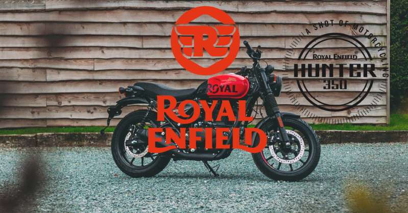
- Triumph vs. Royal Enfield: Royal Enfield still uses a crest-heavy combination mark that leans harder into colonial-era British heritage. Triumph’s current mark is cleaner and more contemporary while still carrying British identity
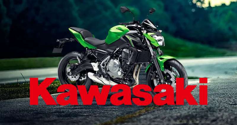
- Triumph vs. Kawasaki: Kawasaki’s angular wordmark and green color scheme signal aggression and sport. Triumph’s neutral palette keeps it from being locked into a single riding category
- Triumph vs. Yamaha: Yamaha uses its tuning fork symbol as a strong standalone icon. Triumph has no equivalent standalone symbol in primary usage, which is both a limitation and a clarity advantage
- Triumph vs. KTM: KTM’s orange and black wordmark is aggressive and off-road-coded. Triumph’s identity is more premium and road-focused by comparison
What Are the Technical Specifications of the Triumph Motorcycles Logo?
Official Color Codes
- Primary Color: Black
- Hex: #000000
- RGB: (0, 0, 0)
- CMYK: (0, 0, 0, 100)
- Pantone: Black C
- Secondary Color: White
- Hex: #FFFFFF
- RGB: (255, 255, 255)
- CMYK: (0, 0, 0, 0)
- Pantone: White
- Accent Color: Heritage Gold
- Hex: #C9A84C
- RGB: (201, 168, 76)
- CMYK: (0, 16, 62, 21)
- Pantone: 871 C (metallic gold; approximate)
Dimensions and Proportions
- Aspect ratio: Approximately 5:1 width-to-height for the standard wordmark
- Minimum size requirements: Triumph does not publish official minimum sizes publicly, but standard brand practice requires the wordmark to remain fully legible at no smaller than 20mm wide in print
- Clear space specifications: Standard practice uses the cap-height of the wordmark as the minimum clear space buffer on all sides
- Official usage guidelines: Full brand guidelines are not publicly available; dealer and licensing partners receive proprietary documentation directly from Triumph Motorcycles Ltd.
- File formats available: Official assets distributed as vector graphics (AI, EPS, SVG) and raster formats (PNG with transparent background) to authorized partners
- Resolution requirements: Print applications require minimum 300 DPI; digital use at 72-96 PPI standard
What Cultural Impact Has the Triumph Motorcycles Logo Had?
Triumph’s logo carries a cultural weight that most motorcycle brands can’t replicate, built on decades of film appearances, racing history, and genuine rider loyalty across multiple continents.
The mark appeared on the 1962 Bonneville Steve McQueen rode in “The Great Escape.” That single film association did more for the logo’s cultural status than most planned marketing campaigns could achieve.
Through the 1960s and 70s, Triumph-badged bikes dominated American flat-track racing and appeared throughout British popular culture, from mod subculture to rock and roll.
The brand’s near-collapse in the 1980s actually reinforced its authenticity. When it came back, the logo carried survival as part of its meaning.
Today the wordmark appears across apparel, accessories, and lifestyle products that have nothing to do with motorcycles, which tells you how far the cultural reach extends beyond the actual product. It functions less like a manufacturer’s badge and more like a statement of identity for the person wearing it.
That kind of recognition puts Triumph in a specific group alongside Harley-Davidson and Ducati as brands whose logos carry meaning independent of the machines themselves.
How Does the Triumph Logo Fit Into the Overall Brand Identity?
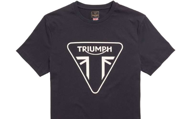
The wordmark anchors a broader identity system that separates into two distinct tracks: modern and heritage. Each uses the core logo differently, and that flexibility is the most interesting thing about how Triumph manages its brand.
The modern range (Speed Triple, Tiger, Street Triple) uses the clean black wordmark on its own, supported by sharp photography and minimal graphic design. The identity leans into performance and precision.
The heritage range (Bonneville family, Thruxton, Scrambler) reintroduces the eagle crest and gold colorways alongside the wordmark. The color palette shifts warmer, the typography in supporting materials gets more nostalgic, and the overall feel references the 1960s golden era deliberately.
This dual-track approach is actually tricky to pull off. Most brands that try to be both heritage and modern end up looking confused. Triumph manages it by keeping the wordmark itself constant and adjusting everything around it.
The logo also connects outward to the wider vehicle brand landscape, where British identity carries premium associations. Alongside brands like Royal Enfield and Aprilia, Triumph holds a specific position as the only surviving major British motorcycle manufacturer, and the logo communicates that status without stating it directly.
The brand style guide (available only to authorized partners) governs how these two identity tracks are kept distinct and coherent across global markets.
How Should the Triumph Motorcycles Logo Be Used?
Triumph keeps tight control over logo usage, which is standard for a brand with significant licensing revenue from apparel and accessories.
Official Usage Guidelines
- Do: Use official files sourced directly from Triumph Motorcycles Ltd. or authorized dealer portals
- Do: Maintain clear space around the wordmark; avoid crowding with other graphic elements
- Do: Use approved color variants only: black on light backgrounds, white on dark backgrounds, gold only in heritage-designated contexts
- Don’t: Stretch, condense, rotate, or otherwise distort the wordmark
- Don’t: Apply unauthorized color fills, gradients, or effects to the logo
- Don’t: Combine the Triumph wordmark with third-party logos without written authorization
- Don’t: Use the eagle crest or heritage combination mark outside of approved heritage product contexts
- Don’t: Reproduce the logo at sizes where legibility is compromised
Where to Access Official Logos
- Authorized Triumph dealers receive asset packages through the official dealer portal
- Licensed merchandise partners work directly with Triumph’s brand licensing team based in Hinckley
- Press and media can request high-resolution assets through the official Triumph Motorcycles press office
- General public access to official logo files is not provided; unofficial reproductions found online may not reflect current brand standards
Licensing and Trademark Protection
- The Triumph name and logo are registered trademarks of Triumph Motorcycles Ltd. in all major markets
- Unauthorized commercial use of the logo or name constitutes trademark infringement
- Licensing inquiries for merchandise, events, and co-branding are handled through Triumph’s official licensing department
- Fan art and non-commercial personal use generally falls outside enforcement focus, but commercial production without authorization does not
FAQ on The Triumph Logo
What does the Triumph logo represent?
The Triumph logo represents British engineering heritage and performance. The bold wordmark communicates confidence and precision.
The eagle crest, used in heritage contexts, connects back to the brand’s 1930s identity, when Triumph was building some of the most respected machines in the industry.
When was the current Triumph logo introduced?
The current refined wordmark was standardized around 2013 as part of a broader Triumph brand identity refresh.
It replaced earlier versions that mixed the wordmark with shield and eagle emblem elements. The update simplified the mark for better use across digital platforms and smaller applications.
What font does the Triumph logo use?
Triumph uses a custom-modified bold sans-serif typeface. It is not a standard off-the-shelf font.
The letterforms have been adjusted for tight tracking and strong horizontal weight, keeping the mark legible on tank badges, apparel, and small-scale digital use.
What colors are used in the Triumph logo?
The primary Triumph logo colors are black (#000000) and white (#FFFFFF). These are used across all standard applications.
A heritage gold (#C9A84C) appears in Bonneville and classic model contexts. The color psychology here is straightforward: black signals authority, gold signals craftsmanship.
Has the Triumph motorcycle emblem always looked the same?
No. The Triumph motorcycle emblem has gone through at least six meaningful iterations since 1902.
Early versions used ornate Victorian crests. The brand moved through eagle motifs, shield badges, and italicized wordmarks before arriving at the clean, modern mark used today.
What is the difference between the Triumph wordmark and the Triumph crest?
The wordmark is the primary Triumph brand mark used across modern models, marketing, and digital platforms. It stands alone.
The crest is a combination mark pairing the wordmark with the eagle emblem. It appears specifically on heritage and classic range models like the Bonneville family.
How does the Triumph logo compare to other motorcycle brand logos?
Most competitors use combination marks or abstract symbols. Harley-Davidson relies on its bar-and-shield, while Ducati leans into Italian sport associations.
Triumph’s clean wordmark is more internationally neutral, which suits its presence across Europe, North America, and growing Asian markets.
Is the Triumph logo trademarked?
Yes. The Triumph name and logo are registered trademarks of Triumph Motorcycles Ltd., protected across all major global markets.
Unauthorized commercial use constitutes trademark infringement. Licensing for merchandise and co-branding is handled directly through Triumph’s official licensing department in Hinckley.
Where can I download the official Triumph logo?
Official Triumph logo vector files are not publicly available for general download. Authorized dealers access assets through the official dealer portal.
Press and media can request high-resolution PNG and EPS files through the Triumph Motorcycles press office. Unofficial files found online may not reflect current brand standards.
What makes the Triumph logo design effective?
It works because it does very little. The logo design principles at play here are restraint and consistency.
The bold wordmark scales cleanly from a tank badge to a billboard. The Triumph visual identity avoids trend-chasing, which is exactly why it still reads as premium across a 120-year-old brand.
Conclusion
The Triumph logo is a case study in how a motorcycle trademark symbol can outlast factory closures, ownership changes, and market upheaval and still mean something.
From its Victorian crest origins to the clean Hinckley-era wordmark, the Triumph brand mark has tracked every major chapter of British motorcycle history.
What holds it together is consistency of intent. The Triumph corporate identity has always prioritized authenticity over trend-chasing, and that’s exactly why the badge still carries weight on a Bonneville tank or an embroidered jacket today.

Renowned for his expertise in logo design and visual branding, Bogdan has developed a multitude of logos for various clients.
His skills extend to creating posters, vector illustrations, business cards, and brochures. Additionally, Bogdan's UI kits were featured on marketplaces like Visual Hierarchy and UI8.
He also wrote in the past years on sites like Design Your Way, WebDesignerDepot, WPDean, Designmodo, Speckyboy, Slider Revolution, and more.
- The Windsurf Logo History, Colors, Font, And Meaning - 10 October 2026
- How to Remove Background From Product Photos (No Photoshop) - 10 October 2026
- How Designers can Build a Stronger Online Creative Identity - 9 October 2026

Bogdan Sandu is a seasoned designer who has been designing websites since 2008. Renowned for his expertise in logo design and visual branding, Bogdan has developed a multitude of logos for various clients. His skills extend to creating posters, vector illustrations, business cards, and brochures. Additionally, Bogdan's UI kits were featured on marketplaces like Visual Hierarchy and UI8. He also wrote in the past years on sites like Design Your Way, WebDesignerDepot, WPDean, Designmodo, Speckyboy, Slider Revolution, and more.
You Might Also Like