The Yamaha logo is one of the most recognized brand marks in both the music and motorsport industries. Built around three interlocking tuning forks arranged in a triangular formation, it has carried the same core symbol for decades. What makes it interesting is that a single mark covers everything from concert grand pianos to MotoGP race bikes.
Yamaha as a company dates back to 1887, when Torakusu Yamaha founded Nippon Gakki Co., Ltd. in Hamamatsu, Japan. The logo has gone through several refinements since then, though the tuning fork symbol has remained the constant thread across every version.
What is the Yamaha Logo?
The Yamaha logo is a combination mark built around three interlocking tuning forks arranged in a circle, paired with the “Yamaha” wordmark. The current version has been in use since 1998 and was developed internally by Yamaha Corporation. It represents the intersection of technology, craftsmanship, and sound.
- Design Type: Combination mark (emblem + wordmark)
- Primary Elements: Three interlocking tuning forks in a circular arrangement, custom “Yamaha” wordmark beneath
- Official Introduction Date: 1998 (current version)
- Designer/Agency: Developed in-house by Yamaha Corporation
- Trademark Status: Registered trademark held by Yamaha Corporation, protected under Japan Patent Office and international filings via WIPO
- Color Palette:
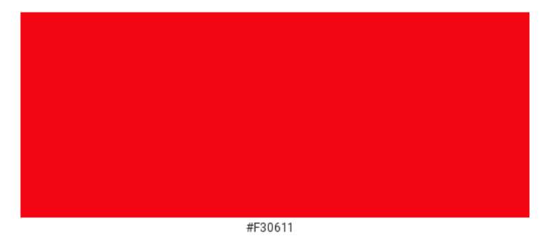
- Yamaha Red: #E60012
- Black: #000000
- White: #FFFFFF (for reversed applications)
- Usage Context: Motorcycle fuel tanks, musical instrument headstocks, product packaging, digital platforms, racing liveries, and branded merchandise worldwide
How Has the Yamaha Logo Evolved Over Time?
The Yamaha logo has gone through steady refinement since the late 1800s, moving from ornate Victorian-era lettering toward the clean, geometric mark used today. The tuning fork symbol arrived in 1955 and has anchored every version since.
Original Yamaha Logo (1887-1927)
- Years Active: 1887-1927
- Design Description: Text-based mark using decorative script lettering with no symbol element
- Color Scheme: Black and white
- Designer: Unknown
- Context: Created at the founding of Nippon Gakki Co., Ltd., primarily for use on reed organs and pianos
- Key Changes from Previous: First official mark for the company
- Cultural Significance: Positioned Yamaha as a Japanese instrument manufacturer at a time when Western music education was rapidly expanding in Japan
Nippon Gakki Era Logo (1927-1955)
- Years Active: 1927-1955
- Design Description: Refined wordmark with early use of a circular badge format on select products
- Color Scheme: Black and white, gold on premium instruments
- Designer: Unknown
- Context: Company expanded product lines through this period, including harmonicas and guitars
- Key Changes from Previous: Increased standardization across product categories
- Cultural Significance: Reflected Japan’s post-war push to become a global manufacturing force
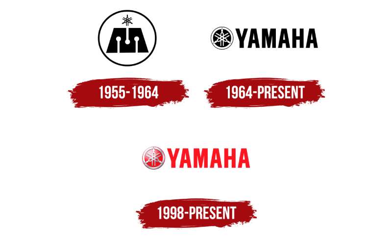
First Tuning Fork Logo (1955-1967)
- Years Active: 1955-1967
- Design Description: Three interlocking tuning forks introduced for the first time in a circular emblem, accompanied by “Yamaha” wordmark
- Color Scheme: Black and white
- Designer: Internal design team
- Context: Introduced the same year Yamaha Motor Co., Ltd. was founded as a separate entity from Nippon Gakki
- Key Changes from Previous: First appearance of the tuning fork symbol that defines the brand to this day
- Cultural Significance: Marked Yamaha’s expansion beyond instruments into motorcycles, requiring a mark strong enough to span two very different industries
Refined Emblem (1967-1998)
- Years Active: 1967-1998
- Design Description: Tuning fork emblem refined with cleaner geometry, bolder lines, and a more structured wordmark
- Color Scheme: Red and black introduced more prominently
- Designer: Internal design team
- Context: Yamaha was aggressively growing its motorsport presence through this period, including Formula 1 and MotoGP involvement
- Key Changes from Previous: Tighter proportions, improved legibility at small sizes, stronger red accent usage
- Cultural Significance: The logo became globally recognized through motorsport, appearing on race bikes and podiums around the world
Current Logo (1998-Present)
- Years Active: 1998-present
- Design Description: Streamlined tuning fork emblem with a custom sans-serif wordmark. Cleaner, more modern proportions throughout
- Color Scheme: Yamaha Red (#E60012) and black as primary colors
- Designer: Yamaha Corporation internal team
- Context: Updated to reflect Yamaha’s position as a global, multi-industry corporation
- Key Changes from Previous: More refined geometry, updated typography, better performance across digital applications
- Cultural Significance: Represents the mature brand identity of one of Japan’s most internationally recognized corporations
What Do the Design Elements of the Yamaha Logo Mean?
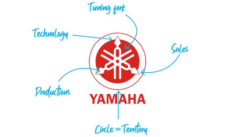
The three interlocking tuning forks at the center of the Yamaha logo carry most of the symbolic weight. Each fork represents one of three core areas: technology, production, and sales. Together, they form a triangle, suggesting balance and interconnection between all three.
The circular arrangement reinforces unity. Nothing is dominant. Each element supports the others.
That said, the tuning fork as a symbol goes deeper than corporate structure. Tuning forks are precision instruments used to produce a specific, reliable pitch. Choosing them as the brand’s central icon was a deliberate signal of accuracy and craftsmanship, values Yamaha has tried to carry across every product category.
Why Did Yamaha Choose These Specific Colors?
- Yamaha Red (#E60012)
- Pantone: Pantone 485 C
- Symbolic meaning: Energy, performance, passion
- Psychological impact: Attention-grabbing, associated with speed and power, particularly relevant in motorsport contexts
- Brand connection: Reinforces Yamaha’s identity in racing; red is used consistently across MotoGP liveries and motorsport branding
- Black (#000000)
- Symbolic meaning: Precision, sophistication, authority
- Psychological impact: Builds trust and signals quality, especially in premium audio and instrument markets
- Brand connection: Works across both the music and motor divisions without favoring either
- White (#FFFFFF)
- Symbolic meaning: Clarity, simplicity, versatility
- Psychological impact: Keeps reversed logo applications clean and legible
- Brand connection: Allows the mark to function across dark backgrounds in digital and physical applications
What Typography Style Is Used in the Yamaha Logo?
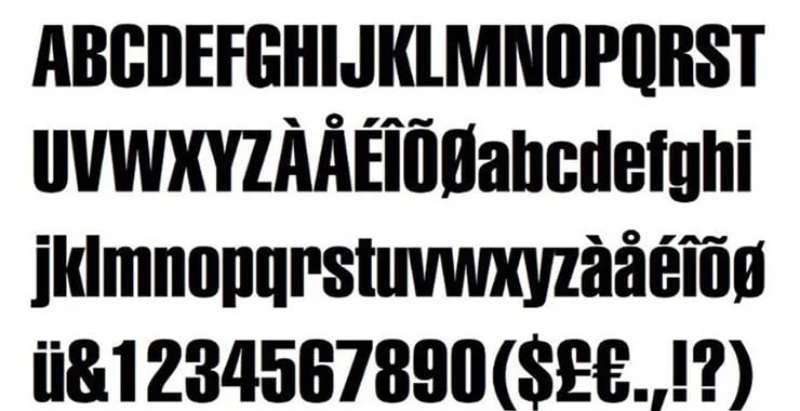
The “Yamaha” wordmark uses a custom sans-serif typeface. It sits cleanly beneath the tuning fork emblem without competing with it.
The letterforms are geometric but not rigid. There’s a slight warmth to the curves, which stops the mark from feeling cold or overly corporate.
Spacing between letters is tight and deliberate, keeping the wordmark compact enough to work at small sizes, like on instrument headstocks or motorcycle side panels, without losing legibility.
The typography has become more refined over the decades. Earlier versions used heavier, more condensed letterforms. The current version is noticeably more balanced, which suits the brand’s broader positioning across premium markets.
What Are the Hidden Meanings in the Yamaha Logo?
The three tuning forks aren’t just decorative. Each one officially represents a distinct pillar of the business: technology, production, and sales. The fact that they interlock suggests these three can’t function independently.
There’s also a less discussed reading. The tuning fork is a tool of calibration. It exists to set a standard. Using it as the brand’s symbol suggests that Yamaha sees itself as a benchmark, not just a manufacturer.
The triangular negative space formed at the center of the three-fork arrangement is sometimes noted by designers as an unintentional but pleasing geometric detail. Whether it was planned or not, it adds visual stability to the mark.
How Does the Yamaha Logo Compare to Competitor Logos?
Among motorcycle brands, Yamaha’s logo is unusual because it leads with a symbol rooted in music rather than speed or aggression. Most competitors in the space lean heavily into motion, sharp angles, or animal imagery.
The Kawasaki logo uses a bold, angular wordmark with no symbolic element, keeping everything in the letterforms themselves.
The Suzuki logo goes a different direction, using a stylized “S” that functions as both letterform and graphic mark. It’s clever but less immediately distinct than Yamaha’s tuning fork.
The Ducati logo relies on a wordmark paired with a red color block, with most of the brand’s visual identity carried by color rather than symbol.
The Harley-Davidson logo is more ornate and heritage-driven, reflecting a very different brand positioning. It’s expressive where Yamaha’s is restrained.
What Yamaha does differently is use a single symbol that works credibly across two completely separate industries. That’s genuinely rare in branding. Most companies with that kind of product diversity end up with fragmented visual identities. Yamaha managed to keep it unified.
Among music-focused brands, the tuning fork also has no real equivalent. Gibson uses a script wordmark. Fender uses a logotype. Roland and Korg both rely on clean wordmarks without symbolic elements. Yamaha stands alone in having a meaningful, purpose-built icon that connects directly to the craft of music.
What Are the Technical Specifications of the Yamaha Logo?
Official Color Codes
- Primary Color: Yamaha Red
- Hex: #E60012
- RGB: (230, 0, 18)
- CMYK: (0, 100, 92, 10)
- Pantone: 485 C
- Secondary Color: Black
- Hex: #000000
- RGB: (0, 0, 0)
- CMYK: (0, 0, 0, 100)
- Pantone: Black C
- Accent Color: White (reversed applications)
- Hex: #FFFFFF
- RGB: (255, 255, 255)
- CMYK: (0, 0, 0, 0)
Dimensions and Proportions
- Aspect ratio: The emblem is designed on a near-square base with the wordmark extending the overall mark horizontally below the symbol
- Minimum size requirements: The tuning fork emblem should not be reproduced below approximately 15mm in diameter to maintain legibility of the fork details
- Clear space specifications: A minimum clear space equal to the height of the “Y” in the wordmark is required on all sides of the combined mark
- Official usage guidelines: Yamaha publishes brand guidelines for corporate partners and licensed manufacturers; unauthorized modifications to proportions, colors, or element arrangement are prohibited under trademark protection
- File formats available: Official assets are distributed in vector graphics formats (EPS, SVG) for scalable applications, as well as high-resolution JPEG and PNG for digital use
- Resolution for print: A minimum of 300 DPI is required for all printed applications
What Cultural Impact Has the Yamaha Logo Had?
The Yamaha logo has reached a level of recognition that very few brand marks achieve across multiple industries. Most people who have never owned a Yamaha product can still identify the three tuning forks immediately.
In motorsport, the logo became a fixture of global racing culture through decades of MotoGP competition. Valentino Rossi’s championship years in the mid-2000s brought the mark to a generation of fans who may have had no prior connection to the brand.
In music, the situation is similar. Walk into any music school or rehearsal room and you’ll find Yamaha somewhere, whether it’s an upright piano, a digital keyboard, a mixing desk, or a student clarinet. The tuning fork has become shorthand for reliable, accessible musical equipment.
The logo also carries weight as an example of effective logo design in branding education. It comes up regularly in discussions about how a single mark can function across wildly different product categories without losing coherence. That’s a harder problem than it looks.
There’s also a cultural dimension specific to Japan. Yamaha represents one of the country’s most successful post-war industrial stories, and the logo carries that legacy. In Japan, the tuning fork symbol is associated not just with products but with a broader idea of Japanese precision and manufacturing excellence.
How Does the Yamaha Logo Fit Into the Overall Brand Identity?
The logo sits at the center of a brand identity that has to work for two very different audiences: musicians and motorsport enthusiasts. Most branding frameworks struggle with that kind of split. Yamaha handles it by keeping the logo neutral enough to serve both while letting product-level branding do the heavy lifting.
Yamaha Motor Co. and Yamaha Corporation are technically separate companies, but they share the logo and the tuning fork symbol. That’s a deliberate choice. The shared mark signals common origins and shared values around craftsmanship and precision, even as the two businesses operate independently.
The brand guidelines that govern logo usage are consistent across both divisions, which keeps the visual identity unified in public-facing applications.
The logo works within a broader system that includes consistent color usage, typography, and a set of brand style guide rules that govern how the mark appears across packaging, digital platforms, physical products, and advertising. The tuning fork emblem functions as what designers call the “hero element,” the single icon that anchors everything else.
Product lines like the YZF motorcycle series or the Clavinova piano range carry their own sub-brand identities, but the Yamaha mark always appears alongside them. It acts as a quality endorsement as much as an identifier.
How Should the Yamaha Logo Be Used?
Official Usage Guidelines
- Do: Use official files sourced directly from Yamaha’s brand resources or licensed partners
- Do: Maintain the required clear space on all sides of the mark
- Do: Reproduce the logo in approved color combinations: red on white, black on white, white on black, or white on red
- Do: Use vector formats for any print or large-format application
- Don’t: Alter the proportions of the tuning fork emblem or wordmark
- Don’t: Recreate the logo using standard system fonts or approximate colors
- Don’t: Place the logo on backgrounds that reduce contrast or legibility
- Don’t: Add effects such as gradients, drop shadows, or outlines to the mark
- Don’t: Use the logo in a way that implies endorsement or partnership without written authorization from Yamaha Corporation
Where to Access Official Logos
- Yamaha Corporation’s official press and media resources (available via their global corporate website)
- Yamaha Motor Co. press room for motorsport-specific applications
- Licensed distributor and dealer portals for authorized retail partners
Licensing and Trademark Protection
- The Yamaha name and tuning fork symbol are registered trademarks in most major markets worldwide
- Commercial use of the logo requires written permission from Yamaha Corporation or Yamaha Motor Co., depending on the application
- Trademark protection covers both the tuning fork emblem and the “Yamaha” wordmark independently, as well as the combined mark
- Infringement cases are actively pursued; using the mark on unauthorized merchandise or in misleading commercial contexts carries real legal risk
- Fan art and editorial use generally fall under fair use provisions, but any commercial application requires licensing
FAQ on The Yamaha Logo
What does the Yamaha logo represent?
The three interlocking tuning forks represent technology, production, and sales.
Arranged in a triangular formation, they signal balance between these three pillars. The tuning fork symbol also connects directly to Yamaha’s origins as a musical instrument manufacturer.
When was the current Yamaha logo introduced?
The current version of the Yamaha corporate logo was introduced in 1998.
It refined the geometry of earlier versions and updated the wordmark for better legibility across digital platforms and physical products.
What are the official Yamaha logo colors?
The primary color is Yamaha Red, with the hex code #E60012 and Pantone 485 C.
Black and white complete the official palette. These three cover all approved color combinations in the brand guidelines.
Why does Yamaha use tuning forks in its logo?
Yamaha started as a piano and reed organ maker in 1887. The crossed tuning forks symbol was a natural choice, directly referencing the precision instruments used to tune and calibrate musical equipment.
Is the Yamaha logo the same for motorcycles and musical instruments?
Yes. Both Yamaha Corporation and Yamaha Motor Co. use the same three tuning forks emblem and wordmark.
The two companies are legally separate but share the logo as a symbol of their common heritage and founding values.
How many times has the Yamaha logo changed?
The Yamaha brand mark has gone through several iterations since 1887.
The tuning fork symbol first appeared in 1955. Since then, refinements in 1967 and 1998 adjusted proportions and typography without changing the core icon.
What font is used in the Yamaha logo?
The Yamaha wordmark uses a custom sans-serif typeface developed in-house. It is not based on a publicly available font family and cannot be accurately replicated using standard system typefaces.
Where can I download the official Yamaha logo?
Official Yamaha logo PNG and vector files are available through Yamaha’s corporate press resources and authorized dealer portals.
Using files sourced from third-party sites risks getting outdated or incorrectly reproduced versions.
Can I use the Yamaha logo for my project?
The Yamaha name and tuning fork are registered trademarks. Commercial use requires written authorization from Yamaha Corporation.
Editorial and educational use generally falls under fair use, but anything tied to selling a product or service needs a proper license.
How does the Yamaha logo compare to other motorcycle brand logos?
Most motorcycle brand logos rely on wordmarks or abstract shapes tied to motion and aggression.
Yamaha is unusual. Its symbol comes from music, not speed, which gives the Yamaha visual identity a depth that competitors like Kawasaki, Suzuki, and Ducati don’t share.
Conclusion
The Yamaha logo is a rare example of a brand mark that has stayed relevant across more than six decades without losing its core identity.
The crossed tuning forks emblem covers motorcycles, pianos, marine engines, and pro audio gear without feeling out of place in any of them.
That kind of consistency doesn’t happen by accident. It comes from a symbol with genuine meaning behind it, solid Yamaha corporate branding, and a disciplined approach to logo usage guidelines that most companies struggle to maintain.
Few marks in Japanese brand history carry that much weight across that many industries.
Renowned for his expertise in logo design and visual branding, Bogdan has developed a multitude of logos for various clients.
His skills extend to creating posters, vector illustrations, business cards, and brochures. Additionally, Bogdan's UI kits were featured on marketplaces like Visual Hierarchy and UI8.
He also wrote in the past years on sites like Design Your Way, WebDesignerDepot, WPDean, Designmodo, Speckyboy, Slider Revolution, and more.
- The Airtable Logo History, Colors, Font, And Meaning - 12 July 2026
- How to Blur Background in Canva: A Quick Tutorial - 11 July 2026
- Typography Trends - 10 July 2026
Bogdan Sandu is a seasoned designer who has been designing websites since 2008. Renowned for his expertise in logo design and visual branding, Bogdan has developed a multitude of logos for various clients. His skills extend to creating posters, vector illustrations, business cards, and brochures. Additionally, Bogdan's UI kits were featured on marketplaces like Visual Hierarchy and UI8. He also wrote in the past years on sites like Design Your Way, WebDesignerDepot, WPDean, Designmodo, Speckyboy, Slider Revolution, and more.
You Might Also Like