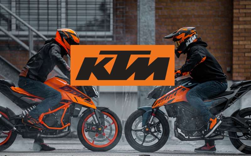
The KTM logo is one of the most recognized marks in motorsport. Bold, aggressive, and immediately readable, it reflects exactly what the brand stands for: performance-focused two-wheelers built for riders who take racing seriously. KTM has used variations of its wordmark since the 1950s, refining it steadily into the sharp, angular identity seen on bikes and gear today.
The brand was founded in 1934 in Mattighofen, Austria, by Hans Trunkenpolz. The logo has gone through roughly six to eight notable iterations over the decades, each one moving further away from ornate detail and closer to the stripped-back, high-contrast style the brand now owns completely.
What Is the KTM Logo?
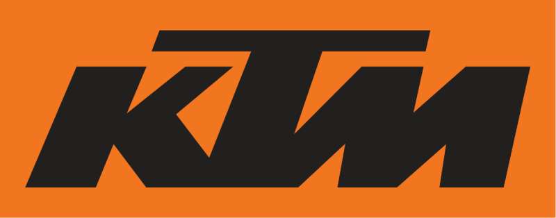
The KTM logo is a bold orange-and-black wordmark featuring the three-letter abbreviation in a custom sans-serif typeface. Introduced in its current form in the early 2000s, it represents the brand’s Austrian racing heritage and “Ready to Race” identity, designed for maximum visibility on bikes, helmets, and apparel.
- Design Type: Wordmark (text-based logo with no separate icon or mascot)
- Primary Elements: Three-letter acronym “KTM” in a bold, custom-modified sans-serif typeface, set against a high-contrast background
- Official Introduction Date: Current version refined and standardized in the early 2000s; orange colorway solidified as brand standard around 2000-2003
- Designer/Agency: Developed in-house by KTM’s brand and design team; no single external agency is publicly credited for the current version
- Trademark Status: Registered trademark held by Pierer Mobility AG (parent company of KTM); protected across major global markets
- Color Palette: KTM Orange (#FF6600 approximate), Black (#000000), White (#FFFFFF) for reversed applications
- Usage Context: Applied across motorcycles, racing gear, KTM PowerWear apparel, KTM PowerParts accessories, digital platforms, and motorsport event branding
How Has the KTM Logo Evolved Over Time?
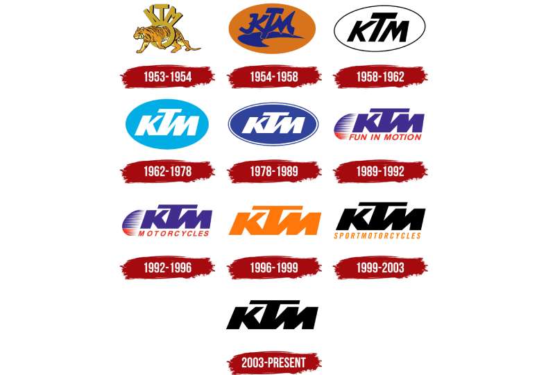
The KTM logo started as a relatively ornate badge in the 1950s and gradually shed detail with each decade. The shift toward a clean, aggressive wordmark happened progressively through the 1980s and 1990s, with the orange-and-black combination becoming the definitive standard by the early 2000s.
Original KTM Logo (1953-1960s)
- Years Active: Approx. 1953-late 1960s
- Design Description: Early badge-style emblem featuring the KTM lettering inside a shaped frame with decorative elements typical of European motorcycle brands of the era
- Color Scheme: Typically monochrome or two-tone; orange was not yet the dominant color
- Designer: Unknown; developed internally
- Context: Hans Trunkenpolz established the visual identity as the company began producing motorcycles commercially after initially building farm tools and vehicles
- Key Changes from Previous: First formal logo; no prior version to compare
- Cultural Significance: Positioned KTM as a legitimate Austrian motorcycle manufacturer in a competitive postwar European market
Transitional KTM Logo (1970s-1980s)
- Years Active: Approx. 1970s-1980s
- Design Description: Simplified lettering with less ornate framing; the three letters became more prominent relative to surrounding design elements
- Color Scheme: Orange began appearing more consistently alongside black
- Designer: Internal design team
- Context: KTM was building a serious off-road racing reputation, particularly in enduro and motocross. The logo needed to read clearly on race bikes and in event photography
- Key Changes from Previous: Reduced decorative framing, stronger letterform emphasis
- Cultural Significance: Aligned the brand visually with its growing motorsport identity
Modern KTM Logo (1990s-Early 2000s)
- Years Active: Approx. late 1990s-2003
- Design Description: Bold all-caps wordmark with the letters tightened and modernized; the typeface became more angular and aggressive
- Color Scheme: Orange and black firmly established as the primary palette
- Designer: Internal brand team during the Stefan Pierer era of ownership
- Context: KTM came out of bankruptcy in 1992 under new ownership and needed a brand rebuild. The cleaner logo reflected that reset
- Key Changes from Previous: Removed remaining badge elements; pure wordmark approach adopted
- Cultural Significance: Signaled KTM’s comeback and its sharper focus on performance and racing
Current KTM Logo (2003-Present)
- Years Active: 2003-present
- Design Description: Highly refined bold wordmark with custom letter spacing, sharp angles, and consistent stroke weight. The letters are wide, confident, and built for visibility at speed
- Color Scheme: KTM Orange on black background for primary use; white version for dark surface applications
- Designer: Refined internally; no external agency publicly credited
- Context: KTM was expanding aggressively into MotoGP, winning Dakar Rally titles consistently, and launching the Duke and Adventure series globally
- Key Changes from Previous: Tighter letter proportions, more consistent weight, fully standardized color application
- Cultural Significance: Became one of the most visible logos in motorsport globally, appearing on factory race bikes, Red Bull KTM team vehicles, and championship podiums
What Do the Design Elements of the KTM Logo Mean?
The KTM logo communicates speed, precision, and a no-nonsense attitude through its letterforms alone. There is no icon, no animal, no abstract shape. Just three letters that, at this point, carry more recognition in motorsport than most elaborate emblems ever could.
The bold weight and angular construction of the letters are not accidental. They mirror the physical design language of KTM bikes: sharp edges, rigid frames, nothing wasted.
What Does the KTM Wordmark Symbolize?
KTM stands for Kraftfahrzeuge Trunkenpolz Mattighofen, the full Austrian name of the company’s origin.
Over time, the acronym stopped needing explanation. The three letters now carry their own identity, completely separate from the original long-form name.
The decision to keep a pure wordmark rather than develop an icon says something deliberate: the name itself is the symbol. That kind of confidence in letterform branding is rare and takes decades of consistent application to earn.
Why Did KTM Choose These Specific Colors?
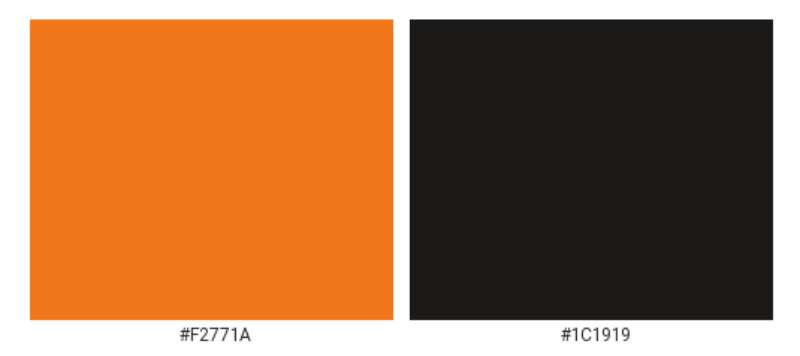
- KTM Orange
- Hex: Approximately #FF6600 (exact Pantone varies by application)
- Pantone: Closest standard match is Pantone 151 C or Pantone Orange 021 C
- Symbolic meaning: Energy, speed, aggression, heat
- Psychological impact: High visibility, stimulates excitement, stands out on track and in retail environments
- Brand connection: Orange is rare enough in the motorcycle industry that KTM effectively owns it. You see that orange on a bike from 200 meters and you know what it is. That kind of color psychology at work in branding is genuinely hard to build, and KTM has built it.
- Black
- Hex: #000000
- Symbolic meaning: Power, precision, technical authority
- Psychological impact: Creates maximum contrast with orange; grounds the palette and prevents it from reading as casual or playful
- Brand connection: Black is a standard in motorsport branding, used by most serious performance brands to communicate technical credibility
- White (reversed applications)
- Hex: #FFFFFF
- Symbolic meaning: Clarity, cleanliness
- Usage: Applied when the logo appears on dark surfaces where black background is not practical
What Typography Style Is Used in the KTM Logo?
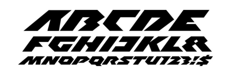
The KTM logotype uses a custom-modified bold sans-serif typeface. It is not a commercially available font pulled off a standard library.
The letters are wide, with consistent heavy stroke weights and subtle angular cuts that give the wordmark an aggressive, forward-leaning feel without using actual italics.
Readability at small sizes and high speeds was clearly a priority. The letterforms are open enough to remain legible on a moving motorcycle or helmet, which is a practical constraint that shaped the typographic decisions directly.
Earlier versions of the logo used slightly more rounded or varying-weight letterforms. The current version tightened everything, creating a more uniform and technical appearance that aligns with the sans-serif font conventions used across performance and motorsport branding.
What Are the Hidden Meanings in the KTM Logo?
There are no widely documented hidden images or subliminal figures in the KTM logo. It is an honest, direct wordmark without the kind of embedded geometry you see in logos like FedEx or Amazon.
That said, the proportional relationships between the three letters are carefully controlled. The spacing and weight balance create a visual stability that makes the logo feel planted and solid, which connects back to the engineering-first identity KTM has built.
The choice to never introduce an animal mascot or abstract icon, unlike competitors such as the Ducati logo or the Triumph logo, is itself a deliberate design stance. The meaning is in the restraint.
How Does the KTM Logo Compare to Competitor Logos?
KTM sits in a competitive group of motorcycle brands, each with a distinct visual identity. Where KTM uses a pure wordmark in orange and black, most competitors rely on emblems, shields, or figurative marks. KTM’s approach is arguably the most minimal and direct in the segment.
The Harley-Davidson logo leans into heritage with shield shapes and detailed typography that references Americana. It’s the opposite design philosophy from KTM.
The Yamaha logo uses three tuning forks arranged in a circle, a figurative emblem with layers of symbolic meaning. Again, very different from KTM’s text-only approach.
The Kawasaki logo is also a wordmark but uses a softer green colorway that reads as more accessible and less aggressive than KTM’s orange-black combination.
The Husqvarna logo, which is now a KTM Group brand, uses a blue and yellow color scheme that deliberately distances itself visually from the KTM identity, even though both come from the same parent company. Smart brand management.
The Aprilia logo and MV Agusta logo both lean into Italian design heritage with more stylized letterforms and refined aesthetics that target a different buyer persona entirely.
Among all of them, KTM’s orange wordmark is probably the easiest to spot on a racetrack, which is not a coincidence. That is the whole point when you look at it from a branding strategy perspective.
What Are the Technical Specifications of the KTM Logo?
Official Color Codes
- Primary Color: KTM Orange
- Hex: #FF6600
- RGB: (255, 102, 0)
- CMYK: (0, 60, 100, 0)
- Pantone: Closest match Pantone 151 C / Orange 021 C (exact specification varies by licensed application)
- Secondary Color: Black
- Hex: #000000
- RGB: (0, 0, 0)
- CMYK: (0, 0, 0, 100)
- Pantone: Process Black C
- Accent Color: White (for reversed use)
- Hex: #FFFFFF
- RGB: (255, 255, 255)
- CMYK: (0, 0, 0, 0)
Dimensions and Proportions
- Aspect ratio: The wordmark has a wide horizontal proportion; the three letters together are roughly 2.5:1 to 3:1 width-to-height ratio depending on version
- Minimum size requirements: KTM’s brand guidelines (not fully public) recommend minimum sizes that maintain legibility of the letterforms, generally no smaller than 15-20mm in width for print applications
- Clear space specifications: Standard practice is to maintain clear space equal to the height of the “K” letterform on all sides of the wordmark
- Official usage guidelines: Full brand standards are available to licensed partners and dealers through KTM’s official brand portal. The logo should not be stretched, recolored, or placed on backgrounds that reduce contrast below acceptable legibility thresholds. For digital use, RGB values apply; for print production, CMYK or Pantone spot color matching is standard. High-resolution assets are distributed in vector format to ensure clean scaling across all applications.
What Cultural Impact Has the KTM Logo Had?
The KTM logo has become a genuine symbol of off-road and motorsport culture. You see it on helmets, jerseys, van stickers, and workshop walls worldwide, worn by people who have never raced competitively but identify with what the brand represents.
Winning the Dakar Rally more than 20 consecutive times did more for logo recognition than any advertising campaign could have. Every podium appearance, every race broadcast, every highlight reel put that orange wordmark in front of millions of viewers.
The “Ready to Race” tagline, which consistently appears alongside the logo in KTM marketing, reinforced a specific identity: this is not a casual commuter brand. That positioning attracted a loyal rider community that treats the logo as a badge of seriousness.
Among younger riders especially, the KTM orange carries real cultural weight in the dirt bike and motocross community. It shows up in orange-branded logo culture discussions as one of the cleaner examples of how a single color can define an entire brand persona across decades.
The logo also travels well across cultures. Unlike logos that rely on text-heavy taglines or culturally specific imagery, the three-letter wordmark reads the same whether you are in Austria, Australia, or the United States. That kind of cross-market legibility is genuinely valuable for a global motorsport brand.
How Does the KTM Logo Fit Into the Overall Brand Identity?
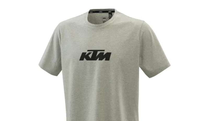
The KTM logo is the anchor of a broader visual system that includes bike design, apparel, packaging, race team liveries, and retail environments. Every touchpoint uses the same orange-black contrast, the same aggressive typography, and the same no-excess approach to visual communication.
KTM PowerWear and KTM PowerParts both carry the logo directly. The consistency across product lines means a customer sees the same visual language whether they are buying a motorcycle, a riding jacket, or a set of handlebars.
The Red Bull KTM Factory Racing partnership extended the logo’s reach significantly. The Red Bull red and blue appear alongside KTM orange in race contexts, and the two brands have managed that co-branding relationship without either one visually overwhelming the other. That is harder to pull off than it looks.
KTM’s subsidiary brands, including Husqvarna and GASGAS, use deliberately separate visual identities. This is a conscious decision to prevent brand dilution. The KTM logo stays premium and performance-focused while the other brands target adjacent buyer segments. Solid brand guidelines thinking, actually.
Compared to other vehicle manufacturer logos in adjacent categories, KTM’s system is lean and disciplined. There is no sprawling sub-brand architecture, no confusing variations. The logo means one thing and it means it consistently.
How Should the KTM Logo Be Used?
Official Usage Guidelines
- Do: Use the logo in its approved color versions: orange on black, white on black, or black on white/light backgrounds
- Do: Maintain required clear space around the wordmark at all times
- Do: Source logo files from KTM’s official brand portal or authorized dealer materials
- Do: Use vector file formats (SVG, EPS, AI) for print and large-format applications to maintain sharpness at any size
- Don’t: Stretch, compress, or alter the proportions of the logo
- Don’t: Change the colors outside of approved variations
- Don’t: Place the logo on backgrounds that reduce contrast and legibility
- Don’t: Add drop shadows, gradients, or effects not specified in official brand guidelines
- Don’t: Combine the KTM logo with other logos in ways not officially approved by KTM’s marketing team
Where to Access Official Logos
- KTM’s official press and media portal (press.ktm.com) provides approved assets for media use
- Authorized dealers receive brand asset access through KTM’s dealer network portal
- Sponsorship and partnership agreements include specific logo usage rights and asset delivery
Licensing and Trademark Protection
- The KTM logo is a registered trademark of Pierer Mobility AG
- Unauthorized reproduction for commercial purposes, including merchandise and apparel, is prohibited without a formal licensing agreement
- Trademark protection covers major global markets including the EU, US, and key Asian markets
- Counterfeit KTM-branded products are actively pursued through legal channels; the brand has a known history of enforcing its trademark rights
- Fan use in non-commercial contexts (personal projects, fan art) generally falls outside enforcement focus, but commercial application always requires proper licensing
FAQ on the KTM Logo
What Does KTM Stand For in the Logo?
KTM stands for Kraftfahrzeuge Trunkenpolz Mattighofen, referencing the founder Hans Trunkenpolz and the brand’s home city in Austria.
Over time, the abbreviation outgrew its origin. Most riders today know the KTM wordmark purely as a racing brand identity, not a company name.
What Colors Are Used in the KTM Logo?
The primary colors are KTM orange (approximately #FF6600) and black.
White appears in reversed applications. The orange-black combination is now so strongly tied to the brand that it functions almost like a second logo on its own.
Has the KTM Logo Ever Changed?
Yes. The KTM logo evolution spans roughly six to eight versions since the 1950s.
Early designs used badge-style framing. Each iteration removed detail until the current clean wordmark design emerged, standardized in the early 2000s.
Is the KTM Logo a Wordmark or an Emblem?
It is a pure wordmark. No icon, no animal, no abstract shape sits alongside the letters.
That is actually unusual in the motorcycle industry, where competitors like Yamaha and Triumph rely on figurative marks. KTM’s approach puts full weight on the three letters alone.
What Font Does the KTM Logo Use?
The KTM logo uses a custom sans-serif typeface, not a standard commercial font.
The letterforms are wide, heavy, and angular. They were built for high visibility on moving vehicles, which shaped every typographic decision in the design.
What Does the KTM Logo Represent?
It represents KTM’s “Ready to Race” identity: performance, aggression, and Austrian engineering precision.
The KTM brand identity deliberately avoids softness or approachability. Every design choice, from color to letterform weight, points toward a racing-first positioning.
Can I Download the KTM Logo for Free?
Official high-resolution assets are available through KTM’s press portal at press.ktm.com, intended for media use.
The logo is a registered trademark of Pierer Mobility AG. Commercial use without a licensing agreement is not permitted, regardless of where you find the file.
How Does the KTM Logo Compare to Other Motorcycle Brand Logos?
Most competitors use emblems or figurative marks. The Indian Motorcycle logo uses a detailed headdress; the Royal Enfield logo carries a classic crest.
KTM’s motorsport logo approach is more minimal than almost any rival in the segment, which makes it easier to reproduce consistently across bike decals, apparel, and digital platforms.
What Are the Official KTM Logo Color Codes?
Orange: Hex #FF6600, RGB (255, 102, 0), CMYK (0, 60, 100, 0), closest Pantone match is 151 C.
Black: Hex #000000. These are the two colors that define every primary KTM logo application across print, digital, and merchandise contexts.
Where Is the KTM Logo Used?
It appears on motorcycles, helmets, riding gear, KTM PowerWear apparel, KTM PowerParts packaging, and Red Bull KTM Factory Racing vehicles.
The logo also shows up on Dakar Rally entries, MotoGP bikes, and retail signage globally, making it one of the most widely seen marks in motocross branding.
Conclusion
The KTM logo is a case study in what happens when a brand commits to one direction and never flinches. Three letters, two colors, zero compromise.
Decades of Dakar Rally wins and MotoGP appearances did the heavy lifting. The KTM corporate identity didn’t need a mascot or an emblem to earn recognition globally.
From the early badge designs in Mattighofen to the sharp orange wordmark on factory race bikes today, the logo evolution tracks directly with the brand’s growth into a serious powersports force.
That consistency is the real story here. The KTM color scheme, the custom typography, the restraint in not overcomplicating things. It all adds up to a racing brand logo that genuinely means something.

Renowned for his expertise in logo design and visual branding, Bogdan has developed a multitude of logos for various clients.
His skills extend to creating posters, vector illustrations, business cards, and brochures. Additionally, Bogdan's UI kits were featured on marketplaces like Visual Hierarchy and UI8.
He also wrote in the past years on sites like Design Your Way, WebDesignerDepot, WPDean, Designmodo, Speckyboy, Slider Revolution, and more.
- Canva vs PowerPoint: Which Is Better for Presentations? - 22 September 2026
- How to Install Fonts on Mac (Step-by-Step Guide) - 20 September 2026
- From Mockup to Code: How AI-Augmented Development Speeds Up the Design Handoff - 19 September 2026

Bogdan Sandu is a seasoned designer who has been designing websites since 2008. Renowned for his expertise in logo design and visual branding, Bogdan has developed a multitude of logos for various clients. His skills extend to creating posters, vector illustrations, business cards, and brochures. Additionally, Bogdan's UI kits were featured on marketplaces like Visual Hierarchy and UI8. He also wrote in the past years on sites like Design Your Way, WebDesignerDepot, WPDean, Designmodo, Speckyboy, Slider Revolution, and more.
You Might Also Like