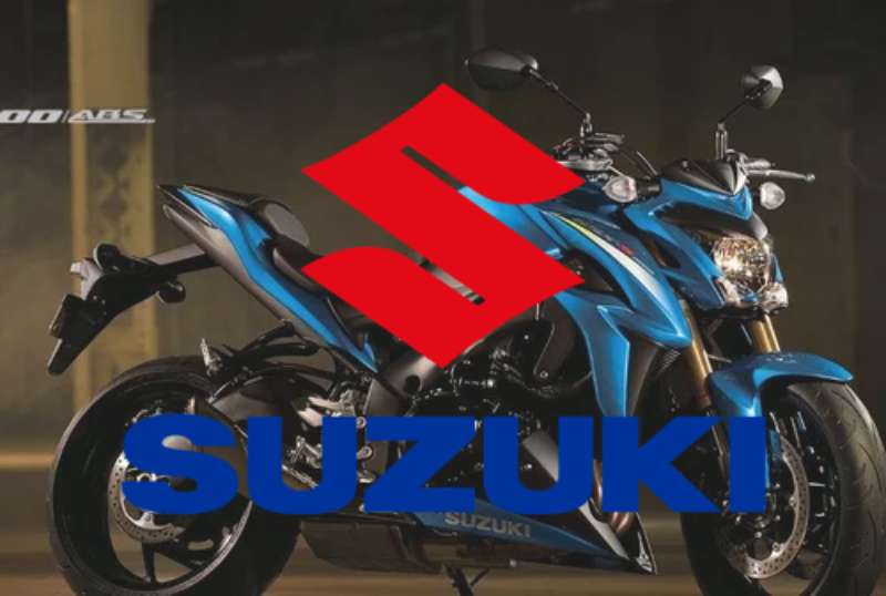
The Suzuki logo is one of the most recognized marks in the global automotive and motorcycle industries. It represents a Japanese multinational company founded in 1909, originally as a loom manufacturer before shifting to motorized vehicles. The logo has gone through several changes since the brand entered the vehicle market, but its current form has remained largely stable for decades.
Suzuki sits in a unique spot among vehicle brands. Unlike European luxury marks that lean on heritage crests, or American brands that favor bold lettering, Suzuki built its identity around a clean, geometric symbol that works equally well on a motorcycle fairing, a car hood, or a dealership sign.
The company was founded in 1909 by Michio Suzuki. It introduced its first motorcycle in 1952 and its first car in 1955. The logo has seen roughly five to six major iterations across its history, with the current “S” mark becoming the defining visual from the 1950s onward.
What Is the Suzuki Logo?

The Suzuki logo is a stylized red “S” mark paired with the wordmark “SUZUKI” in bold capital letters. The current version was refined in the mid-20th century and is used across all vehicle lines. It represents speed, precision, and the brand’s Japanese engineering heritage.
- Design Type: Combination mark (abstract symbol + wordmark)
- Primary Elements: Interlocking “S” symbol, bold sans-serif wordmark
- Official Introduction Date: The stylized “S” emblem became standard around 1958; the modern refined version was solidified in the 1980s
- Designer/Agency: Developed internally; no single external agency is officially credited
- Trademark Status: Registered trademark of Suzuki Motor Corporation globally
- Color Palette: Primary red (#E2000F), white (#FFFFFF), and black (#000000) depending on application
- Usage Context: Vehicles, motorcycles, outboard motors, dealership signage, digital platforms, marketing materials, and merchandise
How Has the Suzuki Logo Evolved Over Time?

Suzuki’s visual identity started with text-based marks in the early 1900s and gradually moved toward the bold “S” symbol that defines the brand today. The shift from loom manufacturer to vehicle maker pushed the need for a stronger, more industrial mark.
Each decade brought refinements. The overall trajectory moved from ornate and detailed toward cleaner, more geometric forms.
Original Suzuki Logo (1909-1950s)
- Years Active: 1909 to early 1950s
- Design Description: Text-based mark using the family name in Japanese and Roman characters; no distinct symbol
- Color Scheme: Typically black and white in printed materials
- Designer: Unknown
- Context: The company was manufacturing looms; brand identity was functional rather than designed for consumer recognition
- Key Changes from Previous: N/A (first mark)
- Cultural Significance: Reflected the industrial, pre-automotive identity of the company
First “S” Symbol Logo (1950s-1970s)
- Years Active: Approximately 1958 to mid-1970s
- Design Description: Introduction of the stylized interlocking double “S” shape, blocky and geometric with hard edges
- Color Scheme: Red and white
- Designer: Internal design team
- Context: Suzuki was expanding into motorcycles and small cars; needed a mark that could compete visually on an international stage
- Key Changes from Previous: Dropped the purely typographic approach, introduced a standalone symbol
- Cultural Significance: Marked Suzuki’s transition into a global vehicle brand
Refined Modern Logo (1980s-Present)
- Years Active: Early 1980s to present
- Design Description: Cleaner, more precise “S” mark with tighter geometry; paired with the bold all-caps “SUZUKI” wordmark in a strong sans-serif style
- Color Scheme: Red (#E2000F), white, and black variants depending on surface
- Designer: Internal refinement
- Context: Global expansion of the automotive and motorcycle divisions; needed a mark that read clearly at small sizes on badges and at large scale on signage
- Key Changes from Previous: Smoother curves on the “S,” improved proportional balance between symbol and wordmark
- Cultural Significance: The version most people recognize worldwide; tied to decades of motorsport, off-road culture, and affordable vehicle reliability
What Do the Design Elements of the Suzuki Logo Mean?
The core of the Suzuki logo is the interlocking “S” shape, which works on multiple levels. It functions as the brand’s initial, but the interlocking form suggests continuity, movement, and structural strength.
The double form of the “S” is not accidental. It creates a visual loop, suggesting forward motion and the mechanical connection between parts of an engine or drivetrain.
Why Did Suzuki Choose These Specific Colors?
- Red (#E2000F): The primary brand color. Red signals energy, speed, and urgency. In Japanese culture, red carries associations with strength and good fortune. For a vehicle brand, it also connects to performance and motorsport heritage.
- White (#FFFFFF): Used as the background in most primary applications. White adds clarity and gives the red mark room to breathe. It also communicates cleanliness and precision, qualities associated with Japanese manufacturing.
- Black (#000000): Used in monochrome applications and on certain vehicle badges. Black adds weight and seriousness to the mark when red is not appropriate for the surface.
What Typography Style Is Used in the Suzuki Logo?
The “SUZUKI” wordmark uses a custom bold sans-serif letterform. The letters are wide, even-weighted, and spaced for maximum legibility at a distance.
There are no serifs, no thin strokes, and no decorative elements. The typography is purely functional, built to be read quickly on a moving vehicle or from across a showroom floor.
Over time, the letterforms were tightened slightly to improve tracking and make the wordmark feel more compact and confident alongside the “S” symbol.
What Are the Hidden Meanings in the Suzuki Logo?
The interlocking “S” can be read as two “S” shapes mirrored against each other, which some interpret as representing the connection between manufacturer and rider, or between the brand and its customer.
Officially, no hidden meaning beyond the initial “S” for Suzuki has been stated by the company. But the interlocking geometry does carry an implicit sense of integration and mechanical precision that aligns with what the brand builds.
Some motorsport fans also associate the looping form with a road or track layout viewed from above, though this is an informal reading rather than a stated design intent.
How Does the Suzuki Logo Compare to Competitor Logos?
Suzuki’s mark is more abstract than most of its direct competitors. Honda uses a plain bold “H,” Yamaha uses a three-tuning-fork emblem, and Kawasaki uses a wordmark. Suzuki’s interlocking “S” is the most geometrically complex of the group.
Among car logos, Suzuki sits in the middle ground between utility-focused simplicity and badge-engineered prestige marks.
In motorcycle branding specifically, the red “S” competes visually with Ducati’s shield and Honda’s wing mark. Suzuki’s symbol is arguably the most abstract of the three, which gives it versatility across product categories but slightly less immediate emotional punch than a more figurative mark like Ducati’s.
Compared to tech company logos or other industries, Suzuki’s approach reflects a more traditional industrial brand philosophy: geometric, bold, color-defined, and built for physical surfaces rather than screens first.
What Are the Technical Specifications of the Suzuki Logo?

Official Color Codes:
- Primary Color: Suzuki Red
- Hex: #E2000F
- RGB: (226, 0, 15)
- CMYK: (0, 100, 93, 11)
- Pantone: Pantone 485 C (approximate)
- Secondary Color: White
- Hex: #FFFFFF
- RGB: (255, 255, 255)
- CMYK: (0, 0, 0, 0)
- Accent Color: Black
- Hex: #000000
- RGB: (0, 0, 0)
- CMYK: (0, 0, 0, 100)
Dimensions and Proportions:
- Aspect ratio: The “S” symbol is roughly square in proportion; the combined lockup with wordmark sits at approximately 4:1 width to height
- Minimum size requirements: The symbol should not be reproduced below 15mm in height in print design applications to maintain legibility
- Clear space specifications: A minimum clear space equal to the height of the “S” symbol should surround the mark on all sides
- Official usage guidelines: Suzuki provides brand guidelines to authorized dealers and partners; the logo should never be stretched, recolored outside approved palettes, or combined with unauthorized graphic elements
What Cultural Impact Has the Suzuki Logo Had?
The Suzuki mark has become shorthand for accessible performance, particularly in motorcycle culture. The red “S” appears on race leathers, aftermarket parts catalogs, and off-road gear worldwide.
In markets like India, where Maruti Suzuki dominates passenger car sales, the logo carries a different weight. There it signals reliability and everyday value rather than performance. Same mark, completely different cultural reading.
In motorsport, Suzuki’s MotoGP presence and the GSX-R line turned the logo into a symbol within sport bike communities. The badge carries genuine subcultural meaning for riders who grew up with the brand.
The logo also has recognition in outboard motor markets across Southeast Asia and among ATV users in North America, making it one of the few vehicle marks with strong recognition across completely different product categories.
How Does the Suzuki Logo Fit Into the Overall Brand Identity?

The logo sits at the center of a brand style guide that covers everything from dealership fascia to helmet decals. The red “S” acts as the anchor point for all visual communication.
Suzuki’s broader identity leans on the ideas of accessibility, durability, and honest engineering. The logo supports this. It is not trying to look premium in the way a BMW roundel or Mercedes star does. It is direct and functional, which matches what the brand actually builds.
The visual hierarchy in Suzuki’s marketing materials consistently places the red “S” as the dominant element, with product imagery and copy supporting rather than competing with the mark.
The logo connects directly to product lines (motorcycles, cars, marine engines, ATVs) through consistent color application. Red appears on signage, in advertising, and on physical badges. The consistency across very different product categories is actually one of the stronger aspects of how Suzuki manages its mark.
How Should the Suzuki Logo Be Used?
Official Usage Do’s and Don’ts:
- Do use the approved color versions: full color (red on white), reversed (white on red or black), and monochrome (black on white)
- Do maintain the required clear space around the mark
- Do use vector versions for any reproduction above small digital icon sizes
- Don’t stretch, distort, rotate, or skew the logo
- Don’t recolor the mark outside of approved brand colors
- Don’t place the logo over busy backgrounds without a solid color field behind it
- Don’t recreate or redraw the logo; always use official files
Where to Access Official Logos:
Authorized dealers and media partners can access official logo files through Suzuki’s regional press portals. In the US, Suzuki Motor of America provides brand assets directly to registered media contacts and official partners.
Licensing Information:
The Suzuki logo is a registered trademark. Any commercial use outside of authorized dealership or media contexts requires explicit written permission from Suzuki Motor Corporation or the relevant regional subsidiary.
Trademark Protection:
The “S” mark and the SUZUKI wordmark are protected trademarks in all major markets globally. Unauthorized reproduction on merchandise, apparel, or promotional materials without a licensing agreement constitutes trademark infringement.
FAQ on The Suzuki Logo
What Does the Suzuki Logo Represent?
The interlocking “S” mark represents the Suzuki name and the brand’s focus on mechanical precision.
The looping geometry suggests forward motion and structural strength. Red signals energy and performance across all product lines, from motorcycles to outboard motors.
When Was the Current Suzuki Logo Introduced?
The stylized “S” symbol first appeared around 1958. The refined modern version, with cleaner geometry and the bold wordmark, was standardized in the early 1980s.
It has remained largely unchanged since.
What Color Is the Suzuki Logo?
The primary color is Suzuki Red, with hex code #E2000F. White and black versions exist for different surface applications.
The red aligns with the brand’s motorsport heritage and connects to broader color psychology principles around energy and urgency.
Is the Suzuki Logo a Wordmark or a Symbol?
It is a combination mark. The standalone “S” emblem functions as a symbol, while “SUZUKI” in bold capitals works as a wordmark.
Both elements appear together in most applications, though the symbol is often used alone on vehicle badges.
Who Designed the Suzuki Logo?
No single external designer or agency is officially credited. The mark was developed and refined internally by Suzuki’s own team over several decades.
This is fairly common among Japanese manufacturers of that era.
Has the Suzuki Logo Ever Changed Significantly?
Yes. The brand started with a purely text-based mark in the early 1900s. The shift to a geometric “S” symbol came in the late 1950s as Suzuki expanded into vehicles.
Refinements since then have been gradual rather than dramatic.
What Font Does Suzuki Use in Its Logo?
The wordmark uses a custom bold sans-serif font with wide, even-weight letterforms. It was not drawn from a standard typeface library.
The letters are spaced for legibility at speed, on signage, and on vehicle surfaces.
What Is the Suzuki Logo’s Trademark Status?
The “S” emblem and the SUZUKI wordmark are registered trademarks of Suzuki Motor Corporation in all major global markets.
Unauthorized use on merchandise or promotional materials without a licensing agreement constitutes infringement.
How Does the Suzuki Logo Compare to Other Motorcycle Brand Logos?
Among the main Japanese brands, Suzuki’s mark is the most abstract. Honda uses a plain “H,” Yamaha uses a tuning fork emblem. Suzuki’s interlocking geometry stands apart.
It works across more product categories than most competitor marks.
Where Can I Download the Official Suzuki Logo?
Official logo files are available through Suzuki’s regional press portals, accessible to registered media contacts and authorized dealers.
General public downloads from unofficial sources risk using outdated or incorrect versions that don’t meet brand guidelines.
Conclusion
The Suzuki logo has held up across decades and product categories because the core design decisions were solid from the start. A geometric “S” mark, a consistent red color palette, and a clean wordmark don’t need reinvention every few years.
What makes it work is consistency. The same mark appears on a sport bike, a compact car, and a marine engine without looking out of place.
For anyone studying logo design principles or brand guidelines, Suzuki is a useful case. It shows how a straightforward combination mark, built around a single letter and one strong color, can carry a global brand identity for over 60 years.

Renowned for his expertise in logo design and visual branding, Bogdan has developed a multitude of logos for various clients.
His skills extend to creating posters, vector illustrations, business cards, and brochures. Additionally, Bogdan's UI kits were featured on marketplaces like Visual Hierarchy and UI8.
He also wrote in the past years on sites like Design Your Way, WebDesignerDepot, WPDean, Designmodo, Speckyboy, Slider Revolution, and more.
- The Windsurf Logo History, Colors, Font, And Meaning - 10 October 2026
- How to Remove Background From Product Photos (No Photoshop) - 10 October 2026
- How Designers can Build a Stronger Online Creative Identity - 9 October 2026

Bogdan Sandu is a seasoned designer who has been designing websites since 2008. Renowned for his expertise in logo design and visual branding, Bogdan has developed a multitude of logos for various clients. His skills extend to creating posters, vector illustrations, business cards, and brochures. Additionally, Bogdan's UI kits were featured on marketplaces like Visual Hierarchy and UI8. He also wrote in the past years on sites like Design Your Way, WebDesignerDepot, WPDean, Designmodo, Speckyboy, Slider Revolution, and more.
You Might Also Like