A driver has about five seconds to read your billboard. That’s it.
The best fonts for billboards aren’t chosen for style. They’re chosen for survival at distance, at speed, in direct sunlight, and on a surface the size of a house.
Typeface selection directly determines whether your outdoor advertising message lands or gets ignored. Stroke weight, x-height, letter-spacing, and aperture size all affect how well text reads from 200 feet away at 65 mph.
This guide covers the 10 most reliable fonts for large format signage and roadside billboard design, with exact specifications, real-world use cases, and pairing recommendations for each.
By the end, you’ll know which typefaces hold up at highway viewing distances, which work best on digital LED displays vs. print vinyl, and which to avoid entirely in outdoor advertising.
The Best Fonts For Billboards
Drivers have roughly 5 to 7 seconds to read a billboard. That’s not much. The wrong font kills the message before anyone reads it.
The fonts below cover the full range of billboard use cases, from highway advertising at 70mph to digital OOH screens in pedestrian zones. Each was selected based on structural attributes: stroke weight, x-height, letter-spacing, and distance legibility, not aesthetics.
—
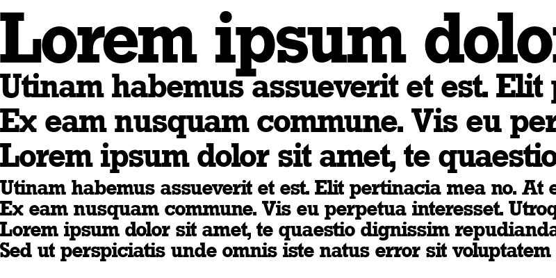
Helvetica Bold
Helvetica Bold is a neo-grotesque sans-serif font designed by Max Miedinger and Eduard Hoffmann in 1957, released by the Haas Type Foundry in Switzerland. It delivers neutral, high-legibility typography at any scale for outdoor advertising and large format signage.
Helvetica Bold suits billboard advertising because its consistent stroke width and tall x-height maintain character recognition at distances exceeding 500 feet. Massimo Vignelli used it for the New York City subway signage system, one of the most demanding large-scale legibility environments ever designed.
—
What makes Helvetica Bold suitable for billboards?
Helvetica Bold has a consistent stroke width with no thick-to-thin transition, which prevents character degradation at large print sizes. Its x-height is tall relative to cap height, improving lowercase legibility when viewed at speed. Open counter spaces in letters like “c,” “e,” and “a” reduce misreads under low contrast or glare conditions.
Well, the thing is, its tight apertures (the narrow openings in rounded letters) do create some legibility issues at smaller sizes or on low-contrast backgrounds. At billboard scale, that tradeoff disappears.
| Attribute | Value |
| Classification | Neo-grotesque sans-serif |
| Designer | Max Miedinger & Eduard Hoffmann, 1957 |
| Weight range | 34 weights across Helvetica family; Neue Helvetica covers 59 fonts |
| Variable font | No (standard); Helvetica Now Display available via Monotype |
| Optical sizes | Yes (Helvetica Now: Micro, Text, Display) |
| Recommended sizes | Bold weight at 100pt+ for primary billboard headlines |
| Letter-spacing default | Tight |
| License | Commercial (Monotype); not free |
| Available on | Adobe Fonts, Monotype, Linotype direct |
| Price | Subscription (Adobe Fonts) or one-time purchase via Monotype |
—
How does Helvetica Bold perform at billboard scale?
Helvetica Bold renders with high stroke uniformity at large format print sizes, which prevents ink bleed or visual thinning at 14×48 foot dimensions. Its neutral design means letter forms don’t compete with each other, which keeps short messages (5 words or fewer) instantly scannable.
Brands like American Airlines, The North Face, and 3M have used it in outdoor advertising for decades. That kind of real-world use is hard to argue with.
—
What are the best pairings for Helvetica Bold in billboard design?
Helvetica Bold pairs with Garamond or a classic serif font for secondary tagline text when a contrast in tone is needed. It also works alongside other typefaces in the Helvetica family for weight-based hierarchy without introducing a second typeface.
—
What are the limitations of Helvetica Bold for billboards?
Helvetica Bold requires a commercial license, which adds cost for smaller advertisers. Its tight apertures can reduce legibility on low-contrast backgrounds (gray text on white, for example), so color pairing matters more than with more open-aperture typefaces.
—
Helvetica Bold – Recommended Use Cases Within Billboard Advertising
- Best for: Corporate brand billboards, transit advertising, highway OOH campaigns requiring neutral authority
- Avoid for: Low-budget print runs where licensing cost is a constraint; reversed-out text on mid-tone backgrounds
- Optimal weight: Bold (75 in Neue Helvetica numbering) for primary headline
- Optimal size range: 120pt+ for primary copy; secondary text no smaller than 60pt
—
Futura Bold
Futura Bold is a geometric sans-serif typeface designed by Paul Renner in 1927, released by Bauersche Giesserei. It delivers clean, geometry-based letterforms for high-impact display advertising and large format signage.
Futura Bold works best for billboard headline copy because its near-perfect circular forms and uniform stroke weight produce consistent visual weight across all characters at large print sizes. It’s the typeface NASA used on the Apollo 11 plaque left on the Moon, which is about as far from a billboard as you can get, but proves the point about large-scale readability.
—
What makes Futura Bold suitable for billboards?
Futura Bold uses monotone strokes (consistent thickness throughout each letterform) with no calligraphic variation, which prevents character blurring at extreme print sizes. Its geometric construction, based on circles, triangles, and squares, produces high character differentiation even at viewing distances over 400 feet.
The relatively small x-height compared to Helvetica is worth noting. At equal point sizes, Futura Bold’s lowercase reads slightly smaller, so slight size compensation is needed when mixing with other typefaces.
| Attribute | Value |
| Classification | Geometric sans-serif |
| Designer | Paul Renner, 1927 |
| Weight range | Light to Extra Bold (standard); Futura PT extends to 7 weights including condensed |
| Variable font | No |
| Optical sizes | Yes (Display version available with more angular strokes) |
| Recommended sizes | Bold at 100pt+ for billboard headlines; avoid below 48pt outdoors |
| Letter-spacing default | Generous (wider than Helvetica) |
| License | Commercial (Adobe Fonts, Myfonts); Futura PT available separately |
| Available on | Adobe Fonts, MyFonts, Bauer foundry direct |
| Price | Subscription (Adobe Fonts) or purchase per weight |
—
How does Futura Bold perform at billboard scale?
At large format sizes (300dpi equivalent for print billboards), Futura Bold’s geometric shapes reproduce cleanly without ink gain distortion. Its open counter spaces in “O,” “C,” and “G” maintain interior clarity even on vinyl substrates with slight texture. Brands like Volkswagen and Absolut Vodka used it in outdoor campaigns precisely because of this large-scale visual stability.
—
What are the best pairings for Futura Bold in billboard design?
Futura Bold pairs with Garamond for secondary tagline text, where the contrast between geometric and humanist forms creates clear hierarchy. For a warmer alternative, Merriweather as body copy pairs well while keeping Futura Bold as the dominant headline weight. Check out the full Futura font pairing guide for more combinations.
—
What are the limitations of Futura Bold for billboards?
Futura Bold’s small x-height reduces lowercase legibility at distance compared to typefaces like Helvetica or Verdana. The condensed variants (Futura Condensed Bold) can compromise readability at highway speeds and should be tested carefully before committing to a large-format print run.
—
Futura Bold – Recommended Use Cases Within Billboard Advertising
- Best for: Brand-focused campaigns, luxury OOH advertising, modern product launches where geometric precision reinforces the brand identity
- Avoid for: Condensed layouts with long copy; low-resolution digital billboards where geometric curves may alias
- Optimal weight: Bold for primary copy; Extra Bold for single-word or two-word statements
- Optimal size range: 110pt+ for primary headline; do not use condensed versions below 80pt
—
Bebas Neue
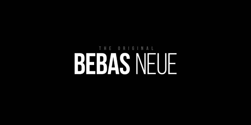
Bebas Neue is an all-caps display sans-serif typeface designed by Ryoichi Tsunekawa, first released as Bebas in 2005 by Dharma Type, then refined as Bebas Neue in 2010. It delivers condensed, high-impact lettering for space-constrained large format advertising.
Bebas Neue suits billboard outdoor advertising because its condensed uppercase structure fits more characters per line than most bold sans-serif typefaces, while maintaining strong stroke weight. It appeared in movie title sequences including La La Land and is widely used in event posters and brand campaigns.
—
What makes Bebas Neue suitable for billboards?
Bebas Neue uses a condensed letterform structure with tight default spacing, allowing longer messages to fit within standard billboard aspect ratios (14×48 ft or 10×36 ft) without reducing point size. Its consistent stroke weight across all uppercase characters produces even visual density at large format print sizes.
Since it’s all-caps only (the base version has no lowercase), it removes any decision about case style, which actually speeds up layout. That said, you lose some legibility flexibility that mixed-case provides.
| Attribute | Value |
| Classification | Display sans-serif (all-caps, condensed) |
| Designer | Ryoichi Tsunekawa, 2005/2010 |
| Weight range | Thin, Light, Book, Regular, Bold (Bebas Neue family); single heavy weight in base version |
| Variable font | No |
| Optical sizes | No |
| Recommended sizes | Regular/Bold at 90pt+ for billboard primary copy |
| Letter-spacing default | Tight (condensed) |
| License | SIL OFL 1.1 (free for commercial and personal use) |
| Available on | Google Fonts, Adobe Fonts, Fontfabric |
| Price | Free (base); Bebas Neue Pro is commercial |
—
How does Bebas Neue perform at billboard scale?
Bebas Neue renders with high contrast and visual impact at large print sizes. Its condensed structure means individual letterforms are tall relative to their width, which actually improves vertical legibility on standard landscape billboard proportions. At highway speeds (65+ mph), the all-caps uniformity supports fast scanning because there’s no lowercase/uppercase height variation to process.
—
What are the best pairings for Bebas Neue in billboard design?
Bebas Neue pairs with Libre Baskerville for secondary copy requiring a serif contrast, or with Open Sans Regular for supporting information at smaller sizes. The pairing of condensed display with a humanist sans-serif is the most common practice.
—
What are the limitations of Bebas Neue for billboards?
Bebas Neue is uppercase only in its base version, which limits layout flexibility and can reduce legibility for longer phrases compared to mixed-case typefaces. Bebas Neue Pro adds lowercase and Cyrillic support but requires a commercial license.
—
Bebas Neue – Recommended Use Cases Within Billboard Advertising
- Best for: Event billboards, short punchy slogans, entertainment or sports brand campaigns with space constraints
- Avoid for: Long-form copy; any design requiring lowercase lettering in the free version
- Optimal weight: Bold for maximum impact; Regular for layouts with more than 4 words
- Optimal size range: 90pt+ for primary headline on standard 14×48 ft format
—
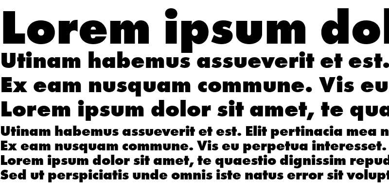
Montserrat Black

Montserrat Black is a geometric sans-serif typeface at its heaviest weight, designed by Julieta Ulanovsky in 2011 and released via Google Fonts under the SIL Open Font License. It delivers bold, structured letterforms for high-visibility outdoor advertising.
Montserrat Black suits billboard headline use because its 900-weight stroke mass produces high visual density at large print sizes, while the geometric construction keeps individual letterforms distinct. The typeface was directly inspired by the signage and posters of the Montserrat neighborhood in Buenos Aires, making its outdoor advertising DNA literal, not theoretical.
—
What makes Montserrat Black suitable for billboards?
Montserrat Black has a tall x-height relative to cap height, which improves lowercase legibility at distance. Its open circular forms (particularly in “O,” “G,” “C”) maintain counter clarity even at extreme print sizes or on textured vinyl substrates. The 18-weight family (Thin 100 to Black 900) means hierarchy can be established within a single typeface family, reducing layout complexity.
| Attribute | Value |
| Classification | Geometric sans-serif |
| Designer | Julieta Ulanovsky, 2011 |
| Weight range | Thin 100 to Black 900 (18 styles including italics) |
| Variable font | Yes (full 100–900 weight axis in a single file) |
| Optical sizes | No |
| Recommended sizes | Black (900) at 96pt+ for billboard primary copy |
| Letter-spacing default | 0 (neutral) |
| License | SIL OFL (free for commercial and personal use) |
| Available on | Google Fonts, Adobe Fonts |
| Price | Free |
—
How does Montserrat Black perform at billboard scale?
Montserrat Black’s heavy stroke weight (900) produces strong silhouette contrast against light or dark backgrounds, which is important for roadside billboard visibility under changing daylight conditions. Its geometric but slightly warm letterforms (softer than pure Futura) read as confident without feeling cold, which matters for brand tone in consumer-facing outdoor advertising.
—
What are the best pairings for Montserrat Black in billboard design?
Montserrat Black pairs with Montserrat Regular (400) for secondary text within the same family for clean hierarchy. It also works with Lora as a serif secondary when a warmer tone is needed in supporting copy. See the full Montserrat font pairing breakdown for more options.
—
What are the limitations of Montserrat Black for billboards?
At Black (900) weight, Montserrat’s counters (interior spaces in “a,” “e,” “s”) narrow significantly, which can reduce legibility at distance on low-contrast backgrounds. Stick to high-contrast color combinations and avoid using Black weight for anything below 80pt in large format contexts.
—
Montserrat Black – Recommended Use Cases Within Billboard Advertising
- Best for: Short headline copy (3–5 words), brand name displays, consumer product campaigns
- Avoid for: Mixed-case long phrases on low-contrast backgrounds; secondary copy below 60pt at Black weight
- Optimal weight: Black 900 for headline; ExtraBold 800 for supporting lines
- Optimal size range: 96pt+ for primary copy; 60–80pt for secondary text
—
Impact

Impact is a condensed display sans-serif typeface designed by Geoffrey Lee in 1965, released by the Stephenson Blake type foundry. It delivers maximum stroke weight in a condensed letterform for short, high-visibility advertising messages.
Impact suits billboard use for extremely short copy (3 words or fewer) because its heavy stroke mass and condensed structure produce near-maximum ink coverage per character at large print sizes. In practice, it’s one of the most recognized typefaces in public advertising, though its internet meme association has created some brand tone concerns for premium advertisers.
—
What makes Impact suitable for billboards?
Impact has one of the highest stroke-to-counter ratios of any commonly available display typeface, meaning individual characters read as solid, heavy masses at large distances. Its condensed width allows more characters per line compared to wider bold typefaces, which is useful for billboard layouts with horizontal constraints.
Took me a while to appreciate this: Impact actually becomes harder to use well as copy length increases. Short bursts, it’s unbeatable. Three-line paragraphs, it’s a mess.
| Attribute | Value |
| Classification | Condensed display sans-serif |
| Designer | Geoffrey Lee, 1965 (Stephenson Blake) |
| Weight range | Single weight (Regular, which is effectively Bold/Black) |
| Variable font | No |
| Optical sizes | No |
| Recommended sizes | 100pt+ for billboard primary copy; avoid for secondary text |
| Letter-spacing default | Tight (condensed default) |
| License | Included in Microsoft Core Fonts; commercial use licensing varies by platform |
| Available on | System font (Windows/Mac), various free font sources |
| Price | Free (system); confirm commercial license before print use |
—
How does Impact perform at billboard scale?
Impact produces extremely high visual weight at large format sizes, which means it reads at greater distances than most typefaces at equivalent point sizes. Its condensed letterforms maintain legibility in horizontal billboard proportions because the tall, narrow characters create strong vertical rhythm. Blip Billboards recommends sticking to 5 words or fewer when using Impact in outdoor advertising contexts.
—
What are the best pairings for Impact in billboard design?
Impact pairs with Arial Regular for supporting copy where the weight contrast makes the hierarchy clear. For a typeface combination that softens the visual aggression, Open Sans Light as secondary text works well. Pairing with any other bold or condensed typeface creates visual competition.
—
What are the limitations of Impact for billboards?
Impact has a single weight only, which eliminates typographic hierarchy within the typeface family. Its strong association with internet meme culture since the early 2000s makes it inappropriate for premium brand or luxury product billboard campaigns.
—
Impact – Recommended Use Cases Within Billboard Advertising
- Best for: Promotional retail billboards, sale announcements, high-energy event advertising with 1–3 word messages
- Avoid for: Luxury brands, multi-line copy, any campaign requiring weight hierarchy within the headline
- Optimal weight: Regular (only option) at maximum available size
- Optimal size range: 120pt+ for primary copy; not recommended for secondary text
—
Rockwell Bold
Rockwell Bold is a geometric slab serif font designed by the Monotype Corporation and released in 1934, supervised by engineering manager Frank Hinman Pierpont. It delivers monoweight slab serif letterforms for high-contrast outdoor display typography.
Rockwell Bold suits billboard advertising because its thick, flat rectangular serifs add additional horizontal mass to each letterform, improving legibility under conditions where character recognition at distance matters more than typographic elegance. The Docklands Light Railway used a bold weight of Rockwell in the late 1980s, a real-world legibility test in a demanding transit environment.
—
What makes Rockwell Bold suitable for billboards?
Rockwell Bold uses a monoline construction where all strokes appear roughly the same width, similar in visual logic to a geometric sans-serif but with the added horizontal anchoring of slab serifs. Its large x-height and open counter spaces (including a distinctive two-storey lowercase “a”) produce character shapes that remain distinct at over 300 feet.
The flat-top serifs on the capital A and the circular capital O are immediately recognizable and set it apart from softer slab serif options like Clarendon.
| Attribute | Value |
| Classification | Geometric slab serif |
| Designer | Monotype Corporation (Frank Hinman Pierpont, supervisor), 1934 |
| Weight range | Light, Regular, Bold, Extra Bold, Condensed (Rockwell Nova expands this further) |
| Variable font | No |
| Optical sizes | No |
| Recommended sizes | Bold at 96pt+ for billboard primary copy |
| Letter-spacing default | 0 (neutral); should not be set tight (serifs may touch) |
| License | Commercial (Monotype) |
| Available on | Adobe Fonts, MyFonts, Monotype direct |
| Price | Subscription (Adobe Fonts) or purchase |
—
How does Rockwell Bold perform at billboard scale?
Rockwell Bold’s slab serifs add visible horizontal weight at the base and cap of each stroke, which improves letter anchoring at large sizes on light backgrounds. Its monoline construction means there’s no thick-to-thin stroke transition that could create visual noise at distance. This makes it one of the most structurally stable slab serif options for outdoor large format use.
—
What are the best pairings for Rockwell Bold in billboard design?
Rockwell Bold pairs with ITC Franklin Gothic for secondary sans-serif copy, which the MyFonts field guide specifically recommends. It also works with Frutiger Serif or Harmonia Sans for supporting text when a softer secondary voice is needed. The slab-to-sans pairing is standard practice here.
—
What are the limitations of Rockwell Bold for billboards?
Rockwell Bold should not be set with reduced letter-spacing because the slab serifs can touch adjacent characters, eroding legibility. It also requires a commercial Monotype license, which increases cost for independent advertisers.
—
Rockwell Bold – Recommended Use Cases Within Billboard Advertising
- Best for: Professional services, real estate, traditional retail, and any campaign requiring authority with a classic tone
- Avoid for: Tight letter-spacing layouts; tech or startup brands where the slab serif reads as too conservative
- Optimal weight: Bold for standard headlines; Extra Bold for single-word emphasis
- Optimal size range: 96pt+ for primary copy; maintain generous tracking (at least +20)
—
Arial Black
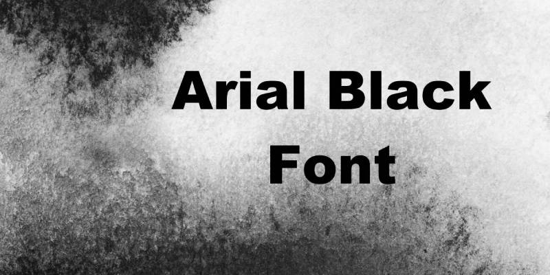
Arial Black is a neo-grotesque sans-serif typeface designed by Robin Nicholas and Patricia Saunders for Monotype in 1982, initially developed as a metric-compatible alternative to Helvetica. It delivers high-weight, wide-spaced letterforms for accessible large format outdoor advertising.
Arial Black suits billboard advertising because its wide default character spacing prevents letter crowding at large print sizes and its heavy stroke weight maintains contrast in bright sunlight or at viewing distances up to 500 feet. It ships with most Windows and Mac systems, which means no licensing cost for print production workflows.
—
What makes Arial Black suitable for billboards?
Arial Black has a consistently wide character set with generous default tracking, which reduces the risk of letter collision at large print sizes on vinyl or aluminum substrates. Its stroke weight sits between Bold and Black on most weight scales, producing strong visual mass without the full compression of a condensed typeface like Impact or Bebas Neue.
| Attribute | Value |
| Classification | Neo-grotesque sans-serif |
| Designer | Robin Nicholas & Patricia Saunders, 1982 (Monotype) |
| Weight range | Regular, Bold, Black (Arial family); Arial Black is a standalone heavy-weight cut |
| Variable font | No |
| Optical sizes | No |
| Recommended sizes | 96pt+ for primary billboard headlines |
| Letter-spacing default | Wide (spacious compared to Helvetica) |
| License | Bundled with Windows/Mac OS; commercial print use generally permitted |
| Available on | System font (Windows/Mac), Microsoft Typography |
| Price | Free (system font) |
—
How does Arial Black perform at billboard scale?
Arial Black’s wide default spacing means characters don’t require manual tracking adjustment for most billboard layouts, which speeds up production. Its neo-grotesque construction (based on Helvetica proportions but with softer terminals) produces familiar, instantly readable letterforms that perform well in consumer-facing outdoor advertising across retail, local services, and event promotion.
—
What are the best pairings for Arial Black in billboard design?
Arial Black pairs with Arial Regular for secondary supporting copy within the same family. For contrast, a transitional serif like Georgia or Times New Roman for supporting text creates clear hierarchy without introducing a third typeface.
—
What are the limitations of Arial Black for billboards?
Arial Black lacks the typographic refinement of Helvetica Bold (different terminal angles, slightly less sophisticated spacing), which some designers consider a disadvantage for premium brand campaigns. Its wide default spacing can cause layout challenges on narrow horizontal billboard formats with longer copy.
—
Arial Black – Recommended Use Cases Within Billboard Advertising
- Best for: Local advertising, retail promotions, budget campaigns where no font licensing cost is needed
- Avoid for: Luxury or premium brand campaigns; narrow horizontal billboard formats with 5+ word headlines
- Optimal weight: Black (the typeface is already a single heavy weight)
- Optimal size range: 96pt+ for primary copy; 60pt+ for secondary
—
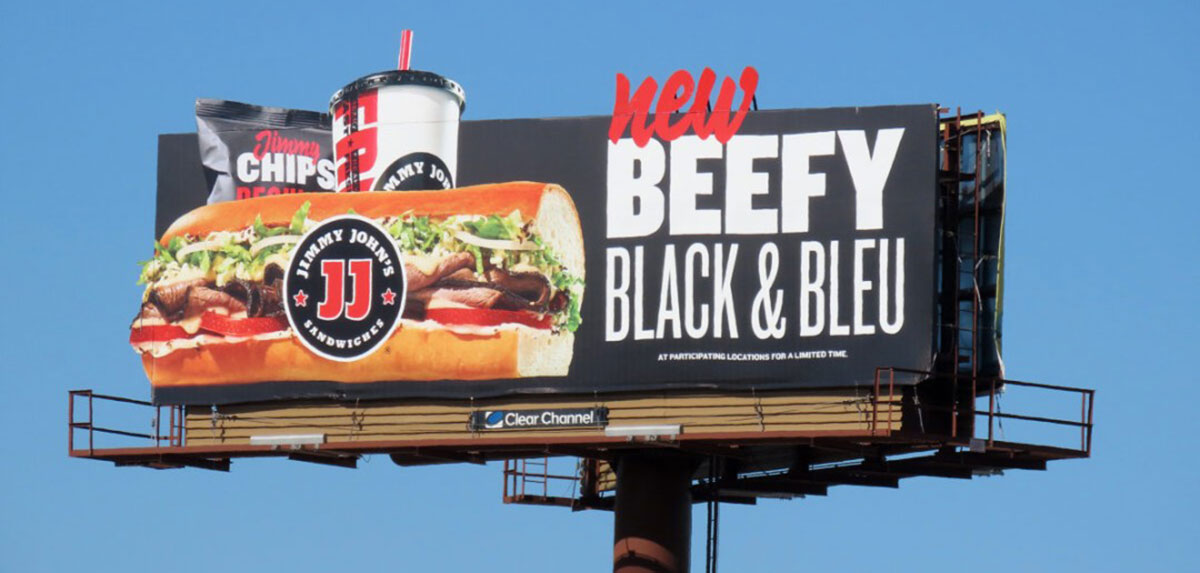
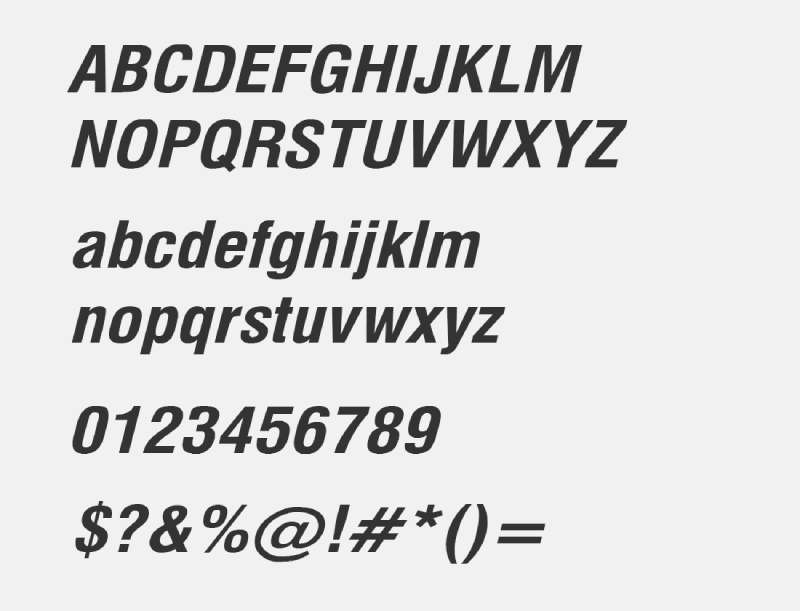
Trade Gothic Bold
Trade Gothic Bold is a grotesque sans-serif typeface designed by Jackson Burke for Mergenthaler Linotype between 1948 and 1960, released through Linotype. It delivers strong, versatile letterforms suited to both condensed and standard outdoor advertising layouts.
Trade Gothic Bold suits billboard use because its industrial-style letterform construction produces high character legibility across varying viewing conditions, from direct sunlight to dusk. It’s been a standard choice for newspaper mastheads and signage since the 1950s, proving its distance readability in real-world high-traffic contexts.
—
What makes Trade Gothic Bold suitable for billboards?
Trade Gothic Bold has a slightly condensed structure compared to Helvetica, which means it fits more characters per line at equal point sizes while maintaining comparable stroke weight. Its grotesque letterform DNA (pre-Helvetica Swiss rationalism) produces slightly more character differentiation between similar letters, which can reduce misreads at distance.
| Attribute | Value |
| Classification | Grotesque sans-serif |
| Designer | Jackson Burke, 1948–1960 (Mergenthaler Linotype) |
| Weight range | Light, Regular, Bold, Bold Condensed, Bold Extended (and variants) |
| Variable font | No |
| Optical sizes | No |
| Recommended sizes | Bold at 96pt+ for billboard primary copy; Condensed Bold for space-constrained layouts |
| Letter-spacing default | Slight negative (condensed character) |
| License | Commercial (Linotype/Monotype) |
| Available on | Adobe Fonts, MyFonts, Linotype direct |
| Price | Subscription (Adobe Fonts) or purchase |
—
How does Trade Gothic Bold perform at billboard scale?
Trade Gothic Bold’s slightly condensed proportions perform well on horizontal billboard formats where copy needs to stretch across a wide layout without losing weight. Its industrial construction means it holds detail at extreme print scales (300dpi vinyl output at 14 feet tall) without serif complications. Blip Billboards lists it as a primary display font recommendation for OOH advertising alongside Helvetica Neue.
—
What are the best pairings for Trade Gothic Bold in billboard design?
Trade Gothic Bold pairs with Trade Gothic Regular for secondary text within the same family. Across families, it works with serif typefaces like Clarendon or Rockwell for a contrast in structure. Using both Trade Gothic and a slab serif in one layout is unconventional but effective for campaigns needing a industrial or utilitarian tone.
—
What are the limitations of Trade Gothic Bold for billboards?
Trade Gothic Bold requires a commercial Linotype license. Its default tight spacing in the Condensed variant requires manual tracking adjustment for billboard use to prevent character collision at large print sizes.
—
Trade Gothic Bold – Recommended Use Cases Within Billboard Advertising
- Best for: Industrial brands, construction, automotive, and utilitarian campaigns; space-constrained horizontal billboard layouts
- Avoid for: Luxury or fashion brands; layouts where the slightly condensed default conflicts with the design’s required openness
- Optimal weight: Bold for standard copy; Bold Condensed for 6+ word headlines
- Optimal size range: 96pt+ for primary; 60pt+ for secondary with adjusted tracking
—
Verdana Bold
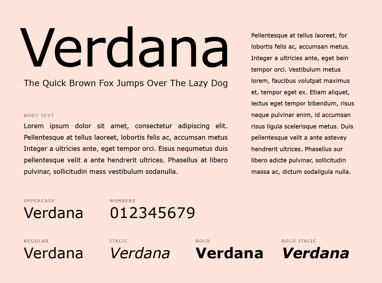
Verdana Bold is a humanist sans-serif typeface designed by Matthew Carter for Microsoft in 1996, released as a system font for Windows and Mac. It delivers wide, generously spaced letterforms designed for maximum clarity in low-resolution and high-glare viewing conditions.
Verdana Bold suits digital billboard advertising in particular because its pixel-first design philosophy produces unusually open default spacing and wide character proportions. That logic translates directly to LED digital OOH screens, which share some of the same visual constraints as early computer monitors.
—
What makes Verdana Bold suitable for billboards?
Verdana Bold has the widest default letter-spacing of any typeface on this list, which directly addresses one of the main billboard legibility problems: character collision at large print sizes. Its large x-height and carefully differentiated similar letterforms (lowercase “i,” “l,” and “1” are distinct by design) reduce misreads in fast-moving viewing conditions.
Matthew Carter himself noted that Verdana Bold is “bolder than most bolds” because of how it was hinted for early screen rendering. That extra stroke mass translates well to large format outdoor use.
| Attribute | Value |
| Classification | Humanist sans-serif |
| Designer | Matthew Carter, 1996 (Microsoft) |
| Weight range | Regular, Bold (base); Verdana Pro adds Light, Semibold, Black, and condensed widths |
| Variable font | No |
| Optical sizes | No |
| Recommended sizes | Bold at 96pt+ for billboard primary copy |
| Letter-spacing default | Wide (the widest default of commonly used sans-serifs) |
| License | Free (system font); Verdana Pro is commercial (Carter & Cone / Type Network) |
| Available on | System font (Windows/Mac), Adobe Fonts, Type Network (Verdana Pro) |
| Price | Free (base); Verdana Pro is subscription or purchase |
—
How does Verdana Bold perform at billboard scale?
Verdana Bold’s wide proportions mean it occupies more horizontal space than Helvetica Bold or Arial Black at equivalent point sizes. This is actually an advantage for digital billboard formats because the wide characters produce larger individual touch areas on LED pixel grids, reducing aliasing artifacts on lower-resolution screens. For standard print billboards, the wide spacing requires fewer words per line, which enforces brevity.
—
What are the best pairings for Verdana Bold in billboard design?
Verdana Bold pairs with Tahoma for supporting text when staying within Microsoft’s humanist sans-serif family. For wider typographic flexibility, Georgia (also designed by Matthew Carter) provides a complementary serif option for secondary copy, creating a cohesive design system without needing a third typeface.
—
What are the limitations of Verdana Bold for billboards?
Verdana Bold’s wide default spacing makes it less suitable for copy-heavy billboard layouts because it requires more horizontal real estate per word than condensed or neutral-width alternatives. The base family has only two weights (Regular and Bold), limiting hierarchy options within the typeface.
—
Verdana Bold – Recommended Use Cases Within Billboard Advertising
- Best for: Digital LED billboard advertising, short messages on high-brightness outdoor screens, accessibility-focused campaigns
- Avoid for: Copy-heavy layouts; narrow billboard formats where its wide spacing creates line-break problems
- Optimal weight: Bold (only heavy weight in base family)
- Optimal size range: 96pt+ for primary; wide spacing means secondary copy needs the same size as other typefaces use for primary
—
Roboto Black
Roboto Black is a neo-grotesque sans-serif typeface at its heaviest weight, designed by Christian Robertson for Google in 2011 and released as Android’s primary system font. It delivers geometric, mechanically structured letterforms with dual-nature construction (geometric forms with humanist flow) for modern advertising.
Roboto Black suits billboard use because its 900-weight stroke mass produces high visual density while its open apertures maintain character legibility at large distances. Google’s outdoor campaign advertising regularly uses Roboto at large scale, providing real-world evidence of its OOH performance.
—
What makes Roboto Black suitable for billboards?
Roboto Black combines geometric letterform construction with slightly humanist curves, which produces a dual benefit: geometric clarity for character differentiation at distance, and warmer curves that reduce the coldness sometimes associated with pure geometric typefaces. Its Black weight maintains open counters better than Impact or condensed display typefaces at equivalent visual mass.
| Attribute | Value |
| Classification | Neo-grotesque sans-serif (with humanist characteristics) |
| Designer | Christian Robertson, 2011 (Google) |
| Weight range | Thin 100 to Black 900 (12 styles including italics) |
| Variable font | Yes (weight axis available) |
| Optical sizes | No |
| Recommended sizes | Black (900) at 96pt+ for billboard primary copy |
| Letter-spacing default | 0 (neutral) |
| License | Apache 2.0 (free for commercial use) |
| Available on | Google Fonts, Adobe Fonts |
| Price | Free |
—
How does Roboto Black perform at billboard scale?
Roboto Black’s high stroke weight combined with open apertures produces strong legibility across both print and digital billboard formats. Its neutral geometric-humanist character makes it appropriate for corporate, consumer, and technology brand campaigns without the aggressive tone of Impact or the cold precision of pure geometric typefaces like Futura.
—
What are the best pairings for Roboto Black in billboard design?
Roboto Black pairs with Roboto Regular (400) within the same family for clean typographic hierarchy, following the same within-family pairing logic as Montserrat. For cross-family pairing, Roboto’s pairing options include Merriweather as a serif secondary and Open Sans for a closely matched sans-serif supporting role. Your mileage may vary on the Roboto-plus-Open-Sans pairing, as they’re quite similar in visual tone.
—
What are the limitations of Roboto Black for billboards?
Roboto Black’s neutral character, while broadly applicable, can feel generic on campaigns that require distinctive typographic personality. Its similarity to other neo-grotesque typefaces (including Helvetica and Arial) means it rarely becomes the identifying visual element of a campaign.
—
Roboto Black – Recommended Use Cases Within Billboard Advertising
- Best for: Tech brands, app-driven businesses, digital campaigns extending to OOH, corporate advertising requiring neutral authority
- Avoid for: Campaigns needing strong typographic personality or brand distinctiveness through typeface choice alone
- Optimal weight: Black 900 for primary headline; Bold 700 for secondary
- Optimal size range: 96pt+ for primary copy; 60–80pt for secondary
—
Choosing the Right Billboard Font: Quick Reference
Different campaign types need different structural characteristics. Here’s a direct comparison of the core decision criteria.
| Font | Best For | Copy Length | License Cost | Key Strength |
| Helvetica Bold | Corporate, transit | 3–6 words | Paid | Neutral authority |
| Futura Bold | Luxury, brand-focused | 3–5 words | Paid | Geometric precision |
| Free Neue | Events, entertainment | Up to 7 words | Free | Space efficiency |
| Montserrat Black | Consumer brands | 3–5 words | Free | Variable weight axis |
| Impact | Retail promotions | 1–3 words | Free | Maximum stroke mass |
| Rockwell Bold | Professional services | 3–5 words | Paid | Slab serif anchoring |
| Arial Black | Local retail | 3–6 words | Free | Wide default spacing |
| Trade Gothic Bold | Industrial, automotive | Up to 7 words | Paid | Condensed + sturdy |
| Verdana Bold | Digital billboards | 2–4 words | Free | Maximum letter-spacing |
| Roboto Black | Tech, corporate | 3–6 words | Free | Humanist geometry |
A few principles apply across all of these. High contrast between text and background matters more than typeface choice at viewing distances over 200 feet. Copy length should stay at 5–7 words maximum regardless of font. And font spacing should be checked at print scale, not screen scale, before committing to a final design.
Understanding font psychology also helps, since different typefaces carry tonal associations that affect how audiences perceive the brand behind the billboard, not just the words on it. If you need help combining fonts in your billboard layout, a font pairing generator can quickly surface workable combinations for review.
For campaigns extending into other formats, the same principles around weight and contrast apply to fonts for banners, fonts for posters, and fonts for advertising more broadly. And before scaling up for print production, always confirm font licensing covers commercial large format use, since some commercial fonts have restrictions on print scale or number of output locations.
FAQ on The Best Fonts For Billboards
What is the best font for a billboard?
Helvetica Bold is the most proven choice for billboard advertising. Its consistent stroke width, tall x-height, and open counter spaces maintain character legibility at distances over 300 feet, making it the default for highway signage and large format outdoor advertising campaigns.
What fonts should you avoid on a billboard?
Script fonts and thin decorative typefaces fail at billboard scale. Hairline strokes disappear at distance, and complex letterforms can’t be processed in 5 seconds. Avoid any typeface with high stroke contrast, tight apertures, or intricate details at outdoor advertising sizes.
Is sans-serif or serif better for billboard fonts?
Sans-serif fonts perform better in most outdoor advertising conditions. Their uniform stroke weight holds at large print sizes without detail loss. Slab serif fonts like Rockwell Bold are the exception, as their thick flat serifs add legibility rather than reducing it.
How big should the font be on a billboard?
On a standard 14×48 ft billboard, primary headline text should be set at 100pt or larger. A common rule in large format signage: one inch of letter height per 10 feet of viewing distance. Smaller formats require proportional adjustments.
What font does most outdoor advertising use?
Helvetica Bold, Arial Black, and Futura Bold dominate roadside billboard design. Bebas Neue has become common in event and entertainment campaigns. Highway Gothic (FHWA series) remains the standard for government road signage due to its strict legibility testing at speed.
Does font color affect billboard readability?
Yes. High-contrast color combinations matter as much as typeface choice. Black text on yellow, or white text on dark backgrounds, produce the strongest visibility at highway viewing distances. Even the best bold display font fails on a low-contrast background in direct sunlight.
Can you use a free font on a billboard?
Yes, several top-performing billboard fonts are free for commercial use. Bebas Neue, Montserrat Black, and Roboto Black are all available under the SIL Open Font License. Always verify font licensing terms before sending files to a large format print vendor.
What is the most readable font at a distance?
Verdana Bold was specifically engineered for maximum legibility at distance. Its wide default letter spacing, large x-height, and clearly differentiated characters reduce misreads. Research from Microsoft’s screen design program confirms it outperforms most typefaces in low-resolution and high-glare viewing conditions.
How many fonts should a billboard use?
One typeface family, two weights maximum. Using a single family with weight contrast (Black for headline, Regular for tagline) is cleaner and faster to read than mixing two separate typefaces. Most professional billboard signage uses this within-family approach.
Do digital billboards need different fonts than print billboards?
Yes. LED digital billboard screens have pixel grid constraints that cause geometric typefaces with tight apertures to alias at lower resolutions. Fonts like Verdana Bold and Roboto Black, with open forms and wide spacing, perform better on digital displays than on standard print vinyl.
Conclusion
This conclusion is for an article presenting the best fonts for billboards, and the core takeaway is straightforward: typeface legibility at distance is not subjective.
Stroke weight, x-height, and aperture size determine whether roadside billboard typography works or fails, regardless of how good the layout looks on screen.
Sans-serif typefaces dominate large format outdoor signage for structural reasons. Geometric display fonts like Futura Bold and condensed options like Bebas Neue serve specific campaign needs, while Montserrat Black and Roboto Black cover broader brand contexts for free.
For digital OOH screens, prioritize open letter-spacing and wide character proportions. For vinyl print, focus on bold stroke mass and high color contrast.
Match the typeface to the format, the viewing distance, and the copy length. That’s the decision framework that holds across every billboard type.
Renowned for his expertise in logo design and visual branding, Bogdan has developed a multitude of logos for various clients.
His skills extend to creating posters, vector illustrations, business cards, and brochures. Additionally, Bogdan's UI kits were featured on marketplaces like Visual Hierarchy and UI8.
He also wrote in the past years on sites like Design Your Way, WebDesignerDepot, WPDean, Designmodo, Speckyboy, Slider Revolution, and more.
- The Airtable Logo History, Colors, Font, And Meaning - 12 July 2026
- How to Blur Background in Canva: A Quick Tutorial - 11 July 2026
- Typography Trends - 10 July 2026
Bogdan Sandu is a seasoned designer who has been designing websites since 2008. Renowned for his expertise in logo design and visual branding, Bogdan has developed a multitude of logos for various clients. His skills extend to creating posters, vector illustrations, business cards, and brochures. Additionally, Bogdan's UI kits were featured on marketplaces like Visual Hierarchy and UI8. He also wrote in the past years on sites like Design Your Way, WebDesignerDepot, WPDean, Designmodo, Speckyboy, Slider Revolution, and more.
You Might Also Like


