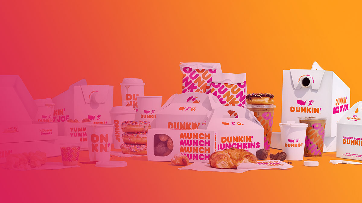
Dunkin’ uses a custom typeface family called Dunkin Sans, commissioned from London-based Colophon Foundry and developed alongside branding agency Jones Knowles Ritchie (JKR) for the 2019 rebrand. The family includes 3 styles: Dunkin Sans Display (Headline), Dunkin Sans Book, and Dunkin Serif.
Before 2019, Dunkin’ Donuts relied on Frankfurter, a bold rounded display typeface, as the dominant font in its logo. The 2019 refresh kept the spirit of Frankfurter alive but replaced it with a purpose-built, digitally optimized system.
What Type of Font Is Dunkin Sans?

Dunkin Sans is a rounded sans-serif typeface. It sits closer to the geometric sans-serif category, with soft terminals, open counters, and consistent stroke widths that make it instantly readable at small sizes on mobile screens and drive-thru signage alike.
The Display cut is heavy and wide, designed for wordmarks and large-format use. The Book cut is lighter, used for supporting text across packaging and digital interfaces.
A few things that stand out about the type design:
- Generous x-height, which helps legibility on cup sleeves and small-scale print
- Soft, rounded terminals that link back visually to the old Frankfurter letterforms
- Tight tracking in the wordmark, creating a compact, energetic feel
- Dunkin Serif included for editorial and body copy contexts
The typeface also covers Arabic and Cyrillic scripts, which was a requirement for a brand operating in 46 countries.
Who Designed the Dunkin’ Font?
Colophon Foundry designed the Dunkin Sans and Dunkin Serif typefaces. The London-based studio was commissioned by Jones Knowles Ritchie (JKR), the branding agency leading the 2019 Dunkin’ identity overhaul.
Colophon was founded in 2009 by Anthony Sheret and Edd Harrington. The studio has since created custom typefaces for Burger King, Canva, Cadillac, and Instagram. In December 2023, Colophon was acquired by Monotype.
The brief for Dunkin Sans was to “build upon the heritage of Dunkin’s strong and highly-recognisable type usage” while producing something new enough to work across digital platforms. That’s a tricky balance. Looking at the result, they landed it reasonably well.
The font family is proprietary. It belongs to Dunkin’ Brands and is not available for public licensing or purchase.
Is the Dunkin’ Font Free to Use?

No. Dunkin Sans is a proprietary typeface owned by Dunkin’ Brands, Inc. It was commissioned specifically for internal brand use and is not commercially available.
The license filed with the font files states: “To be used by Dunkin Brands, Inc., parents, subsidiaries and affiliate companies.” That’s as locked-down as it gets.
Some unauthorized copies of Dunkin Sans files exist on third-party font sites. Downloading those would violate Dunkin’ Brands’ intellectual property rights and isn’t recommended.
If you’re trying to match the Dunkin’ aesthetic for a project, the alternatives section below covers the closest free and paid options.
What Font Did Dunkin’ Use Before?
Dunkin’ Donuts used Frankfurter as its primary logo typeface from 1973 until the 2019 rebrand.
Frankfurter was designed by Bob Newman at the Letraset studio and first released in 1970. It’s a bold, rounded display typeface with no lowercase in its original heavy weight. Alan Meeks added Frankfurter Medium (with lowercase) in 1978. The font is published by ITC and remains commercially available today.
| Era | Font | Status | Notes |
| 1950–1973 | Cursive Wordmark | Custom | A classic mid-century script representing the “coffee and a donut” era. |
| 1973–2018 | Frankfurter | Commercial | The “bubble” font that defined the brand’s most famous period. |
| 2019–Present | Dunkin Sans | Proprietary | A custom family designed to modernize and simplify for the “Dunkin'” name change. |
Dunkin’ official press materials from the 2018 rebrand announcement noted the brand was “retaining its familiar pink and orange colors and iconic font, introduced in 1973.” By “iconic font” they meant Frankfurter. The 2019 custom system quietly replaced it while maintaining the same visual energy.
What Are the Best Free Alternatives to Dunkin Sans?
Since Dunkin Sans isn’t available publicly, here are 4 solid alternatives that match its rounded, bold character.
| Font | Why It Works | License | Source |
| RockoFLF Ultra-Bold | Soft geometric design, very close rounded weight | Free | Various font sites |
| Nunito Black | Rounded terminals, geometric proportions | Free (OFL) | Google Fonts |
| Varela Round | Cleaner, slightly lighter rounded sans | Free (OFL) | Google Fonts |
| VAG Rounded | The classic rounded geometric, well-known in auto branding | Commercial | Adobe Fonts |
Nunito Black is probably the most accessible and widely used of these. I’ve seen designers reach for it constantly when they need that soft-bold look without paying for a custom license.
VAG Rounded is the heavier commercial option and gets closest to Frankfurter’s original weight. Worth it if you need something that reads as retro-warm rather than contemporary-clean.
How to Use a Dunkin-Style Font in Your Design Tools
If you’re using Nunito or Varela Round as an alternative, here’s how to get them into your workflow quickly.
In Figma: Both fonts are available directly inside Figma via Google Fonts integration. Just type the name in the font picker.
In Canva: Nunito is available natively. You can also upload fonts to Canva if you have a Pro account and want to use a custom file.
In Photoshop: Download the font files from Google Fonts, install them system-wide, then restart Photoshop. Here’s a detailed walkthrough on how to add fonts to Photoshop if you get stuck.
In Adobe Illustrator: Same install process. For step-by-step instructions, see how to add fonts to Adobe Illustrator.
CSS embed for web use:
“ <link href="https://fonts.googleapis.com/css2?family=Nunito:wght@900&display=swap" rel="stylesheet"> `
Then in your stylesheet:
` font-family: 'Nunito', sans-serif; font-weight: 900; `
Worth noting: font licensing matters here. Nunito is released under the Open Font License (OFL), so it’s safe for commercial use, web embedding, and app development without additional fees.
Why Did Dunkin’ Choose This Font?
The 2019 rebrand had one main job: make “Dunkin'” (without “Donuts”) work as a standalone wordmark across every touchpoint, from a 3-inch phone screen to a 10-foot drive-thru sign.
Frankfurter was a strong display font but wasn’t built for that kind of flexibility. It also lacked a proper lowercase, which limits how you can use it in supporting text, app UI, and digital marketing copy.
Dunkin Sans solved both problems. The Display cut kept the chunky, friendly energy of Frankfurter. The Book cut gave the brand a usable body text option. The Serif added contrast for editorial contexts. Three cuts, one coherent system.
The psychology behind rounded fonts also plays a role here. Rounded letterforms consistently test as more approachable and less intimidating than sharp geometric or angular typefaces. For a brand competing on speed, value, and everyday familiarity (not premium positioning), that matters.
Dunkin’s orange and magenta pink color scheme, unchanged since 1976, relies heavily on the wordmark’s weight and shape for brand recognition. The font carries a lot of that load. It’s not decorative. It’s structural.
Compare this to how a brand like Starbucks handles its logo typography: much quieter, letting the siren icon do the work. Dunkin’ doesn’t have that luxury. The wordmark is the brand. So the font choice isn’t just a style decision. It’s the whole identity.
Other coffee chains and fast food brands facing similar digital-first identity challenges have gone through the same exercise. McDonald’s and DoorDash both invested in custom typefaces for similar reasons during their respective rebrand periods.
FAQ on What Font Does Dunkin’ Donuts Use
What is the official font used in the Dunkin’ logo?
Dunkin’ uses Dunkin Sans, a custom typeface commissioned from Colophon Foundry. It replaced Frankfurter in 2019 as part of the brand’s full identity refresh developed with agency Jones Knowles Ritchie.
Is the Dunkin’ font available for free download?
No. Dunkin Sans is a proprietary typeface owned by Dunkin’ Brands, Inc. It is not publicly available. Any files found on third-party sites are unauthorized copies and should not be used.
What font did Dunkin’ Donuts use before the 2019 rebrand?
The brand relied on Frankfurter, a bold rounded display typeface designed by Bob Newman at Letraset in 1970. Dunkin’ adopted it for its logo around 1973 and used it for over four decades.
What type of font is Dunkin Sans?
It’s a rounded sans-serif with geometric proportions. The family includes a Display cut for headlines, a Book cut for body text, and a Serif style for editorial use.
Who designed the Dunkin’ Donuts font?
Colophon Foundry, a London-based type studio founded in 2009 by Anthony Sheret and Edd Harrington, designed the custom Dunkin Sans typeface. The foundry was acquired by Monotype in December 2023.
What is the closest free alternative to the Dunkin’ font?
Nunito Black on Google Fonts is the most accessible free match. RockoFLF Ultra-Bold and Varela Round are also solid options. All three share the rounded terminals and bold weight that define the Dunkin’ wordmark style.
Why did Dunkin’ change its font in 2019?
Frankfurter lacked a lowercase and wasn’t built for mobile and digital use. The rebrand needed a flexible type system that worked across app interfaces, packaging, signage, and international markets including Arabic and Cyrillic scripts.
Does Dunkin’ use the same font across its app, packaging, and signage?
Yes. The Dunkin Sans family covers all brand touchpoints. The Display cut handles the wordmark and large-format signage. The Book cut appears in supporting text across menus, packaging, and digital interfaces.
Is Frankfurter still available to buy or download?
Yes. Frankfurter is a commercial typeface published by ITC and available through MyFonts and Adobe Fonts. It comes in 4 styles, including Medium (the only cut with a lowercase) and Highlight.
How does the Dunkin’ font compare to fonts used by other fast food brands?
Most major QSR brands now use custom type systems. Dunkin Sans sits in the same category as purpose-built retail branding fonts: bold, rounded, and built for high-traffic digital and physical environments rather than editorial elegance.
Conclusion
If you’ve been asking what font does Dunkin’ Donuts use, the answer is Dunkin Sans, a proprietary rounded sans-serif system built by Colophon Foundry for the 2019 rebrand.
It replaced Frankfurter after more than four decades, bringing a flexible typographic hierarchy that works across digital platforms, international markets, and physical signage.
For designers looking to match the Dunkin’ wordmark style, Nunito Black and VAG Rounded remain the closest free and commercial alternatives.
The Dunkin Sans logo typeface isn’t just a visual choice. It carries the full weight of one of the most recognized quick service restaurant brands in the world.

Renowned for his expertise in logo design and visual branding, Bogdan has developed a multitude of logos for various clients.
His skills extend to creating posters, vector illustrations, business cards, and brochures. Additionally, Bogdan's UI kits were featured on marketplaces like Visual Hierarchy and UI8.
He also wrote in the past years on sites like Design Your Way, WebDesignerDepot, WPDean, Designmodo, Speckyboy, Slider Revolution, and more.
- The Cursor Logo History, Colors, Font, And Meaning - 24 September 2026
- Canva vs PowerPoint: Which Is Better for Presentations? - 22 September 2026
- How to Install Fonts on Mac (Step-by-Step Guide) - 20 September 2026

Bogdan Sandu is a seasoned designer who has been designing websites since 2008. Renowned for his expertise in logo design and visual branding, Bogdan has developed a multitude of logos for various clients. His skills extend to creating posters, vector illustrations, business cards, and brochures. Additionally, Bogdan's UI kits were featured on marketplaces like Visual Hierarchy and UI8. He also wrote in the past years on sites like Design Your Way, WebDesignerDepot, WPDean, Designmodo, Speckyboy, Slider Revolution, and more.
You Might Also Like