Most printed books use serif fonts for body text, with Garamond, Baskerville, Caslon, and Minion Pro being the most common choices across traditional publishing.
The reasoning is straightforward: serifs guide the eye along each line of text, reducing reading fatigue over hundreds of pages. Publishers have followed this standard for over a century, and most readers never consciously notice it.
What Type of Fonts Are Used in Most Books?
Book typography almost always defaults to serif typefaces for body text. The small strokes at the end of each letterform create a visual flow that moves the eye from character to character, which matters a lot when someone is reading for hours.
Sans-serif fonts appear occasionally in headings or chapter titles, and sometimes in books targeting younger readers. But for long-form body text in printed books, they create more visual fatigue than their serif counterparts.
Old-Style Serifs
Typeface origins: These trace back to 15th-century Italy and remain the backbone of literary publishing.
Examples include Garamond, Caslon, Bembo, and Jenson. They have an oblique stress axis (the thickest part of a curved letter sits at an angle) and relatively low contrast between thick and thin strokes.
Old-style serifs are common in literary fiction, poetry, and fine press editions where a classical, warm look is the goal.
Transitional Serifs
More contrast between thick and thin strokes. More vertical axis on round letters. Generally cleaner on the page.
Most-used examples: Baskerville, Times New Roman, Georgia, and Minion Pro. This category dominates modern commercial book publishing because these faces print cleanly, reproduce well at small sizes, and work across a wide range of genres.
Robert Bringhurst’s widely referenced book The Elements of Typographic Style is itself typeset in Minion, which tells you something.
Font Size Standards
Body text in most printed books runs between 10 and 12 points. Children’s books use 16 to 24 points.
The exact size depends heavily on the specific typeface. Garamond at 11pt reads larger than Times New Roman at 11pt because of differences in x-height and letter spacing.
The Most Common Book Fonts
| Font | Classification | Common Use | Origin |
| Garamond | Old-style Serif | Literary fiction, prestige nonfiction | 16th-century France |
| Baskerville | Transitional Serif | Academic, classic literature | 1757, England |
| Caslon | Old-style Serif | General trade publishing, history | 1720s, England |
| Minion Pro | Old-style / Transitional | Modern nonfiction, academic journals | 1990, Adobe |
| Times New Roman | Transitional Serif | Mass-market paperbacks, newspapers | 1932, England |
Who Designed the Most Common Book Fonts?
Garamond
Designer: Claude Garamond (c. 1480–1561), a French punch-cutter and type designer working in Paris.
Garamond developed his roman types from the 1530s onward, drawing influence from Venetian old-style printing, particularly the work coming out of Aldus Manutius’s press. His letterforms became the standard for French and wider European printing for over 150 years.
After his death in 1561, his punches and matrices were sold and distributed to foundries across Europe. The typefaces known as “Garamond” today are mostly revivals, not direct casts from the originals. Adobe Garamond (1989) was designed by Robert Slimbach after studying original specimens at the Plantin-Moretus Museum in Antwerp.
Baskerville
Designer: John Baskerville (1706–1775), an English writing master, stonecutter, and printer based in Birmingham.
Baskerville first used his typeface in a 1757 quarto edition of Virgil. He classified his work as an attempt to improve on Caslon, increasing stroke contrast and sharpening the serifs. Benjamin Franklin admired the typeface and brought it back to the United States, where it was adopted for much of early federal government printing.
The modern revival began in 1917 when typographer Bruce Rogers recommended casting the type from original matrices at Harvard University Press. Linotype and Monotype both released their own versions in the 1920s.
Caslon
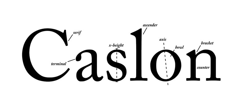
Designer: William Caslon I (1692–1766), an English type founder and the first major typeface designer of English origin.
Caslon’s earliest designs date to 1722. His types were distributed throughout the British Empire and became the standard for English-language printing through much of the 18th century. The saying “when in doubt, use Caslon” persisted among printers well into the 20th century.
Minion Pro
Designer: Robert Slimbach. Released: 1990 (Minion), 2000 (Minion Pro), by Adobe.
Slimbach drew on Renaissance old-style models, particularly the types of Garamond and Aldus Manutius, but Minion is not a revival of any single historical source. It was designed as a digital-native text face, built specifically for the capabilities of PostScript and later OpenType.
Minion Pro remains one of the most widely used fonts in professional book design and academic publishing. It comes bundled with Adobe software, which partly explains its reach.
Are These Book Fonts Free to Use?
Availability varies. Most of the classic book fonts require a paid license or come bundled with software you already own.
Garamond: EB Garamond is available free on Google Fonts (SIL Open Font License). Cormorant Garamond is another free alternative. Adobe Garamond Pro requires an Adobe subscription or direct license from Adobe Fonts.
Baskerville: Libre Baskerville is free on Google Fonts, optimized for screen use with a taller x-height. The full commercial Baskerville families from Linotype or Monotype are paid. Check out the Libre Baskerville pairing options if you want to use it in a project.
Caslon: Adobe Caslon Pro requires an Adobe license. There’s no widely available free version that matches the quality of the original, which is a real gap in the free font market.
Minion Pro: Comes bundled with Adobe Creative Cloud. Not freely available otherwise. For similar alternatives, see the section below.
Times New Roman: Pre-installed on most Windows and macOS systems. Available for free through most document applications. Not ideal for book design (it was created for newspaper columns, not book pages) but usable.
What Are the Best Free Alternatives to Classic Book Fonts?
If the commercial versions are out of reach, these free options hold up well for serious book typography work.
| Font | Replaces / Similar To | License | Source |
| EB Garamond | Garamond | OFL (Free) | Google Fonts |
| Libre Baskerville | Baskerville | OFL (Free) | Google Fonts |
| Cormorant Garamond | Garamond / elegant old-style | OFL (Free) | Google Fonts |
| Crimson Text | Minion Pro / old-style serifs | OFL (Free) | Google Fonts |
| Gentium Plus | General book serif | OFL (Free) | SIL International |
EB Garamond is the most usable free option for body text, though it lacks some of the optical size refinements that Adobe Garamond Pro provides. For longer books, those details start to matter.
If you want to see how some of these Cormorant Garamond pairings work in practice, it helps to print a test spread at your final trim size before committing to a full layout.
How to Use Book Fonts in Your Layout Software
In Adobe InDesign
InDesign is the standard for professional book typesetting. If you’re working with Minion Pro or Adobe Garamond Pro, both are accessible through Adobe Fonts directly within the application.
For Google Fonts alternatives: download the font files, install them to your system, then they’ll appear in InDesign’s font menu automatically. If you need step-by-step instructions, this guide on how to add fonts to InDesign covers the full process.
In Other Tools
Canva: Supports font uploads for Pro users. Free plan limits you to Canva’s built-in library, which includes some reasonable serif options. Instructions for uploading fonts to Canva are available if needed.
Google Docs: Limited serif options by default, but you can access additional Google Fonts through the “More fonts” menu. See how to add fonts to Google Docs for a walkthrough.
Figma: Works with any system-installed font. The process for adding fonts to Figma requires the Figma Font Helper app if you’re working in a browser.
Why Do Publishers Choose Serif Fonts for Books?
It comes down to readability over long passages, not aesthetics. Serif fonts were not chosen because they “look classic.” They were chosen because they perform better for continuous reading in print.
The serifs create a visual baseline that the eye follows across each line. In print especially, at 10–12pt sizes, this reduces the cognitive effort of tracking text. Less effort means less fatigue, which means readers stay engaged longer.
There’s also a cultural and psychological dimension. Font psychology research suggests readers associate serif typefaces with authority, tradition, and credibility. For nonfiction and academic works, that association reinforces the content’s perceived trustworthiness.
Sans-serif fonts tend to read better at larger sizes and on screens because pixels render thick-thin stroke contrast poorly at small sizes. That’s why many ebook platforms use clean sans-serifs or let users choose their own typeface. Print doesn’t have that constraint, which is why the serif standard has held for so long.
Genre Influences Font Choice
Publishers don’t apply one typeface to every book. Genre plays a real role.
- Literary fiction: Garamond, Caslon, Bembo. Warm, classical feel matches the tone.
- Nonfiction / academic: Minion Pro, Baskerville, Charter. Clean and authoritative.
- Thrillers / commercial fiction: Georgia, Utopia. More neutral, fast-reading.
- Children’s books: Larger point sizes, rounded serifs, sometimes sans-serif for early readers.
These are tendencies, not rules. A publisher can and does break them when the content calls for it.
Leading, Tracking, and the Invisible Work
Font choice is only part of what makes a book readable. Leading (the space between lines) and tracking (the overall spacing between characters) are just as critical to the reading experience.
Most published books set leading at roughly 120–130% of the point size. A 11pt font typically gets 13–14pt leading. Tighter than that and the text feels cramped. Looser and the eye struggles to find the next line.
This is why comparing fonts purely by their names misses the point. A beautifully chosen typeface, set with poor leading, reads worse than a mediocre font set correctly. Typesetting is the combination of all these decisions working together.
If you want to go deeper into how these choices connect, the broader field of typography elements covers the full system of decisions that shape how text feels on a page.
FAQ on What Font Are Most Books Written In
What font is used in most printed books?
Most printed books use Garamond, Baskerville, Caslon, or Minion Pro.
All four are serif typefaces. Publishers have favored them for decades because they hold up well at small point sizes and reduce reading fatigue over long passages.
Why do books use serif fonts instead of sans-serif?
Serifs guide the eye along each line of text. In print, at 10–12pt body text sizes, that visual flow makes a real difference over hundreds of pages.
Sans-serif fonts work better at larger sizes and on screens. For continuous reading in print, they create more strain.
Is Times New Roman a standard book font?
It’s common but not preferred by professional book designers. Times New Roman was originally created for newspaper columns, so it’s narrower and more condensed than most purpose-built book typography faces.
Designers usually recommend Garamond or Minion Pro over Times for fiction and trade nonfiction.
What font size is used in most books?
Body text typically runs between 10 and 12 points. The right size depends on the specific typeface, since fonts differ in x-height and apparent size even at identical point sizes.
Children’s books use 16 to 24 points. Academic texts often sit at 11pt with generous leading.
What font do most fiction novels use?
Literary fiction tends toward Garamond or Caslon for their warm, classical feel. Commercial fiction often uses Georgia or Baskerville. There’s no single rule, but old-style and transitional serif typefaces dominate across genres.
What font is used in nonfiction books?
Minion Pro and Baskerville are the most common choices. Both are clean, authoritative, and readable at small sizes.
Academic publishers also reach for traditional serif fonts like Palatino or Sabon when they want a slightly warmer, more humanist tone.
What is the difference between old-style and transitional book fonts?
Old-style serifs (Garamond, Caslon) have an oblique stress axis and low contrast between thick and thin strokes. They look warm and classical.
Transitional serifs (Baskerville, Times New Roman) have more contrast and a more vertical axis. They read as cleaner and slightly more formal on the page.
Do ebooks use the same fonts as print books?
Not usually. Most e-readers let users choose their own ebook font, overriding whatever the designer embedded. Screen rendering at small sizes also favors fonts with higher x-heights and simpler stroke contrast.
Print and digital publishing have different technical constraints, so the font choices rarely overlap directly.
Who designs the fonts used in books?
The major names are Claude Garamond (16th century), John Baskerville (1757), William Caslon (1722), and Robert Slimbach, who designed Minion Pro for Adobe in 1990.
Most book fonts in active use today are digital revivals of historical typefaces, refined for modern typesetting software like InDesign.
Can I use book fonts for free?
Some versions are free. EB Garamond and Libre Baskerville are both available on Google Fonts under an open license.
Professional versions like Adobe Garamond Pro or Minion Pro require an Adobe subscription. Font licensing matters if you’re publishing commercially, so check the terms before using any typeface in a printed book.
Conclusion
If you’ve been asking what font are most books written in, the short answer is: old-style and transitional serif typefaces, with Garamond, Baskerville, Caslon, and Minion Pro leading the pack.
These choices aren’t arbitrary. Centuries of print typography, typesetting standards, and reader expectations have shaped them into the defaults they are today.
Font size, kerning, and line spacing all work alongside typeface selection to determine how comfortable a book feels to read. Choosing the right typeface is only the first step.
Whether you’re self-publishing or just curious about book typography, understanding why publishers reach for these classic typefaces gives you a solid foundation for making better design decisions.

Renowned for his expertise in logo design and visual branding, Bogdan has developed a multitude of logos for various clients.
His skills extend to creating posters, vector illustrations, business cards, and brochures. Additionally, Bogdan's UI kits were featured on marketplaces like Visual Hierarchy and UI8.
He also wrote in the past years on sites like Design Your Way, WebDesignerDepot, WPDean, Designmodo, Speckyboy, Slider Revolution, and more.
- The Windsurf Logo History, Colors, Font, And Meaning - 10 October 2026
- How to Remove Background From Product Photos (No Photoshop) - 10 October 2026
- How Designers can Build a Stronger Online Creative Identity - 9 October 2026

Bogdan Sandu is a seasoned designer who has been designing websites since 2008. Renowned for his expertise in logo design and visual branding, Bogdan has developed a multitude of logos for various clients. His skills extend to creating posters, vector illustrations, business cards, and brochures. Additionally, Bogdan's UI kits were featured on marketplaces like Visual Hierarchy and UI8. He also wrote in the past years on sites like Design Your Way, WebDesignerDepot, WPDean, Designmodo, Speckyboy, Slider Revolution, and more.
You Might Also Like