DoorDash uses TT Norms Pro, a geometric grotesque sans-serif font published by TypeType, a Russian type foundry.
DoorDash adopted TT Norms Pro as part of its 2018 rebrand, handled by the San Francisco-based branding agency Character (now operating under Michael Kent Allen). The typeface has been used across the website, wordmark, and marketing materials since then.
What Type of Font Is TT Norms Pro?
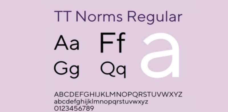
TT Norms Pro is a geometric grotesque typeface, which means it draws its letterforms from geometric shapes while staying neutral enough for extended reading.
It also carries humanist sans-serif qualities, which gives characters a slight warmth that pure geometric fonts often lack. That balance is what makes it work so well for a consumer-facing app.
A few things that stand out about its design:
- Clean, open letterforms with consistent stroke weight
- Slightly rounded terminals that soften the overall feel
- High x-height, which helps readability at small sizes on mobile screens
- Available in 5 widths: standard, Mono, Compact, Condensed, and Expanded
For a food delivery platform, this classification matters. The font needs to read fast on a phone screen while still feeling approachable. TT Norms Pro handles both.
Who Designed TT Norms Pro?
Primary designers: Ivan Gladkikh, Pavel Emelyanov, and Marina Khodak, working as part of the TypeType studio team.
Foundry: TypeType, a full-service type foundry founded in 2013.
First release: 2017, with significant updates added in subsequent years including variable font support and Arabic script coverage added in 2025.
TT Norms Pro is a commercial font, not a custom typeface designed exclusively for DoorDash. DoorDash licensed it. That said, the Pro version is TypeType’s flagship product, and it’s been adopted by a notable list of brands including ASUS, AliExpress, DreamWorks, Intercom, and CBSN.
Is TT Norms Pro Free to Use?
No. TT Norms Pro is a commercial font with a paid license required for any professional or commercial use.
TypeType does offer trial versions for testing, but those demo files are restricted to personal, non-published work. Using them in a client project or live product without a full license violates the EULA.
Licensing is available through several platforms:
- TypeType directly (typetype.org) – desktop, web, app, and ebook licenses available
- MyFonts – individual style licenses starting at lower price points
- Fontspring – worry-free licensing with clear EULA terms
- Adobe Fonts – TT Commons Pro (a related TypeType face) is included with Creative Cloud subscriptions
If you’re building something and need a commercial font license, go directly to typetype.org. Their pricing varies by license type and number of users, so it’s worth checking their current rates.
What Font Did DoorDash Use Before?
Before the 2018 rebrand, DoorDash used a simpler sans-serif wordmark. The early 2013 logo was a basic two-color text treatment in lowercase letters, reflecting a startup aesthetic with no sophisticated typographic system behind it.
The 2018 overhaul by Character was a significant step up. The agency completed the rebrand in under 4 months, introducing TT Norms Pro as the primary typeface and shifting the wordmark to uppercase letters.
A rough timeline of the font evolution:
| Period | Typography | Context | Notes |
| 2013–2017 | Basic Sans-Serif | Early Startup | Simple, lowercase “cash app” used for approachable utility. |
| 2018–Present | TT Norms Pro | Rebrand | Shifted to an uppercase wordmark for a “bolder” financial identity. |
| 2022 Update | Refined Wordmark | Post-IPO | Polished in-house; optimized for “Super App” scalability. |
The 2022 update refined the logo further, with DoorDash’s internal design team handling the work. No external agency was publicly credited for that iteration.
What Are the Best Free Alternatives to TT Norms Pro?
If you’re looking to match the DoorDash aesthetic without purchasing TT Norms Pro, there are solid free options that share its geometric grotesque character.
| Font | Similarity | License | Source |
| DM Sans | Geometric, clean, similar x-height | Free (OFL) | Google Fonts |
| Inter | High readability, similar weight range | Free (OFL) | Google Fonts |
| Work Sans | Grotesque feel, neutral tone | Free (OFL) | Google Fonts |
| Roboto | Geometric + humanist mix, very neutral | Free (Apache 2.0) | Google Fonts |
| Nunito Sans | Rounded terminals, warm feel | Free (OFL) | Google Fonts |
DM Sans is probably the closest match if you’re working on an app interface. Inter is the go-to if readability at small sizes is the priority. Both are worth having in your toolkit regardless.
How to Use TT Norms Pro Alternatives in Your Projects
In Figma
Google Fonts in Figma: All five alternatives above are available directly inside Figma through the font picker. No installation needed. Just search by name.
If you’ve licensed TT Norms Pro, you can install it into Figma by adding it to your system fonts first, then relaunching the Figma desktop app.
In CSS (Web)
To use Inter via Google Fonts, paste this into your HTML <head>:
“ <link href="https://fonts.googleapis.com/css2?family=Inter:wght@400;600;700&display=swap" rel="stylesheet"> `
Then apply it in your CSS:
` body { font-family: 'Inter', sans-serif; } `
If you’re after DM Sans instead, just swap “Inter” for “DM+Sans” in the Google Fonts URL. Same process.
In Canva
Canva doesn’t include TT Norms Pro natively. You can upload fonts to Canva if you have a Pro account and a valid commercial license. DM Sans and Inter are already available inside Canva’s free font library.
Why Did DoorDash Choose TT Norms Pro?
The short answer: it solves the right problems for a consumer delivery app.
TT Norms Pro sits in an interesting position within typography. It’s geometric enough to feel modern and tech-forward, but the humanist touches keep it from feeling cold or clinical. For a brand that needs to feel fast but also friendly, that’s a meaningful distinction.
The uppercase wordmark introduced in 2018 also plays a role here. Uppercase lettering creates stronger brand recognition at a glance, particularly on small app icons and delivery bags where the full name needs to read instantly.
There’s also a practical dimension. As one of TypeType’s flagship releases, TT Norms Pro comes with extensive language support (280+ languages), variable font versions, and well-optimized hinting. For a company operating in markets across the US, Canada, Australia, Germany, Japan, and New Zealand, broad character set coverage is not a nice-to-have.
The font’s neutral tone also matters for brand partnerships. DoorDash co-brands with thousands of restaurant partners, and a typeface that doesn’t compete visually with partner logos is a smart choice. It holds the system together without asserting too much personality.
Compared to competitors: Uber’s typography leans cooler and more minimal. DoorDash’s TT Norms Pro reads warmer and more energetic, which aligns with the red-dominant brand identity and the overall sense of urgency the platform is built around.
Other delivery apps worth comparing in terms of font strategy include the Instacart font and the Cash App font, both of which take different approaches to the same problem of balancing clarity with brand character.
For anyone building in the food or delivery space, studying DoorDash’s app font choices is genuinely useful. The decisions aren’t random, and most of them hold up well even years after the original rebrand.
FAQ on The What Font Does DoorDash Use
What font does DoorDash use?
DoorDash uses TT Norms Pro, a geometric grotesque sans-serif licensed from TypeType.
It has been the brand’s primary typeface since the 2018 rebrand by agency Character. The font appears across the wordmark, website, and marketing materials.
Is the DoorDash font free to download?
No. TT Norms Pro requires a paid commercial license.
TypeType offers free trial files for testing only. Using those in a live project or client work without purchasing a full font license violates their EULA.
What type of font is TT Norms Pro?
It’s a geometric grotesque with humanist sans-serif qualities.
That combination gives it a neutral, clean structure while keeping the letterforms warm enough for consumer-facing use. It reads well at small sizes, which matters for mobile app typography.
Who designed the DoorDash font?
TT Norms Pro was designed by Ivan Gladkikh, Pavel Emelyanov, and Marina Khodak at TypeType, a Russian type foundry established in 2013.
It was first released in 2017 and has been updated several times since.
What font does the DoorDash app use?
The DoorDash mobile app uses system fonts for its UI. That means San Francisco on iOS and Roboto on Android.
TT Norms Pro is reserved for the wordmark, website, and brand materials. Most mobile apps follow this same split.
What fonts are similar to TT Norms Pro?
The closest free alternatives are Inter, DM Sans, and Roboto.
All three share the geometric grotesque classification and similar x-height proportions. They’re available free on Google Fonts under open licenses.
When did DoorDash change its font?
DoorDash adopted TT Norms Pro in March 2018 as part of a full rebrand by the agency Character.
Before that, the wordmark used a basic sans-serif with lowercase letters. The 2018 shift also moved the wordmark to all-uppercase, which strengthened brand recognition at small sizes.
Does DoorDash use a custom font?
No. TT Norms Pro is a commercially available typeface, not a proprietary or custom-built font.
DoorDash licensed it from TypeType. Other major brands using the same typeface include ASUS, AliExpress, and DreamWorks.
Where can I buy TT Norms Pro?
Directly from TypeType at typetype.org, or through MyFonts and Fontspring.
License types include desktop, web, app, and ebook. Pricing scales by usage and number of users. A trial version is available for free testing before you commit.
How does DoorDash’s font compare to other delivery apps?
DoorDash’s TT Norms Pro reads warmer and more energetic than Uber’s cooler, minimal typeface.
The Instacart font takes a different direction entirely. DoorDash’s choice aligns with its bold red identity, projecting speed and approachability at the same time.
Conclusion
So, what font does DoorDash use? TT Norms Pro, a geometric grotesque typeface licensed from TypeType, adopted during the 2018 brand overhaul by agency Character.
The font choice isn’t arbitrary. Its humanist qualities, strong x-height, and neutral tone make it well-suited for a delivery platform operating across multiple markets and touchpoints.
If you need something similar without the commercial license cost, DM Sans and Inter are both solid free alternatives with comparable proportions and weight ranges.
Either way, the DoorDash font family is a good case study in how brand typography decisions connect directly to platform identity and user experience.
Renowned for his expertise in logo design and visual branding, Bogdan has developed a multitude of logos for various clients.
His skills extend to creating posters, vector illustrations, business cards, and brochures. Additionally, Bogdan's UI kits were featured on marketplaces like Visual Hierarchy and UI8.
He also wrote in the past years on sites like Design Your Way, WebDesignerDepot, WPDean, Designmodo, Speckyboy, Slider Revolution, and more.
- The Airtable Logo History, Colors, Font, And Meaning - 12 July 2026
- How to Blur Background in Canva: A Quick Tutorial - 11 July 2026
- Typography Trends - 10 July 2026
Bogdan Sandu is a seasoned designer who has been designing websites since 2008. Renowned for his expertise in logo design and visual branding, Bogdan has developed a multitude of logos for various clients. His skills extend to creating posters, vector illustrations, business cards, and brochures. Additionally, Bogdan's UI kits were featured on marketplaces like Visual Hierarchy and UI8. He also wrote in the past years on sites like Design Your Way, WebDesignerDepot, WPDean, Designmodo, Speckyboy, Slider Revolution, and more.
You Might Also Like