The Chick-fil-A Logo History, Colors, Font, and Meaning
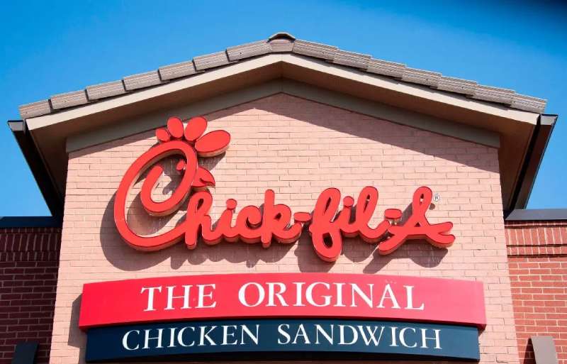
Imagine biting into your favorite crispy chicken sandwich. Now, what springs to mind before that first savory crunch? Chances are, it’s the striking red and white emblem that’s become synonymous with quality comfort food—the Chick-fil-A logo.
This icon isn’t just a random sketch; it’s a powerhouse of brand identity shaping our dining choices even before we step foot inside a Chick-fil-A.
This emblem has etched itself into the American ethos, representing more than just delicious eats; it symbolizes a legacy of trademarked logos and an advertising campaign that has charmed millions, showcasing the might of a branding strategy in the fast food game.
Visual identity, folks—it’s the silent ambassador of your favorite brands.
Dive into the unfolding story of the Chick-fil-A logo with me. Unpack how meticulous graphic design standards intertwined with the unique “Eat Mor Chikin” stance to craft a corporate identity that stands out in the bustling quick-service restaurant landscape.
You’ll come away appreciating how a logo does more than meet the eye—it builds a narrative, engenders loyalty, and becomes a cornerstone of the customer recognition experience.
The Meaning Behind the Chick-fil-A Logo
Symbolism and Significance
Now, let’s dive into the Chick-fil-A logo, shall we? It’s more than just a bunch of random shapes and letters. In fact, every bit of it carries a deeper meaning.
The chicken in the logo? Not just a cute drawing. It signifies the restaurant’s commitment to providing top-tier chicken-based meals. They’re saying, “Chicken is our thing, and we’re proud of it.”
The “C” and the Chicken
And then there’s the “C”. It’s not your every day “C”, it’s designed to look like a chicken, right? The beak, the eye, and the comb on top – everything’s in place. The logo literally embodies the brand’s name, Chick-fil-A. Genius, isn’t it?
The History of the Chick-fil-A Logo
The Start of Something Beautiful
Let’s take a stroll down memory lane. The Chick-fil-A logo has an interesting past.
It was born in the 60s, right along with the first Chick-fil-A restaurant. The founder, Truett Cathy, wanted something that would represent his vision – a restaurant that served top-notch chicken sandwiches.
Consistency is Key
Since its inception, the logo has remained pretty much the same. A few tweaks here and there, but the core essence? Unchanged. That’s because it was created with a timeless approach, an approach that has kept the logo relevant even today.
The Colors of the Chick-fil-A Logo
So, you know how when you’re cruising down the street and you spot that bold red sign? You’re instantly thinking chicken sandwiches, right? That’s all thanks to their distinctive logo color!
Now, the official shade they’ve chosen, it’s not just any red. It’s got a special name – Medium Candy Apple Red. Sounds tasty, doesn’t it? And if you’re into the nerdy design stuff, it’s hex code is E60E33.
The Font Used in the Chick-fil-A Logo
That’s One Unique Typeface
Ever noticed how the Chick-fil-A logo seems to stand out in a crowd of logos? A lot of that has to do with the unique typeface they use. It’s not just any off-the-shelf font; it’s a custom creation, designed specifically to echo the brand’s individuality.
The Evolution of the Chick-fil-A Logo
A Journey Through Time
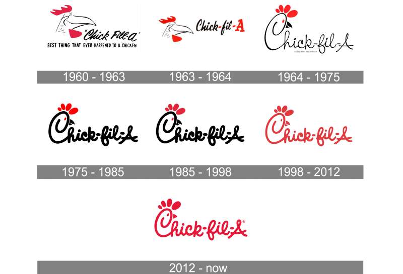
If you look at the logo’s journey, it’s been a steady ride. Sure, the colors and the detailing have been refined over the years, but the overall design has remained true to its roots.
Tweaks and Refinements
The most noticeable change came in the form of a color upgrade. The black turned a bit darker, and the red got a tad brighter. The chicken got a facelift too, but the “C” and the chicken’s elements? Untouched. They’re the soul of the logo, after all.
The Impact of the Chick-fil-A Logo
A Logo That Resonates
The Chick-fil-A logo, with its deep-rooted symbolism and timeless design, resonates with millions. It’s a testament to the brand’s commitment towards quality and flavor, and its passion for serving delicious chicken meals.
Staying True to the Brand
The logo mirrors the brand’s essence perfectly. It’s bold, it’s unique, and it’s all about chicken. Just like Chick-fil-A. So, whether you see it on a billboard, a takeaway bag, or the restaurant’s façade, you know you’re in for a treat!
FAQ On The Chick-Fil-A Logo
Who designed the Chick-fil-A logo?
The original logo for Chick-fil-A, with its distinctive script, was crafted by founder Truett Cathy and designer Lenny Williams back in 1964. This dynamic duo aimed to encapsulate the essence of the brand’s customer service and corporate culture in one timeless design.
Is there a meaning behind the Chick-fil-A logo?
You bet. The logo’s capital “A” emphasizes the “grade A top quality” of their chicken, and the stylized chicken in the “C” reflects the specialty of Chick-fil-A. It’s a slick nod to their unique selling proposition (USP)—a commitment to premium poultry.
How has the Chick-fil-A logo evolved over the years?
Over the years, the logo has undergone subtle tweaks for a modern look while maintaining its classic feel. These changes reflect the brand’s evolution while respecting its rich heritage—a balancing act of brand loyalty and adaptation.
What does the Chick-fil-A cow campaign have to do with the logo?
The “Eat Mor Chikin” cows are separate from the actual logo but reinforce the brand’s message with humor. This iconic marketing campaign complements the logo, enhancing the brand’s visual identity through these mischievous bovine mascots.
Why does the Chick-fil-A logo use a red color?
Red is a color that grabs attention and is often associated with appetite and excitement. Using red in the Chick-fil-A logo aligns with cognitive psychology, tapping into emotions that can drive customer recognition and draw the eye—critical in a competitive fast food industry.
Are there any controversies related to the Chick-fil-A logo?
Controversies are more linked to the company’s past political donations and stances rather than the logo itself. The logo represents the brand’s corporate identity and has largely remained a positive symbol of the franchise branding and Chick-fil-A’s mourish offerings.
How is the Chick-fil-A logo used in their marketing?
In marketing, the Chick-fil-A logo becomes a stamp of trust across advertising campaigns, menu graphics, and marketing visuals.
It harnesses branding and identity to assure quality, enabling consistent cross-platform consistency from billboards to social media posts.
What does the Chick-fil-A logo represent to consumers?
To consumers, the logo is a beacon of quick, friendly service and quality food. It’s an unmistakable mark of the quick-service restaurant category that many associate with trademarked logos that promise a familiar, comforting dining experience.
Can you tell me about any legal issues involving the Chick-fil-A logo?
Legal tussles have usually revolved around protecting the distinguished logo and preventing trademark elements from being replicated or misused.
The vigilant protection of their trademarked logos signifies the weight and importance Chick-fil-A places on their brand recognition.
Has Chick-fil-A’s logo impacted its business success?
Absolutely. A good logo goes a long way, and Chick-fil-A’s emblem of the friendly chicken in the “C” has undoubtedly become an integral part of their success story. Its blend of charm and simplicity makes it a masterstroke in the company’s overall branding strategy.
Conclusion
Wrapping things up, the Chick-fil-A logo stands as more than just a symbol on a sign. It’s the hallmark of a narrative steeped in branding savvy and a touch of whimsy with the “Eat Mor Chikin” ethos. As we’ve chewed through the layers of visual identity, we’ve seen how this emblem is more sophisticated than it looks at first glance.
It’s a beacon of familiarity, firing up appetites and loyalty with its bold strokes and that unmistakable shade of red. Whether it’s emblazoned on the storefront or popping up in an ad, that logo is the silent signal, calling out to fans of quality comfort food and exceptional customer service.
- It signifies tradition built within the moderating cauldron of the fast-food industry.
- It’s a testament to clear branding strategy that communicates without a single word.
- It’s the quiet assurance that here lies a standard of chicken sandwich magnificence that’s hard to match.
So here’s to the Chick-fil-A logo: simple, iconic, and brimming with stories, standing proud as a giant in the world of fast food flair.
If you liked this article about the Chick-fil-A logo, you should check out this article about the Subway logo.
There are also similar articles discussing the Pizza Hut logo, the Arby’s logo, the Little Caesars logo, and the Dairy Queen logo.
And let’s not forget about articles on the Panda Express logo, the McDonald’s logo, the Shake Shack logo, and the Domino’s Pizza logo.
- Rainbow Color Palettes for Joyful Designs - 29 April 2024
- The Bethesda Logo History, Colors, Font, And Meaning - 28 April 2024
- Out of This World: Space Color Palettes for Cosmic Designs - 28 April 2024


