The Little Caesars Logo History, Colors, Font, and Meaning
Ever notice how some symbols sear themselves into your brain? The Little Caesars logo does just that. Instantly recognizable, this vibrant mascot of a Roman emperor offers more than a smirk; it’s a masterclass in visual charm that’s become a fast food icon.
With a clever twist of the toga and the infamous, forked spear, this emblem signifies more than just a love for pizza—it’s a slice of Americana, dished out with a side of history.
As I unwrap the tale of this emblematic design, you’ll uncover the layers—both cheesy and profound—that make the Little Caesars character a staple beyond billboards and pizza boxes.
From its logo evolution and branding dynamics to the infamous “Pizza! Pizza!” slogan echoing through TV ads, this isn’t just about a quirky Caesar—it’s about how a brand leaves a lasting impression through smart marketing and advertising.
So, buckle up, pizza aficionados and design buffs.
You’re about to dive deep into the world of corporate identity, brand recognition, and the secrets behind the smile that promises a hot slice at a wallet-friendly price.
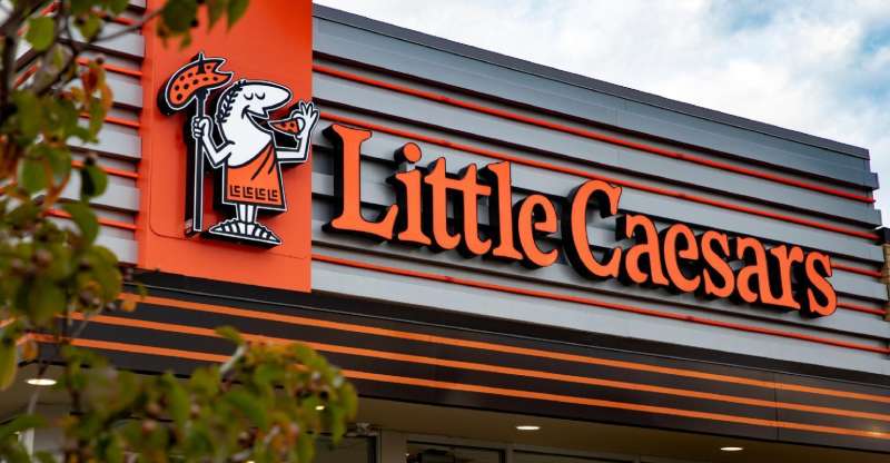
The Meaning Behind the Little Caesars Logo
![]()
Dive into the sea of symbols and meanings. Let’s uncover the layers of the Little Caesars logo.
The Laurel Wreath
In the logo, you’ll notice a green laurel wreath. This symbol finds its roots in ancient Rome. Laurel wreaths were used to crown victors, signaling success and power. In the Little Caesars context, this can be interpreted as a promise of victory in taste and service.
The Little Caesar Character
At the heart of the logo sits the Little Caesar character himself. Donning a toga, he’s a visual representation of the pizza chain’s Roman theme. His welcoming gesture conveys the brand’s commitment to friendly, warm service.
The History of the Little Caesars Logo
![]()
Now, let’s travel back in time. The logo didn’t just pop out of thin air. There’s a story behind it.
Origins
Founded in 1959, the Little Caesars logo has been through several changes. The early versions featured a cartoon Caesar, serving as the restaurant’s mascot. His toga was a simple white, and the laurel wreath was yet to be introduced.
Developments Over the Years
As the brand expanded, so did its logo. The cartoon Caesar was stylized, the toga turned orange, and the laurel wreath was introduced. These changes communicated the brand’s evolution while staying true to its Roman theme.
The Colors of the Little Caesars Logo
![]()
The colors are the silent speakers. They say more than what meets the eye.
Orange
Orange is vibrant and full of life. It’s the color of energy and enthusiasm, just like Little Caesars pizza. It’s the color that speaks volumes about the brand’s personality.
The Bold Black
Let’s chat about black, shall we? Now, don’t get all gloomy on me. Black in the Little Caesars logo is the backbone of their visual identity.
- Black equals stability. It’s a nod to Little Caesar’s dedication to their craft – their commitment to quality pizza, day in and day out.
- More than that, black is the color of elegance. It’s a confident statement. It says, “We know our pizzas are awesome. You know it too.”
- Finally, black strikes the perfect balance with the vibrant orange. Just like their perfect blend of cheeses, the contrast is just chef’s kiss.
The Font Used in the Little Caesars Logo

Typography is an art. And the Little Caesars logo paints a masterpiece.
Unique and Bold
The font used in the logo is unique, just like the brand. Its bold and somewhat playful style embodies the fun and welcoming vibe of Little Caesars. Each letter appears hand-drawn, adding a personal touch.
Impact of the Little Caesars Logo
Impact is what matters at the end of the day. A logo without impact is like a pizza without cheese.
Brand Recognition
Thanks to its unique design, the Little Caesars logo stands out from the crowd. Its simplicity aids in easy recognition, making it one of the most recognizable logos in the fast food industry.
Consistent Branding
Despite minor changes over the years, the core elements of the logo remained the same. This consistency has helped in maintaining a strong brand image and a loyal customer base.
The Little Caesars Logo and Pop Culture
Logos and pop culture share a deep bond. One influences the other, and the cycle continues.
Merchandise
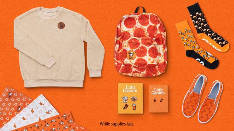
The Little Caesar character, with his charm, has found his way onto various merchandise. From t-shirts to mugs, the logo has become a part of pop culture.
Advertising
Little Caesar has been the star of many memorable ad campaigns. His catchphrase, “Pizza! Pizza!”, is as iconic as the logo itself, further embedding the brand into pop culture.
FAQ On The Little Caesars Logo
Who designed the Little Caesars logo?
Initially, it was all about capturing the essence of fun. The original Little Caesars logo, with its cartoonish Roman figure, was crafted to represent a brand that doesn’t just serve pizza but does it with a cheeky wink.
It’s a work of graphic design intended to stick in your memory, and oh boy, does it!
What does the Little Caesars logo represent?
Think of it like a pizza party thrown by Julius Caesar himself. The logo’s roots go back to Roman splendor, dishing out an image of an emperor who’s all about sharing—two pizzas for the price of one, actually.
It embodies the spirit of generosity, a hallmark of the brand’s promotional material.
Has the Little Caesars logo changed over time?
Sure has! The logo’s kept up with the times—evolving, but never losing its soul. The design tweaks over the years subtly nod to modern tastes while honoring the brand recognition that’s as comforting as the aroma of a fresh pizza pie.
Why does the Little Caesars logo have a toga?
Classic, isn’t it? The toga’s a shoutout to the Roman theme, a clear nod to the company’s namesake, Caesar himself. It’s branding genius—instantly linking pizza to a historical reference that’s both familiar and playful.
What is the significance of the phrase “Pizza! Pizza!” in relation to the logo?
It’s the catchphrase that became a legend. “Pizza! Pizza!” goes hand-in-hand with the logo, reinforcing the idea of abundance—two pies clamoring for your attention. It’s a marketing campaign anthem that’s as mouthwatering as their deals.
Who owns the rights to the Little Caesars logo?
Ownership? That’s all Little Caesars Enterprises, Inc., the big cheese behind the brand. They hold the logo trademark, safeguarding this iconic image from imitators. It’s theirs—lock, stock, and pizza box.
How has the Little Caesars logo impacted the company’s branding?
Oh, majorly. The logo isn’t just a sign; it’s a beacon—a herald of affordable, tasty pizza without a wait. This branding powerhouse encapsulates corporate identity and customer expectations in one fell swoop.
Is the Little Caesars logo considered effective in terms of marketing?
Absolutely. It’s a home run. The Little Caesars logo packs a punch in its simplicity, making it ideal for memorable visual marketing strategies. Effortless recognition plus emotional connection equals marketing gold.
How does the Little Caesars logo differentiate from other pizza chain logos?
It’s all about charm and wit. While others go for minimalist or gourmet vibes, Little Caesars sticks to its jovial, cartoonish mascot. It stands out in a crowded market by donning a toga and offering a fun brand image.
Can the Little Caesars logo be used for personal or commercial purposes?
Not without a game plan. You see, the logo’s protected—trademark laws aren’t just suggestions. For any commercial shenanigans, permission from Little Caesars is a must. Personal use? Best to stick to official merch and lay off the copy-paste hustle.
Conclusion
So we’ve tossed our dough, sprinkled the cheese, and now we’re sliding this deep-dive on the Little Caesars logo out of the oven. What have we got? A piping-hot emblem that stands as much for a quick, tasty bite as it does for clever branding.
- It’s iconic, no two ways about that.
- It’s got that historical flair, a wink to an emperor who knew a thing or two about conquest.
- And let’s not forget the “Pizza! Pizza!” chant that’s almost as catchy as the logo is memorable.
Beyond the chuckles and the chariot rides, this logo proves that smart design can slice through the noise, keeping a brand relevant in the ever-spinning fast food arena. Whether it’s on a sign, in an ad, or atop a pizza box, that sly smile, toga, and spear keep us coming back for more.
Here’s the kicker: Great design tells a story. And with every “Pizza! Pizza!” we hear the tale of a little chain that dreamed big, clothed in a toga, leading a pizza empire—one slice at a time.
If you liked this article about the Little Caesars logo, you should check out this article about the Subway logo.
There are also similar articles discussing the Pizza Hut logo, the Arby’s logo, the Dairy Queen logo, and the Panda Express logo.
And let’s not forget about articles on the McDonald’s logo, the Shake Shack logo, the Domino’s Pizza logo, and the Chick-fil-A logo.
Bogdan Sandu, a seasoned designer with 15 years of diverse experience, has been designing websites since 2008.
Renowned for his expertise in logo design and visual branding, Bogdan has developed a multitude of logos for various clients.
His skills extend to creating posters, vector illustrations, business cards, and brochures. Additionally, Bogdan's UI kits were featured on marketplaces like Visual Hierarchy and UI8.
Latest posts by Bogdan Sandu (see all)
- After Dark: Night Color Palettes for Mysterious Designs - 27 April 2024
- The Capcom Logo History, Colors, Font, And Meaning - 26 April 2024
- Earth Color Palettes Grounded in Nature: 40 Examples - 26 April 2024