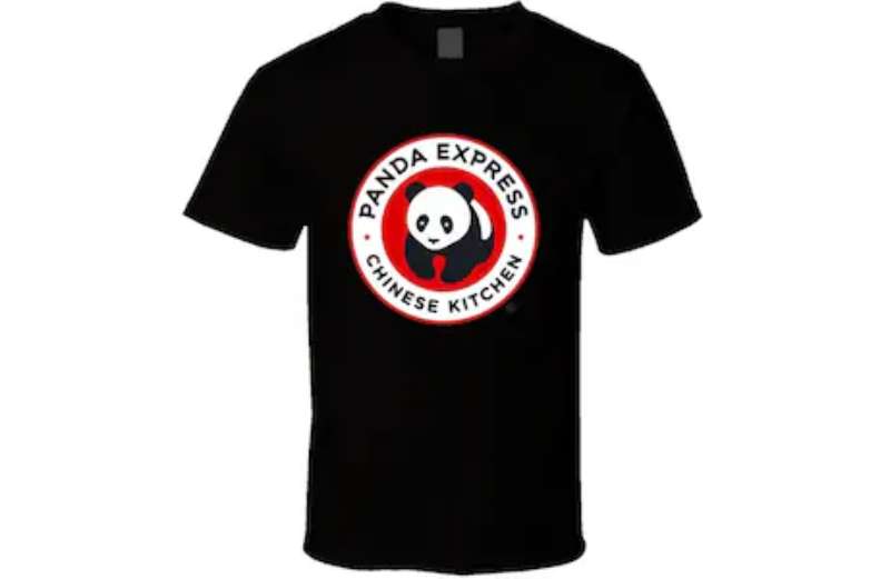
The Panda Express logo stands as one of the most recognized brand marks in American fast food. It features a stylized panda bear alongside bold red typography that signals the chain’s Chinese American cuisine focus.
Within the quick service restaurant industry, this logo has maintained strong visual consistency since the brand’s 1983 founding. The current version represents the third major iteration, refined over four decades of expansion.
Panda Restaurant Group, the parent company founded by Andrew and Peggy Cherng, has grown to over 2,400 locations. The logo serves as the primary identifier across all touchpoints, from storefront signage to mobile apps and packaging.
What is the Panda Express Logo?
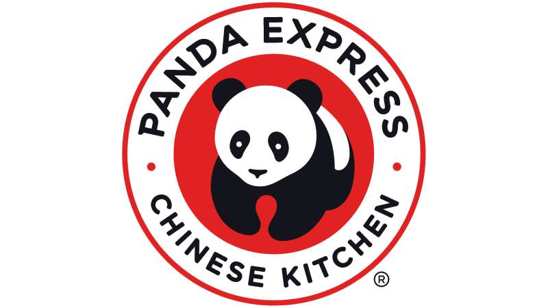
The Panda Express logo is a combination mark featuring a stylized giant panda illustration paired with the brand name in custom red lettering. Introduced in its current form during the early 2000s, the design represents Chinese heritage, approachability, and fast casual dining. The panda mascot creates instant brand recognition.
Key attributes of the current logo:
- Design Type: Combination mark (mascot plus wordmark)
- Primary Elements: Stylized panda illustration, custom sans-serif wordmark, bamboo-inspired accents
- Official Introduction Date: Current version refined in 2009
- Designer/Agency: Internal brand team with external consultants
- Trademark Status: Registered trademark of Panda Restaurant Group, Inc.
- Color Palette: Primary Red (#C8102E), Black (#000000), White (#FFFFFF)
- Usage Context: Restaurant signage, packaging, uniforms, digital platforms, merchandise, delivery apps
How Has the Panda Express Logo Evolved Over Time?
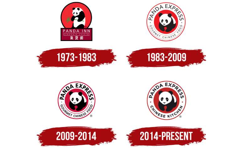
The logo has gone through three distinct phases since 1983. Each version maintained the panda mascot while updating typography and stylization to match contemporary design trends.
The original featured a more cartoonish panda. The 1990s brought refinement. The 2009 update delivered the streamlined version seen today.
Original Panda Express Logo (1983-1993)
- Years Active: 1983-1993
- Design Description: Cartoon-style panda with rounded features, playful expression, hand-drawn quality typography
- Color Scheme: Red, black, white with occasional green accents
- Designer: Unknown, likely regional design firm
- Context: Introduced when first location opened in Glendale Galleria mall food court
- Cultural Significance: Established the panda as central brand identifier during mall expansion era
Second Generation Logo (1993-2009)
- Years Active: 1993-2009
- Design Description: More refined panda illustration, bolder typography, cleaner lines
- Color Scheme: Standardized Panda Red, true black, pure white
- Key Changes from Previous: Removed cartoonish elements, added dimensional shading, modernized letterforms
- Context: Coincided with nationwide expansion beyond California
- Cultural Significance: Positioned brand as legitimate national chain rather than regional player
Current Panda Express Logo (2009-Present)
- Years Active: 2009-present
- Design Description: Streamlined panda with friendly expression, contemporary sans-serif font, balanced composition
- Color Scheme: Official Panda Red (#C8102E), Black, White
- Key Changes from Previous: Simplified panda shape, updated wordmark spacing, improved digital scalability
- Context: Launched alongside menu innovations and store redesign initiative
- Cultural Significance: Reflects brand’s maturity as America’s largest Asian restaurant chain
What Do the Design Elements of the Panda Express Logo Mean?
The panda symbolizes China, peace, and approachability. Its black and white coloring creates natural contrast that works across all applications.
The animal’s gentle expression invites customers in. It says “friendly” without trying too hard.
Why Did Panda Express Choose These Specific Colors?
Red dominates because it carries weight in Chinese culture. It represents luck, prosperity, and celebration. Walk into any Chinese restaurant and you’ll likely see red somewhere.
But there’s a practical angle too. Red grabs attention in crowded food courts. It stands out against competitors.
Understanding color psychology explains why red also stimulates appetite. Fast food brands figured this out decades ago.
- Panda Red: Hex #C8102E, symbolizes luck, energy, and appetite stimulation
- Black: Hex #000000, provides grounding and sophistication
- White: Hex #FFFFFF, creates breathing room and cleanliness perception
What Typography Style Is Used in the Panda Express Logo?

The wordmark uses a custom typeface with soft curves and sturdy weight. It reads clearly at any size, which matters for everything from highway billboards to mobile app icons.
Letter spacing sits tight but not cramped. The overall effect feels bold without being aggressive.
Earlier versions used more decorative lettering. The current approach prioritizes function.
What Are the Hidden Meanings in the Panda Express Logo?
The panda’s posture suggests forward motion. Some see bamboo influences in the letterform styling, though this hasn’t been officially confirmed.
The circular composition creates a sense of completeness. It contains the brand elements in a unified shape.
Designers often build in subtle touches that most people never consciously notice. Whether intentional or not, the logo’s rounded forms echo the curved architecture of traditional Chinese design.
How Does the Panda Express Logo Compare to Competitor Logos?
Among fast food logos, Panda Express stands apart through its mascot-forward approach. Most competitors in the quick service space rely purely on wordmarks or abstract symbols.
The McDonald’s logo uses golden arches. Wendy’s logo features a human mascot. Taco Bell logo goes abstract with its bell icon.
Panda Express shares more DNA with Chick-fil-A logo, which also uses an animal in clever ways. Both brands benefit from memorable, distinctive marks that children recognize instantly.
Within Asian fast casual specifically, Panda Express faces less direct competition. Most regional chains lack comparable brand consistency.
What Are the Technical Specifications of the Panda Express Logo?
Official Color Codes:
- Primary Color (Panda Red): Hex #C8102E, RGB (200, 16, 46), CMYK (0, 100, 85, 5), Pantone 186 C
- Secondary Color (Black): Hex #000000, RGB (0, 0, 0), CMYK (0, 0, 0, 100)
- Tertiary Color (White): Hex #FFFFFF, RGB (255, 255, 255), CMYK (0, 0, 0, 0)
Dimensions and Proportions:
- Aspect Ratio: Approximately 3:1 (horizontal lockup)
- Minimum Size: 0.75 inches width for print, 72 pixels for digital
- Clear Space: Minimum padding equal to height of letter “P” on all sides
- File Formats: Available in vector graphics (AI, EPS, SVG) and raster (PNG, JPEG)
What Cultural Impact Has the Panda Express Logo Had?
The logo helped normalize Chinese American cuisine in mainstream American dining. Before Panda Express scaled nationally, most Americans associated Chinese food with local takeout spots.
That friendly panda made the cuisine approachable. It removed unfamiliarity.
The brand has also influenced how other Asian restaurant chains approach visual identity. Many now prioritize warmth over exotic mystique.
How Does the Panda Express Logo Fit Into the Overall Brand Identity?
The logo anchors a broader visual system. Store interiors echo its red and black color palette. Packaging carries the panda illustration consistently.
Employee uniforms incorporate brand colors. Menu boards maintain typographic consistency.
Digital presence extends these elements to apps and social media. The panda appears in animated form for marketing campaigns.
Everything connects back to that central mark. It works because the system maintains discipline.
How Should the Panda Express Logo Be Used?
Official Usage Guidelines:
- Do: Maintain minimum clear space, use approved color versions only, preserve aspect ratio when scaling
- Don’t: Stretch or distort, place on busy backgrounds, alter colors, separate panda from wordmark without approval
- Access: Franchisees receive brand assets through internal portal; media requests go through corporate communications
- Licensing: Third-party usage requires written permission from Panda Restaurant Group legal team
- Trademark Protection: Actively enforced; unauthorized usage results in cease and desist action
For vendors and partners, detailed brand guidelines specify exact usage parameters. These documents typically run 30+ pages covering every application scenario.
FAQ on The Panda Express Logo
What Does the Panda Express Logo Look Like?
The logo features a stylized panda bear mascot alongside bold red typography spelling out the brand name.
It uses a combination mark format. The panda sits to the left of the wordmark in most applications.
Black, white, and red create the entire logo design. Simple but effective.
When Was the Panda Express Logo Created?
The original version launched in 1983 when Andrew Cherng and Peggy Cherng opened the first location in Glendale, California.
The current refined version dates to 2009. That update improved digital scalability while keeping brand recognition intact.
Who Designed the Panda Express Logo?
Panda Restaurant Group handled design internally with support from external consultants. No single famous graphic designer has been publicly credited.
The brand team maintains tight control over visual identity evolution. Most refinements happen in-house.
What Colors Are in the Panda Express Logo?
Three colors define the palette. Panda Red (#C8102E) dominates the wordmark and backgrounds.
Black and white complete the scheme. These colors appear in the panda illustration itself.
Red carries cultural significance in Chinese tradition. It represents luck, energy, and prosperity. Understanding color theory explains why this combination works so well for a Chinese American restaurant chain.
Why Does Panda Express Use a Panda in Their Logo?
The giant panda symbolizes China instantly. It creates immediate association with Chinese cuisine without relying on stereotypical imagery.
Pandas also appear friendly and approachable. The psychology of shapes shows that rounded forms feel welcoming to customers.
Kids love pandas. That helps with family dining appeal.
Has the Panda Express Logo Changed Over the Years?
Yes. Three major versions exist. The 1983 original looked more cartoonish with hand-drawn qualities.
A 1993 update brought cleaner lines. The 2009 version streamlined everything for modern applications.
Core elements stayed consistent through each iteration. The panda mascot and red typography remained central to brand identity throughout the chain’s expansion.
What Font Is Used in the Panda Express Logo?
The wordmark uses a custom typeface developed specifically for the brand. You won’t find it in standard font libraries.
It features soft curves and sturdy weight. The letterforms read clearly at any size, from highway billboards to mobile app icons.
What Does the Panda Express Logo Symbolize?
The logo represents Chinese American cuisine made accessible. It bridges cultural heritage with mainstream fast casual dining.
The panda conveys friendliness. Red signals energy and appetite. Together they communicate quick service without sacrificing warmth.
Strong visual hierarchy ensures the brand name reads clearly while the mascot creates memorability.
Can I Use the Panda Express Logo for My Project?
Not without permission. The logo is a registered trademark of Panda Restaurant Group, Inc.
Unauthorized usage triggers legal action. Media requests require corporate communications approval.
Franchisees access official assets through internal portals. Everyone else needs written authorization from the legal team before any commercial use.
Where Can I Download the Panda Express Logo?
Official high-resolution files aren’t publicly available for download. The company protects its brand style guide and logo assets carefully.
Press inquiries can request materials through official channels. Stock image sites sometimes carry the logo, but quality and licensing vary.
For legitimate business purposes, contact Panda Restaurant Group directly.
Conclusion
The Panda Express logo demonstrates what smart restaurant branding looks like. It balances cultural authenticity with mass market appeal.
Three decades of brand evolution refined the mascot design without losing recognition. That takes discipline.
The red and black color scheme triggers appetite while honoring Chinese tradition. Strong logo design principles keep everything cohesive across thousands of locations.
Few fast food chains achieve this level of visual consistency. The panda mascot works because it tells a story instantly.
Good storytelling always wins in corporate identity.

Renowned for his expertise in logo design and visual branding, Bogdan has developed a multitude of logos for various clients.
His skills extend to creating posters, vector illustrations, business cards, and brochures. Additionally, Bogdan's UI kits were featured on marketplaces like Visual Hierarchy and UI8.
He also wrote in the past years on sites like Design Your Way, WebDesignerDepot, WPDean, Designmodo, Speckyboy, Slider Revolution, and more.
- Canva vs PowerPoint: Which Is Better for Presentations? - 22 September 2026
- How to Install Fonts on Mac (Step-by-Step Guide) - 20 September 2026
- From Mockup to Code: How AI-Augmented Development Speeds Up the Design Handoff - 19 September 2026

Bogdan Sandu is a seasoned designer who has been designing websites since 2008. Renowned for his expertise in logo design and visual branding, Bogdan has developed a multitude of logos for various clients. His skills extend to creating posters, vector illustrations, business cards, and brochures. Additionally, Bogdan's UI kits were featured on marketplaces like Visual Hierarchy and UI8. He also wrote in the past years on sites like Design Your Way, WebDesignerDepot, WPDean, Designmodo, Speckyboy, Slider Revolution, and more.
You Might Also Like