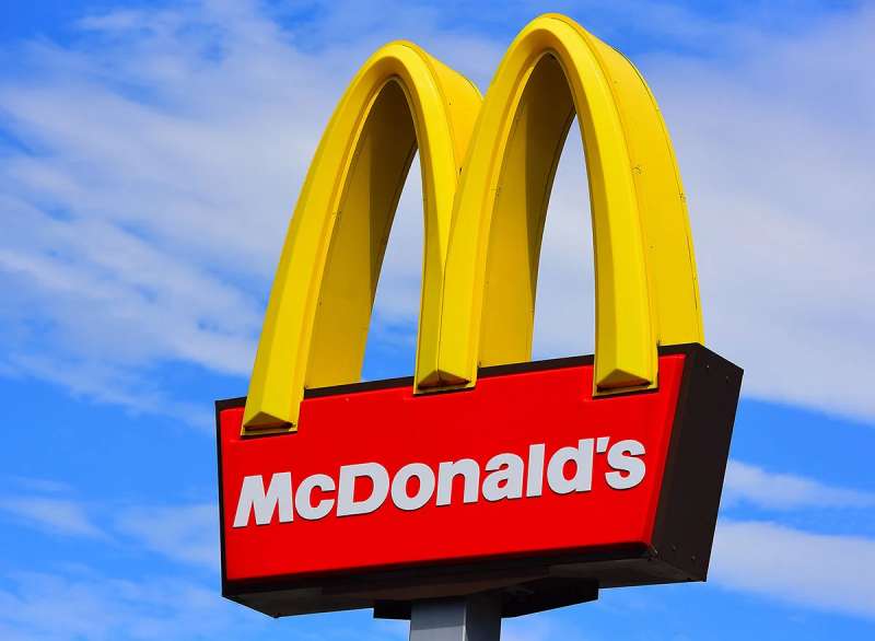
The McDonald’s logo is one of the most recognized corporate symbols on the planet. Those golden arches have become shorthand for fast food itself.
As a logo, it does more than identify a brand. It gets recognized across cultures, languages and generations.
The story starts in 1940, when Dick and Mac McDonald opened a barbecue drive-in in San Bernardino, California. Ray Kroc opened his first franchised McDonald’s in Des Plaines, Illinois, in April 1955 and bought out the brothers in 1961.
The arches moved from the buildings into the logo in 1962. The current version, used since 2006, is the arches on their own, often with no text at all. Simple. Clean. Unmistakable.
What Is the McDonald’s Logo?

The McDonald’s logo is the Golden Arches: two yellow arches joined into an “M”. Jim Schindler drew the M logo in 1962, based on the arches architect Stanley Meston gave the restaurants in 1953. The current flat version, usually shown without the wordmark, has been in use since 2006.
| Symbol | Golden Arches forming an “M”, taken from the arches on the 1953 restaurant buildings |
| Designer/agency | Jim Schindler (1962 M logo), based on Stanley Meston’s 1953 building arches; current version not credited to a named designer |
| Current version since | 2006 |
| Colors (hex) | Gold approx. #FFC72C (some references list #FFCC00), red #DA291C |
| Typeface | Speedee, a custom typeface by Dalton Maag (replaced Lovin’ Sans and other fonts around 2018–2019); no free version |
| Previous major version | 2003–2006 arches used with the “i’m lovin’ it” campaign; before that, the arches on a red background |
How Has the McDonald’s Logo Evolved Over Time?

The McDonald’s logo moved from a plain restaurant name to a mascot, then to the arches. The big turning points were 1948, 1953, 1962 and 1968, with smaller refreshes after that.
Logo-history sites don’t always agree on the in-between years, so the dates below stick to what can be traced.
McDonald’s Famous Barbecue (1940-1948)
The brothers opened their first restaurant on May 15, 1940, as McDonald’s Famous Barbecue. It was a typical carhop drive-in with a large menu.
The name on the sign was plain lettering. No arches, no gold. The designer is unknown.
Speedee Era Logo (1948-1962)
In 1948, the brothers closed the drive-in, cut the menu down to burgers and fries and introduced the Speedee Service System, built around 15-cent hamburgers.
The mascot that went with it was Speedee, a chef with a hamburger for a head. On the 1953 buildings he strode across the top of a smaller roadside arch sign. This is the old McDonald’s logo many people search for when they want to know what the brand looked like before the M.
The Golden Arches Buildings (1953)
The arches started as architecture, not graphic design. In late 1952 the brothers hired architect Stanley Clark Meston for a new building.
Richard McDonald’s sketch of two half-circles became, under Meston and his assistant Charles Fish, two 25-foot yellow arches on either side of the restaurant. The first franchise with the design opened in Phoenix, Arizona, in May 1953.
Golden Arches “M” Logo (1962-1968)
In 1962 the arches replaced Speedee as the brand’s main symbol. Fred Turner sketched a stylized “V”. Jim Schindler extended it into an “M” that looked like a McDonald’s store seen from an angle.
That version had a slanted line through the arches, standing in for the roofline of the building.
The 1968 Golden Arches Logo
In 1968 the company introduced the version that still looks familiar today: the arches as a clean “M” without the slanted line, often paired with the “McDonald’s” wordmark.
Logo-history sources date the version with the arches sitting on a red box to the mid-1970s. That red-backed logo is the one many people over 30 grew up with on signs and packaging.
The “i’m lovin’ it” Era (2003-2006)
In 2003 McDonald’s launched “i’m lovin’ it”, its first global campaign. It was created by Heye & Partner, a McDonald’s agency in Unterhaching, Germany. It was unveiled in Chicago in June 2003 and first rolled out in Munich that September.
A logo version dated 2003 to 2006 ran during the campaign’s first years, before the current flat arches took over.
Current McDonald’s Logo (2006-Present)
The current Golden Arches logo has been used since 2006. It’s a flat yellow “M”, usually shown on its own or on a solid background. When text does appear, it uses a clean sans-serif font.
The arches themselves didn’t change in Turner Duckworth’s 2018–2019 identity work. What changed was how the arches were used. Its “Archery” system showed them “oversized, cropped, angled, bold, even implied” instead of small and precious.
It’s a good example of minimalist design at work: a symbol strong enough to need no explanation.
What Do the Design Elements of the McDonald’s Logo Mean?

The golden arches started as part of the building. The “M” logo simply turned that architecture into a letter.
Over time, people have read other things into it: doorways, welcoming arms, even a pair of fries. None of that was the original intent.
What Are the McDonald’s Logo Colors?
McDonald’s doesn’t publish its official color values. The figures below are the ones most reference sites use, and they don’t all agree on the yellow.
- Gold/yellow: approx. #FFC72C, the screen equivalent of Pantone 123 C. BrandColorCode and Brand Palettes list #FFCC00 instead.
- Red: #DA291C, the screen equivalent of Pantone 485 C, which references broadly agree on.
- White: #FFFFFF for text and backgrounds.
Treat any RGB, CMYK or Pantone values you find online as third-party estimates, not McDonald’s own specs.
According to Turner Duckworth, the 2018–2019 refresh narrowed the palette from almost any color to a disciplined set built around McDonald’s gold and red. Gold became the primary color.
Yellow and red are usually explained through color psychology: yellow reads as cheerful and catches the eye, red reads as energetic. Those are general associations, not a reason McDonald’s has documented. You’ll find similar choices among other yellow logos and many red logos in food service.
What Font Does McDonald’s Use?
McDonald’s brand typography is set in Speedee, a custom typeface developed by Dalton Maag during the 2018–2019 identity overhaul.
It’s named after the Speedee Service System. Its designers drew on the shape of the Golden Arches and on the lettering of the 1971 “You deserve a break today” ads. It comes in three weights.
Speedee replaced a mix of older fonts. The most consistently used of these was Lovin’ Sans, the rounded face many people still associate with McDonald’s.
Speedee is proprietary, so there’s no official download.
What Are the Hidden Meanings in the McDonald’s Logo?
The most famous story involves design consultant Louis Cheskin. In the 1960s, when the company was dropping the physical arches from many restaurants, Cheskin reportedly argued for keeping them. He likened them to “mother McDonald’s breasts” with a Freudian pull on customers.
Freudian? Maybe. But the arches stayed.
More practically, the psychology of shapes suggests arches and curves feel softer and friendlier than sharp angles.
The “M” obviously stands for McDonald’s. Readings like mountains, doorways or two fries standing up are fan interpretations.
How Does the McDonald’s Logo Compare to Competitor Logos?

Among fast food logos, the golden arches stand apart through pure simplicity. Burger King frames its name in a bun, Wendy’s features a character, and KFC shows Colonel Sanders. McDonald’s needs only geometry.
That minimalism makes it versatile. The arches work on any background, at any size.
Competitors lean on more literal imagery. Taco Bell’s bell. Arby’s hat. Pizza Hut’s roof.
You can spot those arches from far down a highway. That reach is hard to match.
What Cultural Impact Has the McDonald’s Logo Had?
McDonald’s had more than 45,000 restaurants in over 100 countries at the end of 2025. Wherever it goes, the logo goes too.
That reach turned the arches into shorthand for American fast food, globalization and consumer culture.
The arches show up in art, pop culture references, political commentary and documentaries about food systems.
Love it or hate it, you recognize it. That’s the point.
How Does the McDonald’s Logo Fit Into the Overall Brand Identity?
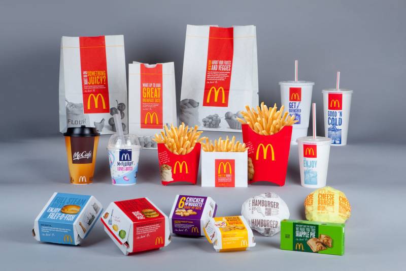
The logo anchors everything McDonald’s does visually. Packaging features the arches. Signage and the app use the gold and red.
Ronald McDonald (introduced in 1963), the Happy Meal box and the “i’m lovin’ it” jingle all connect back to that golden “M.”
Turner Duckworth’s work tied it together with one typeface, a tighter palette and a looser, bolder way of using the arches. Internal brand guidelines keep this consistent across franchise markets, but they aren’t public.
Consistency built this brand. The logo makes that consistency instantly visible.
How Should the McDonald’s Logo Be Used?
McDonald’s doesn’t publish public logo rules, so treat this as general trademark advice rather than the brand’s own guidance:
- Trademark: The Golden Arches and the McDonald’s name are registered trademarks. Commercial use needs permission.
- Editorial use: News, reviews and commentary can generally show the logo to identify the company.
- Keep it intact: Don’t stretch, recolor or redraw a trademarked logo, and don’t add effects.
- File quality: Vector graphics scale cleanly; low-resolution copies from the web don’t.
McDonald’s is known for defending its marks, including the “Mc” prefix in food names, so lookalike branding is a real legal risk.
FAQ on the McDonald’s Logo
What do the golden arches represent in the McDonald’s logo?
They come from the two yellow arches on McDonald’s restaurant buildings, first used in 1953. In 1962 they were turned into an “M” logo, so the arches stand for both the restaurant and the name.
Who designed the McDonald’s logo?
Jim Schindler designed the “M” logo in 1962, extending a “V” sketch by Fred Turner. The arches it’s based on came from architect Stanley Meston’s 1953 building design, which started from a sketch by Richard McDonald.
When was the McDonald’s logo created?
The first restaurant sign dates to 1940. The arches became the logo in 1962, the slanted line was dropped in 1968, and the current flat Golden Arches have been in use since 2006.
What did the old McDonald’s logo look like?
Before the arches, McDonald’s used the name in plain lettering and a mascot called Speedee, a chef with a hamburger head. The 1962 arches had a slanted roofline running through them. Later versions put the arches on a red box.
What was the McDonald’s symbol before the golden arches?
Speedee, the hamburger-headed chef linked to the 1948 Speedee Service System. The arches replaced him as the main symbol in 1962, and Ronald McDonald arrived in 1963.
What font does McDonald’s use?
McDonald’s uses Speedee, a custom typeface by Dalton Maag introduced in its 2018–2019 identity overhaul. It replaced older fonts, most notably Lovin’ Sans. Speedee is proprietary and isn’t available for public download.
What are the McDonald’s logo colors?
Gold and red. The red is usually given as #DA291C (Pantone 485 C equivalent). The yellow is given as #FFC72C (Pantone 123 C equivalent) or #FFCC00, depending on the source. McDonald’s doesn’t publish official values.
Why is the McDonald’s logo yellow and red?
The arches were yellow from the start: the 1953 buildings already had yellow “golden arches.” Red came in as a background color. Both are bright, high-contrast colors that stand out on a roadside sign. Appetite-related explanations are general color theory, not something McDonald’s has documented.
Has the McDonald’s logo changed over time?
Yes, several times. The big shifts were dropping Speedee, turning the arches into an “M” in 1962, cleaning it up in 1968 and moving to flat arches in 2006. Each step left more white space and less detail.
Is the story about the McDonald’s arches and Louis Cheskin true?
It’s widely reported that consultant Louis Cheskin compared the arches to “mother McDonald’s breasts” in the 1960s and argued against dropping them. It’s best treated as a colorful anecdote rather than the reason for the design, which came from the buildings.
Why is the McDonald’s logo so recognizable?
Simplicity and repetition. The arches work at any size, and the same symbol has been on signs, packaging and ads at tens of thousands of restaurants for decades.
Conclusion
The McDonald’s logo proves that simple shapes can carry enormous meaning. Two golden arches became a global symbol recognized across every continent.
What started as restaurant architecture became one of the most valuable corporate logos in history.
The design follows core logo design principles. Clean geometry. Strong color. Instant recognition at any scale. Even the brand’s custom typeface and other typography elements now take their cues from the arches.
Ray Kroc understood something fundamental about brand recognition. Consistency builds trust.
Those arches aren’t just a logo anymore. They’re a cultural landmark.
Sources
- Wikipedia, Golden Arches – https://en.wikipedia.org/wiki/Golden_Arches
- Wikipedia, History of McDonald’s – https://en.wikipedia.org/wiki/History_of_McDonald%27s
- Wikipedia, McDonald’s – https://en.wikipedia.org/wiki/McDonald%27s
- Wikipedia, I’m Lovin’ It – https://en.wikipedia.org/wiki/I%27m_Lovin%27_It
- It’s Nice That, Behind the McDonald’s redesign: from the Speedee typeface to the Archery logo system – https://www.itsnicethat.com/articles/turner-duckworth-redesign-mcdonalds-branding-visual-identity-graphic-design-250719
- BrandColorCode, McDonald’s color codes – https://www.brandcolorcode.com/mcdonalds
- Brand Palettes, McDonald’s color codes – https://brandpalettes.com/mcdonalds-color-codes/

Renowned for his expertise in logo design and visual branding, Bogdan has developed a multitude of logos for various clients.
His skills extend to creating posters, vector illustrations, business cards, and brochures. Additionally, Bogdan's UI kits were featured on marketplaces like Visual Hierarchy and UI8.
He also wrote in the past years on sites like Design Your Way, WebDesignerDepot, WPDean, Designmodo, Speckyboy, Slider Revolution, and more.
- How to Unlock Canva Page and Locked Elements - 4 November 2026
- How to Design a Google Docs Template That Looks Professionally Designed: Fonts, Grid and Color - 4 November 2026
- Black Metal Font Generator - 2 November 2026

Bogdan Sandu is a seasoned designer who has been designing websites since 2008. Renowned for his expertise in logo design and visual branding, Bogdan has developed a multitude of logos for various clients. His skills extend to creating posters, vector illustrations, business cards, and brochures. Additionally, Bogdan's UI kits were featured on marketplaces like Visual Hierarchy and UI8. He also wrote in the past years on sites like Design Your Way, WebDesignerDepot, WPDean, Designmodo, Speckyboy, Slider Revolution, and more.
You Might Also Like