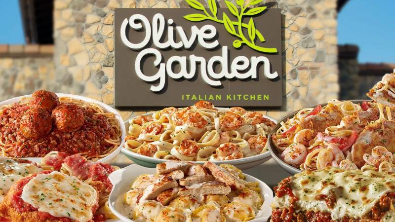
The Olive Garden logo stands as one of the most recognizable marks in American casual dining. It represents an Italian-American restaurant chain owned by Darden Restaurants, headquartered in Orlando, Florida.
Within the broader context of fast food logos and casual dining branding, this logo occupies a unique space. It blends Mediterranean warmth with American accessibility.
The current version was introduced in 2014. The brand itself launched in 1982, and the logo has gone through approximately four major iterations since then.
What is the Olive Garden Logo?
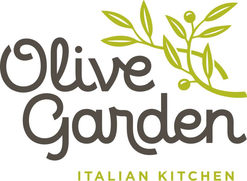
The Olive Garden logo is a combination mark featuring stylized grape leaves and vines above a custom wordmark. It was redesigned in 2014 by an internal Darden creative team. The design symbolizes Italian hospitality, growth, and the restaurant’s commitment to fresh ingredients.
Design Type: Combination mark (symbol plus wordmark)
Primary Elements: Grape vine illustration with leaves, custom serif typography spelling “Olive Garden,” tagline “Italian Kitchen”
Official Introduction Date: 2014 (current version)
Designer/Agency: Darden Restaurants internal creative team
Trademark Status: Registered trademark of Darden Concepts, Inc.
Color Palette: Forest green (#5C7F35), burgundy/wine red, warm gold accents
Usage Context: Restaurant signage, menus, digital platforms, television advertising, merchandise, and packaging design for take-home items
How Has the Olive Garden Logo Evolved Over Time?
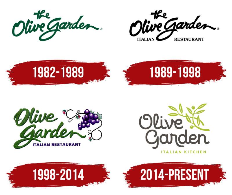
The Olive Garden logo has transformed significantly across four decades. Each redesign reflected changing consumer tastes and the brand’s evolving identity.
The journey moved from rustic simplicity to polished sophistication.
Original Olive Garden Logo (1982-1989)
Years Active: 1982-1989
Design Description: Simple text-based design with minimal graphic elements. The wordmark used a basic serif font that felt approachable but unremarkable.
Color Scheme: Green and white
Context: General Mills launched Olive Garden during a boom in casual dining. The logo needed to communicate Italian food to American suburbia. Nothing fancy.
Cultural Significance: It established the green color association that would carry through every future version.
Second Olive Garden Logo (1989-1998)
Years Active: 1989-1998
Design Description: Introduction of the grape vine motif. The typography became more refined with better kerning between letters.
Color Scheme: Deeper green tones with gold accents
Key Changes from Previous: Added the iconic grape illustration that would become the brand’s signature visual element.
Cultural Significance: This version coincided with Olive Garden’s massive expansion across the United States.
Third Olive Garden Logo (1998-2014)
Years Active: 1998-2014
Design Description: More elaborate grape vine design. The illustration became detailed and almost painterly. Typography shifted to a more elegant serif style.
Color Scheme: Rich burgundy, forest green, warm gold
Designer: Updated by Darden’s brand team
Key Changes from Previous: Added depth through shading and more realistic grape leaf rendering. Included a Tuscan-style border element on some applications.
Cultural Significance: Reflected the “Tuscan farmhouse” aesthetic that dominated the restaurant’s interior design during this period.
Current Olive Garden Logo (2014-Present)
Years Active: 2014-present
Design Description: Streamlined grape vine graphic. Cleaner lines. The wordmark uses a custom serif typeface with improved legibility.
Color Scheme: Simplified to green and gold with occasional burgundy accents
Key Changes from Previous: Removed excessive ornamentation. Added “Italian Kitchen” tagline beneath the main wordmark. Better suited for digital applications.
Cultural Significance: Arrived during a major brand repositioning effort focused on fresh ingredients and updated recipes.
What Do the Design Elements of the Olive Garden Logo Mean?

The grape vine sits at the heart of the Olive Garden logo for good reason. It connects to Italian winemaking traditions and Mediterranean agriculture.
This symbol speaks to abundance, hospitality, and the sharing of food with family.
Why Did Olive Garden Choose These Specific Colors?
Forest Green (#5C7F35)
This hue connects to olive groves, fresh herbs, and Italian countryside landscapes. The color psychology here signals freshness and natural ingredients.
It also creates a calming dining atmosphere.
Gold/Warm Yellow
Gold represents warmth, quality, and the golden tones of pasta, bread, and olive oil. It adds a touch of sophistication without feeling pretentious.
Burgundy/Wine Red
Used as an accent color, burgundy references Italian wine culture. It adds richness to the overall color palette and suggests an elevated dining experience.
What Typography Style Is Used in the Olive Garden Logo?
The current wordmark uses a custom serif typeface. It features moderate stroke contrast and classic proportions.
The letters have subtle curves that feel hand-crafted rather than mechanical.
Readability was clearly a priority. The leading between “Olive Garden” and “Italian Kitchen” creates clear separation.
Earlier versions used more ornate fonts. The evolution toward simplicity reflects broader trends in restaurant branding.
What Are the Hidden Meanings in the Olive Garden Logo?
The grape vine arrangement subtly forms a protective arch over the wordmark. This creates a sense of welcome and shelter.
The number of grape leaves has varied between versions. Some designers have noted the asymmetrical leaf placement feels more organic and natural.
The upward growth direction of the vine symbolizes prosperity and family growth, which ties directly to Olive Garden’s “When you’re here, you’re family” positioning.
How Does the Olive Garden Logo Compare to Competitor Logos?
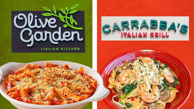
Olive Garden’s logo occupies a traditional space within casual Italian dining. It leans into classic imagery while competitors have gone different directions.
The approach stands apart from modern minimalism.
Versus Carrabba’s Italian Grill: Carrabba’s uses bolder, more masculine typography with flame imagery. Olive Garden feels softer and more family-oriented by comparison.
Versus Maggiano’s Little Italy: Maggiano’s employs an upscale script font suggesting fine dining. Olive Garden positions itself as more accessible through its straightforward serif.
Versus Fazoli’s: Fazoli’s uses bright red and a chef mascot, targeting a faster, more casual experience. Olive Garden’s grape motif signals a slower, sit-down meal.
Most Italian restaurant chains rely heavily on green logos and red accents. Olive Garden differentiates through its unique grape vine illustration rather than generic Italian flag colors.
What Are the Technical Specifications of the Olive Garden Logo?
Official Color Codes:
Brown (Caput Mortuum)
- Hex:
#54301A - RGB: (84, 48, 26)
- CMYK: (0, 43, 69, 67)
Cream (Chinese White)
- Hex:
#E4E1DC - RGB: (228, 225, 220)
- CMYK: (0, 1, 4, 11)
Yellow-Green (Light Gold)
- Hex:
#A8AD00 - RGB: (168, 173, 0)
- CMYK: (3, 0, 100, 32)
Dimensions and Proportions:
The logo maintains approximately a 2:1 width-to-height ratio when including the tagline.
Minimum size requirements typically specify no smaller than 1 inch wide for print design applications.
Clear space around the logo should equal the height of the letter “O” in the wordmark on all sides.
What Cultural Impact Has the Olive Garden Logo Had?
The Olive Garden logo became a suburban American icon during the 1990s and 2000s. For many families, that grape vine symbolized affordable celebrations and special dinners out.
It represents a specific era of American casual dining.
The brand has been both celebrated and mocked in popular culture. Yet the logo remains instantly recognizable to multiple generations of diners.
Internet culture has embraced it through memes, often affectionately. The logo’s earnest, unpretentious design somehow became endearing rather than dated.
How Does the Olive Garden Logo Fit Into the Overall Brand Identity?
The logo anchors a complete visual identity system. Every element, from menu design to server uniforms, references the grape vine motif and green-gold palette.
Restaurant interiors echo the Tuscan warmth suggested by the logo.
Television commercials consistently feature the logo alongside imagery of bread, pasta, and family gatherings. The storytelling reinforces themes of generosity and togetherness.
Darden maintains strict brand guidelines governing logo usage across all touchpoints, from billboards to social media.
How Should the Olive Garden Logo Be Used?
Official Usage Guidelines:
- Never alter the logo colors or proportions
- Maintain required clear space around all logo applications
- Use only approved logo files from official sources
- Never place the logo on busy backgrounds that reduce legibility
- The tagline should remain attached in most applications
Where to Access Official Logos:
Darden Restaurants provides approved logo files to franchisees, vendors, and media partners through internal portals. Public access is restricted to protect trademark integrity.
Licensing Information:
The Olive Garden logo and name are registered trademarks of Darden Concepts, Inc. Any commercial use requires explicit written permission.
Trademark Protection:
Darden actively monitors and enforces trademark rights. Unauthorized use of the logo can result in legal action. This includes parody uses that might cause consumer confusion.
FAQ on The Olive Garden Logo
What Does the Olive Garden Logo Look Like?
The Olive Garden logo features a stylized grape vine illustration positioned above a custom wordmark.
Green leaves arch over the restaurant name. Below sits the tagline “Italian Kitchen.”
The whole thing works as a combination mark. Simple, recognizable, and distinctly Italian-American in feel.
When Was the Current Olive Garden Logo Introduced?
Darden Restaurants unveiled the current version in 2014 during a major brand refresh.
The original logo debuted back in 1982 when General Mills launched the chain. Four major redesigns have happened since.
Each version kept the green color scheme intact.
What Colors Are Used in the Olive Garden Logo?
Forest green dominates the design. It references olive groves and fresh Italian herbs.
Gold accents add warmth and suggest quality. Burgundy appears occasionally, nodding to Italian wine culture.
The gold logos trend works well for brands wanting to signal both accessibility and sophistication. Olive Garden strikes that balance effectively.
Who Designed the Olive Garden Logo?
The current logo came from Darden Restaurants’ internal creative team in Orlando, Florida.
No famous external agency gets credit here. Corporate in-house designers handled the 2014 redesign as part of a broader repositioning effort.
Earlier versions likely involved outside firms, though records are scarce.
Why Does Olive Garden Use a Grape Vine in Its Logo?
Grapes connect directly to Italian winemaking traditions and Mediterranean agriculture. The vine symbolizes abundance, hospitality, and shared meals.
It also creates a natural focal point above the wordmark.
The psychology of shapes matters here. Curved organic forms feel welcoming rather than corporate.
Has the Olive Garden Logo Changed Over Time?
Yes. Four distinct versions have existed since 1982.
The grape vine first appeared in 1989. Each subsequent redesign refined the illustration and updated the typography elements.
The 2014 version stripped away ornate details for cleaner lines. Better suited for digital applications and web design requirements.
What Font Style Does Olive Garden Use?
The wordmark uses a custom serif typeface with moderate stroke variation.
It feels hand-crafted rather than generic. The letterforms have subtle curves that suggest Italian craftsmanship.
Understanding font psychology explains this choice. Serifs communicate tradition, trust, and established heritage.
Can I Download the Official Olive Garden Logo?
Not easily. Darden restricts public access to protect trademark integrity.
Approved vector graphics files go only to franchisees, vendors, and authorized media partners through internal portals.
Using the logo without permission risks legal action. Darden actively enforces its intellectual property rights.
What Does the Olive Garden Logo Symbolize?
Family, warmth, and Italian-American hospitality. The grape vine represents growth and togetherness.
Green signals freshness and natural ingredients. These design elements reinforce the “When you’re here, you’re family” brand promise.
Every detail supports that core message of generous welcome.
Is the Olive Garden Logo Trademarked?
Absolutely. Darden Concepts, Inc. holds registered trademark protection.
This covers the grape vine illustration, wordmark, and color combinations. The company maintains strict brand style guide standards.
Unauthorized commercial use, including parodies causing consumer confusion, can trigger legal consequences.
Conclusion
The Olive Garden logo tells a story of American casual dining evolution. From its 1982 origins to the streamlined 2014 redesign, every version maintained that signature grape vine and green palette.
Good logo design principles show here. The mark balances tradition with accessibility.
Darden Restaurants built strong visual hierarchy into every application. The result is instant brand recognition across thousands of locations.
Whether you love or mock it, that grape vine became an American icon. Sometimes the most effective branding is simply consistent branding applied over decades.

Renowned for his expertise in logo design and visual branding, Bogdan has developed a multitude of logos for various clients.
His skills extend to creating posters, vector illustrations, business cards, and brochures. Additionally, Bogdan's UI kits were featured on marketplaces like Visual Hierarchy and UI8.
He also wrote in the past years on sites like Design Your Way, WebDesignerDepot, WPDean, Designmodo, Speckyboy, Slider Revolution, and more.
- Jujutsu Kaisen Font Generator - 12 October 2026
- The Windsurf Logo History, Colors, Font, And Meaning - 10 October 2026
- How to Remove Background From Product Photos (No Photoshop) - 10 October 2026

Bogdan Sandu is a seasoned designer who has been designing websites since 2008. Renowned for his expertise in logo design and visual branding, Bogdan has developed a multitude of logos for various clients. His skills extend to creating posters, vector illustrations, business cards, and brochures. Additionally, Bogdan's UI kits were featured on marketplaces like Visual Hierarchy and UI8. He also wrote in the past years on sites like Design Your Way, WebDesignerDepot, WPDean, Designmodo, Speckyboy, Slider Revolution, and more.
You Might Also Like