The Dunkin Donuts logo stands as one of the most recognized symbols in the quick service restaurant industry. It represents more than coffee and donuts. It signals familiarity, energy, and an almost ritualistic morning routine for millions.
Founded in 1950 by William Rosenberg in Quincy, Massachusetts, the brand has gone through roughly five major logo iterations. The current version dropped “Donuts” entirely in 2019. Jones Knowles Ritchie handled the rebrand.
Within fast food branding, Dunkin sits alongside McDonald’s and Starbucks as a case study in visual identity evolution. The orange and pink combination has remained constant since 1973, making it one of the longest-running color schemes in the industry.
What Is the Dunkin Donuts Logo?
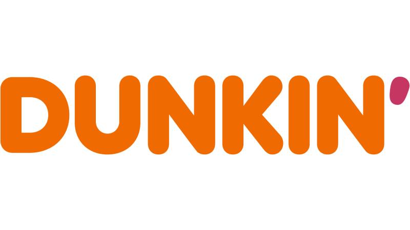
The Dunkin Donuts logo is a wordmark featuring bold, rounded sans-serif lettering in orange and magenta pink. Introduced in its current simplified form in January 2019, it was designed by Jones Knowles Ritchie to modernize the brand while keeping its iconic color scheme intact.
Design Type: Wordmark (text-only logo)
Primary Elements:
- Custom sans-serif typography
- Two-color treatment (orange letters, pink “DUNKIN'” apostrophe accent in some versions)
- Rounded letterforms with generous weight
Official Introduction Date: January 2019 (current version)
Designer/Agency: Jones Knowles Ritchie (JKR)
Trademark Status: Registered trademark owned by Dunkin’ Brands, now under Inspire Brands since 2020 acquisition
Official Color Palette:
- Dunkin’ Orange: #FF671F
- Dunkin’ Magenta/Pink: #DA1884
- Supporting neutrals: White, Brown
Usage Context: Storefronts, cups, packaging, mobile app, drive-thru signage, merchandise, digital advertising, social media
How Has the Dunkin Donuts Logo Evolved Over Time?

The Dunkin’ Donuts logo has undergone several major redesigns since 1950. Each version reflected changing design trends and business strategy.
The brand moved from simple script lettering to illustrative coffee cup imagery, then to the iconic orange and pink wordmark. The 2019 rebrand marked a significant shift, officially shortening the name to just “Dunkin'” (announced in September 2018, implemented January 2019).
Original Dunkin’ Donuts Logo (1950-1955)
Years Active: 1950-1955
Design Description: Simple cursive, handwritten-style wordmark featuring the name “Dunkin’ Donuts”. No distinctive symbol or icon.
Color Scheme: Reddish-brown hue resembling rich coffee or cocoa
Designer: Unknown (likely in-house)
Context: William Rosenberg opened the first shop in 1950 after rebranding from “Open Kettle”. The focus was entirely on text to reflect the no-frills experience.
Cultural Significance: Represented the humble beginnings of what would become a national chain. Personal and unpretentious design approach.
Dunkie Mascot Era (1955-1960)
Years Active: 1955-1960
Design Description: Introduction of mascot “Dunkie” – a whimsical character with a mug body, donut head, donut hands and feet, and yellow coffee cup torso wearing a chef’s hat. Original script logo appeared across the cup.
Color Scheme: Multiple colors including yellow for coffee cup
Designer: Unknown
Context: Character-based branding was popular in fast food marketing during this period
Key Changes from Previous: First use of illustrative mascot character, added personality and humor
Cultural Significance: Gave the brand a friendly face for storefronts, packaging, and newspaper ads
Pink Coffee Cup Era (1960-1976)
Years Active: 1960-1976
Design Description: Logo featuring bright pink color applied to a coffee cup illustration framed inside a bold circular wordmark, with the circle split horizontally – top portion in bold pink, bottom in white
Color Scheme: Introduction of the now-familiar candy pink color that first appeared in 1960
Designer: Unknown
Context: Franchise expansion required stronger brand recognition
Key Changes from Previous: Debuted the now-familiar bright pink color, more polished and modern design
Cultural Significance: Established the pink color that would become synonymous with the brand
Iconic Orange and Pink Logo (1976-2002)
Years Active: 1976-2002
Design Description: Redesigned logo replacing the donut and cup with bright lettering “Dunkin’ Donuts” in two rows – “Dunkin'” in tinted powdery orange at top, “Donuts” in candy pink at bottom
Color Scheme: Orange and magenta pink became official brand colors
Designer: Unknown (brand standardization effort)
Context: National advertising campaigns required consistent visual identity
Key Changes from Previous: Removed coffee cup graphic, standardized the pink and orange color scheme
Cultural Significance: This version became embedded in American pop culture and is what many people picture when thinking of Dunkin’
Modernized Classic (2002-2018)
Years Active: 2002-2018
Design Description: Logo refreshed with coffee cup icon maintained, font updated to more modern sans-serif style, orange and pink colors made brighter
Color Scheme: Same orange and pink, adjusted for digital applications
Designer: Internal brand team
Context: Digital age required logos that worked on screens, apps, and small formats
Key Changes from Previous: Reintroduced coffee cup icon beside text, updated font, streamlined design for contemporary look
Cultural Significance: Balanced tradition with modernity, emphasized coffee alongside donuts
Current Dunkin’ Logo (2019-Present)
Years Active: 2019-Present
Design Description: Bold wordmark reading simply “DUNKIN'” with the apostrophe, no coffee cup, no “Donuts”. Pure typographic identity.
Color Scheme: Orange (#FF671F) and Magenta (#DA1884)
Designer: Jones Knowles Ritchie (JKR) working alongside BBDO New York and Arc Worldwide
Context: Menu expansion beyond donuts, focus on serving “great coffee fast,” beverage-led brand strategy
Key Changes from Previous: Dropped “Donuts” entirely, removed coffee cup graphic, simplified to wordmark only
Cultural Significance: Represents brand evolution after 68 years, moving to a “first-name basis” with customers
What Do the Design Elements of the Dunkin Donuts Logo Mean?

Every element in the Dunkin logo carries meaning. The rounded letterforms suggest friendliness and approachability.
The bold weight communicates confidence. And those colors? They work harder than you might think.
Why Did Dunkin’ Choose These Specific Colors?
The orange and pink combination is no accident. Understanding color psychology in branding explains why this pairing works so well.
Dunkin’ Orange (#FF671F)
- Pantone: 1665 C (Note: Some sources cite PMS 155 C; color codes vary slightly by source)
- RGB values: 255, 103, 31
- Symbolic meaning: Energy, warmth, enthusiasm, freshness, vitality
- Psychological impact: Creates excitement and stimulates appetite, perfect for morning routines. Represents freshly baked donuts.
- Brand connection: Evokes fresh-baked goods, warmth of coffee, energy to start the day
Dunkin’ Magenta/Pink (#DA1884)
- Pantone: 218 C (Note: Some sources cite PMS 232 C; the official Dunkin’ Pink is also called “Powdered Candy”)
- RGB: 218, 24, 132
- Symbolic meaning: Fun, playfulness, sweetness, happiness, brightness
- Psychological impact: Differentiates from competitors, creates joyful mood, memorable and unique
- Brand connection: References donut sprinkles, sweet treats, joy, elevated mood
Together, orange and pink create high visual contrast. They stand out from the browns and greens dominating coffee shop branding. The colors were selected by designer Lucia DeRespinis in 1976, who suggested her daughter’s favorite colors to make the brand feel fun rather than “toasted.” Among brands using orange and those incorporating pink, Dunkin’s specific combination remains distinctive and has remained largely unchanged since 1976.
What Typography Style Is Used in the Dunkin Donuts Logo?
The current Dunkin logo uses a custom sans-serif typeface. It resembles Frankfurter but with modifications.
The letterforms are rounded, almost bubbly. Thick strokes create strong presence at any size.
The x-height is generous, improving readability on cups and signage. Letter spacing stays tight but not cramped.
Earlier versions used different font treatments, but the friendly, approachable character remained consistent across decades.
What Are the Hidden Meanings in the Dunkin Donuts Logo?
There’s no arrow hidden in the negative space here. No secret message in the letterforms.
But the simplicity itself communicates something. Dropping “Donuts” signals menu evolution.
The apostrophe in “DUNKIN'” subtly suggests action, the “-ing” implying ongoing motion. You’re dunkin’ right now.
Some see the rounded letters as donut-shaped. Intentional? Probably not. But our brains make these connections anyway.
How Does the Dunkin Donuts Logo Compare to Competitor Logos?

In the coffee shop wars, Dunkin plays a different visual game. Starbucks has the mermaid. Tim Hortons uses red and warm tones.
Dunkin stands alone with pure typography and that unmistakable orange-pink punch.
Starbucks: Green, illustrative siren, premium positioning. Complex emblem design requires careful scaling.
Tim Hortons: Red maple-leaf influenced, Canadian heritage focus. Traditional feel.
Krispy Kreme: Green and red, bowtie shape, nostalgic Americana. More ornate typography.
Peet’s Coffee: Earth tones, serious coffee credibility. Minimal, sophisticated.
Dunkin’s approach is louder. More casual. Unapologetically mass-market. The logo doesn’t try to be artisanal or premium. It’s accessible, fun, and fast.
What Are the Technical Specifications of the Dunkin Donuts Logo?

Official Color Codes:
Primary Color: Dunkin’ Orange
- Hex: #FF671F
- RGB: (255, 103, 31)
- CMYK: (0, 70, 100, 0)
- Pantone: 1665 C
Secondary Color: Dunkin’ Magenta
- Hex: #DA1884
- RGB: (218, 24, 132)
- CMYK: (0, 100, 10, 0)
- Pantone: 232 C
Supporting Color: Brown
- Hex: #653819
- RGB: (101, 56, 25)
- Used in secondary applications, coffee-related materials
Dimensions and Proportions:
- Aspect ratio: Approximately 4:1 (horizontal wordmark)
- Minimum size: 0.75 inches wide for print, 100 pixels for digital
- Clear space: Height of the “D” on all sides minimum
- Backgrounds: Preferred on white; approved on orange or pink solid backgrounds
What Cultural Impact Has the Dunkin Donuts Logo Had?

The Dunkin logo transcends mere corporate identity. It’s become shorthand for a certain kind of American morning.
In the Northeast especially, that orange and pink signals ritual. Grab a coffee before work. Meet friends. Fuel up.
“America Runs on Dunkin” wasn’t just a slogan. The logo made that promise visual. Recognizable from highway exits. Comforting in unfamiliar towns.
The 2019 name change sparked real debate. People felt ownership of “Dunkin’ Donuts.” The shortened version felt like losing something familiar.
How Does the Dunkin Donuts Logo Fit Into the Overall Brand Identity?

The logo anchors a complete brand style guide covering every customer touchpoint. It connects to packaging, store design, uniforms, and digital presence.
Cup designs mirror the logo’s energy. Store interiors use the same color family.
The mobile app carries the wordmark prominently. Social media maintains color consistency.
Under Inspire Brands (which also owns Arby’s, Buffalo Wild Wings, and Sonic), the Dunkin identity remains distinct. The logo serves as the primary recognition driver across all these applications.
How Should the Dunkin Donuts Logo Be Used?

Dunkin maintains strict brand guidelines protecting their visual identity. Here’s what matters:
Do:
- Use official logo files from approved brand portals
- Maintain required clear space around the logo
- Use approved color combinations only
- Scale proportionally (never stretch or distort)
Don’t:
- Add effects like shadows, gradients, or outlines
- Change the colors
- Rotate or angle the logo
- Place on busy backgrounds that reduce legibility
- Recreate or approximate the logo with similar fonts
Accessing Official Logos: Franchise partners access assets through Dunkin’s internal brand portal. Media requests go through corporate communications. Unauthorized use triggers trademark enforcement.
Trademark Protection: The Dunkin’ name and logo are registered trademarks. The specific orange and pink color combination has trade dress protection in the quick service restaurant category. Inspire Brands actively monitors and enforces these protections.
FAQ on The Dunkin Donuts Logo
What Does the Dunkin Donuts Logo Look Like?
The current Dunkin logo is a bold wordmark displaying “DUNKIN'” in rounded sans-serif letters.
It uses orange and magenta pink colors. No coffee cup graphic. No “Donuts” text.
The design prioritizes simplicity and instant brand recognition across digital and physical applications.
Why Did Dunkin Donuts Change Their Logo?
Dunkin updated their logo in 2019 to reflect a beverage-first business strategy.
The brand wanted to signal menu expansion beyond donuts. Coffee and other drinks now drive most sales.
The refresh also improved visual hierarchy for mobile apps and smaller screens.
What Colors Are in the Dunkin Donuts Logo?
Two colors define the Dunkin brand: orange (#FF671F) and magenta pink (#DA1884).
This combination has remained consistent since 1976. Understanding color theory explains why it works.
Orange stimulates appetite and energy. Pink adds playfulness and differentiates from competitors.
Who Designed the Current Dunkin Logo?
Jones Knowles Ritchie (JKR) designed the 2019 Dunkin rebrand.
This global branding agency has worked with major quick service restaurant brands. They simplified the visual identity while preserving decades of brand equity.
What Font Is Used in the Dunkin Donuts Logo?
Dunkin uses a custom typeface similar to Frankfurter.
The rounded, bubbly letterforms create a friendly appearance. Thick strokes ensure readability on cups, signage, and franchise storefronts.
The psychology behind font choices here suggests approachability over sophistication.
Why Did Dunkin Drop “Donuts” From Their Name?
Dunkin removed “Donuts” because beverages now represent most revenue.
The company wanted flexibility. Keeping “Donuts” in the name limited perception of their expanded menu offerings.
The shortened name also fits better in digital design contexts and app icons.
What Year Did Dunkin Change Their Logo?
The current logo launched in January 2019.
This marked the biggest visual change in company history. Previous updates refined existing elements, but 2019 removed the coffee cup entirely.
What Is the Meaning Behind the Dunkin Logo?
The logo communicates energy, speed, and everyday accessibility.
Rounded letters suggest friendliness. The orange-pink scheme signals warmth and fun. Dropping “Donuts” positions Dunkin as a complete beverage destination, not just a donut shop.
Can I Download the Official Dunkin Donuts Logo?
Official logo files require authorization from Dunkin’s corporate communications team.
Franchise partners access vector graphics through internal brand portals. Media outlets can request assets for editorial use. Unauthorized downloads risk trademark issues.
Is the Dunkin Logo Trademarked?
Yes. The Dunkin name and logo are registered trademarks owned by Inspire Brands.
The specific orange and pink color combination has trade dress protection in the QSR industry. Inspire actively enforces these intellectual property rights.
Conclusion
The Dunkin Donuts logo proves that effective brand identity doesn’t require complexity. A simple wordmark, two bold colors, and consistent application across decades built one of America’s most recognizable quick service restaurant symbols.
The 2019 rebrand showed courage. Dropping “Donuts” was risky. But it aligned the visual identity with business reality.
Strong logo design principles guided every iteration. The orange and pink scheme demonstrates how brand storytelling works through color alone.
Whether on a highway sign or mobile app, that wordmark delivers instant recognition. That’s the goal of any successful corporate identity.

Renowned for his expertise in logo design and visual branding, Bogdan has developed a multitude of logos for various clients.
His skills extend to creating posters, vector illustrations, business cards, and brochures. Additionally, Bogdan's UI kits were featured on marketplaces like Visual Hierarchy and UI8.
He also wrote in the past years on sites like Design Your Way, WebDesignerDepot, WPDean, Designmodo, Speckyboy, Slider Revolution, and more.
- Jujutsu Kaisen Font Generator - 12 October 2026
- The Windsurf Logo History, Colors, Font, And Meaning - 10 October 2026
- How to Remove Background From Product Photos (No Photoshop) - 10 October 2026

Bogdan Sandu is a seasoned designer who has been designing websites since 2008. Renowned for his expertise in logo design and visual branding, Bogdan has developed a multitude of logos for various clients. His skills extend to creating posters, vector illustrations, business cards, and brochures. Additionally, Bogdan's UI kits were featured on marketplaces like Visual Hierarchy and UI8. He also wrote in the past years on sites like Design Your Way, WebDesignerDepot, WPDean, Designmodo, Speckyboy, Slider Revolution, and more.
You Might Also Like