The Pizza Hut Logo History, Colors, Font, and Meaning
Imagine the sizzle of mozzarella as it melds with a perfectly charred crust. Now, picture the emblem that represents this melodic union: the Pizza Hut logo. It’s a symbol etched into the culinary cosmos, one slice of pepperoni at a time.
This isn’t just about a logo. It’s about a legacy. It tells a story of dough hand-tossed through time and the evolution of a global franchise, echoing the passions of pioneer founders, Dan and Frank Carney.
In this article, dive deep into the red roof design that became an icon of the fast-food logos galaxy. You’ll unravel the threads of Pizza Hut’s brand history and discover how this emblem reflects an entire industry’s ethos.
Along the way, we’ll decipher the role of visual identity elements, brand recognition, and the subtle dance of color schemes—all through the lens of a graphic design maestro.
You’ll leave with insights on harnessing the magnetic pull of effective branding, informed by the experience of a web-dwelling artisan.
Welcome to a narrative that blends the art of the Pizza Hut emblem with the science of visual seduction.
The Meaning Behind the Pizza Hut Logo
A Homely Hut
Have you ever noticed the imagery of a hut in the Pizza Hut logo? This isn’t just for kicks, folks. That hut embodies the idea of home and comfort.
Pizza Hut wants you to feel at home, to kick back, and enjoy your meal as if you’re in your own cozy space. It’s all about creating that warm, welcoming atmosphere.
Emphasis on ‘Pizza’
Just take a good look at the logo, what do you see? ‘Pizza’ right up there, underlined, right? That’s because Pizza Hut is loud and proud about what they do best. No secrets, no confusion, just straight-up pizza love.
The History of the Pizza Hut Logo
The Original Hut
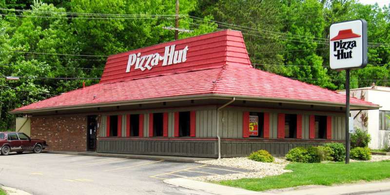
Flashback to 1958, two brothers, and the birth of Pizza Hut. The original logo? Pretty different from what we see today. It had a straightforward, rustic sketch of a hut. A reminder of the brand’s humble beginnings.
The Evolution
Over the years, the logo has evolved. In the 70s, we saw the addition of that iconic red roof, and the 80s brought us that sleek, stylized hut shape that we know and love today.
The Colors of the Pizza Hut Logo
Red: The Color of Passion
Ever wonder why red is such a standout color in the Pizza Hut logo? Red is the color of passion, energy, and of course, appetite. It’s a color that makes your heart beat just a bit faster and makes your stomach grumble just a bit louder.
The Font Used in the Pizza Hut Logo
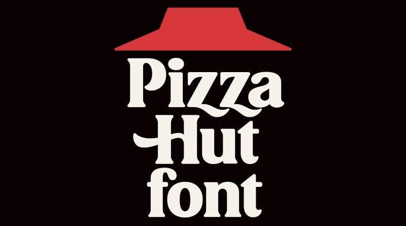
Bold and Unmissable
No fancy schmancy fonts here. The Pizza Hut logo uses a bold, sans-serif typeface. It’s strong, it’s unmissable, and it’s as straightforward as it gets.
The Underline
And the underline? That’s a power move right there. It draws attention, it emphasizes, and it makes a statement.
Psychology and the Pizza Hut Logo
Triggering Taste Buds
Logos aren’t just about looking good. They’re about creating a connection, sparking a reaction. And the Pizza Hut logo does that perfectly.
The colors, the bold font, the hut imagery, they all come together to trigger your taste buds, to make you crave that delicious, cheesy pizza.
Creating Brand Recognition
With its distinctive design, the logo has done a remarkable job in creating brand recognition.
Whether you see it on a billboard, a TV commercial, or your pizza box, you immediately recognize it. It’s not just a logo, it’s a symbol of deliciousness.
The Impact of the Pizza Hut Logo
Global Recognition
From a small pizza place in Kansas to a global franchise, the Pizza Hut logo has come a long way. Today, it’s recognized globally, a symbol of delicious pizza and comfort food.
Inspiring Other Brands
The success of the Pizza Hut logo has also served as an inspiration for many other brands. The simplicity, the powerful use of colors, and the smart design choices have paved the way for many other memorable logos.
FAQ On The Pizza Hut Logo
Why did Pizza Hut change its logo?
They wanted a fresh take. New era, new look. The redesign was all about staying relevant in a fast-moving market. It was less about ditching their roots and more about keeping up with the times. They updated the emblem to match the modern consumer’s taste—simple yet bold.
What does the Pizza Hut logo represent?
The red hat is more than just a graphic. It’s a visual identity element, a nod to the iconic building design with the actual red roof. It screams warmth, energy, and, I’d say, an invitation to indulge in a comforting meal.
How many times has the Pizza Hut logo been redesigned?
Several, but nothing too outlandish. Seems they’ve always tried to keep that recognizable roof silhouette in play. Each iteration built on the last, ensuring that brand recognition was never compromised. A testament to how a company can evolve without losing its essence.
Who designed the original Pizza Hut logo?
The Carney brothers were behind the initial concept, but it was a collective effort with early franchisees and marketing teams. They managed to cook up a logo as iconic as the pan pizza itself. The specifics of the individual designer, though, are lost to history.
What year was the original Pizza Hut logo created?
Started back in the ’50s, 1958 to be precise. At the time, it was all about that classic Americana vibe. Imagine, just a year after Sputnik beeped across the sky, these guys planted the red roof sign on the ground. Historic, right?
Is the Pizza Hut logo trademarked?
Absolutely. You bet it’s protected. Trademarks are no joke, and when you’ve got a logo that’s as well-known as the Pizza Hut one, you guard it like a hawk. It’s a vital component of their brand identity, and keeping it under legal lock and key is essential.
What’s the significance of the colors used in the Pizza Hut logo?
Red for passion, appetite, excitement. It’s no coincidence; color psychology is at play. The black amplifies the boldness. They didn’t just throw darts at a board to choose them. The colors were intentionally selected to trigger that ‘must-have-pizza-now’ response.
Did the Pizza Hut logo always include the company name?
Originally, yes. The name was front and center, underscored by the distinctive red roof. But you know what? As they evolved, there was a brief flirtation with logo-only signage. Yet, they looped back, realizing how the name itself is an indispensable part of the visual trigger.
How does the Pizza Hut logo impact brand recognition?
You catch a glimpse of that red roof, and instantly, you’re thinking pizza. That’s the impact, right there. It’s about instant recognition, tying the visual symbol to the taste, smell, and experience of digging into a Pizza Hut meal. Pure branding magic.
What’s the future of the Pizza Hut logo?
Who’s got a crystal ball, right? But, if I had to guess, it’ll stay true to its roots, with just enough tweaks to stay fresh. They’ve struck a fine balance between tradition and modernity—and I don’t see them tipping that scale too drastically anytime soon.
Conclusion
So, we’ve journeyed through the fabric of an icon—the Pizza Hut logo—weaving through its storied past, its trademark triumphs, and the sheer magnetism it casts on the global tapestry of fast-food fame.
This emblem—part symbol, part beacon—holds power. Not just in the world of pies and toppings, but as a chapter in the chronicles of how visual identity shapes our cultural narrative. The red and black color scheme doesn’t just catch our eye; it grabs our cravings by the collar.
To wrap it up:
- The roots: A humble beginning with a single red roof.
- The change: Evolution is the name of the game for staying atop the food chain.
- The future: Adaptation with respect for the past, eyes peeled for the next trend on the horizon.
Next time that red hat winks at you from the corner of the street, you’ll know—it’s not just a logo. It’s a slice of history.
If you liked this article about the Pizza Hut logo, you should check out this article about the Subway logo.
There are also similar articles discussing the Arby’s logo, the Little Caesars logo, the Dairy Queen logo, and the Panda Express logo.
And let’s not forget about articles on the McDonald’s logo, the Shake Shack logo, the Domino’s Pizza logo, and the Chick-fil-A logo.
Bogdan Sandu, a seasoned designer with 15 years of diverse experience, has been designing websites since 2008.
Renowned for his expertise in logo design and visual branding, Bogdan has developed a multitude of logos for various clients.
His skills extend to creating posters, vector illustrations, business cards, and brochures. Additionally, Bogdan's UI kits were featured on marketplaces like Visual Hierarchy and UI8.
Latest posts by Bogdan Sandu (see all)
- Rainbow Color Palettes for Joyful Designs - 29 April 2024
- The Bethesda Logo History, Colors, Font, And Meaning - 28 April 2024
- Out of This World: Space Color Palettes for Cosmic Designs - 28 April 2024